Apple
- Monday - A client needed a questionnaire laid out in a 2 page spread that would fit in a larger document.
- Tuesday - A different client scheduled their regular quarterly newsletter. Also, Tuesday, I met with the staff of the local library where I volunteer. The agenda was the reboot of our oral history interview series which is published as a podcast but is also being added to a new local history website.
- Wednesday, Thursday and Fridaywere spent doing the work.
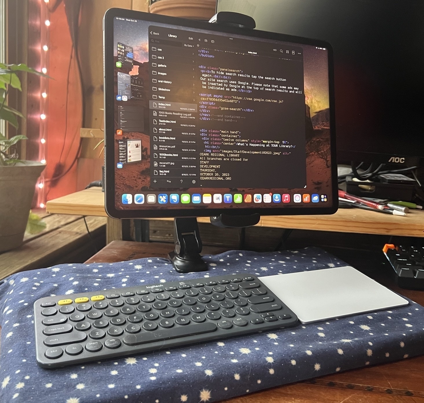
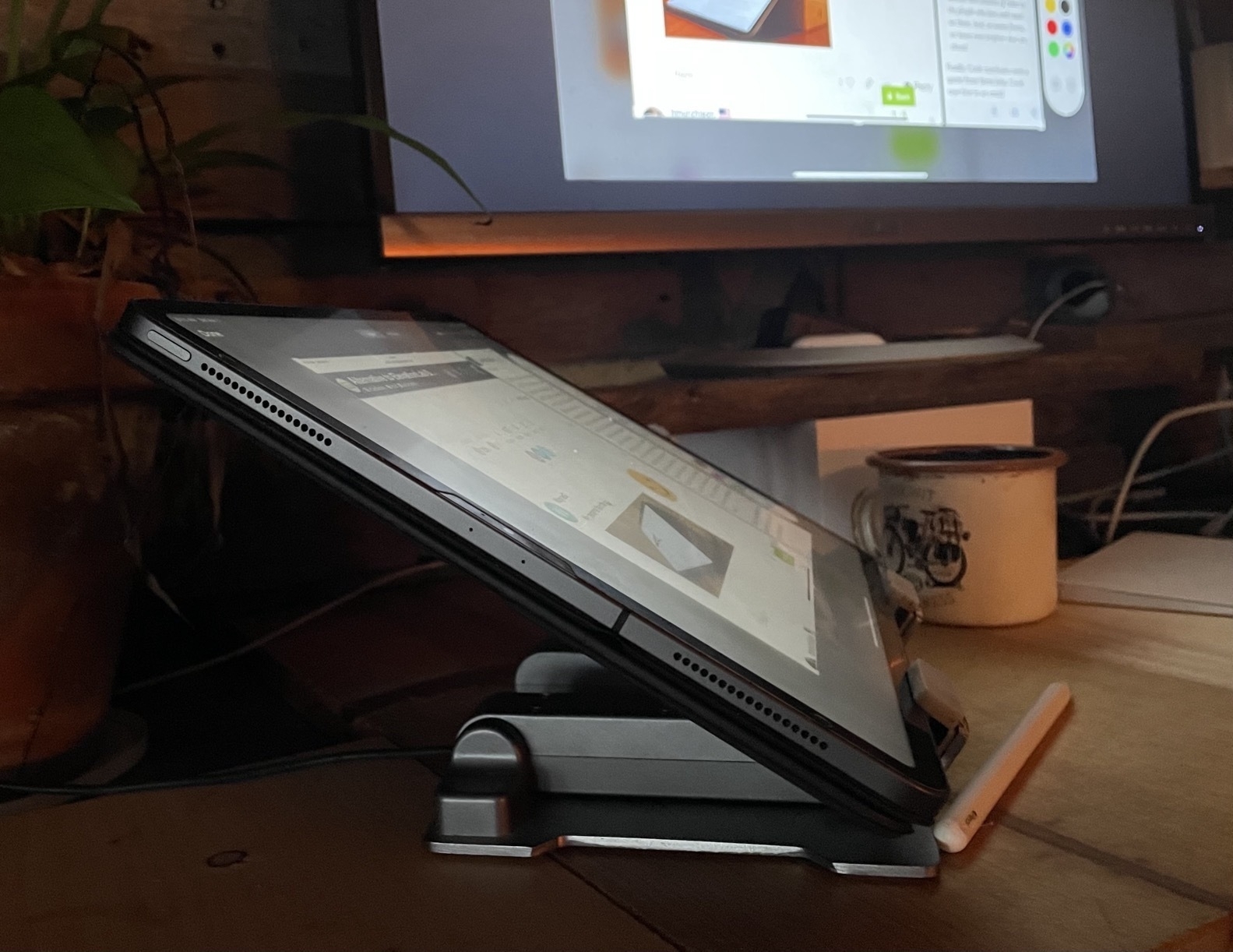
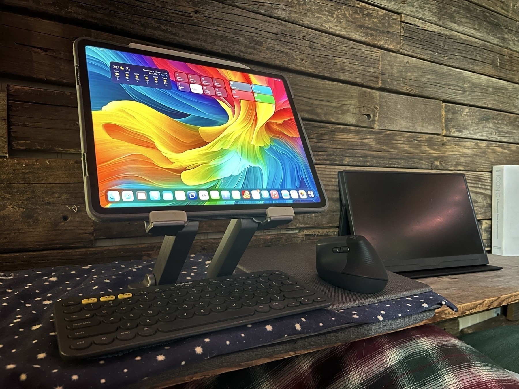
- The main point in using a stand like this is to raise the iPad fairly high, getting it much closer to eye level.
- With two hinges it is adjustable to any angle, far better than the limited angles available with iPad Magic Keyboard or other folio style keyboards.
- This stand is the older style of stand with a non-magnetic back and two support brackets on the bottom to hold the iPad. The newest magnetic stands look very clean and hold the iPad in place but only work with one size iPad based on the current model designs. They're also more expensive. These older style stands are sturdy and the cost is usually less than $25 compared to the magnetic stands that usually come in above $70.
- I like being able to place my current keyboard of choice on the base while typing.
- Export to ePub.
- Charts
- Small businesses and nonprofits that want to cover their own document creation internally
- Students creating reports
- Nonprofit and community volunteers that need to creat newsletters, brochures, flyers, or other documents
- Creating ePubs
- Document design and layout that can be fully customized with no limits on graphic elements or text
- Management of large documents with many layers and assets
- Documents intended for printing that requires industry standard output such as printers marks with bleeds.
- Documents in Pages lack the option for "master pages". It is possible to have a page template which can have elements added that will appear across the document but it's far more limited.
- While Pages has built in snapping for objects on a page it lacks the option to add other guides to pages. Affinity Publisher allows for adding unlimited guides for flexible design of columns or other elements that will be snapped to as a document is put together. A less flexible but helpful work around in Pages is to use the more basic page template to set-up various invisible lines/boxes that can be used similarly.
- Document set-up in Pages also lacks options such as bleed and then, when exporting, options such as printers marks crop marks.
- Effects are far more limited in Pages. In fact, there are only two, reflection and shadow and they can only be applied at the block level. So, for example, a block of text as opposed to smaller level of elements like a single letter or word.
- Layers of objects in a Pages document can become cumbersome with larger documents. Affinity provides per page layering that is easier to manage with large documents.
- Pages is free!
- While simplicity limits the potential results to some degree, it is easier to learn for new users.
- When learning Pages users are also becoming familiar with similar tools and interface elements found in the other iWork apps, Numbers and Keynote
- Pages works well with other iWork apps and Apple apps generally. Need to add a photo? You can drag a photo from the Files app or add it from the toolbar.
- Pages comes with a variety of ready-to-use, well designed templates for newer users.
- Tables are much easier to set up and modify in Pages. Need a table with calculations? Just copy and paste in a table from Numbers. Charts are also easy to set-up in Pages.
- Interesting multimedia options for documents that won't be printed.
- Editable options for sharing to other users via built in collaboration tools for other Apple device users, Pages in iCloud or export to Word.
- Though this document is being created using the Page Layout option which is more freeform offering a blank canvas, there is also an option to start with a basic word processing document which makes getting started easier for that kind of document.
- The Mac is a keyboard/mouse/trackpad driven computer with a more mature, more open desktop OS.
- The iPad is a touch-first mobile computer that has additional "power user" features when connected to a keyboard and mouse.
A Day in the Life of Working with an iPad
I've had a few interesting workdays recently that I thought would be worth sharing in terms of highlighting what's possible with an iPad. Before I dig in, I'll mention that I use the 12.9" M1 iPad Pro with 8GB of memory. For me the largest screen is absolutely necessary for more complicated tasks. Even the 13" (I'm just going to refer to it as 13") sometimes feels too small at which point I now have the option of connecting to an additional screen.
I mention this in part because lately there's speculation about the 2024 iPads and along with that quite a few folks have shared that they are still happy with their 2018 iPad Pro because it's all they've needed. Sometimes these sorts of statements are praise of how long the iPad hardware lasts which I agree with and am happy about. These devices are resource intensive and should be used as long as possible.
Some posts have a different tone which implies that iPadOS is too limited so they haven't bothered updating because it's not a device they rely upon or need. This post is, in part, to highlight what the M1 or M2 models are capable of with the additional memory and iPadOS 17.
Here's the run-down on the previous five days' work and how I got it done with the iPad. The overview:
Monday's task, the questionnaire, was done by end of day and I used Affinity Publisher. It was a relatively straight forward task that was finished in a couple hours. No big deal.
Tuesday is where it starts to gets more interesting. The day started with the library meeting and then the email from client ready to start their newsletter. The newsletter took priority for the afternoon as it's on a deadline.
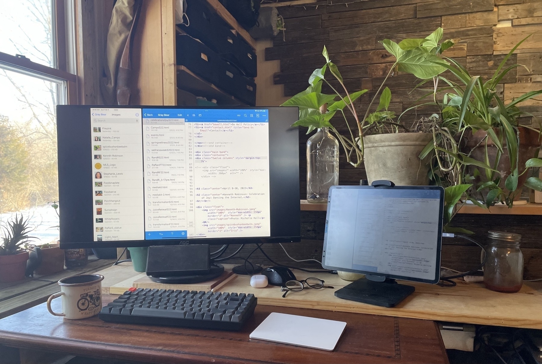
The client shares the files via Dropbox, a folder of images and a basic pdf with the text content and any directions. Afternoon spent in Affinity Publisher. I bounce back and forth between Publisher and the pdf document opened in Files to copy paste text. I use Stage Manager with Publisher taking up almost the full screen. Files/PDF is just behind for quick access. I get this done in a few hours hours. Again, a fairly easy to manage task.
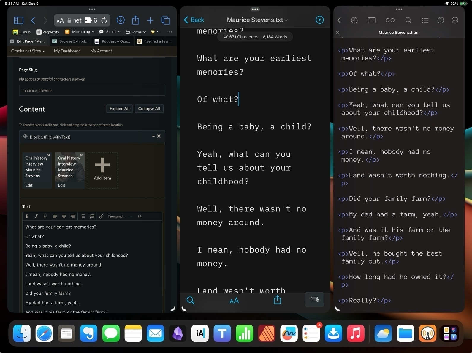
Then it's on to the Library project. I use Safari to login to Omeka, the CMS we use for the library's local history website. I've not used it in awhile so I spend an hour reacquainting myself and checking for any changes made by the other user that inputs data.
Before I go any further, a brief description of the Library project because I think it's a cool project worth sharing. In 2019 we recorded and published 19 oral history interviews. I was a co-interviewer. Each interview was 60 to 90 minutes and was recorded on a standard 2018 iPad with a USB mic. I Used Ferrite on my iPad to do light editing to remove audio gaps and added some intro/outro music that I made in Garage Band. I'd then use iA Writer to write an extended synopsis/abbreviated transcript with highlights. The transcript, mp3 and a photo of the interviewee were published to the Library's WordPress blog which was used as the feed for our podcast in Apple's directory. The interviews were paused at the end of 2019. The arrival of Covid in early 2020 put the project on an indefinite hold as the interviews were done in person and the interviewees were primarily elderly, often exceeding 75 years.
In early 2023 the Library decided to resume the project but with the intent of adding new interviews to the Omeka CMS that was set-up to document local history. I did the initial, basic set-up in 2020 but it has largely been unused since. The first task is to add the 2019 interview audio, images, transcripts to this Omeka site. Then to continue adding material, largely consisting of the resumed oral history recordings set to resume in 2024.
I'd initially planned to spend a couple weeks running the audio files through the Aiko app on the iPad to generate the full transcripts and then add these and the audio to the Omeka site.
I started the process on Wednesday afternoon. A 60 minute interview takes 10 to 15 minutes to transcribe into text. I did 9 or so and saved the files to a folder in iA Writer. Then I spent the evening using Safari to create entries for each interview in Omeka, adding an interviewee image, text and mp3 files along with various fields of metadata. It's fairly time consuming as Omeka is designed as a CMS for historical/museum content with each record added along with many potential types of metadata. The CMS works very well in Safari on the iPad though so no problems doing it.
I spent much of Thursday afternoon and evening finishing the task of processing the remaining mp3 files with Aiko then, again, creating entries with corresponding image, text and audio files. Happily way ahead of schedule and I learned more details about using Omeka. The CMS allows for two primary ways to display records to the public: Collections and Exhibits.
I started by adding the individual interviews to a new oral history collection. I could have stopped with that but it's not the most pleasant way to browse content. It's just a list of the individual items, in this case, interview records. Each of those records displays metadata and links to view the txt transcript or an embedded media player to listen to the interview. It's basically an informational, academic database.
The better way to present is via what Omeka calls an exhibit. I spent the remainder of Thursday setting up such an exhibit which begins with an easy to read introduction that links to the individual interviews pages that are designed like a more typical web page. Each page consists of the full transcript with an image of the interviewee and the media player in the top left of each page.
In setting up the first page I found that, not surprisingly, pasting the plain text into the CMS text editor resulted in very unfriendly formatting. Instead I used iA writer to export each plain txt file into html which I saved into a folder in Textastic. I'd open these in Textastic, copy the html then hop over to Safari, create a page for the interview, paste in the html, then attach the associated mp3 and image of the interviewee. Save and move on to the next.
Using Stage Manager on the the 13" iPad it was easy to arrange a Safari window along side of iA Writer and Textastic. This could also be done using Split Screen windows and a slide over but it would feel a bit more cramped with one window covering another.
This is exactly the sort of day-to-day busy work that really is improved with Stage Manager on larger screen iPad Pro, on an iPad that accommodates multi-tasking with more windows at a time. In other words, an iPad that more closely resembles the experience of using a Mac. And I'll add that the 8GB of memory on the base M1 iPad Pro does improve the multitasking experience especially when as the number of apps being used increases.
This is the type of more complicated workflow that frustrates users on older or smaller iPads with less memory and less working room. Even today, trying to accomplish this with Stage Manager on a smaller screen would be very frustrating for me. I see people all the time posting that their 11" iPad Pro sits unused or isn't good for "real work". I'd guess the same folks, if handed an 11" screened Mac, would also quickly grow frustrated. The nature of a small screen on any computer is less space to work with.
In my day-to-day work with an iPad I've found touch and gesture based computing to be a real pleasure. And with year-to-year improvements of iPadOS like Stage Manager and pointer support that's only grown. But I've come to think that for anyone intending to replace a Mac the 13" is likely to be the right size.
It seems likely that in 2024 we're going to see new iPad hardware with some big improvements and I don't doubt that with those new releases will come months of complaints from pundits that the iPad is still an iPad, that it's held back by the OS. To that I would say the iPad is not the Mac, it's a touch screen computer. Use it as it's meant to be used and if it's your intent to replace a Mac get the larger screen version.
Apple Pundit Dick Moves
Discussing a trick he learned with the multi selection of tabs on a Mac browser John Gruber feels the weird need to beat-up on the iPad:
This trick does not work in Safari on iPadOS, because iPads are baby computers where you can’t select more than one thing at a time.
He got it wrong but the big boy issued a correction:
Update: In a reply on Threads, Jay Robinson points out (and includes a nice screencast) that you can select multiple Safari tabs on iPad with multitouch. Drag one tab out of the tab bar, then, while keeping the drag active with one finger, use another finger to tap additional tabs to add them to the collection of tabs being dragged.
But then he gets it wrong again and, because he’s such a cool guy, offers another snide comment:
But: all you can seemingly do with such a collection of dragged tabs is move them to another area in the current Safari window, or drop them as URLs into another app, like a message in Mail or Apple Notes.
This is incorrect. You can do more with these tabs, keep reading.
You can drag a single tab in iPad Safari to the edge of the screen to move it to a new split screen window, but if you have more than one tab in the drag collection, you can’t do that.
The way to do it: Drag a tab into a new window or Command+Option+N to make a new window. Then multitouch to select the tabs you want to move, drag over to the top tab bar area of the 2nd Safari window. You’ll see the little indicator to drop your tabs to add them to this second Safari window.
It’s not exactly the same as the maneuver on the Mac but it works just as well.
Nor can you take group actions on the collection of tabs, like closing them all at once, or closing all tabs in the window other than the selected ones, like you can with the multiple-tab-selection feature in the big-boy Safari on MacOS.
Okay, um, but if you just moved all these tabs to a new window and want to close the other window all you have to do is select it’s little 3-dot multitasking widget and close it. Honestly, is that so difficult?
I’m going to just file this under Dick Moves by Apple Pundits.
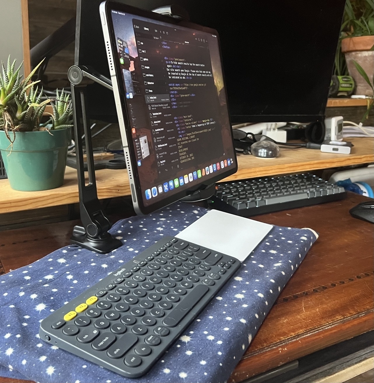
Experiments with iPad Set-ups
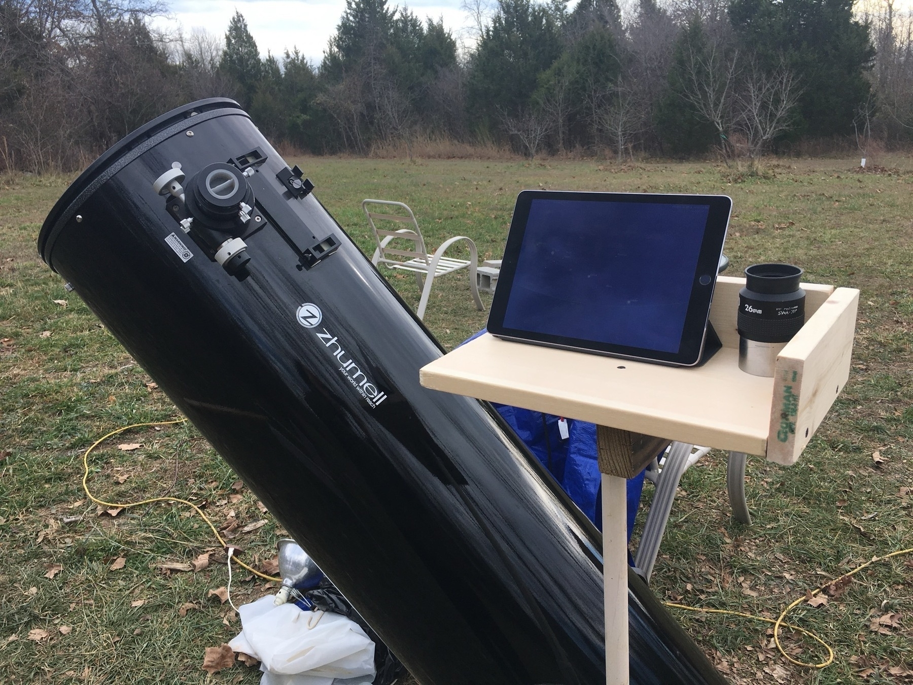
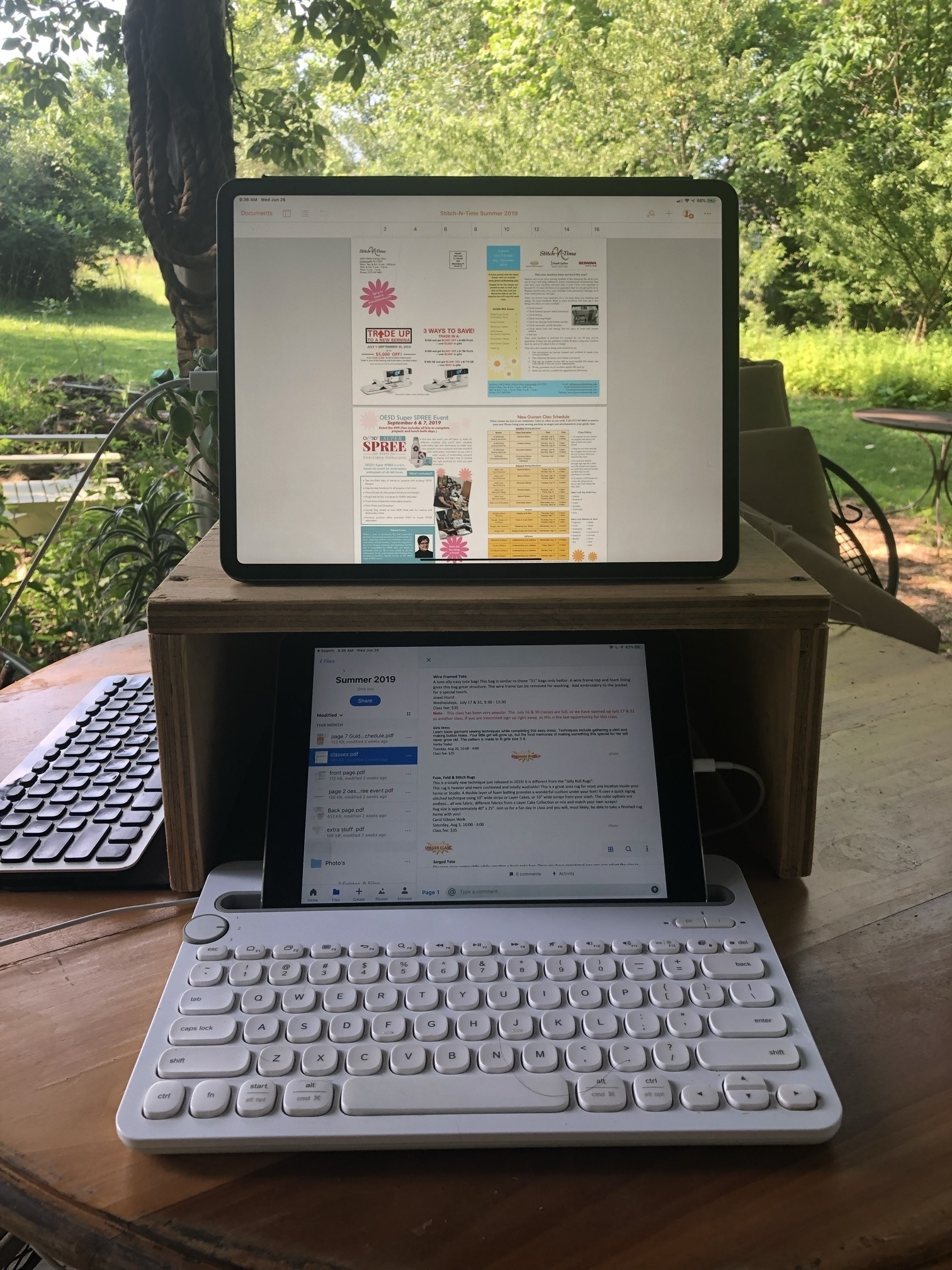
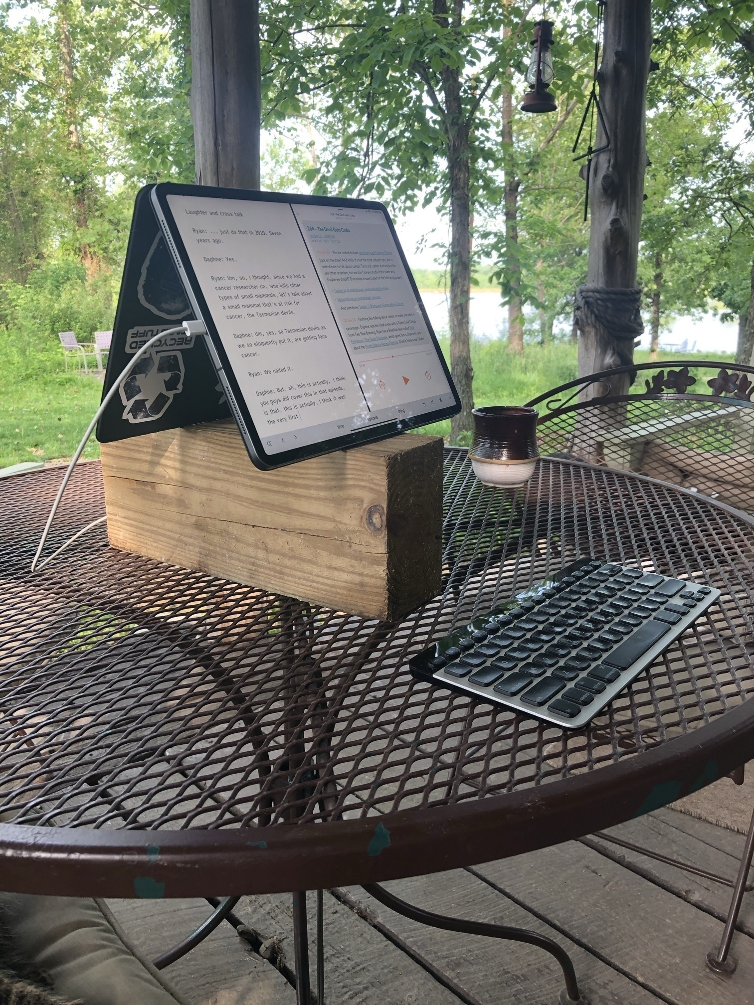
My ongoing experimentation with iPad set-ups continues. A couple of months ago while browsing the web I happened upon a new-to-me concept, the cyberdeck. The idea is to build modular, hacked-together computers that are semi portable. I spent a few hours obsessing over images that presented something very close to what I've been wanting for my iPad set-up for quite awhile.
At its core a set-up that raises the iPad/screen to eye level, semi-portable, stable, and a place to store/use a swap-able keyboard.
I've been using this stand for a couple of months now. It's the second stand of this style that I've bought. The other one purchased a couple years ago is now being used to hold a portable 15" screen. This current stand is a bit heavier, especially the base, and even more stable. A couple of notes about the stand and then I'll get into the purpose for adding the cardboard base.
Editing to note that since original post the hacky cardboard component has been replaced with plywood. Still a bit rough but okay for a prototype. 🤓 Images below depict the original cardboard version.
Now, why clutter it up with the addition of the ugly, hacky cardboard? In short, the cardboard is a cheap, easy way to experiment and improve the function of the stand. I often work from my futon with a pillow or two in my lap. I'm more likely to be working this way than I am to be at a desk. While this stand is very stable when sitting on a desk, the metal base is too small to be stable on a pillow which means using some sort of lap desk. In the past I've always used a plank of wood as my improvised lap desk and it works very well. I'll still do that when I need access to my trackpad or mouse. But most lap desks, be they the purchased variety with cushion attached to a thin board or my improvised wood planks are quite a bit heavier and more unwieldy to move. And though the stand is stable on the lap desk sitting in my lap, when I need to get-up I do have to be careful that the stand with the 13" iPad Pro doesn't tip over as I sit on the shelf next to my futon.
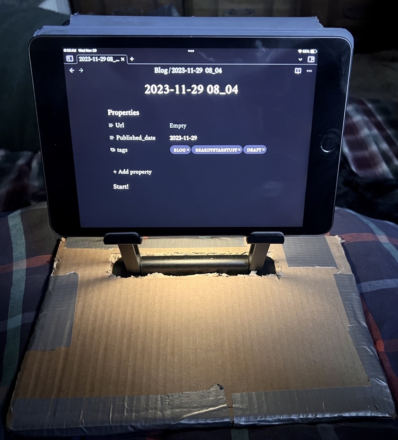
Thanks to the weight of the inserted metal base and the larger surface area of the cardboard, I now have something that is stable on cushy, soft surfaces like pillows. It won't ever tip over unless I intentionally flip it. I've got two pieces of heavy-duty cardboard taped together for a very rigid, sturdy base. I cut a slot in the top piece of cardboard to insert the metal base up to the hinge and between the two layers of cardboard. In addition to the stability it provides its larger size also means a better placement for the keyboard. The stand base is very snug in between the layers of cardboard. When I need to get up or move I can easily move the stand, iPad and keyboard by grabbing the cardboard or the metal arms of the stand. Unlike the stand sitting on a lap desk, this feels like I'm moving one, integrated piece similar to a laptop or the iPad attached to the Magic Keyboard.
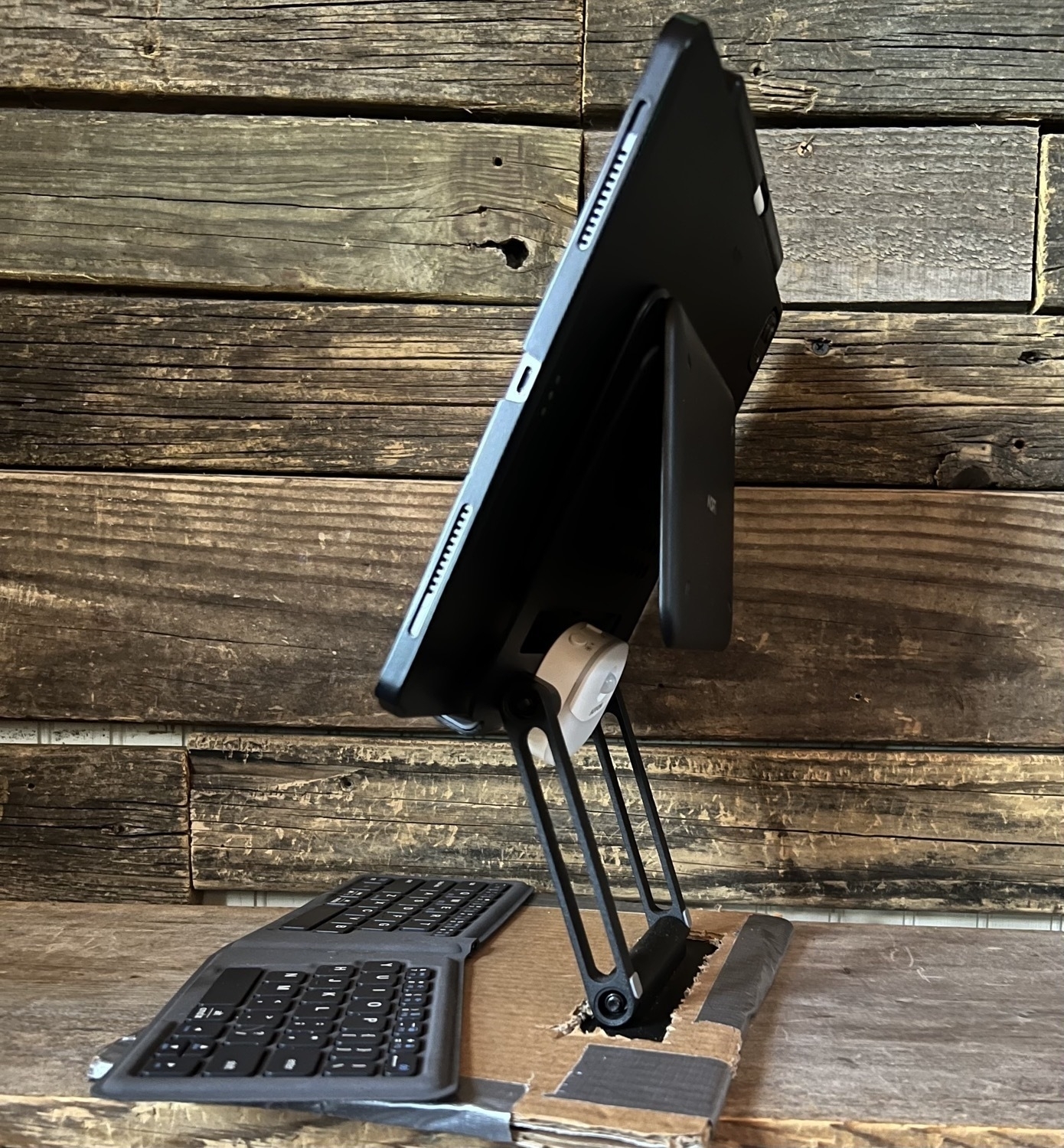
The last bit that makes this work well is having a way to attach the iPad to the stand rather than just having it resting on the brackets. The stand is metal and when I'm using the iPad mini I just use Apple's folio cover folded behind the iPad. The magnets of the folio stick firmly to the stand so the iPad isn't going anywhere. With the larger iPad Pro I have the Moft float stand. It's attached magnetically to the Moft case and I just fold it down over the back of the metal stand. It's not going anywhere.
So, it's all a bit hacky but some free cardboard and duct tape make for a big improvement. I may well try a larger version next to accommodate use of a mouse or trackpad. For the moment it's easy enough to just use my wood plank lap desk when I need the extra pointer device.
Obsidian and Interstitial Journaling
It’s only been a couple weeks since I decided to give Obsidian yet another try and yes, this is going to work out. I’m so glad I decided to give it a try again. A few brief thoughts too about interstitial journaling.
First, my primary use of any markdown/text app is for writing blog posts. In this regard Obsidian is generally on par with any other markdown editor and so it’s easy to just copy my archive over. That’s the beauty of working from folders of files. I duplicated and tweaked my previous Shortcuts for quickly creating new posts from the Home Screen or for link blogging from a web page that now save to my Obsidian folders.
As for journaling, I’ve only ever been irregular at that effort. Obsidian has the daily note feature to help the process along so I took a look at various templates in the hopes that perhaps I’d find one that might help in the process. After a few days I found it wasn’t quite what I wanted. As I browsed around I hit upon “interstitial journaling”. My first thought was, no, not for me.
If you’re not familiar, the basic concept is to just record a timestamped entry when you’re between tasks. Note what you’ve finished, what you might work on next or if you’re taking a break. A sort of running commentary on the day but geared towards productivity. But I wasn’t looking for a productivity hack or anything focused on that. I tend to do fine getting work tasks done without any additional tools or apps. I’d rather my journaling be a bit more open. But something about frequent, time-stamped writing appealed to me. The structure isn’t topical, it’s not definite or set. I’m viewing it as a tool for simple self awareness and as an opportunity to note thoughts and activities as they seem worth noting.
A week in and I have to say that I’m really digging it. I set aside any desire to focus on some sort of constant productivity/task journal and have simply used it to check in. The time stamping pulls me in, I honestly don’t know why. But I do know that I’m writing more as a result. Also worth mentioning, there’s a behavioral phenomena called the Hawthorne effect that several folks have mentioned. The idea being that people “modify an aspect of their behavior in response to their awareness of being observed.” The idea in relation to interstitial journaling is that as one starts paying attention to the moments of a day with the added intent of recording those moments, a kind of self awareness sets in.
I suppose in a round-about way I am, in fact, being more “productive” but frankly, I’m just not fond of all of the nerd focus on productivity. I’d much rather think of it in terms of cultivating self awareness. Regardless of the framing, I’m finding it enjoyable and useful. And, unexpectedly, I feel like my days are longer and almost more meaningful as a result of the increased focus on my daily activity.
It’s worth noting, that most of what I’m doing with Obsidian I could have accomplished with iA Writer or other markdown editor. It’s a strange thing really but it’s a fairly small design detail that partly served to prompt my look back to Obsidian. I wanted to be able to more easily navigate and see all my files in folders at the same time. Most markdown editors have a sidebar file browser that functions as a singular column list of files. It makes for a lot of clicking or tapping to navigate. Obsidian offers disclosure triangles and it just feels easier and faster to view the contents of multiple folders at once.
That said, Obsidian is extendable via plugins so it does actually do quite a lot beyond a standard text editor. But out of the box it can be used in a more standard way. As I poke and prod I expect I’ll share a bit about some of the more advanced features.
The Apple Update cycle
Seeing recent news on Apple slowing work on next OS versions to bug fix current OS. Even better, slow release cycle of everything. Do we really need new iPhones every 12 months? New OS every 12 months?
We can recalibrate expectations for new stuff. Slow down. Shift priorities.
Predictably Apple’s line-up of Macs continues to be confused and overly complex. I mean, jeesh, now we have M1, M2 and M3 Macs not to mention some of those are Pro, Max and Ultra. Just so confusing.
Who needs all these choices? Ridiculous.
I hope all the podcasters/pundits can make sense of this mess.
A note: This post started as reply to Jason's excellent post about the iPad being his computer again. I decided to turn my reply into a blog post instead.
In his post Jason focuses on three key attributes of the iPad that he feels are important: Simplicity, familiarity, and flexibility. Though I agree with those points I wanted to focus on flexibility as that's what I find most draws me to the iPad. In online discussion the iPad is often compared to laptops, usually Mac laptops. This makes sense given that a tablet is thought of as a mobile device. But as Jason points out, attach an iPad to an external display, keyboard, trackpad or mouse and it starts to feel like a desktop. Add a hub and a couple of attached drives for a more complete desktop replacement as needed.
For the past few days I've been using the iPad in the Twelve South HoverBar Duo clamped to my little wooden lap desk. Still very portable in my house but not in the way a laptop is. This wouldn't be a solution for a coffee shop, but in-house, it's excellent! I can sit at my desk with it or I can recline back in a chair or couch. The HoverBar Duo lets me raise, lower, swivel or move it closer or further away. Far more options than I'd get in a laptop configuration or even with the stand that I often use. Not only do I have more variability in position but it frees up more space for the keyboard/trackpad/mouse. Lastly, this is more stable than the iPad in a stand on the same lap desk. Back around 2004 Apple sold the G4 iMac which had the arm mounted screen. This feels like that only it's portable!
I think this modularity of the tablet as a display that contains the computer and its own power source really speaks to the strength of the iPad. Agreed with Brandon that it is something different. It absolutely is. But I consider it a better laptop than a MacBook and a better desktop than a MacMini! Better? Yes, absolutely. Because in addition to the free-form modularity of the iPad, I also have a touch screen and built in internet. In other words, in terms of hardware, there is no doubt the iPad Pro is an equally powerful computer (given the existence of the M2 Pro, Max and Ultra processors this is only true to a point) but is also the more flexible option.
Four years ago the argument that the Mac was the better, more complete computer was a stronger argument than it is today due to the limitations of iPadOS. But since then important features have been added to iPadOS. Full cursor support for trackpads and mice, a greatly improved Files app, additional windowing options with Stage Manager and, on M1 iPads, full external display support being the most notable.
No, the iPad is still not a Mac and that's for the better. macOS will always be the more complex, higher-maintenance operating system from the user perspective. But with each year iPadOS becomes more capable while retaining ease of use options for those that prefer or need simplicity. In other words, just as the hardware is more flexible, so to is iPadOS becoming more flexible. Unlike macOS, iPadOS starts with the easy to use, simple tablet experience. But for users that want a more advanced computing experience, the options are there waiting to be turned on.
The Mac lineup is so confusing!
I have concerns. Have you noticed how complicated the Mac line-up has become? It’s so perplexing. I mean, first, there’s both desktops and laptops. But it get’s worse, each of those categories is a huge mess.
On the portable side, we have three models of MacBook Air. So confusing that Apple’s keeping the older M1 Air and now we have two screen sizes of MacBook Air. As if that’s not bad enough there’s three screen sizes of MacBook Pro. It’s bananas! And don’t get me started on all these different chips! The regular M2, the M2 Pro and the M2 Max? My head is spinning. And what’s up with that 13" that still has the Touchbar, older Retina display and FaceTime camera. Somebody steady the room, I’m so disoriented.
But no, dear reader, the lunacy doesn’t stop there! The desktop lineup adds to this chaos! Four Mac desktops?! Four???? An iMac, a Mini, a Studio and a Pro. Has Cook and Company lost its collective mind?? I mean, one of these has a built in screen and still runs on the old M1. The other three don’t have monitors and come in such a range of processors that I’ll need a nap before I can even think about trying to understand.
The Mini has an M2 and an M2 Pro, the Studio has a Max and an Ultra, the Mac Pro is confusingly a Pro but has an Ultra processor. Oh my, the water is deep and I can’t keep my head above water. Somebody help me through this complex and confusing line-up!
And we haven’t even begun to grapple with the array of accessories. I can’t possibly do that in this post. It’s all so confusing.
Apple, please, this is too many choices. Please for the love of all that we hold dear, make it make sense. All we need is a simple 2x grid, let’s call it a column. In the top box you’ll offer Desktop Mac and in the bottom box you’ll offer a Laptop Mac.
Thanks Apple!
I Recently started up a little social sharing experiment using Apple's Freeform app in which Jacob pointed out an interesting use of Muse by Avancee Agency. I really like the idea of processing links of interest using Freeform in the same way. Maybe do a weekly screenshot blog post.
Apple's Freeform as Social Media Collaboration Space
I woke up at 3am with thoughts about climate change and started composing a blog post in my head. Sometimes at this moment I just fall back to sleep and the post never sees the light of day. But in this moment my mind is awake enough that I reach for my iPad. But instead of opening iA Writer to start a post I’ve realized that this might actually be a case for using Freeform. The ideas I’m having seem to complicated and I want to start with a diagram. I’ve been wanting to try using Freeform a bit more and this is an opportunity to give it a try.
I start blocking out what I’m thinking will be an interesting post about climate pathways. And then I have a side thought: Wouldn’t it be fun to have an excuse to try out a collaborative Freeform document? I work alone and have yet to have a need to do this. And that’s when I start to wonder: Could Freeform serve as a kind of micro social space? Hmmm. Wait, this actually seems very interesting.
So, still in Freeform I move the canvas over and start a new diagram which, actually, quickly turned into a blog post with a couple of side blocks that I’m realizing might likely become blog posts on related thoughts about using Freeform. And now I’m wondering if there’s something going on with my early morning brain or if this is a result of using Freeform. What started as a blog post idea has branched off into 3, possibly 4 different blog posts. And it occurs to me that I don’t want to get lost in the ideas!
Jumping over to a different box and idea (yes, I’m writing this in Freeform and breaking the document up into boxes as I’m not sure where I’m going with it).
Freeform as a Social Space? Is it possible that Freeform could serve as a small, semi-private, collaborative social space for shared interests? Or maybe it’s bigger than just the Freeform app?
This brings up a vague memory of a previous online discussion/meme from several years ago about Apple creating a social media network. As I recall, the idea was that Apple was spending a lot of energy into yearly updates to the Messages app. Was the intent to slowly, quietly grow Messages into a kind of social network? I don’t recall that discussion continuing for long. But something else was happening in parallel.
Apple was adding collaboration to other apps. Early commentary was basically along the lines that this was Apple trying to enter into or, at least, tag-along with what Google was very successfully doing with Google Docs collaboration. It was/is sort of a joke with Apple pundits that Apple wasn’t very good at collaboration. Pages and the other iWork apps had been given collaboration features as had Reminders and Notes. But the question was asked by Pundits: Is anyone actually using the collaboration features?
But Apple has continued to improve these features with the most recent additions being the Freeform app which has had improvements with the latest round of Apple OS updates in 2023. Also entering the ecosystem in 2023 are new PDF specific collaboration features added to Notes with this year’s OS updates.
Might Apple’s iCloud ecosystem serve as a semiprivate social space? Perhaps it already is serving such a purpose?
The current social media landscape
Before I jump in, let me begin with a very brief summary of what the social media landscape is in Fall of 2023.
Timelines: Blogs, Facebook, Twitter/X, Mastodon, Bluesky, Instagram, Threads, Tumblr, TikTok, Flickr, etc. This subset of social media consists of websites that present primarily as a social feed which is linear, organized by time of posts or algorithmically. Many if not most of these options allow for comment threads, likes, boosts, etc. Some are a mix of media, others primarily text or primarily photos. The feeds consists of posts by individuals sharing “stories” of personal life experiences or professional content. Often used by “content creators” that cross post or broadcast their primary content. A blogger or podcaster will broadcast new stories or episodes from their website out to their various social media accounts as a form of marketing.
Podcasts: Driven by RSS, primarily audio, some video. No comments unless provided on the host website. Primary directory is hosted by Apple. Episodes/feeds are often collaborative, hosted by small teams.
YouTube: Primarily video, RSS, allows for subscription to channels, comments on posts. Channels are usually hosted by a single author/creator. Presents as a feed of new content but allows for dipping into old content.
Smaller linear timeline islands are also a part of this landscape. Slack groups, Discord and forums of various kinds allow for semi-private, restricted access spaces for discussion.
This social media landscape or ecosystem is primarily presented as linear timelines or feeds. And is driven by individually produced “content”.
This social media landscape can foster communities, sub-cultures, etc. though such “community” often clusters around popular individual creators surrounded by many commenters. Typically not a place for collaboration or creation. Historically social media are centralized, owned and operated by corporations. ActivityPub, most popularly exemplified by Mastodon, now offers a decentralized option for self-hosted, federated services of various kinds.
A common trait in all of these is linear feed presentation of posts within larger timelines often with comments trailing off as threads from primary posts.
What about a non-linear, non-feed space?
The monolithic, linear timeline with a steady flow of traffic has been the primary embodiment of social media thus far. And much if not most of the internet as we know it has followed this trend. It reminds me of the classic video game Frogger. I enjoyed that game as a kid and yet it made me anxious. Trying to hop across roads congested by constant traffic and across logs moving in opposite directions. We’re in one flow of traffic and then hop to the next to the next and then the next. Is it any wonder that we often use the term “doom” scrolling when we describe social media? Even without the bad news of the day, it’s a constant, never ending flow, a road of never ending traffic.
But what about a non-directional space? Rather than a constant flow of news, might we create slower spaces that feel more like parks or digital maker spaces? You could liken this to the “old” internet of websites but even then many of those websites were feeds. Live Journal and old school blogs were often feeds. Even RSS is just another way to try to keep up with linear news feeds that never end.
What clicked in my brain this morning when I opened up Freeform to organize a blog post is that while we experience life in a sort of day-to-day, linear timeline, it’s also very much a spatial experience. Real life is spatial. The best parts of life are often experienced in cozy rooms or parks. The most anxious parts of life are associated with non-stop traffic down busy roads.
So I asked myself, how might we begin to create digital space that is slower, more collaborative and less focused on constant consumption and production of a steady stream? What would it look like? Is that kind of space possible? Would anyone be interested?
For the moment I’ll continue to focus on this space as it might take place in Apple’s iCloud and associated apps. But I do so knowing that such a space has obvious limitations as it’s belongs to one particular company’s ecosystem. For the moment I’m willing to accept that for the sake of getting somewhere with this idea.
Using Apple’s iCloud-app ecosystem and most notably Freeform, to create ephemeral, spatial spaces for collaboration
So, finally, I’ll circle this back to the idea that began percolating in the early wee hours this morning. I imagine a scene I’ve been in many times: a small, cozy coffee shop where I’m enjoying a comfortable spot on a couch. There are plenty of nearby chairs and tables and as the evening unfolds a slow steady stream of people from the neighborhood outside stream in. Over the next few hours a few acquaintances, friends and familiar faces come in and settle down somewhere. The space is filled with chit-chat. It feels a bit random as casual conversations come and go, clustering and moving as people settle in but notice a familiar faces coming and going.
It’s the sort of space where people share about the things they’ve got going on that day or week. Projects, problems, ideas, creations, collaborations are talked about. How might such a shared space be created on the internet. What would it look like?
As I’m in the Apple ecosystem, of course I’m thinking about how to solve the problem or create the space using apps and a service I already have. With iCloud I’ve got Messages, Notes, Freeform and the iWork apps all of which have group collaboration built in. And perhaps most useful in this context would be Messages and Freeform.
The goal here would not be to organize any particular project but rather as a general space to share. I’m not sure how it would really unfold. I can imagine a sort of folks sort of setting up a section of the canvas/workspace for themselves just as they might sit at a table at a coffee shop. Here I am! This is what I’m working on. Here’s a link. Here’s a picture of my cat that just sat on my keyboard. A spatial status board. Then I could imagine a bit of blending of spaces as people visit one another’s spaces. I see something you’ve shared that I find interesting so I plop down an emoji sticker and a note. If you happen to be there at that moment you might comment back. Or you might pop in later and respond.
At the very least I could see it being an interesting experiment and I’m interested in giving it a go. So if you’re interested get in touch. My plan is to set up a Freeform document and share it with anyone interested. I’ve not come up with any particular ground rules other than perhaps to be kind and respectful. I don’t want to over-complicate it.
So, yeah, interested? Get in touch: dennyhenke@me.com
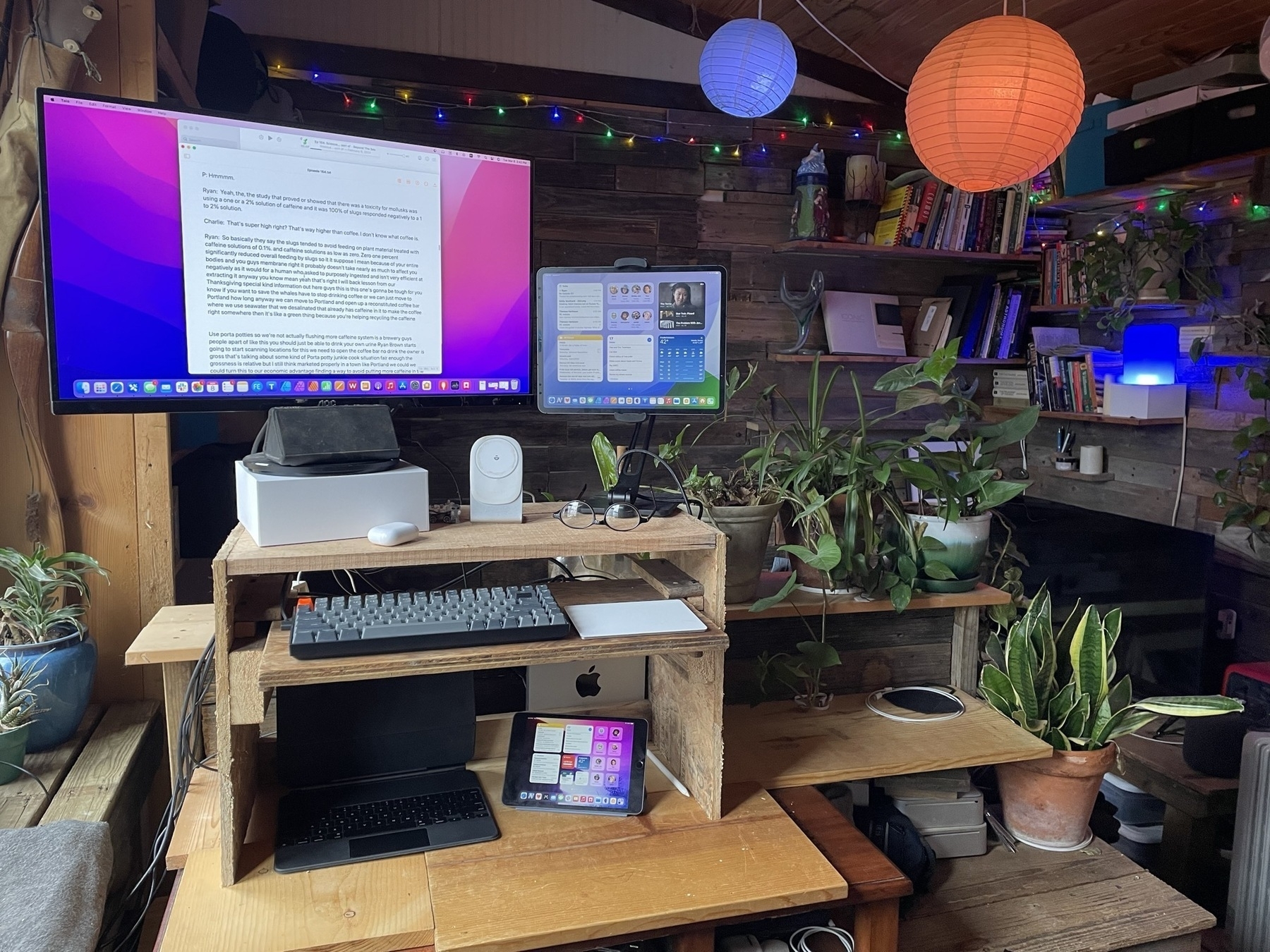
Experimental iPad Configurations
Before I dive into the discussion of my ongoing experimentation with iPad modularity I think it would be helpful to provide a description of the physical space and context of my iPad use.
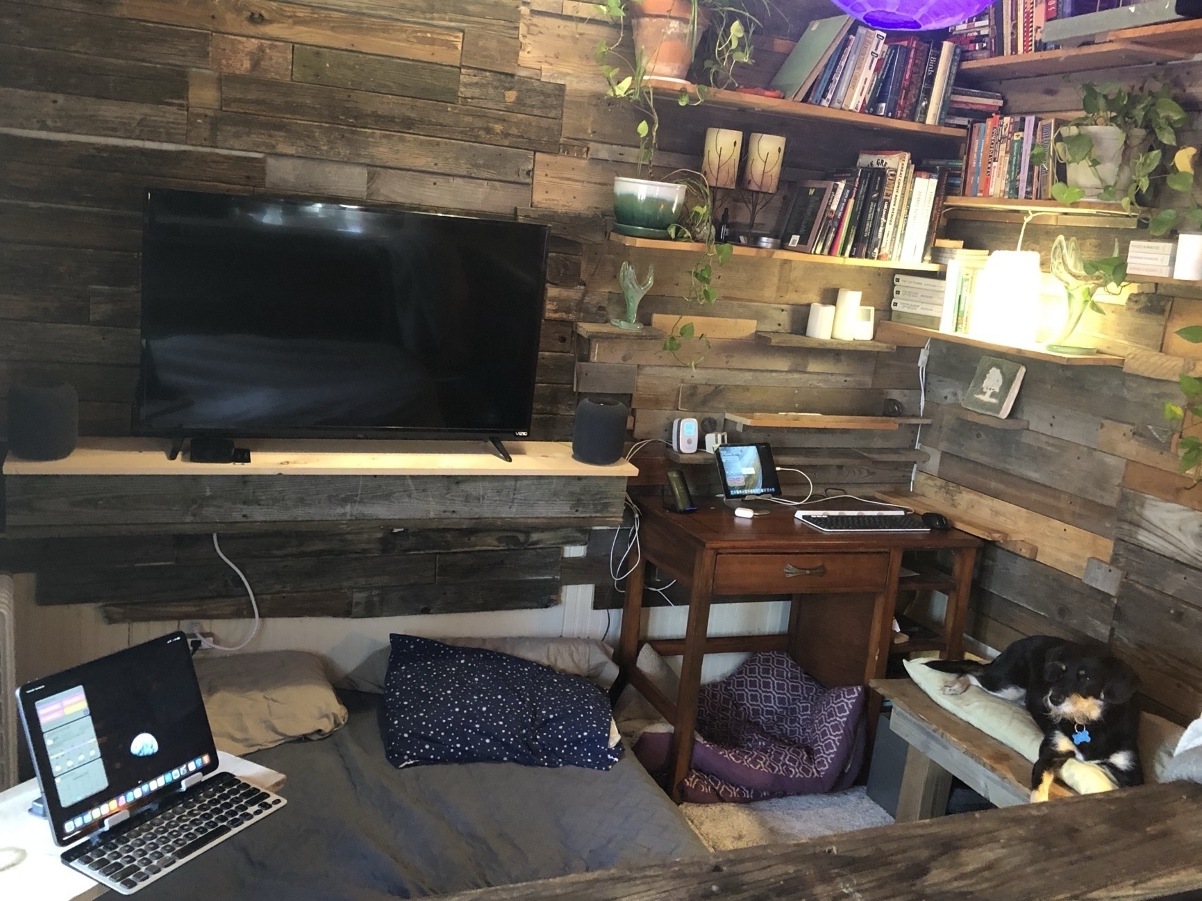
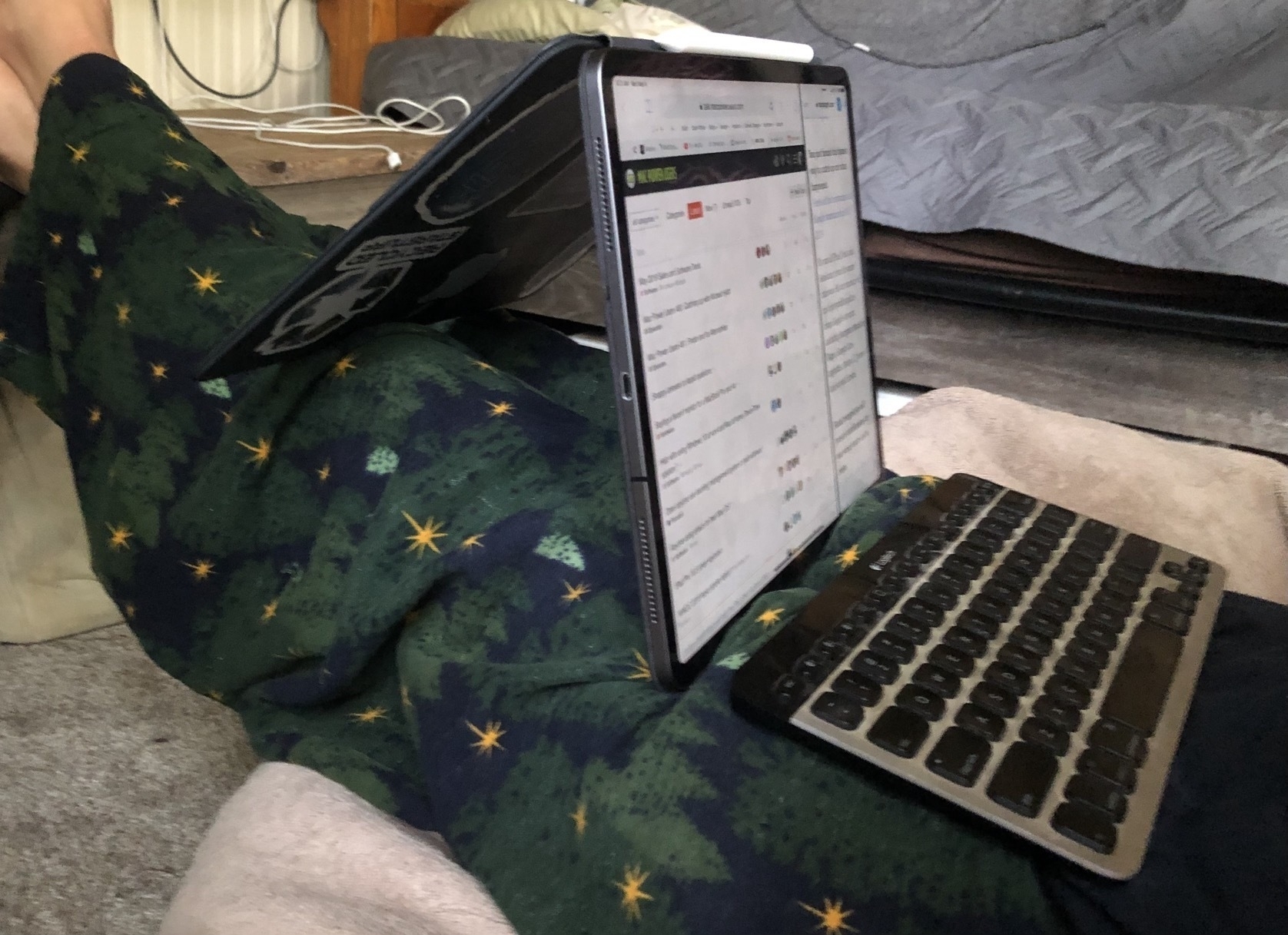
I work from a 200 sq ft tiny house which I share with 2 dogs and a cat. Over the past 15 years most of my work time is either in this small space or outside on a porch. In the house only about 30% of my work is at a desk, mostly it's done reclining on a futon. Those may seem like simple options but as I live on my own I have the freedom to reconfigure the small space fairly often. And even more so, within the space, I reconfigure the iPad arrangement constantly. This, in fact, is why I've come to love the iPad so much.
With a traditional laptop or desktop I have a screen or screens, keyboard, mouse and/or trackpad as the base configuration. But at a minimum the traditional computer must have the keyboard and pointing device. And of course with a laptop that keyboard and trackpad are not removable which is why I sold my MacBook Pro in 2017. Using it actually frustrated me because I came to dislike the fact that the keyboard was permanent.
I still marvel at the fact that the iPad, in its base configuration, seems like such a simple object. Just a rectangle of glass and aluminum. And though I can use it in this simple form I rarely do. The iPad is the core building block which, in my case, is always being used with at least one other component.
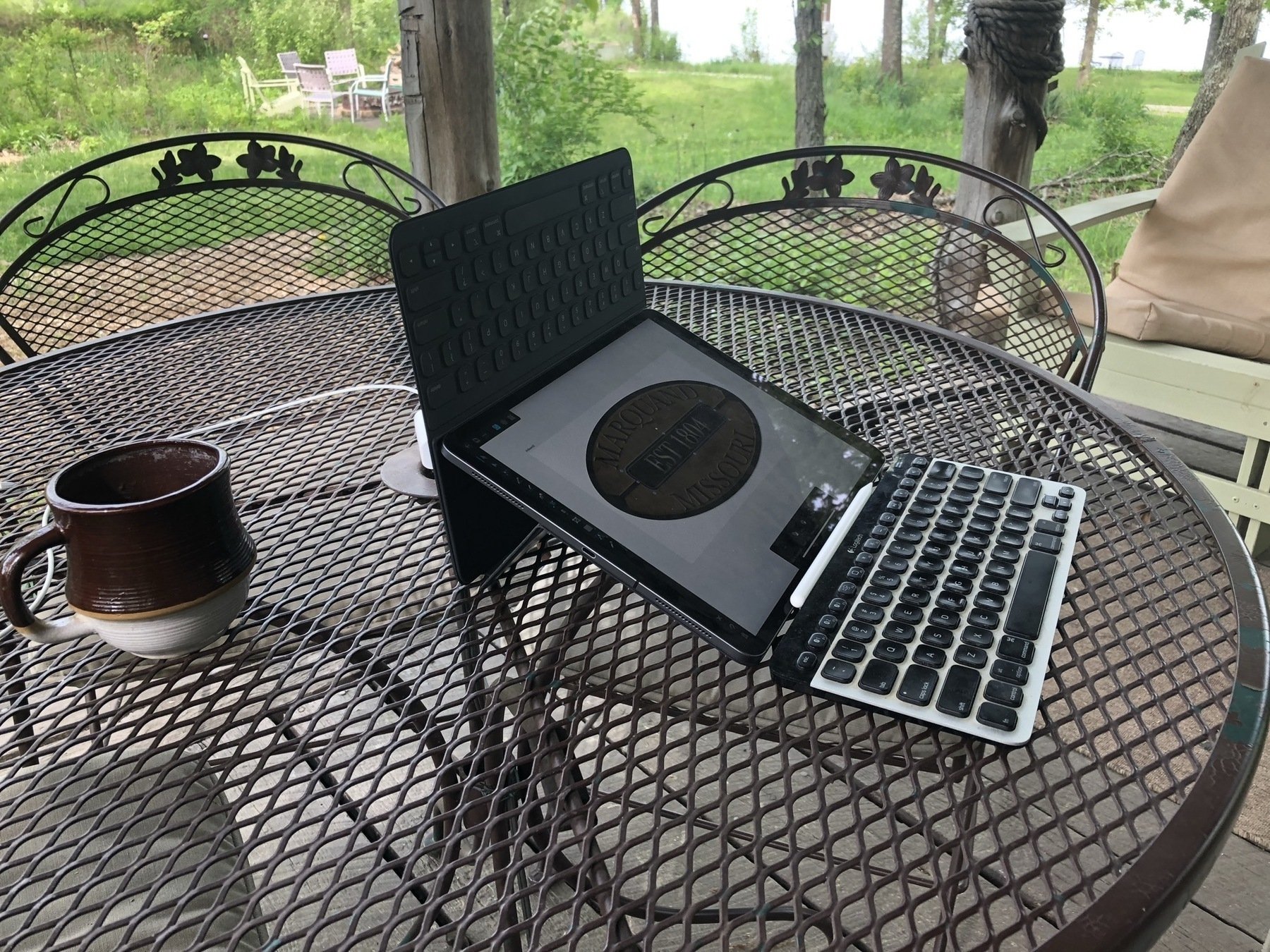
A 13" iPad Pro is not heavy but compared to its smaller counterparts it's less a hand held tablet device. Yes, it can be held in the hand and it can be used in portrait mode. But for me, the most likely, most natural pattern of use and function is in landscape mode, standing up on its own with the addition of a stand of some sort. But often with no keyboard. So, yes, still very much a tablet, just not a hand held tablet.
The delight of this device and form factor is best described in terms of nearly unlimited depth of variation and experimentation. This happens in two ways. The arrangement of the device in physical space as well as my interactions with the device via screen or a variation of input devices.
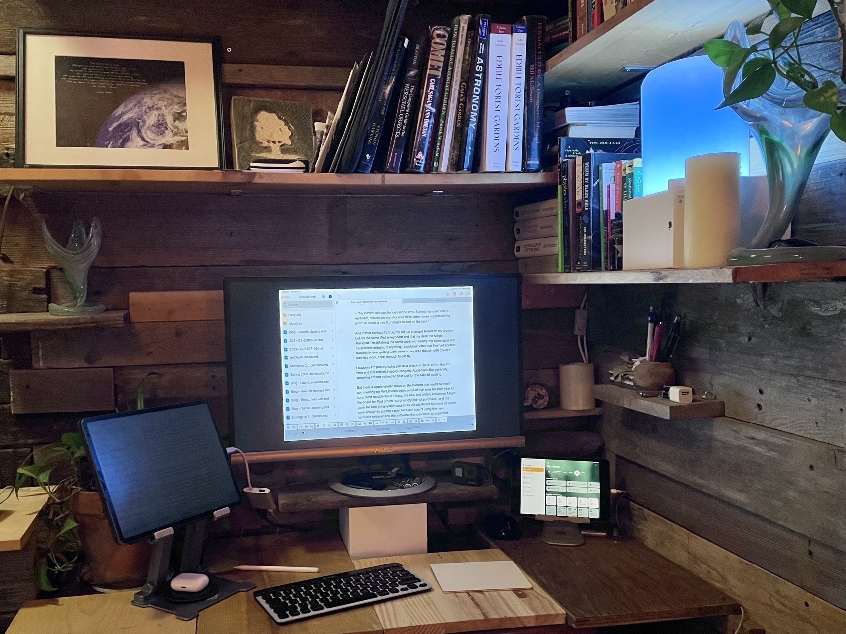
I'll note the possibility that my experiments are, perhaps, sometimes a bit off the wall but I enjoy trying out arrangements with keyboards and accessories that were not necessarily intended. I also enjoy customizing my space. So, for example, in my tiny house I often add and rearrange shelving near desks, my futon, and anywhere I might work or lounge with the iPad. This means that walls get shelving for the purpose of a standing desk. Other walls just get shelves solely for holding an iPad near a desk or extra display.
I should note too that because I've added an inner wall of reclaimed, rustic wood I don't hesitate to move planks of wood to accommodate shelving or anchors for shelves. It's a freedom others in more conventional housing may not have.
In some ways I treat the interior of the house as one of my reconfigurable building blocks that I arrange to suite my current comfort, thoughts and needs for a workspace. I move around a lot for a change of view and posture.
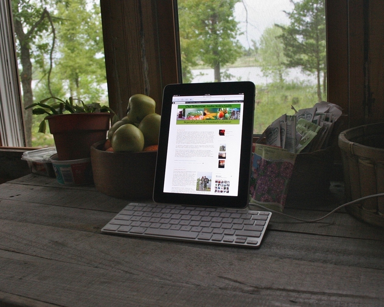
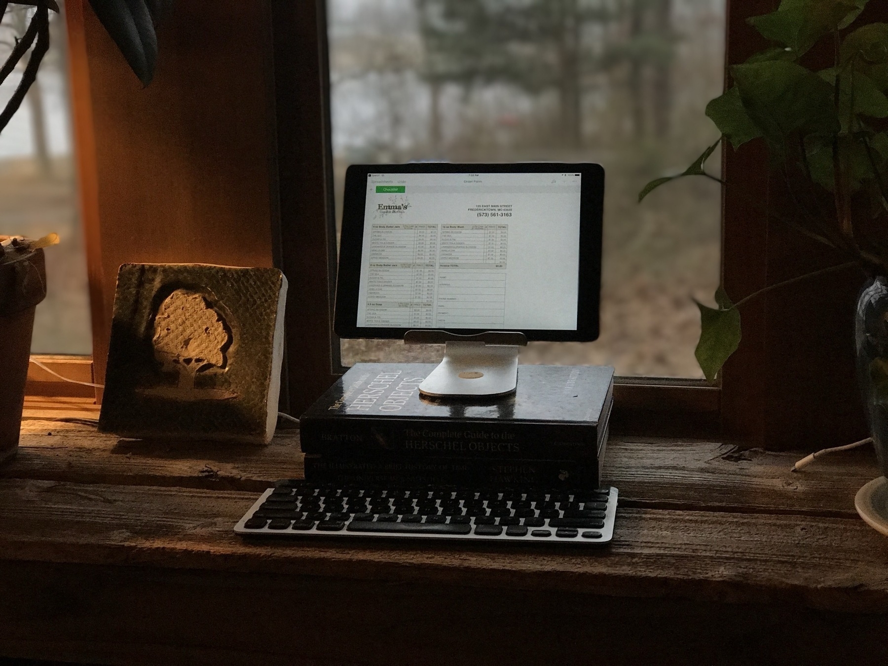
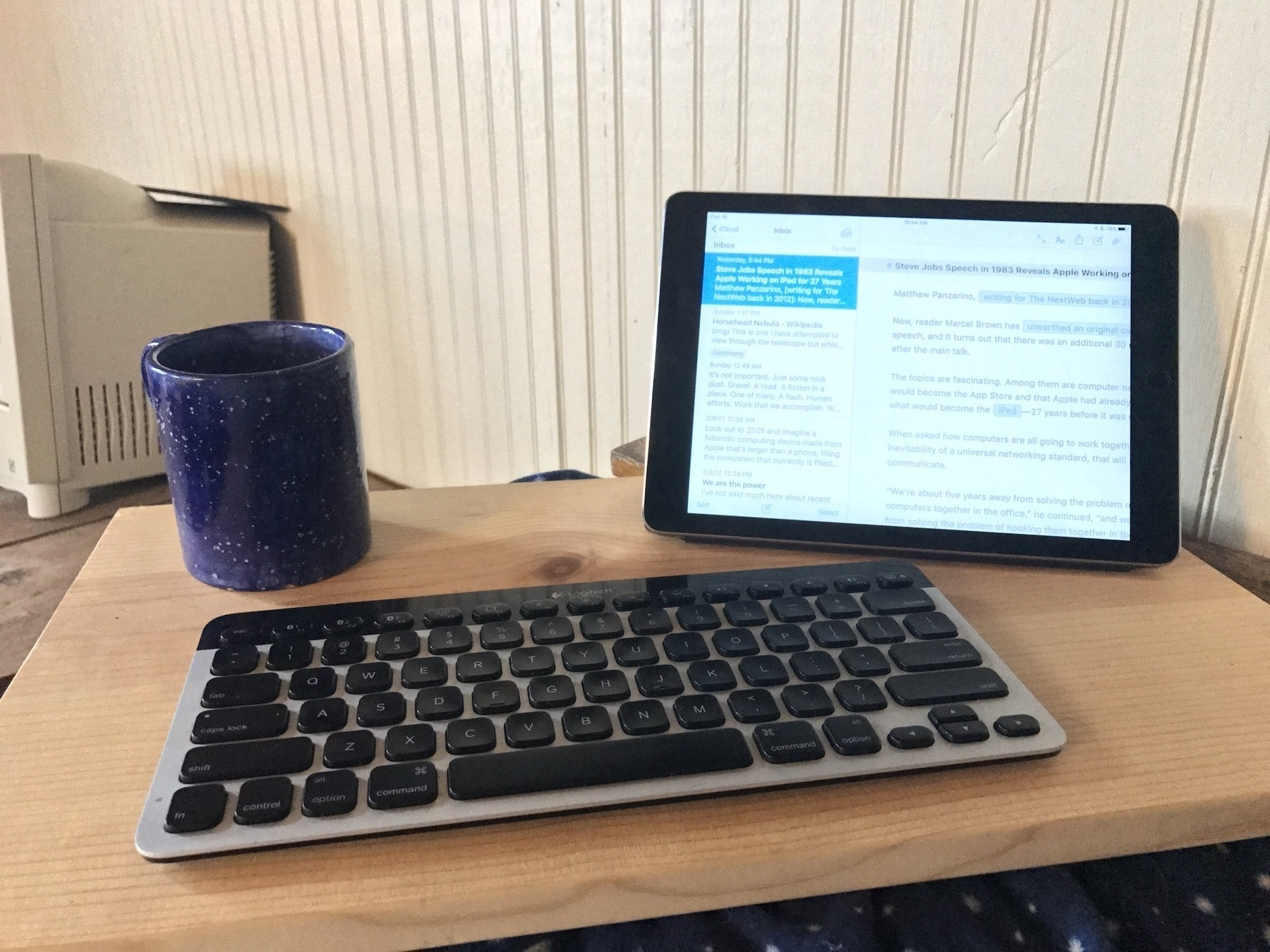
Let's have a look.
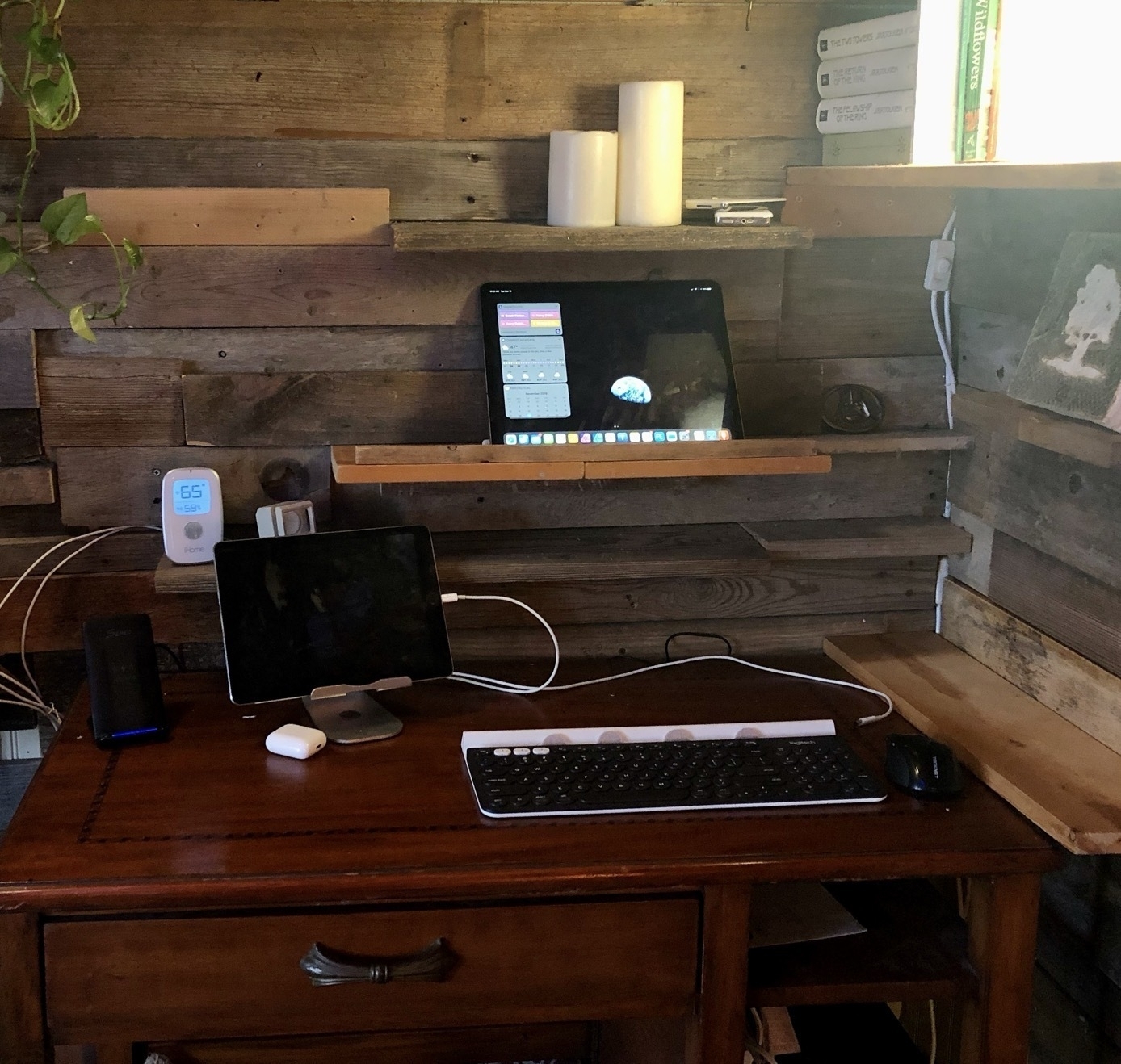
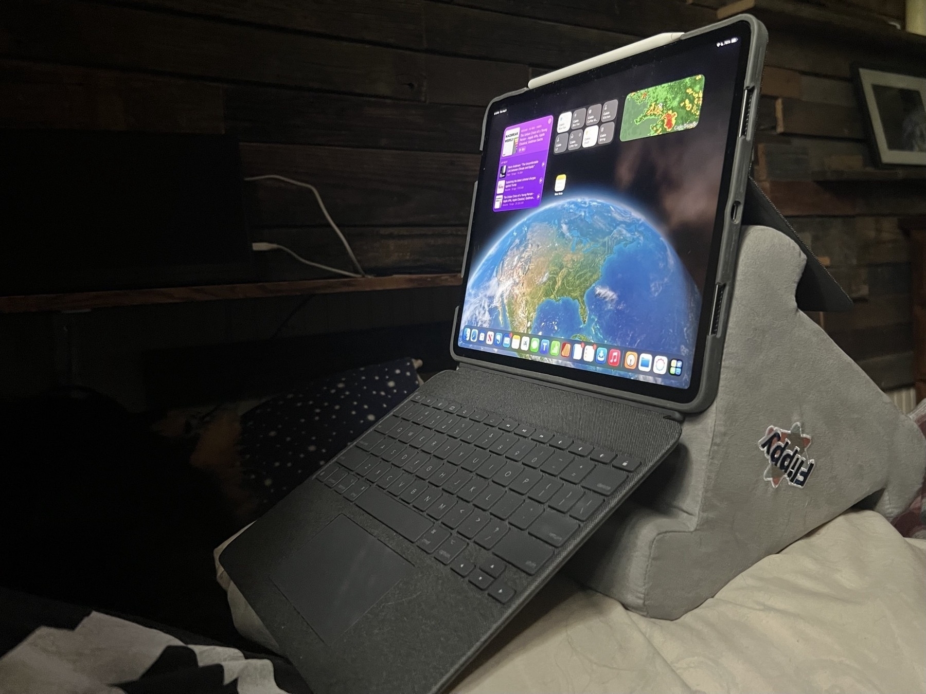
Starting off with the first iPad in the Keyboard Dock.
Pages and Publisher on the iPad Compared Pt 2
This story is available as a pdf download.
For the first few years of my switch to the iPad I relied heavily on Apple’s Pages app for many of my document layout projects. It’s a fairly powerful app and in most cases was easily capable in creating the newsletters and annual reports I often create for clients. When clients needed printers marks, bleed or other features I fell back to Adobe Indesign, then, later, Affinity Publisher, both on the Mac. In the fall of 2022 Serif released Affinity Publisher for iPad and that’s now my go to for all of my design and layout work. There are only two exceptions! First, projects for clients that require delivery of a Word or Pages file. Second, projects that require delivery of an ePub. Though this hasn’t come up for me yet it’s worth noting that Publisher does not yet support export to ePub but Pages does.
I continue to recommend Pages for people that need a more general use word processor and layout application. It’s a fantastic application that Apple is likely to support for many years to come.
Why Affinity Publisher?
Simply put Publisher offers nearly everything I need and want for designing documents on the iPad. No app is perfect but Publisher is excellent and a real pleasure to use.
Before I dig in to everything I like about the app I’m going to tackle the one current problem I have with the app: It’s not yet optimized for Stage Manager and external display support. Serif states that they do not support Stage Manager. But in truth it actually works pretty well with Stage manager. What it does not do is support the many different resizing options of a supported Stage Manager app. But I can use it as a floating window and have other windows under or on top of it. Where this is most useful is having Files and an app like Notes or Word with text sent by a client. This allows me to easily refer to those other apps for text or images in the Files app for adding to the document.
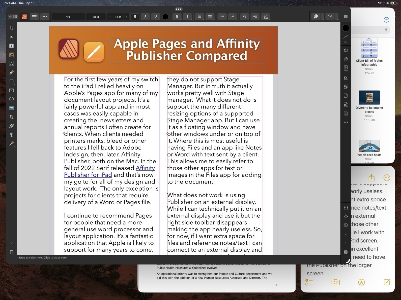
What does not work is using Publisher on an external display. While I can technically put it on an external display and use it but the right side toolbar disappears making the app nearly useless. So, for now, if I want extra space for files and reference notes/text I can connect to an external display and keep those other windows there while I work with Publisher on the iPad screen. And really, that’s an excellent experience. I don’t need to have the Publisher on the larger screen.
Okay, with that out of the way, let’s jump into the good stuff!
Before Affinity Publisher there was InDesign
I started with InDesign with the first version back around 1999. I used it fairly regularly until 2019 when Affinity Publisher for Mac was released at which point I transitioned entirely to Affinity apps. I used Publisher on the Mac alongside of Pages on the iPad to cover all of my document design work. Not long after releasing Publisher for Mac, Serif announced that they would eventually bring it to the iPad and three years later they delivered.
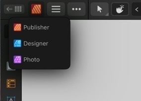
As with all of the Affinity apps on the iPad (and in sharp contrast to Adobe), these apps are the full versions. It’s worth noting too that Publisher is best used with the other two Affinity apps, Photo and Designer installed. Publisher has a feature called Studio Link which, assuming the other two apps are installed, allows the user to simply change “Persona” from Publisher to Photo or Designer. It’s seamless and there’s no launching of another app. Rather, the Publisher interface changes to the toolbars of the other app. So, for example, when I recently needed to edit a photo provided by a client I just tapped the photo to select the image and then tapped to the Photo Persona to edit the photo. When finished I tapped back to Publisher to carry on with the layout. The same can be done when creating or editing more complicated vector objects by tapping over to Designer Persona.
Okay, time to dig into some of the comparison points between Affinity Publisher And Apple’s Pages.
Cost
While Pages is free, Publisher for iPad is $20. It’s a one time purchase rather than a subscription. But really, to take full advantage, the other two Affinity Apps should be purchased as well, same price. So $60. There’s a bundle price for a Universal license for all apps, all platforms (Mac, Windows, iPad) of around $165.
Modularity
This is big. As mentioned earlier, with Studio Link and all three apps installed, I have a design and layout tool that has, thus far, seemed unlimited. There are many features I’ve not used yet. Publisher alone is a very powerful program, add into it the features of the other two apps and, well, I suspect there are many features I will never use. This is a good thing. It just means that the apps cover a very expansive set of methods, use cases and so on for many different users and scenarios.

Vectors and Text
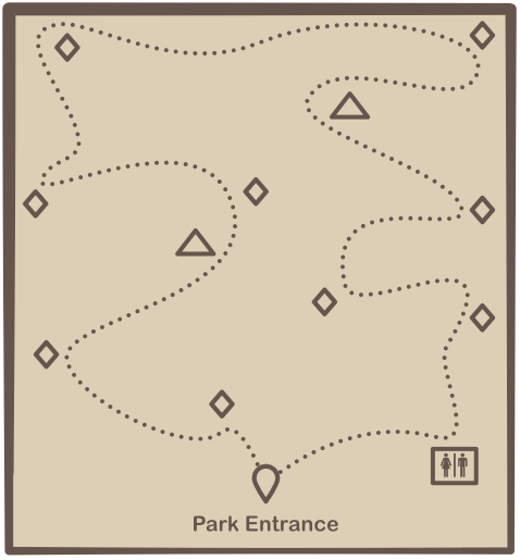
A part of what’s so impressive about Publisher is that while I can tap into the other two apps as needed Publisher itself has a very impressive toolset on it’s own. This is especially true of the text and vector tool sets which allows for the creation of elements like complex curves, shapes, and text on curves. Perhaps I’m designing a brochure that includes a map for a park and trail with various points of interest. I can easily do this within Publisher. If I reach the limits of what Publisher can do then I just change over to the Designer Persona.
Page-based Layers
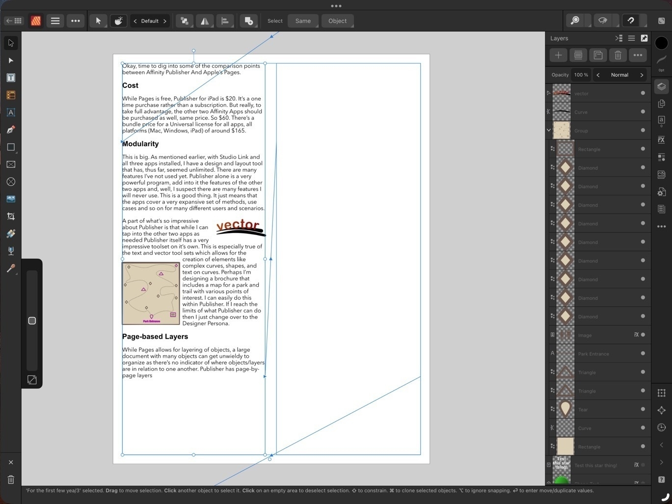
While Pages allows for layering of objects, a large document with many objects can get unwieldy to manage as there’s no indicator of where objects/layers are in relation to one another. Publisher has page-by-page layers all of which are visible in the layers sidebar - much easier to keep track of everything!
Bleeds, Printers Marks, Guides
These are all features considered essential in professional page layout and Publisher has them, Pages does not. Bleeds can be added anytime in the Document Set-up screen. Printers Marks are an option when exporting. Pages has alignment options to help snap objects but does not allow for creating custom guides in a document.
Zoom in, Zoom out
 This isn’t anything special in the realm of page layout apps but Pages is limited in what it allows in terms of the level of zoom it offers, even more so if Stage Manager is being used. And it’s a limitation I often bumped into when working on a document.
Publisher allows for zooming as far out or in as desired. I’m not sure if there’s a limit. Very fluid and fast, helpful when working on small details or when wanting to zoom out for wide view of a page.
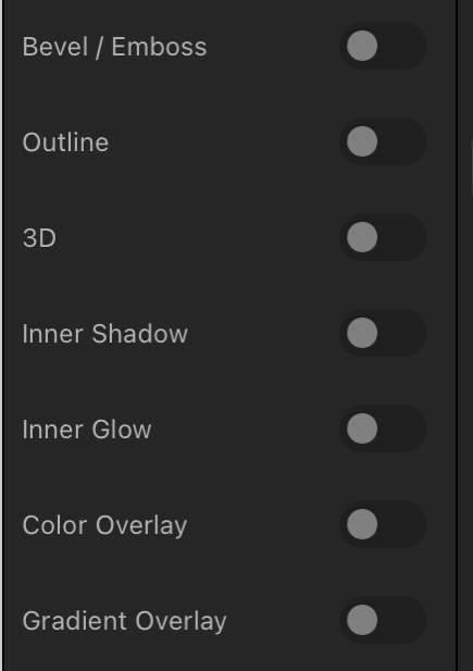
Visual Effects

Again, this isn’t all that special for page layout applications but Pages lacks most of the options that might be expected. Bevel/Emboss, outline, inner and outer shadows, glow, Gaussian blur are some of the possible effects and of course each effect has a variety of variables that can be adjusted for each.
Built in access to stock photo libraries

Publisher includes built in access to Pixabay and Pexels stock photos libraries. On Pixabay this includes vector images as well. Handy in my use case for infographics when doing annual reports and newsletters.
Vector assets
Add images and vectors to an Assets library for reuse in a document or between documents. While there is a small library of assets included with Designer I often will search Apple’s Pages included vector art and copy those over as needed (bike on left comes from Pages). Or, mentioned above, vectors are available for download via Pixabay. If I can’t find what I want I can make my own.
Font Manager
Affinity also includes it’s own Font Manager. Install a font in Publisher directly via the settings in the app. It’s much easier than going through a third party using the Settings App to download profiles. The benefit of that method is that installed fonts are available system wide. But as I’m doing almost all of my design work in Affinity apps it’s not an issue. Also, install a font in one Affinity app and it’s available in the other two Affinity apps.
Artboards
Publisher has space outside of the document for storing objects. If I’m not sure where something is going or if it’s going to be used I can keep it off to either side of the document. It’s incredibly helpful and not something found on Pages. At this point I consider it a necessity.
Importing IDML and PDF
I’ve had several occasions to use the option to import IDML and pdf files. It’s a time saver and really helpful getting started when a client wants to start with a previous document template. Or, as with a recent annual report, a client provided numerous pdf infographics several of which needed minor edits. I was able to do the editing right in Publisher within the larger document.
Missing features
In direct comparison to Pages there are two missing features that stand out:
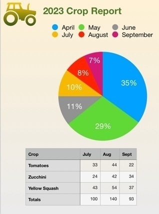
There’s no work around for the first but it’s not been a problem for me as I’ve never had the need to export to ePub. In the second case, charts, the work around would be to set-up a table and chart in Apple’s Numbers app and copy paste. It’s not ideal as it’s pasted as in image but it does work.
Conclusion
iPad users are well taken care of in the category of document layout. Pages is very powerful and fairly easy to learn. It is a great app to get started with but it’s not a basic application. Over the past few years, Pages has really matured into an app capable handling many of the projects I’ve needed to do. But when compared to a dedicated document design and layout app like Publisher, Pages does lack some of the options. I’ve not covered all of the differences here but have tried to mention some of the more notable examples.
Some example use cases for Pages:
Use cases for Affinity Publisher
Publisher is an advanced app for doing practically any kind of document design project. It takes more time to learn but if you’ve had experience with Adobe applications you’ll likely learn Publisher and the other Affinity apps fairly quickly. The tool set and tool options found in Publisher go far beyond what I’ve covered here.
Pages and Affinity Publisher on the iPad Compared Part 1

I've been using Pages since the first version available on the Mac many years ago. And of course I used the first version that was available on the iPad from day one. In the years since the app has gone through many changes as Apple worked to bring compatibility between the iWork apps on the two platforms which began with the Pages 1.7 on iOS and on the Mac, version 4.3 in 2012. But the big change in 2013 with an overhauled Pages 5.0 on the Mac. This new version on the Mac was a step back in features and templates as it was brought inline with the upgraded iOS version of Pages.
Controversy!
Gradually features were added back in as Pages across the platforms were improved year to year. It's been 10 years since that major re-write and while the Mac version of Pages of 2023 is still different from the version of 2013 it is far more capable and the app across platforms is much closer to feature-for-feature parity.
Pages on the iPad
Pages is an excellent app for general purpose word processing and document layout. For students, businesses, organizations, Pages is a feature rich, capable app that's fairly easy to learn and use. Brochures, posters, flyers, newsletters, annual reports, research papers are all easily created with Pages. The app can export to Word, PDF, ePub as well as several other formats.
Over the years I've relied on Pages for a lot of my work with clients that required a pdf or Word document as the final product. Until Serif released Affinity Publisher in the fall of 2022 Pages was usually the app I used
Keeping in mind that Pages is free and intended for a general audience, ie, anyone that purchases an Apple device, I'd like to do a basic comparison to Affinity Publisher on the iPad. This is from the perspective of a more advanced Pages user but with an awareness that the app is not just for advanced users.
Pages - The misses
While I generally find the user interface and features of Pages to be a good balance for a large range of users, there are a few aspects of the design that I think could be improved. In addition, there are also a few features that still could be added to bring it closer to full parity with the Mac.
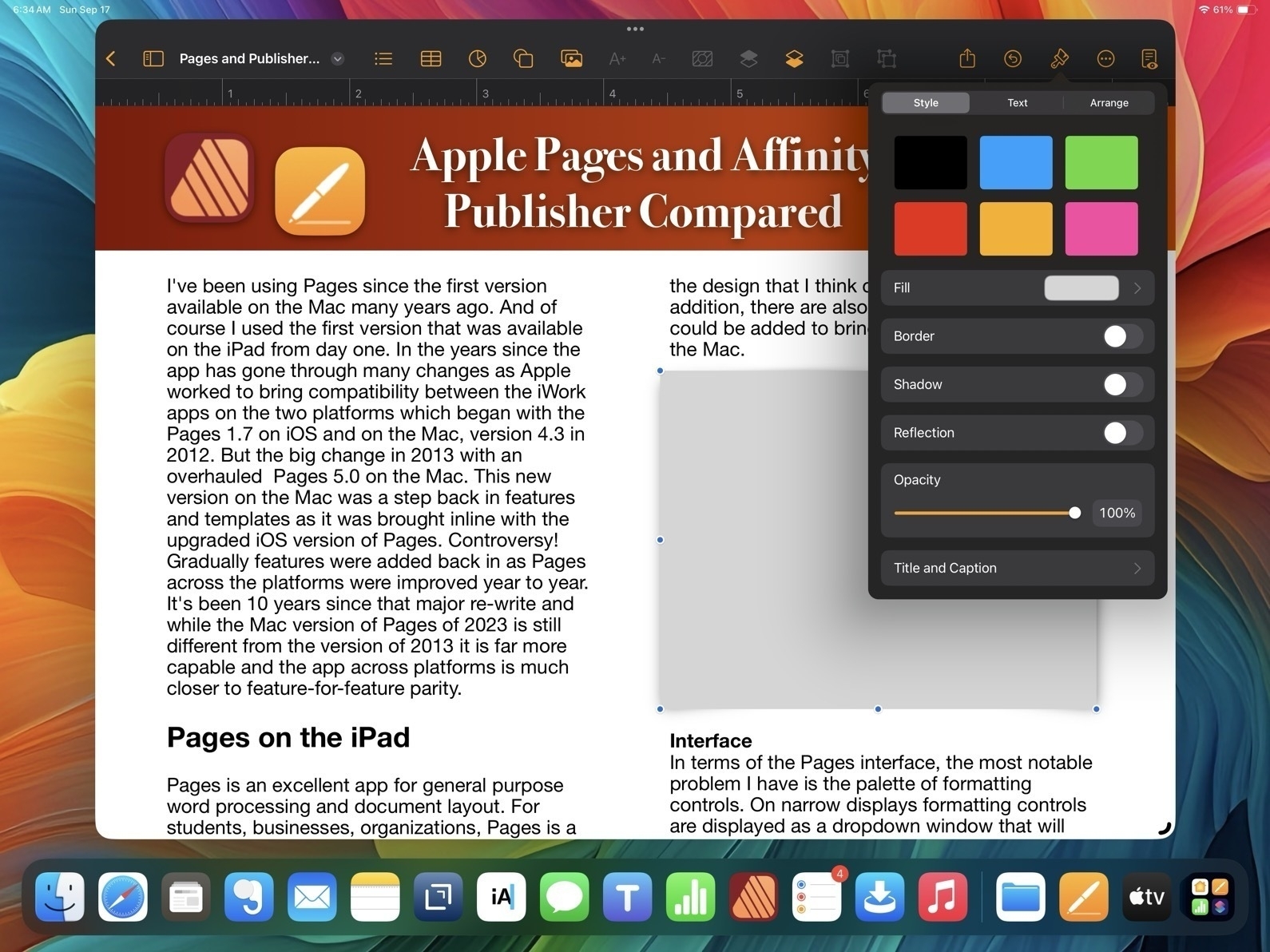
Interface In terms of the Pages interface, the most notable problem I have is the palette of formatting controls. On narrow displays formatting controls are displayed as a dropdown window that will disappear to make room for content on the page.
This generally makes sense on a narrow window when it is more necessary but I'd suggest it's important to only force the dropdown when it's necessary. Why? Well, because it's harder to use because it takes more tapping/clicking. Every time I tap or click in a document the format options dropdown disappears requiring me to click again to reactivate it. This adds up to lots of extra tapping/clicking.
Pages and Affinity Publisher Sidebars Compared
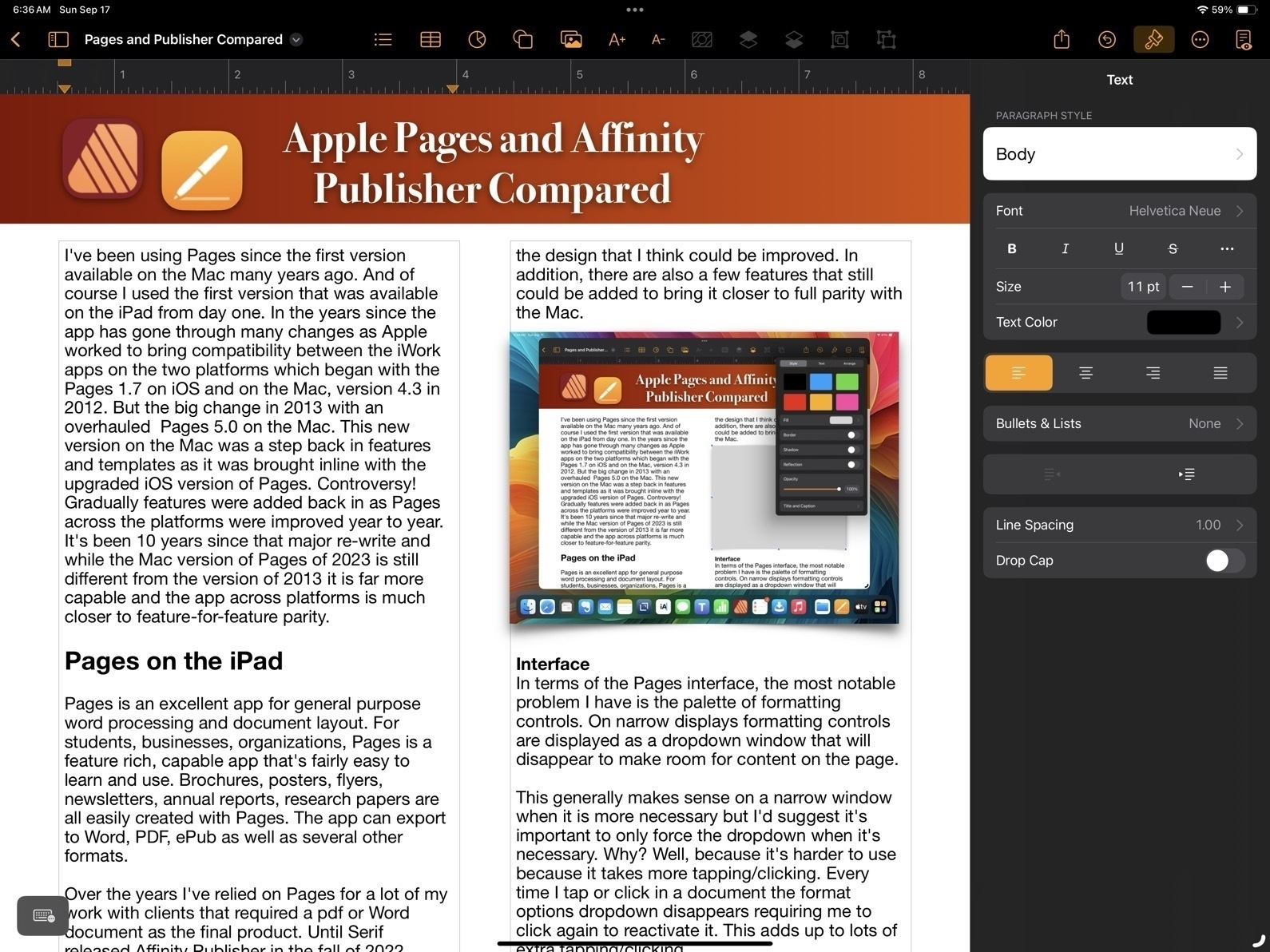
On the large 13" iPad there are many times I'd prefer to have a more permanent sidebar for the formatting options. The sidebar is available when the app is full screen or nearly full screen. I'd like to have a preference or the ability to pin the formatting options as a more permanent sidebar.
And on an external display, well, it actually feels broken. If I'm using an external 27" display I only get the sidebar when I'm in full screen mode. If I have a Pages window set as a floating window that takes up any other portion of screen, even if stretched across 24", I'm forced to use the dropdown formatting window. That's huge waste of space on a big screen.
Missing Tools
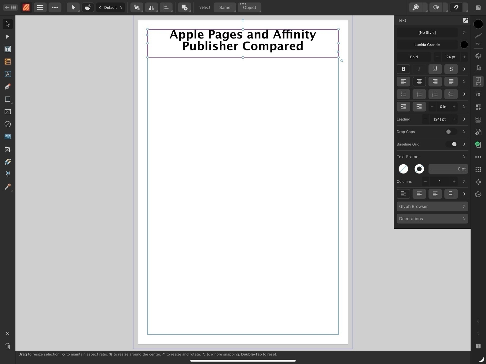
First, I'll note at least one tool that's missing on the iPad version of Pages which is present on the Mac: the pen tool for drawing complex, multi-point lines and shapes.
Now, comparing to Affinity, we begin to see how Publisher is an advanced application for a more specific, professional publishing and design audience. The reason for the smaller, more dense tool palette in Affinity Apps is because there are far more tools and options. Just as one example, text spacing. While Pages has many of the most important basic options such as finely adjustable line spacing and spacing before and after paragraphs, Affinity Publisher has all the very fine-grained controls expected of full publishing apps. While Pages has had many new features added over the years it still lacks options when compared to an app like Publisher. Really, there are far too many to list here. But I will note a small sample:
That's just a small sample of what features found in Publisher but lacking in Pages. And they are significant. And yet, Pages is still quite capable. Let's move on to the features Pages does have that make it worth considering.
Pages - The hits
So, what does Pages on the iPad have going for it?
Conclusion
For people that are in a general use setting, Pages as a part of the larger iWork suite of apps makes a lot of sense. It's easier to get started for more novice users who might just need basic word processing or someone that needs to put together their first newsletter for a community group they belong to. It's easy to work with using touch, Pencil, trackpad or mouse or some combination of those. As a simpler app the settings are more sparse than dedicated professional graphics design apps like Publisher and yet provide enough to allow users to accomplish a great deal without getting bogged down.
For more advanced users Pages is powerful enough that large and fairly complicated documents are possible. Documents can be laid out using free form, linked text boxes intermingled with charts, tables of static data or live calculated data. Adding photos, line art, shapes or even embedded video or scrollable photo galleries are all options for export to multi-media ePubs. I've only touched on a small sample of the features found in Pages and just a simple example of what's possible in terms of designing documents with Pages.
Because it's a free app there's no cost to try it out and if you need to create documents it's an excellent app to start with.
Working on a fun and hopefully helpful two-part article. The overall topic is a comparison of Apple Pages to Affinity Publisher. Though specific to the apps on the iPad it generalizes pretty well to the Mac.
Part one is centered from the perspective of Pages and I've written the post in Pages and designed it in Pages as a sort of 3 page example of what a user can do in terms of laying out a document with the app. I'll have that as a viewable/downloadable pdf.
The second part is written from the perspective of Affinity Publisher and will feature a very similar designed document that will highlight some of the additional features found int the Affinity app.
The goal is to help potential users see and understand the differences in terms of using the two apps as well as the potential results. Posting part one sometime today.
iPad Stories Follow up
A few days ago I posted links to recent stories by fellow iPad enthusiasts. Since then a couple more have come through my Mastodon and RSS feeds. Both of these are really fun reads.
First, there’s Michael Sliwinski, founder of the Nozbe to-do app. I’ve been reading Michael’s blog for awhile and this recent post about the versatility of the 13" iPad Pro is excellent. I think he perfectly sums up why so many of us love the iPad:
I love the form factor of a tablet. Keyboard is optional. This super powerful M1 iPad Pro 13” is a beautiful slab of aluminum and glass that can be used for reading, watching, playing and you can do it in both portrait and landscape modes. And when you hold it in your hands, you only interact with it via touch. After more than a decade with it, it hasn’t stopped being the best form of interaction for me. And it just brings joy.
He shares a variety of ways that the iPad get’s used during a day from company tasks to using Apple’s Freeform app for math homework with his daughter to mobile video editing with LumaFusion.
There’s also Brandon McMullen who shares his thoughts on the iPad. I really appreciate the detailed description the various tasks that he accomplishes with the iPad in his office at a construction company:
I use it to view & annotate blueprints, scan and sign documents, deal with employees time and expenses, as well as remote in to my work PC (using Jump Desktop) when I am out of the office.
Then, for entertainment and reading:
To me, the iPad is the ultimate entertainment device, where the Mac is more limiting. I can go laptop like experience with my Magic Keyboard case and switch seamlessly to tablet mode to write or journal with my Apple Pencil. I can rotate my iPad to portrait mode for a killer reading experience for catching up on my RSS feeds with Reeder or reading my saved articles through Pocket.
And, like Michael, he points out that being able to hold the iPad as a tablet without a keyboard is a more personal experience.
I think that the iPad’s secret weapon is its modularity, it can conform to what you need it to be way better than a desktop or even a laptop can.
Finally, he shares observations of how others are using the iPad around him.
As far as how I see others use the iPad, I can only speak to my circle of friends and family and anecdotal evidence I see when I am out and about. But I feel like at least for the people around me, the iPad is widely used and accepted by all sorts of people. My wife uses a 12.9″ iPad Pro and iPad mini 6 as her only computers… My two young boys both have iPads in kid protective cases for learning, schoolwork, and Apple Arcade games (no ads or in-app purchases!). To them, the iPad is the only computer they have ever used and they can navigate it effortlessly. My parents both use iPads as their only computers.
He also shares observations of the many people around town that he regularly sees using iPads. He also offers more details about the importance of the iPad in the construction industry where it’s used out on job sites, going so far as to describe it as indispensable for his company. It’s a very interesting peak into real-world field work scenarios that I’d guess are fairly common but not often discussed.
I guess the point of saying all of this is once you get out of the tech nerd bubble, you see lots of regular people choosing to use iPad because it is the best computer for them. They are almost assuredly not even aware of the great Mac vs. iPad debate.
For those interested in the iPad as a flexible, modular computer it’s a great read. I wish Apple shared more of these kinds of stories.
Some recent iPad Stories
It’s been enjoyable to read the recent iPad related posts by several indie bloggers over the past few days. I’m considering the possibility of setting up an old fashioned web ring for Indie Apple bloggers that fall outside of the well known pundits. I think it might be useful and fun to have a little neighborhood of folks that regularly write about how they use Apple tech. My particular interest is the iPad but I wouldn’t want to limit it to that. Hmmm.
Here are the posts in no particular order. There’s Rob’s post, “The iPad Works":
I’m not suggesting that the iPad is perfect or that everyone can use it for their work. That would be almost as silly as suggesting that it can’t do any real work. We are fortunate that Apple has created, and continues to improve, several computing platforms. Each has its strengths, but also significant overlap in their capabilities and the types of work that can be accomplished using them. I find it odd that some pundits find the need to pit these platforms against each other, as if one must win out over the other. It’s not a competition.
Warner Crocker wrote “The iPad Mystery That Isn’t Really a Mystery":
So I say enjoy the ride while the riding’s good. There’s no Goldilocks iPad for all. There’s no Goldilocks computing platform for all. There probably shouldn’t be and I hope that always remains the case. Niches can be nice. And besides, we’d all be bored and begging for more anyway if the game just stopped.
Jason McFadden recently posted “iPad is not a laptop":
Viewing iPad for what it is correctly sets expectations and avoids disappointment. When you know what it’s great for, you’ll use the iPad for those things and find it a great device. But if you want or need the full power of a laptop, then the iPad won’t suffice.
And another by Jason: Maybe there’s room for tablets:
Hearing how others get “real” work done on iPad and enjoy the “iPad way” makes me welcome the tablet bug biting me. And I know I don’t have to ditch my excellent MacBook in the process; I’d likely use both. In fact, I kind of miss the Sidecar and Universal Control features I used before. The iPad can serve as a 2nd display to the MacBook, either as an extended macOS screen or simply as the iPad itself but with the mouse cursor effortlessly moving to it from the Mac.
iPad goal posts and hand wavy things
The iPad discussion is all about moving goal posts and hand wavy things. In other words, it’s about framing and context. But it’s also about fluff. Let’s start with the fluff. It’s kinda like cotton candy. Sweet and interesting at first but not a lot there when you really bite into it.
A few days ago Jason Snell, wrote his latest on how the iPad has been failing him. And, predictably, a host of prominent pundits chimed in. Yesterday another notable iPad user, Harry McCracken also commented. He’s not planning to leave the iPad but shared some observations.
The company’s legendary dedication to making what Steve Jobs called “the whole widget” usually results in deeply integrated experiences; the iPad, however, has gotten that benefit only in fits and starts. And lately, it’s felt like the platform is stuck somewhere between its past and its future.
I’m noticing a theme with these posts which is a lot of hand waving about the “problem of iPadOS” but rarely anything specific. In general the sentiment is that Apple is moving too slowly in making the iPad into a Mac. After some very general statements McCracken finally points to a specific example, support for external webcams coming with iPadOS 17 as a feature he’ll be happy to have. But also points out that it took too long as evidence that Apple is too “lackadaisical” in its progress. He mentions a long list of other things but doesn’t provide the list.
The only other specific he gives is Stage Manager which he doesn’t like so continues to use the old Split Screen-based multitasking. But in general he continues to love his iPad and will continue using it. The point of the post seems to be: 1. Mac hardware got better with Apple Silicon 2. iPadOS is still not macOS.
In other words, his story really feels like a fluff piece during a slow news cycle. Gotta write a column this week so take an easy ride on the current pundit meme. But no real substance.
In all of the articles taking that ride this week none provided much actual specific evidence of any significant problem. Each might provide one example of something very specific that may be a miss in iPadOS or limitations of third party apps. Matt Birchler had a post about how the edge cases add up to something significant. As examples he cites several third party apps that are possible on the Mac but not available on the iPad or limited on the iPad: Spotlight alternatives, third party password manager limitations and alternative screenshot tools. Echoing Snell’s original article he writes:
I guess my feeling is that the iPad is great to a point, and as soon as you stop out of bounds a little bit, it becomes quite challenging to deal with, as your options to override system behavior are basically zero.
He follows up with an example of where the iPad failed him on a recent trip:
I took only my iPad on a trip recently and I was editing photos. Lightroom is my editing app of choice, and Adobe does a really nice job of keeping features in sync between the Mac and iPad versions of their app. However, I took some really high ISO shots on the trip and wanted to denoise them using Lightroom’s relatively new AI denosing feature. That’s on the Mac but it’s not on the iPad version, so some of my photos weren’t able to be edited until I got home.
Okay, but, wait. Let’s talk about picking nits a bit. The reason the iPad is not a capable computer is the lack of 3rd party screenshot or Spotlight apps? Limitations to 3rd party password managers? Or a missing feature in one of Adobe’s apps that has nothing to do with iPadOS but rather is a choice made by Adobe?
My point here is that this story about the iPad as a computer really has entered a new stage as the goal posts are constantly being moved. In 2018 the discussion had far more substance and we could point to important, core functionality and features were still missing. For example, file management with the new Files app was still a very basic. Multiple app instances didn’t appear until 2019. Before 2020 the iPad was a touch only computer with zero support for mouse or trackpad.
In other words, it’s all relative. Year to year, improvements are made to iPadOS. And let’s not pretend that the same cannot also be said of macOS. Somehow Mac users in 1992 were getting things done with their Macs running System 7.1. In 1999 they were able to do even more running System 8.6. Sure there were limitations in the system and third party apps but somehow we got by. I loved my Mac and used it daily.
Not long after we had the big transition to OS X. It was rough at times, slow going but things gradually improved and stabilized with OS X and third party apps for the new platform gradually appeared allowing users to get more done. I can tell you that in 2002 I was happily using my iMac to build and maintain websites and create documents of various kinds, email, use the web, edit photos and video.
See? Same thing. The evolution of computing is an ongoing process. This iPad conversation, if given context, is kinda silly. All operating systems and app ecosystems are always in a state of becoming better. Computers as tools are always contextual. The users, tasks, environment, hardware, OS, apps are all fluid.
And the framing of the discussion as “Can I get by with an iPad as my only computer” is also past it’s usefulness if it was ever useful at all. Do we similarly ask, can I get by without my iPhone (or any phone at all) and just carry a Mac? Of course not. For all its openness and extendability, if you need to make a phone call or easily take photos while on the go, you likely don’t want to rely on your Mac.
Speaking of the iPhone, for the cost of such a little device and all the attention paid to it, one would think that people had abandoned their Macs and were “iPhone only”. But of course, that’s ridiculous. Surely not. But it’s not ridiculous, is it? For some users the iPhone is exactly the computer they need and nothing more. In fact there are some people that have both a Mac and iPhone but find more convenience and utility with the iPhone, leaving the Mac sitting idle most of the time. Again, like all tools, computers are contextual and relative.
I’m not planning on writing this up, but I have gone through iPadOS 17, and all my old posts about iPadOS 16, and collated a list of many of the things Stage Manager still gets wrong.
I appreciate when users take the time to document problems but it’s worth noting that in some cases “wrong” is opinion as opposed to broken. Just one example in the list, the dock disappearing when a window is moved down to bottom of screen. I like and want that to remain as it’s useful to me. I can swipe the dock up if needed or move the window.
The iPad originated as a touch-first computer and remains touch-first 13 years later
An interesting aspect of the ongoing discussion about the iPad is that it's primarily from the perspective of Mac "power" users. Which is to say, long-time users that have been using the Mac and are most comfortable with its feature set and interface. These are users that have and want access to the most open-ended computing experience possible. They're very efficient with their Macs and have time-tested workflows with apps they know well.
In terms of understanding the iPad as a broadly used computing platform, it's important to remember the bias of the most heard on-line voices which are, predominantly, the voices of content creators and tech enthusiasts that publish podcasts, videos on YouTube, and websites.
But what about the touch-first users? I've often referred to my extended family when I've written about the iPad. They seem to be what I assume is close to the average. They're not tech-oriented, they don't read tech blogs or keep up with the latest hardware. The iPad users in this group have never heard of Stage Manager or even Split Screen.
Their most used apps, including those that use Macs: Safari, Messages, Photos, Mail, Notes. Other apps most used: Netflix, Facebook, and a few games. No one in the sample develops applications or publishes videos or podcasts.
They are almost all touch-first users, relying on their iPhone for at least 50% of their "computing". Those that use an iPad use it about 50% of the time to compliment the iPhone. Most of them are using these two devices. There are 3 Mac users compared to 6 iPad users and 2 PC/Chromebook users.
If my family is even close to average then it would be accurate to say that there are more touch-first, casual users than there are "power users" that use a mouse/trackpad/keyboard.
Of the 3 that use a Mac, 1 is a college student, 1 recently graduated from college, 1 retired. All 3 use their iPhone far more than their Mac. The two who use computers full time at work are using work issued Windows/Chromebooks. When not at work their computer is the iPhone.
So, in my family at least, casual, touch-first users dominate first with iPhone, then iPad. Their usage patterns seem to reflect the larger picture of Apple's sales for the past 13 years and it explains why Apple has prioritized iOS and touch-based computing for the past decade.
The iPad started as a touch-first tablet computing device and it remains as a primarily touch-first tablet computing device. Admittedly this is my best guess based on anecdotal observation and a general sense of Apple sales numbers, but if true then it would be accurate to say the iPad, in use, remains closer to the iPhone than the Mac.
2015: iPad Pro
All that said, Apple opened up a whole new set of expectations when they released the much larger screen 12.9" iPad Pro in 2015. It instantly created a whole new idea of what the iPad could be and speculation about where Apple would take the platform.
The 2015 iPad Pro brought with it the Pencil and the return of an iPad specific keyboard offering from Apple. It's been 8 years and I was curious about the initial reviews of this first iPad Pro.
From the Tech Radar review of the 2015 iPad Pro:
The iPad Pro could be a lot of things to many people - including professional users, considering the amount of business apps in the App Store. To some, a great sofa pal. To others, a brilliant hybrid device that enables them to flip effortlessly from sketching to movies to typing reports on the go.
Is it good enough to usurp the need for a MacBook Air? Could you ever get by just using this tablet and the optional accessories around it, or does it need to be part of a larger family – a device that's perfect for certain situations but gets relegated when it's time for proper work?
There was only one way to find out – force myself to ditch the laptop and try to write this review on the Pro (and you can see the results below). While that wasn't as easy as I'd hoped, I've found a lot of use for the iPad Pro 12.9 in day to day life.
He goes on later to [describe the process of writing the review](https://www.techradar.com/reviews/pc-mac/tablets/ipad-pro-12-9-1269255/review/5). His conclusion on writing, editing images and posting the story:
But I learned a lot about the iPad Pro's capabilities in that time. This thing is definitely capable, and the amount of workarounds are large - you can get things done, just not as easily, and since then I've used it on the train to do loads of different bits and pieces and really enjoyed the portability.
iOS isn't a desktop experience, and I can't see it ever being. As such it's hard to call the iPad Pro 12.9 a definite laptop replacement. For some, it will be more than enough, but workers might struggle with the limitations iOS brings through its silo app methodology.
And Macworld also wondered about the intended use and audience for the iPad Pro:
One mild concern that is currently troubling us is the issue of who exactly is expected to buy it, and how it will affect (and potentially confuse) the buying decision...
Five years after its launch, questions still remain over the iPad’s ability to operate as a primary work tool – because its screen is smaller than almost all laptops, because iOS is limited in many areas, and because the iPad can’t multitask. Some or all of these shortcomings can be addressed in a 12-inch iPad Pro,
They go on to mention possible use-cases such as office productivity and creative as well as the available software and the lack of multitasking.
Though much has changed with the various iterations of the iPad OS and available apps over the past 8 years, many of the questions raised in those first reviews persist today. From pundits to article comments, many Apple nerds are still confused and frustrated by the iPad.
But I do think some clarity can be found in two simple bullet points:
For those that want the full-on power user experience with fewer OS limitations, the Mac is the choice.
For those that want touch-based computing that can be extended with the addition of a keyboard/trackpad/mouse there is the iPad.