iPad Journal
- In general, I prefer the Taio interface as it always shows the sidebar of files. If I want to go full screen I can but I like seeing the files all the time.
- Taio does nothing with hashtags for searching whereas 1Writer recognizes tags and a click to a tag brings up other files with that tag, showing them in the sidebar as an auto-populated search which is fantastic.
- Search in 1Writer is generally much better as it also searches file content. Search in Taio is nearly useless as it basically searches titles.
- When it comes to editing vs previewing Taio creates a mess of tabs along the top of the document window. Open a file to edit then switch to the preview and you get a new tab showing that preview. Tap on a link in that preview to another document? New preview tab of that document. Want to edit that document? New tab. Now you’ve got 4 tabs open! It can get out of control quickly. By comparison 1 Writer does everything in one window. Much tidier. And if I want nearly real-time html preview with clicking to other files I can bring up a second window of the file I’m editing and put it in preview mode. Works very well.
- Copy plain text, formatted text or html
- Email plain text, formatted text, pdf attachment or plain text attachment
- Print as plain text or formatted text
- Open in plain text or pdf which then goes to the standard share sheet
- Unit price calculations. I use this one on the phone when I’m shopping to do quick comparisons of items. The shortcut asks for unit quantity and the cost then gives me the cost per unit. Very fast.
- File converters. These only get used on the iPad, usually when I’m doing work on a website. I often need to convert a png or pdf to jpg and while I can use an app like Affinity Photo this shortcut is much quicker.
- Switching audio playback. Apple Music, Podcasts, Overcast and any other app has an Airplay icon to send audio to a HomePod or AirPods. It’s easy to use. But it often takes a few seconds and if I’m on LTE I may also have to first tap once or twice to turn on and connect to my WiFi if, for example, I’m coming back from walk and want to switch from AirPods to HomePods. With a shortcut on my home screen or a widget I can tap once and my iPhone connects to my WiFi network and then changes audio playback to the HomePod. It’s not a huge difference but it is noticeably faster and it’s something I do often.
- Reliability and consistency have been issues for me. Shortcuts sometimes just seem to fail. Or they work for a period of time and then stop working. Sometimes it would seem something should be possible and I’ll spend time trying to build an automation only to find out that it’s not possible. A recent and very frustrating example. I often want to use a screenshot on a website but the native png screenshot files are huge. I can save to Files then share the png to a Shortcut to convert to a jpg, set quality and size. But I cannot do this directly from the screen shot interface to Shortcuts. I have to take the extra step of saving the file then opening it up. Why?
- Multi-window apps, while not game changing, have been been fairly helpful in reducing a bit of friction. Especially true of the Files app.
- Widgets on the home screen have been more useful than I expected!
- Better, free-form local storage of files on iPad have been helpful.
- Safari download manager has been one of the more notable benefits of the new Safari.
- Multiple slide-over apps is a fantastic new addition to multi-tasking.
- Column view in Files and the new long-tap contextual menu are both great additions.
- The new organization of the sharing menu is proving helpful. Initial organization of shortcuts in that menu takes some time but I think the result has been worth it.
- The Apple Reminders app has gotten some very nice updates with 4 built in smart lists and sub tasks. John Mitchell at Everything is Ablaze has a fantastic post about updated Reminders.
- Last is the new accessibility mouse support. I’m not using it all the time but I am using it for certain tasks.
Been a week since WWDC 2022 and I’ve still not put together a proper post. For now I’ll just say, while I’ve been very happy with iPadOS as it is, I’m also excited about Stage Manager and extended desktop support coming in iPadOS 16.
Universal Control
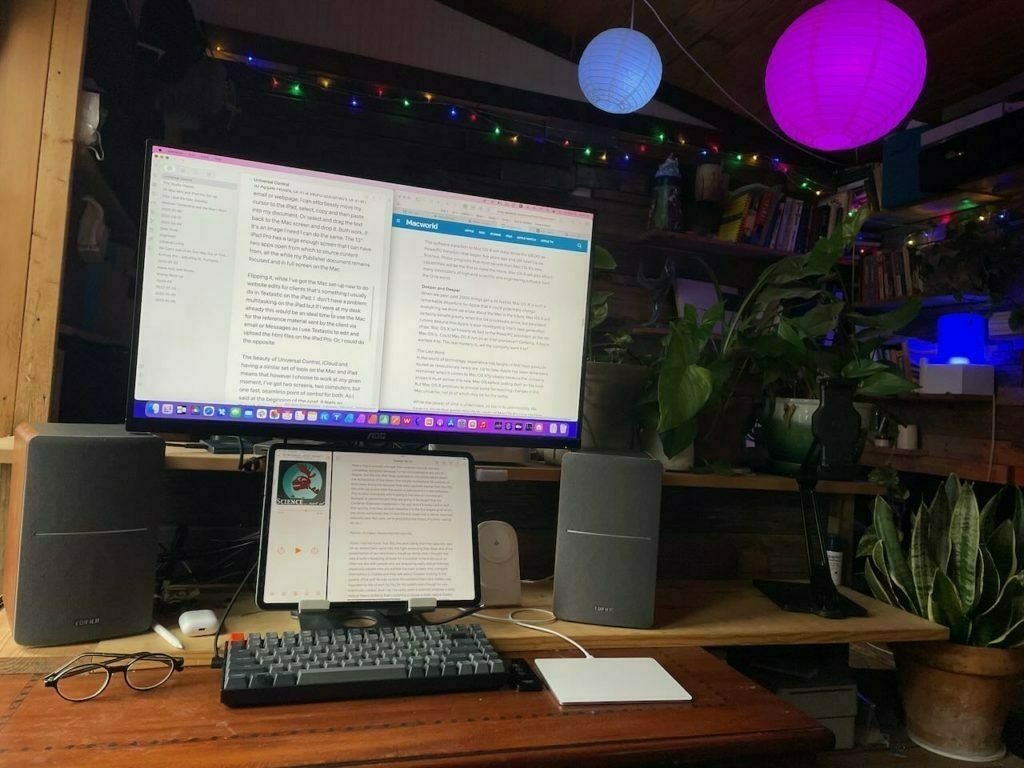 It’s just one computer. That’s what I’m telling myself when I use Universal Control. The Mac, the iPad, functioning as one. It’s a computing experience with two screens. In the week or two since the release of the new feature there’s been a bit of debate about the usefulness of the new feature with some suggesting it’s a gimmick or just not that useful. And I suppose it’s possible that the usefulness might be a question depending on your workflow.
But in my case as I’ve been making more of an effort to use my Mac and sitting at a desk to do so, I’ve worked out a pretty comfortable flow between the two. There’s nothing here that’s set in concrete. It’s all about flexibility and flow and learning to move between the screens just as I might if my Mac were using two screens. But rather than the Mac driving both I’m using the extra compute power of the iPad as needed. The key here, and I believe Apple’s intent, is that the movement of cursor and keyboard between multiple screens be so fluid that we just do what we do without thinking too much. Initially there may be a tendency to over-think it.
An example of how it’s been useful to me. I often need to design newsletters, reports or brochures. For longer documents I’ll likely use Affinity Publisher which currently is not available on the iPad. In that case I’ll open my document full screen on the Mac and use the iPad for sourcing material sent by the client. I might have text saved to Apple Notes, or in a Word document or in an email or webpage. I can effortlessly move my cursor to the iPad, select, copy and then paste into my document. Or select and drag the text back to the Mac screen and drop it. Both work. If it’s an image I need I can do the same. The 13" iPad Pro has a large enough screen that I can have two apps open from which to source content from, all the while my Publisher document remains focused and in full screen on the Mac.
Flipping it, while I’ve got the Mac set-up now to do website edits for clients that’s something I usually do in Textastic on the iPad. I don’t have a problem multitasking on the iPad but if I were at my desk already this would be an ideal time to use the Mac for the reference material sent by the client via email or Messages as I use Textastic to edit and upload the html files on the iPad Pro. Or, I could do the opposite.
The beauty of Universal Control, iCloud and having a similar set of tools on the Mac and iPad means that however I choose to work at any given moment, I’ve got two screens, two computers, but one fast, seamless point of control for both. As I said at the beginning of the post, it feels as though I’m working with one computer.
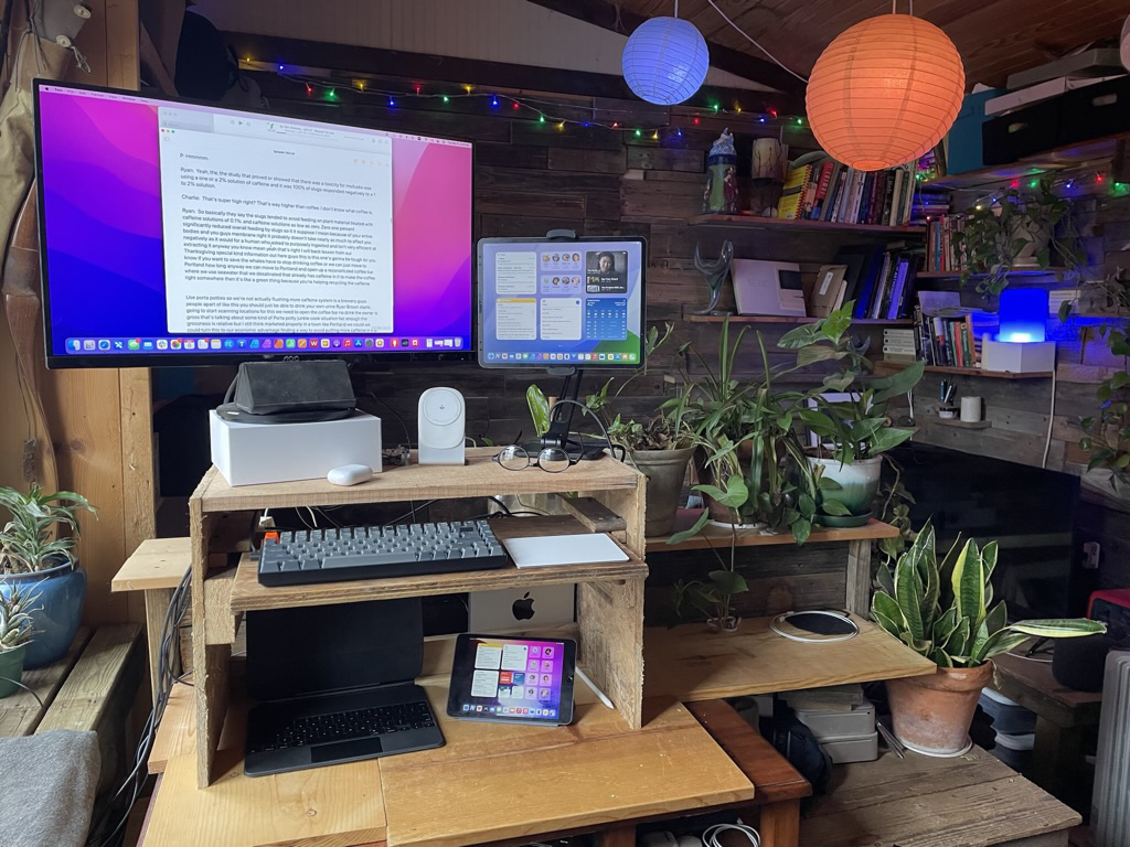
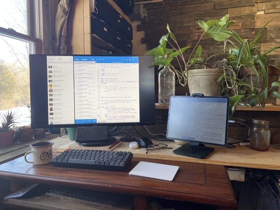
The last change I’ve just made to the set-up is a monitor arm for the 27" display and two bookend speakers as the monitor has no built in speakers and the Mac Mini’s internal speaker is pretty useless. With this arrangement it occurred to me it might be better to place the iPad under the display rather than to the side as I’ve been using it. This makes room for the speakers on either side and the iPad fits perfectly below the display and just above the Keychron keyboard. Not only does Universal control work perfectly via this vertical arrangement it actually feels better and less error prone than it did when I had it off to the side.
All in all I think Universal Control will be the kind of feature, like the other Continuity features such as Handoff and Shared Clipboard, that will prove really useful in my workflow as I suspect it does for others that are using multiple devices.
M1 Mac Mini and iPad Pro Set-up
After a bit of consideration these past few months I finally bought an M1 Mac Mini. My 2012 Mini is still running but with inflation, war and the general state of world affairs, I thought I’d go ahead and get set-up with a Mac that should last the next 10 years. The new Mac will largely fill the same role as the old, essentially, a file server, internet sharing, and occasional projects that require Affinity Publisher which is not yet on the iPad.
All that said, as I posted a couple days ago, thinking about a battery powered Mac Mini and modular computing, it’s also on my mind to reconsider the value of the Mac. To that end, upon setting up the Mac Mini last week, I determined to spend as much time as possible using it over the course of the week. Largely that was to explore the new features of macOS Monterey but also just to get a feel for the new M1 hardware and finally to compare both to working on the iPad. There were even a couple days that I didn’t touch the iPad Pro.
After several days sitting at the desk I did a quick stand-up desk modification and now have everything setup as I used to 5 years ago, in terms of a standing desk set-up. I’ve got plenty of room for the iPad too. One consideration, knowing that Universal Control is coming next week, was to have a set-up that would allow me to easily move back and forth between the Mac and iPad. And of course, it’s also still very easy for me to plug the iPad in to one usb C cable and be using the external screen that’s shared with the two Mac Minis, each with their own input. The downside of the Universal Control set-up is that the Mac would be driving the larger 27" display and the iPad Pro would be restricted to its smaller display. We’ll have to see how that goes. For now it’s acceptable as the Mac takes full advantage of the screen whereas the iPad looses a bit on each side. But letting the iPad take over the screen is as simple as using the screen sleep hot corner on the mac.
Okay, so, to compare the experience of coming back the Mac after several years of my regular, daily use of the iPad. What I’ve noticed in the past week is that while this new M1 Mac hardware is fast it still feels slower than the iPad in my normal, day-to-day usage and I think that’s largely due to multitasking.
iPad Multitasking versus Mission Control on the Mac I’ve gotten used to the iPad way of using apps either in full screen or split screen. And so, upon returning to the Mac I’ve set-up several virtual desktops in Mission Control and have various apps assigned to them. It’s similar to the iPad multitasking experience with the most noticeable downside being that the thumbnails for screens are all at the top and small. I can’t tell what I’m looking at because the label for each is “Desktop 1”, “Desktop 2” and so on.
There is an option to run them in actual split screen (referred to as tiled), 2 apps to a shared screen which puts a label at the bottom with the app names. The downside to that is that the window becomes unavailable to other app windows. It feel locked. Compare that to an iPad where I can have my side by side apps and easily pull in an app as a slide over or a Quick Note. It’s a small thing but important in how it feels in use. Tiled apps on the Mac won’t even allow for a Quick Note and there is no such thing as slide over so it feels really restricted.
For many long-time Mac users the iPad is described as restrictive and as an environment where getting things done is more difficult due to what’s described as inferior multi-tasking. I’m finding the opposite to be true but I’ve also gotten out of the habit of using my Mac and having lots of windows open on a single screen. For many Mac users I think this is the key thing, just lots of windows from different apps on top of one another. I guess I did that as well in the days before the multi desktops brought by Mission Control. And to some degree, even after that. I think I often used overlapping windows but it now seems cluttered to me. Nevertheless, I’m going to continue for another week or two in an effort to give macOS a nice visit. My hope with this experiment is to discover how I can best use the Mac and the iPad together, as complimentary computers and screens. I’ve got two very powerful computers, if I can use both side-by-side I will.
And on the topic of multitasking and windows, I’ve decided to download and use an app called Raycast primarily for window management. There are paid apps to do this but Raycast seems to do what I want. It does a lot more than window management but that’s what I’ll start with. I changed the Command-Space shortcut to open Raycast and Spotlight is now Option-Command-Space. Raycast has the added benefit of doing window management. So I can activate it and start typing “right” and it has learned that I probably want to tile the current window to the right using half the screen. Then I can tap over to any other window and type “left” and it will prompt me to move the window to the left half. Or I can type “center” or a variation such as “center third” to place the window. Lots of options. All in all, it will make keeping windows organized easier when I feel that need, which I expect to be most of the time. I found it odd that I had to download a third party app to do this kind of keyboard shortcut window management.
App Launch Times Surprisingly, the M1 Mac Mini is not as fast as I expected. Coming from the contrast of a 2012 Intel Mac and the iPad Pro, I expected apps to launch faster than they do. Many do launch with one bounce though the Affinity apps take longer to launch than they do on the iPad, about double the time. The same can be said for Pages and Numbers. If they’ve been open recently then they open with one or two dock bounces. Otherwise it’s 4 bounces or more. This compares the iPad where they appear to open instantly. This is part of the experience is very much related to memory management so I’ll dive into that a bit next.
Memory Management This is an interesting one that is surprising me a bit. I knew going in that a budget Mac Mini running 8GB would be a bare minimum. It was the right choice for me though. Still, it’s worth mentioning a comparison to the iPad Pro with the same 8GB memory and M1 processor. Given how I’ve been using the iPad Pro, it seems noticeably better at managing memory for multitasking and yes, this goes against the common narrative that Macs are better for multitasking. I bring it up because yesterday as I worked on an Affinity Publisher project on the Mac I needed to open Affinity Photo to optimize a few images. Most edits can be done within Affinity Publisher’s very cool Studio Link feature that just opens a sort of Photos Mode. But I actually wanted to open an overly large png file externally and export it to a smaller png. Upon clicking the Photos app in the dock I found myself waiting for quite awhile for the app to open. Bounce, bounce, bounce, bounce. It seemed to go on forever. I wish I’d counted. I expected maybe 4 bounces but guessing it was over 10. Now, to be fair, I had several other apps open and both of these Affinity Apps are resource intensive. But here’s the thing, on the iPad often bounce between Affinity Photo and Affinity Designer and then over to Safari, Mail, Obsidian then back to Photo to Designer then to Messages to News Explorer. As I type this in Obsidian I did the above to test. The sort of thing I do often on the iPad but I wanted to try it again to confirm my memory. It wasn’t till I got to News Explorer that I saw an app reload and that’s not surprising because I hadn’t used News Explorer since sometime yesterday afternoon. And the reload time was a mere half second.
I find that with the iPad I don’t “close apps” or manage them in the same way I do on the Mac. On the Mac when I see an app in the dock that indicates it is an open app I’m more likely to close it if I’m not using it or planning to use it. Perhaps that’s unnecessary and something I need to let go of as a habit from previous years' habits. As a test I’m going to try to leave apps open longer and see how well the system manages it. I noticed the other day in the System Preferences app that there is an option to turn off the dock indicator for open apps, I’ve just turned that on so I’ll no longer know which apps are open. This brings me closer to the iPad experience and might also change how I think about managing app usage.
Finder on the Mac, Files on the iPad This is one that’s brought up often as a subpar experience on the iPad. For the most part I disagree. Comparing the two, they seem to be very close to the same in experience. The one primary advantage that the Mac does have is that Finder has a customizable toolbar and the ability to view more columns of data about files in list view. It’s also got better file searching in that the contents of pdfs, text documents, etc are all indexed and searched. There’s no doubt that there’s room for some of these features to be added to Files and they should be. Sure, Apple probably needs to keep the default simple but certainly settings could be added for those that want more. All that said, using the Finder this past week has not led to any sense that I’ve been missing out anything essential on the iPad. In day-to-day, probably the most notable feature would be adding extra columns in list view then having the ability to click those column headers for quick sorting.
Built in Mac apps have all been as expected. I notice slight changes coming from macOS Catalina but mostly small refinements. Speed wise, it all seems to be about the same, perhaps just a bit faster in daily tasks. I guess that says something, too, about how optimized macOS is at this point. Made for iPad apps seem to run pretty well on the Mac.
Working together Overall, I like and appreciate the refinements of macOS. Also, that while it still looks like macOS, visually, it’s getting closer to iPadOS. They’re coming together in a way that it’s easy to fluidly move back and forth without it being a jarring experience. And really, that brings my to my final point and something I was already thinking about even with Catalina, and something I touched on with my last post, that the Apple ecosystem, particularly the Mac and iPad, function so similarly that I could just as easily be on the same device. I think that’s counter to much of the narrative online which is focused so often towards which of the two is better, always framed as a competition and the differences. I’d much rather enjoy them both and use as needed.
A final edit to add after initial publishing, Apple released the OS updates hours after I posted this that include Universal Control. It seems amazing. I’m planning to return in a week with more about this experiment of using my Mac and iPad together and if it’s been impacted by Universal Control.
Modular Computing and the Mac I Want
Just a few days ago I wrote, not for the first time, about having mostly quit the Mac. I t was a response to a forum post over at Mac Power Users though it was also a post that had already been brewing in my head as a general frustration that I’ve had with managing my Mac. I’ve been a Mac user since around 1993 when I purchased my first, a Mac Color Classic. Still have it. Since then many Macs and I’ve loved using them. It’s only been the past couple of years that I started finding macOS frustrating largely because the simplicity of the iPad has sort of spoiled me, especially in terms of background maintenance type tasks. Also, window management. Bit’s of friction that just kind of crept in with the Mac. But really that might move me from the real topic of this post so I’ll save that bit for another day.
But more relevant to this post is that over time the iPad, as the simplest possible computer grew to feel like a comfortable extension of me. First and foremost a slab of glass. I’ve never gotten over that simple fact that this simple tablet was the computer. It not only set a new standard of simplicity but also of personal, direct interaction. And also the beginning (for me at least) of a new way of thinking about modular and portable computing.
Of course the laptop is that to a degree. Certainly portable and a complete package. I sold my last laptop in 2016 because I’d mostly stopped using it. I was either using my Mac Mini or my iPad. I no longer wanted a mobile device that was permanently attached to a keyboard. At that point the iPad OS was more limited so I often still used my Mac Mini at a desk for many computing tasks.
The past few weeks I’ve been getting closer to purchasing a replacement for the 10 year old Mac Mini. It’s still working pretty well but with inflation, supply chain disruption etc, I thought I’d go ahead and get the replacement, a 2021 M1 Mac Mini. I’ll keep the current Intel as a backup, maybe a server (which is already it’s primary function) or gift it to a family member. In any case, before purchasing I carefully considered a MacBook Air.
Why I skipped the laptop and went with the Mini is the subject of this post as it speaks to the modular, portable Mac I really want but which does not exist. I’ll say first that I went with the Mini because I have a 27" 4K display which is what I’ll be using anytime I use the Mac. Why pay extra for the 13" screen, keyboard and trackpad I don’t want or need? The reason I almost spent the extra was that the laptop also comes with it’s own battery, essentially, a back-up power supply and can be charged via USB C from AC or DC power supplies. If I’ve got a power outage my iPads, mobile hotspot, iPhone, etc can all be charged via a solar powered battery indefinitely. As would a MacBook Air. Sure, I can use the standard AC wall plug such as the one that the Mac Mini comes with and run it for many hours from that back-up. But not indefinitely. That’s okay and not a problem because when it comes down to it I’ll be using the iPad for most tasks anyway. But thinking about it did send me down a rabbit hole.
The modular Mac I want most would be a Mac Mini with a battery and the option to charge/power via USB C. But why? Why not just a laptop? Because as I get older I want a bigger screen for larger text. And because I want to be able to have that screen at various heights as needed. And because I’m happy to use an external keyboard and mouse or external trackpad. So, in part, it’s very much a hardware positioning issue. Again, the iPad has spoiled me. I’m used to being able to arrange work spaces in all sorts of ways between the iPad, keyboard and trackpad.
But it’s also an expression of the Apple hardware and software ecosystem. Between my iPhone, 2 iPads and Mac, everything is connected. While not perfect it mostly works most of the time - generally speaking, it feels like like being in a very functional, useful and often magical modular computing ecosystem. I expect I’ll notice and enjoy this even more with an M1 Mac running the latest OS and features like Universal Control.
But about this Mac Mini with a battery, well, I suspect that the current Mac Mini could be much smaller with the lower energy Apple Silicon. I’m imagining a device about half the size and weight. Unlike a laptop, the dimensions of this device would not be constrained by the dimensions of the built in screen, keyboard and trackpad. Maybe a fan, maybe not. But with a built in battery it could be an always on device, easy to transport from home to office or even to different locations within a home. With one of the new portable screens, a keyboard and trackpad, the overall package wouldn’t have to be much more than a laptop. But has the option of a larger screen set at an optimally ergonomic height with different arrangements between the keyboard, mouse and screen rather than for optimal ergonomics.
I can imagine a scenario where I’m at the home office working at the 27" display attached to this portable Mac Mini and/or iPad and the usual peripherals. But a quick unplug of the display and I’m off to the library or a coffee shop or office. Maybe I’m headed to an office where I’ve already got another display, keyboard, etc waiting so I just take this tiny Mac Mini and my iPad. Or maybe I’m going to another space and I can take a portable 15" display, keyboard and mouse. Certainly that’s more heft and bulk than a laptop but it’s still very portable and, the key point, at the home office it has advantages over the laptop.
One last thing I’d want in this kind of set-up would be a new macOS and iPadOS feature, an extension of Hand-off, Continuity, Sidecar and Universal Control that would allow me to initiate control of the Mac from the iPad without a third party app and without the Mac or iPad initially being on the same network. In this setting the iPad would see the nearby Mac, recognize it as mine and that it was running without a display, and prompt a connection, turning the iPad into a wireless display for the Mac, no dongles or third party software needed. Currently I can control the Mac via an app like Screens but that requires that both be on the same wireless network. Or I could use a third party wireless dongle or a wired connection via an app like Duet (see below story).
I can imagine that carrying a portable, battery powered Mac Mini and an iPad that could seamlessly initiate screen sharing/control would be a very cool feature in certain circumstances.
I’ll end with this story that popped up in my RSS feed as I neared the end of this post: Dave Mark at the Loop posts about this project to DIY a portable Mac Mini! Similar to what I’ve been thinking here though I would stress the value of a screen that is NOT attached.
Why I quit the Mac (Mostly)
I had a chuckle late yesterday afternoon when I opened up the forum and found this thread: iOS and iPadOS are endlessly frustrating to me.
The reason for my amusement was that earlier in the day was one of the rare occasions I found myself at the keyboard of my Mac Mini and I found myself frustrated with the experience for most of the time. I had a few things I needed to do in the Contacts app that aren’t up to snuff on that app on the iPad. Also not great on the Mac but a little better. Side note, Apple needs to give the Contacts app on all platforms some attention. It’s been awhile since spent any time managing contacts and it’s not a great experience. (Cardhop on the iPad is fantastic, a much better experience and I could have used that but hadn’t checked on the Mac in a couple weeks so figured I’d check for software updates, etc).
So, as I was working on that I had a tech question texted to me from a relative that resulted, after a series of exchanges between us, in my checking my Time Machine back-up. Huh, no back-ups since January 11th. No notifications that it had stopped. Upon investigating I found an error “A disk you are backing up is case-sensitive, but the backup disk is not. Select a different backup disk or exclude the case-sensitive disk from backups.” One of those fun Mac power user exercises! I do some searching and no resolution. Fine, I’ll come back to that later. I’ve had issues with Time Machine for years. For some it seems to work very well, for me, well, this is just the latest in a long, long list of failures.
I get back to my task. A client is having issues with his Contacts app throwing up the spinning beach ball which is why I’m tooling around looking at options for possibly moving some of his workflow to Numbers spreadsheets for contacts relating mailings, class sign-ups, invoicing and various other bits of data tracking that he’s never gotten around to doing.
While I’m at the Mac this same client messages me with a few requested changes to his website. I instinctively reach over to the iPad attached to the Magic Keyboard and open Textastic in split screen with Messages to reference the text and images he’s sending. He also sends a hyperlink to gather additional images and text from a website so I tap over to Safari. I select some text with the Magic Keyboard trackpad and copy. Then I use my finger to tap and hold an image in Safari, then use another other finger to drag up the dock and open Files to navigate to my client’s website folder. I drop the image in. As my hands are already near the screen I use my thumb to drag the dock up and tap over to Textastic. I finger tap the images folder, then tap and hold the new image to rename from the contextual menu then rename it using the keyboard. The client wants another image that I have in my Photos library so I Command-Space and type “flowers” and from those Spotlight results I open Photos app which opens a search for my flower images. I tap the “moments” section of the photos search results which has groupings based on date and within a few seconds I’ve got the image. I tap the share icon to send the image to a shortcut that resizes and compresses the photo which I save straight to the website images folder.
Over the course of this 5 minutes of activity my fingers and hands have danced back and forth from screen, to keyboard to trackpad. I can’t say that I know exactly how I’ll do any particular task, whether it will be the trackpad or touching the screen, I just do it. If my fingers are already on the keyboard I’ll likely use the trackpad. But because they’re always close to the screen tapping is easy and often I find that I can go quite a bit faster because I can interact more directly with the screen via touch and with two hands - with the trackpad I am limited to one cursor. This kind of interaction isn’t possible on the Mac and I feel slower because of it. The Mac limits me to one cursor, one point of on-screen interaction with a mouse or trackpad. I have to drag that cursor, and aim it. Not so with the touch screen where I can much more quickly move a finger right to the place I want to interact.
Another place where the Mac slows me down is in the processing of mail. The iPad and a touch screen feels far superior when processing mail. When it comes time to delete and move mail around the two hand, multi finger process is excellent. My left hand goes up towards the left side of the screen and I use my thumb and/or other fingers to multi select multiple emails to drag and drop. Or I can slide delete or tap delete using a second finger on the delete key if I’m doing this with the keyboard attached. Lots of options and I tend to use all of them.
Same thing for files. I feel slower on the Mac with a trackpad or mouse. On the iPad, whether I’m in split screen with two Files windows open or just one, multi-touch file selection is fantastic. Two finger drag to select multiples is great. Almost everything feels faster.
Another area that I’ll mention is multi-tasking. It’s often said that multitasking on the iPad is cumbersome, difficult and still not finished. It is true that on a Mac I can have as many windows of as many apps as I want, all on one screen, placed free form wherever I want and overlapping as I see fit, and yes, sometimes that is useful. Sometimes, it’s just a complicated mess of windows.
After several years working on the iPad I prefer the iPad multitasking model of interaction, especially given the improvements of the past few years. Having a single app window open is generally fine and when it’s not it takes me no time to bring up a split screen and/or a slide over as needed. Dragging up from the bottom of the screen to get multitasking or using any of the new keyboard shortcuts, again, all of these work very well for me. I don’t need third party window managers to help me organize or keep my windows tidy. I just use the iPad as it is intended and find that it’s fluid and fast and fun to use.
To compare, I just hopped back to my Mac to see where I left things yesterday. A Finder window open and 7 minimized windows in the dock. I can run the cursor over those tiny minimized windows in the dock to get a label to identify them but it feels slow compared to multitasking on the iPad. On the iPad I can more quickly activate the multitasking view which gives me a view that’s much quicker and easier to navigate with less eye strain and cognitive load. Not only that, but I can more quickly get back to an app or task from further back in time right where I left off. This is especially true of the newer M1 iPad Pro with increased memory. I can often, with just a couple of swipes pull an app from multitasking right where I left off at some point earlier in the day or a previous day.
A few more ways that I find the Mac to be too restrictive are tied to the hardware limitations. I don’t know how folks can deal with a permanently attached keyboard. A MacBook Air is more flexible than a desktop Mac in terms of location but it’s still stuck to landscape mode and a keyboard/trackpad. Sure, I use my iPad with a keyboard/trackpad much of the day. But as needed I give the iPad a gentle tug and it’s free to continue using in landscape or rotated to portrait without the extra baggage. I can keep using my fingers to touch the screen directly or I have the additional option of using the Pencil. There’s a fluidity of form, handling and function that come with the iPad that I can’t get with a Mac that’s locked to a keyboard, trackpad and/or mouse.
I’m not sure at what point I began viewing the Mac as more of a hinderance and something I had to over-manage. I’m not certain if it’s the complexity of the OS, troubleshooting things like file permissions, window clutter or just the form factor that requires a cursor. But at some point around 2018 I’d spent enough time with the iPad as my computer that going back to the Mac was more trouble than it was worth. When I was younger I enjoyed the Mac more in part I think because I didn’t mind maintenance, it was a part of the fun. The iPad came along and matured at a rate that matched my own needs and inclinations I suppose. 12 years on and it’s not as simple (or limited) as it was in those first few years. But nor is it overly complex.
Ultimately we’ll all chose the tools we’re most comfortable with for various tasks, environments and at different times of our lives. I’m grateful that the iPad has been iterated in such a way that my mom can still have her easy to use iPad, mostly unaware of all of the new features that have been added. The same is true for my father and quite a few others in my family. For them the iPad is still that simple computer that they don’t have to worry about or spend time maintaining. But for me Apple has provided another version of this same device, one that is far more capable and yet, still, not cumbersome or overly burdened with troubleshooting or maintenance.
The Mac served me well for 25 years and while it will still have it’s place I’m happy to have moved on to the iPad.
Using Apple Notes and iCloud as a Facebook Alternative
This past spring I returned to a topic I’ve often thought about in regards to Apple, iCloud and Facebook. With the rumors that Messages was getting lots of attention I started hoping that we might see a push towards a platform that might replace Facebook. I left Facebook 8 or so years ago and as time has gone on I’m convinced that was one of the best decisions of my life. That said, most in my family and friend circles are still there so I often wonder what an alternative might look like. In particular, what might Apple do with an expansion of Messages and perhaps some new iCloud service or app?
With 2021’s updates to macOS, iOS and iPadOS we’ve now got even more cross pollination between the iCloud ecosystem via the “Shared with You” feature that connects Messages, Photos, Notes, Safari, Apple News, Podcasts and Music. Messages seems to form the basis of most if not all of the sharing. The one missing feature, when compared to social media, particularly Facebook, is any kind of persistent timeline. Often times it seems a messy substitute for a timeline is the group chat. I know for a long time we’ve had a large group family chat and several smaller such chats with subsets of people. Pinning chats helps but it can still be hard to keep track of.
Creating a timeline with Apple Notes? I’m currently experimenting with Apple Notes as a kind of group timeline. I’ve set up a shared folder that I’ve just called “Family Stories”. I’ve invited much of the extended family to that, in particular, those that I’m closest to. I’ve written a kind of “Introduction/FAQ” note to explain the purpose of the folder of notes which is, in short, a place for any family member to post a note which might be a personal experience, story, thought or photo. The sorts of things that might be posted on social media but more personal. And while technically it’s not possible to add the kinds of comments one would find on a blog it is of course possible that thoughts, questions and comments can be added free-form at the bottom of any note. That will have the added benefit of re-surfacing older notes when or if comments or questions are added to any particular note.
While Apple Notes is not likely an app that comes to mind when we think of fun social sharing, I think the updated functionality and ease of use will lend itself to this kind of group activity and that it might serve as a kind of timeline for sharing. In particular, the new Activity sidebar will make it easier than a scrolling Messages thread to notice recent activity. The question that remains is whether or not it will prove to be sticky enough that it will become a new sharing habit that will bring folks back. My impression is that it’s a fairly popular default app - perhaps that popularity will increase the likelihood of it being used in this way?
Two months with iPadOS 15
I’ve been using the beta on my iPad Pro since the first day of the public beta and thought I’d write a bit about what stands out to me as noteworthy. This is just a tiny fraction of what’s coming and again, it’s what I’ve found noteworthy. The most comprehensive coverage that I’ve found thus far is this fantastic mini-site over at MacRumors.
My impressions…
First and perhaps unexpected, I’m enjoying and using the new widgets far more than I expected.
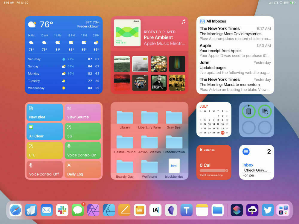
With iPadOS 14 and earlier I generally kept my Home Screen clear except for the sidebar of widgets. All my apps were in a single folder in the dock. With iPadOS 15 I’ve moved all my apps to the App Library and now have a full Home Screen of widgets which functions as a fantastic dashboard. I’m finding the 2nd largest widget sizes the most useful with just one small section for 4 of the small widgets. So, a view of my Home Screen gives me the current weather, easy access to my most recently listened to music, my most recent email, a selection of frequently used Shortcuts, my most recently accessed folders and files, calendar, current daily calories, battery status and upcoming reminders. Edit to note that I’ve since changed this by moving the 4 small widgets back to the sidebar which stays hidden. I’ve since added the large-sized Contacts widget which does a great job of providing an overview of my latest interactions with my closest contacts.
With earlier versions of, the public beta some of widgets were l a bit buggy, especially the Files widget though it seems to have settled down as of this date. Also, the mail widget does not always update recent new mail in the background as I would expect though that may be an expected limitation. Obviously having to switch to mail to see updates isn’t helpful.
I’ll mention Spotlight next because it’s somewhat integrated with the above mentioned Contacts widget. In short, Spotlight has a few new additional results added to searches. Most important for me is the improvements in it’s surfacing of my contacts related information such as photos, shared notes, messages, etc. Also, Spotlight now does more with web searches of public figures and built in web search generally. Rather than go to Safari it’s possible to just start with a Spotlight search of a topic. Web results starting with Wikipedia, images, top web results are all neatly organized in the Spotlight results. For some searches the results can be quite extensive ranging from your content, shared with you content, articles from Apple News, TV shows or movies and on. By default the extensive content categories are hidden behind a “Show more results” button.
Next, while I’m still training myself to use it the new globe keyboard shortcut is great. I forget too often to use it but suspect that as that habit takes hold it will become a really nice feature. Specifically the Siri shortcut Globe-S as I’ve always wanted such a shortcut on the keyboard. I enjoy using Siri and know I’ll use it more with that shortcut. Also, the globe shortcuts for multi-tasking are very useful. Again, one I need to practice more to more fully integrate and take advantage of. It’s not that it’s difficult so much as remembering it’s there and making it a new habit.
On the subject of multitasking, using the keyboard to navigate through app windows In the multitasking view is really nice. I normally use the trackpad but the arrow key navigation works great too.
Also in the category of multitasking, the active window indicator is still too subtle when using split screens. It’s better than before but Apple insists on making the indicator subtle enough that I have too look longer and with more attention than I should. Actually, in a nod to macOS I wish they’d offer an option to have the same red-yellow-green color scheme. Not likely and probably not that useful. But at the very least, more contrast would actually be useful.
Keyboard shortcuts are improved in presentation when using an external keyboard and the new organization of keyboard shortcuts to resemble the Mac’s categories of File, Edit, etc are nice improvements. This whole area is more compact and useful.
The Safari redesign. This one has been talked about a lot as it should be. I agree in general that it’s nice to see an effort but it made Safari worse and seemed to be an attempt to solve problems that most people don’t really have. Glad to see the dedicated tab bar back as the default now they need to take the next step of putting it where it was and also removing the extra padding that the new rounded rectangles have. It’s wasted space that hides the description of the tab. Also, the active tab indicator is far too subtle.
But there’s some good stuff with the updated Safari too. Tab groups!! This falls under the “I didn’t know I needed this until I had it” category. I’m using it a lot to create topic areas. I’ve got a climate change group and a tech group. A week ago I was searching for a new chair and had a group of tabs for that. I’ve got a group now for a new WordPress site I’m working on for a client. I expect some of these will be persistent as they are topics I always read about. Others will come and go as needed. The key is that a tab group is easy to create from any window with tabs, easy to re-open via the sidebar and easy to delete when you’re finished. It’s also easy to add a tab from any other Safari window to an existing tab group.
I’m glad to have the updated Notes and Reminders apps. The ability to tag will be useful in both of these. Also, Quicknotes in Notes is very nice though I’m not using it as much as I think I will. Notes really is an excellent app. The indexing of Notes text, attached pdfs and now text recognition in images is fantastic. It’s all very fast and shows up nicely in Spotlight. If I hadn’t recently integrated Obsidian into my daily workflow Notes would likely shine brighter. As it is though it will still have a place. It’s a great place do do photo and document scanning and as I’m currently scanning in a bunch of old family photos I’m enjoying it for that.
The updates in the Photos app are really proving useful. I love the improved metadata, editable location and machine learning that now identifies plants and other objects. Some of that was identification was already there but it’s much, much better now with more accurate results and far more specificity in the identifications. Where before Photos could show me my dog pictures it now also suggests the specific breed and has an integrated Wikipedia link. This is especially useful for all of the photos I get out on the trail for identification of plants and flowers. It’s not yet offering specific insect ID but it does recognize more general animal categories such as insect, butterfly, bird, horse. I suspect that over time range of objects for which specific IDs are offered will grow.
Live Text in photos is absolutely fantastic and useful. Not only does it improve search but if you’re someone that deals with a lot of text and images it comes in handy often. I often need the text that’s in an image for a document or a website. Lazy clients will just send a photo or screenshot with a bit of text rather than retype it for me. This is the sort of feature that once you start using it and realize how often it can be useful, well, you’ll wonder how you did without it.
Messages has some nice improvements, namely “shared with you” which integrates into all the other system apps. Nothing earth shattering but nice. I’ve not had a chance to use FaceTime with any other beta testers and am not a big FaceTime user generally but the announced changes look very helpful for those that use video calls.
A couple more tid-bits. System-wide “shared with you” is a nice new feature. Continuous dictation is great for those that like to dictate text rather than type. Especially useful on the iPhone where I’d much rather dictate than type a long message.
That’s it for the moment. There’s far more of course but they’re features I’m not going into as this isn’t really a review so much as my notes on what I’m interested in and finding most useful. The above linked mini-site over at MacRumors has all the details! Also worth noting, at the bottom of the page is a list of helpful how-to articles for iOS 15.
I started this post in July and am just now, having used the beta for almost two months, finishing off my notes. The final release will likely be coming in the next couple of weeks and with it a load of very detailed reviews.
Obsidian Mobile
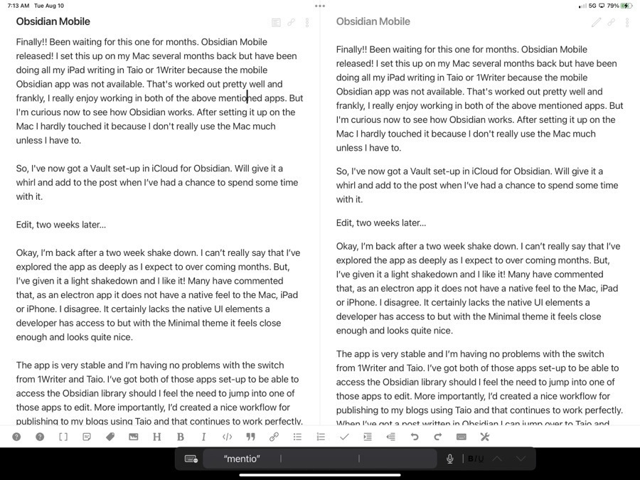
Finally!! Been waiting for this one for months. Obsidian Mobile released! I set this up on my Mac several months back but have been doing all my iPad writing in Taio or 1Writer because the mobile Obsidian app was not available. That’s worked out pretty well and frankly, I really enjoy working in both of the above mentioned apps. But I’m curious now to see how Obsidian works. After setting it up on the Mac I hardly touched it because I don’t really use the Mac much unless I have to.
So, I’ve now got a Vault set-up in iCloud for Obsidian. Will give it a whirl and add to the post when I’ve had a chance to spend some time with it.
Edit, two weeks later…
Okay, I’m back after a two week shake down. I can’t really say that I’ve explored the app as deeply as I expect to over coming months. But, I’ve given it a light shakedown and I like it! Many have commented that, as an electron app it does not have a native feel to the Mac, iPad or iPhone. I disagree. It certainly lacks the native UI elements a developer has access to but with the Minimal theme it feels close enough and looks quite nice.
The app is very stable and I’m having no problems with the switch from 1Writer and Taio. I’ve got both of those apps set-up to be able to access the Obsidian library should I feel the need to jump into one of those apps to edit. More importantly, I’d created a nice workflow for publishing to my blogs using Taio and that continues to work perfectly. When I’ve got a post written in Obsidian I can jump over to Taio and export to html then I load a new post in WordPress on Safari. It works pretty well.
And coming back again to add to this. I’ve now seen several different writers post on their Obsidian set-ups and have been following threads over at the MacPower Users forum. But today’s post by Federico at MacStories is certainly worth mentioning. It’s the first in a series on his Obsidian setup and covers Sync, Core Plugins, Workspaces and other settings. While I often find his posts interesting and sometimes helpful, he tends to go into a depth of detail that covers his very particular workflows that they don’t often translate well to how I use an app. So, I’ll at least skim his posts but unless I can easily see how it is relevant to my workflow I may not finish it. But his post above is very relevant in that it points a finger to the importance of Obsidian the plugins, various options and shortcuts.
After reading his post, the threads at Mac Power Users and a few others, the depth of features in Obsidian really do set it apart from most other apps. It’s easy to get started with the basics and then spend weeks or months just slowly poking around those depths to get to the many possibilities. That said, I’m glad it is based on Markdown files that other apps can access because even as feature rich as it is it does lack the export options that most other apps seem to have.
Using an iPhone and Apple Notes to Scan and Export Old Family Photos
I’ve started a project scanning in old family photos. It’s something I started years ago with a flatbed scanner which I no longer have. This time around I plan to just use my iPhone and Apple Notes. There are a couple things I’ve learned since getting started that might be helpful to others doing a similar project.
Before you get started scanning you’ll want to go to the Settings app and then go to the section for the Notes app. There you’ll see an option under the “Media” section to “Save to Photos”. Turn this on and every scan will be an image in Photos! Doing this eliminates the need to export from notes which the second portion of this post covers.
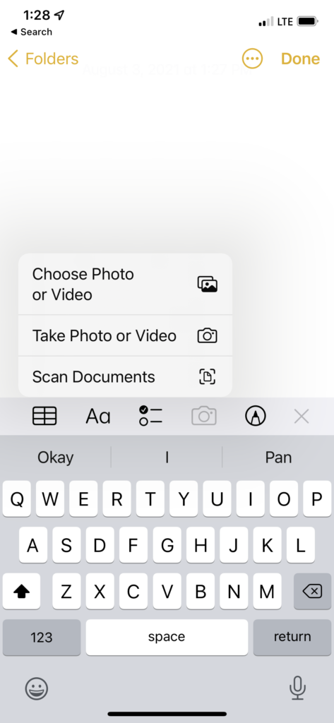
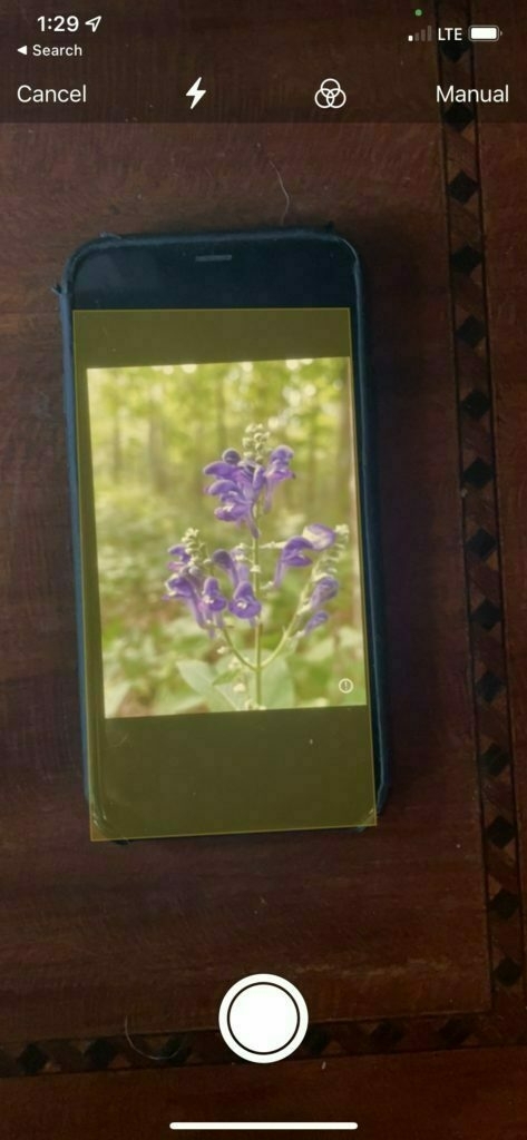
When you open a new note and choose the camera icon to open the camera you’ll choose “Scan Documents” which will open the camera and if auto is selected your iPhone will automatically capture a scan as soon as it detects a photo or document (In the image below I have mine set to manual). To stop the auto scan just put your finger over the lens or put the iPhone down on the table. It’s important to to note that the default scan assumes a color document, not an image. If you’re scanning an image, color or black and white, you need to be sure you select “Photo” as the media type being scanned. You can select this option before each scan or after. To do so tap the icon of 3 overlapping circles (for this post I’ll refer to that as the media type icon).
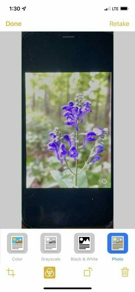
Select Photo option on the right side
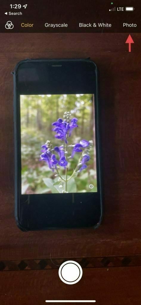
Alternatively, just start scanning your photos and once the group is scanned you can go back and select “Photo” from the media type icon seen below.
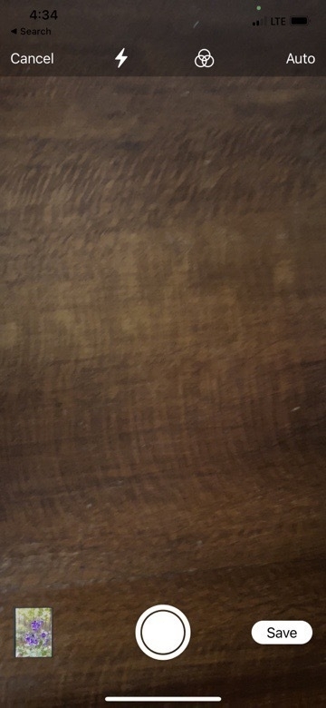
If you scanned a group of images selecting Photo and then tapping Save will then save the whole group to the Photos app. So, to summarize, you can select Photo from media type before scanning or after, then you save the images after that by tapping the Save button.
A final note, it’s possible to save groups of photos as described above. You can also just scan one at a time marking each as a photo and saving it individually.
When finished you can confirm that all the photos have been autosaved into the Photos app. You may want to keep or delete the note once you’re finished scanning.
What to do if you’ve scanned images before setting them to save in the Photos app?
If you started scanning before discovering the setting I mentioned at the top of the post that saves your scans to photos automatically, you’ll have notes full of pdf scans that seem stuck as pdfs. There’s no built in way to export those pdfs to Photos. But, there’s an easy two step process to get the scans to photos.
Before you jump into the export process an optional but important step is to confirm that your scans were done as Photos. Tap a scanned image in a note to open it. Then look in the toolbar for the three overlapping circles icon for selecting media type. Tap that and then select “Photo” as the media type. If you have a group of photos saved in a group you’ll need to go to each photo in the group and do this step. Once you’ve done this for all the scans in the note you can move on to the export.
First, you have to save the pdf scans from Notes to Files. Just long press a note with scans in the list view of your notes. In the context menu chose “Send a Copy”. From the list of options choose Save to Files. Choose the location to save your pdfs and save. Then open the Files app to that location. You’ll see a pdf or multiple pdfs from that note. If you scanned images in groups you’ll have multi-page pdfs consisting of each image.
For the second step, you’ll need this simple Shortcut which will save the pdf as an image or images to the Photos app. Install the above Shortcut into your Shortcuts app. It’s a simple 3 step Shortcut. Once installed you can select your scanned pdf file then tap share, then select the Shortcut “Convert and save to photos”. The Shortcut will run and when finished your image or images will be in the Photos app! It’s also possible to choose multiple pdfs at once and share to the shortcut as described above and all the pdfs will be processed at once into the Photos app.
That’s it, you’re done!
Keychron K2
 My favorite keyboard in recent memory has been the Logitech K811. I bought it reconditioned from Amazon seven years ago. It’s no longer manufactured and mine is beginning to fail. It no longer pairs reliably and at least one key has stopped working. I’ve got at least one other similar Logitech keyboard that can be used but I often have issues with it and the iPad Pro. I’m not sure why. It seems to cause conflict with the Apple Trackpad which I like to use if I’m using the iPad with a separate keyboard and a second display.
So, I decided I’d look for a new keyboard that could connect via Bluetooth and usb as well. And, while I was at it thought I’d finally take a look at mechanical keyboards. I type a lot and have heard lots of good things about mechanical keyboards. This past summer my nephew had one so I had a chance to give it a go and it was very nice. After looking at the less expensive options I settled on the Keychron K2. It seemed reasonable at around $80 and has great reviews. It arrived a few days ago and boy-howdy is this a nice typing experience!
First, I like the fact that it is Mac/iOS first. They include extra key caps for switching out 3 or so keys of you prefer the Windows specific symbols. As I’m running the iPadOS 15 beta which now makes great use of the globe key I’ve got the caps lock re-mapped to the globe key. It’s superficial but I wish that key had a globe icon. Yeah, that’s silly but whatever.
I plugged the keyboard into the iPad with the included and very nice braided USB cable and away we went. I’ve also paired it with the Mac via Bluetooth. I’ll pair it with the iPad Pro as well but with the iPadOS beta Bluetooth is currently somewhat buggy so I’ll wait till that get’s fixed.
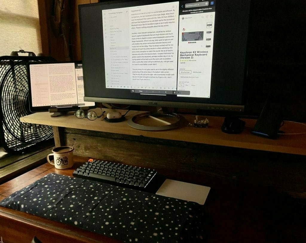
I ordered the keyboard with the brown switches from Amazon but was sent the blue switches which are, as I understand it, the loudest of the three options. It’s not a problem as I live and work alone and they’re not that much louder. Many of the reviews mentioned that the keyboard, being quite tall, is best used with a wrist pad. I have lots of scrap wood boards that I save for projects and found a piece of cedar that was the perfect width and height to match the keyboard. I gave it a light sanding and it’s perfect. Actually, adding this a few days later, I went with a piece of wood that was both deeper, wider and taller than the keyboard. The larger and taller plank provides a platform for my entire forearms rather than just my wrist and hand. I’ve got it covered with some soft flannel and it’s very comfortable. I’m still experimenting with the best position for the trackpad.
The two things that come to mind when describing the typing experience on the K2 is that it is comfortable and efficient. By comparison, the last keyboard of this type (large, deep keys) was the keyboard that came with the iMac G5 from 2006ish. I still have that keyboard as my usb back-up for the occasional Bluetooth issue. But it’s horrible to type on as it really requires effort. There’s nothing enjoyable about the key action.
Another, more relevant comparison, would be my various recent Logitech keyboards that are much thinner and much more similar to Apple’s scissor switch keyboards used on the Magic Keyboards. Which is to say, fairly quiet to type on and with shallow key action somewhere between bouncy and mushy but not too clicky. They’ve always worked well for me. With the K2 each key press results in a fairly satisfying click and a clicky sensation to match the sound. Not at all hard to depress and with a firm bounce back. I suspect that once I’ve gotten used to this keyboard, perhaps another day or so, my typing speed will be back up to the norm with no problem. (Edit a week after initial writing to add that yes, I did get used to it and it’s even better a week later!)
The only thing I’m not quite used to yet is the slightly different positioning of the arrow keys in the bottom right corner. They’re only off a bit to the right with a somewhat smaller shift key but it’s been enough to confuse my fingers a bit. I don’t doubt that I’ll get used to it.
Review: Logitech Combo Touch for the 12.9” iPad Pro
At the the core of my love for the iPad are the many possibilities that come along with a touchscreen tablet. I particularly enjoy the variety of keyboards and stands that make for the modular computing experience that seem to define this form factor. Whenever the subject of external keyboards and cases come up, it’s common for people on the internet to ask, why not just get a laptop? The simple and best answer is that I can’t remove the screen from a laptop. It’s permanently attached. And, along with that limitation, I cannot rotate a laptop from the horizontal position to a portrait position.
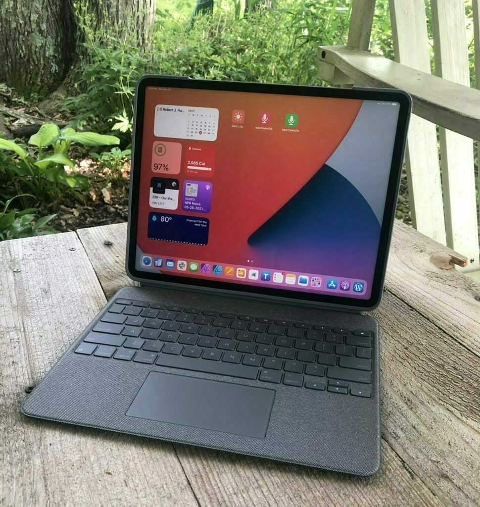
The options I considered Of all the keyboard cases I’ve tried with all of my iPads since 2010, I think this Logitech Combo Touch may prove my favorite though it’s too soon to be certain. I’ve been very happily using Apple’s Smart Keyboard portfolio that I’ve really enjoyed using the past 2+ years and considered just updating that to a new one. In the end my desire for a trackpad and backlit keyboard led me to consider Apple’s Magic Keyboard for iPad, Brydge’s Max+ and Logitech’s Combo Touch. I chose the Logitech.
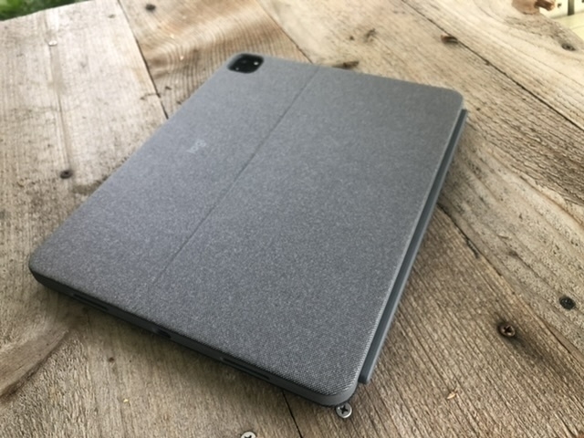
Comparing features The outer material Apple uses on the iPad keyboards has not been durable in my experience so that was a strike against the Magic Keyboard especially at the price Apple asks. Add to that the missing row of function keys and it seemed I should keep looking. The Brydge Max+ was the next choice but was less protective along the edges of the iPad. And when removing the iPad from the Brydge to use hand held it would have no protection at all. It also costs more and would not be shipping till June. Lastly, Brydge has a mixed track record in terms of quality control. That left the Logitech which offered the best protection, earlier shipping and the least cost. Another plus with the Logitech was the built in kickstand for use with the iPad propped up without a keyboard. I also thought I’d like the textured fabric-like covering on the Logitech. The biggest drawback is that due to that kickstand design it has a very deep footprint and the reviews are mixed as to how that works in the lap.
It’s only been a week but here are some thoughts. I like the feel of this case just as I thought I would. The fabric-like texture is very nice, much preferred to Apple’s. It feels nicer and does not show oily smudges from contact with skin I’m really happy to have the iPad protected in a case that seems sturdy but I’ll note that it’s thinner and lighter than I expected.
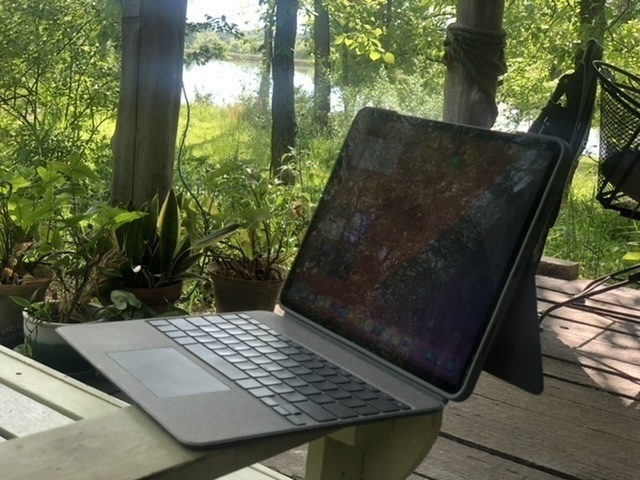
The keyboard itself is excellent just as I’ve come to expect from Logitech keyboards. Now, I should say, I’m not that picky and am fairly adept at adapting to keyboards but this one feels very well made and I type well on it. The row of function keys is a very nice feature to have and happily has screen brightness, keyboard brightness and all the other expected functions. I’m super happy that holding the lock key in the top right corner functions as a Siri key. I like using Siri but don’t like reaching up to the iPad corner button. And Hey Siri sometimes has other devices respond rather than the one I’m using.
The trackpad works pretty well. I did turn off tap to click as there’s not much palm rejection going on and so the cursor jumps all over with the slightest touch. So, still getting used to the click to click as I’ve gotten used to tap to click with the Magic Trackpad I’d been using at my desk. But the clicking works very well in all areas of the trackpad. Also, there’s a two finger click to bring up the contextual menu and that works perfectly. Lastly, scrolling and all the gestures work fairly well and smoothly. All in all, the trackpad is excellent.
What about the deep footprint? Well, when I’m using in my lap I’m almost always in my tiny house with pillows nearby and my general habit is to have a pillow in my lap. This works perfectly with the kickstand folded all the way back to it’s lowest position then propped up on the pillow in my lap. If I need to adjust how I’m sitting or move the pillow or my legs it’s easy to just reach up and adjust the angle of the kickstand to keep it stable and at an angle I want. It’s not as sturdy as I would get with the laptop style of the Brydge but it does work very well though I can imagine scenarios where it does not work as well due to more limited space.
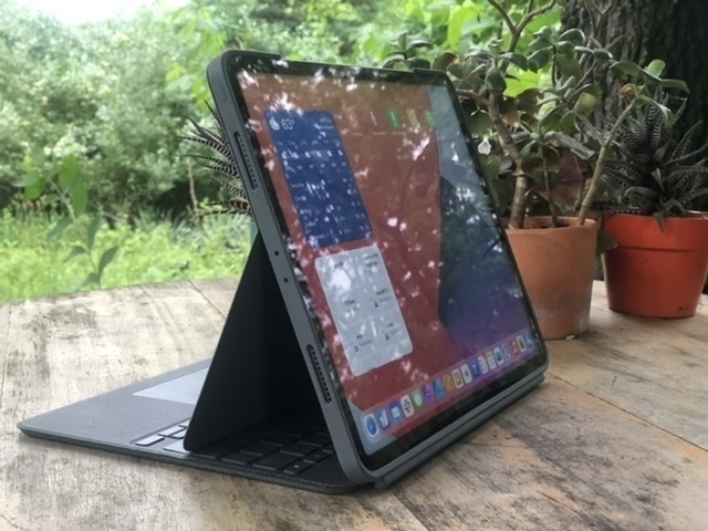
I love the iPad as both a tablet and a laptop. With this case and keyboard I can very easily pull the keyboard off the screen and still have my iPad sitting up on it’s own and still protected in a case. This is often what I’m doing when I just want to read or watch video. I can set the keyboard off to the side or even flip it backwards and reattach it as a base but with the keyboard deactivated. This last point is one of the most important of all because with this case the modularity of the iPad as tablet and laptop is at it’s best.
Experiments with Markdown Editors, Saving Content and Obsidian
Background
This post began as a post over at this thread at the Mac Power Users Forum. I started with Obsidian a couple months back but a funny thing happened. Because I do most of my computing on the iPad and there was at that time no Obsidian mobile app (it‘s in beta now), I started with my trusted iA Writer for the back-end editing of files but it does nothing with Wiki links. So I moved to experimenting with a couple of other Markdown apps, 1Writer and Taio as they both do well with wiki links (more on these two apps later). I figured I’d just hop onto the Mac occasionally to use Obsidian. A couple months in and I’ve hardly touched Obsidian but I’ve been much more proactive in writing of daily notes (a new practice that I’d long pondered) and more writing generally as a result of starting the day with daily notes.
Another result is that it’s got me thinking more actively and critically about what/how/where/why I save files. In yet another post at Mac Power Users, the topic of saving web pages as html rather than pdf files also got me thinking about file format as it relates to what I do with stored files. As a part of considering my intent, I’m also considering the saving process and the information I actually want to save. To put it plainly, I’m trying to be very deliberate about my accumulation of information I may never need. Be it whole files, text, or images embedded in pdfs, etc. The deliberation and a slightly different process adds a bit of friction but that’s good in this case. I’ve generally been pretty good about not saving everything just because I have the thought this might be useful someday. It’s a trap a lot of people seem to fall into.
An example, a few nights ago I happened upon a recipe and considered whether I wanted to save it. Recipes are a new thing for me to bother with but I am starting to save a few. Rather than just save to pdf I used a shortcut to save a markdown/text file to Files in my 1Writer folder. I hop over to 1Writer and open the new document, clean out any cruft and tag it both in the text and also in the Files app. Within just a minute or two I have a very tiny, tidy, portable text file that works in 1Writer and Obsidian and also fairly easy to find in Files/Finder. I’ve since created a Shortcut that outputs nice, clean markdown via reader view which I’ll mention later.
So, rather than dive into DEVONthink (which I had been considering) as a catch-all tool my plan is to go the opposite way. It’s also got me looking at how I use Apple Notes… largely, I’ve been far too lazy and sloppy in throwing stuff in there and not cleaning up after myself when notes are no longer needed. So, avoiding the trap of over-collecting via DEVONthink, cleaning up Apple Notes, and now…
Markdown Editors
Gah!! I consider this useful fiddling but I try to keep app jumping to a minimum as that seems to be a huge time suck. That said, I’m experimenting just a bit. As I mentioned, iA Writer is the app I’ve been using for the past couple years. Love it for compiling podcast transcripts, writing and blogging. But it falls short on Wiki links. So I did a little poking around and found Taio and 1Writer. Here’s how they compare.
Overview
Exporting
Both apps offer a variety of export options though with a very different interface. With Taio I’m presented with a simpler interface to export files to markdown, pdf, html, Docx, RTF and web archive or by copying text to clipboard as markdown or html. After selecting the standard share sheet interface comes up.
1Writer has a preconfigured set of export options with similar formats:
Nearly equal but Taio offers Docx and web archive, neither of which I need but might be useful to some. 1Writer allows for creating new actions for sharing but I’ve not explored what’s possible there.
Shortcuts and automation
Taio is much better in this regard! It offers a variety of actions to the Shortcuts app as well as it’s own built-in shortcuts like action editor. It’s not even close. 1Writer offers 1 action for Shortcuts which is to create a new document. Better than nothing! Taio offers 11 actions. Most important of these in my use thus far, I’ve got a shortcut that takes a web page I want to save, generates cleaned up markdown with a link to the page at the bottom. The Taio version of this shortcut results in an actual file containing content. The 1Writer version creates a new file for me with the text copied to my clipboard. All I have to do is paste it in. But it seems silly that there’s no way (that I know of) to create the file with the content already intact.
The built-in action editor in Taio seems very powerful. I’ve not explored it much just yet but I did create 1 automation to create a daily log file with a pre-populated template and ready to go. I’m looking forward to using it a bit more.
Extras
Last, Taio offers an interesting clipboard saver. I’ve not used it much and I’m not sure I will but it’s there and might prove useful. I’m not really prepared to offer any thoughts yet.
Both of these are excellent markdown apps that will create a folder or folders of markdown files that will play well with Obsidian. Not only are they feature rich in terms of editing they are excellent for viewing, interacting with and exporting documents. For the moment I’ve currently settled on 1Writer and expect that to stick for awhile.
All this to say that it’s great that we have so many apps/tools but I’m recognizing how easy it is to get lost in them, jumping from one to another looking for the perfect tool with all of the exact features we need or think we need. It’s easy to focus on the new shiny tool rather than actively engage with and use the information in a meaningful way. I suppose that’s one of the pitfalls of being a geek.
I guess that was a bit of a sidetrack but I think in looking at the bigger picture it can be helpful to ask what it is we’re hoping to do with apps. I expect I’ll get around to actually using Obsidian more often and it’s feature set will prove helpful when I need them. But for the most part I’m currently just enjoying the focus on writing and more active engagement with information processing for a more tidy and deliberately curated set of open, accessible files.
Video Workflow
Last year when I started cycling a couple of family members suggested I get a GoPro. Partly to share with them but I think also because they were concerned with my safety and thought having a camera could be useful were I to have some trouble while out riding around. I eventually got one and have used it a good bit to record some of my rides. All for fun as I have no serious social media goals.
Of course I‘m working from the iPad and needed to figure out some sort of workflow. It‘s been messy! I‘m not sure if I‘m making it more complicated then it needs to be but I suspect that video workflows can indeed be a bit tricky. I expected to edit in LumaFusion. The question how and where to transfer files.
First, I started with the GoPro App and it‘s a terrible mess. It starts and seems inclined to work in portrait mode. Sometimes it can be coaxed into landscape but often goes back to portrait. Probably intended to be a phone thing. Only thing it‘s good for is letting it auto-create a few clips for a quick share. I made the mistake of getting in the habit of connecting to the camera wirelessly to transfer files to the app and then exporting. It took me far to long to figure out that it‘s a bad method as getting the raw clips out is overly complicated.
First, these clips should be accessible in the Files app but they are not. Second, any attempt to share a clip also seems to export the clip to the Photos app whether you want that or not. So I end up with the shared, exported clip but also a video in Photos. It‘s an extra file that I don‘t want backed up to iCloud photos so I have to delete it before that happens. So, if I come back after a bike ride with 10 video clips using the app to get those out for editing is more difficult than it needs to be if I‘m using the app. If I let the files accumulate in the app as I did then getting them backed up to an external device is really time consuming. I ended up saving them all to Photos then exporting to an SSD. Would have been great to open two Files windows and just drag and drop.
Okay, with that out of the way, my process going forward to skip the GoPro app altogether. I‘ll plug the GoPro into the iPad and import directly to Photos. Again, with I could mount the camera directly in Files as a storage device. At some point I might consider getting a new hub with built in flash reader which would allow for that. For now, I‘m importing to Photos and then saving to an SSD via the Files app. Now, just to point out, LumaFusion can access files directly from Photos so why not just work from there. Well, as mentioned above, I don‘t want all these files using up bandwidth and storage in iCloud.
Okay, so, GoPro camera to Photos to SSD. The last step with LumaFusion is to create a project and add media. For this I have to import media from the SSD to LumaFusion which, in turn, copies the files from the SSD to a local folder on the iPad. This works but, again, something to be aware of when thinking about iCloud back-ups and bandwidth so I‘ve excluded this folder from my iCloud back-ups. Problem solved! Mostly. My iPad is the 256GB version and really, now that I‘ve cleared out the accumulated media from the GoPro app I‘ve got plenty of space for any active LumaFusion projects, over 120GB of free space. It would be great if LumaFusion projects could link to external storage devices for media without copying over locally but to my knowledge this is not possible yet. But given my level of use I‘ll get by with no problems.
Still here!
So, it’s been awhile. Almost a full year since my last post here. But really, that’s just the way it goes. Interesting, looking at my last two posts from Late March and April 2020 explains why I’ve not posted here in a year which is to say that not much has changed that was really worth posting about. There are plenty of websites in the world sharing the details of Apple related news. Lots of sites discussing using Apple tech. This site is my journal of sorts where I’ve enjoyed sharing my work or my tech journey as it evolves and over the past year it has been steady-state. It’s been a fantastic year but with no new developments in how I’m using my iPad or other related Apple gear. Looking at the last two posts made me laugh because as I sit here writing I realized why I’d not posted: my set-up is exactly the same.
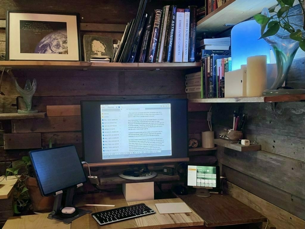
My iPad Pro, Smart Keyboard Portfolio and the Magic Trackpad 2 in a scene that is nearly identical to the second image in my March 31 post which was captioned:
“My current set-up changes all the time. Sometimes used with a keyboard, mouse and monitor on a desk, other times outside on the porch or under a tree. It changes based on the task.”
And in that context, it’s true, my set-up changes based on my location but it’s the same iPad, a keyboard and if at my desk the Magic Trackpad. I’m still doing the same work with mostly the same apps and it’s all been fantastic. If anything, I would just offer that I’ve had another successful year getting work done on my iPad though with Covid it was less work, it was enough to get by.
I suppose I’m posting today just as a check-in. To re-affirm that I’m here and still actively, happily using my Apple tech. But generally speaking, I’m not inclined to post just for the sake of posting.
But there is Apple-related news on the horizon that might be worth commenting on. Well, there’s been some of that over the past year for sure, most notably the M1 Macs, the new and widely acclaimed Magic Keyboard for iPad (which I surprisingly did not purchase), and the usual fall operating system upgrades. All significant but none of which were enough to prompt a post here as I wasn’t using the new hardware released and the software changes were, as expected, incremental.
I’m a little antsy about the possibility of a new iPad Pro being announced and I still ponder the purchase of the Magic Keyboard for iPad but given how well my current set-up works I’m not sure I’ll buy anything. My 2nd Apple Smart Keyboard Portfolio is showing the same wrinkling and bubbling that the first one did before being replaced under warranty. Eventually I’ll need to replace it with something. And in the 2+ years of use I’m definitely seeing degradation in the iPad battery. I’m just not sure it warrants replacement yet because for the tasks I use it for it remains a very fast and capable computer. So, ¯(ツ)/¯
What I‘m hoping to see is currently rumored USB C with Thunderbolt which might also come with an iOS update allowing for better external monitor support similar to what we saw last year with the big mid-cycle release of trackpad support. If I were able to have a second desktop on another display (not just the mirroring that we have now) that took full advantage of the full screen width without the black bars on either side, well, that would likely be enough for a purchase. Add to that the faster processors and 5G (in my area I‘m getting excellent 5G thanks to Sprint/T-Mobile) and that would be a very solid upgrade. Though I‘m still not sure what I‘ll do for a keyboard.
iPad and a Magic Trackpad 2
Last week marked the 10 year anniversary of the release of iPad and I shared a few thoughts. In it I mentioned the recently released iPadOS 13.4 update which added cursor support. At the time I posted I’d been trying it with a Bluetooth mouse and found it fairly helpful though lacking in a few things, namely the swiping gestures that are so integral to using an iPad as a tablet.
For the past day I’ve been using Apple’s Magic Trackpad 2 with the iPad and as many have pointed out, it’s pretty fantastic. Of course, interacting with text on a screen for editing is great but, more importantly, the Magic Trackpad 2 fully supports all the gestures that make the iPad a great tablet. For the first time ever it’s now possible to use the iPad in an elevated stand without reaching up. In the past I worked around this by using keyboard shortcuts which works pretty well. Apps like Pages and Numbers are greatly enhanced with the new cursor and trackpad. LumaFusion is another great app that’s working very well with the cursor-trackpad combination. I’m sure many other apps work great as is or will be enhancing what is possible.
About the keyboard, it is often still faster for some tasks than using the trackpad and cursor. For example, app switching via touch on the trackpad is nice but often is much faster via Command-Tab on the keyboard. An even better example, Spotlight, which I use constantly, is faster via keyboard because it works from anywhere. With the trackpad the two finger swipe down to activate Spotlight only works from the home screen.
All that said, having the new cursor is a great new option and it works perfectly with the trackpad. This configuration, a raised iPad or an iPad with an external monitor with a Bluetooth keyboard and Magic Trackpad, is going to be a really useful set-up.
A last thought about the upcoming Magic Keyboard for iPad. I’m going to pass for now. It’s the perfect device for the iPad and exactly what I’d love to have. But I’ve already got the Smart Keyboard and I’m just not sure about how much work I’ll have given the current Covid virus situation. I opted for the Magic Trackpad because it will give me the option to use the cursor in an efficient way for a lot less money and has the added bonus of working great when I’ve got the iPad in a stand.
iPad Journal: A Decade of iPad
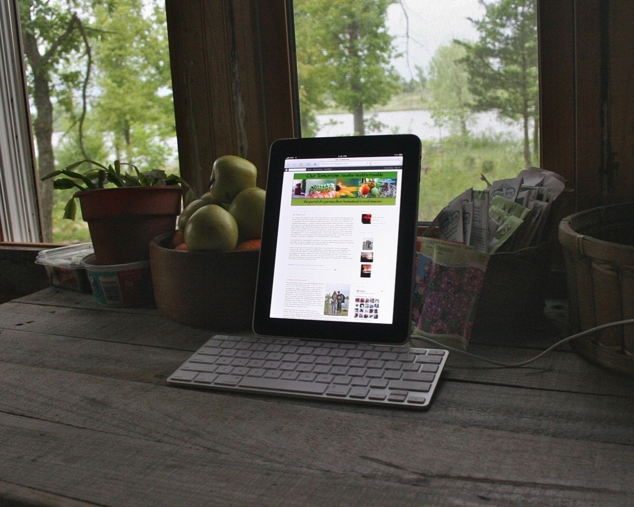 My original iPad docked in Apple’s Keyboard Stand
On April 19, 2010 I got an email from Apple:
Thank you for your recent order of the magical and revolutionary iPad 3G.We would like to confirm that your order will be shipped in late April as communicated at the time you placed your order. You will receive a confirmation notice when your order has shipped.
Woot! According to Wikipedia the first iPad was released on April 3, 2010. Like many Apple nerds, I remember watching the keynote when Steve Jobs introduced the original iPad on January 26, 2010. I ordered it the day it became available for order. I was far more interested in the iPad than the iPhone which I didn’t purchase until 2012.
My iPad arrived a few days later and, like many (3 million were sold in the first 80 days), I loved it. But in my case I was immediately curious about the potential for using the device for work. One of my first app purchases was Gusto which was one of the first coding and ftp apps. For an early gen iPad app it was surprisingly capable and I used it fairly often. Here’s an excerpt of my mini-review of the iPad which makes pretty clear how quickly the iPad became a part of my workflow:
So, I finally have internet access at the cabin thanks to a new iPad...For now I’m making an effort to actually do the work on the iPad which means adapting my normal Mac-based workflow. I’m using Gusto for html editing and ftp. It’s a pretty good app and allows me to get most of the work done. The exception is image editing and uploading of images. For editing my Blogspot blog I’m using BlogPress which works pretty well. For web browsing on the iPad I’m using iCab Mobile rather than Apple’s Safari because iCab has a much better tab system which does a better job of caching files and is much easier to switch between tabs. For rss reading I’m using Reeder which is by far the best rss reader I’ve found for the iPad. NetNewsWire didn’t cut it.
Depending on how well this goes I may end up jailbreaking which will allow for me to share the iPad internet connection to my MacBook Pro for working the old fashioned way. We’ll see.
Yes I think this is a fantastically cool device. I can now easily update my blog, check email and update my clients' websites all from home. The AT&T network here is the slower Edge network but it’s better than nothing. I’m averaging 40-70k a second, which is basically dial-up speeds. Plenty to take care of the basics though I look forward to the day we get 3G!
Ha. I can’t believe how long I got by with 70K internet. And when 3G came it wasn’t much faster but I was happy to have it! I did jailbreak the iPad for the hotspot function but the iPad remained an important part of my workflow.
By the time the iPad 2 was announced in March 2011, 15 million original iPads had been sold. It was with the iPad 2 that I saw many in my family become daily computer users. My granny, mom, aunts and an uncle all became regular users of email and the web with their first iPads. The iPad became the primary computer for many, if not most of my extended family.
I often get frustrated when I hear tech nerd podcasters and writers discuss the iPad because they make it all about themselves. I think they forget or omit the important fact that many, probably most, iPad users were and probably still are users for which a simple iPad is better. The iPad, as introduced by Apple, was a computer for any person, not just advanced users that were already served by desktop and laptop computers.
In the years since the introduction we’ve seen that tension stretch and pull at Apple as it has attempted to reconcile the simplicity that serves beginner users, young or old, and the more complex needs of power users like myself that gradually moved to adopt the iPad as primary computers. Ten years on and it seems to me that the pro-class users that finds voice in the tech media are getting what they’ve been clamoring for, a more powerful iPadOS that matches up to the power of the hardware. Even so, anecdotally, the more basic users (such as my above mentioned family) are still happily using their iPads. I suspect that this reflects Apple’s gradual evolution of features with the basic features still on top while more advanced features remain optional for those that want them.
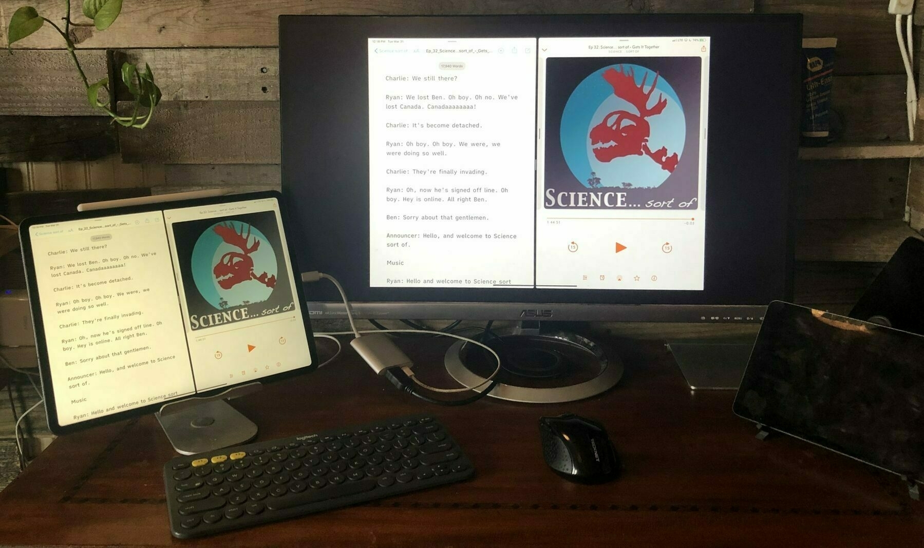 My current set-up changes all the time. Sometimes used with a keyboard, mouse and monitor on a desk, other times outside on the porch or under a tree. It changes based on the task.
One of the often repeated questions is if the iPad is going to get all these features, why not just use a Mac? Or was Apple wrong with it’s approach as it seems to be moving the device closer to Microsoft’s approach with the Surface. I think the answer is pretty simple. The iPad is still a tablet first. That’s all that really needs to be said. On a fundamental level, any user can pick up the iPad and do everything they’ve been doing for the past 10 years using their fingers. It’s still a touch first device.
For those that want to do more we have more advanced features ranging from multitasking to multiple instances of the same app to added input options via the Pencil and now a mouse and trackpad. None of these features are required to use an iPad but they are now there for those of us that want them.
I think this is the real strength of the iPad is this flexibility of form factor. For my aunt it is still just a big iPhone, a bigger slab of glass that she can use by tapping with her fingers. It’s still easy for her to send an email, browse the web, send a message, save a photo or play a game. She does these things everyday and has for 10 years. When she ordered the very first iPad she also got the keyboard Apple made for it but she never used it. She wanted the big iPhone, a tablet that was easy to use.
On the other hand I bought and used that keyboard. And many Bluetooth keyboards in various shapes and sizes since. I still use the iPad as a tablet and appreciate that I can do so. But I also use it with a keyboard and sometimes attach it to an external monitor and now I’m also using a mouse with it. Not all the time, but some of the time. When the Magic Trackpad arrives this week I’m sure I’ll use it most days that I use my iPad for certain tasks. Other times it will sit on a desk.
The first 10 years of the iPad has been a hardware and software evolution as will it’s next 10 years. I suspect that going forward it will retain the surface-level simplicity as it’s depth of power-user features increase. I’m looking forward to where Apple takes the iPad and have little doubt that it will continue to serve a wide variety of users in the future. On a personal note, I’ll happily continue to use the iPad everyday whether I’m holding it in my hands, using it in a stand with an external keyboard and trackpad or attached to the Smart Keyboard Portfolio. The iPad is still the personal computer I prefer to use for work and fun.
iPad Journal: Zugu Case Review
As I mentioned in my recent post about my evolving iPad workflow and workspace, I’m currently trying out the iPad Pro in a Zugu Muse case with an external keyboard. This is a change from recent months using the iPad with no case and having it in a stand when typing or hand-held for browsing. Previous to that I usually had it in the Smart Keyboard Portfolio.
Briefly, the move to the Zugu case is not so much about protecting the iPad (though the case is designed to be very protective and in that regard it’s much better than Apple’s Portfolio) but more about having a variety of angles possible as well as ease of use in my lap or on the futon beside me.
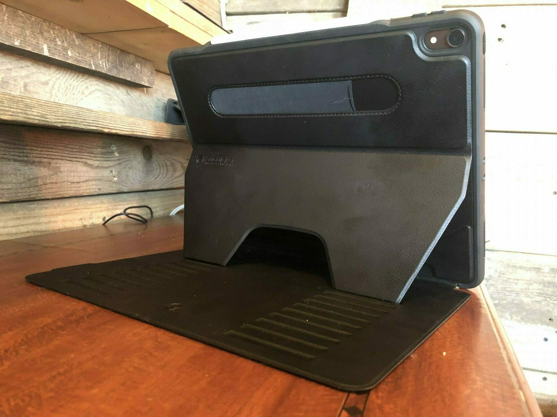
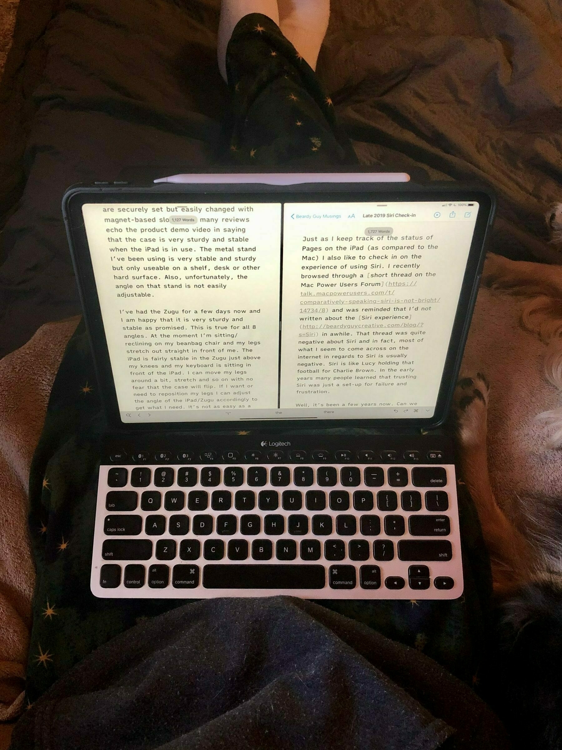
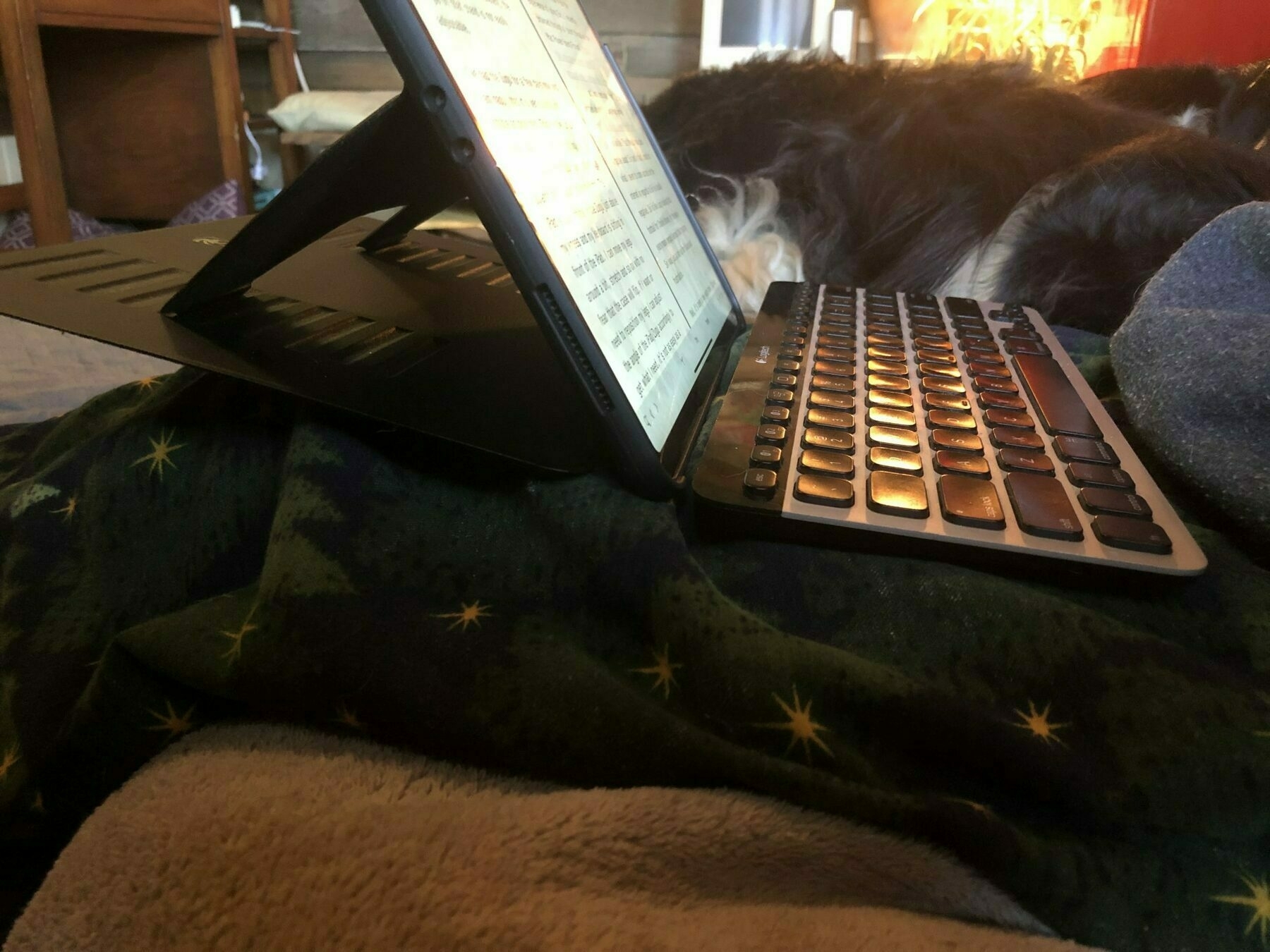
I have only three critiques at this point.
First, when, changing the angle I do have to be careful to get both of the slots set. The magnets are very strong once the folding flaps are in place though.
Second, there is room for one more slot closest to the iPad/hinge that would result in an even more vertical position and still retain the stability of the other positions.
Third, I’m still not quite sure what the best way is to pick this up when I’m moving a short distance, say from my futon to the desk 10 feet away. It just seems a bit clumsy to move around. In that regard, the Smart Keyboard Portfolio seemed a bit more stable and sturdy when picked up in it’s typing position and moved. With the Zugu sometimes I’m not sure where to put my hands when picking up and as a result I’ve knocked the folding brace from the magnet slots a few times causing a moment of panic as the cover/bottom flops loose. Perhaps more practice?
So, to compare the set-up to Apple’s solution, the Smart Keyboard Portfolio. For the 12” iPad Pro the SKP is $200. I love the typing experience of the SKP and find it very stable in the lap. It does not flop around or seem unstable at all. The downsides: lack of backlit keyboard, no special function/media keys and only two angles to choose from.
Another downside with the SKP, as I mentioned in my previous post, I’ve already had to replace it once. From my experience with the current and previous version I expect that these cases won’t last for much more than a year given the amount of daily use they get. Now, I’ve got a replacement under warranty that should last another year. But, $200 for a keyboard that only lasts a year, so two keyboards in two years at $200. That’s not acceptable. These should be more durable. I expect to use this iPad for at least 2 if not 3 more years. A $200 case should last 3 to 4 years.
The Zugu with an external keyboard, usually my beloved Logitech K811, is still fairly mobile. The Zugu and Smart Keyboard Portfolio weigh about the same and are about the same thinness. But, of course, with the Zugu there is the added weight of a separate keyboard though it is a more functional keyboard. I’ve also got the very thin and light Logitech Keys-to-Go that I can take instead though it is less functional and not as nice to type on.
As mentioned above, the iPad in the Zugu is very stable and a pleasure to use at all 8 angles, on the desk or shelf or on my lap or on my chest when laying down. It does not easily tip. The separate keyboard can be a hassle at times but is a great benefit at other times.
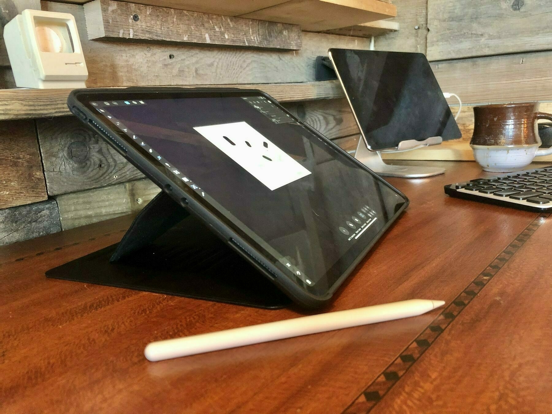
My tentative conclusion in comparing the two is this. If Apple sold a more durable Smart Keyboard Folio with backlighting and the special function media keys that would be my choice. I’d be willing to forgo the 8 viewing angles. But, given what that product is today, I would go with the Zugu and an external keyboard. The 8 slots are very useful and having a backlit keyboard with media keys is something I really do like to have. And considering the cost, the Zugu and an external keyboard also make sense. The K811 and Zugu is less that $170 and other keyboards are even less. I don’t yet know how durable the Zugu will be but it is made very well so I’m hoping it will last at least 2 to 3 years.
A final note (for now) and a consideration. Apple’s product is 1 piece, the Zugu and an external keyboard, 2 pieces. There are times when a 1 piece, laptop like experience is better. There are times when separate is better. In my scenario I think I’d choose the 2 piece because of where I usually sit to work.
iPad Journal: Shortcuts Update
Many in the iOS user community really, really love Shortcuts. This is especially true of the iPad power users. There are some that have made Shortcuts a key component to most of their workflows.
Apparently I am not one of these users. Way back when it was Workflow I built out a few and downloaded a few. I usually ended up just using 2-3 of 20 that I had. And that’s fine. Sometimes you don’t know what’s going to prove useful and it doesn’t hurt to try. The app is now Shortcuts and is more deeply integrated and more powerful. I’m using it more than before but nothing like what some do.
A few thoughts. When I see what power users like Federico Viticci, Mathew Cassinelli and David Sparks do with Shortcuts I’m often not sure whether I should be impressed or if I should laugh. I’ll explain.
There’s no doubt Shortcuts is a powerful way to assemble workflows. But often what I see happening is the creation of Shortcuts that don’t seem to do much more than what an app can do on it’s own. Or, it may just be that the examples provided are un-relatable to my needs as they are often very specific to the workflow of the user. And for that user it seems they are very useful.
Something else I’ve noticed, and I’m sort of restating the above, but many shortcuts seem to just be solutions in search of a problem. Again, solving something that already is solved in the app. I can illustrate with an example that popped up on Twitter as I’ve been writing this post. Federico has tweeted that in this week’s Club Mac Stories he is introducing a new series on using Shortcuts with the Apple Music API. His tweet states that:
The first shortcut I'll share lets you search the entire Apple Music catalog in 2 taps.
That’s pretty cool. But here’s the thing, I can do that right in Apple Music. If I long press the Apple Music app icon I can jump right into a search in Music. Or, I can Command-Space to open Music then tap the search icon at the bottom. His shortcut allows for first typing a search term then presents a list of choices: song, album, artist, and playlist then presents the result. I’m just not sure that’s any faster.
Much of what I see being presented by Shortcuts enthusiasts falls within this category of tasks that apps already do without a shortcut. That said, I think Shortcuts can be very useful. In my case I get the most benefit when I use it to do specific utility type functions that iOS itself does not do. Or, it provides a noticeably faster way to do something.
Here are examples of my current favorites and they are fairly simple and usually saved as widgets for quick access:
Another example. With iOS 13.2 a new feature is handoff from iPhone to HomePod or HomePod to iPhone. Sounds nice but in practice that’s been very slow or unreliable for me. Instead, I’ve got a Shortcut which has the added benefit of also working with iPads. If I’m playing a podcast or music on iPhone or iPad I can tap a widget or icon on my home screen to very quickly send the audio to the HomePod. It’s quicker and easier than using the Airplay picker which sometimes seems to have a long delay. BUT, I have to tap. I should be able to use Siri. It would be very cool to step inside after a walk and just say “Hey Siri, HomePod” to have my audio hop over to the HomePod. But there’s an error and it fails. While I mostly want to do this from the Phone I’ve also tested with iPad and it fails there too. Again, why?
Oh, and a note about using shortcuts that have been saved to the home screen, this experience feels weird because it actually opens the app when it runs the shortcut. Why not just do it with a progress indicator in the icon similar to what we see when an app is updating? Having the whole app open up seems janky.
I love the idea of Shortcuts but in practice it’s still bumpy and still very much for the tech crowd. I’ve asked my extended family and of 16 or so using iPads and iPhones, ranging from young students to older, retired folks, not a one is using Shortcuts. Most of them don’t even know that the app exists let alone what it does. And really, I think that’s for the best. I consider myself a fairly advance iOS user and if I’m struggling with Shortcuts they would very likely have an even more frustrating experience.
All that said, with iOS 13 Shortcuts have taken a big step in the right direction. I hope Apple keeps pushing it forward. I’m not sure it will ever be an app for most people but there’s great potential there for power users if reliability and consistency can be improved.
iPad Journal: Workflow and Workspace Updates
A few updates...
iPadOS
I’ve been using iPadOS now since installing one of the early public betas in July. Word on the internet has generally been constant complaint that iOS and iPadOS 13 have been way too buggy. In my use I would not agree. It’s been buggier than iOS 12 which was notable as one of the more stable iOS releases in years. But my experience is that 13 has been a fairly stable release.
The most noticeable bug in my use has been slowness in working with the new Files app. In general use Files is actually quite fast but when I’m using other apps and have need to pick a file for uploading to a website or attaching to an email, I often have a fairly long delay while I have a blank Files picker window. Eventually, usually in 30 seconds or so, the app will show the files and I can carry on. As of mid-November recent incremental updates to 13.2 seem to have fixed the problem.
The most notable changes that have a positive impact on my workflows:
Accessory and configuration changes
In August I had my Smart Keyboard Portfolio replaced under warranty. I’m using the new one less. Partly due to concerns about longevity I’ve been limiting use to mobile use out of the house. In the house/office I’m spending more time with Bluetooth keyboards and different stand/shelf arrangements. One thing to note here is that during the colder months my tiny house interior is my primary workspace and I often make use of perspective changes to keep things interesting. I can work at a window, a beanbag/futon, my desk or standing desk. It’s a small space so I’ve done a lot to maximize the ways I can use it. You’ll note in the image of my desk that the wall contains a variety of shelves. One or two of those often has an iPad on it. It’s easy to adjust as needed for different heights and positions.
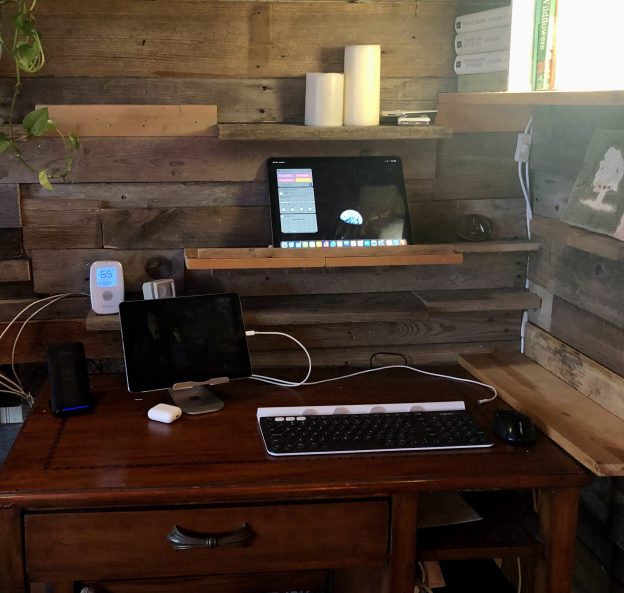
An interesting and fun result of the change from the SKP is that I’ve been using the iPad with no case. It’s either in a stand or on a shelf when I use a Bluetooth keyboard with it. Or it’s in my hands being used as a tablet. Either way, I like this non-laptop arrangement as it feels more true to the iPad. It’s quite nice to have the iPad up at eye level while I’m using an external keyboard with it. In those cases I’m using touch less and am relying more on keyboard shortcuts to navigate between and within apps. Or using a Bluetooth mouse.

When I want to use the iPad as a tablet it is super easy to pick it up and use. With the Smart Keyboard Portfolio I often kept it in the case and just folded the keyboard back behind the iPad. That was fine as it was easy and the case was pretty light, so, very little friction. But there’s even less friction with this new arrangement and no case at all weighs even less!
A side benefit is that because I’m relying more on the multi-device Logitech K811 keyboard I can very easily switch between iPads. I tend to switch to the older iPad Air 2 in the evening. I just put the iPad Pro on the desk for charging and grab the smaller Air for the evening. The same shelf/stand combination by my beanbag works for either iPad and the keyboard is always there. Yet another side benefit, as much as I like the feel of typing on the Smart Keyboard, the K811 remains my favorite keyboard to type on and of course, it has backlighting and media/function keys. It’s a pleasure to use.
All that said let me now completely contradict myself! I’m about to try out a change which would be putting the iPad Pro in a Zugu Case. Why mess with my system that seems to be working so well? There two downsides to the current arrangement (there always seem to be downsides to any set-up!).
First, the stand is is very sturdy but is somewhat limited in the angle I can use. Adjusting the angle requires taking the iPad off because the hinge for adjusting the angle is very tight by design. As a result I tend to keep the iPads at one angle in that stand and it mostly works. But sometimes I do want to change it and it’s not as easy as it should be. The Zugu case has 8 different angles and is super easy to change between them.
The second downside of the current set-up is that sometimes I want to use the iPad while laying down or in a position where I might want to type but not be near my shelf/stand combo. The shelf/stand is perfect when I’m sitting in a very particular spot, namely on the beanbag futon. But sometimes my animals are there and I end up reclining on the futon. Or I may be on the beanbag but may be reclining or at an odd angle.
The Zugu case is reported to be VERY sturdy and stable, easy to use in a variety of places and angles. It adds back the same weight and thickness of the Smart Keyboard Folio and I can still fold it back like the Folio when I want to hand hold the iPad like a book. I’m expecting the combination of the Zugu and K811 keyboard to be a replacement of sorts for the Folio that I’m relying on less. I’ll write about it after I’ve had a few days using it.
New Keyboard: Logitech K780

In late fall I was doing a lot of work at the table on my porch and wanted an easier way to use two iPads together without dragging out stands. I ordered the Logitech K780 which is one of two that Logitech makes that has a built in tablet holder. I have the other one and use it as well. I’ve written previously about using two iPads, specifically when I’m using text content sent by a client in one document on the iPad Air 2 which I’ll copy/paste using the handoff feature. My previous arrangement has one iPad low, the other on a stand above. This new keyboard allows for them to be used side by side. The K780, like the K811, is very nice to type on. It does lack backlighting but I can deal with it. The convenience of being able to slot two iPads in is really nice. I didn’t care for the angle that the iPads are held at so I added some felt spacers to hold them at a steeper angle.

It’s all a bit fussy I suppose but I think of it as an ongoing experiment and enjoy the process. If it makes working more comfortable I’m okay with changing things up a bit. Regardless of the changes I make, I continue to be very happy with the iPad form factor and consider the experimentation a feature that comes with the flexibility of a tablet.
iPad Journal: iPad Keyboards
Okay. I have to admit I have a problem. Keyboards. Possibly cases too. And stands. Just, in general, iPad configurations. The beauty of the iPad is that as a computer it is not hard wired to a keyboard. That, along with iPadOS, is what I love about this device. But, along with this freedom from the keyboard comes the possibility of seemingly endless configurations.
I’ve written recently about this obsession. And now I’m writing about it again. Here’s the thing, I move around a good bit when I’m using the iPad. I use it on my porch, on my futon, my bean bag, at a desk/shelf thing, at the library and when I’m visiting my folks. Much of the time I’m happy using it with Apple’s Smart Keyboard Folio. But not always.
The benefit and shortcoming of that keyboard is that it is attached like a laptop. It’s very stable to use in the lap and fine for a table. Until it isn’t which is usually when I want to elevate it to a higher level, closer to my eyes. At that point there are stands I can use to raise it up. At that point though I need an external keyboard.
So, this is where my various and ongoing experiments come in. Different ways to raise it or position it and the various keyboards to then use with it. It’s a lot of fun and I quite enjoy the many possibilities.
The last time I wrote I was primarily experimenting with the iPad for working on podcast transcripts by flipping the Smart Keyboard Portfolio over into an A-Frame configuration and using the K811 Logitech keyboard with it. It’s a great set-up that I use for podcast transcripts or night-time work because the K811 has back-lighting as well as media control keys. Having the play/pause key on the keyboard is a great help over the course of transcribing 40+ pages of text.
But a few things I’ve tried since that post are different methods for elevating the iPad up to eye level and also adding in two other keyboards for different situations. First, the elevation. I’ve got two things I’m using for this, each to be used in different settings. One is a home-made but very functional stand. It’s made from plywood and is the exact maximum height I want when sitting outside at the table on my porch. I flip the iPad into the A-frame configuration and I’m good to go. Now with iPadOS I can also use a mouse to make it easier for screen taps/clicks rather than always raising my hand up 8 inches. Mostly I try to use the keyboard but still, the mouse might prove handy. In this case I generally use the K811.
However, I’ve got another Logitech keyboard, the K480 which has a slot for tablets or phones. I purchased this a couple years ago for use with the iPad Air 2 and used it quite a bit. I still use it with that iPad on occasions such as this. Two notes about this keyboard. First, it’s HEAVY. This is not a mobile keyboard. It’s great at a desk or even in a lap as the iPad is pretty stable in that slot. Super nice to be able to just grab it and use it in the hand with no need to disconnect. Second, it’s loud and creaky.
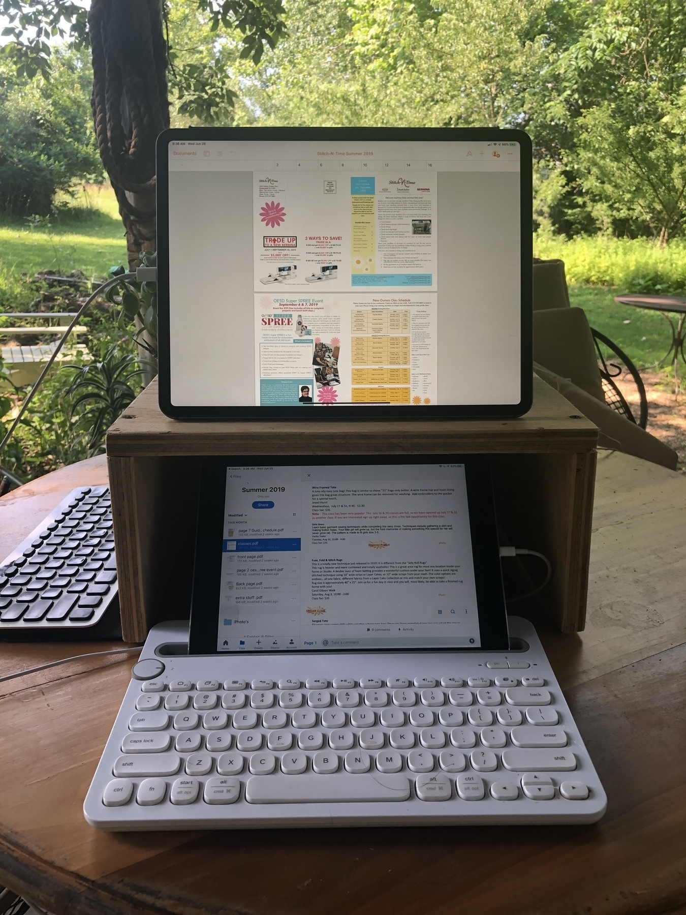
As you can see in the image, I’ve got both iPads in action here and it works great, similar to having a Mac with 2 screens. My workflow in this case is that the smaller iPad is my reference screen with a document sent by a client for a newsletter or brochure design. Then the iPad Pro above is where I’m doing the design work. I can copy text on the iPad below then, using the magic of Handoff, paste the text into the document that I’m designing on the iPad Pro. I could use split screen just on the iPad Pro but when I’m doing design or layout work it helps a lot to have the whole screen devoted to just that document. The K480 is also a multi device keyboard so I’ve got it paired with both iPads and can switch between them with a flick of a little dial. Very handy.
I’ve also got a new stand for use when I’m working from my bean bag or the desk/shelf inside the cabin by the window. This raises the iPad up anywhere from 4 to 6 inches. When I’m working from the bean bag I often have a lap desk and this stand is a bit more manageable on my lap than the home-made stand which is way too big and heavy for that. It’s not quite as tall but it’s enough.
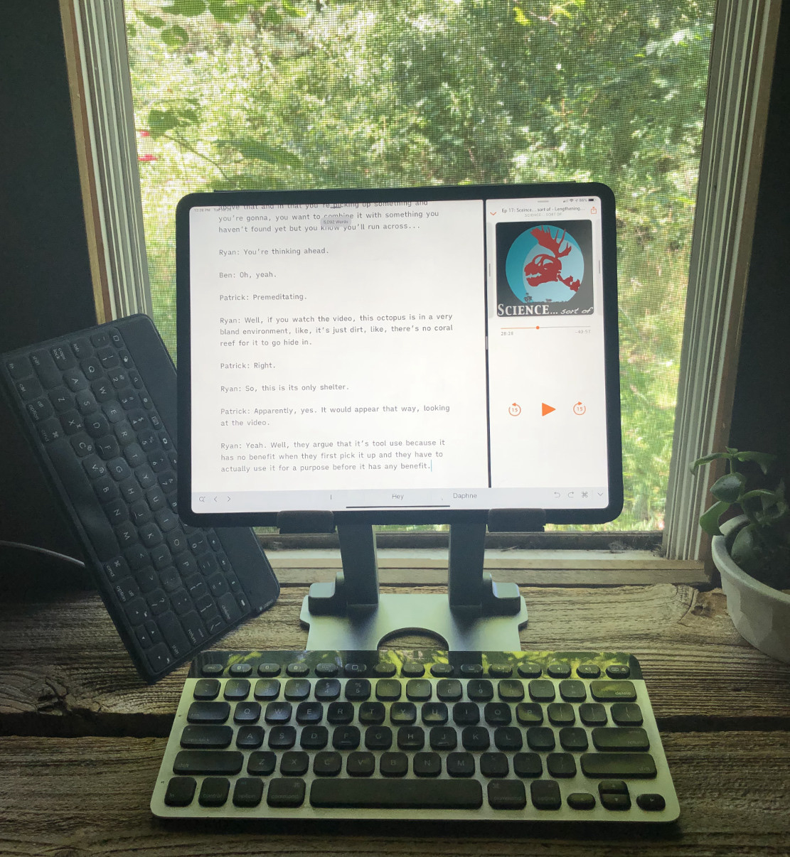
Usually, in these situations, I’m using the K811 keyboard. That said, I recently remembered that I also have the Logitech Keys-to-Go keyboard. I bought it three years ago for on-the-go work with my iPad Air 2. It’s an excellent keyboard. Super light, very thin and small. It’s got a similar covering and feel to Apple’s Smart Keyboards but with the benefit that it is completely silent (if you prefer that in certain settings) and also it has the special row of function keys along the top row. It’s smaller and some might think slightly cramped but it’s still very useable and I love it. I type about as fast with it as I do any other keyboard. This is a great keyboard for the library where I sometimes work because it’s so quiet.
The only negative is that after a year of use the top layer of fabric that covers the keys began to bubble up from the keys forming air pockets. It still works pretty well but now the fabric covering feels loose above the keys and it’s a bit of a distraction. But getting it back out the other day I was reminded of how much I enjoyed using it before I got the first Apple Smart Keyboard. It’s $70 at the Logitech website, usually only $45 on Amazon.
I’ve ordered another one and expect it will mostly get used when I go out to public places where a quiet keyboard is of benefit. Though, to be honest, I like it enough that it might get used a fair bit even at home. The great thing about the iPad is getting to choose what way I want to work and what tools I want to work with on any given day! I’ll also be watching it for signs of the above mentioned defect. Logitech offers a 1 year warranty and I’ll take them up on that if I have issues.
Which brings me to yet another keyboard related point that almost requires it’s own post but I’ll try to fit it in here. Namely the question of durability of these fabric covered keyboards. I love both Apple’s new folio and this Keys-to-Go. While they’re both missing back lighting and Apple’s offering is also missing the top row of special function keys, I’ve really come to enjoy the feeling of the fabric covering as well as the weather/moisture/dirt resistance they offer. That said, I think a keyboard should last more than a year. My previous Apple Smart Keyboard needed to be replaced after about 8 months. I suspect the current folio version will also need to be replaced before a year of use. As stated, the Keys-to-Go, while it still works, should not have the issue it has. It was only in use for about a year when I put it on the shelf.
Perhaps it’s just not possible to design a keyboard of these kinds of materials and have it stand up to 5+ hours of daily use for more than a year. I don’t know how widespread the issues are but I know that I’ve seen several references online to exactly the same issues I’m having so they’re likely not rare. I hope that Apple, Logitech and others can sort out the problems because I think these kinds of keyboards are a natural fit for the tablet form factor. Fabric covered keyboards offer dirt and weather resistance, can be very light weight and a pleasure to type on but if their expected lifespan is less than a year that would seem to be a problem. The lifespan of most of my keyboards, be they Apple or third party, laptop or Bluetooth, has ranged from 5 years on up. I don’t think it’s unreasonable to expect this new style of keyboard to last a minimum of 3 years.
