iPad Journal
- I've noticed that many of these missing features are available in other iOS apps. There's no reason Apple couldn't add them and bring Pages on iOS closer to Pages on the Mac. ↩
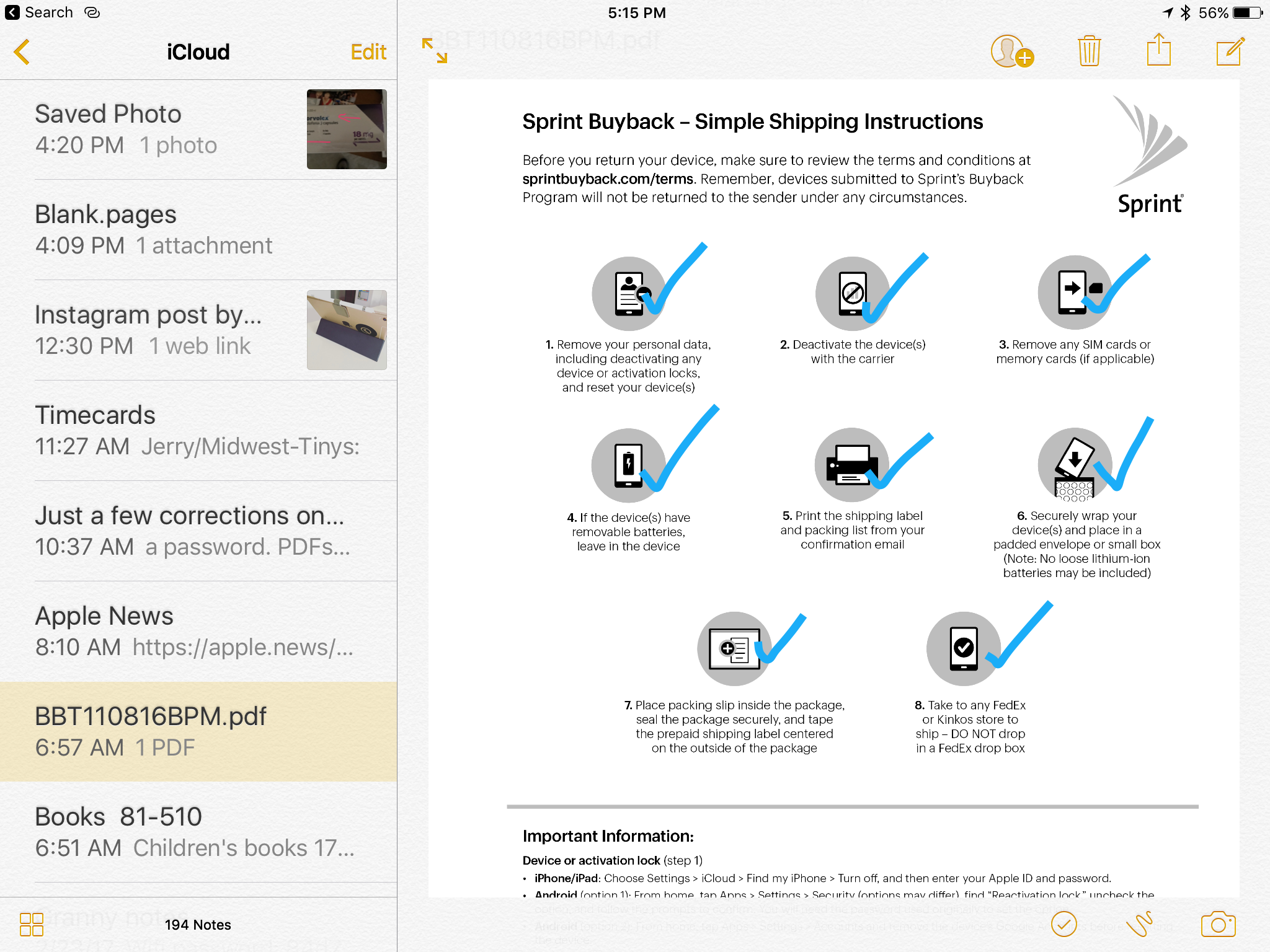
- You can lock any note with a password.
- All kinds of files can be sent via the share sheet to a note as an attachment. The first that come to mind: Pages, Numbers, Keynote, PDF, audio files, video and images.
- PDFs and images can be annotated using the same tool box that allows annotation of such files in the Mail app.
- Offline viewing and editing is possible.
- While markdown is not possible some formatting is: bold, italics, and underline.
- Also, any note can easily be shared as a collaborative note with any user that has an iCloud account.
- Notes can be exported as PDFs via the print preview though that option is not immediately obvious-not sure why Apple hides it in the print dialog on iOS devices.
- The text, links and attachments within a note can easily be shared via the share sheet.
- Usually only 5 or so are "active" in any given month. ↩
- I generally avoid statements about what I think Apple should or should not do as it makes me laugh when others do it. Generally speaking Apple seems to be doing a pretty good job over the past 15 years. But, given they've done practically nothing to promote the iPad I'm going to go ahead. ↩
iPad Journal: Writing more with iPad
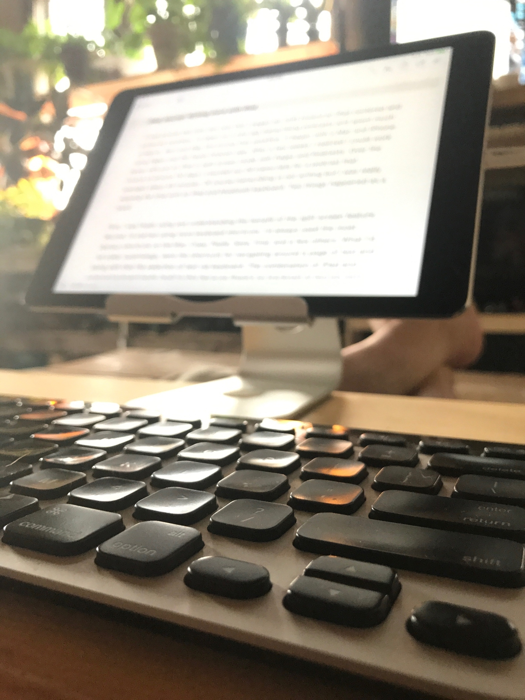
It was around this time last year that I began my shift toward an iPad centered and preferred workflow. I’d taken on a new gig transcribing podcasts and spent much of March, April and May fine tuning that workflow. It began with a Mac and iPhone using Pages and the Apple Podcast app. After a few weeks I realized I could work faster with just an iPad in split screen mode with Pages and Podcasts. Over the course of around 110 days I churned out 29 transcripts for a podcast that averages about 45 minutes. Of course transcribing is not writing but I was really enjoying the time with an iPad and bluetooth keyboard. Two things happened as a result.
First, I was finally using and understanding the benefit of the split screen feature. Second, I’d started using more keyboard shortcuts. I’d always used the most obvious shortcuts on the Mac: Copy, Paste, Save, Find, and a few others. What I’d not used, surprisingly, were the shortcuts for navigating around a page of text and along with that the selection of text via keyboard. The combination of iPad and external keyboard lends itself to this because there’s no trackpad or mouse next to my keyboard. While I wouldn’t say that my arms tire when reaching up to the iPad, but it is simply faster to use the keyboard for selecting text. It would be faster than a trackpad on a laptop too but because the trackpad was easy enough I never bothered to learn. Using the option or command keys with the arrow keys (along with shift for selecting) are great time savers. If you’re not using the keyboard to navigate text in a document do yourself a favor and give it a try.
In early May as I was working through the transcripts I realized I’d not posted on this blog in seven months. So on May 15 I wrote a short post and set a goal of more frequent posting. Up to that point I’d only posted 22 times in the roughly two years1 that the blog had existed. Not great. In the 10 months since that May 15 post? 55 posts not including this one. That’s a nice increase. I also still write semi-regularly on my other blog, Beardy Star Stuff. I’ve posted there 39 times in the past 14 months. That’s a blog I’ve had going in one form or another since April 2003 with a total of 796 posts. Wowza. That’s just shy of 57 posts per year on that blog. That’s not too shabby. As I recall I’d actually been keeping a blog starting in 2001 but I forget the name of the system I used2 and I didn’t bring those posts with me when I transferred my blog to TypePad.
So, that’s 14+ years of blogging most of which was done using Mac laptops from my first iBook to the PowerBook to the MacBook Pro to MacBook Air, using web interfaces or apps such as MarsEdit. Good times.
Now I find myself using the iPad and Ulysses and this feels like the best workflow I’ve ever had. While the Mac in conjunction with an app or web-based environment always worked well enough I don’t think I’ve ever enjoyed the process as much as I do now. But I have to say just how important Ulysses is in this equation. I’d previously tried several apps for blogging on the iPad and was never satisfied. I’d been hosting on WordPress and Blogger and there were a couple apps that could publish to both, the best of those was Byword but it seemed a bit flakey and was too minimal. The web interface for Blogger was terrible on the iPad but the WordPress app was okay and even the WordPress web interface was tolerable so I moved Beardy Star Stuff from Blogger to Wordpress. Having both of my blogs on one platform was much better and for a while I made do with the web interface and WordPress app. It was better. By this time my writing on the Mac had dropped to near zero and I was using it only for graphic design.
It was around this time that many folks were praising the recent release of Ulysses for iOS but I already had too many writing apps and had determined I wouldn’t buy anymore unless I had very good reason to. Ulysses looked great but what I really wanted was a better way to publish to WordPress. When Ulysses added WordPress publishing I jumped and it’s been fantastic. Ulysses and the iPad are the perfect combination for blogging and for the first time since owning an iPad, it is easy to say that this is the best blogging experience I’ve ever had.
I don’t really consider myself a writer so much as a person that likes to share and the sharing often takes the form of writing just as it often takes the form of photos, videos, and lately, even “paintings”. What I’m noticing now is that because there is no friction in this Ulysses/iPad combination I am far more likely to actually write and publish. Not only is there no friction, but I actually enjoy the process. Of course I seek it out when I have ideas brewing but, more interesting, I sometimes find that I’ve opened Ulysses before I have any particular idea. Rather, I have an urge to write, to start with a blank white page. It is a more basic desire to create for the sake of creating rather than a practical, utilitarian expression of an idea that I’ve had that I want to share.
This is all to say that over the past few months I’ve really been enjoying writing and that I’m looking forward to doing more of it in the coming year.
iPad Journal: Painting astronomical objects with iPad and Procreate
Just to be clear from the start, aside from grade school, I've never painted anything other than room walls and home exteriors. I'm not a "painter" and only occasionally had a passing interest in trying it out. I've sketched a few times but there too, very minimal. A few months back the iPad app Procreate popped up on my RSS or twitter feed. I had recently bought some supplies to begin an attempt at sketching astronomical objects while observing at the telescope. Those supplies have gone unopened and sit in their original bag. I'd not really figured out how to go about setting up to sketch in the near dark but it was on my mind as something I wanted to try. Suddenly a lightbulb went off and I had the thought that perhaps I could use Procreate and the iPad to sketch? That approach might be easier because I always have the iPad out with me anyway. So, no extra supplies, no set-up of lighting and supplies. I'd give it a go.
My first effort was Mars which was a pretty basic object to paint/sketch. A circle with a few faint strokes to denote a few of the larger features viewable through the telescope. The next was the Lagoon Nebula. A little more too that but still not a whole lot. Then it occurred to me that it might be fun (and good practice) to try my hand at painting an object from a photograph. Actually, it was not quite like that. It was more like a moment of boredom as I was looking at the a beautiful image of the Eagle Nebula on the cover of a book sitting on my coffee table. It occurred to me to give it a try. To be honest I didn't expect it would go as far as it did. I'm often good at starting little projects but often don't finish. For some reason in this case I found myself drawn in.
I started playing with the brushes. There are many, many brush options in Procreate. I had absolutely no idea where to begin. I tinkered with a couple of brushes and settled in on the airbrush as it seemed the best candidate for painting something like a nebula. I focused on just a portion of one of the "Pillars of Creation" and after a couple hours I decided to try a larger portion. Over the course of a few days I came back to it. It was surprised how quickly time seemed to move as I focused on the "brush". I would look up and two hours would have passed. After about 15 hours I had this:

As it turns out the process is very enjoyable. I worked mostly with the airbrush on the first project. I worked i layers in a way mimicking what I imagine the dimensionality of an actual nebula to be. I created a background of black and on top of this a layer of background nebulosity. On top of that another layer of nebulosity. And then another. And another. Stars had their own layer on the very top though in reality, of course, the stars in intermingled dimensionally.
A few weeks later I decided to paint a much larger portion of the Eagle Nebula though not the whole thing. I started with my existing painting of the pillars and then painted them in. I used the same brushes and techniques. I finished that in about a week.

The next project was the Orion Nebula and then the Lagoon Nebula. The most recent was an infra-red image of the Horsehead nebula which shows the detail of the nebula not seen in the visual spectrum. My current project is a wide field view of the nebula that surrounds the Horsehead, IC 434 and the Flame Nebula NGC 2024. Really, it's just a complex of various nebulae of which the Horsehead is just one, tiny component.
[caption id=“attachment_178” align=“alignnone” width=“4000”] Clockwise from top left: In process IC 434 (tiny dark spot near the middle is the thick gas and dust of the Horsehead Nebula), Orion Nebula, Lagoon Nebula, close-up Horsehead Nebula in infrared[/caption]
As I've worked through these various projects I've been trying out some of the different brushes available. There's so much to learn. I have no idea how this compares to painting on a canvas though I expect some of it would carry over to that process. I do feel as though I'm making some progress. Learning how to see details I would have likely missed in the past. Learning how to use the different brushes and their interaction with one another. Learning how to layer and blend color. Painting with Procreate and the iPad has allowed for a whole new experience, a new form of expression that I would not have had otherwise. It's something I thoroughly enjoy and intend to continue with for a long time to come.
iPad Journal: Weekly iPad Links
I'll start this week with one of my new favorites, Jonathan Wylie. He covers a topic that recently came up for me with one of my local clients who uses his iPad while on the road as a long haul trucker. My client needed to produce a pdf from a non-pdf source so I walked him through the print-to-pdf process using the Share Sheet to Print preview process. I've never written that up and just yesterday the client called me back because he'd forgotten how to do it. He was out on the road (though not driving at the time of our phone call!) so I walked him through it over the phone. Then today I find Jonathan's blog post which is perfect timing as I was going to write this up myself: How To Quickly Create a PDF on iPhone & iPad.
PDFs are an incredibly useful file format because they work on all devices and can be read with free or built-in software that you probably already have. In short, if you want to be sure that someone can read your content, send them a PDF. Easy, right? Well, it’s easy if you know how to create a PDF. Luckily, this is very simple to do on iPads and iPhones, but not everyone knows how to do it. So, here’s a little known trick that shows you how to create a PDF of a web page (and other content) on an iOS device.
I've only just discovered his website but I suspect it will prove to be invaluable. He's an educator and technology consultant and seems to put a lot of emphasis on the iPad. While he's using Apple tech he doesn't seem to be a part of that group of people I associate with the Apple nerd herd. I've been longing for writers and podcasters that actually work in fields outside of the Apple-focused commentary sphere. Real people doing other work but talking about how they are using Apple tech in that context. Great stuff.
And another post from Jonathan: How (and why) to Use the Markup Tools in the iOS Photos App
The tools that I need are actually built-in to iOS, and they cover almost all of my image annotation needs. I’m talking specifically about the Photos app. It has some great options for marking up images and screenshots, but not everyone knows where those tools are. So, here’s what you need to know.
And of course, Federico would post this week on Apple Notes! Just a couple days ago I posted my own thoughts on using Notes but by comparison to Viticci's iPad Diaries: Optimizing Apple Notes, well, my take is just bare bones. Of course, that's what Federico does. He takes the apps that he uses and he pushes them as far as is possible. He is the epitome of a "power user". As usual it's a long post and well worth the read:
I've been using Apple Notes every day since its relaunch with iOS 9 in 2015. Apple's refreshed note-taking app landed with impeccable timing: it supported the then-new iPad Split View in the first beta of the OS released in June, and Apple deftly positioned Notes as a nimble, multi-purpose tool that many saw as a much-needed escape from Evernote's bloated confusion. I almost couldn't believe that I was switching to Apple Notes – for years, it had been derided as the epitome of démodé skeuomorphism – but the app felt refreshing and capable.
iPad Journal: Speedy production of posters and social media graphics
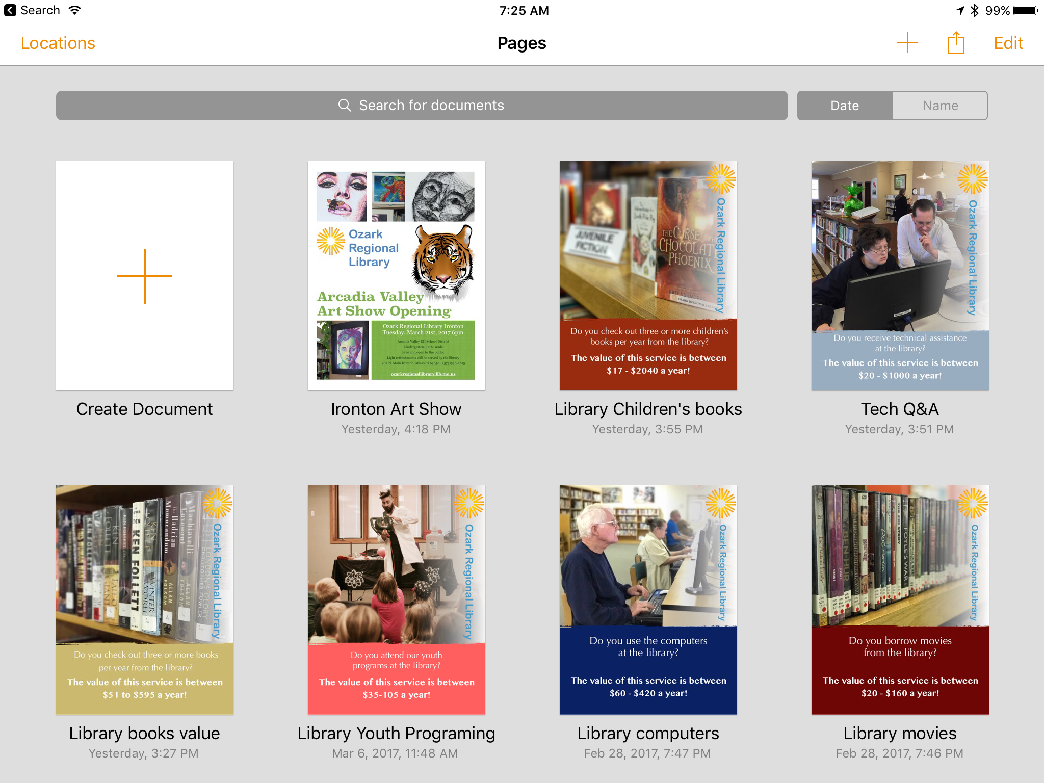
I've been doing a bit of volunteer work for our local library lately and we're currently moving towards an April vote on a tax increase to help cover the operating costs of our little network of rural libraries. I was asked to put together a collection of simple posters that would highlight the value of library services to patrons via print and social media. I did most of the work in Pages on the iPad with two exceptions that required a quick edit on the Mac. On the iOS version of Pages,1 rotating elements is not possible and second, the ability to create a shape with a transparency gradient is also missing. Not a big problem, I just saved in iCloud and stepped over to the Mac to rotate the logo on the side of the page and create a white box with a transparency gradient. By the time I was back at the iPad the file was updated with the two changes. This would be my "template" so I made several duplicates and altered each to a specific value that the library wanted to highlight.

I'd used portrait mode on the iPhone camera to capture a series of images that I AirDropped to the iPad. After quick edits to text and the color of the bottom box element they were each given a different image and I was done. I wanted to send each poster version in its own email with two attachments, a jpg for social media sharing and pdf for printing. Easy enough. From Pages I would share as pdf via the Share Sheet to one of my most used apps, Graphic which I used to export as jpg to my camera roll. I'd jump back to Pages and share as pdf again but this time to Mail. Once I had the Mail draft with pdf attached I'd add my image attachment and send. The whole process took about 90 seconds for each email with two attachments.
Smooth sailing.
iPad Journal: Getting the most out of Apple Notes
I'm on a new quest in how I use the iPad and it can be best expressed with one word: Simplicity. I've always considered myself a "power" user of Apple tech. Of course this is a relative term but I'll just describe it, in this context, as this: I've always used my Macs with a goal as doing as much as possible with them. I used a seemingly limitless variety of apps and utilities. I tinkered. I installed betas. It was practically a goal to break things so that I could fix them. I enjoyed troubleshooting. But I was also concerned with getting things done.
My early use of the iPad was similar. I jailbroke my first two iPads primarily so I could share the cellular connection to my Mac. I immediately installed any app that might allow me to do my "work" on the iPad. From finance tracking to website updating to blogging to graphic creation to database apps. Of course I'm still curious about the possible solutions apps can provide for the tasks I need to do but I've recently realized that I often have the most success with a more straightforward approach. Just as Spotlight gradually replaced Quicksilver and LaunchBar on my Macs, I'm finding that Apple stock apps such as Notes are often be my best option.
I've used Notes quite a bit over the past few years and no doubt, it began as a fairly simple app. But Apple has nurtured it into an app that is, in its current iteration, really very capable. Interestingly, during the same period, I also tried using Evernote more than a couple times but I never quite settled into it. I could understand why so many people used it given its extensive feature list but it never quite clicked for me. My typical use with Apple Notes was saving text notes and the occasional link. I generally did not need to add attachments (on a Mac I preferred to just put any files such as pdfs or images in the Finder) and didn't need to share or collaborate with anyone. I bumped into it's limitations on occasion but it was never enough to stop me from using it.
The best way I can describe my use of Notes is that it is my catch-all for text and links, often as a sort of shared clipboard between devices with an easy way to share out via Messages, Mail or any number of other apps. One unfortunate limitation, links saved in a note seem to export with any method. Any effort to copy/paste or to use a share sheet to send a saved link and any text in a note, removes the link and only results in the plain text of the article title. Not very helpful and a bummer because this could be useful in a lot of different ways. Almost every other attachment can be shared out along with any text I've added to a note. One limitation of attaching documents such as pdfs, Pages or any other document that might have editable text is that they are not indexed. Not a deal breaker but it would be nice. In my personal use I don't tend to accumulate lots of notes with attachments because I tend to use them for projects rather than long-term storage.
More often than not when I create a new note it is a text capture via a share sheet from another app. Quite a few notes are for projects or clients and they might be something that I just scribble in and delete a couple days later or they might be longer term. In the past I've tried different apps for tracking time on client projects but several months ago I realized I wasn't all that happy with the apps I'd been using for such tracking. I decided it might be easier and simpler to do this tracking with a note and I was right. It's worked out great. I have a "Timecards" note and every project gets tracked there. Each project gets a section and anytime I work I log it with a simple line item: Date Time Description in that section. Simple and efficient. Eventually those line items get entered into an a FileMaker Pro invoice.
I've only had a need to share notes via the collaboration feature on a couple of occasions but it has worked well in those instances. It's a nice feature to have when I need it.
A lot of Apple nerds have been raving lately about Bear. I gave it a try and it is a nice app but it's not for me. Between Apple Notes and Ulysses much of what I do with text is covered. In the past I've also tinkered with Drafts and for awhile I used Byword and Editorial as a part of my gathering and writing process but not lately. While I've not yet deleted those three apps I likely will. I've not used any of them in quite some time and doubt I'll have any need of them in the future. They are superfluous. As I whittle down my folders of apps I am enjoying a certain confidence in the fewer tools that I choose to keep.
iPad Journal: Notes App misconceptions
Over the past year or two there have been quite a few write-ups comparing note taking apps particularly comparisons between Apple Notes (since it's big update with iOS 9) and Evernote and most recently the new app, Bear. Inevitably such write-ups always leave out the newest Apple Notes features that were added in iOS 9 and iOS 10. In fact, I'm often left wondering if the writers of such comparisons actually bothered to really use the updated Notes app at all!
I'm sure there are others but this is just a quick list I put together in response to the most recent articles I've come across. As a default, free app, Apple notes really is a powerful app with many of the features found in paid services and I suspect it is underutilized by most users. It's the sort of app that often provokes the response: "I didn't know you could do that!" It's an app I use daily and I expect to do a post on how I'm using it soon. In fact, it fits in well with my recent post about doing more with the stock Apple apps when possible as opposed to cluttering up my iPad with third party apps. Stay tuned for that!
iPad Journal: Week in Links
The Workflow folk have put out yet another update and of course Federico has an excellent write-up: Workflow 1.7.1 Brings New Icon Glyphs, ‘Run Workflow’ Action.
This week’s episode of Canvas with Federico and Fraser is excellent. They delve into one of the most powerful (and I suspect underutilized features of iOS), the share sheet. I didn’t really understand the power of iOS until I understood and began to fully utilize the share sheet. Give it a listen here.
Some discussion this week about Apple switching iOS devices to USB 3. I think it’s obvious that they will at some point. This year or next or the next. Shrug. As usual though the Apple blogosphere can’t help itself. Here’s Federico’s take. The Cases for (and Against) Apple Adopting USB-C on Future iPhones. Only thing I have to say is it’s not as big a deal as people make it out to be. Why do folks so often make issues and problems where they don’t really exist? Biggest complaint I’ve seen is that people would have to spend money on new cables. But that’s silly. A cable comes with every new device. Lots of these folks have already got a new Apple laptop which means they have that cable as well. And a new cable will cost what? $10-$30 depending on brand. Just as lightning cables are everywhere and cheap so too are USB-C cables. It’s a non-issue. And if you have a mix of devices that have both you now have to carry two cables when traveling. I hardly thing that’s going to break anyone’s back. Jiminey. We have other things to worry about in our world.
Mossberg has a great write up on the future of the PC and how the iPad fits in:The PC is being redefined - The Verge
If you became a frequent computer user starting anytime between, say, 1990 and 2007, there’s a good chance that your idea of a PC is a desktop or laptop running a mouse and keyboard-driven graphical user interface — most likely Microsoft Windows or, to a lesser extent, Apple’s (recently renamed) macOS.Daniel Eran Dilger over at Apple Insider has a great two part series on the iPad:But if you got attached to computing in the last 10 years, you very likely find it more natural and comfortable to do your digital tasks on a multi-touch device lacking a keyboard or mouse and running a new, simpler, and cleaner kind of operating system. This certainly includes an Android or Apple smartphone, or, possibly, a tablet running Android or iOS. These devices have become by far the most commonly, frequently, and extensively used personal computers. They are the new PCs. Phones and tablets are the new PCs
Even older people have taken to Android and iOS in a huge way, though they can still rely on their traditional Windows and Mac laptops.
In 2010, Steve Jobs introduced the first iPad as a new product category between the smartphone and notebook. It ended up dramatically shifting demand in the PC industry, but sales have since plateaued. Here's what Apple can do, has done and is doing to build iPad into the Post-PC future of computing.Editorial: The future of Steve Jobs' iPad vision for Post-PC computing, part 1
Born into ridicule, there's still a widespread misunderstanding of what iPad actually is, seven years later. Here's a look at why.Editorial: The future of Steve Jobs' iPad vision for Post-PC computing, part 2
This one’s old but if you use Ulysses on an iPad it’s worth a read anyway: Review: Ulysses 2.5 for iPad and, now, iPhone – MacStories
iPad Journal: A mess of stuff getting in my way
I’m a geek and so I tend to enjoy tinkering. Back in the day I used (or tried to use) speakable items on my Mac. It never stuck because it just didn’t work very well. But it was fun to play with. Something that did stick was Quicksilver. And Launchbar. And then Spotlight. I switched back and forth between the first two but as Apple’s Spotlight got better I eventually just settled on that. Which is to say I went from the more powerful third party tools to Apple’s simpler option. Maybe I’m just less of a tinkerer than I used to be because as time goes on I seem to prefer simplicity.
As I’ve experimented with some of Federico’s favorite iOS productivity apps such as Workflow and recently Copied I’ve begun to think that my needs (or my methods) just are not suited to so much complexity. For example, in his recent post about clipboard workflows using the Copied app or his powerful clipboard manager using Workflow, Federico offers many of the details that make him more productive. But I spent the better part of two hours with Copied and just came away frustrated. It may be that it’s just not suited to the way I work or maybe I need to spend more time learning it. Or, just as likely, it may be that I don’t write the kind of content or perform the kinds of tasks that benefit from that kind of app.
One lesson learned from the experience: when evaluating the tools and workflows of others for my purposes, be open but be critical. Will they really enable me to get things done in a better way or will they just end up slowing me down? Are they the right tools for the jobs I need to get done? These are obvious questions to ask but I think often it’s easy to get caught up in the tools and techniques of others. New and shiny is better right? So, my new goal is to find a balance of being open to new tools but not to spend too much time dwelling on it all.
All this cruft can get in the way. I live and work in a tiny house which requires being very deliberate in the choices I make about owning stuff. As often as stuff is useful it is just as likely a burden that gets in my way. Stuff has a way of accumulating and is often kept around even when it’s not all that useful. One reason I love the iPad is that it strikes a beautiful balance of simplicity and power. I don’t want to ruin it with lots of apps and utilities, many of which overlap in what they offer.
Why was I interested in using Copied? I like the idea of gathering links to posts with titles and relevant quotes and having them ready to put into a blog post just as Federico seems to do. But what I’ve discovered is that I find it much easier to just use the share extension to send items to their own sheet in Ulysses. If some of these are meant to be shared together in the same post I can easily use the merge sheets function of Ulysses to consolidate them all into one. Problem solved without the help of any extra utilities and quite possibly with less effort from me.
Another area in which I thought Copied might be useful was in saving groups of text for websites I manage. But here’s the thing. Again, my tool of choice, Coda, already has that covered with the text snippets or clips function. With a tap I get a dropdown list of my snippets and another tap I get the text I want pasted right into my document. Or I can assign a tab trigger for any snippet. These seems a better option than using Copied.
Another third party utility that I recently purchased that seems like it may be more work for less benefit is Launch Center Pro. As with Copied it may well be that I’ve not spent enough time with it to learn the benefits. I get the gist of it. But so much of what it seems to offer I would file as solutions in search of problems. Much of what it offers I can just as easily accomplish with Siri. Shortcuts to apps end up being just as many taps as clicking on the app or asking Siri to open it or using Command-Space to open via spotlight. On the iPhone with 3D Touch most of my regular apps have short cuts built in. It also seems to duplicate Workflow in many ways and I’m still trying to get a handle on Workflow.
My plan going forward is to focus on using each app as it is provided. This isn’t to say I’m not interested in utilities that might add benefit to my workflows. But I will cast a more skeptical eye towards utilities and workflows that seem overly complex in the name of saving me time. If my use of an app or combination of apps results in obvious friction then I’ll see what I can do to reduce it but step one is to ensure that I’m using all of the features of the app as intended.
iPad Journal: Creating with iMovie
I don’t use the iPad and iMovie for professional work. My iMovie creations are all for fun, personal projects that I generally share with friends and family. But I will say that over the years I’ve created quite a few videos on Macs, iPads and even iPhones using everything from iMovie to Final Cut Pro. My earliest video projects were done with the very first versions of iMovie back around 2000. I advanced to Final Cut Pro which I used for a couple of years but have not used since sometime around 2003 when I used it for a documentary I did about community projects in Memphis. Since then everything has been done using iMovie on the Mac and most recently, iMovie on the iPad. All of that to simply say that while I’m not a pro or expert I have logged hundreds of hours editing many projects using quite a few computing devices and quite a few versions of two editing apps.
[caption id=“attachment_266” align=“alignnone” width=“2048”]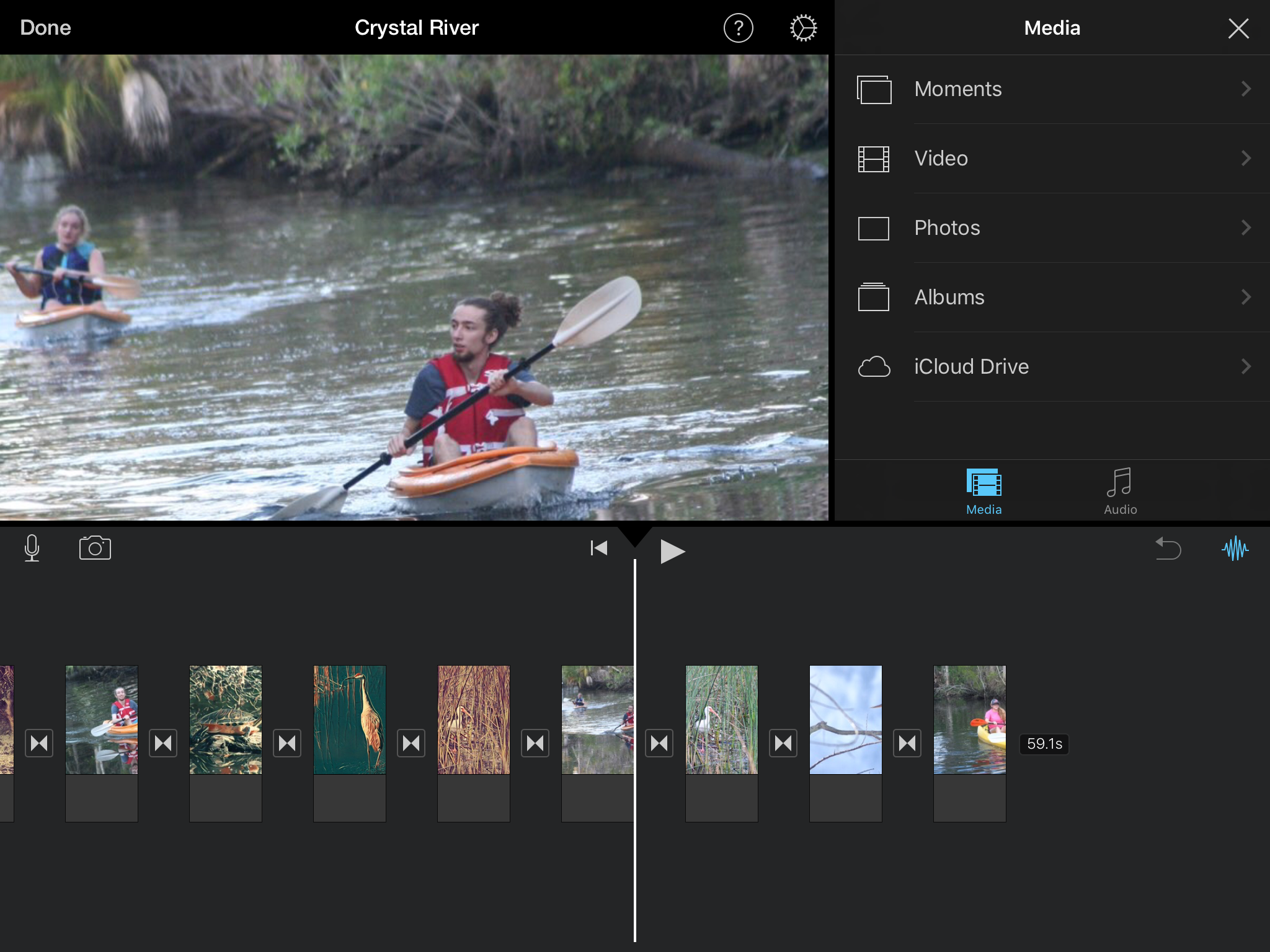 A great benefit of iMovie on iPad is ease of use. Adding media, editing or moving clips in the timeline and most other tasks are very easy to learn and perform.[/caption]
When I first tried iMovie on the iPad using my iPad 3 I must say that I was pleasantly surprised. I used the iPad to record and then iMovie to edit a quick little mini-documentary about my permaculture homestead. As it turns out that video has gotten more views than any other I’ve put on YouTube, almost 89,000 as of this writing. Not too bad for 30 minutes of work and far more views than my 90 minute Memphis documentary ever got! And as I recall it was only the third or fourth time I’d opened the app which is to say, it was very easy to use. Certainly that is in part because I was familiar with the concept of a timeline, transitions, fades, titling, etc. But I think it is also true that Apple has done a great job creating something fairly easy to use. In fact, I’d say that with iMovie for iOS, especially on the iPad, Apple has achieved the perfect balance of ease of use and power. It’s the sort of app that anyone with an interest in making a “movie” and willingness to put forth just a bit of effort, is likely to enjoy and benefit from.
In the five years since I started using iMovie on iPad I’ve put together quite a few videos, the most recent of which was a mini-documentary about my grandmother. It consisted of a couple hours of interview footage shot with an iPhone interspersed with scanned photos. The final result was an hour long and something the entire extended family watched over the holidays. While the kids, grandkids and great-grandkids all enjoyed it I think it was my granny that enjoyed it most. She talked about it for days. I think she enjoyed seeing her family get to know her better as they watched it. I know I certainly got to know her better as a result of making it.
In the end, the iPad is at it’s best when it enables us to create because it’s often in such creation that we build bridges between ourselves and others. Whether it is a silly or informative post on YouTube or a video shared at a family gathering, iMovie is an excellent example of an app that enables such creation.
iPad Journal: Flexible form factor leads to increased productivity
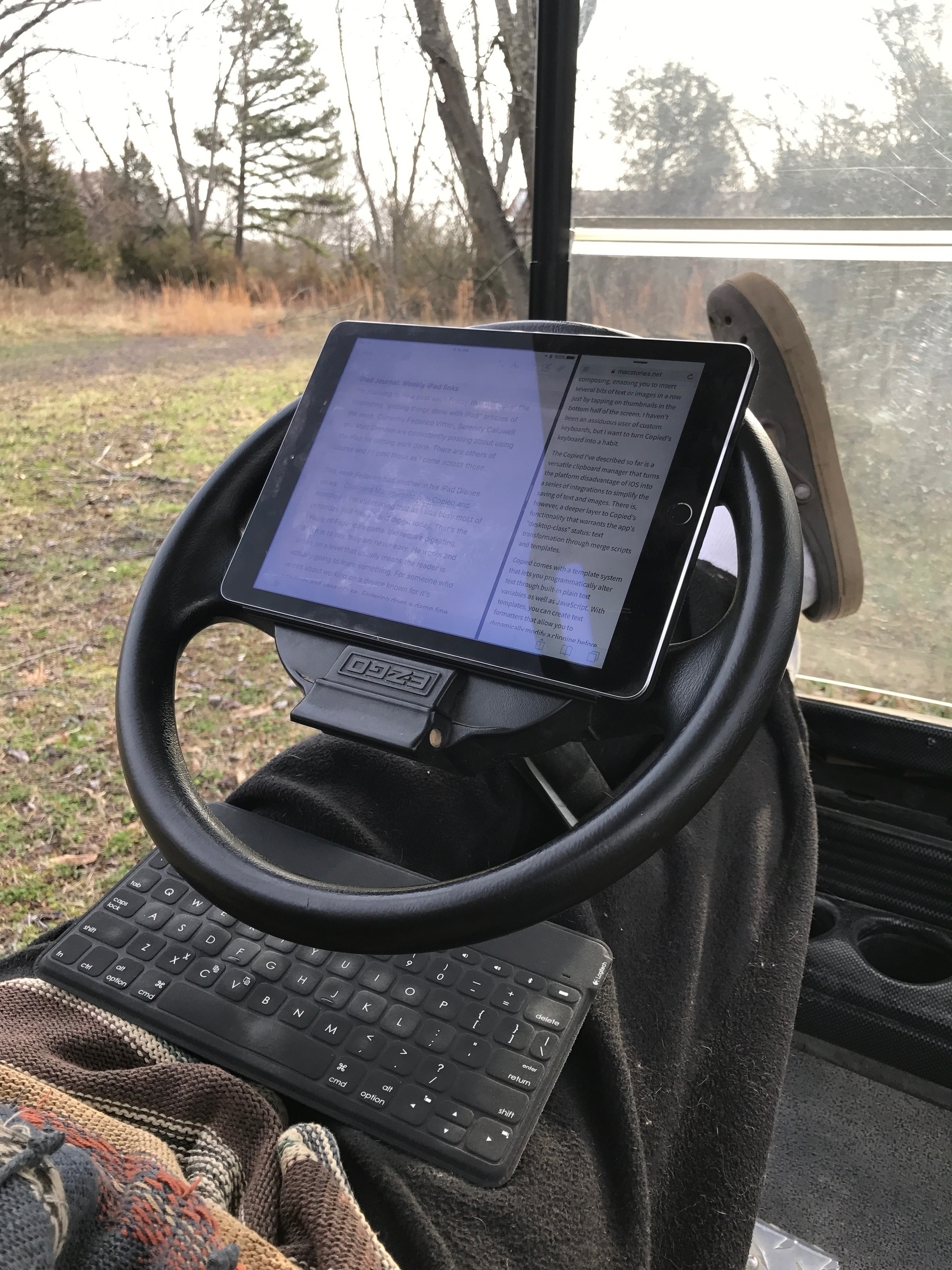
Appreciating (and greatly enjoying) the tablet form factor of the iPad and an external keyboard this morning.
Fact 1: I live in a rural area and expected a package via the USPS. If I wanted this package in my hands I needed to be at the mailbox by the road when the delivery person arrived. If I missed her I’d only have a note letting me know my package was waiting for me in the post office in town.
Fact 2: I normally walk the one mile to the mailbox as a part of my 4 miles a day walking routine. Today we had rain in the forecast.
Fact 3: I am not even a little fancy and do not own a Tesla. But we do have a golf cart for getting around our property. It runs off of batteries. I pretend it is a Tesla.
Fact 4: I knew I might have a wait because I only knew that our postal delivery person normally arrives before 11 am. I went at 8 and took my iPad and keyboard.
Fact 5: With little effort I managed to arrange a comfortable writing situation and got stuff done.
iPad Journal: Weekly iPad links
I'm planning to do a post each Friday that will cover the interesting "getting things done with iPad" articles of the week. Currently Federico Viticci, Serenity Caldwell and Matt Gemmel are consistently posting about using the iPad for getting work done. There are others of course and I'll post those as I find them.
This week Federico had another in his iPad Diaries series: Clipboard Management with Copied and Workflow. I'm still reading that as I was busy most of yesterday. Will finish it and digest today. That's the beauty of Federico's posts, the require digesting. Which is to say, they are never easy. He works and writes on a level that usually means the reader is actually going to learn something. For someone who writes about working on a device known for it's simplicity and ease of use, Federico does a damn fine job of complicating it- but in a good way. A really good way.
I've tried using Clips a bit and found it useful. I'm curious to read about what Copied does that might make it a better choice.
Also worth a bookmark, Federico's archive of iPad articles on MacStories. Wowza.
Matt Gemmell has been working on his own series about going iPad-only and has another great post this week on taking notes with GoodNotes. That's an app I recently picked up on sale for .99 cents. I use Apple notes on a regular basis and I'm not sure GoodNotes is something I'll use but for 99 cents it's silly not to try it. Much of the appeal of the app is handwriting. Actually, that's much of the point. I've often joked that I don't do pens and pencils, I do keyboards. My handwriting is atrocious and I've never taken the time to work on that. That said, I do appreciate and love the idea of sketchnotes. As I've been painting with Procreate in recent moths I've become a bit more interested in seeing what I can sketch and thinking about lettering as art rather than writing is appealing.
iPad Journal: On the road with a truck driver and iPad
I’ve got a client that emailed me back in September. After years of working for other people as a truck driver he had bought his own truck and was going into business for himself. He’d purchased an iPad and needed to know more about using it. Of course I was happy to help him out.
His prior computer experience to that point was primarily a Windows laptop. It was an older and heavier laptop and he didn’t want to lug that around. He called me a couple weeks after getting his iPad because he had a list of tasks he’d not yet discovered an app for. We ended up meeting three or four times. He often receives emails with pdf attachments that need to be filled out and signed and returned. He also gets documents on paper that need to be archived and/or replied to. So, the first thing we did was get him set-up with a scanning and pdf workflow. He followed my advice and purchased Scanner Pro and PDF expert. We discussed iCloud, data-use and the benefits of keeping everything synced up. We went through the process for sharing a pdf from Mail to PDF Expert and then the reverse. We did the same for using Scanner Pro to PDF Expert to Mail. We also downloaded a faxing app for the rare occasion when he needs to fax instead of email.
I helped him set-up an invoice template in Pages. We discussed sharing that out as a pdf via Mail. He’d also purchased a printer for wireless printing which we set-up. He rarely prints but wanted it “just in case”. We’ve not yet gotten into spreadsheets yet though I suspect that might be an interest and we’ve discussed it briefly. Last, he’d downloaded a series of apps specifically for truckers for routing, mileage tracking, fuel purchases and scheduling. He didn’t need my help with those as he’d already been using them on his iPhone for many months. Same thing goes with email which he’d been using on his iPhone. The only new trick there was learning to use the share menu and to effectively move/save/share attachments. Last but not least, when he’s not driving he uses the iPad with the DirectTV app to watch movies and tv shows and FaceTime to chat with his at-home spouse.
He’s now been carrying loads since early November. Nearly five months on the road and he’s very satisfied with his iPad as his primary on-the-road computer. Maybe I should have told him that the iPad is only good for Facebook and watching movies?
iPad Journal: Coordinating family projects
Our extended family has some shared land with a small lake left to us by my grandparents. Sometimes that means we have to coordinate projects together. From road and dam maintenance to creating trails or any number of small things. In the past this was done via phone calls, sometimes email. Lately it’s been texting. But it can be a bit chaotic with anywhere from 3-7 people (sometimes more) chiming in with ideas or criticisms of the process involved in more complicated projects.
A good example would be a recent project clearing the area behind the lake dam which had become too densely overgrown. As we evaluated the project we took the opportunity to look at related tasks such as dredging out parts of the lake that had accumulated silt over the years. Also, there’s always the issue of repairing damage by beavers and muskrats and spillway maintenance. I’ve been helping coordinate with my dad, aunt and two uncles as well as someone we hired to help with some of the work. If my dad and uncle were a bit more technologically savvy I might try hooking them up on Slack. I may do that yet.
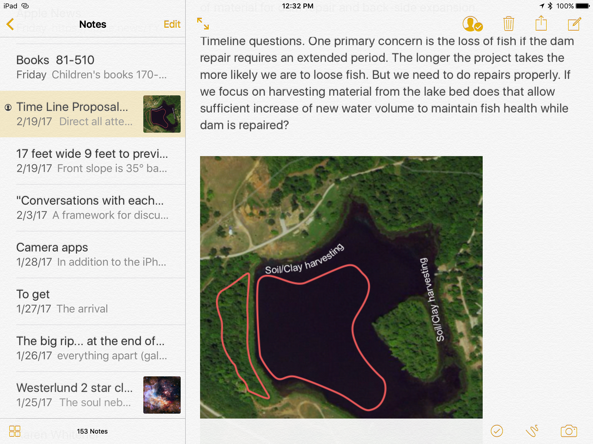
Due to repeated confusion (when texting and phone calls are primary it’s easy to loose track of who knows what!), the other day I decided to put together a project plan of sorts. Just a simple Pages document with a map and diagram. I emailed it out and suggested folks add in details, make changes, etc. But then I realized as I was suggesting they either reply via text in email or use pdf editing built into Apple Mail that at least two of them would likely be confused with the pdf editing. One of them is using an iPhone that he barely knows how to operate. So, it occurred to me that a shared Note which they can all access via iPhone, iPad or Mac might be simple enough and yet allow for the communication to happen all in one document that anyone can edit. It was a trivial task to copy/paste the material from the Pages document into the note. Time will tell if the shared note will prove effective.
Something that I’ve realized with this project is that the iPhone and iPad are a nearly perfect compliment to one another. I suppose I knew that going into it but it’s just working out so well that it seems worth mentioning. I use the iPhone to take notes, measurements and photos. Then from the iPad and a Bluetooth keyboard I can elaborate on the basics and create diagrams and maps with Graphic and Apple Maps. I’m using Numbers (mostly on the iPad) to keep an ongoing record of expenses and dates on which significant work is done.
I’ve not recently been in a position where I needed to do any sort of complicated project management but I’m guessing it could be done fairly well with these two devices and the right apps. In many ways they seem to be the perfect fit for project management taking place “in the field”.
iPad Journal: Website Management with Coda, Transmit, Messages and Mail
Of the various services I offer, web design and content updates are probably 60% of my work. On the Mac I’ve been using Panic’s Coda since it was released many years ago so, when it was released for iOS, I was excited. But I mostly found it lacking (along with iOS at that time) and continued using my Mac. I used it a bit but only minimally. That changed in 2016 as I transitioned to the iPad for website related work. I wrote about my website update workflow back in May and then again in July as things shifted. I’m still not certain things have settled in for good (do they ever?) but I’m more satisfied now then I’ve been in the past with this revised workflow.
As it turns out I have settled in with Coda and Transmit as my primary toolset. I initially resisted Coda because I wanted my “local” files to be synced to DropBox as is possible with the Mac version of Coda. But the convenience and power of Coda was too much to resist. All content updating is now done in Coda on the iPad. Because Coda and Transmit share the same local file store on the iPad I can then use Transmit once a week to push the changed files to my local MacMini’s Dropbox folder and everything get’s synced to DropBox. Not ideal but very close.
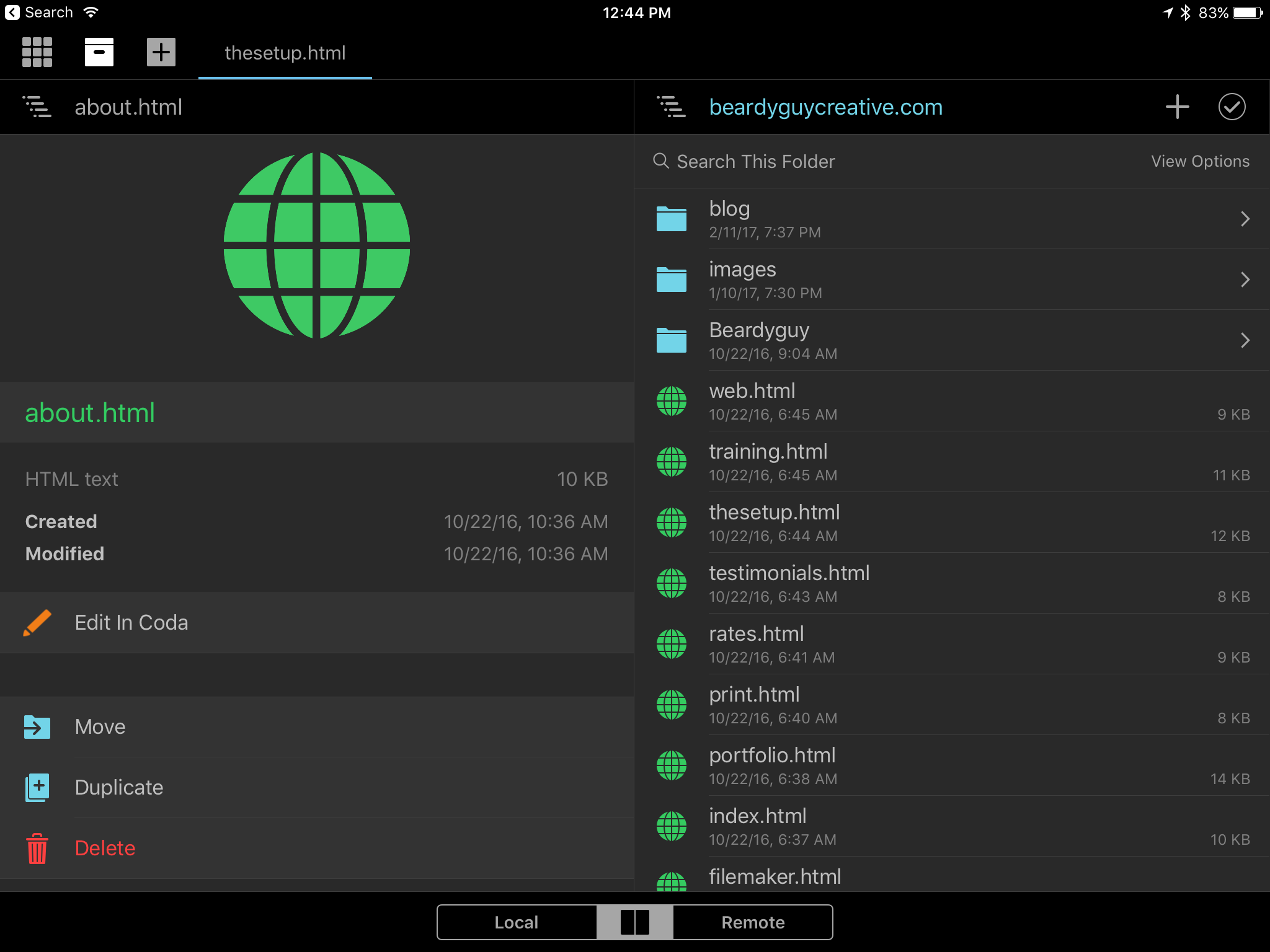
What I’ve grown to appreciate about Coda as I’ve used it more is that it is so fully featured and so close to the Mac version. The familiar two pane interface is very easy to use. I can select multiple files to copy back and forth from local files to the server or the other way around. I can drag and drop single files to do the same. I can quickly filter for a file by name or sort by size, name, date modified. The one power tool missing is find/replace for in-file content across multiple files from the file browser. But that’s not something I use all the time so I’ve gotten along okay without it.
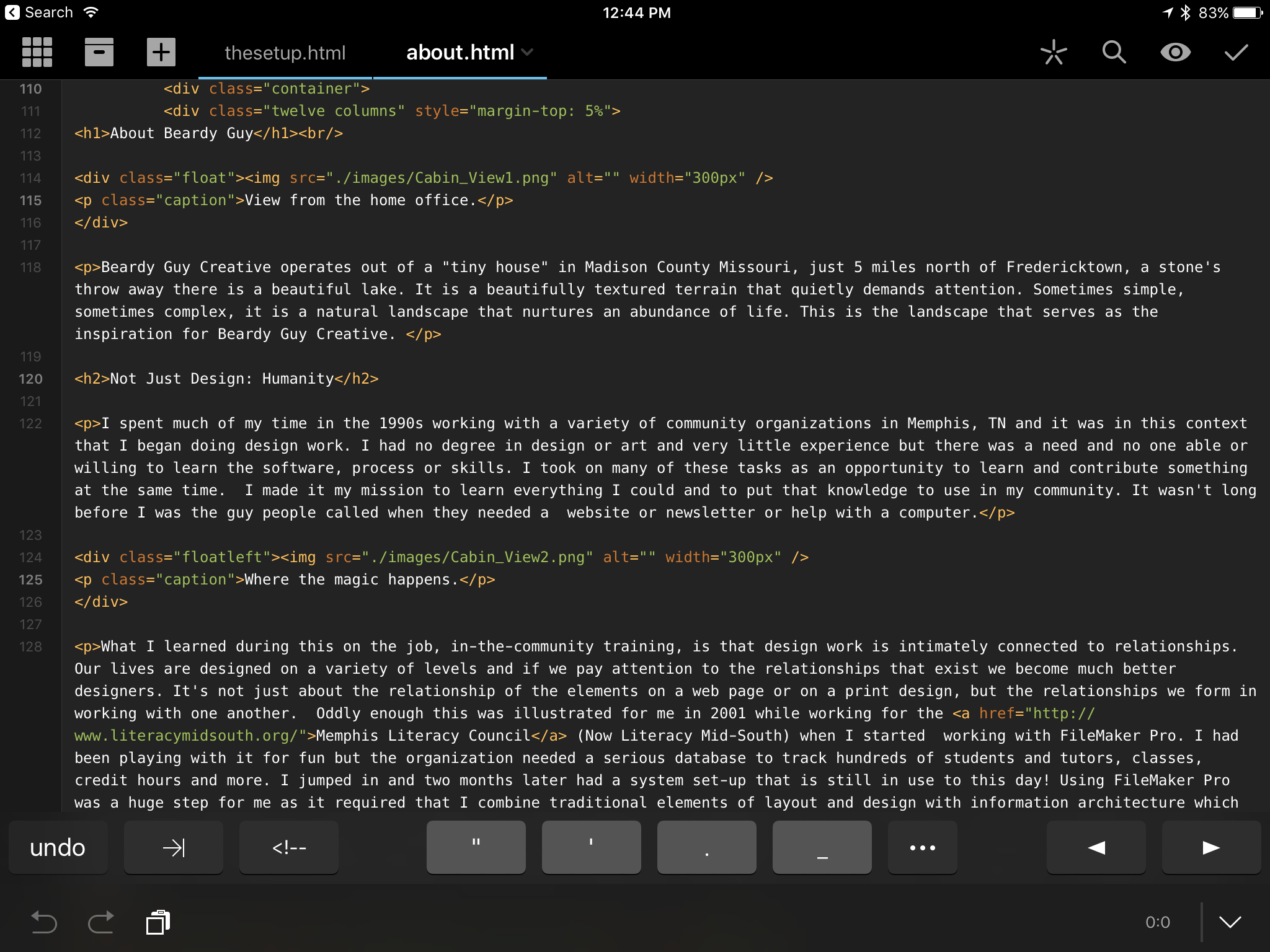
When editing, of course Coda provides for syntax highlighting as well as find and replace of text within a file. I can have multiple files open and switch between them via the tabs. Of course there is code auto-complete as well as suggestion for files such as images that have been indexed. When I’m adding code for an image I get a pop-up with a list of images that reside in the images folder for that site. Very handy. Snippets for specific sites as well as app-wide are occasionally useful. And, of course, preview of a page. Lastly, when using with an external keyboard the app behaves exactly as I expect with the same (or mostly the same) shortcuts that are available on the Mac version. I can save, close, switch tabs, find, preview and more with keyboard shortcuts.
Once I settled on Coda on iPad as the primary tool for website related work I learned far more of the features and became more comfortable with the app. It actually mirrors the process I experienced with the iPad itself. The more I used it the more comfortable I became with it and with that comfort comes increased productivity.
A great example of this is using Coda in split screen with Mail or Messages. My clients use email or Messages to send text, PDF and image files for website updates. Having split view makes all the difference. One of my most regular clients sends the text in the body of emails or Messages or as Pages files. Being able to quickly shift back and forth from Coda to one of those other apps via split screen made all the difference. In fact, if it were not for split screen I would not be using the iPad as I do.
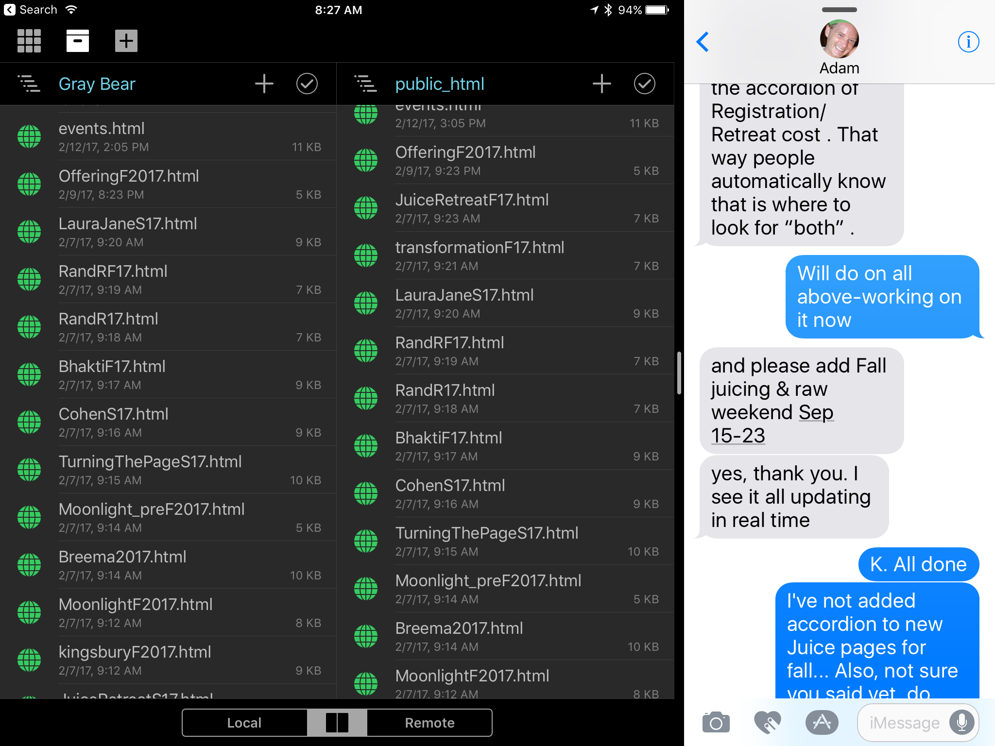
I’ll illustrate with a fun moment that happened a couple weeks ago as I was working with the above mentioned client. He was sending new content and I was updating his site as we chatted back and forth. He commented that it was interesting watching the changes pop up live as we chatted. He was impressed and I was too. Without even thinking about it I’d been switching between Coda, Messages, Mail and Pages, updating html pages, creating new pages and carrying on a conversation in Messages. It wasn’t that I’d accomplished any great feat. This was just the normal process of a pretty typical task. But I was using iOS on an iPad with the same speed and fluidity with which I use a Mac. Very satisfying.
iPad Journal: iCloud and DropBox as iPad File Systems
A consistent criticism of iOS and the iPad is the lack of an easily assessable file system but this is only partially true. When the iPad first shipped in 2010 it certainly was much more limited. But eventually Apple added iCloud which has evolved into Apple’s version of an cloud-based file system and it works fairly well at this point. It’s not perfect but it has been rock solid in my use of it. But, still, time and again, some continue to say the iPad has no file system and no access to a file system. Well, it’s certainly not the full featured Finder that the Mac has and it’s true that it accumulates folders for apps (Mac or iOS) that use iCloud for saving files. But, it IS a file system.
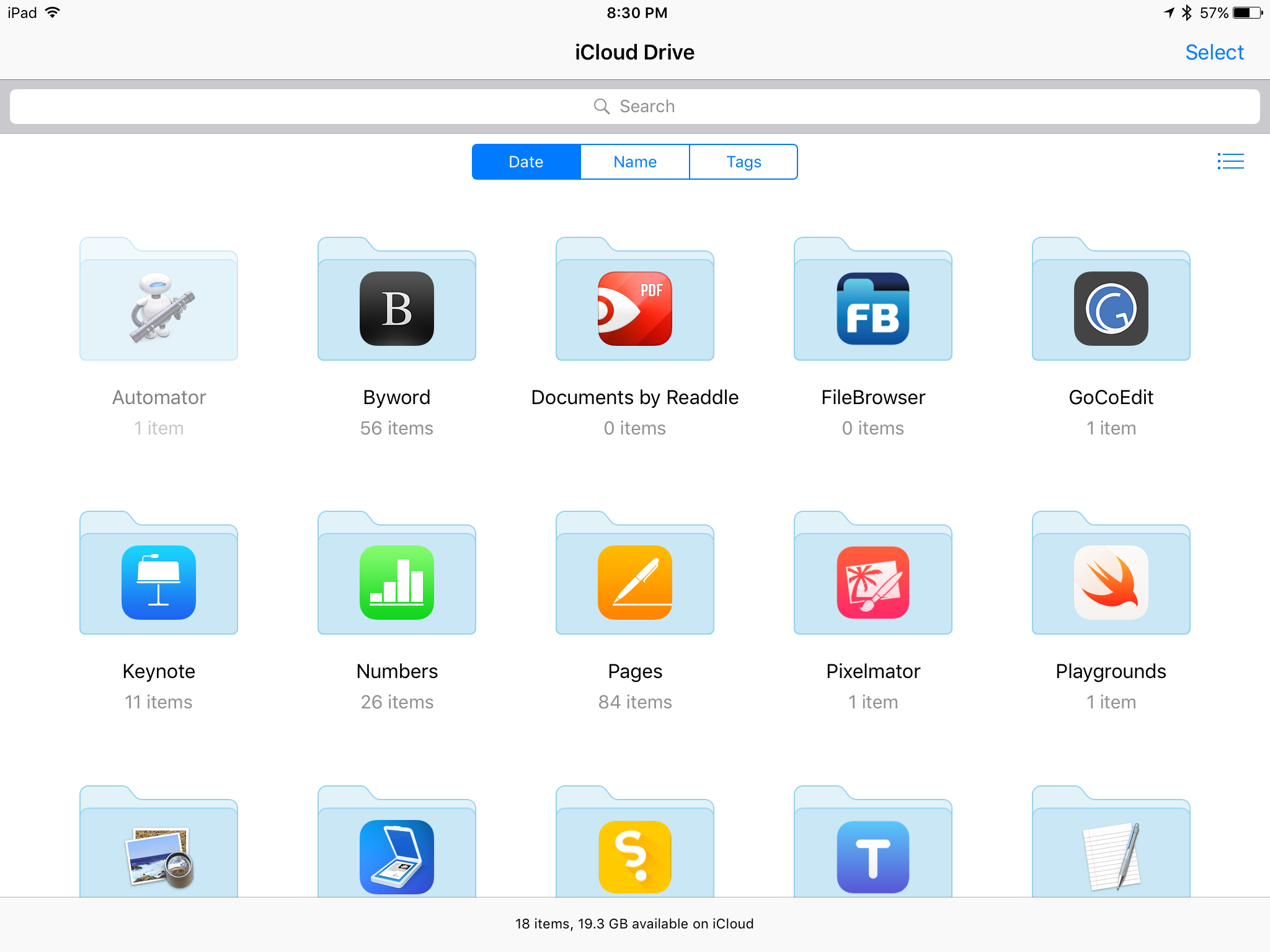
There are different methods to access iCloud files. From within an app is probably the most common way. By default when I open an iWork app I see that app’s documents as they reside in iCloud. But it is also possible to view iCloud folders via the iCloud Drive app or from the file picker. So, for example, if I want to attach a file to an email I can browse through my iCloud folders. It works pretty well. But in many ways the iCloud Drive app is clumsy and somewhat limited. For example, creating new folders in iCloud Drive app is not obvious. I must first select an existing folder or file and then I am then given an option to create a new folder. Also, customizing the iCloud Drive app is very limited. I can choose to view in a grid of icons or as a column/list view hybrid. It is possible to sort by date, tags or name but not possible to add new tags. There is no way to “Get Info” for a file.
I interact with the iCloud file system (usually from within apps such as Pages or Numbers) on a daily basis and it does work very well in that regard. But it is no Finder replacement. Rather, it presents a simplified, iOS version of the Finder. It’s the sort of thing that will frustrate power users coming from the Mac but be perfectly fine for less technically experienced users such as my granny.
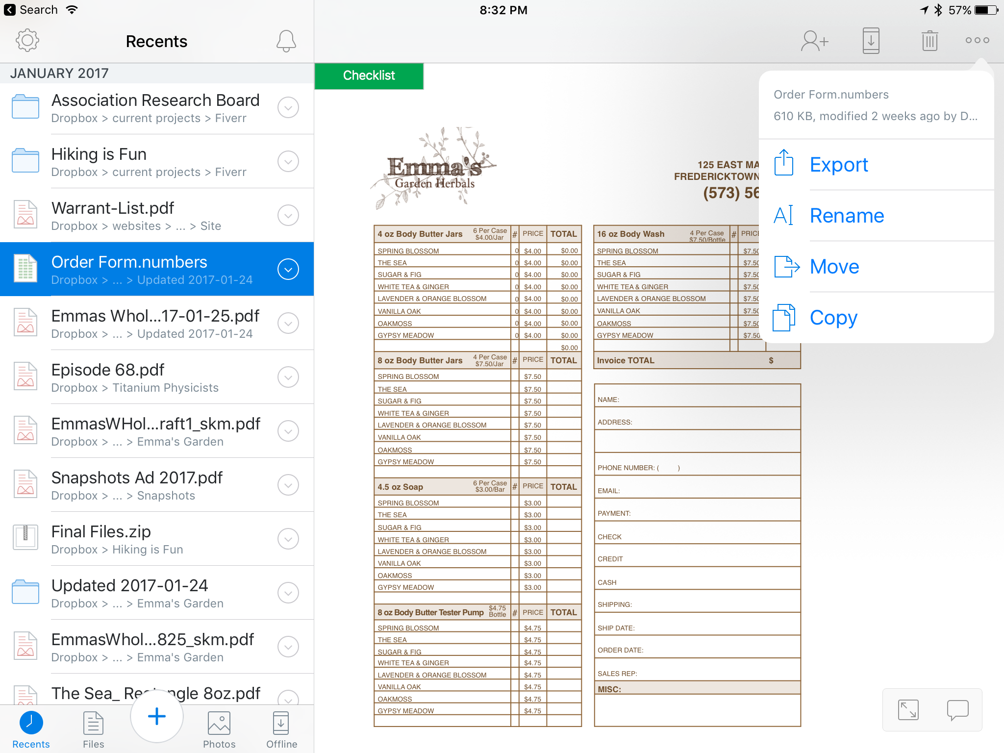
By comparison, the DropBox app feels like a step towards being a Finder replacement. Well, it’s clumsy in its own way but it feels a bit more like the Finder. It does not offer a list or icon view but the column view it presents works fairly well. I can pretty easily navigate through a hierarchy of folders and when I land on a file I get a preview of the file. Even better I can create new folders, add files, etc. Just as I might on the Mac I can browse files and open in their native apps or import into another app. So, I can click on a Word document and open into Word or into Pages. Or I can share it using the normal DropBox method which creates a link which can be shared via email or Messages or any other way I might send text. Or I can export the file and share it as an attachment. If it is a file in a folder shared with a client it’s also possible to have a conversation via comments on the file right in DropBox.
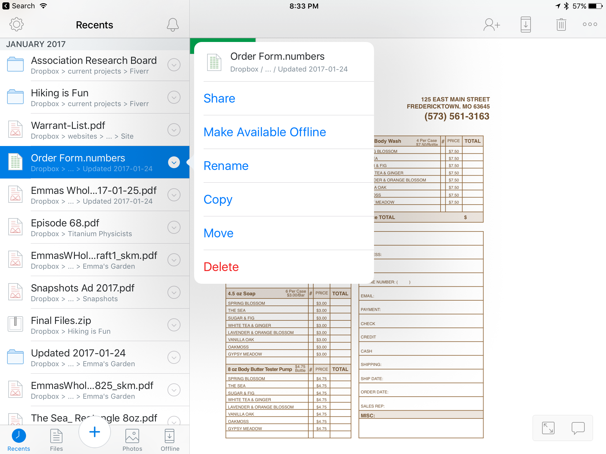
I use DropBox everyday and consider it an indispensable part of my iPad workflow especially when it comes to collaboration. In fact, when it comes to collaboration DropBox on iOS even surpasses the experience on the Mac. For example, commenting on shared files which cannot be done from the Finder. Also, Inviting others to a shared folder or managing the share settings for a folder are all easy to manage from within the DropBox app. All of these things require using a web browser if you’re working on a Mac.
[caption id=“attachment_233” align=“alignnone” width=“2048”]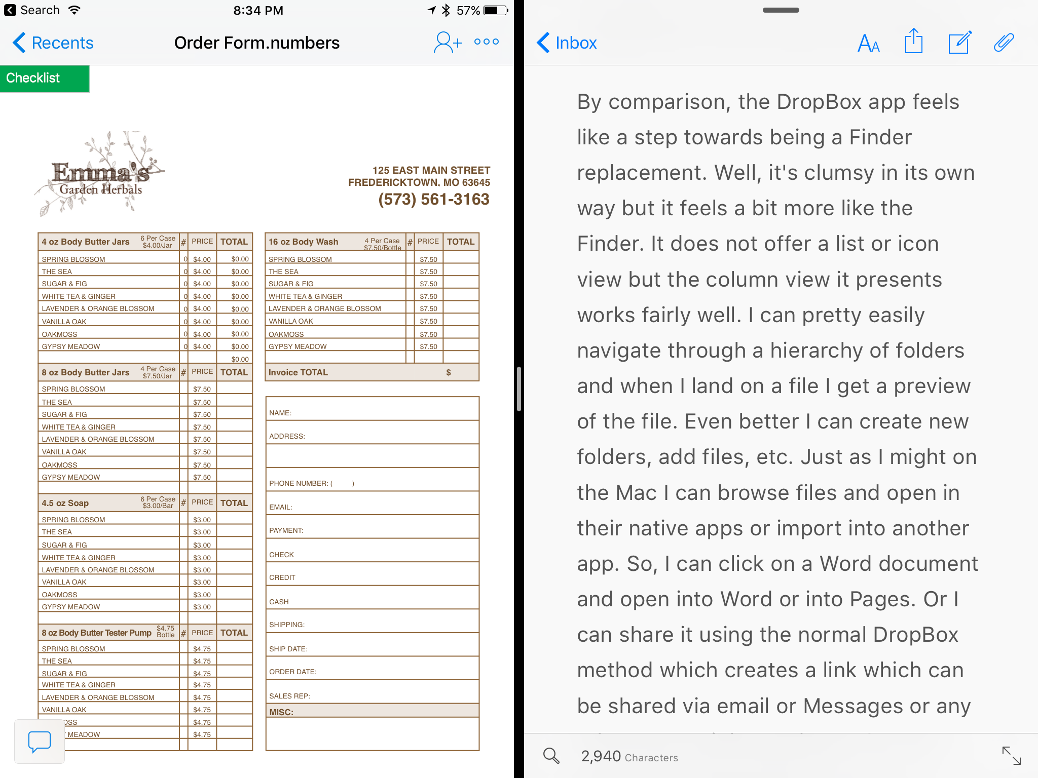 The DropBox app is updated on a regular basis and recently was updated to add support for Split View which is a great addition and very helpful.[/caption]
And of course anything in DropBox is available on any device connected to the internet. I’m not using my Mac as much as I used to but when I do I know that any files I’ve got in DropBox will always be up-to-date regardless of which device was last used to edit the file. This leads me to one last bit that is very specific to my website management workflow. At the moment I have nearly 20 client sites1 that I manage. Before switching to my iPad as my primary device I used to use Coda on the Mac and configured each site to have it’s “local” files in a folder on DropBox. It worked very well as I could switch between my MacMini and my MBP and know that the local files were always in sync. With iOS, Coda does not offer DropBox as a choice for the local files. Instead they are truly local files on the iPad but luckily they are shared with Transmit on the iPad. My super easy solution to back-up these files to DropBox? I open up Transmit on the iPad and connect to my MacMini which is always on as my media server. I can very easily sync multiple folders, files, etc. to the DropBox “Websites” folder on the Mac and it all goes to the cloud automatically. It’s not as easy as it would be if the iOS version of Coda offered DropBox as a “local” file option in the first place but it’s relatively painless and a good example of how a local Mac can serve as both a local back-up and a gateway to DropBox.
iPad Journal: Using Pages
Last time I discussed my use of Numbers. Another useful iWork app and one that is probably better known, is Pages. This is another one that has long been available on the Mac and one which was ported over to the iPad right at the beginning. It’s not quite as powerful as its Mac counterpart but it is VERY close. Also, Pages documents are interchangeable between the Mac and iOS. There have been several occasions when I’ve nearly completed a project on the iPad and then just finished it on the Mac so that I could add in a font that is not installed on the iPad. Easily adding fonts to the iPad is one of those features Apple will need to eventually add if they truly expect people to use iPads as primary or only computing devices. Most people won’t need to bother adding fonts but some of us that are the target of the “Pro” marketing do.
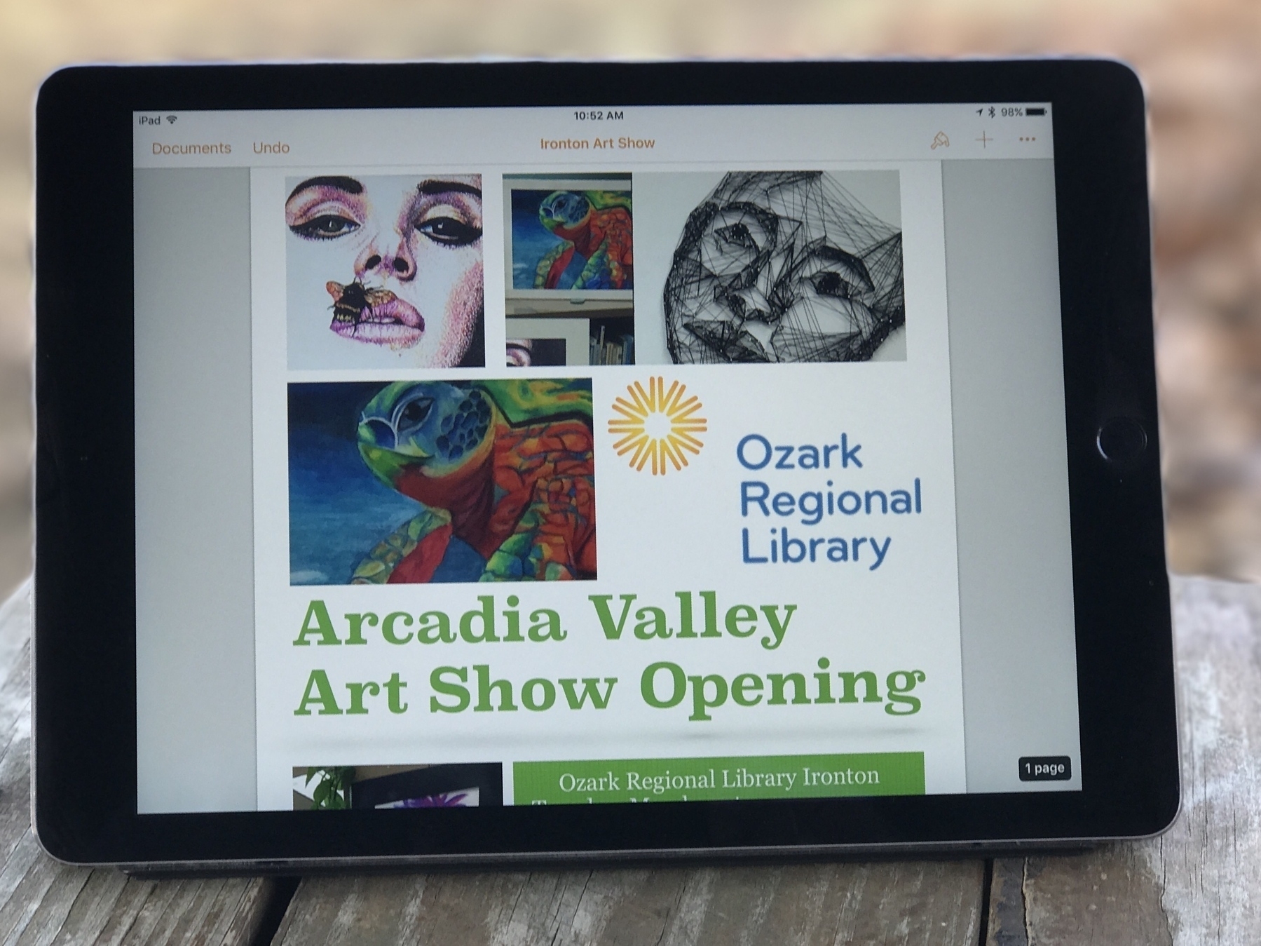
Some of my most recent projects using Pages included brochures for a local business as well as a brochure for our local library. In both cases I started with one of the included brochure templates provided by Apple. I add the client’s content, tweak the design and it’s ready to go. I’ve also used it recently for several event posters and flyers. It’s quick and easy for such projects. Pages is no substitute for something like Adobe’s InDesign but it works very well for brochures, small newsletters, posters and more. At the moment one of the features I miss most is the lack of linked text boxes which are often necessary for larger documents such as newsletters and annual reports. There are other limitations such as no text on path and no stroke for text, features I sometimes need for event posters and flyers. On the Mac version of Pages a pen tool is available but it is, sadly, missing on the iPad. The iPad does offer a line tool but it only allows for one curve. It would be great to see the pen tool added to the iPad.
On the upside, some of my favorite features are the wide variety of graphic and style tools. Of course we expect things like tables and shapes but Pages makes it very easy to add a variety of nice stylistic touches. From different image frames to hover shadows to reflections. Of course such effects need to be used with restraint but it’s very nice to have them.
Lastly, I use it for longer, basic text documents. I often do podcast transcripts and find Pages to be the perfect fit for that job. I open it in split view with Pages on the left and Apple’s Podcast app on the right. This allows for very quick pause and playback control via the bluetooth keyboard as well as the speeding up or slowing of audio with a touch of the screen. I’ve transcribed 30+ podcast episodes this way and it works fantastically.
When I’m done with a document the client usually needs it as a pdf. I export right to DropBox then I pop over to Mail or Airmail and attach the pdf. I could just as easily export to pdf and attach to an email without saving to DropBox but I like to keep the pdfs. Also, using Dropbox allows me to attach multiple pdfs per email which I sometimes need to do. Dropbox serves very well as a compliment to iCloud as a filesystem for the iPad, a topic I plan to address soon.
iPad Journal: Using Numbers
One of the best apps on the iPad is Numbers. For anyone that needs spreadsheets it is essential. I've been using it since it was first introduced on the Mac and then as soon as it was available on iPad. I suspect that, based on some interactions I've had with acquaintances, Numbers is one of those apps that could benefit from some Apple iPad promotion. People seem to be unaware that it exists or, if they are aware of it, do not know what they can do with it. As David Sparks wrote in a recent article about iPad :
If Apple wants to see an increase in iPad sales, I think the answer is making them more useful and getting the word out. Apple should get serious about adding features to iOS that allows users to be more productive in getting their work done. On top of that, Apple should start demonstrating to the public with some its clever advertising how lots of normal people are getting work done on the iPad. I'm not talking about videos of people taking the iPad deep-sea diving but instead how people use it to make spreadsheets, write documents, and all the other work that most of us do to pay for our shoes.
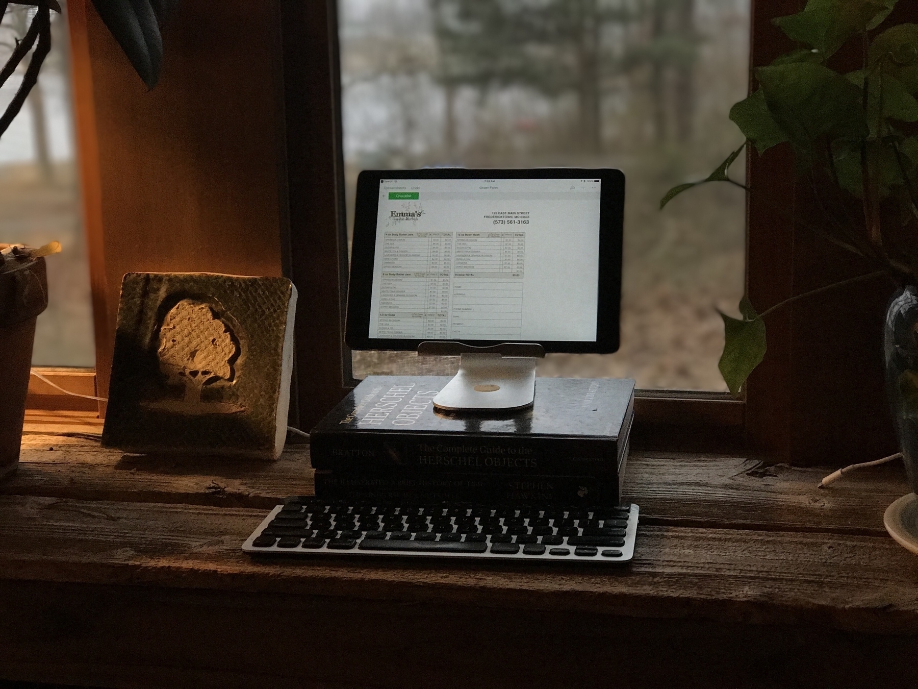
A great example of putting Numbers to work is a client that recently needed some updates to labels for her hand-made soaps and lotions as well as updates to the order form her sales rep uses. As it turns out her order form had been put together by a previous designer using Illustrator. While it looked nice visually it was a mess to edit and was only functional when printed on paper. In conversation with her it became apparent that she would like for her sales rep to be able to enter the data right on her iPhone or iPad so that they could be quickly and easily emailed immediately after the order. The obvious choice was Numbers.
Within an hour I had a Numbers spreadsheet that looked nearly identical to the pretty form created in Illustrator but now she had a form that worked on device, would auto-calculate the total for each line item then calculate the total for each section and, finally, calculate the total amount of the order. No more hand writing and scanning. The whole process is easier and faster for both the sales rep and my client. Even better for my client (not so much for me), she can now update the items in the Numbers spreadsheet herself rather than hire me to do it.
This is the sort of easy to set-up and use workflow that the iPad is perfect for.
Another example would be a Numbers document I created to track my utilities usage. My tiny house shares a utility line with a cabin owned by my sister and her family. I'm a full time resident and they are part-time visitors on weekends. I've got a spreadsheet set-up that allows for easy entry of monthly usage, amount paid and various calculation fields do the work of sorting the payment amounts. I've also used it to keep track of all sorts of data for projects and interests including the membership roster for our local astronomical society, astronomical observing lists, a list of NASA missions and the Periodic Table of Elements.
Numbers is a great way to get started with spreadsheets. It may not be as powerful as Excel but I've found it meets (and exceeds) all of my needs and works great on the iPad. Like all iWork apps it also comes with some great templates that are often a great way to get started on a project. For folks that might need a larger feature set, Excel on the iPad may be the better way to go though I can't say much about it as I've not used it.
One way I hope to see Apple improve Numbers might also require an iOS change and that is to allow for two Numbers windows in split screen mode. I'm sure many would agree that there are times when having two spreadsheets open side by side would be very helpful. For example, I can easily imagine a business owner like my client mentioned above compiling a monthly report of sales in which case she might easily want two Numbers documents open at the same time.
I don't doubt that Apple has plans for such improvements and I'm looking forward to them.
Serenity at iMore is doing a column on people who use the iPad for work
She's already tweeted that she's had a great response within just hours of putting out the request: Use an iPad for work? We want to hear about it!
Hey iMore readers and friends! As part of my ongoing quest to explore working on the iPad Pro, I'm looking into starting a column interviewing folks who do a significant part of their job using an iPad. This doesn't mean the iPad is your only method for work — just that you're using it actively as part of your job.
Based on the screenshot of emails she provided it looks to be very promising. Apple really could and should be doing this sort of thing to promote the iPad1.
iPad Journal: Invoicing with FileMaker Pro
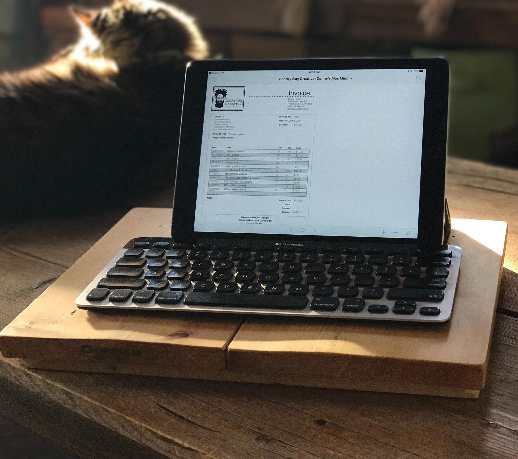
One of my common tasks as a freelancer is invoicing. I've used FileMaker Pro for this task for more than a decade. I host a custom built database on my Mac Mini which is shared and accessed on the local network via FileMaker Go on the iPad. FileMaker Go is an excellent app that lets me do almost anything the full version of FileMaker Pro does. It does not allow for editing the design of the database itself, which is to say, creating layouts, fields, etc. But I have full access to all data and can edit and add new records as I need.
Each client gets a record and then multiple invoices can be created for that client. Each invoice can have an unlimited number of line items added. When I'm ready to send the invoice I click a button which brings up a dialog and with one click to confirm I get a new email with the invoice attached as a pdf. I can then add any note into the body of the email and send. Simple and effective and done right from the iPad. The invoice get's marked as having been sent and dated. With a glance I can look at my invoice list and see those that haven't been paid as well as the outstanding balance for all invoices. If I need to find invoices in a certain time period it's easy as FileMaker Go has great search features. All of this from the iPad.
The only thing I need to use the Mac for is editing the design of the database which I do only rarely. But it's true that a Mac or Windows machine is necessary to add new fields, scripts, layouts or anything related to the building of a database.
Introducing the iPad Journal
As is often mentioned in the Apple-centric media that Apple does not do enough to promote the iPad. Specifically that Apple fails to tell the story of what people can do, are doing with the device. I've certainly become a bit obsessed with the iPad in the past few months. I've had one since the first day they were available to order but it took six years before it really clicked for me at which time I went from a consistent casual user to nearly full time user. In 25 years of using Apple tech I can say that this is my favorite device thus far and the one I'm most likely to be using at any given moment.
So, I'm planning an ongoing journal of sorts in which I'll share not just how I'm using the device day-to-day. I'd like to get into the tasks the device helps me tackle and the apps I find most useful in
the process. I want to tell the story of how and why the iPad has become my favorite and most used technology. Lots of others are doing the same thing and I intend to link to what they are doing as well.
For example, writer Matt Gemmell has recently gone "iPad only" and has written a fantastic series on the process. I highly recommend it. I follow Matt on Twitter as well and I really appreciate his take on things. I'll be sharing bits of what he's doing as he's got a great way of delving into specific areas and workflows that I find helpful.
Others are Federico Viticci and Fraser Speirs who have been hosting the Canvas Podcast which is all about being productive on iPad. Federico is well known as an iPad advocate and is the publisher of MacStories. He writes a pretty amazing review of each year's iOS update and is one of my favorites.
Then there is Serenity Caldwell, Rene Ritchie and iMore in general. Serenity or Rene use the full range of Apple tech but both use the iPad a lot and often write about it, especially Serenity. I've come to really appreciate iMore as a site that that tends to stay positive and one which increasingly focuses on how to use Apple tech rather than share rumors.
Most recently I've really enjoyed the writings of Matt Birchler at BirchTree. He uses an iPad Air 2 as his main machine. I expect I'll likely share some of his posts as well.
There are plenty of others.