iPad
- The Mac is a keyboard/mouse/trackpad driven computer with a more mature, more open desktop OS.
- The iPad is a touch-first mobile computer that has additional "power user" features when connected to a keyboard and mouse.
- Successful responses based on current feature set: 9/10
- Innovation and addition of new features: 3/10
- HomeKit: Checking temperature of various locations with sensors, controlling lights and appliances. Almost always successful.
- Open/run a shortcut
- Open an app
- Open web pages
- Make a new reminder
- Make a new event
- “Make a new note” followed by my dictation of text. Really nice to start a note when I’m out walking and have a thought, observation, etc.
- Get the weather - this has gotten worse not because of Siri but because Apple’s weather app seems to be completely borked in terms of the forecast and eve current conditions. Before dark sky integration this was MUCH better
- Checking location of a family member
- Initiating a phone call to a local business or someone in my contacts
- Creating, dictating and sending a message
- Play the latest news from my NPR station or play the latest episode of “Podcast name”
- Play (music group name) which will play a random rotation of songs from that group
- Maps/businesses: What time does “business name” open
- Maps/businesses: How far is it to “business name” in “town name”
- Maps/businesses: Getting restaurant info
- Quick facts: How many calories in a serving of “food item”, what time is sunrise, what’s the current phase of the moon
- I usually use Reeder for news but if I want to do a quick news check on a specific topic Siri will yield articles from Apple News that’s presented in nice, clickable thumbnails: "What’s the news about “current event”
- Quick math calculations
- Initiating a search of my own photos. This worked very well several years ago but no longer. “Show me my photos of dogs”, “Show me pictures of mom”, etc, results in a search of Bing images. Perhaps worth noting this works perfectly when initiated from a spotlight search, but fails when initiated from Siri.
- Multiple follow-ups, conversational interactions (not really a feature in the first place). This is a specific feature noted for the upcoming release of iOS 17.
- Asking Siri for recent emails or messages for a contact yields inconsistent results and a cumbersome, difficult interface. If I ask Siri to show me recent emails from a contact it usually only shows one email but sometimes will show more and will read the first email subject line asking if I want more read. If I say no the list disappears. There's no way to interact with the found emails.
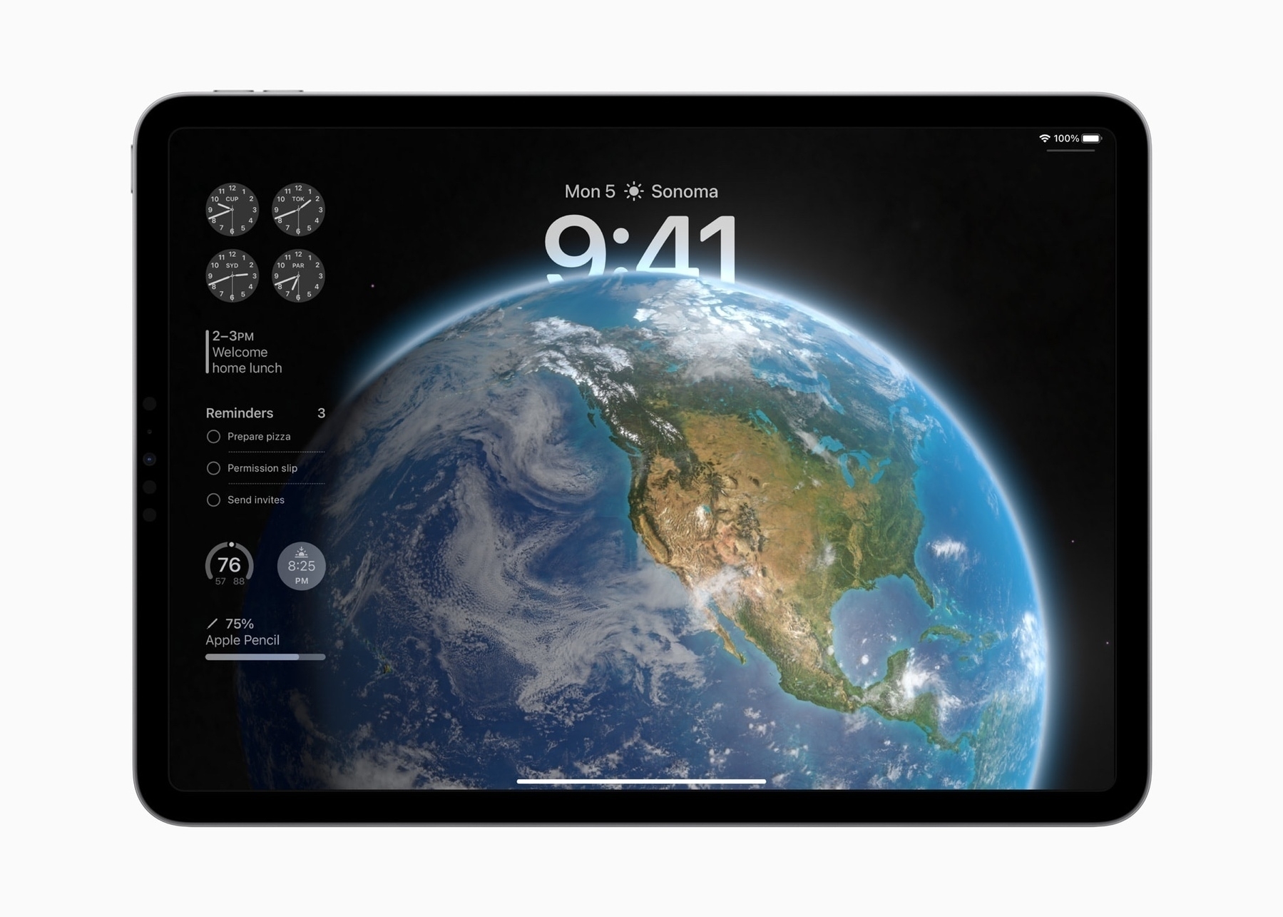
- The customizable Lock Screen with widgets looks really nice and I imagine will be a helpful addition.
- Interactive widgets (and more placement options of those widgets on the Homescreen).
- PDFs in Notes get some really excellent updates like machine learning that recognizes/creates form fields. For people that use pdf forms or who rely on pdfs for annotating or collaboration, these updates will be really useful. I can imagine this will be really great for students.
- Notes gets cross-note linking which is going to be helpful for some.
- Reminders is getting a new column view and categories for grocery lists.
- Not too surprising, Stage Manager is getting more window resizing and placement options which will improve the experience.
I’m not planning on writing this up, but I have gone through iPadOS 17, and all my old posts about iPadOS 16, and collated a list of many of the things Stage Manager still gets wrong.
I appreciate when users take the time to document problems but it’s worth noting that in some cases “wrong” is opinion as opposed to broken. Just one example in the list, the dock disappearing when a window is moved down to bottom of screen. I like and want that to remain as it’s useful to me. I can swipe the dock up if needed or move the window.
The iPad originated as a touch-first computer and remains touch-first 13 years later
An interesting aspect of the ongoing discussion about the iPad is that it's primarily from the perspective of Mac "power" users. Which is to say, long-time users that have been using the Mac and are most comfortable with its feature set and interface. These are users that have and want access to the most open-ended computing experience possible. They're very efficient with their Macs and have time-tested workflows with apps they know well.
In terms of understanding the iPad as a broadly used computing platform, it's important to remember the bias of the most heard on-line voices which are, predominantly, the voices of content creators and tech enthusiasts that publish podcasts, videos on YouTube, and websites.
But what about the touch-first users? I've often referred to my extended family when I've written about the iPad. They seem to be what I assume is close to the average. They're not tech-oriented, they don't read tech blogs or keep up with the latest hardware. The iPad users in this group have never heard of Stage Manager or even Split Screen.
Their most used apps, including those that use Macs: Safari, Messages, Photos, Mail, Notes. Other apps most used: Netflix, Facebook, and a few games. No one in the sample develops applications or publishes videos or podcasts.
They are almost all touch-first users, relying on their iPhone for at least 50% of their "computing". Those that use an iPad use it about 50% of the time to compliment the iPhone. Most of them are using these two devices. There are 3 Mac users compared to 6 iPad users and 2 PC/Chromebook users.
If my family is even close to average then it would be accurate to say that there are more touch-first, casual users than there are "power users" that use a mouse/trackpad/keyboard.
Of the 3 that use a Mac, 1 is a college student, 1 recently graduated from college, 1 retired. All 3 use their iPhone far more than their Mac. The two who use computers full time at work are using work issued Windows/Chromebooks. When not at work their computer is the iPhone.
So, in my family at least, casual, touch-first users dominate first with iPhone, then iPad. Their usage patterns seem to reflect the larger picture of Apple's sales for the past 13 years and it explains why Apple has prioritized iOS and touch-based computing for the past decade.
The iPad started as a touch-first tablet computing device and it remains as a primarily touch-first tablet computing device. Admittedly this is my best guess based on anecdotal observation and a general sense of Apple sales numbers, but if true then it would be accurate to say the iPad, in use, remains closer to the iPhone than the Mac.
2015: iPad Pro
All that said, Apple opened up a whole new set of expectations when they released the much larger screen 12.9" iPad Pro in 2015. It instantly created a whole new idea of what the iPad could be and speculation about where Apple would take the platform.
The 2015 iPad Pro brought with it the Pencil and the return of an iPad specific keyboard offering from Apple. It's been 8 years and I was curious about the initial reviews of this first iPad Pro.
From the Tech Radar review of the 2015 iPad Pro:
The iPad Pro could be a lot of things to many people - including professional users, considering the amount of business apps in the App Store. To some, a great sofa pal. To others, a brilliant hybrid device that enables them to flip effortlessly from sketching to movies to typing reports on the go.
Is it good enough to usurp the need for a MacBook Air? Could you ever get by just using this tablet and the optional accessories around it, or does it need to be part of a larger family – a device that's perfect for certain situations but gets relegated when it's time for proper work?
There was only one way to find out – force myself to ditch the laptop and try to write this review on the Pro (and you can see the results below). While that wasn't as easy as I'd hoped, I've found a lot of use for the iPad Pro 12.9 in day to day life.
He goes on later to [describe the process of writing the review](https://www.techradar.com/reviews/pc-mac/tablets/ipad-pro-12-9-1269255/review/5). His conclusion on writing, editing images and posting the story:
But I learned a lot about the iPad Pro's capabilities in that time. This thing is definitely capable, and the amount of workarounds are large - you can get things done, just not as easily, and since then I've used it on the train to do loads of different bits and pieces and really enjoyed the portability.
iOS isn't a desktop experience, and I can't see it ever being. As such it's hard to call the iPad Pro 12.9 a definite laptop replacement. For some, it will be more than enough, but workers might struggle with the limitations iOS brings through its silo app methodology.
And Macworld also wondered about the intended use and audience for the iPad Pro:
One mild concern that is currently troubling us is the issue of who exactly is expected to buy it, and how it will affect (and potentially confuse) the buying decision...
Five years after its launch, questions still remain over the iPad’s ability to operate as a primary work tool – because its screen is smaller than almost all laptops, because iOS is limited in many areas, and because the iPad can’t multitask. Some or all of these shortcomings can be addressed in a 12-inch iPad Pro,
They go on to mention possible use-cases such as office productivity and creative as well as the available software and the lack of multitasking.
Though much has changed with the various iterations of the iPad OS and available apps over the past 8 years, many of the questions raised in those first reviews persist today. From pundits to article comments, many Apple nerds are still confused and frustrated by the iPad.
But I do think some clarity can be found in two simple bullet points:
For those that want the full-on power user experience with fewer OS limitations, the Mac is the choice.
For those that want touch-based computing that can be extended with the addition of a keyboard/trackpad/mouse there is the iPad.
The iPad Failing Again: Summer 2023 Edition
It's late August 2023 and during this slow time for Apple-related news the pundits have all found time to circle back around to the age old problem of the iPad. The most recent round seemed to start with Jason Snell's post Giving up the iPad-only travel dream.
I’ve noticed that a lot of my colleagues who were previously working hard to integrate the iPad into their professional work have backed off, retreating to the more flexible and powerful Mac side of the house.
The iPad is a tool meant to help you. If you're working hard to make it work it's possible that you may have chosen the wrong tool. Of course, it's also true that a powerful tool like a computer and the associated app ecosystem might take some time to learn and explore. Depending on one's workflow and needs, willingness to learn and explore, it may not be an obvious mis-fit.
But he goes on:
I’m not at all ready to declare the “use iPad to get work done” experiment dead. With the forthcoming release of iPadOS 17, Stage Manager has thrown in a bunch of improvements that suggest the iPad’s progression to more functional status continues, albeit at a pace that’s a bit too slow for my liking.
He then discusses the ways that the iPad doesn't fit as well as the Mac for his specific needs. The stand-out shortcoming is, not surprising for a podcaster, the limitations of the iPadOS audio system which has never been up to the needs of podcasters. This has been a well known issues for years and yet, they keep trying, failing and complaining.
The real problem seems to be knowingly using the wrong tool for a very specific job. And in the case of this select group of independent Apple "content creators", there is the added element of drama, brand identity and the ever persistent need for new content fodder. It's especially gross on tech/Apple You Tube.
But, for the moment, let's assume it's not about content fodder. What is it? There is this strange fascination some have with the iPad. It's the computer they use but shouldn't. Or don't use but want to. Folks, just walk away.
Back to JS:
My productivity needs are clearly unlike those of most people, but the truth is that everyone’s got different productivity needs. The problem with the iPad continues to be that as it builds functionality, it has failed to build in flexibility—or at least the flexibility offered by a platform like macOS.
Yes, true, we all have different needs and the iPad will work for some, not others. But the discussion of flexibility is not so clear-cut. In terms of OS, yes, macOS is more open and more flexible. We'll come back to that in a moment. But in terms of hardware, I've found the iPad form factor to be the one that is the most flexible. In fact, the modularity of the iPad is one of its strong points.
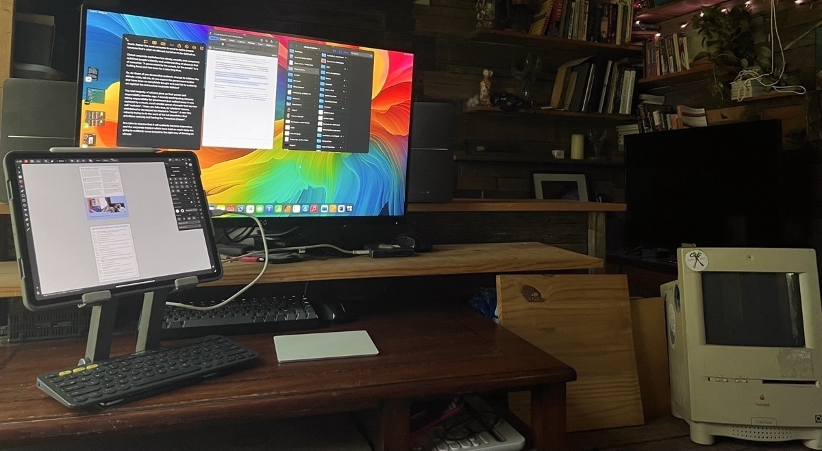
As I type this I've got the iPad in a stand raised up 6 inches for better posture. I'm using an external Bluetooth keyboard and a mouse. I could be doing this at my desk but at the moment I'm reclining on my futon with a little lap desk. It's fantastic. I'm not using the touchscreen much so it's sort of in traditional computer mode. I can do all sorts of things in this physical arrangement.
But if I need to adjust or change modes I can set the lap desk, stand keyboard and mouse aside and use the iPad as a tablet. No keyboard stuck to it, just my hands for scrolling, swiping, tapping. You know, a tablet. And in a few weeks as the weather cools I can attach the keyboard to the case and step outside to a table on the porch. If I need the keyboard/trackpad, cool, it's there. If not, no problem, I can detach it and get it out of my way. Thanks to the flexibility of the iPad I can do all sorts of things with just my fingers on the screen or the Pencil. And in a pinch, if I don't want to bother reaching for the keyboard dictation has gotten good enough that it's easy to dictate text.
My point is that any discussion of flexibility in regards to computers should take into account the physical form factor or it is an incomplete discussion.
Jason goes on to talk about a the Stream Deck, a device he finds useful but which won't work with the iPad. He goes on:
This is where the iPad is today. It’s good enough for what it does. If it doesn’t do it, it doesn’t do it. This is the fundamental difference between the Mac (a platform that basically lets developers and users do anything they want) and the iPad (where if Apple doesn’t specifically allow it, it can’t be done).
But, you know, not really. Yes, it's true that the iPad is locked down in a way that the Mac isn't. That's due to its origins in iOS and the initial intended niche as a super easy to use and safe computer for anyone. Its initial positioning in 2010 was indeed as a tablet computing device meant for consumption but with acknowledgement that it could be used for more computery tasks like creating documents in Pages.
But yes, 13 years in and Apple continues to balance between ease of use, safety/security and the low maintenance simplicity of a computing device with full-on, do anything computer. A variable to remember in this scenario is that the largest portion of the iPad user base is likely to be less sophisticated users. Certainly this is the case in my own extended family where most iPads are used daily as primary computers for basic tasks. I'm the only one using the iPad in its more advanced modes.
In any case, when discussing any computer platform or OS, much of this seems relative. Talk to a Linux or Windows user and they'll have their opinions of the limitations of macOS and/or Mac hardware.
Back to JS, he states that with the Mac "Apple doesn't have to think of every use case" and that it "empowers developers and users to build what they need" thereby extending it's functionality which he pits against the iPad as being limited by Apple and it's operating system cycle which is too slow.
Okay but again, the Mac has been around longer and you know, from Apple to third party developers, everything (waves hands in the air wildly) takes time. There are other considerations with the iPad. If you are tired of waiting as you say you are then it sounds like it's time you moved on. That's okay. The iPad is not the tool you need. I mean, I don't try to make toast with my blender. And if I did I don't think I'd offer it up as a critique of the blender.
He concludes:
I want to do it all on my iPad. I hope that one day I’ll be able to.
But why? If the iPad is not the right tool for the job just accept that and move on to the tool that works for you. It just seems like a strange fixation at this point.
Speaking of moving on, John Gruber, linking to Snell, also chimes in:
But I know I’m best off, productivity-wise, using my iPad basically as a single-tasking consumption device for long-form reading and video watching.
The reason this topic remains evergreen is that I want to use my iPad more. There’s something ineffable about it. It’s a thrill when I use my iPad to do something that an iPad is actually best at. I honestly think I’d be more productive if I owned no iPad at all, yet I keep trying to find ways to use it more.
Not much to say regarding Gruber other than he uses BBEdit for all of his writing. He's mentioned it many times over the years. And while there are many excellent text editors on the iPad BBEdit is not. So I'd guess that's a limiting factor?
While it's pretty clear that JS really has used the iPad and Gruber has tried it over the years, the next example is off the hook goofy. Truly uninformed Apple podcasters willing to discuss the iPad that borders on the embarrassing. In the August 25 episode of The Context Machine Jeff Gamet and Bryan Chaffin take on the iPad and though they don't mention it I'm guessing the Snell article is what prompted this conversation. Just a guess but it seems pretty common for these folks to echo one another with the same topics and opinions. I've listened to this podcast off and on and Bryan especially seems to be one of the most uninformed Apple podcasters I've heard. Early in the conversation he complains that the iPad does not do Command-Tab app switching as well as the Mac. When pressed by his co-host who correctly states that it works exactly the same with any keyboard as it does on the Mac Bryan admits that he hasn't actually used a keyboard with his iPad.
Ummmmm. Okay. Cringeworthy.
But he keeps digging his hole. He then says "I feel like the lack of a mouse on an iPad is going to also make this more complicated."
This is some high quality, knowledgeable punditry. It's clear that Bryan has no clue what he's talking about. Of course the iPad can be paired with any Bluetooth mouse or the Apple Trackpad and has had this feature since the spring of 2020. I'll file this into the folder of examples of Apple podcasters feeling free to discuss features of a device which they have not made a good faith effort to actually use at all or regularly enough to learn how to use.
At this point in the podcast Jeff diplomatically skirts the issue and simply says that he has no problem using the trackpad or a mouse with the iPad and he indicates that he does it regularly. In fact, he makes the case for the iPad being capable of almost anything a Mac can do. But then does a turn about and falls back to the current pundit/podcaster narrative: He can't do his podcasting. When pressed for other examples he finally comes up with the inability to plug in multiple drives which of course, isn't a problem. Plug in a hub and then plug in as many drives as you have ports for.
Honestly, the whole conversation is so sloppy. He finally brings up multiple apps and windows on the iPad saying it's clumsy. Then he brings up multiple drives again. To be clear, plug in a hub and then drives to that hub and Files app shows every attached drive in the sidebar. Then drag and drop between them with no problem, exactly like the Finder.
It's almost as if old-timey Mac users want to dwell on short comings in iPadOS that no longer exist simply because that's the easy thing to do for them as Mac users. They simply don't want to be bothered to learn or be informed. It's a strange, confused conversation. More than anything it demonstrates that some podcasters don't feel an obligation to be informed on the topics they cover.
Perhaps the real story here is that there are far too many indy content creators in the Apple/Tech bubble and as a mini cottage industry they're all just stepping on one another, repeating the same casual rumor talk.
I'll have to keep looking for more informed, thoughtful nerdery that makes the effort to explore the actual, helpful on-the-ground use cases of the existing tech.
Pundits, podcasters, it's okay to just move on, use the Mac and be happy. Remember, not every tool is made for you or will be useful to you. You can trust that there are those of us out here that find the iPad to be the perfect computer for us and what we need to do with our a computer. We'll leave you to your Macs and hope that one day you'll be able to turn your gaze away from the iPad and learn to be happy with your Mac.
Testing a mouse with the iPad. Works better than I expected but it’s an old, cheap mouse. Scroll wheel is a bit funky and every now and then tracking get’s wonky, seems like the bluetooth connection is lagging. Anyone use the Logitech Lift mouse with an iPad? Do the multiple buttons work on iPad?
Multitasking and Windowing on the iPad Pro
In recent days I've been thinking more about multitasking and windowing on larger iPads. I posted a couple days ago about using the iPad Mini more often in part because I'd been feeling that I might be better served by the smaller iPad Mini for non-work, everyday sort of browsing and reading.
Is Mac windowing the ideal?
As luck would have it the same day I posted that story the weekly episode of Mac Power Users was released and the topic covered: window management on the Mac. In recent weeks and months I've been seeing the topic of window management on the Mac come up on Mastodon and podcasts. When I've seen it come up it's being posed as "why is window management on the Mac still a mess and when/how will Apple fix it?"I can't help but puzzle at this because for the past couple of years much of the ongoing critique/frustration directed towards the iPad from the nerd community has been along the lines of "iPad multi-tasking is terrible, the iPad needs windowing like the Mac, the iPad needs macOS, etc." Then Stage Manager came last year and that critique got louder with the Mac being held up as the windowing that the iPad needs.
So this iPad user has been surprised to hear recently that at least some users think windowing on the Mac is too complex and needs to be fixed. 🤨🤪🧐
In the MPU episode one of the solutions mentioned repeatedly is tiled windows which is an option in Windows OS. On the Mac there is no Apple provided solution for tiling beyond 2 split windows but there are several 3rd party solutions and these seem to be fairly popular for those that don't want to spend a lot of time with arranging free form windows.
Multitasking and windowing on the iPad
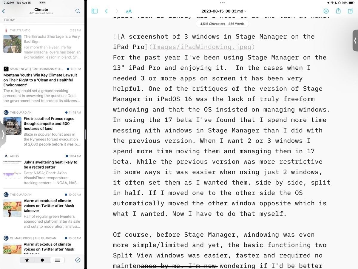
When using the 13" iPad, more often than not, I only actually use one app at a time. And on the occasions that I need more than one app it's often just 2 apps that I need and the relatively simple Split View is likely all I need to do the task at hand. Before the introduction of Stage Manager with iPadOS 16 Split View served me very well. Though it is a more limited option the basic functioning of two Split View windows is also easier, faster and requires practically no maintenance by me. It provides a hint at why some Mac users want window tiling as an option.
I can understand why some users would want more than two app windows and that's why Apple tried to solve the problem first with Slide Over windows and then the floating windows found in picture-in-picture video and then Quick Notes. Though helpful all three of those options have their various limitations in terms of sizing and placement on screen. And of course in each case they cover up a portion of the screen. Some (myself included) wished for an option to have three tiled windows rather than just 2 Split View. I'll come back to that.
Stage Manager
With the first version of Stage Manager users got something close to tiling. A kind windowing with floating windows with more sizing options than previously but still managed in placement. Almost tiling but not quite. Almost free form Mac windowing but not quite. And for the past year at least some iPad users complained quite loudly that it still didn't solve their problems.
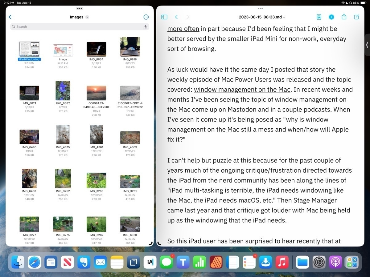
For the past year I've been using Stage Manager on the 13" iPad Pro and enjoying it. In the cases when I needed 3 or more apps on screen it has been very helpful. But it's worth pointing out that even the 13" iPad is on the small size when compared to laptops in part because window chrome takes up more space. On the 11" this is even more true. With the added window chrome and border space around windows forced by the OS, really makes using 3 windows or more feel cramped. It works on the 13" screen but I can't imagine using that many windows on an 11" iPad.
In using Stage Manager on iPadOS 17 beta I've found that I spend more time managing windows than I did with the previous version. While it's true that I have much more control of positioning and sizing that increased control also translates into more time and effort from me. But this is exactly what many users clamored for. A more Mac-like, free form windowing.
But there absolutely is a trade off. While the previous version was more restrictive in some cases, for example if I just want two evenly split windows, it was much easier. I could set them up and if I wanted to switch sides I could just drag one and the OS would move the other for me. Now I have to move one window then move the other. It's a small thing but it can add up over a day as you find yourself adjusting tasks and workflows.
Between the two versions of Stage Manager I'm not sure which I prefer or if I actually would be better served going back to that simpler multitasking version Split View with Slide Over as needed. On the smaller screen of the iPad, with more window chrome, I'm starting to think that there is a third, better option.
Tiling
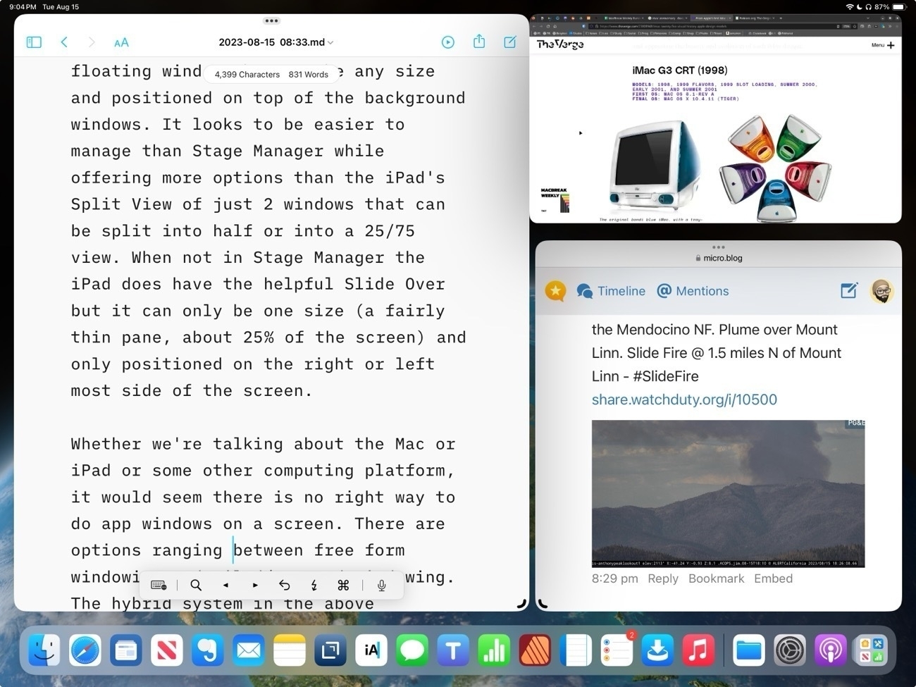
Personally I was hoping for some version of tiled windows. Watching this video review of the Samsung Galaxy Tab S9 Plus and at about 3:46 I see something very close to what I would consider ideal. Essentially, it's an improved version of Split View that allows for up to 3 windows that can be split into any size. It also allows for windows to be pulled into "pop-up view" which is, essentially, a free form floating window that can be any size and positioned on top of the background windows. It looks to be easier to manage than Stage Manager while offering more options than the iPad's Split View of just 2 windows that can be split into 50/50 or into a 25/75 view. I think a 3 pane Split View would be far more useful than the current model that allows for the addition of a Slide Over window that covers other content.
Whether we're talking about the Mac or iPad or some other computing platform, there is no perfect way to do app windows on a screen. There are options ranging between free form windowing and tiled/managed windowing. On the iPad I do think Stage Manager as optional mode is definitely an improvement and I suspect that many that wanted windowing on the iPad will be happy with the new freer form implementation.
For myself, I'll be wishing for tiled windows in the above mentioned Galaxy Tab review. An option for a third pane Split View with free-form splits of any size would be my ideal.
Love Notes to Newton is a film about what a beloved (but short-lived) pen-based Personal Digital Assistant created by Apple Computer has meant for the people who used it, and the community who adore it.
I never used a Newton but as someone who loves the iPad I really enjoyed this documentary. And have a better sense of the lineage of the iPad as a result. And so much fun to see nerds nerding out about things they love.
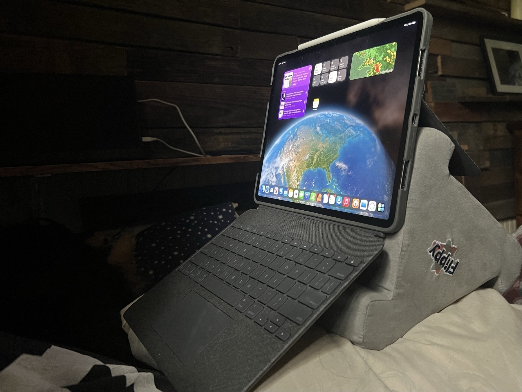
I've found the most comfortable position when working from the bed/futon in my tiny house. Never thought I'd use a pillow stand but was given one and it actually works really well with the Logitech Combo Touch. Perfect eye level and typing angle and really stable when placed on a pillow.
I’ve just discovered my new favorite iPad Nerd! Felicia, also known as the Low-Tech Grandma. After using Windows for most of her life she decided to switch to the iPad a couple of years ago and has documented the process.
After years of blogging on WordPress she decided to switch over to a hand coded static site. Not surprisingly she chose Textastic and wrote a bit about using it to code HTML on an iPad:
After a while, I noticed that I spent more time updating WordPress, the plugins, and themes than I did putting new content on the blogs. It was a time drain. So, I decided to slowly work on converting my blogs to static websites.
In the Windows environment, I used Notepad ++ as my HTML editor of choice. Unfortunately, it did not work on the iPad. So, I had to find a replacement. After much trial and error, I settled on Textastic. It is the perfect Notepad ++ replacement. As a matter of fact, I think I like it even better.
I love discovering geeks that fall outside of my experience of the tech “community”.
I’m finding the new Siri improvements way more useful than I expected. Though a small thing the no “Hey” required really does make for less friction in usage. And multiple follow-up requests without reactivation is also better than expected. Small refinements can make a big difference.
Lol, I’m not sure why I do this but yet again I’ve started a comment to an article that has turned into a full-on post. Entertainment? I suppose I might as well share it. This one was a post by Michael Tsai in which he references a generally positive post by Jesse Peterman who recently wrote about trying an iPad Pro for Coding. I suppose that this is really a reply to both Michael and Jesse. In summary, I think Jesse’s post was fair and accurate though several of the comments on his blog do mention solutions that he was unaware of so it may be that at least some of his critiques were actually met by those apps.
Often times such pieces are written from the perspective of users who have been using Macs or Windows for a long time. I’ve lost track of the times I’ve come across posts by people that wanted to “try an iPad as my main computer” and then a week or month later they conclude it’s not possible because it was a different experience from what they were used to. In a short time frame there’s a lot more friction as a new-to-iPad user settles in. Windowing and multitasking seem to be be the initial primary obstacles but then also, sometimes, needed apps that are not available or if an app is available it’s not an exactly match to the version they’re used to.
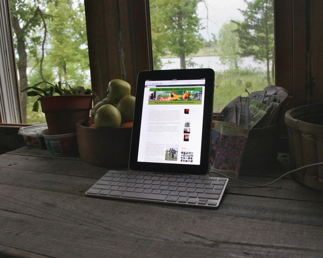 My original iPad docked in Apple’s Keyboard Stand
I came to the iPad as a long time Mac user (A Color Classic and System 7.6). Like many I bought the first iPad and in those days was happy to use it as a tablet along side of my Mac. But I also bought it with the the Keyboard Stand accessory that Apple sold and within the first few months had found an app, Gusto, that was built for managing/coding websites. It had a very similar feel to Panic’s Coda with a sites window with thumbnails, an excellent text/html editor and a built in ftp client. Well, that gave me my first taste of “using the iPad for real work”. Given that much of my work then (and now) involved setting up and maintaining small, static websites in the old school html/css/ftp way, well, I was actually quite happy with that set-up.
Over the next few years I happily bounced back and forth between the Mac and iPad. In those early days I relied on the Mac for graphics focused work and the iPad for reading, writing, blogging and code. Around 2016 Serif started releasing iPad versions of their apps and that allowed me to switch over another chunk of my work. None of this was planned, I enjoyed using my Mac and iPad together. But when given the opportunity I usually chose the iPad if it was the right tool for the job. By that time I’d learned all of the gestures and with each new year I learned any new gestures, new features, etc.
Using the iPad beyond casual consumption requires mastery of its interface and an interest in taking advantage of what makes it different: the touch screen. This is really key and seems obvious but many seem to overlook it when discussing features, price and limitations. Of course a 13" iPad Pro is going to be quite expensive, its got a large glass touch screen. In some ways it is more limited and these days its battery life is less than the M-based Macs. And yes, it’s heavier than some when you add in the keyboard.
I still keep a Mac Mini around as a file server and as a back-up but sold my MBP back in 2017. I feel a bit like a ninja or a wizard with the iPad. Being able to use it without a keyboard is something I really value. I long ago mastered the many multi-touch gestures that are available and my fingers are always dancing across the glass. I enjoy that experience. But the keyboard is always nearby and about 50% of the time is attached and I’m happily using the keyboard, trackpad and touchscreen together. And still other times I’ve also got an external monitor attached.
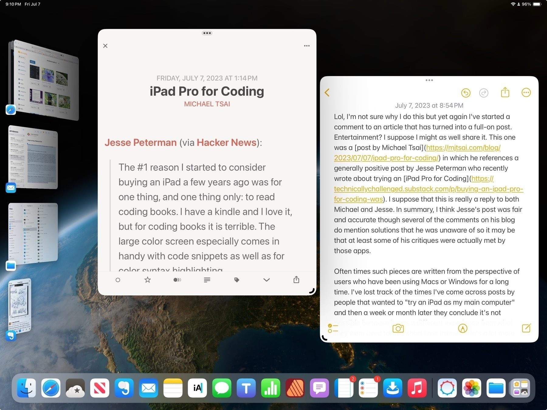
We’re 8 years in since the release of the 1st iPad Pro and though the evolution of iPadOS has been too slow for some I’ve found the last three years of features have added up to a refined user experience that brings a more flexible, powerful range of possibilities for anyone that wants to take advantage of a touch screen, modular form factor. Really, at the end of the day, I like to celebrate the fact that we have so many Apple computers to choose from because it also means so many more people get to have the comfortable computing experience that lets them do more. It’s a win for everyone.
If using the iPad is something you’re interested in I’ve written 100+ iPad focused posts.
A check-in with Siri and Apple's Machine Learning
First, to begin with a recent bit of related news from Humane, a company founded by ex-Apple employees that has finally announced it's first product. I bring this up at the beginning of a post about Siri because the purported aim of the product, the Ai Pin, is ambient computing powered by AI. It is a screen-less device informed by sensors/cameras that the user interacts with primarily via voice or a touch-based projection. Humane is positioning the device as a solution for a world that spends too much time looking at screens. The Ai Pin is intended to free us from the screen. It's an interesting idea but, no.
My primary computer is an iPad and then an iPhone. These are supplemented with AirPods Pro, the Apple Watch and HomePods. Of course all of these devices have access to Apple's assistant Siri. It's common among the tech and Apple press to ridicule Siri as stagnant technology left to wither on the vine. A voice assistant that's more likely to frustrate users than enable them in useful ways. The general joke/meme is that Siri's only good for a couple of things and that it often gets even those few things wrong.
But that's not been my experience. In general my experience using Siri has been positive and I've long found it useful in my daily life. I do think there's some truth to the notion that Apple's been fairly conservative in its pushing forward of Siri. As is generally the case Apple goes slowly with careful consideration. I'm not suggesting Siri is perfect or finished. Of course not and yes, there's more to be done.
All that said, I consider it a big win that I have an always available, easy to access voice assistant, that compliments my visual and touch-based computing. I use Siri several times a day with very good results and I’d say that my satisfaction with Siri the voice assistant is pretty high just in terms of the successful responses I have. My primary methods of interaction are via the iPad or iPhone, sometimes with AirPods Pro, using a mix of Hey Siri and keyboard activation.
Here I'm offering just the most basic, 2 point evaluation:
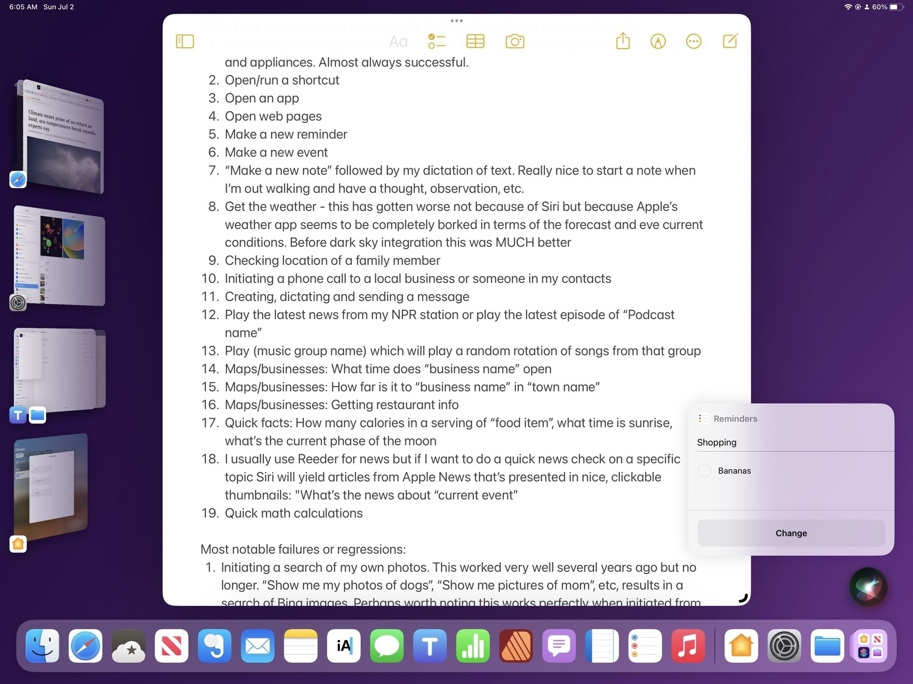
What I use on a regular or semi-regular basis with generally very good results:
Most notable failures or regressions that I've found in my use:
In the tech sphere where the news dominated by "AI" for the past 10 months, most recently ChatAI, large language model integration into web search, Microsoft's Copilot and Google's Bard being the most prominent examples, pundits were wondering, what would Apple do to respond? When would they put more effort into Siri and would it include AI of some sort. Or would the voice assistant be left to fall further behind? The not too surprising answer seems to be that Apple will continue to improve Siri gradually on its own terms without being pressured by the efforts and products of others or the calls from tech pundits.
We view AI as huge, and we will continue weaving it into our products on a very thoughtful basis. - Tim Cook.
Siri the voice assistant is just one part of the larger machine learning that powers features like dictation, text recognition, object ID and subject isolation in image files, auto correct, Spotlight and much more. While Siri is a focus point of interaction, the underlying foundation of machine learning is not meant to be a focus, it's not the tool but rather the background context that informs and assists the user as features found in the OS and apps. Machine learning isn't as flashy as ChatGBT and Bard but unlike those services it absolutely and reliably improves my user experience in meaningful ways every day.
For those that haven't used Siri recently Apple provides a few pages with examples of the current feature list: Apple's Siri for iPad help page and Apple's Main Siri page
How to check your iPad’s battery health | Tom’s Guide
Knowing how to check your iPad’s battery health might sound easy, but it’s actually strangely hard information to find, despite how important that data is. Batteries degrade over time, so it’s handy to know how your long-serving tablet’s faring, or how healthy an iPad is if you’re trying to buy or sell it second-hand.
Be sure to read to the end to get the Shortcut which makes it much easier. Apple really should add the Battery health status to the settings app.
A few thoughts on WWDC23, the Vision Pro and iPadOS 17
It's been a couple weeks since Apple's WWDC keynote and I've been enjoying everyone's excitement. I'm not big on offering a quick hot take as I'd rather take my time in pondering the news.
Apple Vision Pro My initial reaction to the Vision Pro was pretty much in-line with what I'd expected based on the rumors. I think Apple's spatial computer will be a success. Will it redefine computing? That might be an overstatement but it seems likely that if all goes to plan it will certainly have a dramatic influence. Initially it will be an added option, an expensive and premium experience for those that can afford it. But given the cost of a MacBook Pro and external display can get into the territory of $3,000+ the Vision Pro, as a computer with nearly unlimited, room-filling screen size seems to be well within the range of Apple's current offerings.
In the run-up to the announcement, much has been speculated about the use-case for this device. Thus far headsets have been focused on virtual reality experiences such as gaming, and, I think, some are using it for certain industrial/training type applications. At least, that's my impression from a distance. I've not paid much attention to it. Meta wanted to expand that out into a virtual world of weird floating torsos for meetings and other, perhaps social events. Again, I've not paid much attention to it beyond initial skimming of the creepy avatars. Meta's attempt hasn't gone far and seems to be stalled. And so it's easy to think that this is a very small, niche market not likely to be a space where broad consumer success would happen, even for Apple.
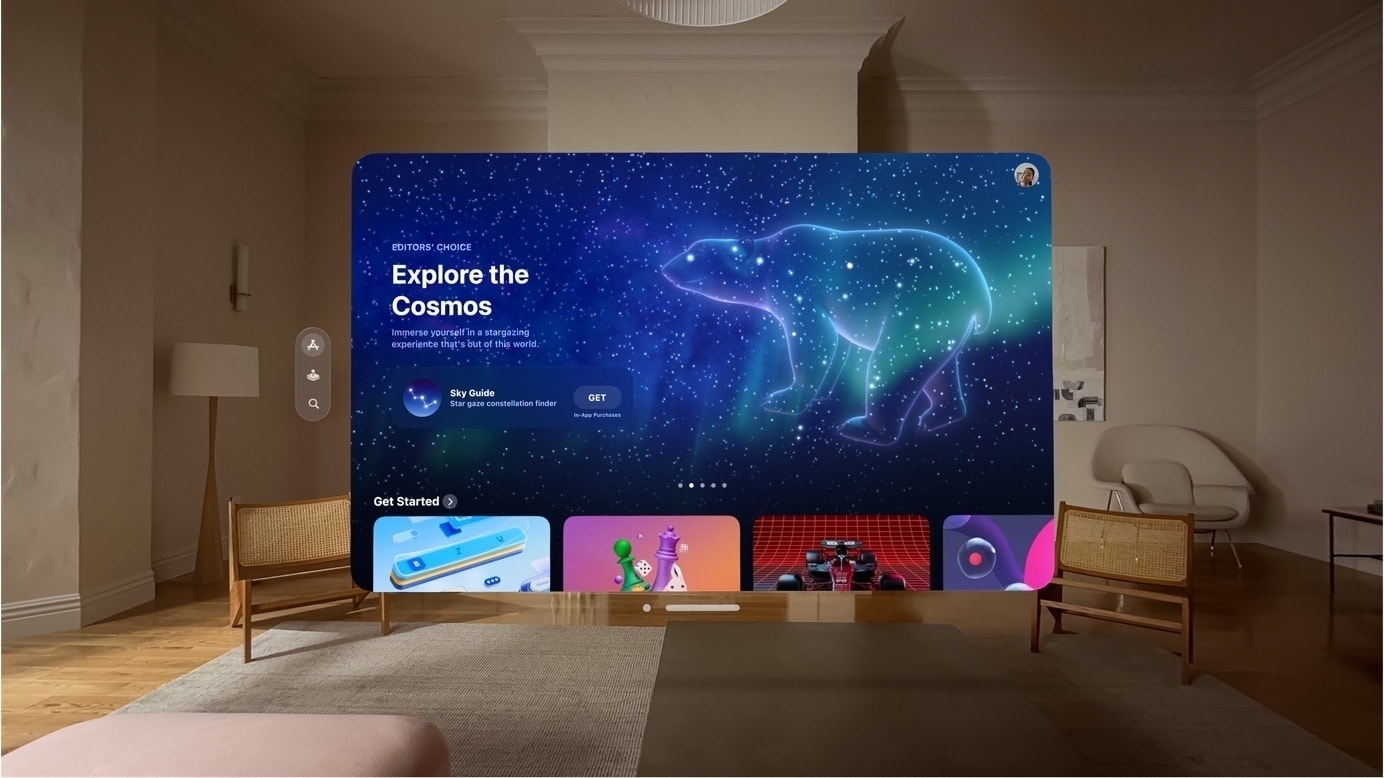
I think it's clear to most by now that what Apple showed us two weeks ago is intended to be something much bigger. And really, it's not surprising given the time and resources they've put into the product. Of course they're going to offer something unlike what's come before, that's what they do. This is not a VR headset but rather a powerful computer that you wear in front of your eyes. It's more akin to an iPad Pro than Mac in that it will run iPad style apps from the start and it has a windowing system that seems more reminiscent of an iPad Pro with Stage Manager enabled. While the windows have a new visual style unique to the new OS they generally seem similar to the style of windows iPadOS in that they are rounded with more space between elements when compared to the more dense, less rounded windows of Mac app windows.
I also suspect that the Vision Pro will frustrate some Mac users in the same way the iPad has. After the initial flash of excitement Mac power users will run up against an OS and applications that, while visually very well designed are still, at the end of the day, more like an iPad than a Mac. And while iPadOS and apps have all been growing in complexity and capability they are still not quite a Mac. But, more importantly, like the iPad, the Vision platform is based on an interaction model that is not a keyboard and a mouse and some will struggle with that just as they have with the iPad and it's unique gesture based interactions.
That said, one key difference is in the size of the windows which will give Vision computers some breathing room. The iPad form factor has always been smaller, maxing out at 13". Even as the OS has become more refined and powerful, it's still a small screen and I think that's been a problem for Mac users that are used to screens 14" and larger. But Vision computers won't be limited in that way. Users will have more room to work and that will relieve some of the sense of confinement they feel when working with the smaller screened iPad. I suspect the experience of using a Vision computer, compared to a Mac, will be simultaneously amazing and frustrating for some.
Another key difference, Vision computers will also offer a gaming and entertainment experience that goes far beyond what a traditional computer or iPad can offer. That, combined with a huge, iPad sized App Library plus new apps designed for the platform, would seem to provide the kind of foundation that might lead to a slow and steady adoption.
We'll still be using smart phones, tablets, laptops and desktops for a good long while. But in 3-5 years we'll begin to see the roll-out of more models of Vision computers in higher volumes. With early bugs squashed, a larger App Library, an improved, higher volume production line, the prices will have started to come down and the general public will have gotten more used to the idea of such a device and what it offers. My guess is that the least expensive version of the 2028 model will be the hardware equivalent to this first offering but at a much lower price. Thinking about it in the context of a long game, in the 4 to 6 year time frame, it seems reasonable to suggest that Apple's headset line-up will have come down to entry level models in the range of $1,500 to $2,000. Still above a budget Mac or iPad, but more affordable.
We'll see. At the moment there seems to be a lot of potential and excitement for this new category of computer. There's plenty of time yet for more hot takes, flushed excitement to be followed by flushed frustration.
Next, iPadOS 17. Beyond the Apple Vision Pro, my primary interest is what's coming to iPadOS. Probably most notable:
I've been really satisfied with iPadOS 16 and the improvements coming with the above features and the many other enhancements in iPadOS 17 will only make it better. The improvements to Stage Manager will likely quiet some of the most vocal complaints of that feature heard over the last year. In other words, the iPad is still not a Mac but some will find it more usable as it more closely approximates the macOS experience they want.
There was no mention of Xcode for iPadOS so that will be a complaint for another year.
With the Stage Manager improvements and the release of FCP and Logic Pro for iPad just before WWDC, it seems likely that we'll see a 15" iPad Pro or iPad Studio sometime in the next year. And I would think that either this year or next year's iPhones will also have cameras/features added for both Vision's 3D video as well as for capturing video for FCP for the iPad. Is there enough bandwidth for that sort of real time capture?
Those of us already happy with the iPad will be even happier.
Using Shortcuts on the iPad to convert an image or pdf, resize, save, rename and extract alt text, all with three taps
One of my regular tasks is updating the front page of our regional library website, either adding upcoming events or removing finished events. Shortcuts automates the process of converting, renaming, extracting text for alt tags and then saving the file for upload to the website. Then I can just paste the name of the file and alt text into my html file. Shortcuts for the win!
iPad Workflow- Using Shortcuts to process images for the web | Beardy Guy Musings
I don’t often speculate about upcoming Apple announcements but I’m going to make an exception with this post. And it’s nothing complicated, just putting a few pieces together. Most of it is probably pretty obvious to folks who have been paying attention Apple news over recent months. Before I continue, for anyone not familiar with my blog, I’m a full-time, very satisfied iPad Pro user. I’m not someone who struggles with the iPad, not someone who longs for macOS on the iPad. For me, iPadOS sings and my interest is in seeing what Apple does to…
Yet another installment of an “Apple pundit ignores the facts to write a clickbait story about the limitations of iPadOS”. It’s a bummer that they just make stuff up to fit their preferred narrative. Filipe Espósito over at 9to5Mac in his work of fiction, Final Cut for iPad highlights iPadOS limitations:
This week, Apple finally released Final Cut Pro and Logic Pro for the iPad – two highly anticipated apps for professionals. While this is a step in the right direction, these apps highlight the limitations of iPadOS.
Hmmmm. Day two with Day One 😉
My habit is to use text editors primarily for blogging. So, now I’m thinking about how to use Day One. Probably over thinking it. I’m aware that most of my time writing is about sharing, usually via blog. This app seems geared towards private journaling for the sake of recording life moments. Right off I’m trying to bend it to blogging. And still considering whether or not I could do something like this in Notes.
It’s far too easy to get stuck in a game of app hopping. Comparing Day One to Apple Notes and I like the Day One sidebar. The grouping by day is helpful. I can edit the dates if needed. The app includes weather and other metadata that would be a nice-to-have info when looking back.
BUT, unlike Notes, I can’t view across devices. I’m not used to and don’t like the navigation via the arrow keys. I’m used to using arrow keys for moving the cursor in the text. This seems like a weird choice and there’s no setting to change it. Ugh.
Okay, so, I spent the last 30 minutes in Notes. 🤣 If I had a nickel for every time I’ve played this game. But listen Linda, Linda, Honey, I think I’ve got something. I think perhaps I can make Notes work in more ways than one…
To be continued as follow-up post on my blog at Beardy Guy Creative.
Finally getting around to trying out Stable Diffusion via the Draw Things app on the iPad. The original photo taken on one of my gravel rides in southern Missouri. One image in the style of Van Gogh and another in the style of Thomas Hart Benton.
A small but welcome change that came with iPadOS 16.4, when using Stage Manager the Homescreen is no longer blurred behind app windows. 🤓
