Scientists have said climate breakdown caused by the burning of fossil fuels is the cause of unusually hot summers and winters with very low snow volume, which have caused the accelerating melts. The volume lost during the hot summers of 2022 and 2023 is the same as that lost between 1960 and 1990. … Experts have stopped measuring the ice on some glaciers as there is essentially none left.
Swiss glaciers lose 10% of their volume in two years | The Guardian
After extreme fire seasons in 2020 and 2021, Congress funded a temporary bonus that boosted average U.S. Forest Service wildland firefighter pay by either 50% or US$20,000, whichever was lower. But that increase expires after Sept. 30, knocking many federal firefighters back to earning the minimum $15 per hour…
The National Federation of Federal Employees warns that a large number of firefighters could quit if their pay also drops.
$15/ hour to do that job?! Insanity to cut their pay.
Wildland firefighters face a huge pay cut without action by Congress
Experimental iPad Configurations
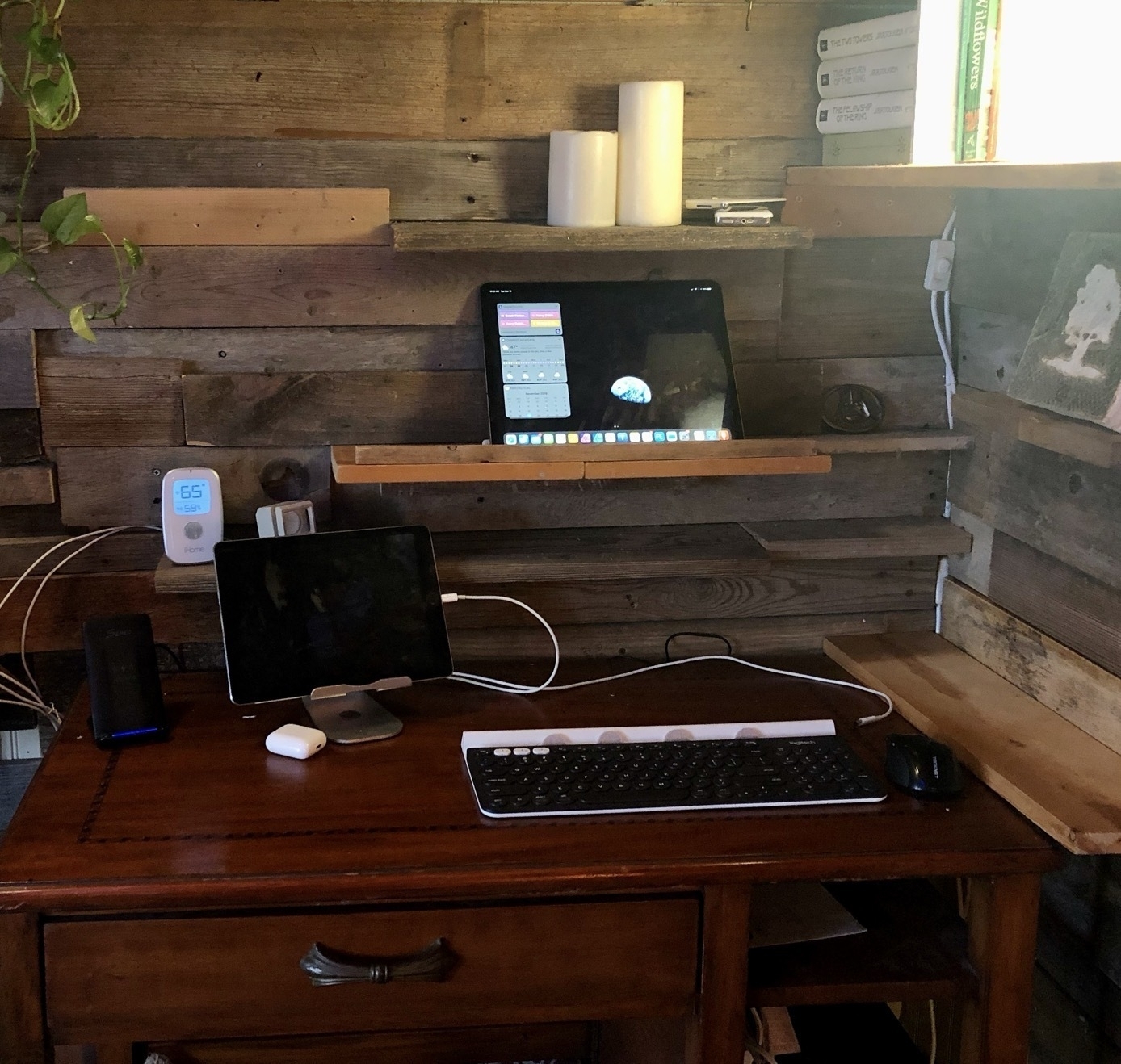
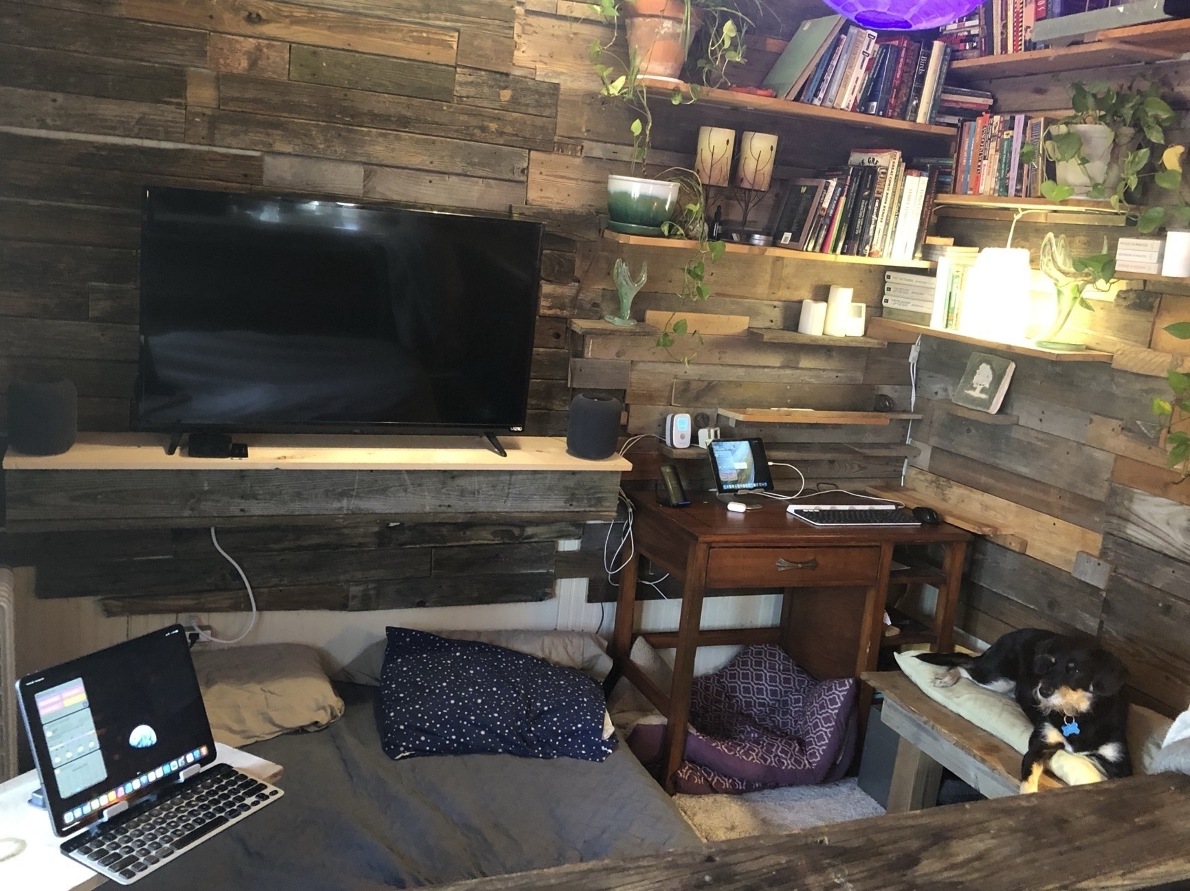
Before I dive into the discussion of my ongoing experimentation with iPad modularity I think it would be helpful to provide a description of the physical space and context of my iPad use.
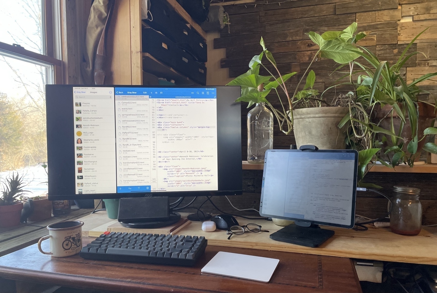
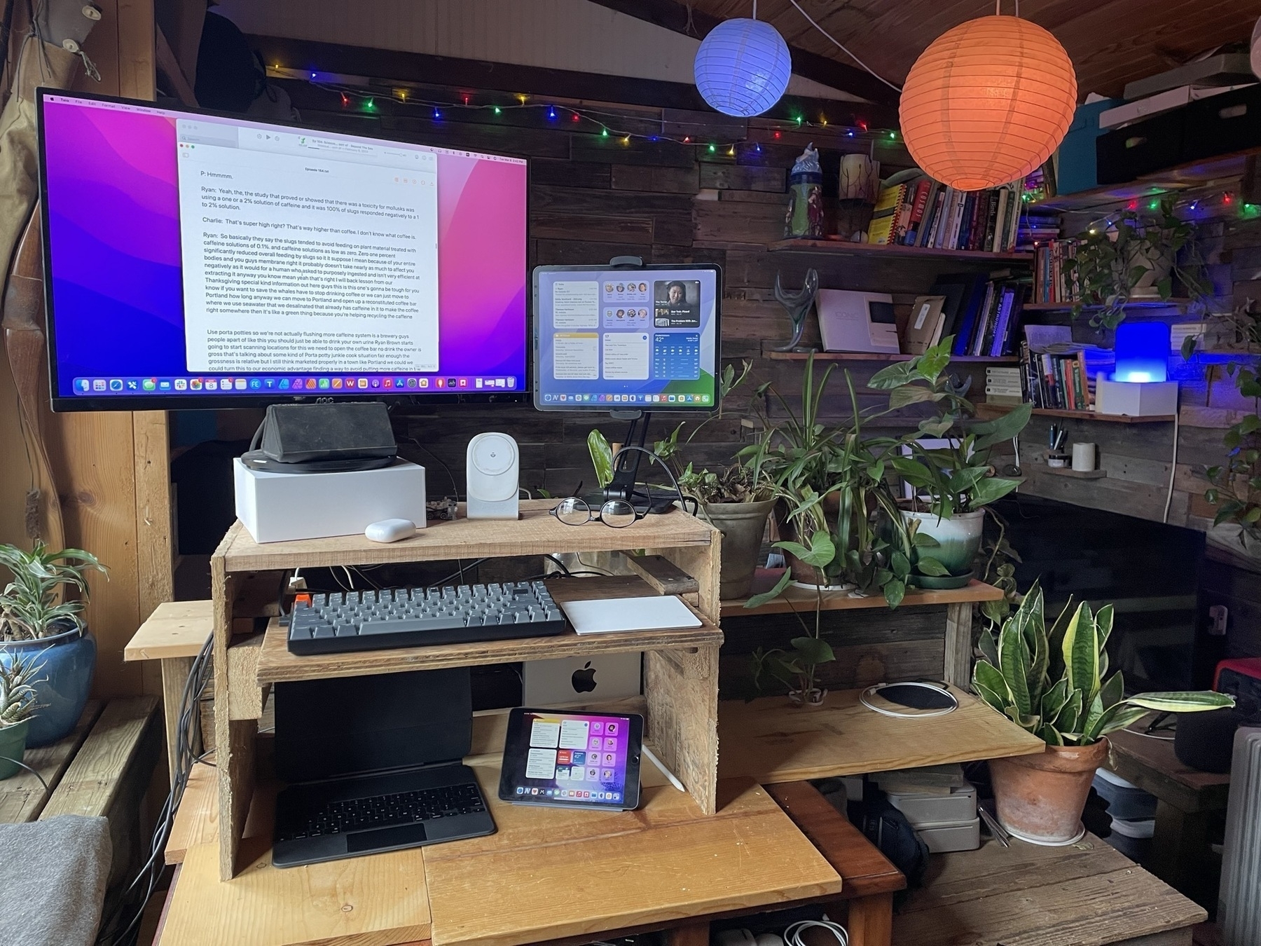
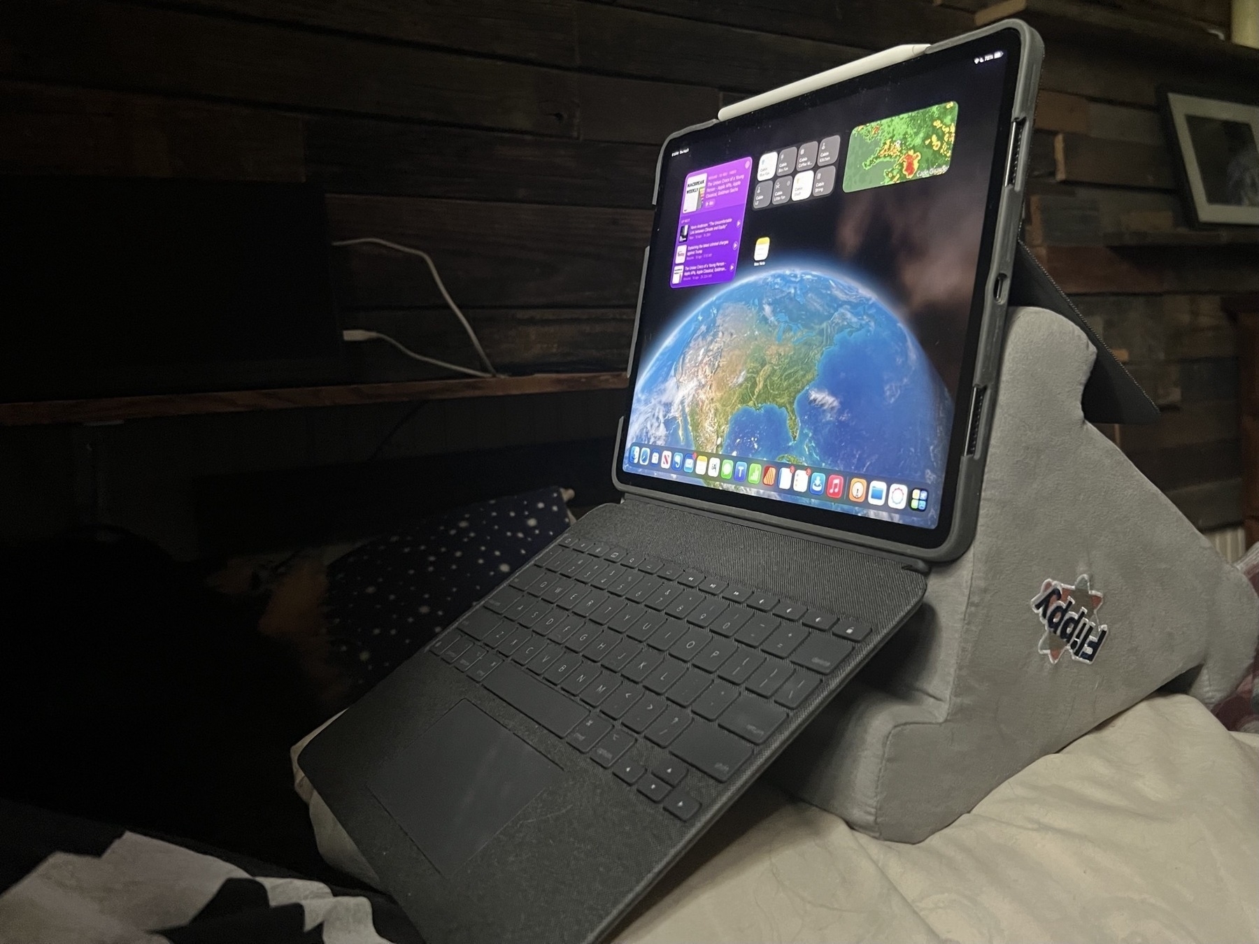
I work from a 200 sq ft tiny house which I share with 2 dogs and a cat. Over the past 15 years most of my work time is either in this small space or outside on a porch. In the house only about 30% of my work is at a desk, mostly it's done reclining on a futon. Those may seem like simple options but as I live on my own I have the freedom to reconfigure the small space fairly often. And even more so, within the space, I reconfigure the iPad arrangement constantly. This, in fact, is why I've come to love the iPad so much.
With a traditional laptop or desktop I have a screen or screens, keyboard, mouse and/or trackpad as the base configuration. But at a minimum the traditional computer must have the keyboard and pointing device. And of course with a laptop that keyboard and trackpad are not removable which is why I sold my MacBook Pro in 2017. Using it actually frustrated me because I came to dislike the fact that the keyboard was permanent.
I still marvel at the fact that the iPad, in its base configuration, seems like such a simple object. Just a rectangle of glass and aluminum. And though I can use it in this simple form I rarely do. The iPad is the core building block which, in my case, is always being used with at least one other component.
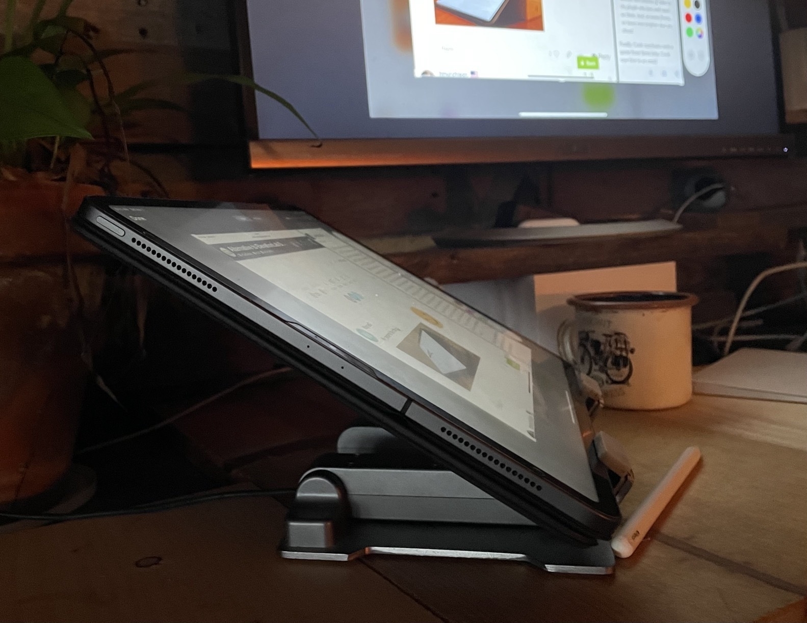
A 13" iPad Pro is not heavy but compared to its smaller counterparts it's less a hand held tablet device. Yes, it can be held in the hand and it can be used in portrait mode. But for me, the most likely, most natural pattern of use and function is in landscape mode, standing up on its own with the addition of a stand of some sort. But often with no keyboard. So, yes, still very much a tablet, just not a hand held tablet.
The delight of this device and form factor is best described in terms of nearly unlimited depth of variation and experimentation. This happens in two ways. The arrangement of the device in physical space as well as my interactions with the device via screen or a variation of input devices.
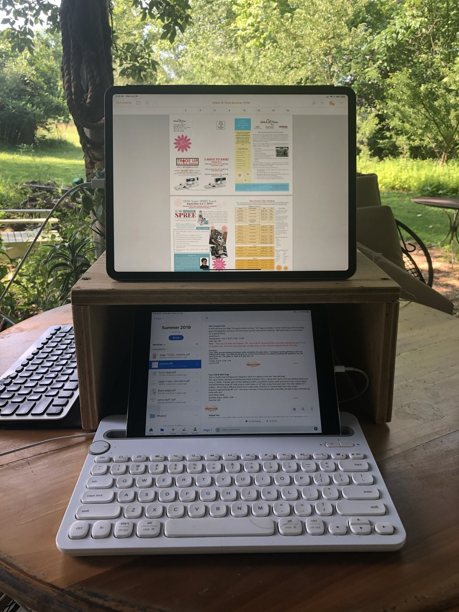
I'll note the possibility that my experiments are, perhaps, sometimes a bit off the wall but I enjoy trying out arrangements with keyboards and accessories that were not necessarily intended. I also enjoy customizing my space. So, for example, in my tiny house I often add and rearrange shelving near desks, my futon, and anywhere I might work or lounge with the iPad. This means that walls get shelving for the purpose of a standing desk. Other walls just get shelves solely for holding an iPad near a desk or extra display.
I should note too that because I've added an inner wall of reclaimed, rustic wood I don't hesitate to move planks of wood to accommodate shelving or anchors for shelves. It's a freedom others in more conventional housing may not have.
In some ways I treat the interior of the house as one of my reconfigurable building blocks that I arrange to suite my current comfort, thoughts and needs for a workspace. I move around a lot for a change of view and posture.
Let's have a look.
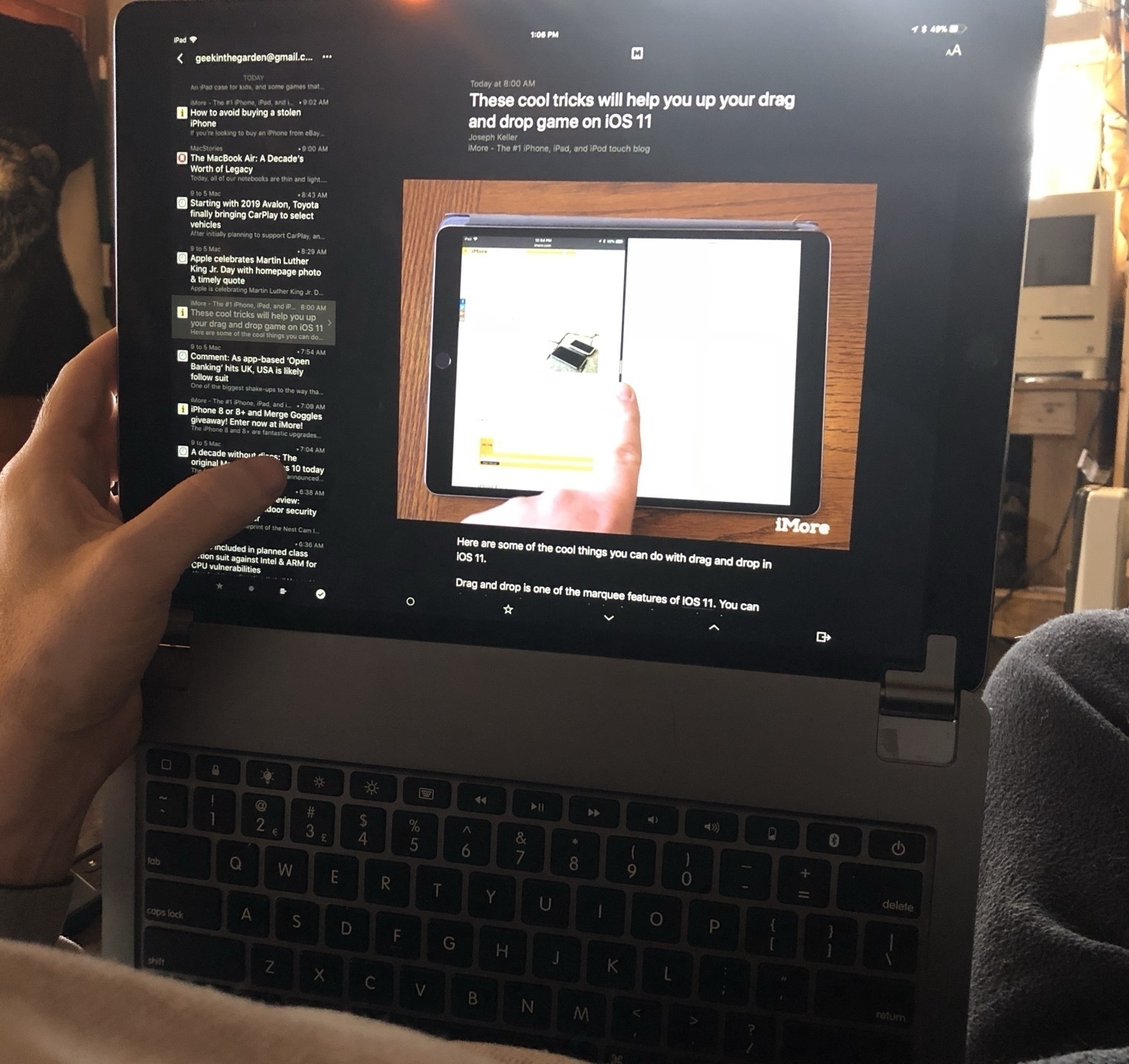
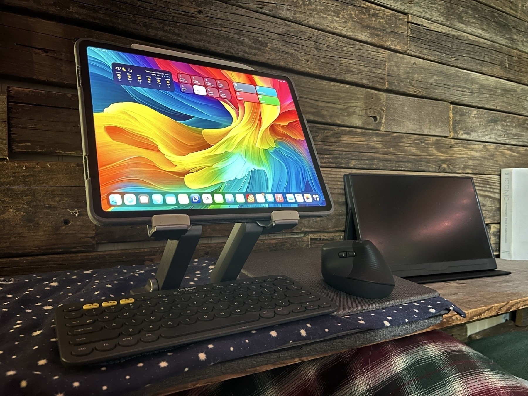
Starting off with the first iPad in the Keyboard Dock.
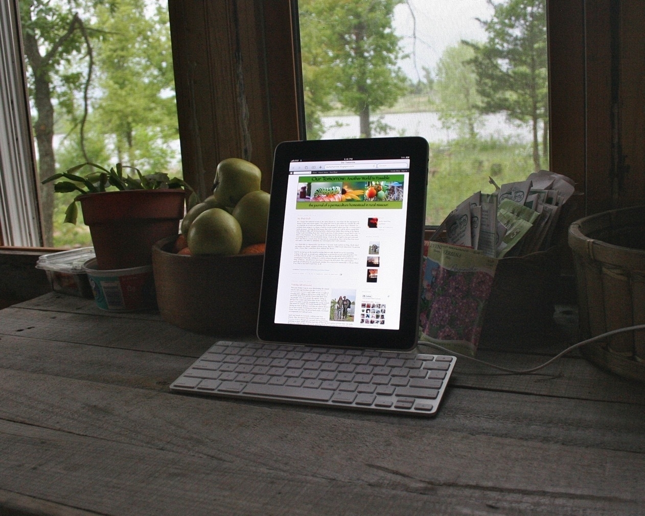
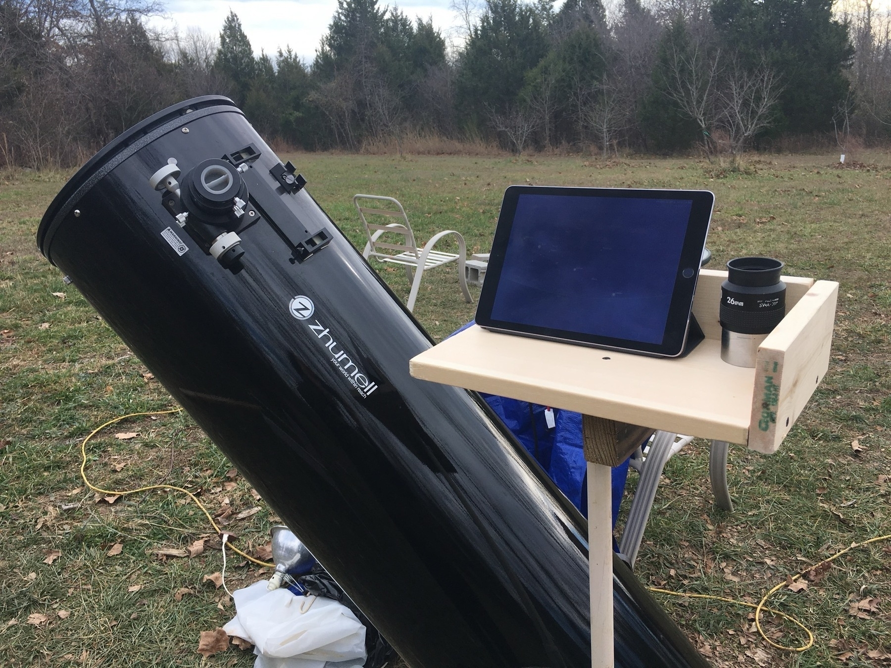
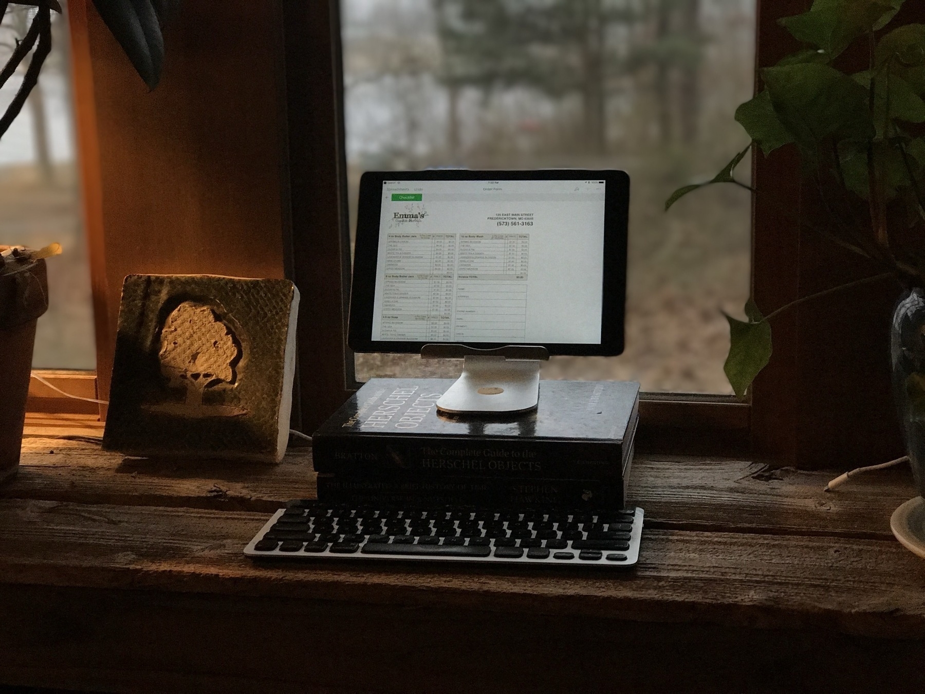
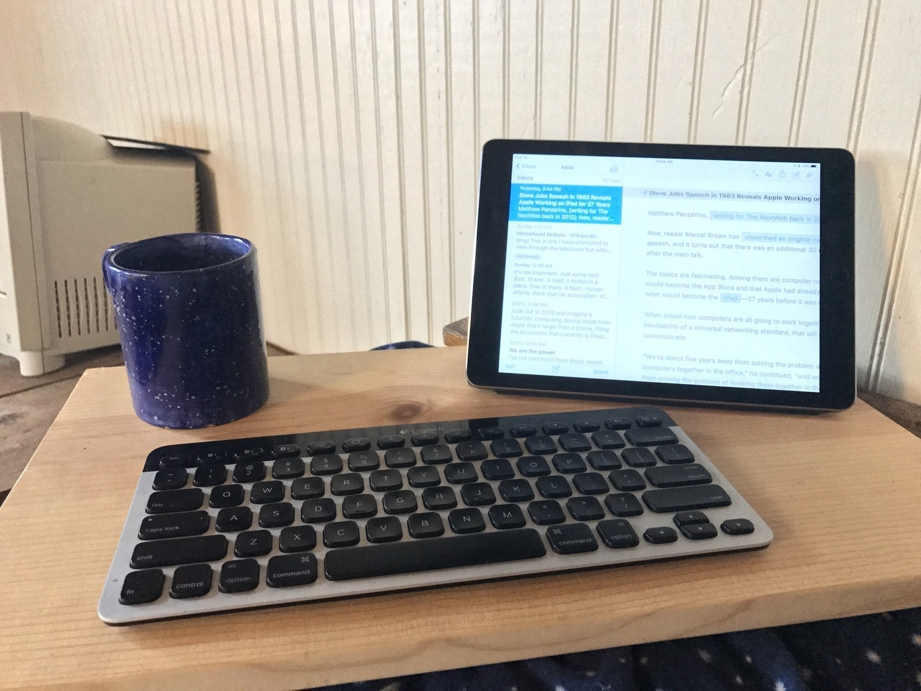
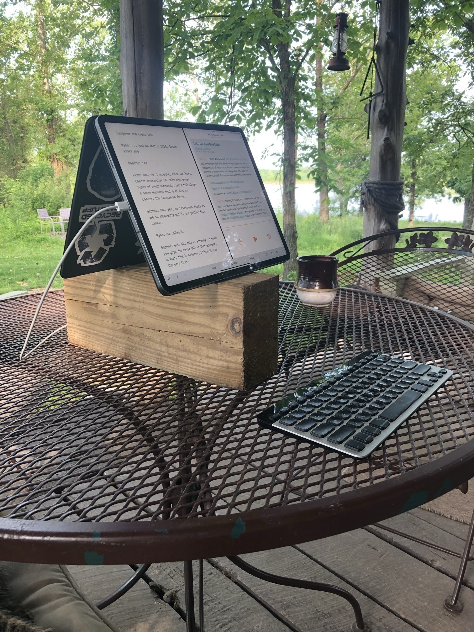
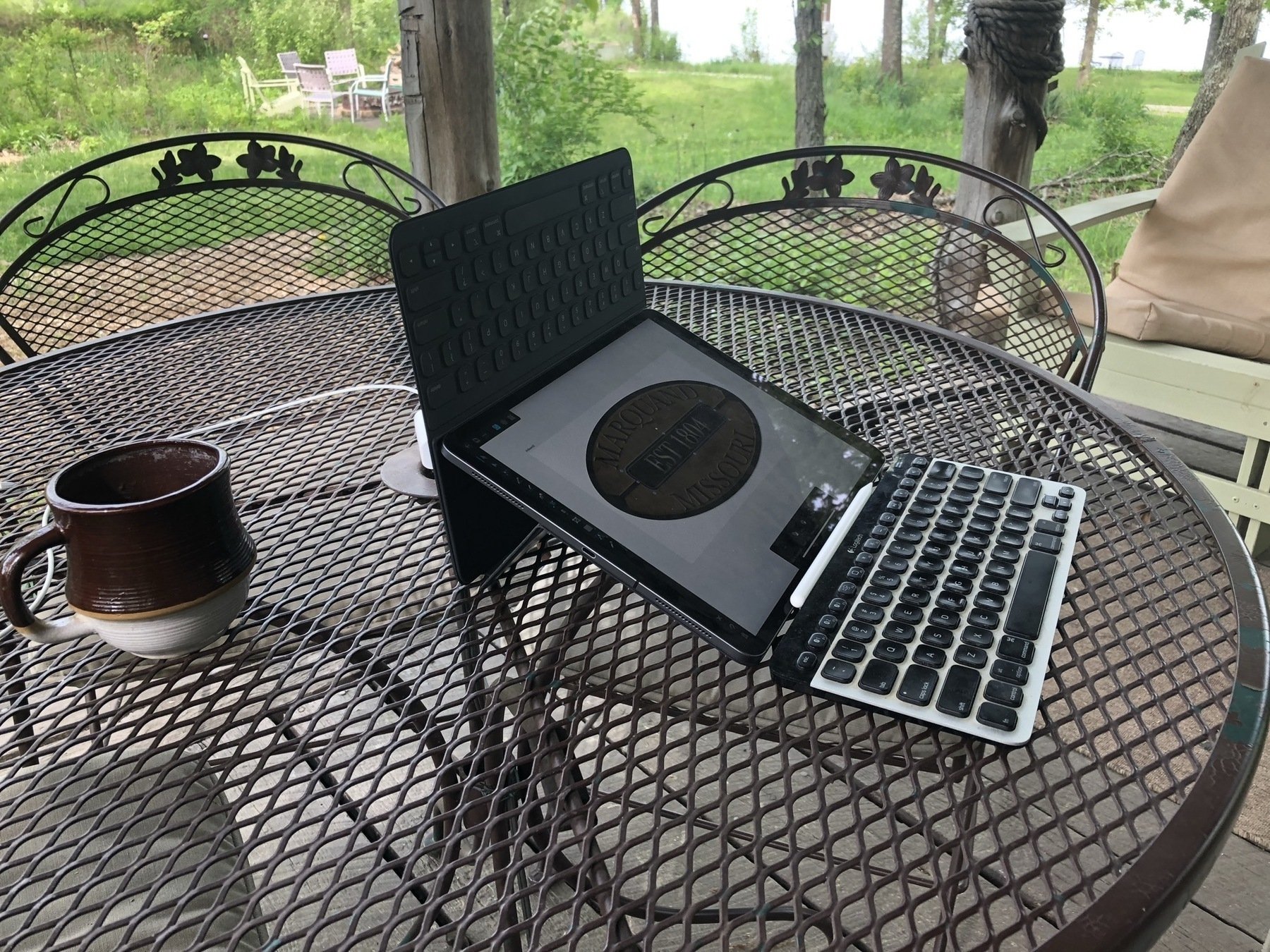
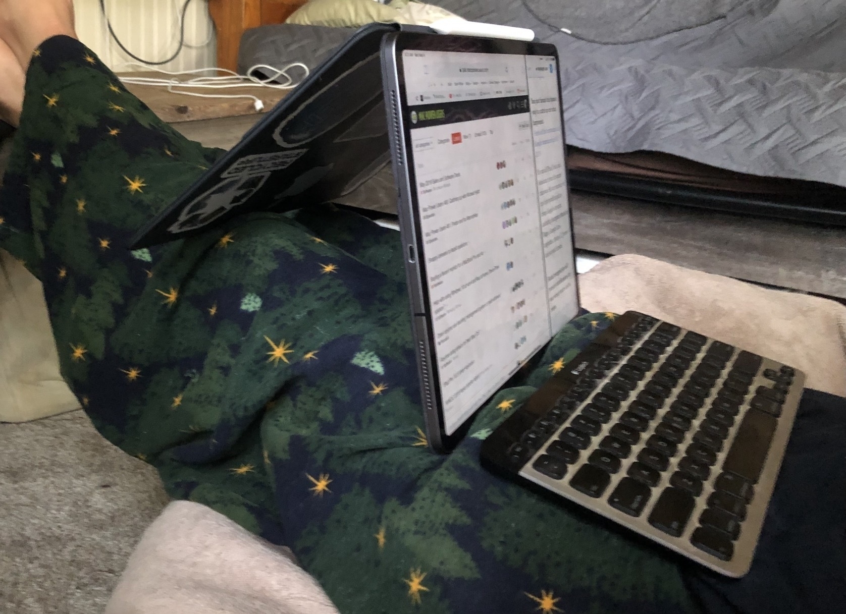
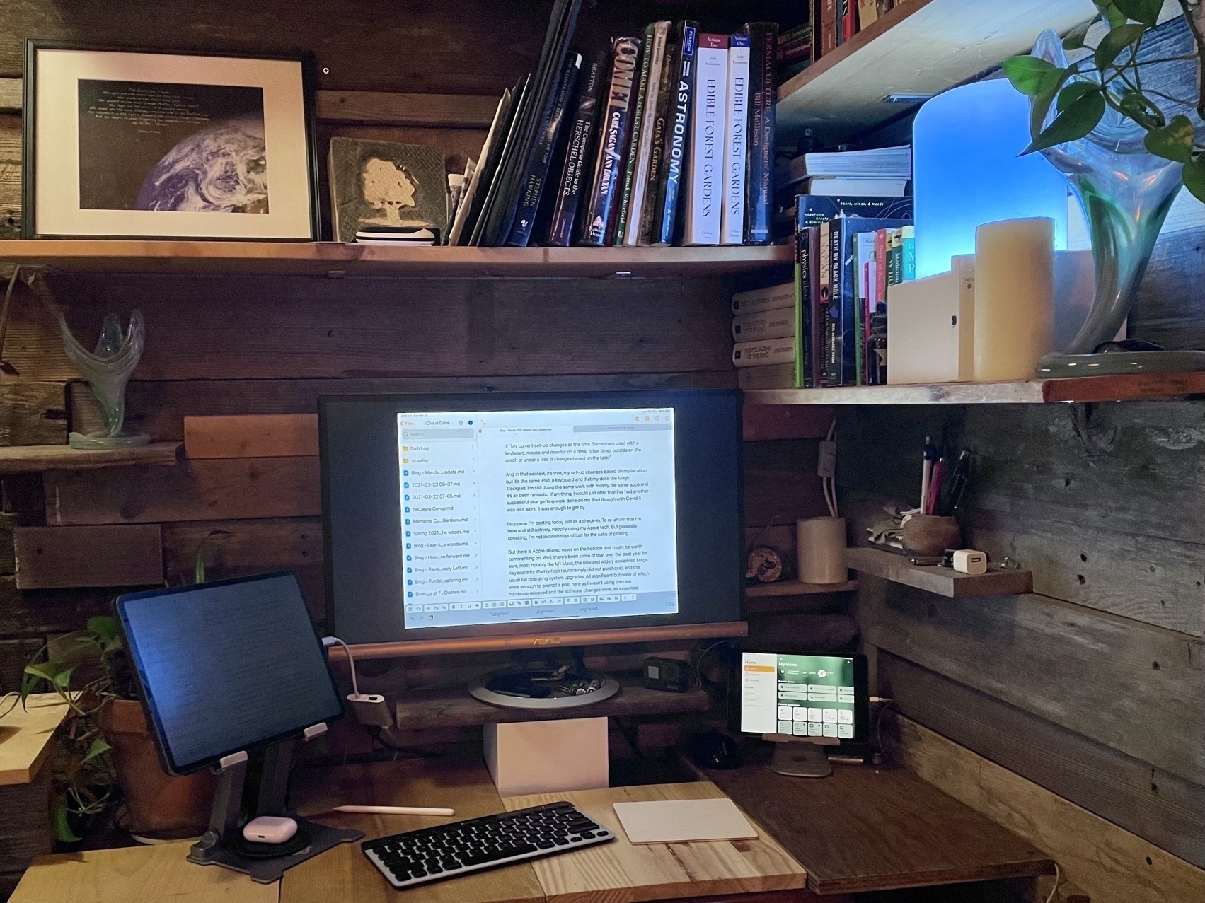
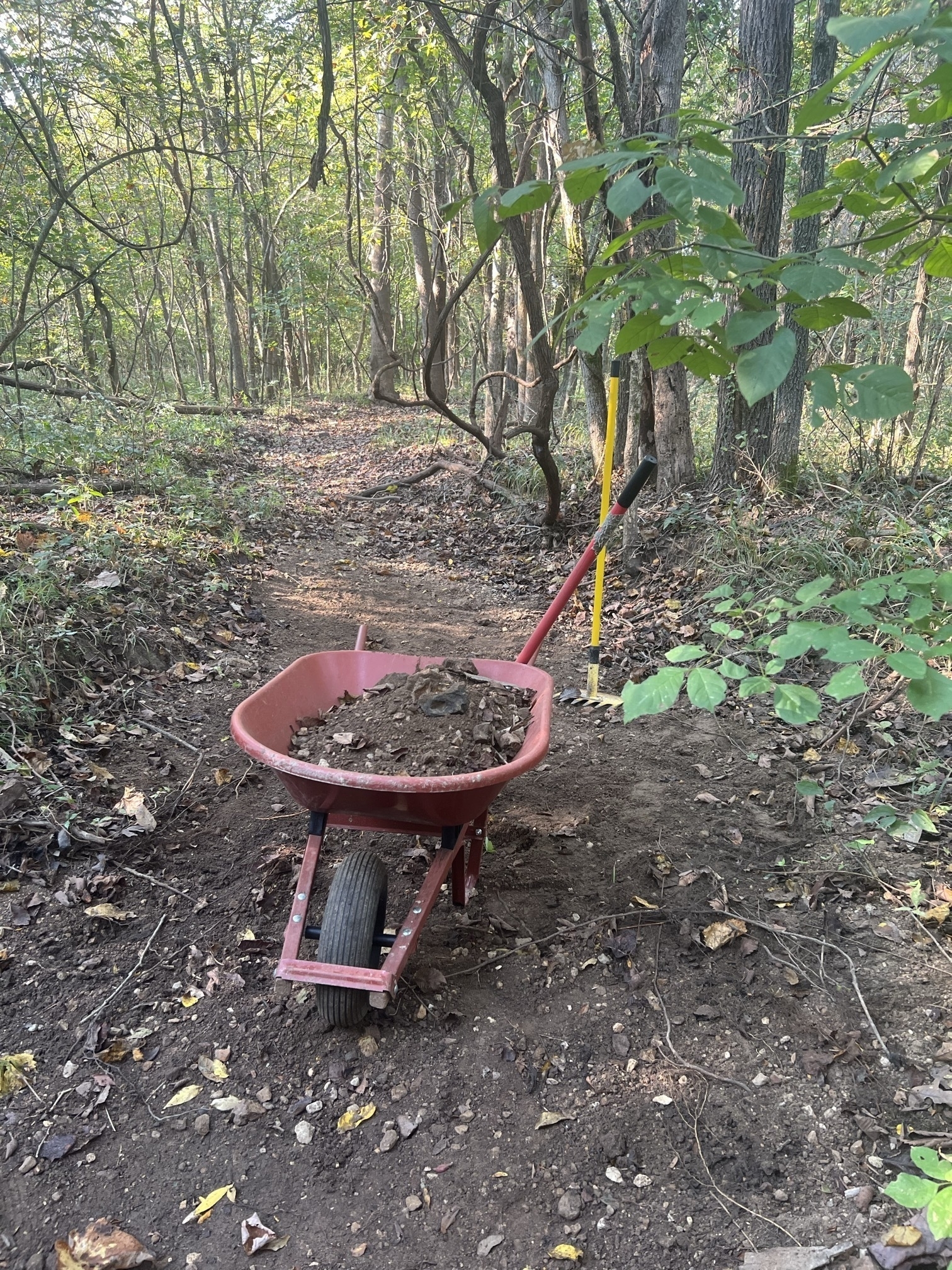
I'm not doing the Micro.blog September photoblogging challenge but thought I'd share a photo for today's Date in the life. For the past 22 days I've been working on our gravel road. Moving 5-8 wheelbarrow loads a day from our dry creek bed to fix a few washed out sections. 100+ loads total, 2+ hours of daily exercise, about 1,100 cal burned as a workout. I like getting actual, needed work done as a workout. Several more sections to fix, another few weeks of exercise. The road actually looks messier because now its a mixed up conglomeration of the original, uniform gray road gravel but with lots of dirt, sand and creek gravel all mixed in. In the process of digging out the shoulders to resurface the burried gravel, adding the creek materials I've raised the whole section of road an inch or two while also lowering the shoulders for better drainage.
Obviously working with just hand tools takes far longer than using a tractor or other motorized equipment but I need the daily exercise anyway. 2 hours a day spent listening to music and working out in the woods to fix a problem makes sense. With two hours a day through September, October and perhaps a week or so into November I should have it done before the ground starts to freeze.
Over the past 3-5 years we've been getting more intense, 7+" rainfall events each year. With each such event more excess gravel is left in the creek while more of the road gravel is washed off the road. Going forward I'll have to spend more time maintaining it but the work now should result in a more stable road and also better divert the excess water during storms. The goal is to have more water shed off the road rather than flow along it.
Pages and Publisher on the iPad Compared Pt 2
This story is available as a pdf download.
For the first few years of my switch to the iPad I relied heavily on Apple’s Pages app for many of my document layout projects. It’s a fairly powerful app and in most cases was easily capable in creating the newsletters and annual reports I often create for clients. When clients needed printers marks, bleed or other features I fell back to Adobe Indesign, then, later, Affinity Publisher, both on the Mac. In the fall of 2022 Serif released Affinity Publisher for iPad and that’s now my go to for all of my design and layout work. There are only two exceptions! First, projects for clients that require delivery of a Word or Pages file. Second, projects that require delivery of an ePub. Though this hasn’t come up for me yet it’s worth noting that Publisher does not yet support export to ePub but Pages does.
I continue to recommend Pages for people that need a more general use word processor and layout application. It’s a fantastic application that Apple is likely to support for many years to come.
Why Affinity Publisher?
Simply put Publisher offers nearly everything I need and want for designing documents on the iPad. No app is perfect but Publisher is excellent and a real pleasure to use.
Before I dig in to everything I like about the app I’m going to tackle the one current problem I have with the app: It’s not yet optimized for Stage Manager and external display support. Serif states that they do not support Stage Manager. But in truth it actually works pretty well with Stage manager. What it does not do is support the many different resizing options of a supported Stage Manager app. But I can use it as a floating window and have other windows under or on top of it. Where this is most useful is having Files and an app like Notes or Word with text sent by a client. This allows me to easily refer to those other apps for text or images in the Files app for adding to the document.
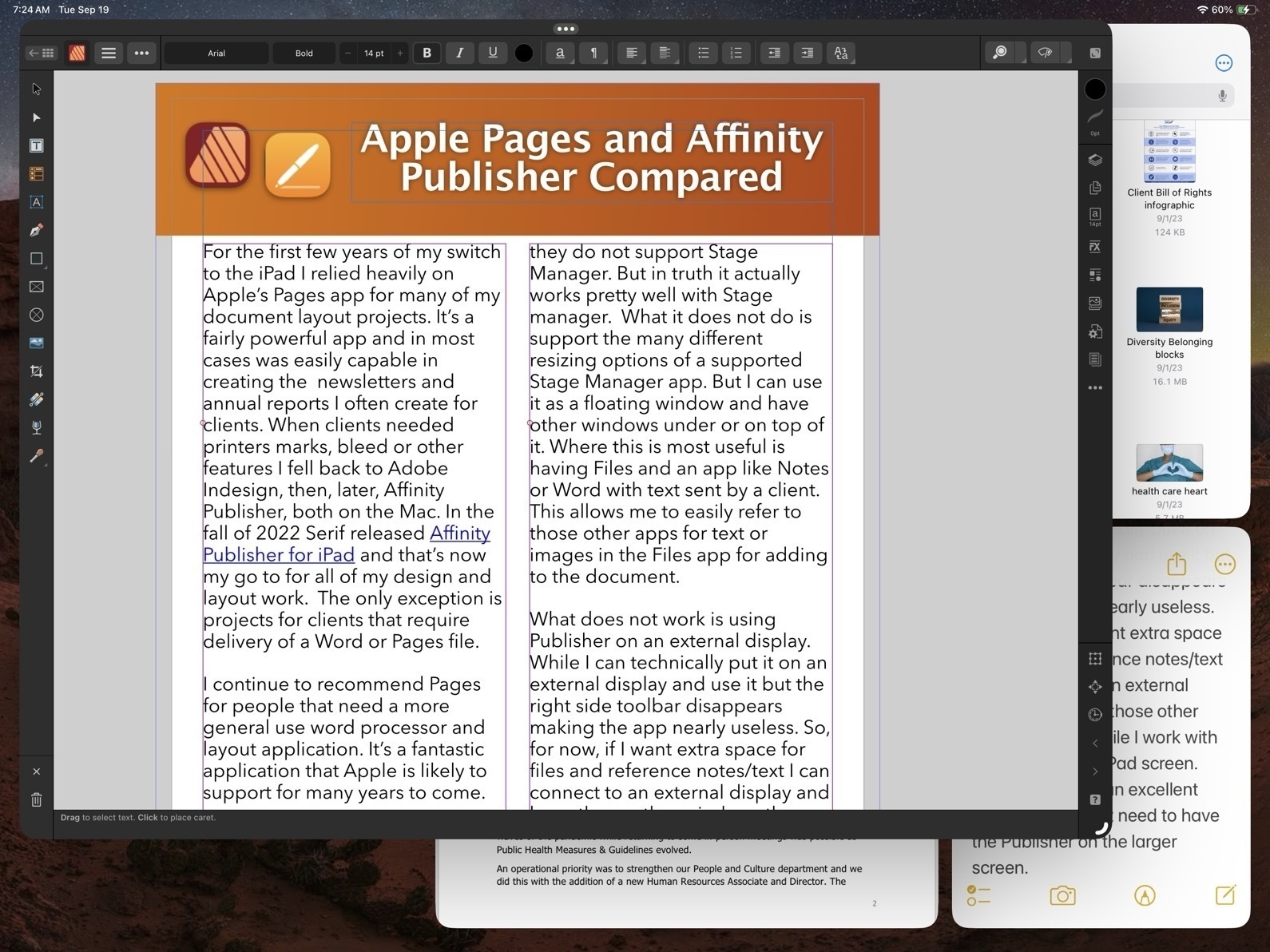
What does not work is using Publisher on an external display. While I can technically put it on an external display and use it but the right side toolbar disappears making the app nearly useless. So, for now, if I want extra space for files and reference notes/text I can connect to an external display and keep those other windows there while I work with Publisher on the iPad screen. And really, that’s an excellent experience. I don’t need to have the Publisher on the larger screen.
Okay, with that out of the way, let’s jump into the good stuff!
Before Affinity Publisher there was InDesign
I started with InDesign with the first version back around 1999. I used it fairly regularly until 2019 when Affinity Publisher for Mac was released at which point I transitioned entirely to Affinity apps. I used Publisher on the Mac alongside of Pages on the iPad to cover all of my document design work. Not long after releasing Publisher for Mac, Serif announced that they would eventually bring it to the iPad and three years later they delivered.
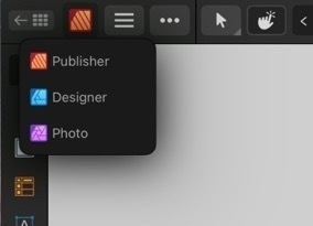
As with all of the Affinity apps on the iPad (and in sharp contrast to Adobe), these apps are the full versions. It’s worth noting too that Publisher is best used with the other two Affinity apps, Photo and Designer installed. Publisher has a feature called Studio Link which, assuming the other two apps are installed, allows the user to simply change “Persona” from Publisher to Photo or Designer. It’s seamless and there’s no launching of another app. Rather, the Publisher interface changes to the toolbars of the other app. So, for example, when I recently needed to edit a photo provided by a client I just tapped the photo to select the image and then tapped to the Photo Persona to edit the photo. When finished I tapped back to Publisher to carry on with the layout. The same can be done when creating or editing more complicated vector objects by tapping over to Designer Persona.
Okay, time to dig into some of the comparison points between Affinity Publisher And Apple’s Pages.
Cost
While Pages is free, Publisher for iPad is $20. It’s a one time purchase rather than a subscription. But really, to take full advantage, the other two Affinity Apps should be purchased as well, same price. So $60. There’s a bundle price for a Universal license for all apps, all platforms (Mac, Windows, iPad) of around $165.
Modularity
This is big. As mentioned earlier, with Studio Link and all three apps installed, I have a design and layout tool that has, thus far, seemed unlimited. There are many features I’ve not used yet. Publisher alone is a very powerful program, add into it the features of the other two apps and, well, I suspect there are many features I will never use. This is a good thing. It just means that the apps cover a very expansive set of methods, use cases and so on for many different users and scenarios.

Vectors and Text
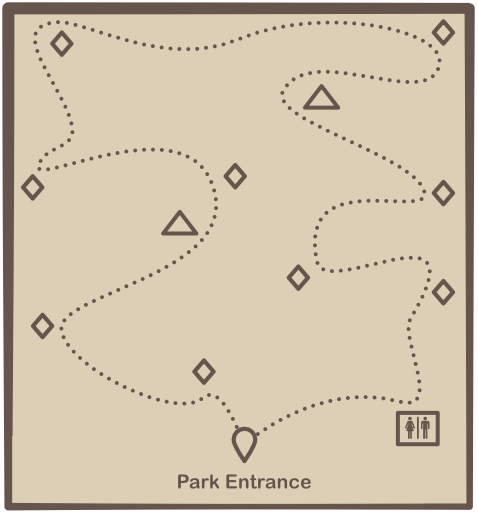
A part of what’s so impressive about Publisher is that while I can tap into the other two apps as needed Publisher itself has a very impressive toolset on it’s own. This is especially true of the text and vector tool sets which allows for the creation of elements like complex curves, shapes, and text on curves. Perhaps I’m designing a brochure that includes a map for a park and trail with various points of interest. I can easily do this within Publisher. If I reach the limits of what Publisher can do then I just change over to the Designer Persona.
Page-based Layers
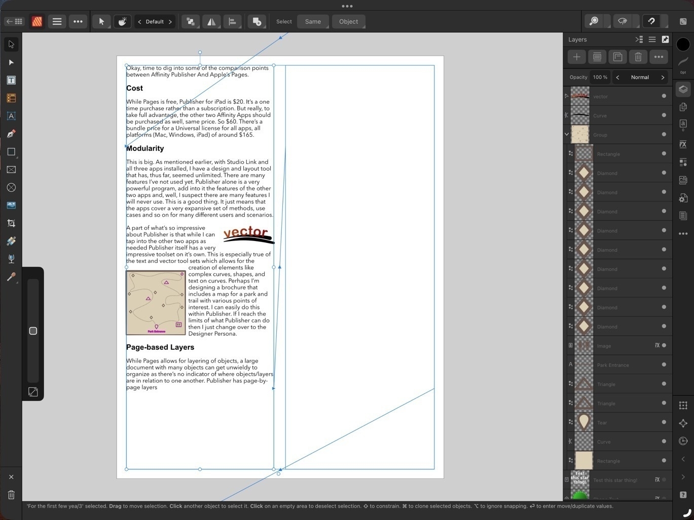
While Pages allows for layering of objects, a large document with many objects can get unwieldy to manage as there’s no indicator of where objects/layers are in relation to one another. Publisher has page-by-page layers all of which are visible in the layers sidebar - much easier to keep track of everything!
Bleeds, Printers Marks, Guides
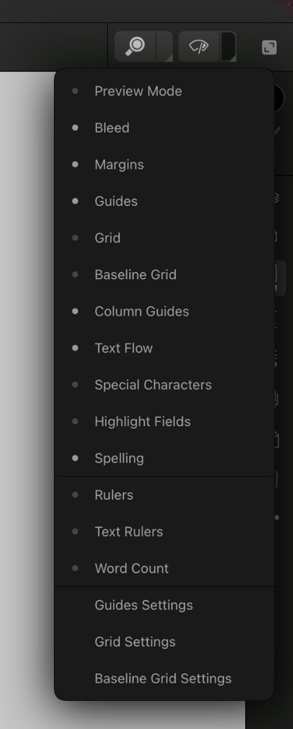
These are all features considered essential in professional page layout and Publisher has them, Pages does not. Bleeds can be added anytime in the Document Set-up screen. Printers Marks are an option when exporting. Pages has alignment options to help snap objects but does not allow for creating custom guides in a document.
Zoom in, Zoom out
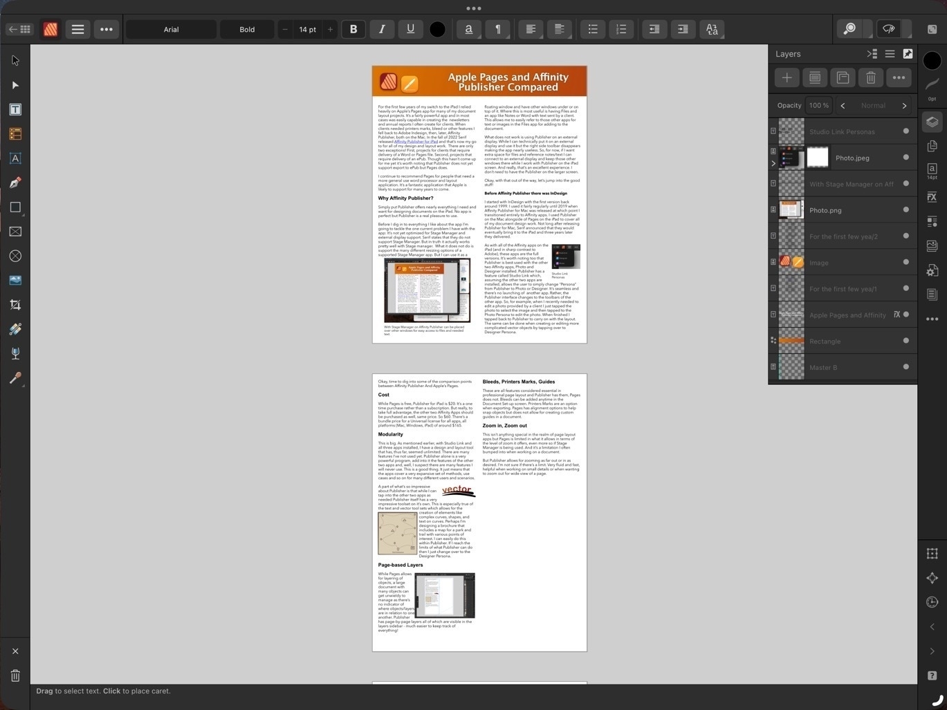
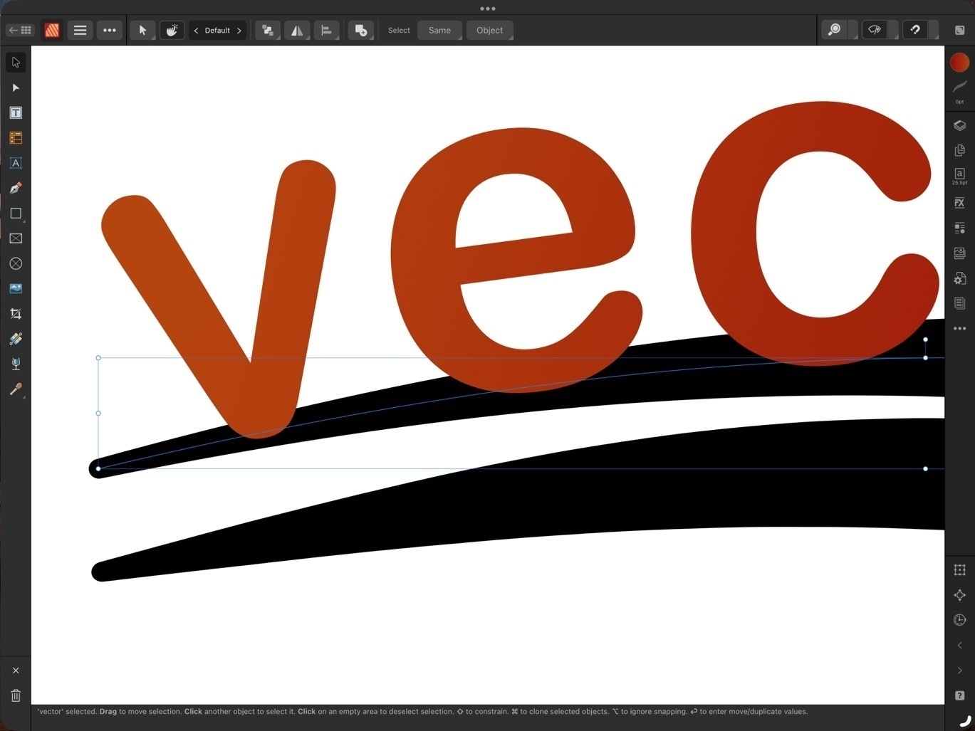 This isn’t anything special in the realm of page layout apps but Pages is limited in what it allows in terms of the level of zoom it offers, even more so if Stage Manager is being used. And it’s a limitation I often bumped into when working on a document.
Publisher allows for zooming as far out or in as desired. I’m not sure if there’s a limit. Very fluid and fast, helpful when working on small details or when wanting to zoom out for wide view of a page.
Visual Effects

Again, this isn’t all that special for page layout applications but Pages lacks most of the options that might be expected. Bevel/Emboss, outline, inner and outer shadows, glow, Gaussian blur are some of the possible effects and of course each effect has a variety of variables that can be adjusted for each.
Built in access to stock photo libraries

Publisher includes built in access to Pixabay and Pexels stock photos libraries. On Pixabay this includes vector images as well. Handy in my use case for infographics when doing annual reports and newsletters.
Vector assets
Add images and vectors to an Assets library for reuse in a document or between documents. While there is a small library of assets included with Designer I often will search Apple’s Pages included vector art and copy those over as needed (bike on left comes from Pages). Or, mentioned above, vectors are available for download via Pixabay. If I can’t find what I want I can make my own.
Font Manager
Affinity also includes it’s own Font Manager. Install a font in Publisher directly via the settings in the app. It’s much easier than going through a third party using the Settings App to download profiles. The benefit of that method is that installed fonts are available system wide. But as I’m doing almost all of my design work in Affinity apps it’s not an issue. Also, install a font in one Affinity app and it’s available in the other two Affinity apps.
Artboards
Publisher has space outside of the document for storing objects. If I’m not sure where something is going or if it’s going to be used I can keep it off to either side of the document. It’s incredibly helpful and not something found on Pages. At this point I consider it a necessity.
Importing IDML and PDF
I’ve had several occasions to use the option to import IDML and pdf files. It’s a time saver and really helpful getting started when a client wants to start with a previous document template. Or, as with a recent annual report, a client provided numerous pdf infographics several of which needed minor edits. I was able to do the editing right in Publisher within the larger document.
Missing features
In direct comparison to Pages there are two missing features that stand out:
- Export to ePub.
- Charts
There’s no work around for the first but it’s not been a problem for me as I’ve never had the need to export to ePub. In the second case, charts, the work around would be to set-up a table and chart in Apple’s Numbers app and copy paste. It’s not ideal as it’s pasted as in image but it does work.
Conclusion
iPad users are well taken care of in the category of document layout. Pages is very powerful and fairly easy to learn. It is a great app to get started with but it’s not a basic application. Over the past few years, Pages has really matured into an app capable handling many of the projects I’ve needed to do. But when compared to a dedicated document design and layout app like Publisher, Pages does lack some of the options. I’ve not covered all of the differences here but have tried to mention some of the more notable examples.
Some example use cases for Pages:
- Small businesses and nonprofits that want to cover their own document creation internally
- Students creating reports
- Nonprofit and community volunteers that need to creat newsletters, brochures, flyers, or other documents
- Creating ePubs
Use cases for Affinity Publisher
Publisher is an advanced app for doing practically any kind of document design project. It takes more time to learn but if you’ve had experience with Adobe applications you’ll likely learn Publisher and the other Affinity apps fairly quickly. The tool set and tool options found in Publisher go far beyond what I’ve covered here.
- Document design and layout that can be fully customized with no limits on graphic elements or text
- Management of large documents with many layers and assets
- Documents intended for printing that requires industry standard output such as printers marks with bleeds.
March to End Fossil Fuels in New York City, activists decried President Joe Biden’s continued investment in fossil fuels and his refusal to declare a national emergency over the worsening effects of climate change. Louisiana climate justice activist Roishetta Ozane said Biden is “personally accountable” for climate change-fueled natural disasters, while 16-year-old Fridays for Future organizer Helen Mancini proclaimed, “There is not enough time to put this off another term.”
Frontline, Labor & Youth Voices Call on Biden to Immediately Act to Prevent Climate Catastrophe
Earth’s life support systems have been so damaged that the planet is “well outside the safe operating space for humanity”, scientists have warned.
Their assessment found that six out of nine “planetary boundaries” had been broken because of human-caused pollution and destruction of the natural world. The planetary boundaries are the limits of key global systems – such as climate, water and wildlife diversity – beyond which their ability to maintain a healthy planet is in danger of failing.
Earth ‘well outside safe operating space for humanity’ | Climate crisis | The Guardian
The devastation wreaked by floods in eastern Libya is nothing less than apocalyptic. In Derna, where two dams burst after torrential rains, a wall of water deluged the city and sliced out the land from beneath its inhabitants. Entire neighbourhoods were swept into the sea, which is now dumping bodies along the shore. More than 6,000 have died there, and 10,000 people are said to be missing, but because entire families were washed away, there may be no survivors to report some losses.
The Guardian view on Libya’s floods: humans, not just nature, caused this disaster | The Guardian
Pages and Affinity Publisher on the iPad Compared Part 1

I've been using Pages since the first version available on the Mac many years ago. And of course I used the first version that was available on the iPad from day one. In the years since the app has gone through many changes as Apple worked to bring compatibility between the iWork apps on the two platforms which began with the Pages 1.7 on iOS and on the Mac, version 4.3 in 2012. But the big change in 2013 with an overhauled Pages 5.0 on the Mac. This new version on the Mac was a step back in features and templates as it was brought inline with the upgraded iOS version of Pages.
Controversy!
Gradually features were added back in as Pages across the platforms were improved year to year. It's been 10 years since that major re-write and while the Mac version of Pages of 2023 is still different from the version of 2013 it is far more capable and the app across platforms is much closer to feature-for-feature parity.
Pages on the iPad
Pages is an excellent app for general purpose word processing and document layout. For students, businesses, organizations, Pages is a feature rich, capable app that's fairly easy to learn and use. Brochures, posters, flyers, newsletters, annual reports, research papers are all easily created with Pages. The app can export to Word, PDF, ePub as well as several other formats.
Over the years I've relied on Pages for a lot of my work with clients that required a pdf or Word document as the final product. Until Serif released Affinity Publisher in the fall of 2022 Pages was usually the app I used
Keeping in mind that Pages is free and intended for a general audience, ie, anyone that purchases an Apple device, I'd like to do a basic comparison to Affinity Publisher on the iPad. This is from the perspective of a more advanced Pages user but with an awareness that the app is not just for advanced users.
Pages - The misses
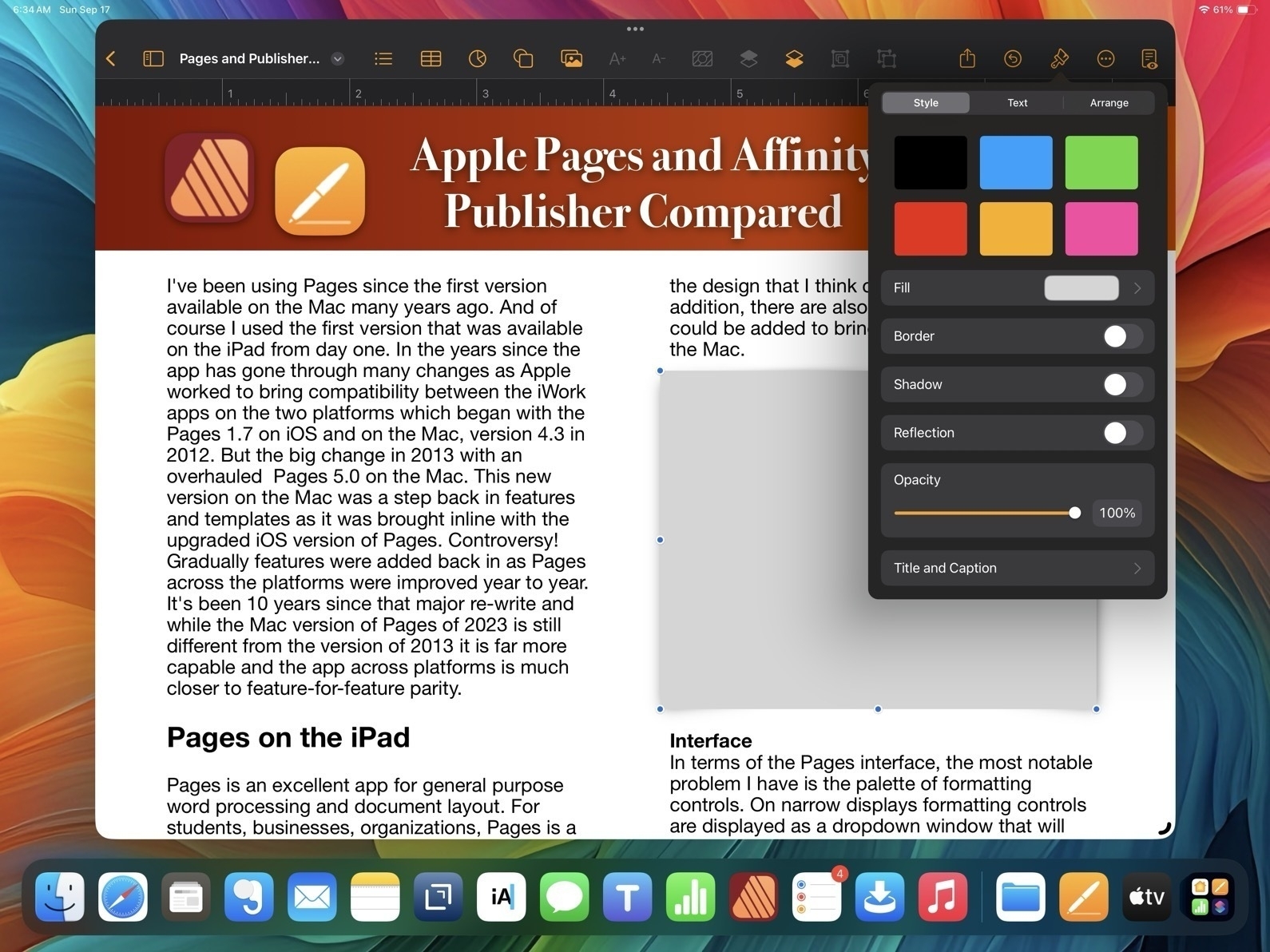
While I generally find the user interface and features of Pages to be a good balance for a large range of users, there are a few aspects of the design that I think could be improved. In addition, there are also a few features that still could be added to bring it closer to full parity with the Mac.
Interface In terms of the Pages interface, the most notable problem I have is the palette of formatting controls. On narrow displays formatting controls are displayed as a dropdown window that will disappear to make room for content on the page.
This generally makes sense on a narrow window when it is more necessary but I'd suggest it's important to only force the dropdown when it's necessary. Why? Well, because it's harder to use because it takes more tapping/clicking. Every time I tap or click in a document the format options dropdown disappears requiring me to click again to reactivate it. This adds up to lots of extra tapping/clicking.
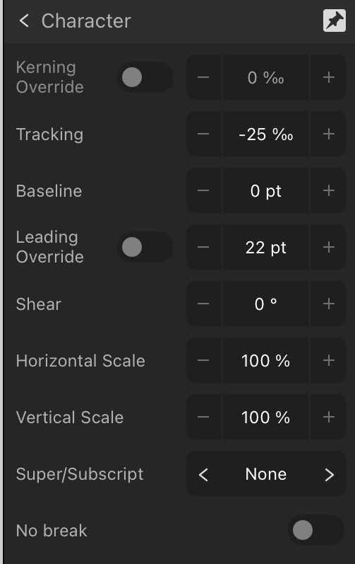
Pages and Affinity Publisher Sidebars Compared
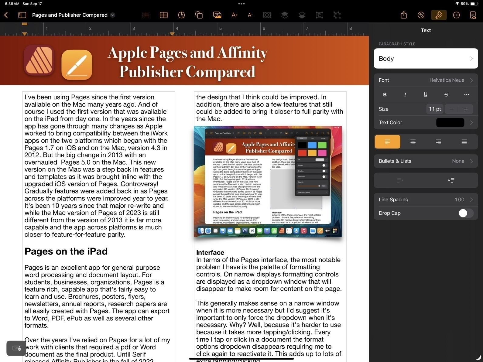
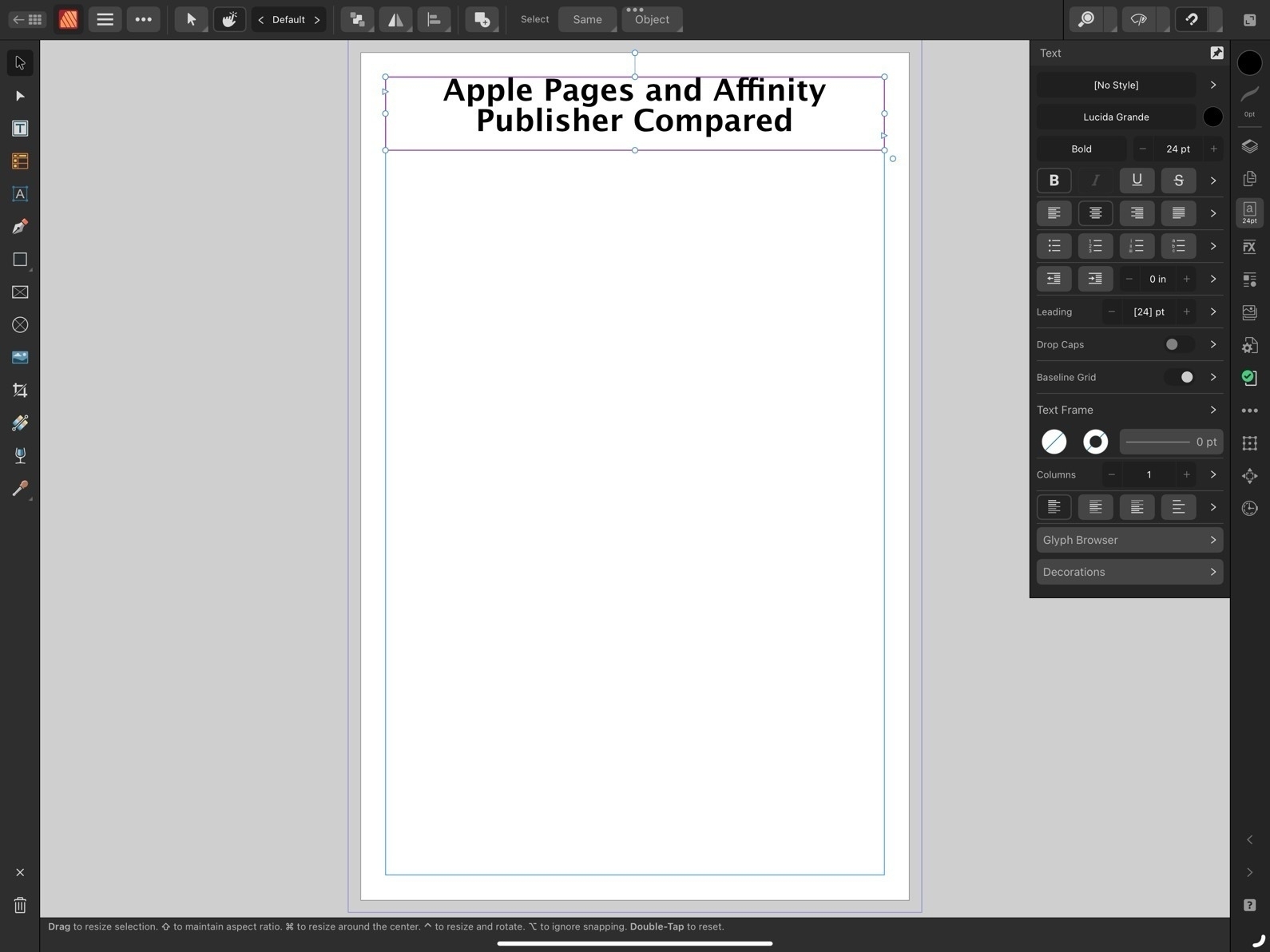
On the large 13" iPad there are many times I'd prefer to have a more permanent sidebar for the formatting options. The sidebar is available when the app is full screen or nearly full screen. I'd like to have a preference or the ability to pin the formatting options as a more permanent sidebar.
And on an external display, well, it actually feels broken. If I'm using an external 27" display I only get the sidebar when I'm in full screen mode. If I have a Pages window set as a floating window that takes up any other portion of screen, even if stretched across 24", I'm forced to use the dropdown formatting window. That's huge waste of space on a big screen.
Missing Tools
First, I'll note at least one tool that's missing on the iPad version of Pages which is present on the Mac: the pen tool for drawing complex, multi-point lines and shapes.
Now, comparing to Affinity, we begin to see how Publisher is an advanced application for a more specific, professional publishing and design audience. The reason for the smaller, more dense tool palette in Affinity Apps is because there are far more tools and options. Just as one example, text spacing. While Pages has many of the most important basic options such as finely adjustable line spacing and spacing before and after paragraphs, Affinity Publisher has all the very fine-grained controls expected of full publishing apps. While Pages has had many new features added over the years it still lacks options when compared to an app like Publisher. Really, there are far too many to list here. But I will note a small sample:
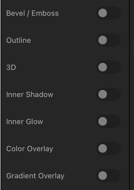
- Documents in Pages lack the option for "master pages". It is possible to have a page template which can have elements added that will appear across the document but it's far more limited.
- While Pages has built in snapping for objects on a page it lacks the option to add other guides to pages. Affinity Publisher allows for adding unlimited guides for flexible design of columns or other elements that will be snapped to as a document is put together. A less flexible but helpful work around in Pages is to use the more basic page template to set-up various invisible lines/boxes that can be used similarly.
- Document set-up in Pages also lacks options such as bleed and then, when exporting, options such as printers marks crop marks.
- Effects are far more limited in Pages. In fact, there are only two, reflection and shadow and they can only be applied at the block level. So, for example, a block of text as opposed to smaller level of elements like a single letter or word.
- Layers of objects in a Pages document can become cumbersome with larger documents. Affinity provides per page layering that is easier to manage with large documents.
That's just a small sample of what features found in Publisher but lacking in Pages. And they are significant. And yet, Pages is still quite capable. Let's move on to the features Pages does have that make it worth considering.
Pages - The hits
So, what does Pages on the iPad have going for it?
- Pages is free!
- While simplicity limits the potential results to some degree, it is easier to learn for new users.
- When learning Pages users are also becoming familiar with similar tools and interface elements found in the other iWork apps, Numbers and Keynote
- Pages works well with other iWork apps and Apple apps generally. Need to add a photo? You can drag a photo from the Files app or add it from the toolbar.
- Pages comes with a variety of ready-to-use, well designed templates for newer users.
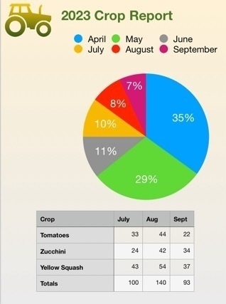
- Tables are much easier to set up and modify in Pages. Need a table with calculations? Just copy and paste in a table from Numbers. Charts are also easy to set-up in Pages.
- Interesting multimedia options for documents that won't be printed.
- Editable options for sharing to other users via built in collaboration tools for other Apple device users, Pages in iCloud or export to Word.
- Though this document is being created using the Page Layout option which is more freeform offering a blank canvas, there is also an option to start with a basic word processing document which makes getting started easier for that kind of document.
Conclusion
For people that are in a general use setting, Pages as a part of the larger iWork suite of apps makes a lot of sense. It's easier to get started for more novice users who might just need basic word processing or someone that needs to put together their first newsletter for a community group they belong to. It's easy to work with using touch, Pencil, trackpad or mouse or some combination of those. As a simpler app the settings are more sparse than dedicated professional graphics design apps like Publisher and yet provide enough to allow users to accomplish a great deal without getting bogged down.
For more advanced users Pages is powerful enough that large and fairly complicated documents are possible. Documents can be laid out using free form, linked text boxes intermingled with charts, tables of static data or live calculated data. Adding photos, line art, shapes or even embedded video or scrollable photo galleries are all options for export to multi-media ePubs. I've only touched on a small sample of the features found in Pages and just a simple example of what's possible in terms of designing documents with Pages.
Because it's a free app there's no cost to try it out and if you need to create documents it's an excellent app to start with.

Working on a fun and hopefully helpful two-part article. The overall topic is a comparison of Apple Pages to Affinity Publisher. Though specific to the apps on the iPad it generalizes pretty well to the Mac.
Part one is centered from the perspective of Pages and I've written the post in Pages and designed it in Pages as a sort of 3 page example of what a user can do in terms of laying out a document with the app. I'll have that as a viewable/downloadable pdf.
The second part is written from the perspective of Affinity Publisher and will feature a very similar designed document that will highlight some of the additional features found int the Affinity app.
The goal is to help potential users see and understand the differences in terms of using the two apps as well as the potential results. Posting part one sometime today.
iPad Stories Follow up
A few days ago I posted links to recent stories by fellow iPad enthusiasts. Since then a couple more have come through my Mastodon and RSS feeds. Both of these are really fun reads.
First, there’s Michael Sliwinski, founder of the Nozbe to-do app. I’ve been reading Michael’s blog for awhile and this recent post about the versatility of the 13" iPad Pro is excellent. I think he perfectly sums up why so many of us love the iPad:
I love the form factor of a tablet. Keyboard is optional. This super powerful M1 iPad Pro 13” is a beautiful slab of aluminum and glass that can be used for reading, watching, playing and you can do it in both portrait and landscape modes. And when you hold it in your hands, you only interact with it via touch. After more than a decade with it, it hasn’t stopped being the best form of interaction for me. And it just brings joy.
He shares a variety of ways that the iPad get’s used during a day from company tasks to using Apple’s Freeform app for math homework with his daughter to mobile video editing with LumaFusion.
There’s also Brandon McMullen who shares his thoughts on the iPad. I really appreciate the detailed description the various tasks that he accomplishes with the iPad in his office at a construction company:
I use it to view & annotate blueprints, scan and sign documents, deal with employees time and expenses, as well as remote in to my work PC (using Jump Desktop) when I am out of the office.
Then, for entertainment and reading:
To me, the iPad is the ultimate entertainment device, where the Mac is more limiting. I can go laptop like experience with my Magic Keyboard case and switch seamlessly to tablet mode to write or journal with my Apple Pencil. I can rotate my iPad to portrait mode for a killer reading experience for catching up on my RSS feeds with Reeder or reading my saved articles through Pocket.
And, like Michael, he points out that being able to hold the iPad as a tablet without a keyboard is a more personal experience.
I think that the iPad’s secret weapon is its modularity, it can conform to what you need it to be way better than a desktop or even a laptop can.
Finally, he shares observations of how others are using the iPad around him.
As far as how I see others use the iPad, I can only speak to my circle of friends and family and anecdotal evidence I see when I am out and about. But I feel like at least for the people around me, the iPad is widely used and accepted by all sorts of people. My wife uses a 12.9″ iPad Pro and iPad mini 6 as her only computers… My two young boys both have iPads in kid protective cases for learning, schoolwork, and Apple Arcade games (no ads or in-app purchases!). To them, the iPad is the only computer they have ever used and they can navigate it effortlessly. My parents both use iPads as their only computers.
He also shares observations of the many people around town that he regularly sees using iPads. He also offers more details about the importance of the iPad in the construction industry where it’s used out on job sites, going so far as to describe it as indispensable for his company. It’s a very interesting peak into real-world field work scenarios that I’d guess are fairly common but not often discussed.
I guess the point of saying all of this is once you get out of the tech nerd bubble, you see lots of regular people choosing to use iPad because it is the best computer for them. They are almost assuredly not even aware of the great Mac vs. iPad debate.
For those interested in the iPad as a flexible, modular computer it’s a great read. I wish Apple shared more of these kinds of stories.
In the Atlanta suburb of Peachtree City, teens and older people alike rely on little electric vehicles to get around. Is this a potential model for a more sustainable suburbia?
With about 9,300 golf carts registered among its 13,000 households, this town 31 miles southwest of Atlanta might be the most golf-cart-friendly municipality in America. A hundred miles of car-free multi-use paths crisscross the town’s 25 square miles…"
E-Bikes and golf carts would seem to be perfect for slower, safer, more climate friendly local travel.
The Electric Vehicle That Suburbia Needs Could Be a Golf Cart
Climate rallies over the next few weeks to demand an end to fossil fuel usage ahead of the United Nations’ summit on 9/20.
“Clearly, saving the planet is the most important issue facing humanity,” the Democratic senator Jeff Merkley of Oregon, said. “But here’s the ugly and brutal truth: right now, humanity is failing..”
The rally was one of some 200 global climate actions taking place this week in countries including Bolivia, Pakistan, Ethiopia and Austria.
Climate activists kick off rallies against fossil fuel in week of action in New York | The Guardian
International aid is slowly starting to reach the devastated port city of Derna as an inquest starts into how as many as 20,000 people might have perished when Storm Daniel hit the northern coast of Libya on Saturday night.
Corpses still litter the street, and drinkable water is in short supply. Whole families have been wiped out by the storm and with the remoteness of some villages and the rudimentary nature of municipal government, it will take time for the death toll to be confirmed.
Meanwhile:

‘Sea is constantly dumping bodies’: fears Libya flood death toll may hit 20,000 | The Guardian
Copperheads are fairly common in my area and I see several each summer. They're beautiful snakes. Venomous, yes, but in my experience never aggressive. Just respect them and let them have their space, they make fine neighbors. And frankly, they're beautiful animals.

Some recent iPad Stories
It’s been enjoyable to read the recent iPad related posts by several indie bloggers over the past few days. I’m considering the possibility of setting up an old fashioned web ring for Indie Apple bloggers that fall outside of the well known pundits. I think it might be useful and fun to have a little neighborhood of folks that regularly write about how they use Apple tech. My particular interest is the iPad but I wouldn’t want to limit it to that. Hmmm.
Here are the posts in no particular order. There’s Rob’s post, “The iPad Works":
I’m not suggesting that the iPad is perfect or that everyone can use it for their work. That would be almost as silly as suggesting that it can’t do any real work. We are fortunate that Apple has created, and continues to improve, several computing platforms. Each has its strengths, but also significant overlap in their capabilities and the types of work that can be accomplished using them. I find it odd that some pundits find the need to pit these platforms against each other, as if one must win out over the other. It’s not a competition.
Warner Crocker wrote “The iPad Mystery That Isn’t Really a Mystery":
So I say enjoy the ride while the riding’s good. There’s no Goldilocks iPad for all. There’s no Goldilocks computing platform for all. There probably shouldn’t be and I hope that always remains the case. Niches can be nice. And besides, we’d all be bored and begging for more anyway if the game just stopped.
Jason McFadden recently posted “iPad is not a laptop":
Viewing iPad for what it is correctly sets expectations and avoids disappointment. When you know what it’s great for, you’ll use the iPad for those things and find it a great device. But if you want or need the full power of a laptop, then the iPad won’t suffice.
And another by Jason: Maybe there’s room for tablets:
Hearing how others get “real” work done on iPad and enjoy the “iPad way” makes me welcome the tablet bug biting me. And I know I don’t have to ditch my excellent MacBook in the process; I’d likely use both. In fact, I kind of miss the Sidecar and Universal Control features I used before. The iPad can serve as a 2nd display to the MacBook, either as an extended macOS screen or simply as the iPad itself but with the mouse cursor effortlessly moving to it from the Mac.
Leaders failed to agree on a phase-out of fossil fuels despite a United Nations report a day earlier deeming the drawdown “indispensable” to achieving net-zero emissions.
G20 nations account for about 80 percent of global emissions and an inability to agree on the phase-out is a cloud over a key round of climate discussions to begin in November in the oil-rich United Arab Emirates.
I want to be hopeful but there is no evidence that we will phase out fossil fuels. Progress is far too slow, far too little.
Five key takeaways from G20 summit: ‘We need bolder action’ | Al Jazeera
The task ahead is immense: According to the report, global emissions need to be slashed 43 percent by 2030 to limit warming to 1.5 degrees Celsius, one of the main goalposts of the Paris agreement…
Among its recommendations, the report unapologetically calls for “phasing out all unabated fossil fuels” and for a “radical decarbonization of all sectors of the economy.”
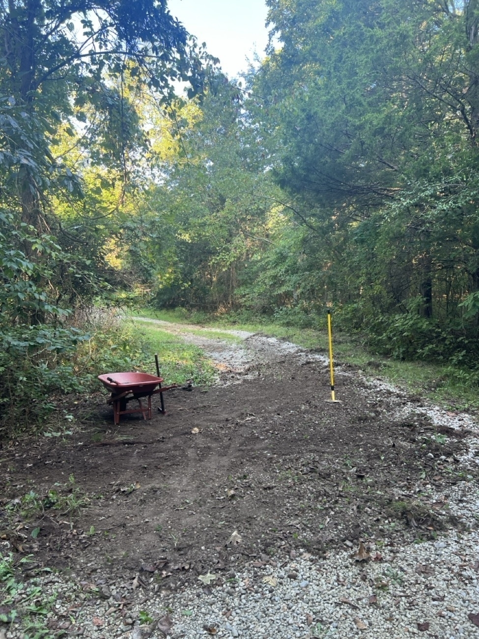
Over time a gravel road used by heavy vehicles will deform. The weight of cars and trucks will crush rock into smaller bits as they also push gravel to the outer sides of the road forming raised areas in the center of the road as well as raised shoulders. As the tire tracks slowly deepen, gravel being broken into smaller bits water begins to do more damage.
Add to the scenario a hill that sheds water to the road and a creek that floods and now you've also got extra erosion as water channels down along the tire tracks in the road.
In recent years I've watched as flooding due to more frequent 7-8" rain events do more damage to our private road each time. It's a project I should have taken on sooner. I don't have a tractor so all this will be done by hand using a few tools. It's a lot of work but I consider it my daily exercise. Though the final result will take much longer to accomplish it will be done just as well and with zero carbon emissions. And I'll be healthier for the exercise.
Broken down into 1.5 to 2 hours per day this section of road will take me 5 to 7 days, 10-13 hours. The photo above was taken after about 3 hours of work. Each workout has my heart rate average at about 140bpm which is equivalent to a moderate effort bike ride on the trail. Perfect.
The general idea is to cut into the shoulder and rake the top 3-4 inches of dirt and gravel back onto the road. It's messy but will all settle in. I'm only doing the low side of the road where water needs to shed to. With 5 inches taken off the top of the shoulder and added to the road, water will now shed properly off the road and into the lower elevation of the woodland moving away from the road (to the left side of the photo).
Once I get the dirt pulled onto the road for the full length of the area, I'll then spend a few hours raking it, mixing the gravel and dirt and leveling out any obvious bumps. I'll also make a bit of effort to break the center hump down a bit. Normally a raised crown on a gravel road is desirable but in this section of road I only have drainage on one side, hill on the other, and I want to have a nearly level road with just a very shallow angle off the downslope.
I've already completed one other section of road and there will be another two sections to do after this one. When it's all done it will amount to 4 sections, each about 50 feet, each about 5-7 days of work. So, a month of great exercise and when it's completed an improved road that will be more resilient, less likely to erode and loose gravel with each heavy rain.
Side note, while I walk and ride a bike on this road daily, I rarely actually drive a car. Most of the large vehicle traffic is family that visit.