Pages and Publisher on the iPad Compared Pt 2
This story is available as a pdf download.
For the first few years of my switch to the iPad I relied heavily on Apple’s Pages app for many of my document layout projects. It’s a fairly powerful app and in most cases was easily capable in creating the newsletters and annual reports I often create for clients. When clients needed printers marks, bleed or other features I fell back to Adobe Indesign, then, later, Affinity Publisher, both on the Mac. In the fall of 2022 Serif released Affinity Publisher for iPad and that’s now my go to for all of my design and layout work. There are only two exceptions! First, projects for clients that require delivery of a Word or Pages file. Second, projects that require delivery of an ePub. Though this hasn’t come up for me yet it’s worth noting that Publisher does not yet support export to ePub but Pages does.
I continue to recommend Pages for people that need a more general use word processor and layout application. It’s a fantastic application that Apple is likely to support for many years to come.
Why Affinity Publisher?
Simply put Publisher offers nearly everything I need and want for designing documents on the iPad. No app is perfect but Publisher is excellent and a real pleasure to use.
Before I dig in to everything I like about the app I’m going to tackle the one current problem I have with the app: It’s not yet optimized for Stage Manager and external display support. Serif states that they do not support Stage Manager. But in truth it actually works pretty well with Stage manager. What it does not do is support the many different resizing options of a supported Stage Manager app. But I can use it as a floating window and have other windows under or on top of it. Where this is most useful is having Files and an app like Notes or Word with text sent by a client. This allows me to easily refer to those other apps for text or images in the Files app for adding to the document.
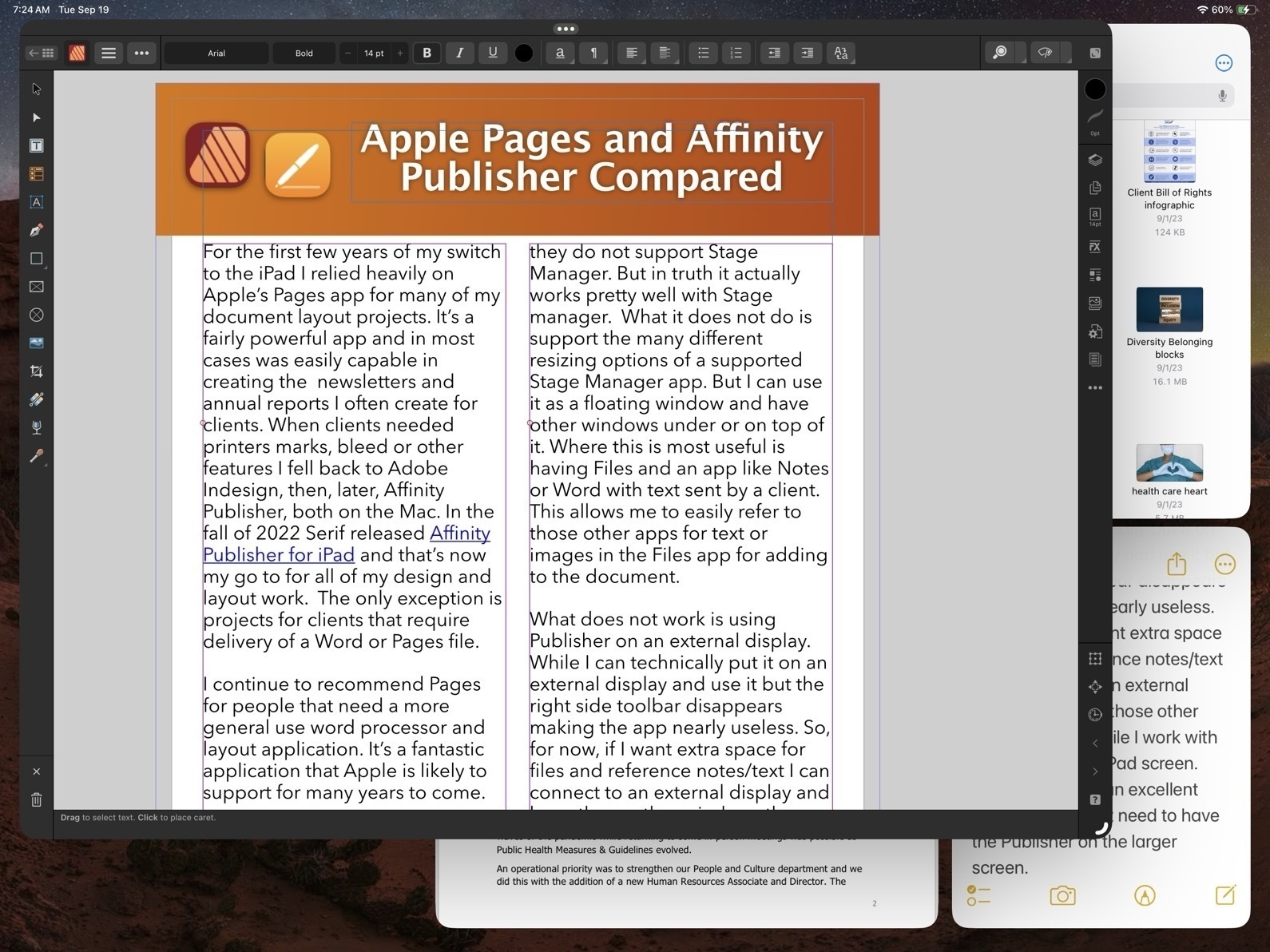
What does not work is using Publisher on an external display. While I can technically put it on an external display and use it but the right side toolbar disappears making the app nearly useless. So, for now, if I want extra space for files and reference notes/text I can connect to an external display and keep those other windows there while I work with Publisher on the iPad screen. And really, that’s an excellent experience. I don’t need to have the Publisher on the larger screen.
Okay, with that out of the way, let’s jump into the good stuff!
Before Affinity Publisher there was InDesign
I started with InDesign with the first version back around 1999. I used it fairly regularly until 2019 when Affinity Publisher for Mac was released at which point I transitioned entirely to Affinity apps. I used Publisher on the Mac alongside of Pages on the iPad to cover all of my document design work. Not long after releasing Publisher for Mac, Serif announced that they would eventually bring it to the iPad and three years later they delivered.
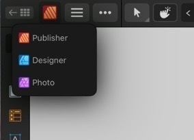
As with all of the Affinity apps on the iPad (and in sharp contrast to Adobe), these apps are the full versions. It’s worth noting too that Publisher is best used with the other two Affinity apps, Photo and Designer installed. Publisher has a feature called Studio Link which, assuming the other two apps are installed, allows the user to simply change “Persona” from Publisher to Photo or Designer. It’s seamless and there’s no launching of another app. Rather, the Publisher interface changes to the toolbars of the other app. So, for example, when I recently needed to edit a photo provided by a client I just tapped the photo to select the image and then tapped to the Photo Persona to edit the photo. When finished I tapped back to Publisher to carry on with the layout. The same can be done when creating or editing more complicated vector objects by tapping over to Designer Persona.
Okay, time to dig into some of the comparison points between Affinity Publisher And Apple’s Pages.
Cost
While Pages is free, Publisher for iPad is $20. It’s a one time purchase rather than a subscription. But really, to take full advantage, the other two Affinity Apps should be purchased as well, same price. So $60. There’s a bundle price for a Universal license for all apps, all platforms (Mac, Windows, iPad) of around $165.
Modularity
This is big. As mentioned earlier, with Studio Link and all three apps installed, I have a design and layout tool that has, thus far, seemed unlimited. There are many features I’ve not used yet. Publisher alone is a very powerful program, add into it the features of the other two apps and, well, I suspect there are many features I will never use. This is a good thing. It just means that the apps cover a very expansive set of methods, use cases and so on for many different users and scenarios.


Vectors and Text
A part of what’s so impressive about Publisher is that while I can tap into the other two apps as needed Publisher itself has a very impressive toolset on it’s own. This is especially true of the text and vector tool sets which allows for the creation of elements like complex curves, shapes, and text on curves. Perhaps I’m designing a brochure that includes a map for a park and trail with various points of interest. I can easily do this within Publisher. If I reach the limits of what Publisher can do then I just change over to the Designer Persona.
Page-based Layers
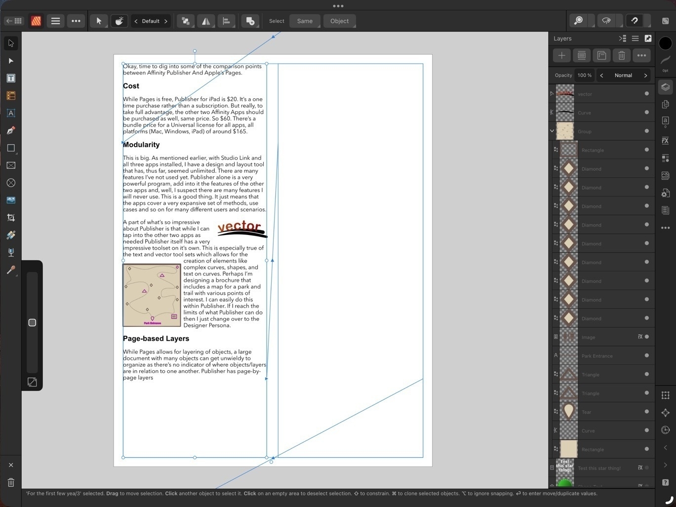
While Pages allows for layering of objects, a large document with many objects can get unwieldy to manage as there’s no indicator of where objects/layers are in relation to one another. Publisher has page-by-page layers all of which are visible in the layers sidebar - much easier to keep track of everything!
Bleeds, Printers Marks, Guides
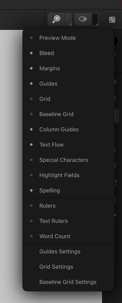
These are all features considered essential in professional page layout and Publisher has them, Pages does not. Bleeds can be added anytime in the Document Set-up screen. Printers Marks are an option when exporting. Pages has alignment options to help snap objects but does not allow for creating custom guides in a document.
Zoom in, Zoom out
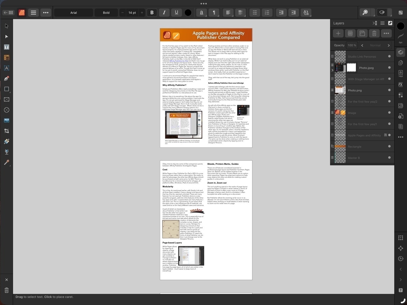
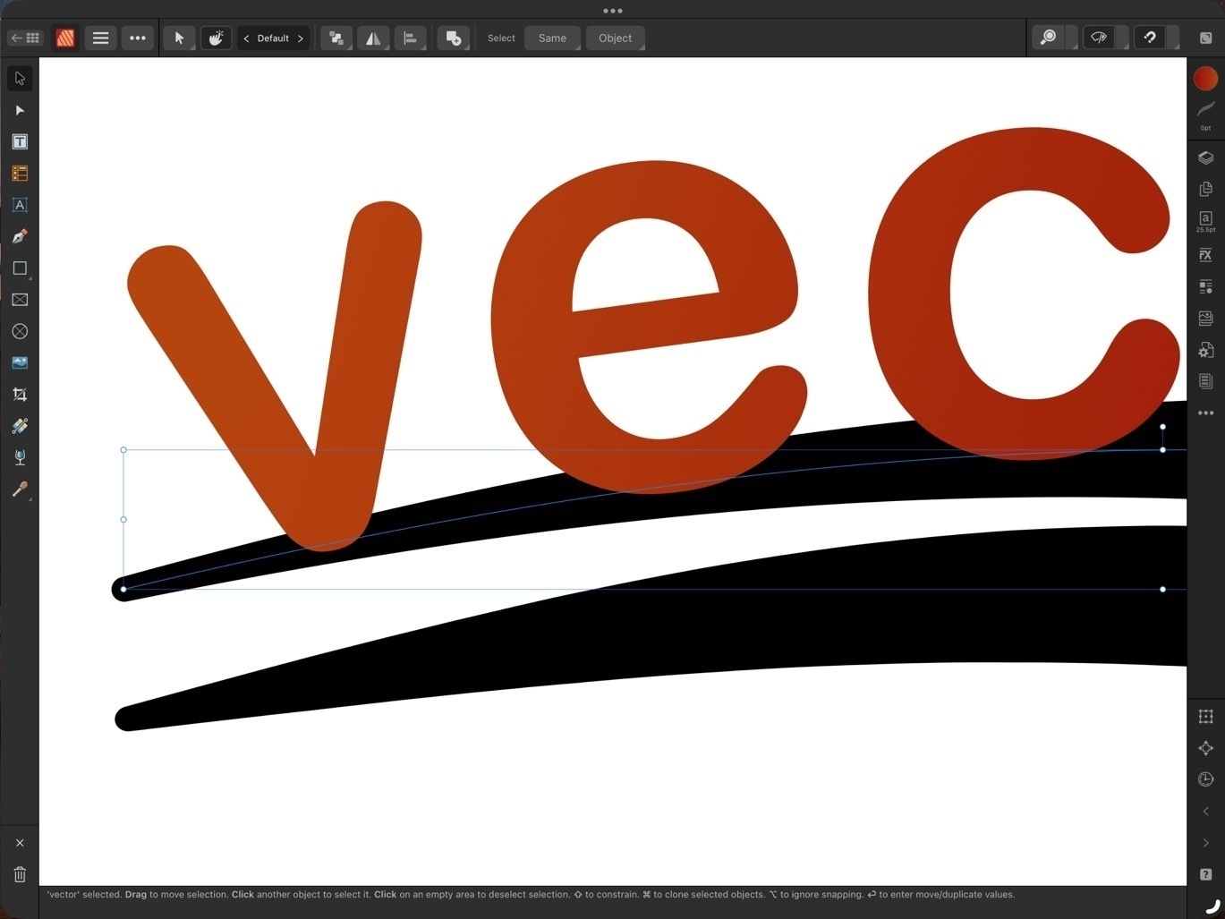 This isn’t anything special in the realm of page layout apps but Pages is limited in what it allows in terms of the level of zoom it offers, even more so if Stage Manager is being used. And it’s a limitation I often bumped into when working on a document.
Publisher allows for zooming as far out or in as desired. I’m not sure if there’s a limit. Very fluid and fast, helpful when working on small details or when wanting to zoom out for wide view of a page.
Visual Effects

Again, this isn’t all that special for page layout applications but Pages lacks most of the options that might be expected. Bevel/Emboss, outline, inner and outer shadows, glow, Gaussian blur are some of the possible effects and of course each effect has a variety of variables that can be adjusted for each.
Built in access to stock photo libraries

Publisher includes built in access to Pixabay and Pexels stock photos libraries. On Pixabay this includes vector images as well. Handy in my use case for infographics when doing annual reports and newsletters.
Vector assets
Add images and vectors to an Assets library for reuse in a document or between documents. While there is a small library of assets included with Designer I often will search Apple’s Pages included vector art and copy those over as needed (bike on left comes from Pages). Or, mentioned above, vectors are available for download via Pixabay. If I can’t find what I want I can make my own.
Font Manager
Affinity also includes it’s own Font Manager. Install a font in Publisher directly via the settings in the app. It’s much easier than going through a third party using the Settings App to download profiles. The benefit of that method is that installed fonts are available system wide. But as I’m doing almost all of my design work in Affinity apps it’s not an issue. Also, install a font in one Affinity app and it’s available in the other two Affinity apps.
Artboards
Publisher has space outside of the document for storing objects. If I’m not sure where something is going or if it’s going to be used I can keep it off to either side of the document. It’s incredibly helpful and not something found on Pages. At this point I consider it a necessity.
Importing IDML and PDF
I’ve had several occasions to use the option to import IDML and pdf files. It’s a time saver and really helpful getting started when a client wants to start with a previous document template. Or, as with a recent annual report, a client provided numerous pdf infographics several of which needed minor edits. I was able to do the editing right in Publisher within the larger document.
Missing features
In direct comparison to Pages there are two missing features that stand out:
- Export to ePub.
- Charts
There’s no work around for the first but it’s not been a problem for me as I’ve never had the need to export to ePub. In the second case, charts, the work around would be to set-up a table and chart in Apple’s Numbers app and copy paste. It’s not ideal as it’s pasted as in image but it does work.
Conclusion
iPad users are well taken care of in the category of document layout. Pages is very powerful and fairly easy to learn. It is a great app to get started with but it’s not a basic application. Over the past few years, Pages has really matured into an app capable handling many of the projects I’ve needed to do. But when compared to a dedicated document design and layout app like Publisher, Pages does lack some of the options. I’ve not covered all of the differences here but have tried to mention some of the more notable examples.
Some example use cases for Pages:
- Small businesses and nonprofits that want to cover their own document creation internally
- Students creating reports
- Nonprofit and community volunteers that need to creat newsletters, brochures, flyers, or other documents
- Creating ePubs
Use cases for Affinity Publisher
Publisher is an advanced app for doing practically any kind of document design project. It takes more time to learn but if you’ve had experience with Adobe applications you’ll likely learn Publisher and the other Affinity apps fairly quickly. The tool set and tool options found in Publisher go far beyond what I’ve covered here.
- Document design and layout that can be fully customized with no limits on graphic elements or text
- Management of large documents with many layers and assets
- Documents intended for printing that requires industry standard output such as printers marks with bleeds.