Greta
Greta Thunberg: “I don’t want your hope. I don’t want you to be hopeful. I want you to panic. I want you to feel the fear I feel every day. And then I want you to act. I want you to act as if you would in a crisis. I want you to act as if the house was on fire, because it is.” 🌍
Excellent presentation describing the already ongoing migrations and what will happen as the climate emergency deepens. From growing food scarcity, increasingly difficult living conditions and economic impact, those least responsible are already being forced to leave their homes.
Abrahm Lustgarten, a nationally recognized writer and thinker about climate change, was the presenter for the 2023 Linda Cotter Speaker Series, co-hosted by the Goldfarb Center for Public Affairs and Mid-Maine Global Forum.
Unlivable: how a changing climate will force a global migration - YouTube
🌍
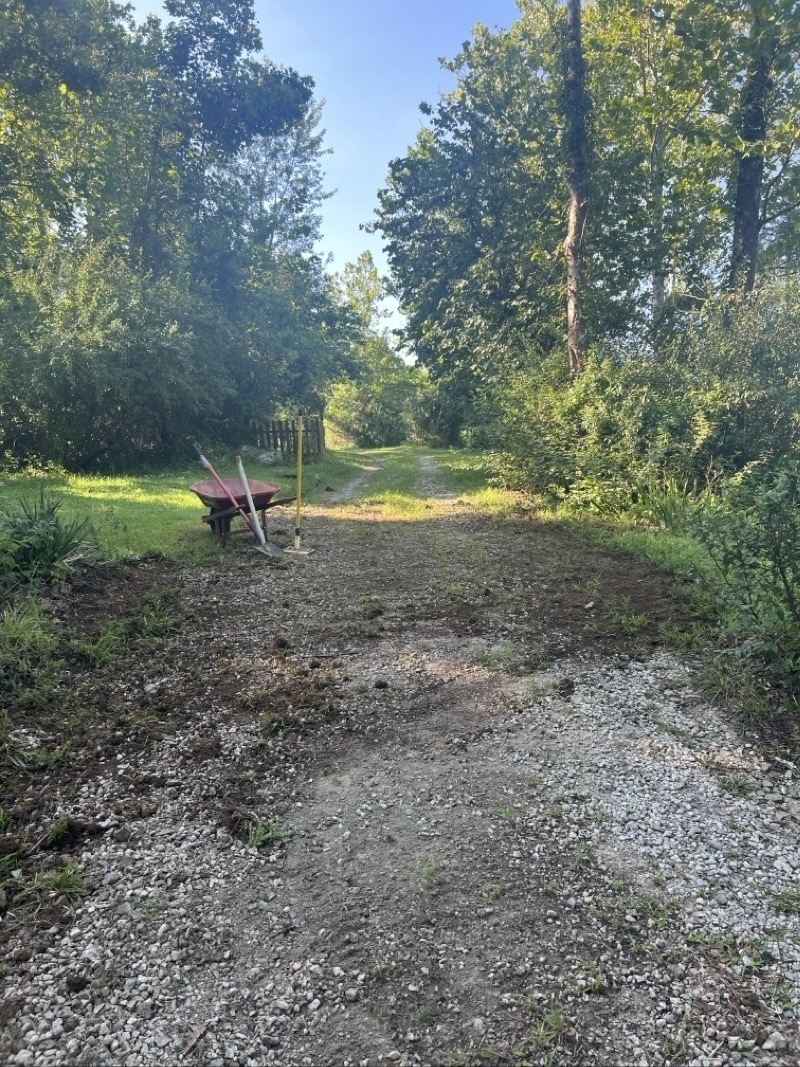
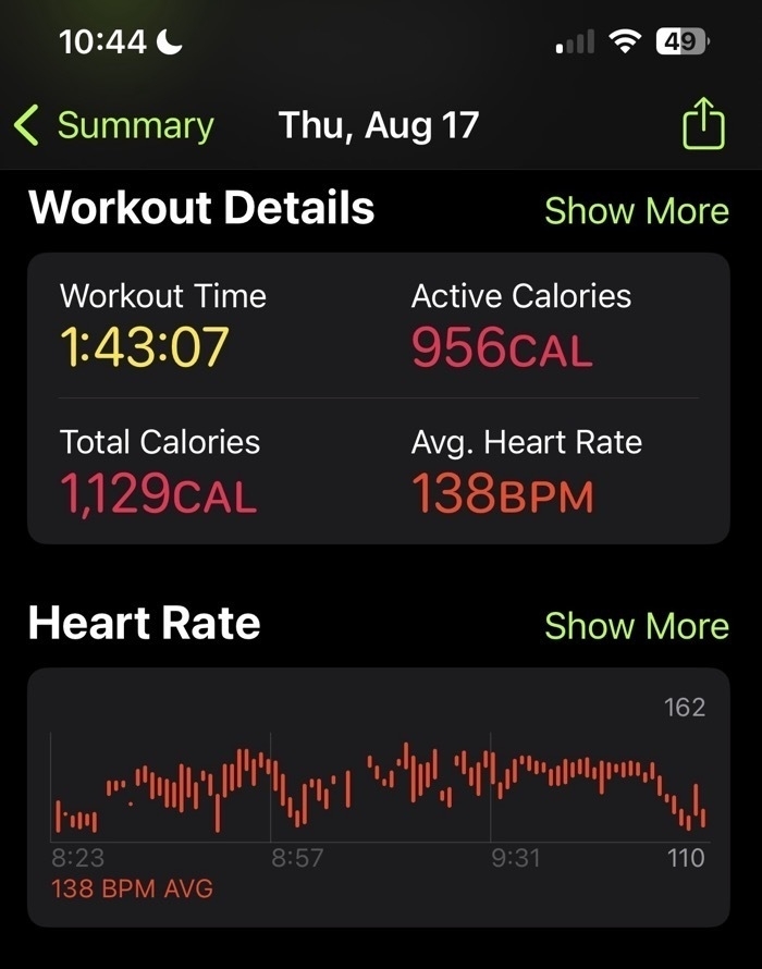
One of the tasks of rural life is gravel road maintenance. I don't have a tractor so I do small bits by hand. The task in this section: remove the center hump and allow for water to shed off the down-hill side. 2 days, 3 hours. 1 more day and 1.5 hours should get it done. Excellent exercise!
Canadians have crammed into a local airport and lined up along a major highway out of the Northwest Territories to escape wildfires, a day after authorities warned the blazes were moving closer to the territory’s capital and largest city, Yellowknife.
Authorities had called on Yellowknife’s nearly 20,000 residents to leave the city by Friday, and an evacuation order was also issued for surrounding communities.
Thousands flee as ‘unprecedented’ fires hit Canada’s Northwest Territories - YouTube
Multitasking and Windowing on the iPad Pro
In recent days I've been thinking more about multitasking and windowing on larger iPads. I posted a couple days ago about using the iPad Mini more often in part because I'd been feeling that I might be better served by the smaller iPad Mini for non-work, everyday sort of browsing and reading.
Is Mac windowing the ideal?
As luck would have it the same day I posted that story the weekly episode of Mac Power Users was released and the topic covered: window management on the Mac. In recent weeks and months I've been seeing the topic of window management on the Mac come up on Mastodon and podcasts. When I've seen it come up it's being posed as "why is window management on the Mac still a mess and when/how will Apple fix it?"I can't help but puzzle at this because for the past couple of years much of the ongoing critique/frustration directed towards the iPad from the nerd community has been along the lines of "iPad multi-tasking is terrible, the iPad needs windowing like the Mac, the iPad needs macOS, etc." Then Stage Manager came last year and that critique got louder with the Mac being held up as the windowing that the iPad needs.
So this iPad user has been surprised to hear recently that at least some users think windowing on the Mac is too complex and needs to be fixed. 🤨🤪🧐
In the MPU episode one of the solutions mentioned repeatedly is tiled windows which is an option in Windows OS. On the Mac there is no Apple provided solution for tiling beyond 2 split windows but there are several 3rd party solutions and these seem to be fairly popular for those that don't want to spend a lot of time with arranging free form windows.
Multitasking and windowing on the iPad
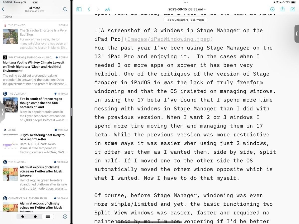
When using the 13" iPad, more often than not, I only actually use one app at a time. And on the occasions that I need more than one app it's often just 2 apps that I need and the relatively simple Split View is likely all I need to do the task at hand. Before the introduction of Stage Manager with iPadOS 16 Split View served me very well. Though it is a more limited option the basic functioning of two Split View windows is also easier, faster and requires practically no maintenance by me. It provides a hint at why some Mac users want window tiling as an option.
I can understand why some users would want more than two app windows and that's why Apple tried to solve the problem first with Slide Over windows and then the floating windows found in picture-in-picture video and then Quick Notes. Though helpful all three of those options have their various limitations in terms of sizing and placement on screen. And of course in each case they cover up a portion of the screen. Some (myself included) wished for an option to have three tiled windows rather than just 2 Split View. I'll come back to that.
Stage Manager
With the first version of Stage Manager users got something close to tiling. A kind windowing with floating windows with more sizing options than previously but still managed in placement. Almost tiling but not quite. Almost free form Mac windowing but not quite. And for the past year at least some iPad users complained quite loudly that it still didn't solve their problems.
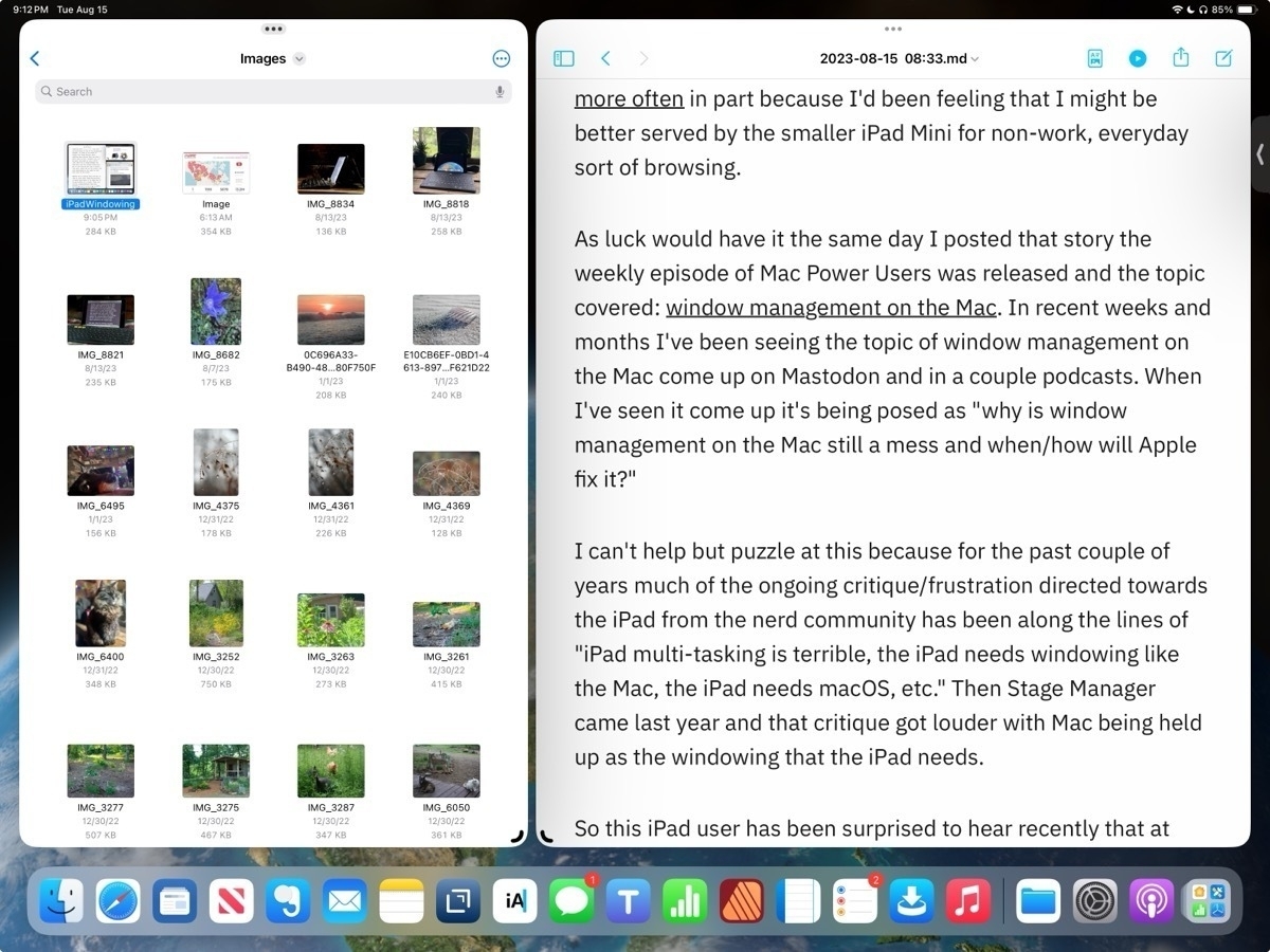
For the past year I've been using Stage Manager on the 13" iPad Pro and enjoying it. In the cases when I needed 3 or more apps on screen it has been very helpful. But it's worth pointing out that even the 13" iPad is on the small size when compared to laptops in part because window chrome takes up more space. On the 11" this is even more true. With the added window chrome and border space around windows forced by the OS, really makes using 3 windows or more feel cramped. It works on the 13" screen but I can't imagine using that many windows on an 11" iPad.
In using Stage Manager on iPadOS 17 beta I've found that I spend more time managing windows than I did with the previous version. While it's true that I have much more control of positioning and sizing that increased control also translates into more time and effort from me. But this is exactly what many users clamored for. A more Mac-like, free form windowing.
But there absolutely is a trade off. While the previous version was more restrictive in some cases, for example if I just want two evenly split windows, it was much easier. I could set them up and if I wanted to switch sides I could just drag one and the OS would move the other for me. Now I have to move one window then move the other. It's a small thing but it can add up over a day as you find yourself adjusting tasks and workflows.
Between the two versions of Stage Manager I'm not sure which I prefer or if I actually would be better served going back to that simpler multitasking version Split View with Slide Over as needed. On the smaller screen of the iPad, with more window chrome, I'm starting to think that there is a third, better option.
Tiling
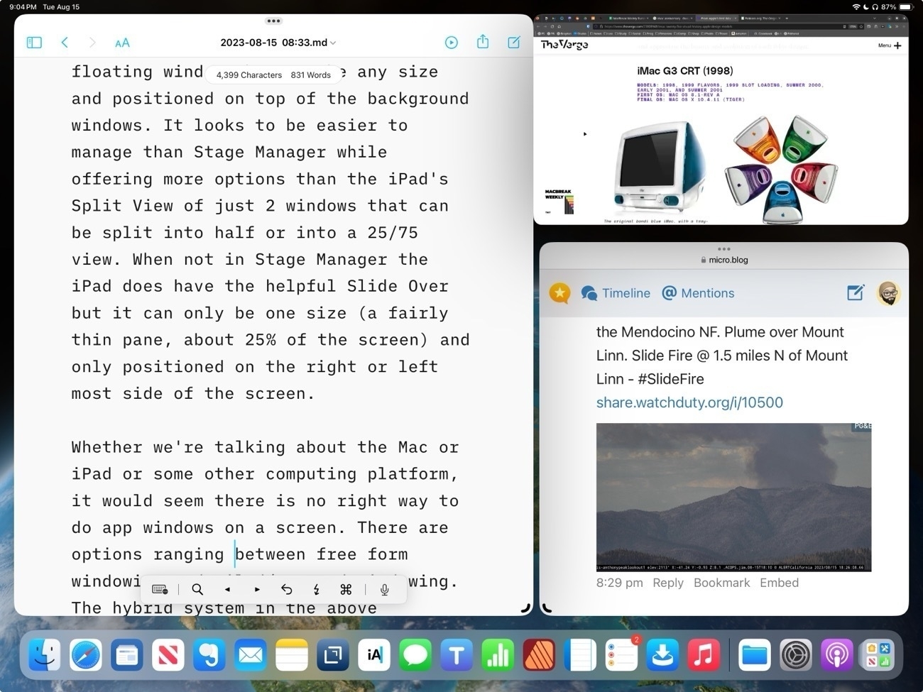
Personally I was hoping for some version of tiled windows. Watching this video review of the Samsung Galaxy Tab S9 Plus and at about 3:46 I see something very close to what I would consider ideal. Essentially, it's an improved version of Split View that allows for up to 3 windows that can be split into any size. It also allows for windows to be pulled into "pop-up view" which is, essentially, a free form floating window that can be any size and positioned on top of the background windows. It looks to be easier to manage than Stage Manager while offering more options than the iPad's Split View of just 2 windows that can be split into 50/50 or into a 25/75 view. I think a 3 pane Split View would be far more useful than the current model that allows for the addition of a Slide Over window that covers other content.
Whether we're talking about the Mac or iPad or some other computing platform, there is no perfect way to do app windows on a screen. There are options ranging between free form windowing and tiled/managed windowing. On the iPad I do think Stage Manager as optional mode is definitely an improvement and I suspect that many that wanted windowing on the iPad will be happy with the new freer form implementation.
For myself, I'll be wishing for tiled windows in the above mentioned Galaxy Tab review. An option for a third pane Split View with free-form splits of any size would be my ideal.
I wish I didn’t have to tell you about this again, but I do. It’s not being reported much in the news — and you know why?
Because it’s not ‘new’ (the origin of the word ‘news’), it’s old. This has been going on for months now, and corporate news outlets are simply tired of reporting it. But it is still happening.
Canada’s boreal forests are burning up.
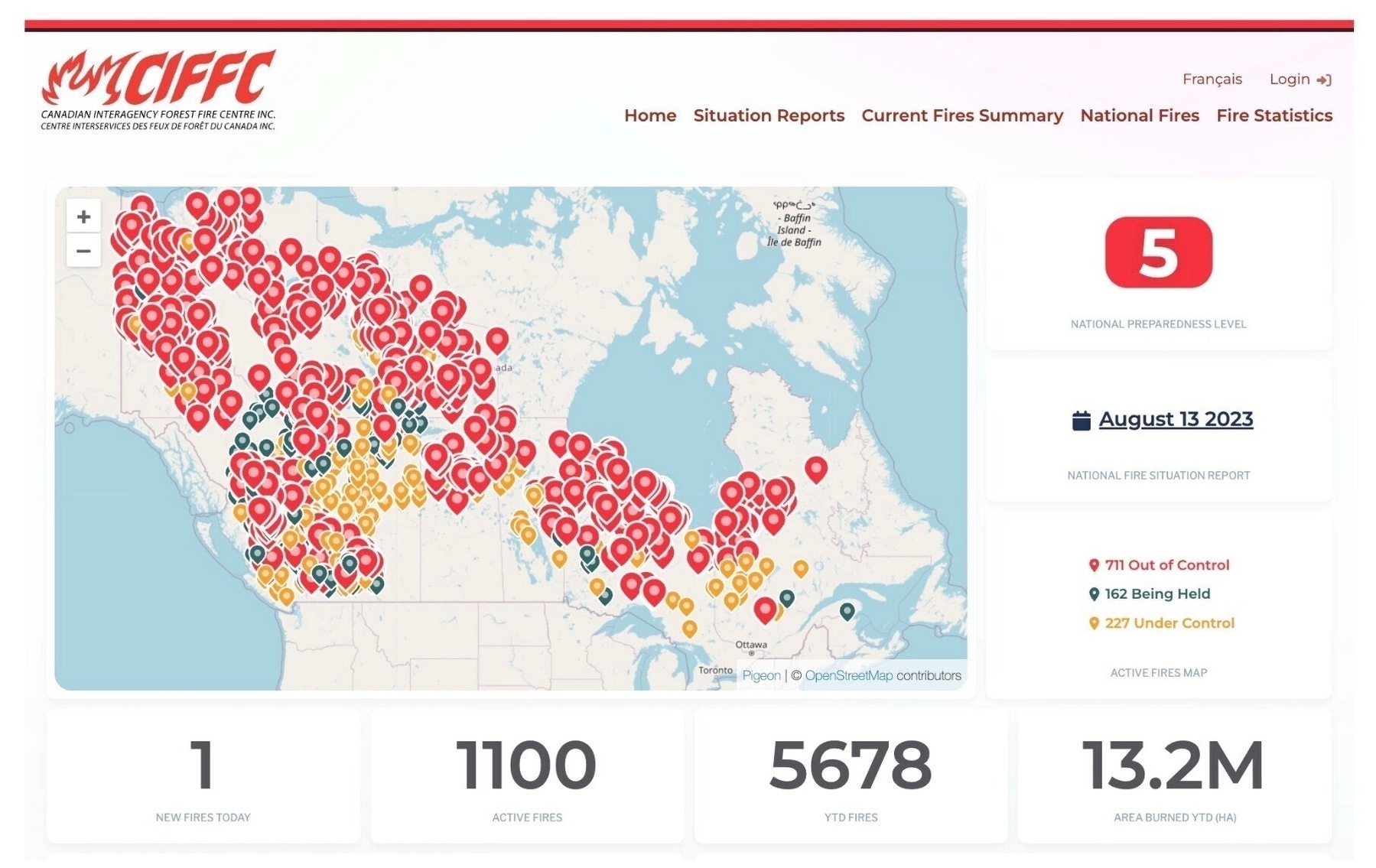
At least 1100 fires are active, more than 700 out of control. Over 13 million hectares have been burned so far, with no end in sight. It’s an unprecedented climate and environmental disaster.
As climate-related disasters become more frequent, more unpredictable and intensively destructive, a step change is needed in how governments and societies respond to the threat. In this regard, state authorities in Hawaii appear to have been badly behind the curve. An emergency management plan, published by state officials last year, identified tsunamis, earthquakes and volcanic hazards as potentially deadly threats, but described the risk of wildfires to human life as “low”. That judgment now looks culpably complacent.
Global heating has inaugurated an era of climatic instability and volatility. Proactively analysing and preparing for worst-case scenarios means acting to anticipate disasters that may not happen, and persuading the public that such caution is worth the cost – both financially and in terms of disruption. The rest of the world, not just Hawaii, needs to wake up to this new and deeply challenging reality.
The Guardian view on Hawaii’s lethal wildfire: lessons to learn from a catastrophe
As weather systems spin out of control across the globe, we take a closer look at how the United States is tackling the “too much” and “too little” of water.
Two very different case studies. The first, a Native tribal community in Washington State, forced to relocate their coastal village to higher ground.
Then, Phoenix, Arizona, where a historic megadrought and heatwave have created dual water supply and heat survival crises.
Constant adaption to crises will be the primary story of our future.
Climate Change Hits Home in the USA | Troubled Waters - YouTube
A return to the iPad Mini
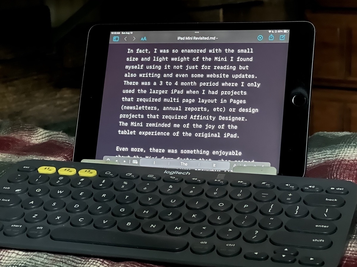
For most of the past 6 years the vast majority of my computing has been with the 13" iPad Pro. Three years ago I bought an iPad Mini 5 primarily for reading and browsing. And it’s been perfect for that, especially books. So light and easy to hold.
In fact, I was so enamored with the small size and light weight of the Mini I found myself using it not just for reading but also writing and even some website updates. There was a 3 to 4 month period where I only used the larger iPad when I had projects that required multi page layout in Pages (newsletters, annual reports, etc) or design projects that required Affinity Designer. Otherwise I used the Mini which reminded me of the joy of the tablet experience of the original iPad.
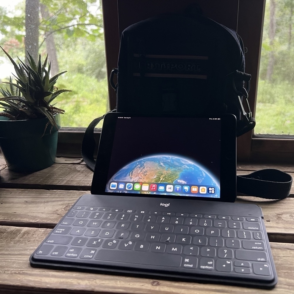
Even more, there was something enjoyable about just how minimal the Mini form factor is when paired with an ultra thin, light keyboard like the Logitech Keys-to-Go. It is the ultimate portable form factor that is still large enough to be usable for my aging eyes. The two easily fit in the smallest of cases.
I gradually, unintentionally shifted back to the larger iPad Pro for most of my computing even when the larger device wasn’t optimal. Certainly the 13" screen is what I need to use when I’m working with Affinity Publisher or Designer. It’s also the iPad I tend to use for working with Numbers spreadsheets or updating websites because I’m likely to be referencing 2 or 3 apps at the same time for those tasks. The larger screen makes sense in those two scenarios.
But my habit has been to use it for everything and the large screen is overkill for most things. For all the talk in tech circles about multitasking and multi windows on the iPad, I usually just need one app, one window. And that one window usually doesn’t need to be a full 13". Of course it works but has me covering much more screen with trackpad or touch. And so I’ve taken to shrinking each app window via Stage Manager so that I have a smaller, centered window on the large screen. But that doesn’t actually help that much.
To put it another way, the larger iPad has been my laptop and the iPad mini my tablet but I’ve been using the laptop form factor for everything, including things that are best left to a smaller tablet.
So I paused and asked, what are my most used apps and how well do they work on the smaller screen of the iPad Mini? iA Writer, Textastic, Apple Notes, Mail, Safari, Mona for Mastodon and ReadKit for RSS are my most used apps and they all work very well in both portrait or landscape orientations on the smaller screen.
So, I’ve been making it a point to use the Mini these past few days. I’m leaving the larger iPad on my desk for the actual work related tasks that require the larger screen. For writing and blogging, browsing and simpler website updates I’m using the smaller, tablet-first iPad. I think it will make for a fun little shake-up of my daily routine.
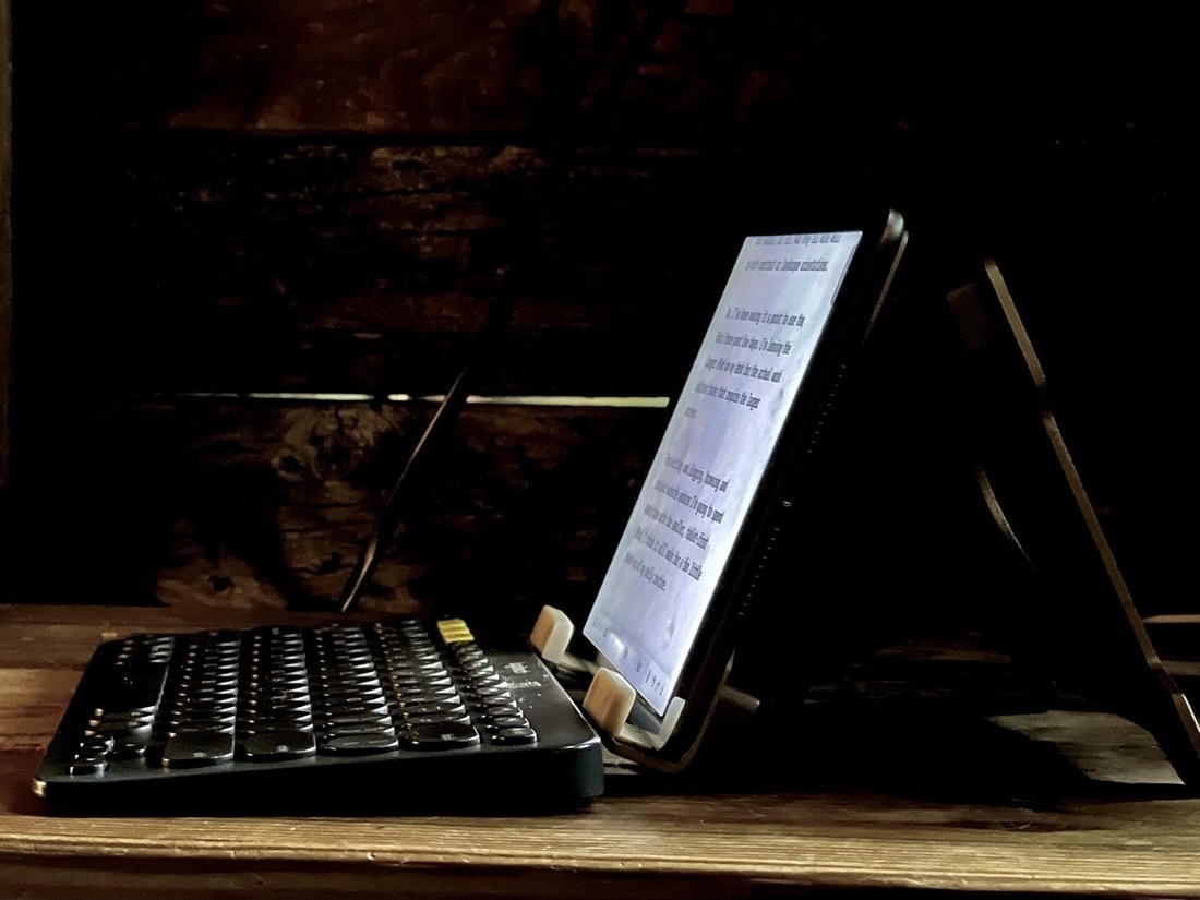
I expect that with the slower processor and less memory (3GB vs 8GB) on the older Mini I’ll notice a few slowdowns when switching between certain apps. But thus far, it’s really not been a problem.
Thus far it’s been pretty smooth. And as expected, I’m really enjoying the ease of just lifting the iPad from the stand for hand held use when I’m not typing.
Personal responsibility and action during two crises: Covid and Climate
When Covid arrived in the spring of 2020 there seemed to be two responses: those that masked and those that refused because it infringed on their “personal liberty”. Those that masked did so regardless of whether there were local, state or federal mandates requiring them to do so. The science at the time suggested that the best any one of us could do to stop the spread was to wear a mask. The responsible, ethical, compassionate behavior, regardless of government mandate forcing the behavior, was to mask up and limit social exposure.
Now, it’s 2023 and we can plainly see that we are in a climate emergency. There is no doubt that we are in it. Will you wait to be forced by government mandates to do the right thing by limiting your negative behaviors? Will you cry, scream and complain that your personal convenience and liberty trumps the ethical and compassionate changes that you can make to limit your contribution to the climate crisis.
Pick your fucking side.
Maui Burning
Of course seeing the predictable but hollow expressions of concern about the wild fires in Maui. If you’re fucking concerned then change your life to reflect the climate emergency we’re living in. Use a bike or e-bike instead of an oversized truck or SUV. Own your contribution to the carbon. Protest, protest, protest.
Stop pretending to be powerless. Stop pretending there’s nothing that can be done. Stop pretending that ONLY government can fix the climate emergency. Stop waiting for the government to force you to do the right thing.
It’s not individual action when we all recognize that we don’t live in a vacuum. It’s not individual action when we look around us and see others taking action. 2+2+2+2 and on adds up. Individual action adds up to collective action. If we all took direct action in our lives by the millions we would be making real change.
STOP MAKING FUCKING EXCUSES BECAUSE YOU’RE NOT INTERESTED IN TRYING TO BE THE SOLUTION. YES, THE SOLUTION MEANS YOU HAVE TO MAKE AN EFFORT. YES, THE SOLUTION MEANS YOU MIGHT HAVE TO DO WITHOUT SOME CONVENIENCE AND MAXIMUM COMFORT. THAT IS THE SOLUTION.
Extreme weather events and our warming planet are primed to strike commodities and the food supply like never before.
The recent global heat wave, deadly floods across China’s grain belt and wildfires that spanned several continents have put a spotlight on how climate change may wreak havoc on the world’s most-consumed food crops.
Studies show that future climate projections indicate significant reductions of crop yields in high-risk regions.
As climate woes intensify, risks to food supply (and inflation) grow
In “Don’t Let Them Bury My Story,” Viola Fletcher recalls the horrific night in 1921 when America’s “Black Wall Street” was burned to the ground.
More than 100 years later, Viola Fletcher can still vividly remember the smell of her thriving neighborhood — dubbed America’s “Black Wall Street” — burning.
And though some progress has been made it’s easy to see that, 100 years later, we still have much work to do. White supremacy is woven into the fabric of the US and it will not go easily.
Tulsa massacre survivor Viola Fletcher releases memoir at 109 years old
Adventures in RSS apps!
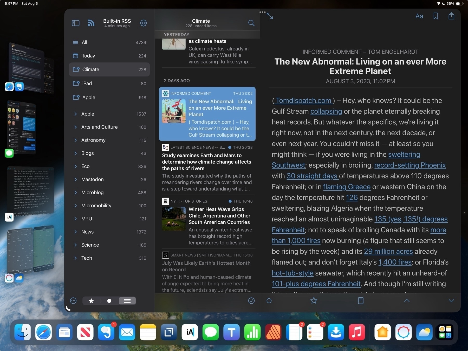
Warning: What lies ahead is a lot of rambling about nitpicky details that may bore anyone who is not me to tears. Proceed with caution.
My exploration of RSS apps seems never ending. I'm sure I'm not the only one who never seems to be able to find the perfect RSS app (the same is true of writing/notes apps). Years ago I used NetNewsWire on the Mac and it held for a very long time. Then as I spent more time on the iPad there were several apps that no longer around like Mr. Reader and likely others, the names of which escape me at the moment. At some point Reeder came along I used that for a long time.
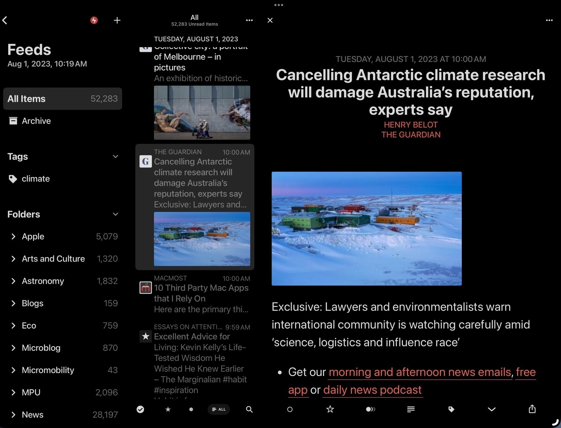
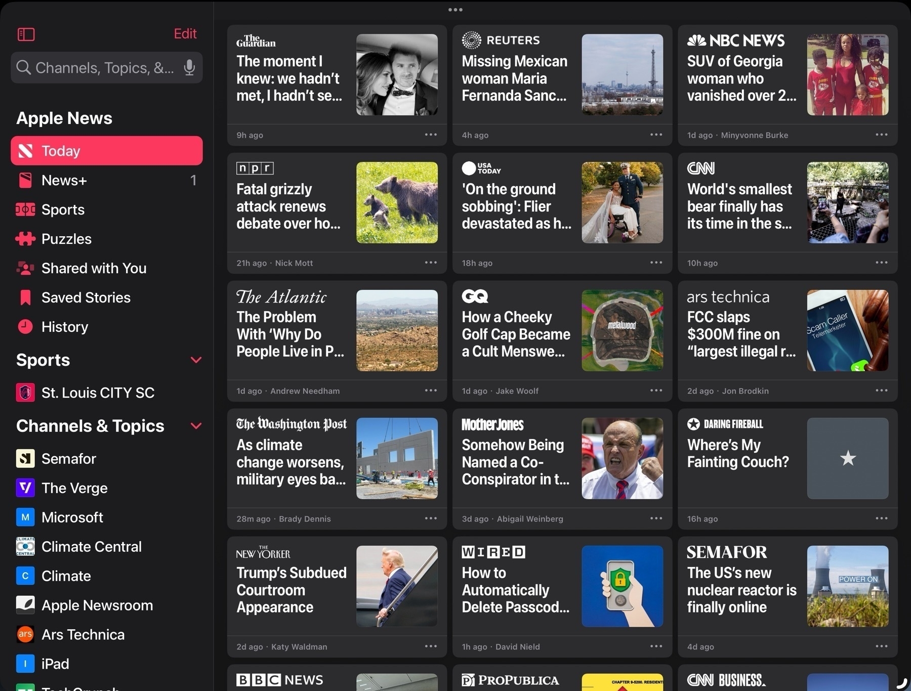
But then came Apple News and while I only dabbled with it briefly it was long enough to realize that I preferred a magazine style grid. It seemed a better use of space. A full window of sheets appealed to me more than the column/pane based Reeder design that so many RSS apps seem stuck on. So I went searching for something similar.
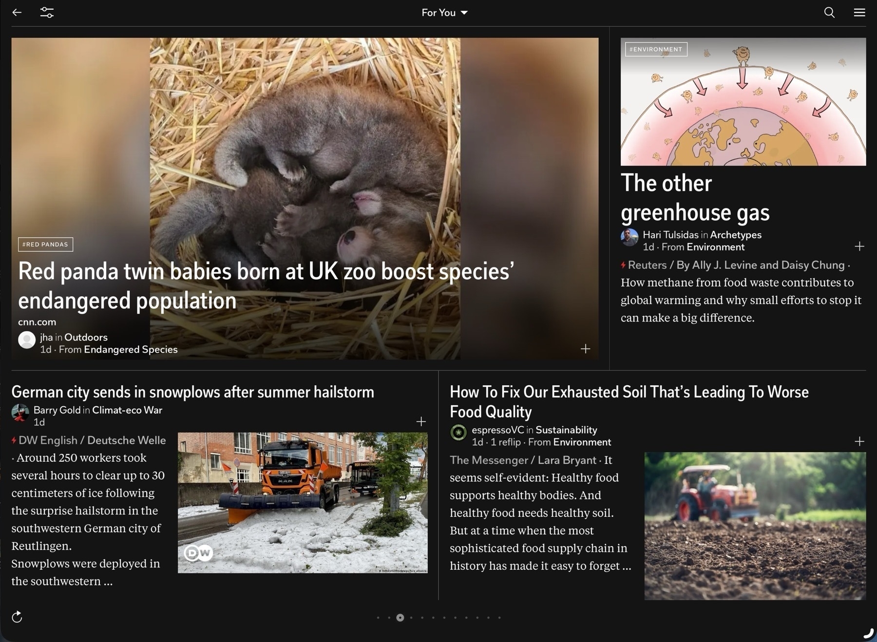
I even revisited Flipboard which I'd tried years earlier. I really like the design of the app interface and page turning which is excellent on the touch screen of an iPad. And it's an interesting take on adding in social interactions to news with user created magazines, comments and as of this spring, integration with ActivityPub. I could almost see myself using it more. That said, the app is really lacking in font size customizations. In general a very small font is used and I've found no way to increase that size to a point that I would need it. There is a setting but it's largest size is still too small.
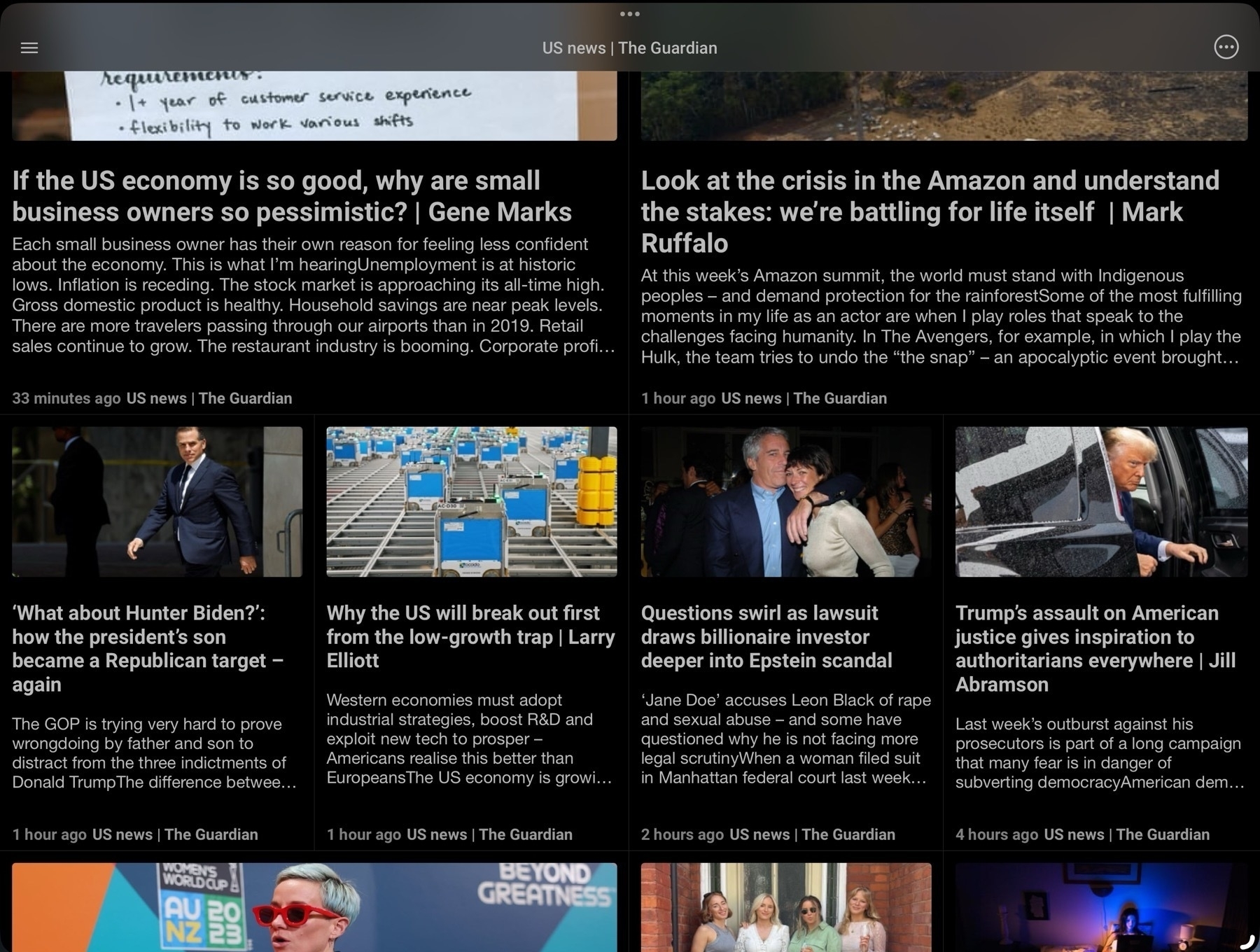
I found Newsify which I used for several months but over time some aspects of the app bothered me enough to keep looking. I came across News Explorer which I switched to and used for a while. It too offers a grid option but again, there were certain aspects of the app that bothered me over time. I use RSS apps a lot, perhaps too much. But I tend to get comfortable and familiar with them I inevitably discover those little nits that bother me. In some cases it's some aspect of the visual style, in other cases it's more about function such as how gestures or keyboard navigation work.
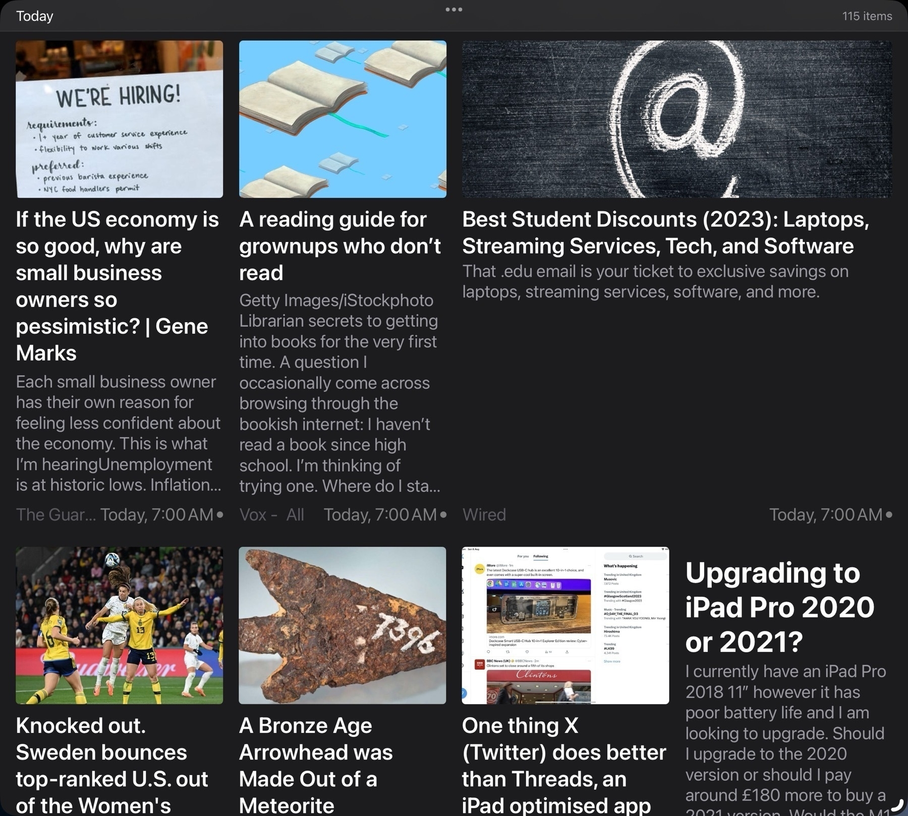
When NetNewsWire came back to the iPad I jumped back to give it a try. Something about the visual design didn't sit right with me so it didn't last long and I decided to try Reeder again. And amidst these jumps I also briefly tried others like lire, Unread, Fiery Feeds, Big News and Inoreader. Of this bunch Big News instantly reminded me of the Apple News design but it's a subscription app so I only tried it in the limited free mode for a brief period. For a while I also used the Feedly app as I was using Feedly as the back-end. More recently some apps have been offering iCloud sync as the back-end and I decided to try that instead of Feedly so that's another consideration. There are many feature options in this app category.
In recent months I'd again settled into Reeder. This time around with Reeder I decided to use it a bit differently. Rather than a large window with 3 panes: Folders of feeds, individual feeds and articles I tried it with just 2 panes, feeds and articles. Seems less a waste of space to hide the 1st pane of folders and only use it when needed. This was working for me until a few weeks ago when I started paying more attention to keyboard navigation. With the iPad I want the best possible touch gesture support but also keyboard navigation within and between panes and articles. Reeder does provide keyboard navigation but for whatever reason I have difficulty with it. It was something I'd overlooked for awhile but I can't easily, reliably move between the 2 primary panes back to the first pane of folders. At first I was trying this with arrows which is intuitively what I think to use. I discovered that the shortcut is p (previous) and n (next) and then space bar to select. I want to be able to use the arrow keys and ideally when I'm navigating these sources I'd like to actually be in the first pane.
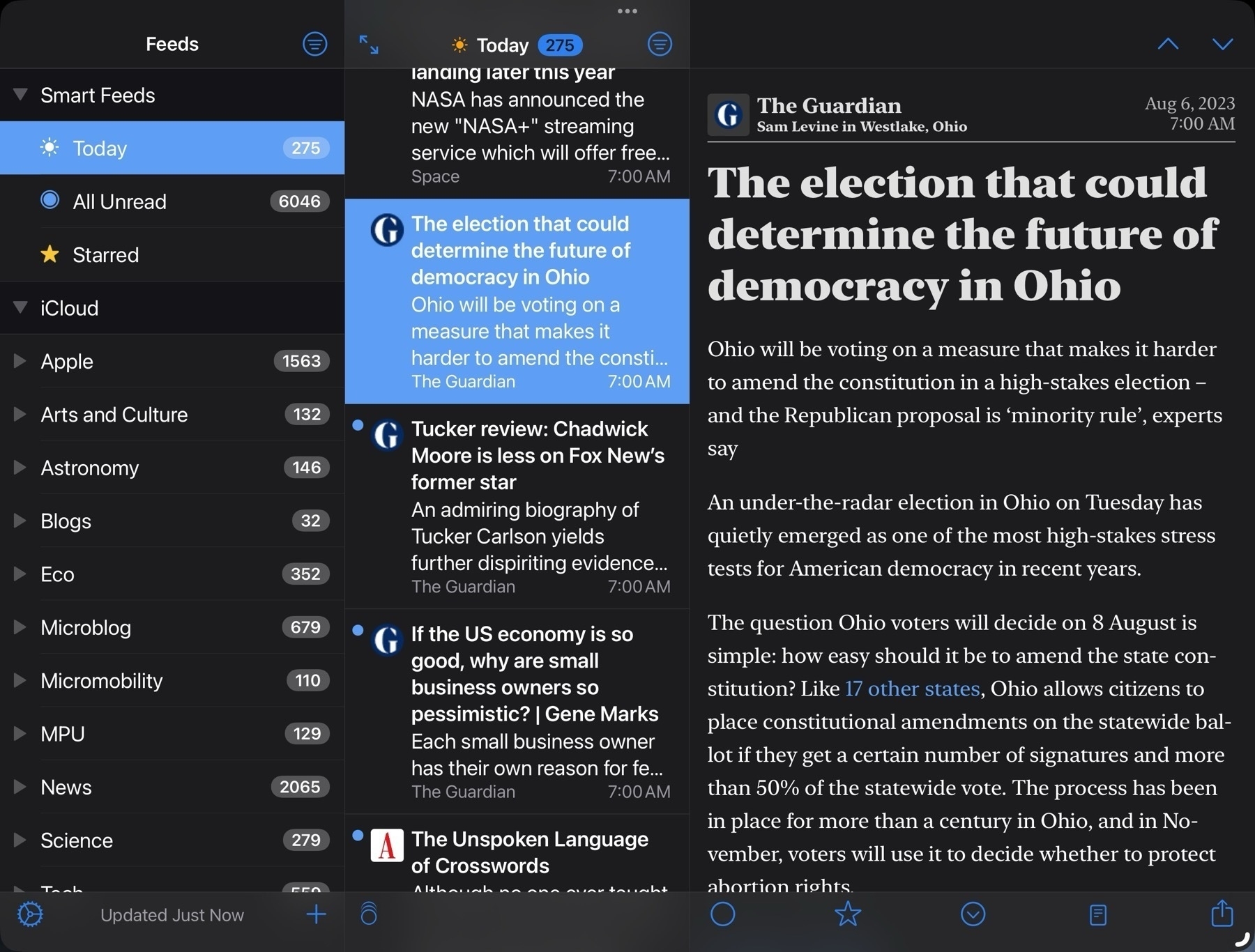
So I thought I'd try NetNewsWire. It works perfectly for keyboard navigation with three panes. Exactly the way I'd want to do it with arrow keys but as I'd gotten in the habit of just using the two panes I gave that a try. No go. Like Reeder it does have navigation shortcuts, an and z to move up and down. At this point I just sorta laughed at myself for being so picky.
Okay then. Fine. I'll see if I can settle into Net News Wire and just use the three panes. Or try the a/Z shortcuts with 2 panes. It wasn't bad but it wasn't good. Like Reeder it does work but after a few days it still felt clumsy for me. And while NNW offers different themes for reading articles I was also not happy with the few available offerings. I could create my own, but from what I could find would have to do so from the Mac. So, okay, fine I thought, I'm back with NNW. Cool, it will be like years ago when I happily opened this app up every day. Yay for nostalgia! I was a few days into this when some heartless bastard in a thread somewhere mentioned ReadKit.
Me: Don't do it. Hey, brain, STFU. Just stick with NNW. You got this. You can do it.
Brain: Hey, I remember ReadKit. You actually tried it awhile back and liked it a lot.
M: Oh, really?
B: Yep!
M: Well then, why am I not using it?
B: Cause it's a paid app and you're cheap.
M: Piss off. Okay. True enough. And NNW is free!
B: It is. But you really did like ReadKit. You thought it was purty as a flower.
M: I don't need purty.
B: Yes you do.
M: How much was it? Dammit.
I downloaded ReadKit. Again. I don't do subscriptions but it's available for one-time purchase of $10. That's not much but I'm cheap and enough $10 apps add up. There's a trial with a few features missing so I downloaded and set up a few feeds to give it a spin.
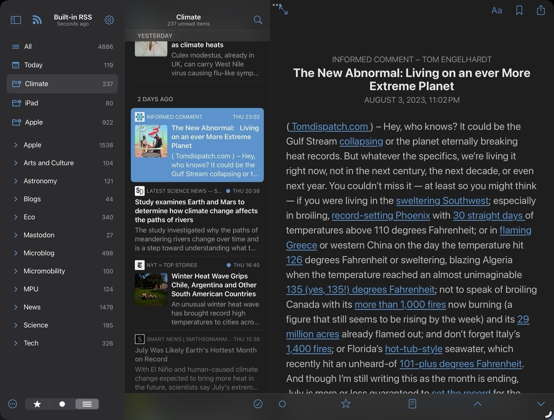
Sure is purty like a flower. Dammit.
I clawed my way back to NNW and lasted 2 whole days before I bought ReadKit. After several days I really do love ReadKit.As I wrote this I jumped back and forth to NNW and Reeder for closer comparison's. I could have gotten by with either of those. They're both excellent apps. I would have gotten used to the shortcuts for keyboard navigation.
Here's what I'm loving about ReadKit and one of these features is pretty fantastic.
- Excellent visual design and function. I really like the defaults but if want to change the font, font size, font spacing or justification, it's all easily done from an always visible button in the top right of the article viewer. Nice! But Reeder does offer this as well.
- Full, reliable keyboard navigation with the arrow keys. Works in 3 panes, works in 2 panes. And keyboard shortcuts for everything I need. Exactly what I wanted.
- Customizable smart folders. This is the feature that the others don't have and one I've long wanted: saved searches. It's fantastic. This is what makes the purchase worth it. I've set up two such searches and in the next few days I expect to set up quite a few more.
What's missing? Only one thing stands out after a few days of use and I'm not going to miss it: iCloud sync. I'll mostly use it on my 13" iPad Pro. I will install the app on my iPhone and iPad mini and import the opml file to get started on each of those. But I'm not to worried about syncing read status. The app does support several backend services but I'm not using any at the moment. It's possible that, like the other apps, the longer I use it I'll find something but right off this just feels like a perfect fit.
Join us as we bike around New York City with Doug Gordan, the co-host of The War on Cars Podcast. We explore a wide array of fascinating topics about reshaping our communities and reclaiming our public spaces. From his passionate advocacy work and the undeniable social benefits of choosing bikes over cars, this rider story is a thought-provoking journey into the world of urban mobility and sustainable transportation.
Riding bikes and walking are critical for lowering carbon emissions.
Love Notes to Newton is a film about what a beloved (but short-lived) pen-based Personal Digital Assistant created by Apple Computer has meant for the people who used it, and the community who adore it.
I never used a Newton but as someone who loves the iPad I really enjoyed this documentary. And have a better sense of the lineage of the iPad as a result. And so much fun to see nerds nerding out about things they love.
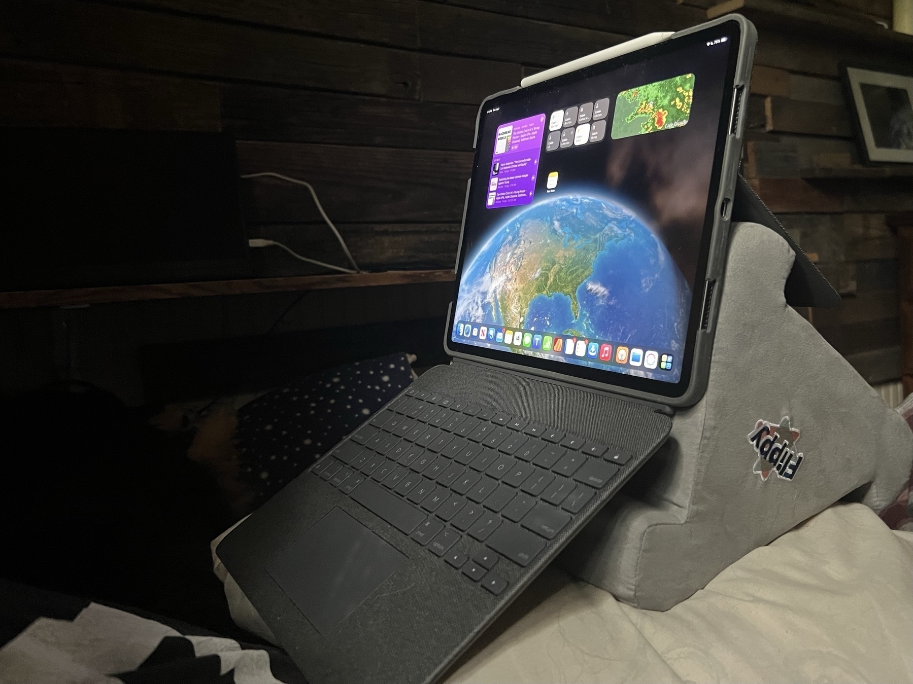
I've found the most comfortable position when working from the bed/futon in my tiny house. Never thought I'd use a pillow stand but was given one and it actually works really well with the Logitech Combo Touch. Perfect eye level and typing angle and really stable when placed on a pillow.
Overall, a majority of respondents – 53% – said addressing climate change should be given priority even at the risk of slowing the economy. … But almost three-quarters of Republicans (72%) said the economy should be given priority, even at the risk of ignoring climate change.
Slowing the economy is absolutely necessary. It’s an inconvenient truth that the hyper consumerism and endless growth foundation of global capitalism are the root of the problem.
Also, conservatives sure do love money!
Climate change is settled science. Republicans don’t see it that way in new poll : NPR


