Adventures in RSS apps!
Warning: What lies ahead is a lot of rambling about nitpicky details that may bore anyone who is not me to tears. Proceed with caution.
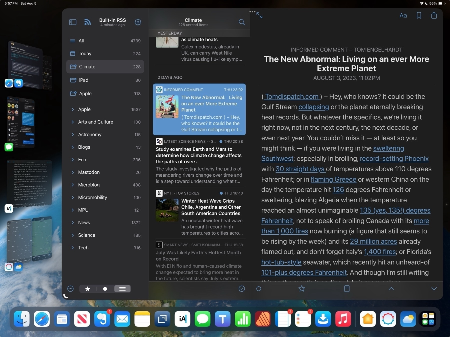
My exploration of RSS apps seems never ending. I'm sure I'm not the only one who never seems to be able to find the perfect RSS app (the same is true of writing/notes apps). Years ago I used NetNewsWire on the Mac and it held for a very long time. Then as I spent more time on the iPad there were several apps that no longer around like Mr. Reader and likely others, the names of which escape me at the moment. At some point Reeder came along I used that for a long time.
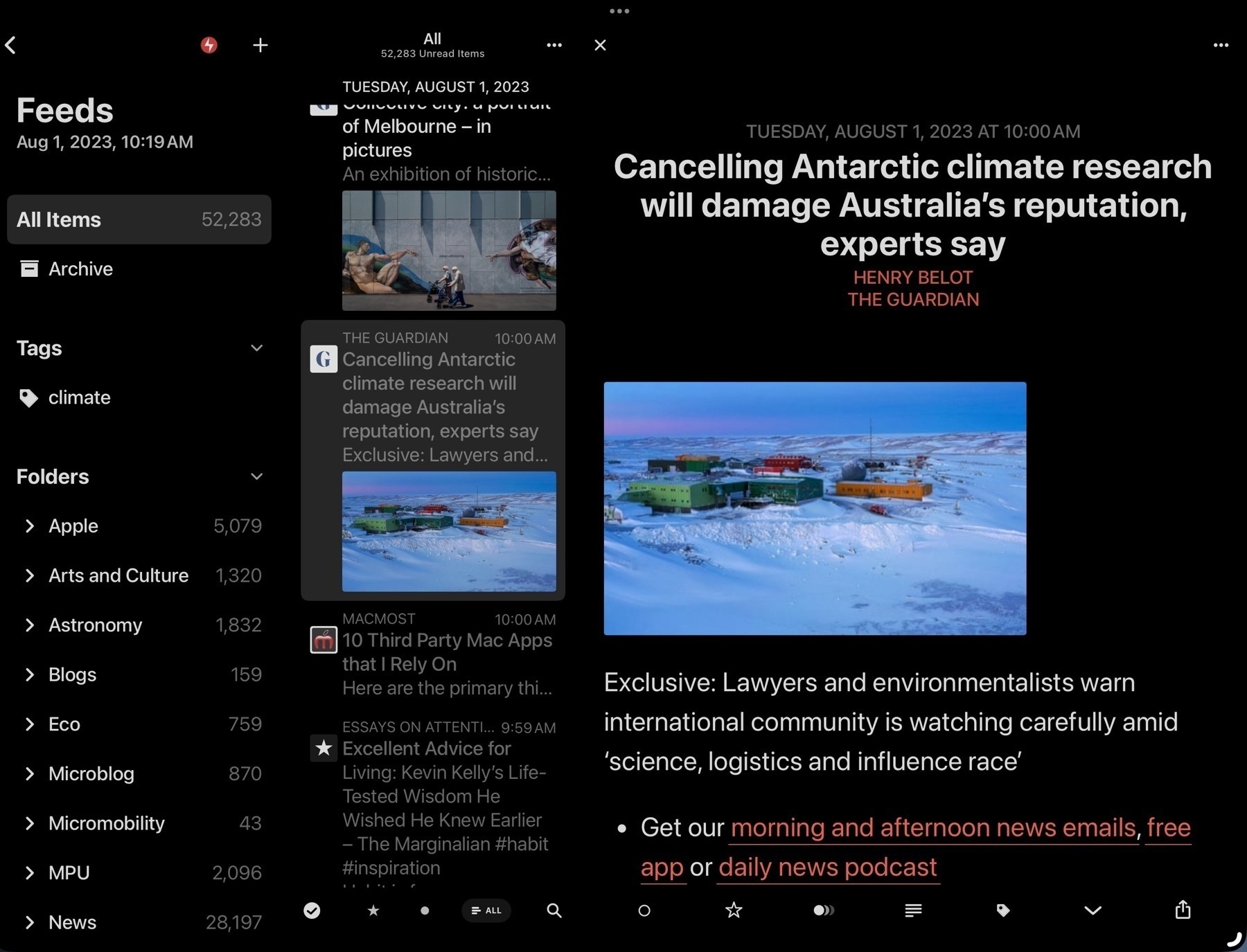
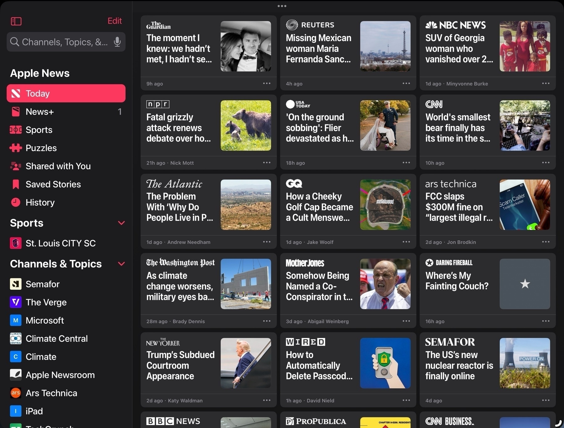
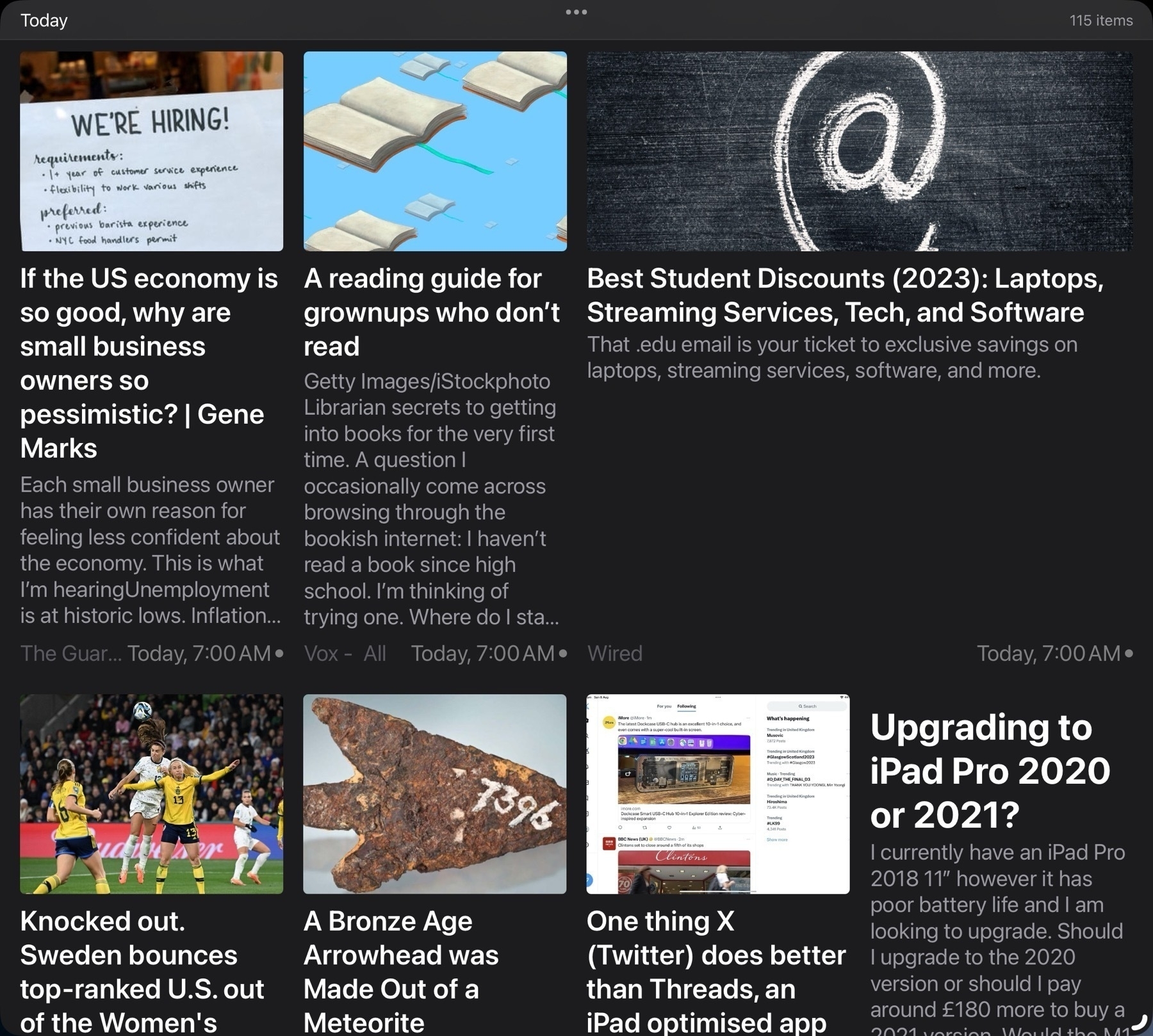
But then came Apple News and while I only dabbled with it briefly it was long enough to realize that I preferred a magazine style grid. It seemed a better use of space. A full window of sheets appealed to me more than the column/pane based Reeder design that so many RSS apps seem stuck on. So I went searching for something similar.
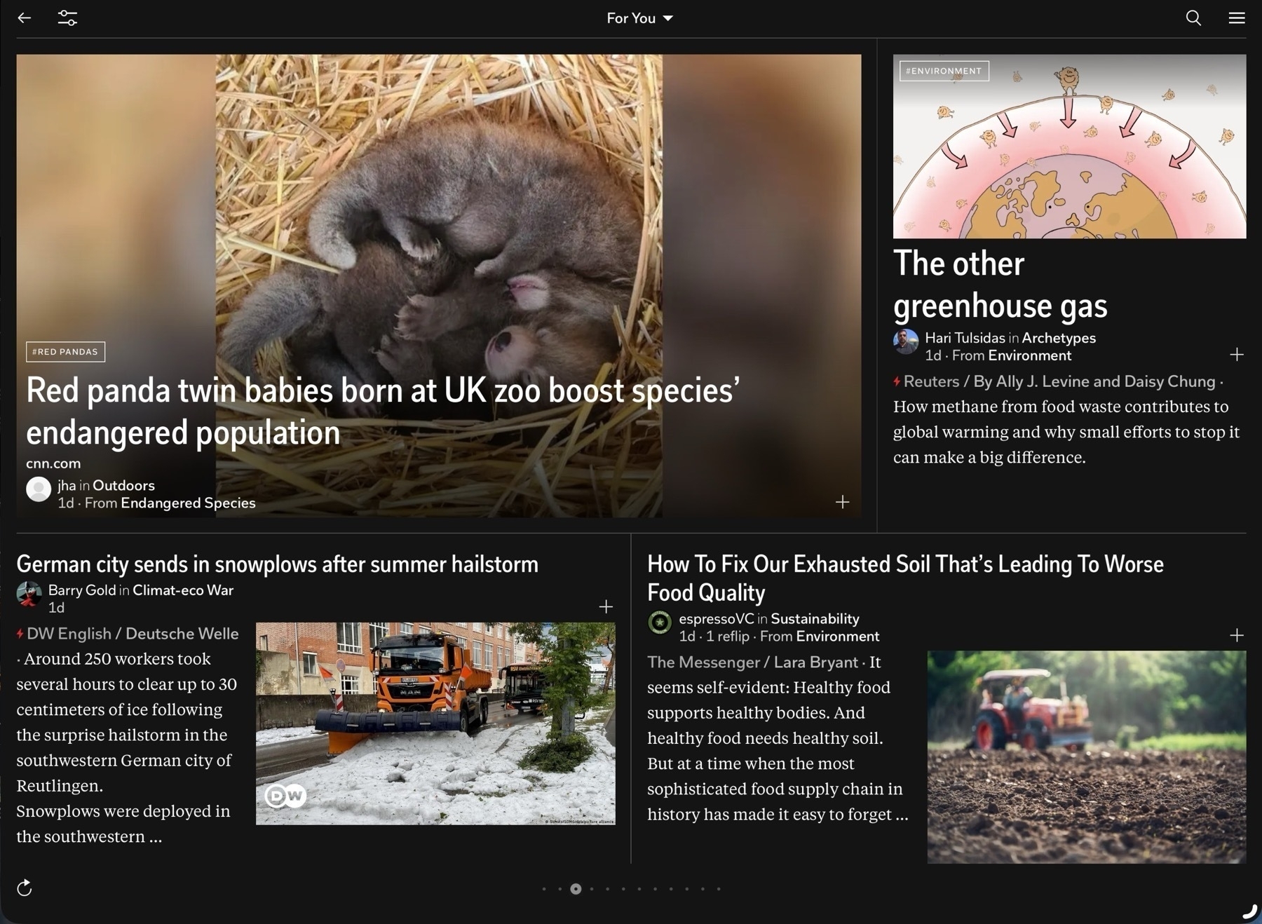
I even revisited Flipboard which I'd tried years earlier. I really like the design of the app interface and page turning which is excellent on the touch screen of an iPad. And it's an interesting take on adding in social interactions to news with user created magazines, comments and as of this spring, integration with ActivityPub. I could almost see myself using it more. That said, the app is really lacking in font size customizations. In general a very small font is used and I've found no way to increase that size to a point that I would need it. There is a setting but it's largest size is still too small.
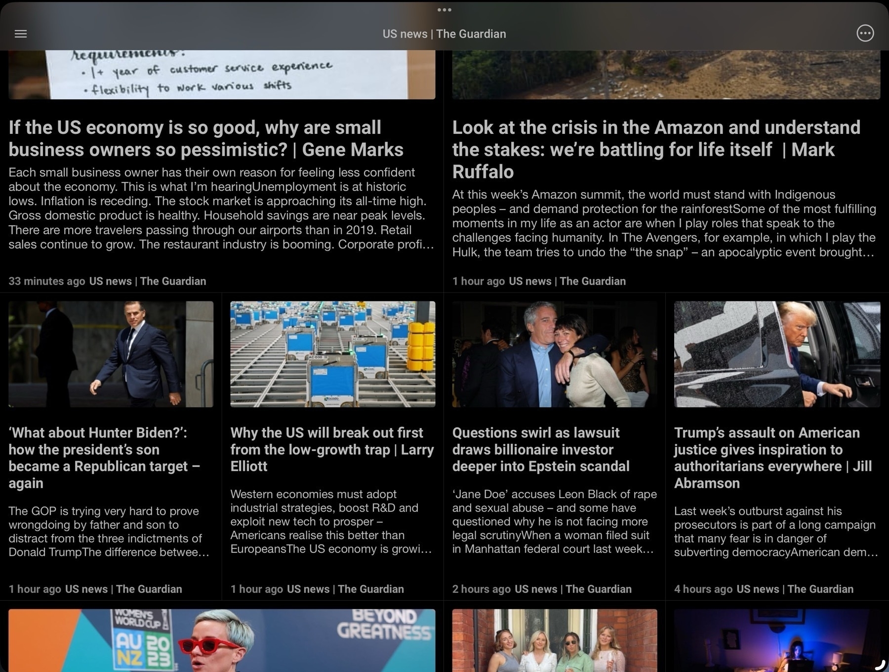
I found Newsify which I used for several months but over time some aspects of the app bothered me enough to keep looking. I came across News Explorer which I switched to and used for a while. It too offers a grid option but again, there were certain aspects of the app that bothered me over time. I use RSS apps a lot, perhaps too much. But I tend to get comfortable and familiar with them I inevitably discover those little nits that bother me. In some cases it's some aspect of the visual style, in other cases it's more about function such as how gestures or keyboard navigation work.
When NetNewsWire came back to the iPad I jumped back to give it a try. Something about the visual design didn't sit right with me so it didn't last long and I decided to try Reeder again. And amidst these jumps I also briefly tried others like lire, Unread, Fiery Feeds, Big News and Inoreader. Of this bunch Big News instantly reminded me of the Apple News design but it's a subscription app so I only tried it in the limited free mode for a brief period. For a while I also used the Feedly app as I was using Feedly as the back-end. More recently some apps have been offering iCloud sync as the back-end and I decided to try that instead of Feedly so that's another consideration. There are many feature options in this app category.
In recent months I'd again settled into Reeder. This time around with Reeder I decided to use it a bit differently. Rather than a large window with 3 panes: Folders of feeds, individual feeds and articles I tried it with just 2 panes, feeds and articles. Seems less a waste of space to hide the 1st pane of folders and only use it when needed. This was working for me until a few weeks ago when I started paying more attention to keyboard navigation. With the iPad I want the best possible touch gesture support but also keyboard navigation within and between panes and articles. Reeder does provide keyboard navigation but for whatever reason I have difficulty with it. It was something I'd overlooked for awhile but I can't easily, reliably move between the 2 primary panes back to the first pane of folders. At first I was trying this with arrows which is intuitively what I think to use. I discovered that the shortcut is p (previous) and n (next) and then space bar to select. I want to be able to use the arrow keys and ideally when I'm navigating these sources I'd like to actually be in the first pane.
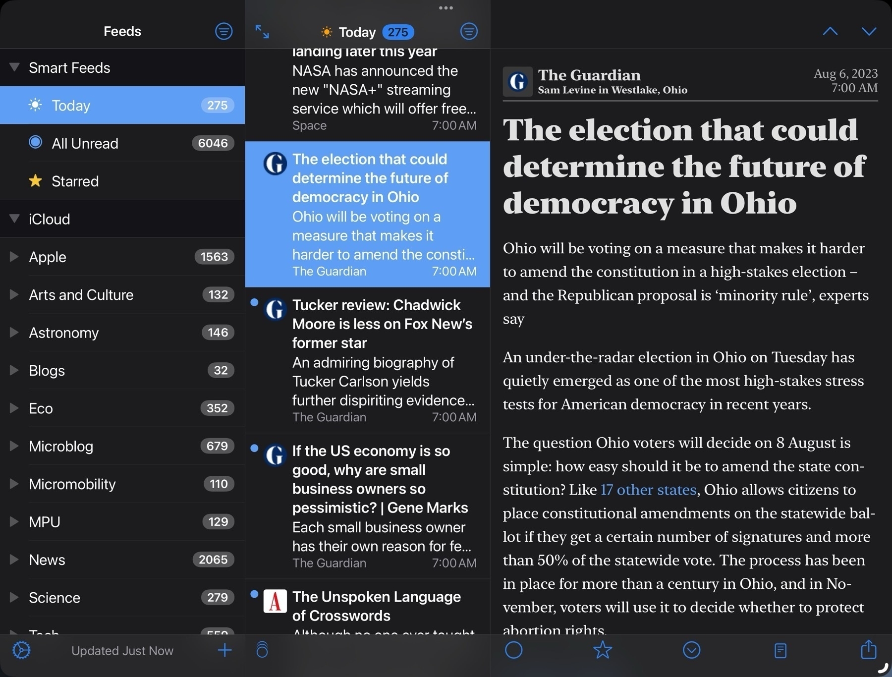
So I thought I'd try NetNewsWire. It works perfectly for keyboard navigation with three panes. Exactly the way I'd want to do it with arrow keys but as I'd gotten in the habit of just using the two panes I gave that a try. No go. Like Reeder it does have navigation shortcuts, an and z to move up and down. At this point I just sorta laughed at myself for being so picky.
Okay then. Fine. I'll see if I can settle into Net News Wire and just use the three panes. Or try the a/Z shortcuts with 2 panes. It wasn't bad but it wasn't good. Like Reeder it does work but after a few days it still felt clumsy for me. And while NNW offers different themes for reading articles I was also not happy with the few available offerings. I could create my own, but from what I could find would have to do so from the Mac. So, okay, fine I thought, I'm back with NNW. Cool, it will be like years ago when I happily opened this app up every day. Yay for nostalgia! I was a few days into this when some heartless bastard in a thread somewhere mentioned ReadKit.
Me: Don't do it. Hey, brain, STFU. Just stick with NNW. You got this. You can do it.
Brain: Hey, I remember ReadKit. You actually tried it awhile back and liked it a lot.
M: Oh, really?
B: Yep!
M: Well then, why am I not using it?
B: Cause it's a paid app and you're cheap.
M: Piss off. Okay. True enough. And NNW is free!
B: It is. But you really did like ReadKit. You thought it was purty as a flower.
M: I don't need purty.
B: Yes you do.
M: How much was it? Dammit.
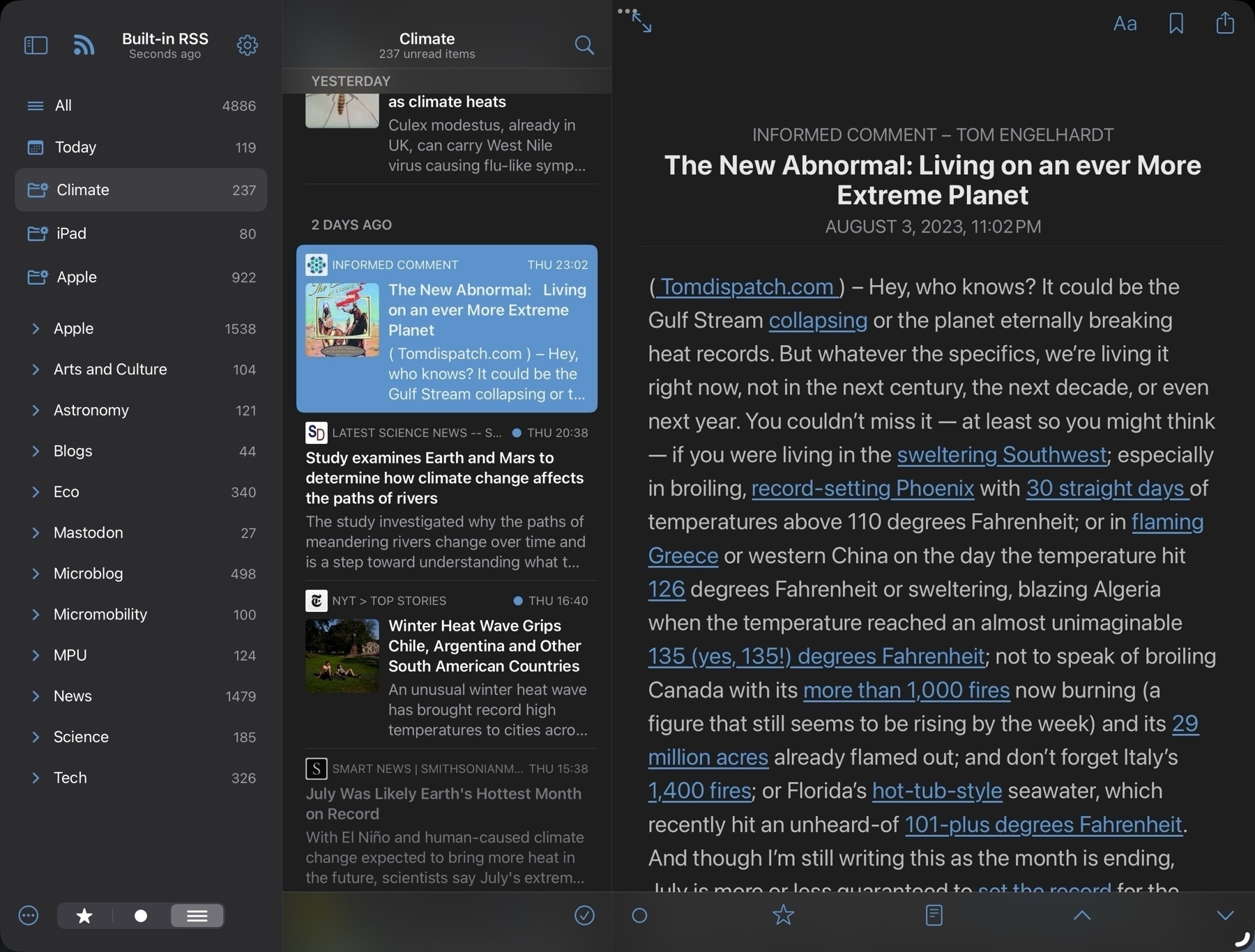
I downloaded ReadKit. Again. I don't do subscriptions but it's available for one-time purchase of $10. That's not much but I'm cheap and enough $10 apps add up. There's a trial with a few features missing so I downloaded and set up a few feeds to give it a spin.
Sure is purty like a flower. Dammit.
I clawed my way back to NNW and lasted 2 whole days before I bought ReadKit. After several days I really do love ReadKit.As I wrote this I jumped back and forth to NNW and Reeder for closer comparison's. I could have gotten by with either of those. They're both excellent apps. I would have gotten used to the shortcuts for keyboard navigation.
Here's what I'm loving about ReadKit and one of these features is pretty fantastic.
- Excellent visual design and function. I really like the defaults but if want to change the font, font size, font spacing or justification, it's all easily done from an always visible button in the top right of the article viewer. Nice! But Reeder does offer this as well.
- Full, reliable keyboard navigation with the arrow keys. Works in 3 panes, works in 2 panes. And keyboard shortcuts for everything I need. Exactly what I wanted.
- Customizable smart folders. This is the feature that the others don't have and one I've long wanted: saved searches. It's fantastic. This is what makes the purchase worth it. I've set up two such searches and in the next few days I expect to set up quite a few more.
What's missing? Only one thing stands out after a few days of use and I'm not going to miss it: iCloud sync. I'll mostly use it on my 13" iPad Pro. I will install the app on my iPhone and iPad mini and import the opml file to get started on each of those. But I'm not to worried about syncing read status. The app does support several backend services but I'm not using any at the moment. It's possible that, like the other apps, the longer I use it I'll find something but right off this just feels like a perfect fit.