The Pillars of Creation are set off in a kaleidoscope of color in NASA’s James Webb Space Telescope’s near-infrared-light view.

Mylissa Farmer’s water broke 17 weeks into her pregnancy and the fetus was dying inside her, but she couldn’t legally get an abortion in the state.
The US and other developed countries are hustling to avoid a collision with developing nations at the United Nations COP27 conference early next month.

I didn’t have a big garden this year but I was lucky to get a volunteer pumpkin plant and harvested 10 pumpkins. Most of them will be made into pumpkin curry coconut soup over the next couple of months.
51° in my cabin this morning! Chilly but I’m bundled up with a layer or two and slept under a good blanket. 55° to 58° is my usual once I start using a heater but I’m resisting turning it on for the first time.
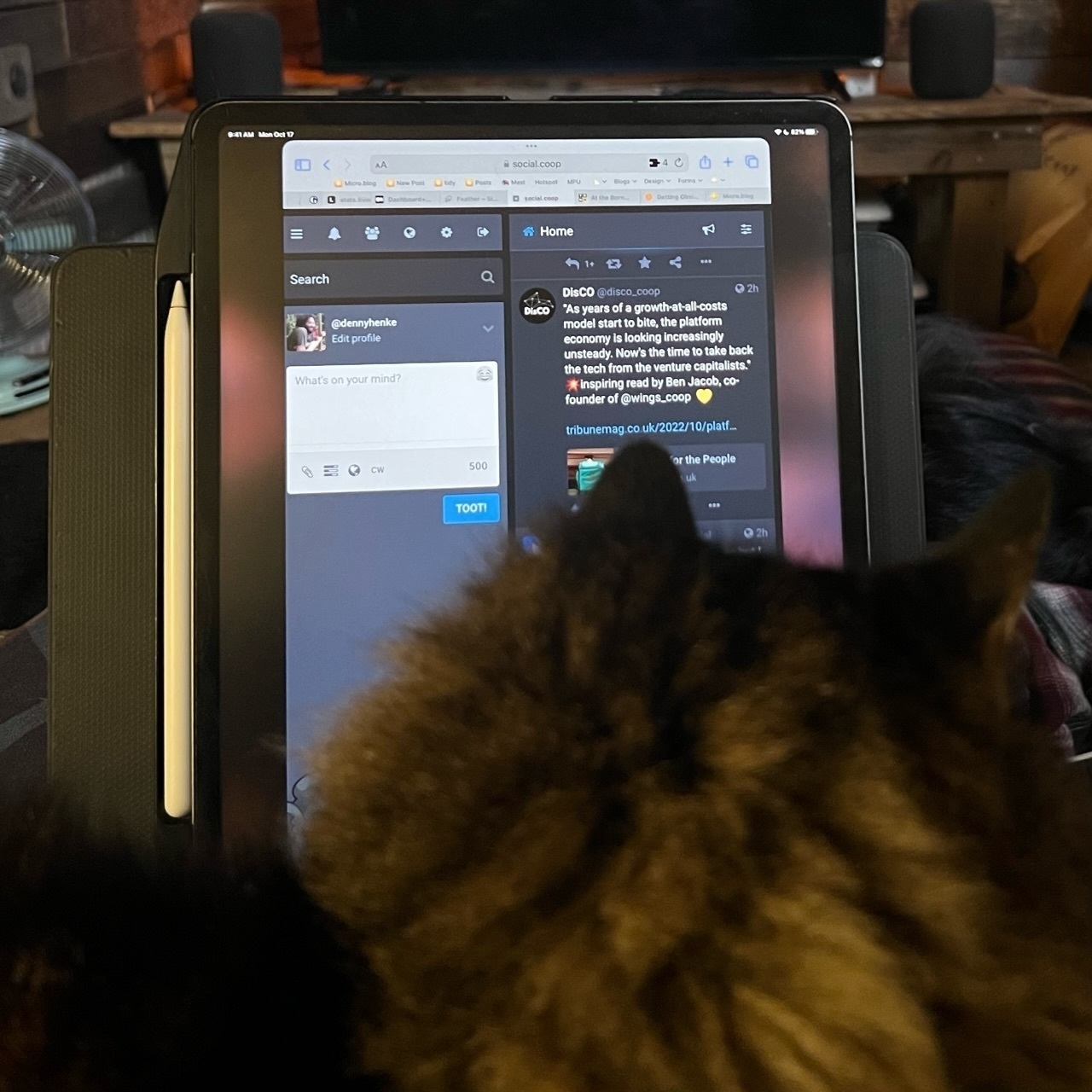
I call this Cat-in-the-lap mode. One of the benefits of the iPad, especially the larger size, is being able to pop it out of the Magic Keyboard Case and prop it up in portrait orientation for reading when Rosie insists on a cozy.
Ministers are pressing ahead with a dual crackdown on climate protests and strike action, a controversial move that followed a day of direct action in London.
Government to unveil crackdown on climate activism and strike action | The Guardian
Since 1970, the scientists find that the population of fresh water species has plunged by 83%, and the population of wildlife species over all has fallen 69%.
Major shipping delays and backlog of vessels after region experiences lack of rainfall in recent weeks
Barges stranded as Mississippi River water levels reach critical low | US news | The Guardian
Many homes are now uninsurable and climate collapse will only make that problem worse.
The uninsurables: how storms and rising seas are making coastlines unliveable | The Guardian
As a part of my ongoing effort to reduce the number of paid apps I rely on, I used Apple’s Numbers app to create a bank/financing ledger tracking multiple accounts. Pretty easy to export csv files from iFinance to get it started. Blog post here.
Switching from a dedicated financial ledger app to Numbers
A few months ago I posted about my switch from FileMaker Pro to Numbers for my client invoice tracking. It’s worked out very well. Recently upon opening the iFinance app where I track my banking I was greeted to a message that there was a new version available. The amount is not too much but my current version works fine and browsing through the changes I didn’t see anything new that I needed. But it brought to mind that it would mean that the current version wouldn’t be seeing any more updates. Not a problem for now but perhaps in the future with OS updates. So, I had a similar thought, why not try to move my banking to a Numbers spreadsheet?
My needs are pretty basic. I wanted to mimic iFinance. I exported each account to a CSV and imported into Numbers. Then I created a master account file and set-up multiple sheets, one each for the various accounts. So, for example, Cash, Apple Cash, bank, PayPal, credit card, etc. Each is a simple line-item ledger that keeps a balance along with the usual: date, description, payee, category and note if needed.
[caption id="" align=“aligncenter” width=“800”]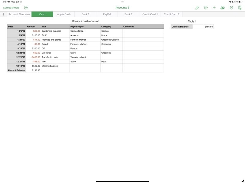 The table for cash on hand. Different accounts are visible in the top row of sheet tabs.[/caption]
[caption id="" align=“aligncenter” width=“800”]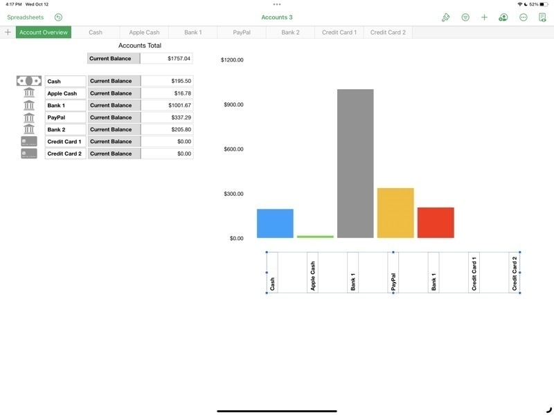 The Account Overview shows the current balance of each account as well as a bar graph.[/caption]
Stage Manager for iPadOS is coming together
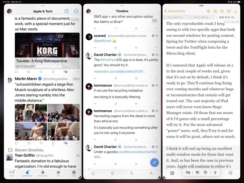
For the iPad enthusiasts that are tuned in to the various pundits of Twitter, YouTube, Blogs, Podcasts, the common narrative is that Stage Manager is a hot mess of bugs, poor design, etc. While I'd generally acknowledge that it's been buggier than recent years' beta cycles I don't think it's the dumpster fire some are making it out to be. A few thoughts.
Windowing: Free form or tiled Some will like overlapping windows, some won't. Notable iPad enthusiast Federico Viticci doesn't seem to like overlapping windows and was hoping for tiled windows instead. I do like the idea of tiled window options as an extension of the current 2 window split. Having options for 3 or 4 windows in splits might work very well. That said I think the current implementation is a good start.
As currently implemented one a general opinion seems to be that truly free form windows would be better than Apple's attempt to manage windows for users with a kind of size snapping and window juggling that seems hard to predict. Apple's goal is to make it easier but it may be that it's actually just making it harder. I think it's still a work in progress and I'm not sure if I have a preference. But I do think that with the last beta the behavior is better.
The Dock and side strip of recent app spaces
In regards to the bottom dock and the side strip of recently used apps, I like that there are options here to hide one or both in stage manager. What I'm finding is that I like to leave both on because I always have the option to size windows such that they can occupy the full screen, temporarily hiding both the dock and the strip as needed. It's easy to use a finger swipe or just push the cursor to the bottom or side to bring forth either as needed.
The Home Screen and Stage Manager
Like many who have noted, I agree that it seems silly to blur the Home Screen when using Stage Manager. Also, as noted by others, when tapping or clicking the Home Screen behind a window, it would seem to be an expected behavior that this would hide/minimize the current windows and reveal the Home Screen.
Other notes on recent betas
I'm seeing a lot of improvement, as we would hope and expect, in the latest beta released on October 11/12. Happy to see the return of the feature enabling a tap at the top of a window to quickly scroll to the top. Generally it's been very stable with fewer bugs or confusing behaviors.
The only reproducible crash I keep seeing is with two specific apps that both use second windows for posting content. Spring for Twitter when composing a tweet and the TestFlight beta for the Micro.blog client.
It's rumored that Apple will release 16.1 in the next couple of weeks and, given that it's not on by default, I think it's ready to go. They'll continue bug fixing over coming months and whatever bugs or inconsistencies that remain will get ironed out. The vast majority of iPad users will never even know Stage Manager exists. Of those that are aware of it I'd guess only a small percentage will try it. For the more advanced "power" users, well, they'll try it and for some it will be great, others not so much.
I think it will end up being an excellent multi-window mode for those that want it. And, as has been the case in previous years, Apple will continue to refine it's vision of multi-tasking on the iPad going forward.
Stage Manager for iPadOS is coming together

For the iPad enthusiasts that are tuned in to the various pundits of Twitter, YouTube, Blogs, Podcasts, the common narrative is that Stage Manager is a hot mess of bugs, poor design, etc. While I'd generally acknowledge that it's been buggier than recent years' beta cycles I don't think it's the dumpster fire some are making it out to be. A few thoughts.
Windowing: Free form or tiled
Some will like overlapping windows, some won't. Notable iPad enthusiast Federico Viticci doesn't seem to like overlapping windows and was hoping for tiled windows instead. I do like the idea of tiled window options as an extension of the current 2 window split. Having options for 3 or 4 windows in splits might work very well. That said I think the current implementation is a good start.
As currently implemented one a general opinion seems to be that truly free form windows would be better than Apple's attempt to manage windows for users with a kind of size snapping and window juggling that seems hard to predict. Apple's goal is to make it easier but it may be that it's actually just making it harder. I think it's still a work in progress and I'm not sure if I have a preference. But I do think that with the last beta the behavior is better.
The Dock and side strip of recent app spaces
In regards to the bottom dock and the side strip of recently used apps, I like that there are options here to hide one or both in stage manager. What I'm finding is that I like to leave both on because I always have the option to size windows such that they can occupy the full screen, temporarily hiding both the dock and the strip as needed. It's easy to use a finger swipe or just push the cursor to the bottom or side to bring forth either as needed.
The Home Screen and Stage Manager
Like many who have noted, I agree that it seems silly to blur the Home Screen when using Stage Manager. Also, as noted by others, when tapping or clicking the Home Screen behind a window, it would seem to be an expected behavior that this would hide/minimize the current windows and reveal the Home Screen.
Other notes on recent betas
I'm seeing a lot of improvement, as we would hope and expect, in the latest beta released on October 11/12. Happy to see the return of the feature enabling a tap at the top of a window to quickly scroll to the top. Generally it's been very stable with fewer bugs or confusing behaviors.
The only reproducible crash I keep seeing is with two specific apps that both use second windows for posting content. Spring for Twitter when composing a tweet and the TestFlight beta for the Micro.blog client.
It's rumored that Apple will release 16.1 in the next couple of weeks and, given that it's not on by default, I think it's ready to go. They'll continue bug fixing over coming months and whatever bugs or inconsistencies that remain will get ironed out. The vast majority of iPad users will never even know Stage Manager exists. Of those that are aware of it I'd guess only a small percentage will try it. For the more advanced "power" users, well, they'll try it and for some it will be great, others not so much.
I think it will end up being an excellent multi-window mode for those that want it. And, as has been the case in previous years, Apple will continue to refine it's vision of multi-tasking on the iPad going forward.
