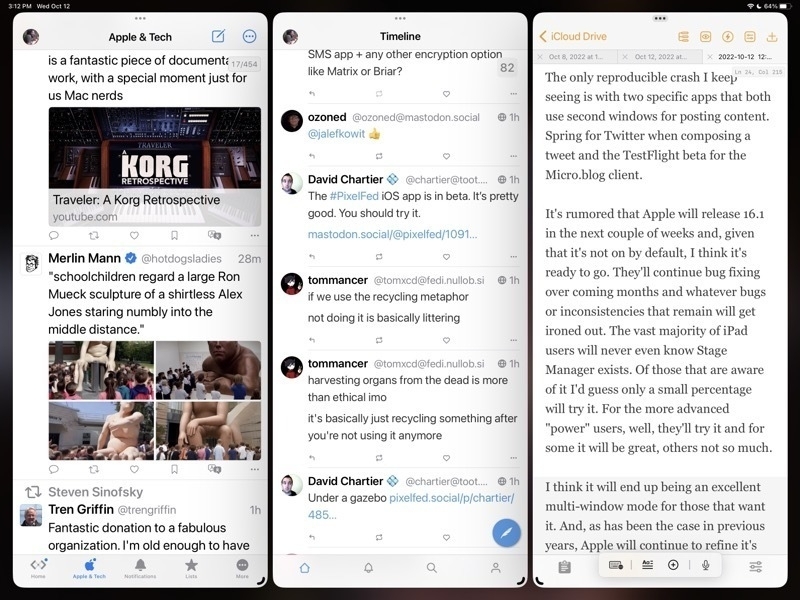
Stage Manager for iPadOS is coming together

For the iPad enthusiasts that are tuned in to the various pundits of Twitter, YouTube, Blogs, Podcasts, the common narrative is that Stage Manager is a hot mess of bugs, poor design, etc. While I'd generally acknowledge that it's been buggier than recent years' beta cycles I don't think it's the dumpster fire some are making it out to be. A few thoughts.
Windowing: Free form or tiled
Some will like overlapping windows, some won't. Notable iPad enthusiast Federico Viticci doesn't seem to like overlapping windows and was hoping for tiled windows instead. I do like the idea of tiled window options as an extension of the current 2 window split. Having options for 3 or 4 windows in splits might work very well. That said I think the current implementation is a good start.
As currently implemented one a general opinion seems to be that truly free form windows would be better than Apple's attempt to manage windows for users with a kind of size snapping and window juggling that seems hard to predict. Apple's goal is to make it easier but it may be that it's actually just making it harder. I think it's still a work in progress and I'm not sure if I have a preference. But I do think that with the last beta the behavior is better.
The Dock and side strip of recent app spaces
In regards to the bottom dock and the side strip of recently used apps, I like that there are options here to hide one or both in stage manager. What I'm finding is that I like to leave both on because I always have the option to size windows such that they can occupy the full screen, temporarily hiding both the dock and the strip as needed. It's easy to use a finger swipe or just push the cursor to the bottom or side to bring forth either as needed.
The Home Screen and Stage Manager
Like many who have noted, I agree that it seems silly to blur the Home Screen when using Stage Manager. Also, as noted by others, when tapping or clicking the Home Screen behind a window, it would seem to be an expected behavior that this would hide/minimize the current windows and reveal the Home Screen.
Other notes on recent betas
I'm seeing a lot of improvement, as we would hope and expect, in the latest beta released on October 11/12. Happy to see the return of the feature enabling a tap at the top of a window to quickly scroll to the top. Generally it's been very stable with fewer bugs or confusing behaviors.
The only reproducible crash I keep seeing is with two specific apps that both use second windows for posting content. Spring for Twitter when composing a tweet and the TestFlight beta for the Micro.blog client.
It's rumored that Apple will release 16.1 in the next couple of weeks and, given that it's not on by default, I think it's ready to go. They'll continue bug fixing over coming months and whatever bugs or inconsistencies that remain will get ironed out. The vast majority of iPad users will never even know Stage Manager exists. Of those that are aware of it I'd guess only a small percentage will try it. For the more advanced "power" users, well, they'll try it and for some it will be great, others not so much.
I think it will end up being an excellent multi-window mode for those that want it. And, as has been the case in previous years, Apple will continue to refine it's vision of multi-tasking on the iPad going forward.