Permaculture Poster Design (& Affinity Designer First Impression)
Before I go any further, let me say this isn’t much of a review or even a mini-review. Just my initial impressions.
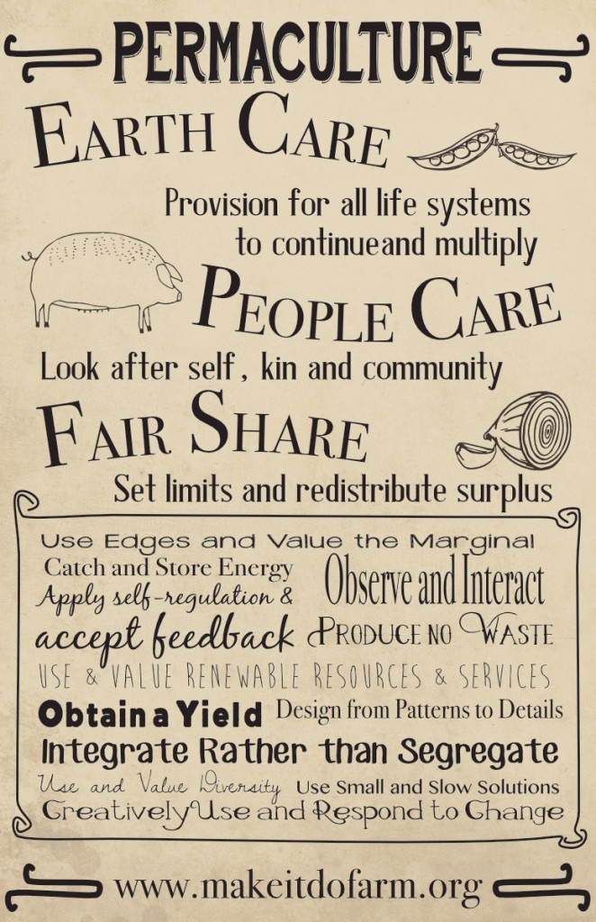
I’m a regular user of Adobe CC but not a big fan of the subscription model. When I recently learned of Affinity Designer and the upcoming Affinity Photo I figured it was worth checking out. The reviews for AD thus far are very high and having used it for a couple of projects I can see why. The Permaculture-themed poster below started as just a quickie to test out some of the basic tools I’ve come to expect from Illustrator and I’m happy to report that AD was a pleasure to use. Everything from the pen tool to text to text on a curve were easy and buttery smooth. As with Illustrator, layers are easy enough to use to group elements for editing and locking. On a couple of test designs I tried a few of the other basics such as shape building and editing as well as applying gradients and various styles, all worked just as one would expect.

What’s missing? Right off, there is no workspace outside of the defined document margins which is something I definitely miss. Illustrator and InDesign both allow for the storing of elements outside of the defined art board or document margins. Also, no export for web. Perhaps I missed it but I certainly didn’t see it and I’ve looked a couple times. I know that I can set a document up as having an intended use for the web but that’s not what I’m after. I want to be able to set up for print and also be able to export or save for web. Found it! Right in front of me but called “Export Persona”. The only option I don’t see is the option to resize the dimensions at time of export.
I’m guessing that I’ll find other features missing that I’m used to having but as of this moment I intend to switch to AD for any design work that I would have previously used Illustrator for.