Design
- Special Keys: I DO miss the lack of media playback keys which are especially helpful when using Apple's Podcast App in split screen for transcription work. That said, reaching up to the same spot to pause and start isn't killing me. Same for the volume keys. I'd prefer to have them but will get along without them.
- The Smart Keyboard/case is very stable thus far. I've used it in may lap during much of every day for the past week. But I've found that it is most stable when used on something and conveniently, almost by accident, I set it on the box it was packaged in as I was setting up the iPad the first day. The first time I picked it up to use it I left it sitting on that box which provides a lightweight and stiff base. It's perfect. I haven't even used it in my lap without that box under it. Confusing at first but now that I've done it a few times the folding of the case over the top of the iPad is very easy as is opening it and setting up the iPad for typing. The two together are very compact and light. I'm really glad I went with this case.
- Typing has been great. Just as I remembered from the 20 minute test in the store, this keyboard is a real pleasure to type on. When I set-up on Tuesday I was halfway through a 75 minute podcast transcription so of course I finished that transcription using the new set-up and I required no time to get used to the new keyboard. It's every bit as enjoyable to type on as my to Logitech keyboards. No, actually, it's more enjoyable with less key travel but with a satisfying movement and light tappy sound.
- Of course, it was pretty fast on the Air 2. See, mostly, the Air 2 felt very fast to me. I was not unhappy with it and were it not for an iPad with this screen size I would have likely just kept using the Air 2 which says something about how fast older iPads and iOS are. ↩
- I've noticed that many of these missing features are available in other iOS apps. There's no reason Apple couldn't add them and bring Pages on iOS closer to Pages on the Mac. ↩
Affinity Publisher for iPad Review
Back in November I published a mini-review of Affinity Publisher for iPad.. At the time I’d only had a week to work with it but was happy with the app. It’s now been four months and I thought I’d offer an update. Serif have released 4 small bug fixes but most of the larger bugs have yet to be fixed. In my experience there have been just three bugs that have been a bit of a bother. The first, some fonts show up in Chinese characters instead of being displayed in English. Second, sometimes the app stops taking input from an external keyboard, restarting the app fixes the issue. The third really isn’t a bug at all because it’s specifically a problem related to using the app on an external display which Serif have said is not yet a supported feature. For now using the app on an external display is useless because the the right side context toolbar disappears anytime a tool is changed using the left side toolbar. Technically Stage Manager isn’t supported at all but I’ve found the app works fine with Stage Manager turned on.
In general the app has been very stable and usable in my four months of use. And to be clear, it’s not just usable, it’s smooth and responsive on the M1 iPad, 8GB of memory. Being able to work with touch, Pencil and trackpad is a real pleasure.
The foundation of Publisher was put down in 2019 with the desktop version of the app. It was a solid foundation offering excellent performance and a well rounded feature set.
Where Publisher really shines is in multi page documents and it has not disappointed in that role. Newsletters, reports, brochures, magazines or anything of that sort. I’ve also been using it for all my single page documents as it has linked text boxes and text wrap, two features not found in Affinity Designer which is what I would have used for single page designs previously.
The usual tools one expects to have with this kind of app are on the left toolbar. As you would expect, as you change tools the top toolbar changes to reflect the options associated with the selected tool. On the right side is a vertical stack called the context toolbar represented by icons that allow for the full range of options you need for whatever tool might be selected. So, for example, when you’re working with text you’ll see the most common tool options in the top tool bar but most of the options are only visible when you click to the text tool button on the right side context toolbar. Note all of the disclosure > icons on the right side. Tap into each one for another menu of text related options. Just as they did with Affinity Designer and Photo, Serif have done an excellent job translating the desktop interface to the iPad.
A powerful app like Publisher, by definition is more complicated than many other apps. I’ve seen people complain that Pages is too complicated and, well, Publisher does far more than Pages. This isn’t an app you’re going to open for the first time and suddenly understand. It can take some time to learn and remember all of the options. It took me several days of repeated use to remember which sub menus in the text tools contained which options. But as you use it you’ll see that the submenus are organized with purpose. For example, when I tap into the Leading disclosure triangle the resulting submenu is appropriately titled Spacing and it’s here that I can change the spacing around paragraphs and other options.
A word of advice if you’re just getting started, the built in help is also available on the web and it can be useful to have that open as it allows you to bounce back and forth between the app and the help while you’re working. The built in help system is located within the main app home page and unfortunately it’s not possible to access the help while working on a file In addition to the help Serif has also posted quite a few Publisher tutorial videos on their YouTube channel and these are worth checking out.
[caption id="" align=“aligncenter” width=“2048”] Another submenu while working in the text context sidebar is character and paragraph styles[/caption]
For many iPad users Apple’s Pages app is all that’s needed. That app has also had many features added over the years and is quite capable for laying out documents. I used it for years designing a wide variety of reports, newsletters and brochures. Affinity Publisher is a competitor to Adobe’s InDesign. It will open InDesign IDML files as well as pdfs for conversion to Publisher files.
Unlike Adobe’s various iPad apps, Publisher on iPad is the full app with the full feature set. Should you want to edit a Publisher file shared by someone or share to someone using Publisher on a Mac or Windows, it’s no problem as long as the file will be opened with version 2 of the app on those platforms (Files created by Publisher 2 or any of the Affinity 2 apps are not backwards compatible so cannot be opened by the version 1 apps. If you’ll be sharing a file with someone else be sure to confirm that they’ve updated to version 2 of the app).
Not only are files cross compatible between iPad, Windows and Mac, but all three apps of the suite can open files from the other apps. So, for example, it’s no problem to open a Designer or Photo file in Publisher. The file can continue to be edited and saved in its original format.
[caption id="" align=“aligncenter” width=“2048”]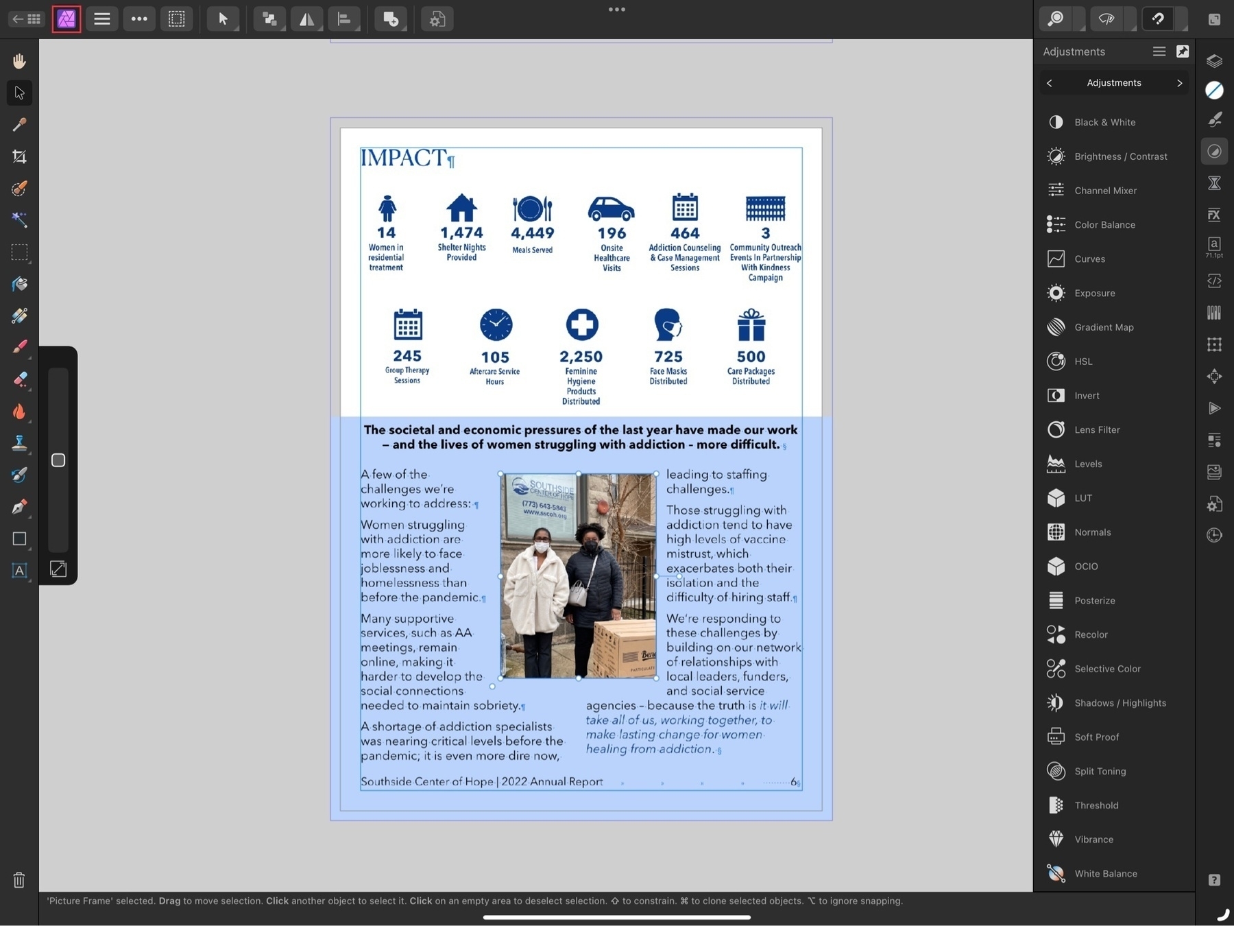 Notice the Publisher icon in the top left has been replaced by the Photo icon. Also the sidebars reflect the tools found in Affinity Photo.[/caption]
The last feature I’ll mention is perhaps one of the best. StudioLink, allows me to open up an a vector graphic in Designer or an image in Photo without actually leaving the Publisher app. It’s an amazing feature though it does require that you have all three apps installed to work. From within the Publisher app the other two apps are referred to as “Personas”. Open them up as needed by tapping the Publisher icon in the top left of the window where you’ll see a dropdown menu showing the other two apps. Choose the other app you need and the Publisher toolset will instantly change to the tools and features found in the other apps. Make adjustments to images from the Photos Persona, create advanced vector graphics or edit embedded vectors from within the Designer Persona. You have the full range of the tools found in the app you’ve “switched” to. When finished just tap back to the Publisher Persona to return to page layout. The transition is seamless and instant.
Serif has set a high bar with the Affinity apps on the iPad and Publisher allows all three to work together seamlessly. And at a time when Apple pundits continue to doubt the potential of the iPad as a powerful tool for creative work, Serif demonstrates what is possible.
If only those pundits could occasionally step away from the churning the rumor mill for a bit they might actually discover there are still innovative developers working hard to create valuable tools used by real people in the real world.
Serif’s Affinity 2 apps continue to be a fantastic bargain. Buy single apps or buy the universal license and use the Mac, Windows or iPad apps, no subscription, these are a one time purchase.
Affinity Publisher Beta!
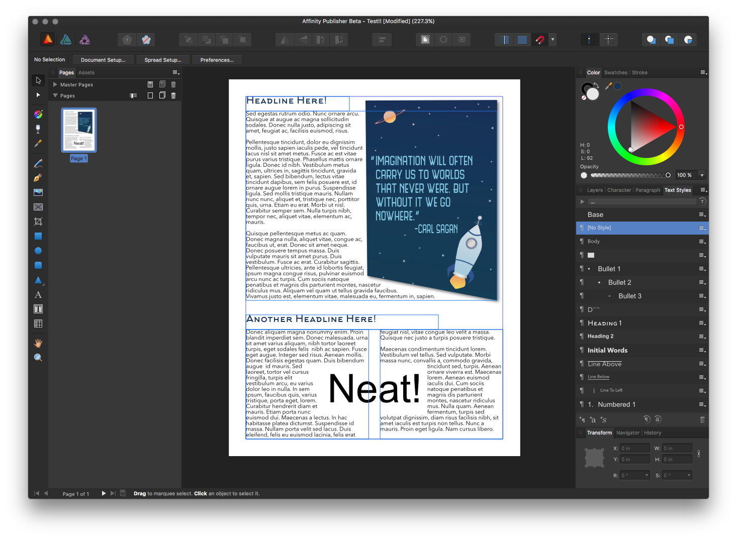 The talented folks over at Serif released the Affinity Publisher beta today! They’ve been teasing it for a year or more so there are a lot of very excited design nerds today and I’m one of them. The current release is for Mac and Window but they’ve already begun work on an iPad version!
I currently use Pages on iPad for most of my layout work. If someone specifies InDesign then I’ll use that on the Mac. I’ve already installed Publisher and have a test file going. Currently it’s unable to open or export InDesign files but that may be coming in the future.
There will come a time when I stop offering InDesign files as an option. I’m not sure when that will be but the sooner the better. As much as I like using Pages I expect I’ll enjoy Publisher on the iPad even more and will likely shift much of my layout work over to it when available.
Revisiting Space Exploration with Affinity Photo for iPad
In June of 2015 Affinity Designer for Mac caused a splash when it was released. I’d never heard of it but was anxious to try something that might allow me to replace Illustrator. I spent a couple weeks with the trial and decided pretty quickly that I would be purchasing it. During that time I created a series of space-themed posters and shared them is a couple of blog posts: post one and post two.
Of course, Designer is primarily for creating vector-based art. But just as Affinity Photo on Mac is very capable of doing vector work so too is the iPad version. I thought it would be fun to revisit with a new space exploration themed image again using a Carl Sagan Quote.
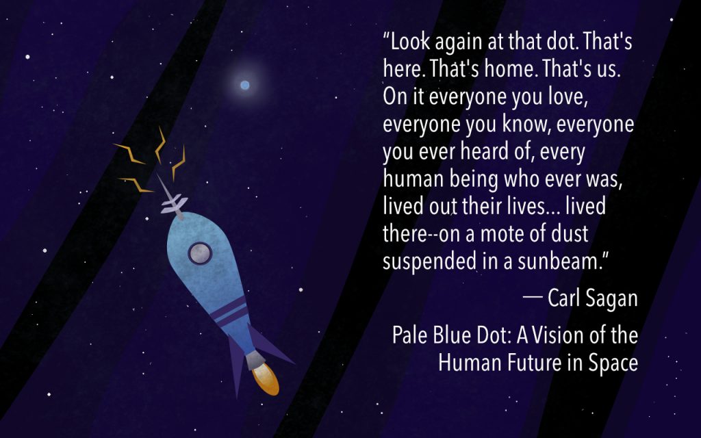
The quote in its entirety:
“Look again at that dot. That’s here. That’s home. That’s us. On it everyone you love, everyone you know, everyone you ever heard of, every human being who ever was, lived out their lives. The aggregate of our joy and suffering, thousands of confident religions, ideologies, and economic doctrines, every hunter and forager, every hero and coward, every creator and destroyer of civilization, every king and peasant, every young couple in love, every mother and father, hopeful child, inventor and explorer, every teacher of morals, every corrupt politician, every “superstar,” every “supreme leader,” every saint and sinner in the history of our species lived there-on a mote of dust suspended in a sunbeam.” - Carl Sagan
iPad Journal: Transitioning from InDesign to Pages
Anytime I’ve written about my transition to iPad for more of my work I always note that one of the few reasons I have for returning to the Mac for client work is InDesign. While the company that makes Affinity Photo also has a publishing app in the works that is intended to replace InDesign it is likely a ways off for the Mac and even further away for the iPad. But there is hope to be found in Apple’s Pages app and with a recent update to the app I’ve been giving more thought to how I might transition more of my InDesign work in that direction. Can Pages handle it?
Yes. Yes it can. Sometimes.
On the Mac side of things I’ve been using InDesign and Pages since they were released. In that time I’ve used InDesign for the projects where I felt Pages was lacking in some way. For example, I’ve worked with two different community newspapers and newspaper layout isn’t something I would ever do with Pages. Actually, I believe I did one issue using Pages and it worked out okay but I felt more comfortable with InDesign for that kind of work. Also, any project in which a client wants more than a printable pdf, specifically when they want an InDesign file well, obviously, that’s the app I use. I’d say my use of each app was about 50/50. Though I generally used InDesign for larger more complicated documents I found Pages worked very well for flyers, posters and smaller newsletters as well as Annual Reports. In 2014 I helped a friend publish her first book and that was done with Pages and turned out very well.
For years both of those apps matured until 2010 when the iPad was introduced by Apple. They also introduced a version for the iPad and then a couple years later rebuilt Pages on both its platforms, Mac and iOS, to be much closer in compatibility. It was a step forward for the iOS version but a big step backward for the Mac version which lost many features. In my own workflow I resorted to keeping the older version of Pages around as it still worked fine though it was no longer being updated. Users howled and Apple responded by gradually re-adding many of those features but it has taken time. It took a few years but the result is that we now have Pages on Mac and iPad which is near feature parity and which has been re-built into something much closer (in features) to the original Mac version of Pages. In many ways it is much improved as it has new features such as real-time collaboration and a web version that works on Windows via iCloud.
What’s still lacking in the iOS version of Pages? Sadly, there are a few important things. Creating and editing styles is not an option. I can apply a style but I cannot edit a pre-existing style. To do that I have to be on a Mac. If I’ve created a document and decide to change the page orientation after the fact I’ll need a Mac. If I want to create a document using a custom page size or change a document to a custom page size I’ll need a Mac. These are some pretty basic and foundational features and should not be missing from the iOS version. This is especially true give than Apple markets their “Pro” iPads as computers powerful enough to replace traditional computers. That said, Apple is consistently updating the app with new and important features. For example, the most recent update released in the summer of 2017, reintroduced a feature which had been removed in the above mentioned redesign of the app: linked text boxes. This is a feature that is an absolute necessity for many multi-page documents.
Where is Pages for iOS lacking in comparison to InDesign. For starters, the above mentioned ability to create and edit styles. InDesign has many advanced typography features lacking in Pages. Just one example: You can’t change the character spacing (though this does work on the Mac version of Pages). There’s no work space (usually called a pasteboard) around a Pages document for temporarily placing things while working. Want to reorder pages by their thumbnails? Nope The header or footer of a Pages document are the only places you can add page numbers and it’s all or nothing. Not much in the way of customization. If I’m doing a cover page or a table of contents I don’t want those pages to have a header with a page number. For small documents, say, a 6 page newsletter, it’s not a huge burden do create my own headers with page numbers added manually. Most of the documents I do are less than 10 pages but it’s worth mentioning the limitation.
Even with these limitations Pages on the the large 12.9" screen of the iPad Pro is very powerful and a pleasure to use. It has a few features that do not exist on InDesign. For example, charts which are almost always a part of any annual report. I can do a table in InDesign but it’s far easier to do in Pages. Of course, adding objects and flowing text around them is something InDesign does but Pages does it so fluidly. Also, the styling options for objects in Pages, while a bit more limited also seem more powerful and are easier to apply. Perhaps the best way of summarizing the difference is that working with Pages means fewer features by comparison to InDesign but what it does do, Pages does very well and with little friction. A last point: when I consider the features I need for a newsletter or annual report job, Pages almost always has what I need.
So, to summarize, InDesign is, without a doubt, a far more powerful application than Apple’s Pages. It is a truly “Pro” application… for the Mac. It is not available for the iPad. But if my end product is to be a newsletter or annual report, either of these apps will allow me to produce a visually attractive, well designed document. Were I to set out to create a similar design using each app, for the sake of comparison, it is very likely that they would, in most cases, be indistinguishable from one another. Put another way, were I to send you 10 pdfs of the usual sort of newsletter or annual report that I’ve produced and ask you to determine which of the two apps was used, you would probably not be able to.
Pages is obviously not the most powerful or the best page layout tool for designing multi-page documents on the Mac. But on the iPad, as far as I am aware, it is the best option and it’s one which I’ve used many times with great results. I’ll keep InDesign around for the projects that require it but going forward if I can do a job on Pages I will.
iPad Journal: First Week with the 2017 iPad Pro
[caption id=“attachment_447” align=“aligncenter” width=“2597”]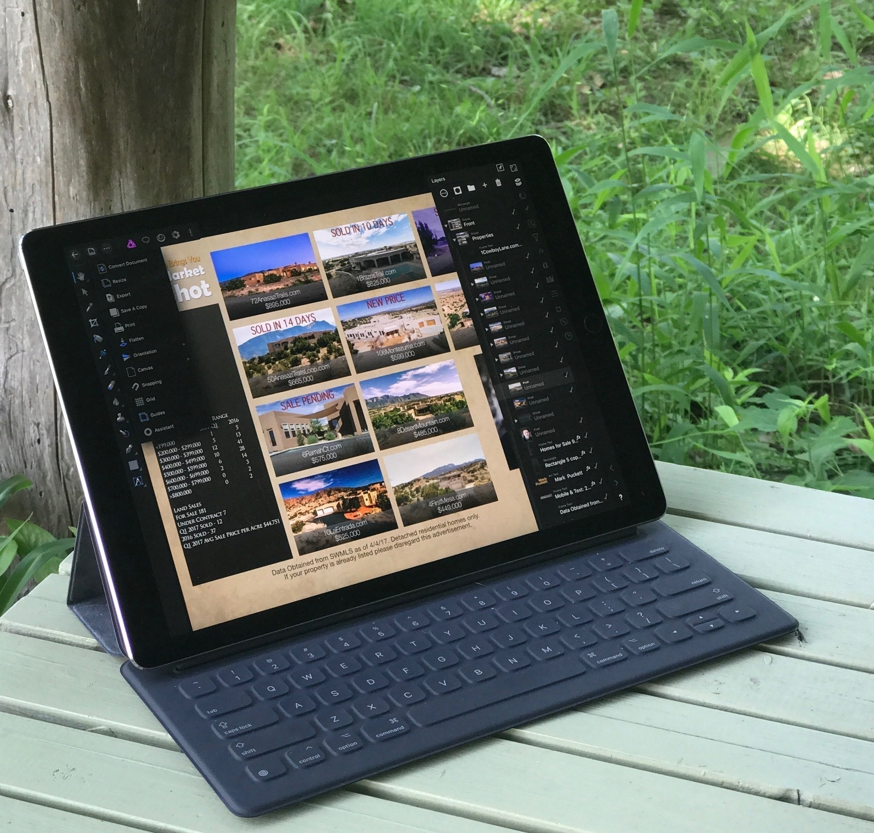 Using Affinity Photo to design a promotional postcard[/caption]
It’s been a week since the 12.9" 2017 iPad Pro arrived at my door. I can best summarize by saying that without any doubt, this is my favorite Apple device ever. I’m not surprised. I expected it would be. And I say that having used it on iOS 10 only. No beta for me. Actually, I should say that it’s not the iPad alone but the pairing of it with the Apple Smart Keyboard and Pencil. I’ve not used the Pencil much but after just few minutes with Procreate and Affinity Photo, I was certain that I will indeed get great use and enjoyment from it. I hope to use it more this week. I did however spend many hours with the keyboard.
The Keyboard
I was a bit surprised at how much I enjoyed using the Smart Keyboard. I’d only used one in a store for about 20 minutes and knew that it felt pretty good to type on. What I wasn’t sure about was the stability of the keyboard or how I would feel about the lack of special, media playback keys.
My main motivation in an iPad Pro was the bigger screen size and it’s been fantastic. Using Coda and Affinity Photo for work over the past week has been an excellent experience on the 12.9" screen. Over the course of the week I updated a client’s website to a new responsive design all from the iPad using Coda to edit CSS and HTML. I often use Coda in conjunction with Transmit, Safari, Messages, and Spark. It’s so much nicer on the larger screen. I also had to put together a magazine ad for a client and a promotional postcard for another client. Both of those were a pleasure to do with Affinity Photo. At no point did I feel I was using anything less than the full version of the app that I’ve gotten used to using on my Mac. The only downside is that Affinity Photo does not yet support split screen. I can live with that given that its the sort of app that begs for the biggest workspace possible. I just use a slide-over when I need to.
Screen Tech
Unlike many I don’t see a huge benefit in the new refresh rate of 120Hz, what Apple is calling Promotion. Sure, scrolling on the new iPad as absolutely smooth. Everything is smooth. But I don’t read text while scrolling. I’ve compared to the iPhone 7+ and I just don’t see a difference. Everything on the iPhone is also buttery smooth. I do notice the TrueTone and the increase in brightness but there again, I rarely use my iPad brighter than 40%! So, yes, it is an absolutely gorgeous screen but to my eyes it is nearly identical to the iPhone 7. I just went back to my Air 2 and scrolled through a full page of text in Safari. First time I’ve done that in a week. I do see a difference but nothing so fantastic as what I’ve been hearing and reading from the Apple Nerdery. Shrug.
Audio
As was noted when the previous iPads Pro were released, yes, the speakers are pretty great. Much better than the iPads that had only two speakers.
Speed and Memory
Yes, no doubt, this machine is beast. Blazing fast. I’ve not noticed any lag in anything I’ve done with any app. Also, having 4 gigs of RAM is pretty nice. I go back to apps that I’ve not used in hours and they are ready to use with no delay. Safari holds far more tabs than I ever saw with the Air 2. I keep most of my apps in folders and all apps that aren’t in the dock are on the second page of the home screen. My main strategy for opening apps is either the dock, Command-Tab, or Spotlight. Most often it is the latter two and it is instantaneous. With Spotlight I type the first few letters of the app then return and there it is 1.
Weight, Size and Portability
Yeah, well, this is bigger than the Air 2 but still, very portable. With it’s Smart Keyboard it is lighter to tote than a MacBook Air 13" or a 2017 MacBook Pro and only slightly heavier than a MacBook. And with at least 10 hours of battery time, yeah, it’s still a great portable machine.
Pro Computer, Pro Apps
Until last spring I’d owned an Apple laptop of one kind or another for 17 years. I sold my last one a year ago because it wasn’t getting used anymore. After over a year of using the iPad Air 2 as a primary, preferred device I have no doubt that my Mac laptop days are over. The real point of this size iPad is that it be a laptop replacement it is fully capable of doing that and even more. As a form factor with flexibility it is better than a fixed hinge laptop. It can be used attached to a keyboard or near a keyboard or with no keyboard at all. Not only that but with the maturity of iOS I have an operating system that I find a delight to use and with iOS 11 it even more so. With the Pro line, iPad is no longer a compromise, no longer a sidestep, it is a step up to something better.
The deal is sealed with “pro” apps. For those that require apps such as InDesign, Final Cut Pro and Xcode this is not YET the device for them. I’m sure there are plenty of other example apps that are not available on iOS and for folks that need those the time for using only an iPad Pro is not yet. But we can see with the release of Affinity Photo that the iPad is fully capable of performing heavy-duty tasks with fully featured apps. There should be no doubt, Affinity Photo represents the long sought after “Photoshop for the iPad”. I’d go further and say it is better because, like it’s desktop equivalent, it does not come with the baggage or subscription pricing that come with Adobe and Photoshop. Going forward it seems a certainty that the iPad Pro, along with iOS 11 and upcoming pro apps by Serif and others, will begin to gain a great deal of traction.
Apple has made it clear that the Mac is not going away which is great news for folks that prefer the Mac. It’s a mature and powerful platform that has it’s place. But it is equally clear now that the iOS platform as an increasingly pervasive and capable mobile ecosystem will continue to expand in power and flexibility to accommodate the needs of power users. I for one am happy to celebrate all of them but it is the iPad that I will look forward to using everyday.
iPad Journal: Affinity Photo for iPad!!
[caption id=“attachment_426” align=“alignnone” width=“2048”]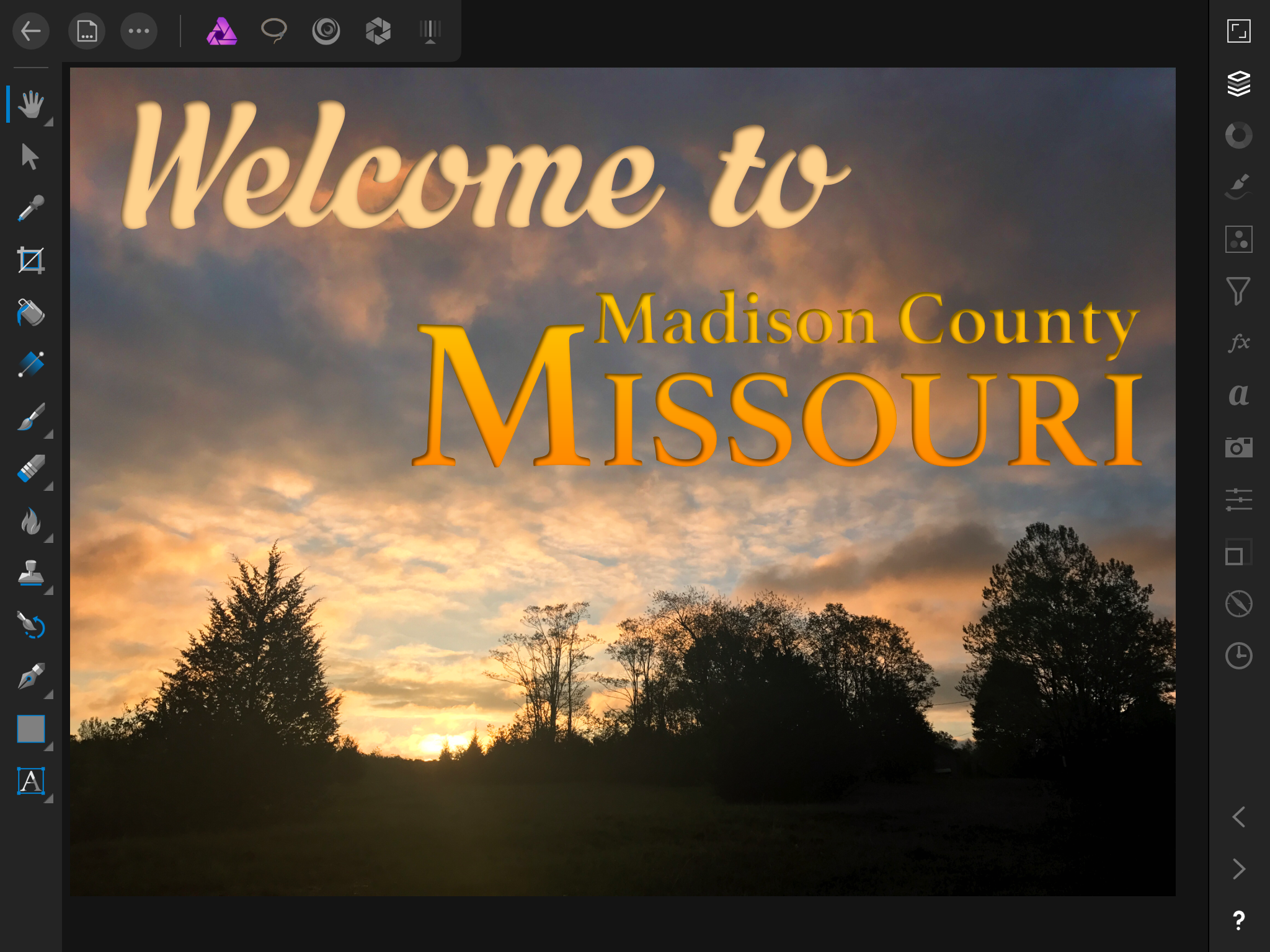 Affinity Photo on iPad[/caption]
I’ve been using the Affinity apps, Photo and Designer, on my Mac for the past couple of years and thanks to them I’ve largely left Adobe behind. In fact, I only use Adobe for InDesign projects and for Illustrator’s trace functionality. It’s rare that I open up either Illustrator or Photoshop and I look forward to the day that I don’t need to have them installed. The Affinity apps are, in my experience, true replacements for those two Adobe apps.
As I’ve transitioned more if my work to iPad I’ve been waiting and hoping for the Affinity apps to make the jump. Monday at the WWDC event it was announced (via an on stage demonstration) that Affinity Photo was now available for iPad. I purchased it immediately and after a few hours of trying it out I can say I am very satisfied. I should note that I’m using it on an iPad Air 2, not a Pro, and that performance is excellent. I’ve already used the app to do work for two clients and expect to do a lot more. This is a full version comparable to the Mac version rather than something only a small subset of features. It is a fantastic experience. I can’t wait to give it a go on the new 12.9" Pro next week!
By way of comparison, I’d previously been trying to use Pixelmator on iPad and while it occasionally proved useful for bitmap-based work it was never as powerful as I needed and so I often ended up back at the Mac using Affinity Photo or Affinity Designer. With Affinity Photo installed I will likely remove Pixelmator altogether. There really is no comparison. Now I’ll be able to that much more work on iPad. The only difficulty that I expect to encounter is in the area of available fonts but that’s a shortcoming of iOS not this app. In such cases I’ll save a copy to my Mac towards the end of the project and finish it off with the Mac Affinity apps.
Once Serif releases Affinity Designer for vector focused work I’ll have a nearly complete iPad toolkit for graphic design. I expect I will, from that point on, only return to the Mac for InDesign and for projects that require additional, Mac-only fonts. I also expect that one day Apple will allow for an easy way to add fonts as we see fit.
This is exactly the kinds of app needed to help move the iPad toward being a fully Pro tool for those of us that do this kind of work and who choose an iPad as our primary device. I can say, without a doubt, Affinity Photo will be one of my most used iPad apps.
Client Website: Liberty Blueberry Farms
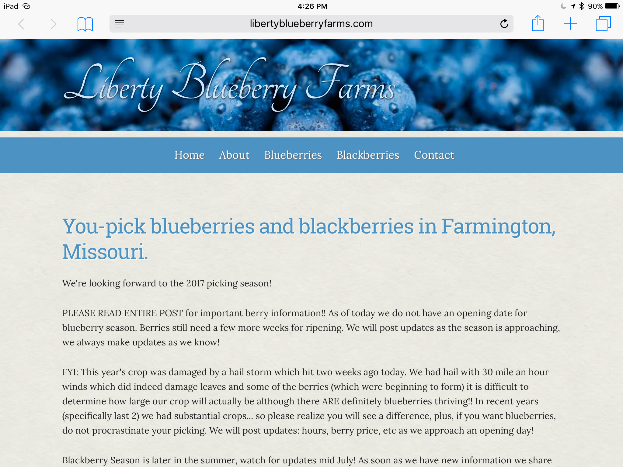
In 2011 I was hired to redesign the website of a local pick-your-own blueberry farm. Six years later it was time to get that site moved over to a mobile friendly design. It was and still is a fairly simple design but it now a responsive design which displays very nicely on mobile devices.
iPad Journal: Speedy production of posters and social media graphics
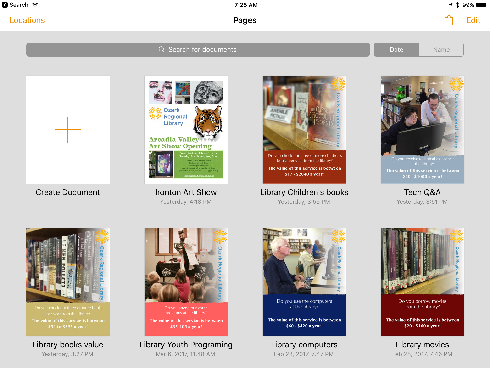
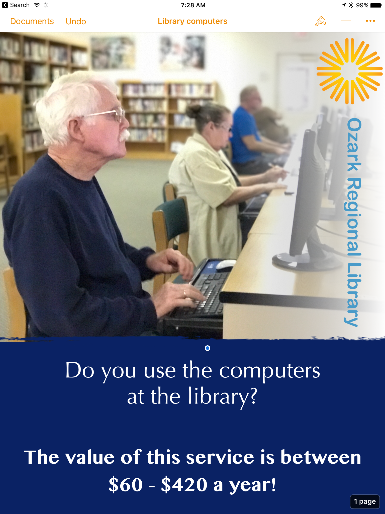
I've been doing a bit of volunteer work for our local library lately and we're currently moving towards an April vote on a tax increase to help cover the operating costs of our little network of rural libraries. I was asked to put together a collection of simple posters that would highlight the value of library services to patrons via print and social media. I did most of the work in Pages on the iPad with two exceptions that required a quick edit on the Mac. On the iOS version of Pages,1 rotating elements is not possible and second, the ability to create a shape with a transparency gradient is also missing. Not a big problem, I just saved in iCloud and stepped over to the Mac to rotate the logo on the side of the page and create a white box with a transparency gradient. By the time I was back at the iPad the file was updated with the two changes. This would be my "template" so I made several duplicates and altered each to a specific value that the library wanted to highlight.
I'd used portrait mode on the iPhone camera to capture a series of images that I AirDropped to the iPad. After quick edits to text and the color of the bottom box element they were each given a different image and I was done. I wanted to send each poster version in its own email with two attachments, a jpg for social media sharing and pdf for printing. Easy enough. From Pages I would share as pdf via the Share Sheet to one of my most used apps, Graphic which I used to export as jpg to my camera roll. I'd jump back to Pages and share as pdf again but this time to Mail. Once I had the Mail draft with pdf attached I'd add my image attachment and send. The whole process took about 90 seconds for each email with two attachments.
Smooth sailing.
Recent Work: Midwest Tiny Houses and Sheds
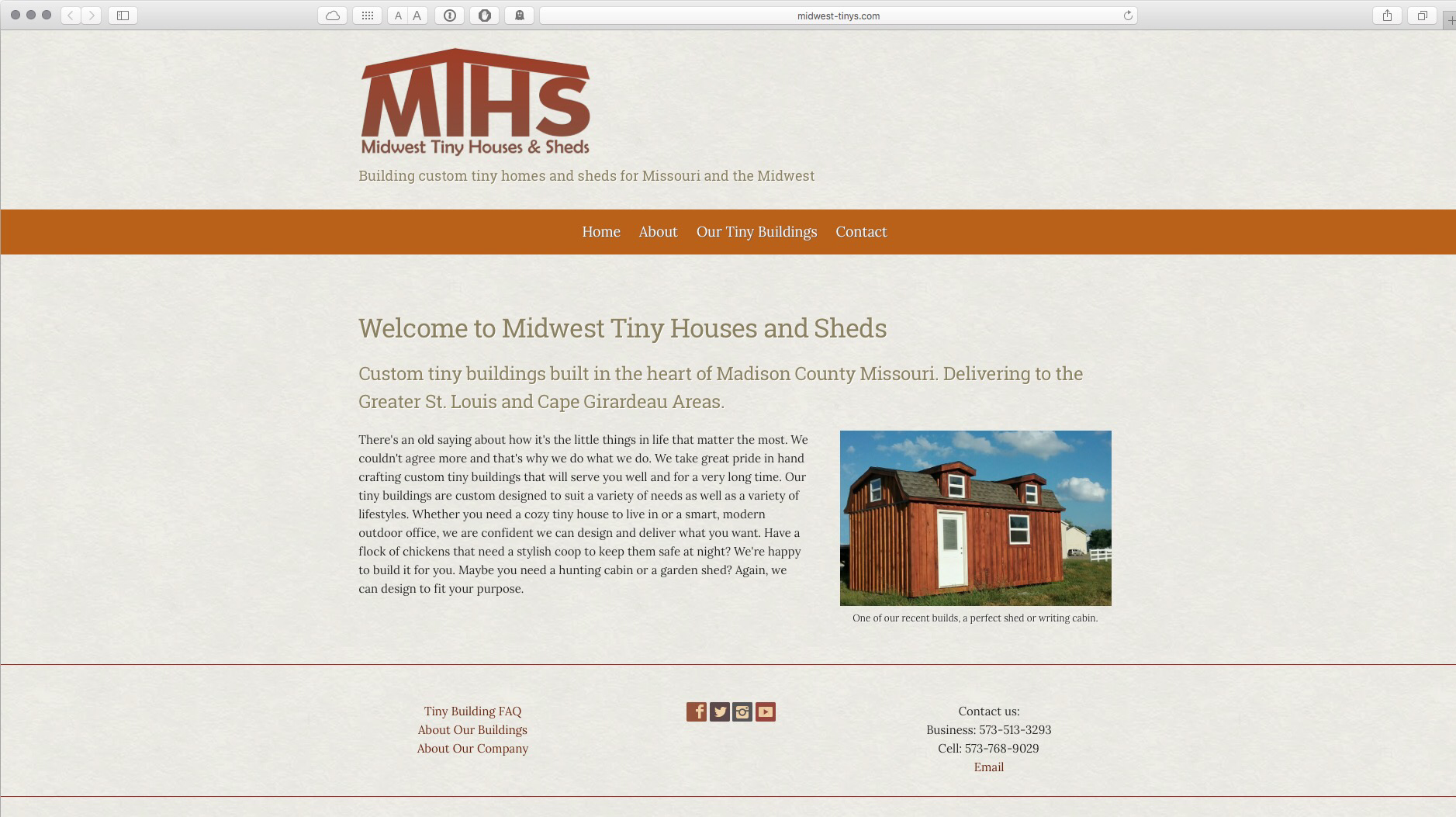
I don't just love tiny houses, I live and work in one. It suits me very well because I don't own much stuff and what I do keep around serves a function. Not much clutter in my world. My small space has served me very well and I don't see that changing for any reason. A couple months ago a local fellow started a new tiny buildings business and asked me to do a website and other marketing materials. Of course I was excited to see a new Fredericktown business and one that was going to be building tiny houses made it all the more interesting to me.
In the short time they've been around they've already built several buildings including a couple of cabins and garden sheds. Midwest Tiny Houses and Sheds will be building for local clients but are planning to build and deliver their buildings to clients in the St. Louis area and Cape Girardeau too. Basically they'll be focusing (initially) on St. Louis and Southeast Missouri.
I've had a first hand look at the construction and it's solid and well crafted. These are beautiful buildings that will last many years. Looking forward to seeing them thrive.
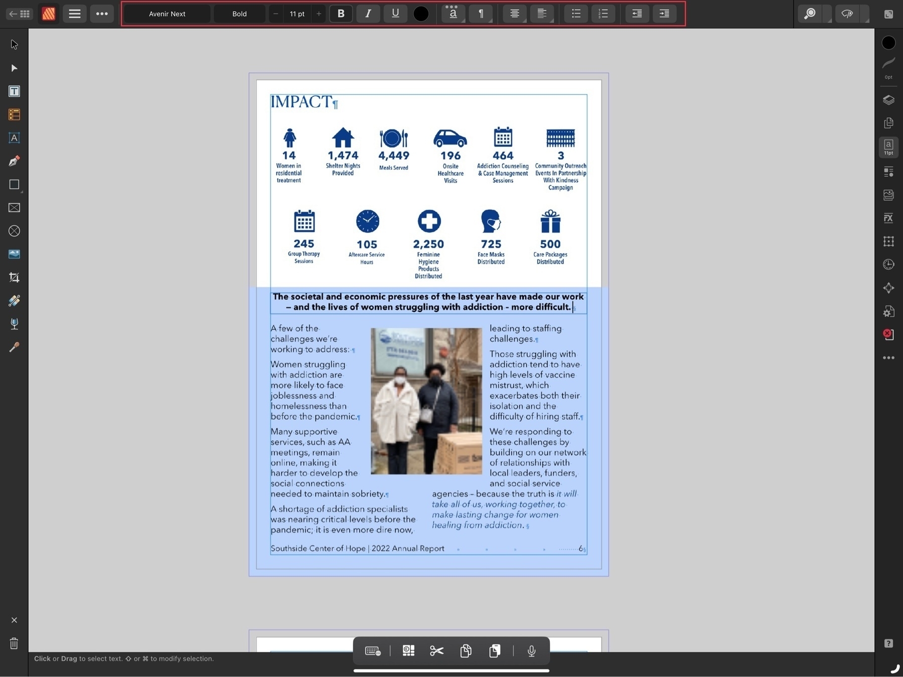
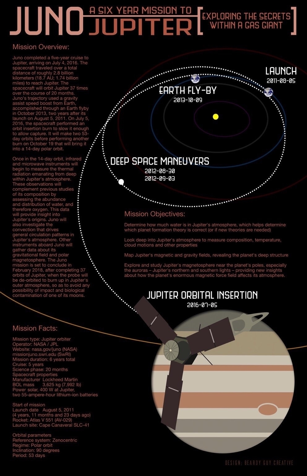
Juno Mission Infographic
When I'm not creating something for a client chances are pretty good that I'm reading about astronomy, physics, space exploration or some related area of science. I've often used those interests as the ingredients in a variety of a for-fun graphic design projects. If you follow NASA at all you probably know that this past July we put the Juno spacecraft into orbit around Jupiter. On August 27 NASA announced that Juno completed it's first extended orbit around the planet and has begun the next orbit. There will be 35 more in total. In celebration of the mission I put together a Juno infographic:
Space Exploration Themed Posters Part Two
I continue to enjoy Affinity Designer. In fact, after three months of use I far prefer it (as well as Affinity Photo) to Illustrator or Photoshop. As of this moment my plan is to only use the Adobe apps if a client/project requires it. These new Affinity apps by Serif are fantastic and did I mention they are not rented via subscription but available for purchase the old-fashioned way? Buttery smooth, fully featured and a pleasure to use.
In my downtime this summer I’ve continued working on my series of space exploration-themed posters which I’ve made available on Red Bubble.
[caption id=“attachment_486” align=“aligncenter” width=“625”]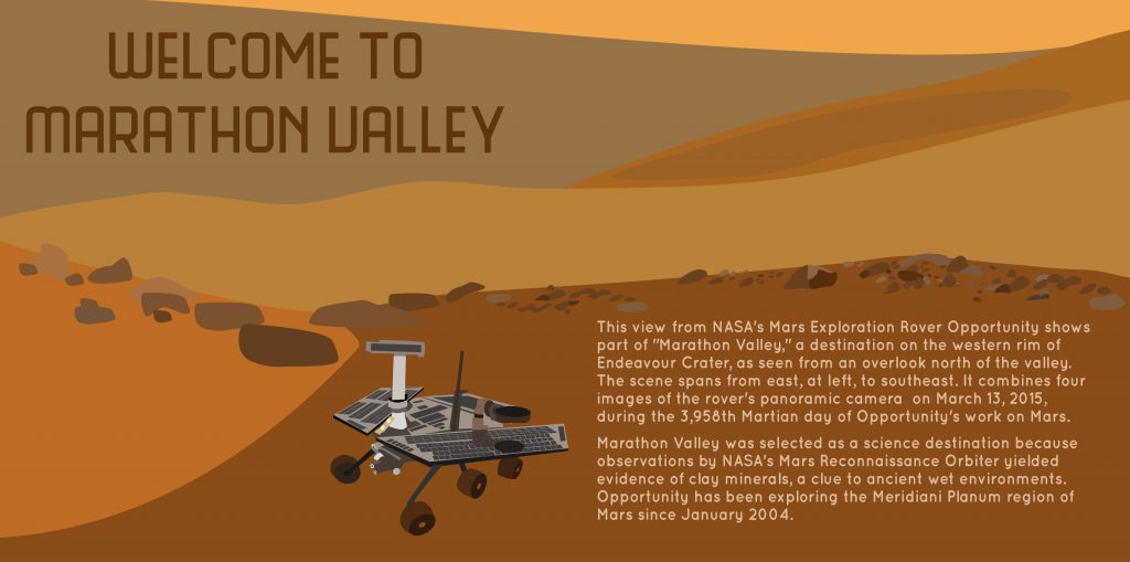 Marathon Valley Overlook[/caption]
This view from NASA’s Mars Exploration Rover Opportunity shows part of “Marathon Valley,” a destination on the western rim of Endeavour Crater, as seen from an overlook north of the valley. The scene spans from east, at left, to southeast. It combines four images of the rover’s panoramic camera on March 13, 2015, during the 3,958th Martian day of Opportunity’s work on Mars.
Marathon Valley was selected as a science destination because observations by NASA’s Mars Reconnaissance Orbiter yielded evidence of clay minerals, a clue to ancient wet environments. Opportunity has been exploring the Meridiani Planum region of Mars since January 2004.
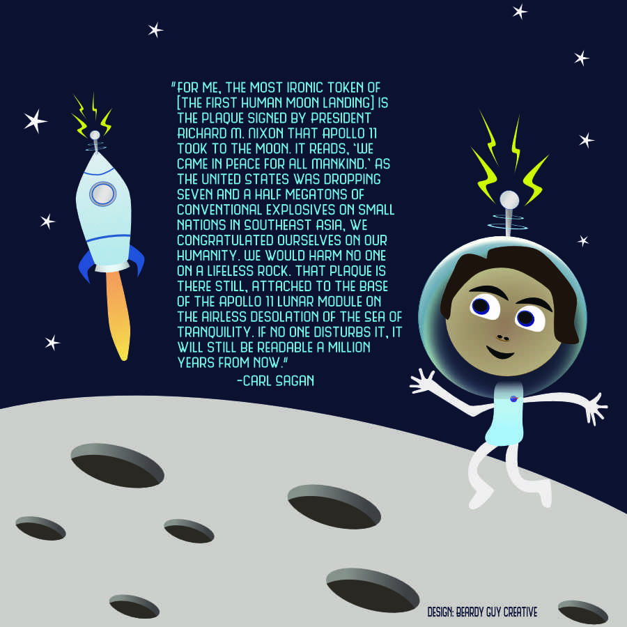
“For me, the most ironic token of [the first human moon landing] is the plaque signed by President Richard M. Nixon that Apollo 11 took to the moon. It reads, ‘We came in peace for all Mankind.’ As the United States was dropping seven and a half megatons of conventional explosives on small nations in Southeast Asia, we congratulated ourselves on our humanity. We would harm no one on a lifeless rock. That plaque is there still, attached to the base of the Apollo 11 lunar module on the airless desolation of the Sea of Tranquility. If no one disturbs it, it will still be readable a million years from now.” -Carl Sagan
Space Exploration Themed Posters
My trial run with Affinity Design continues, this time with a series of space exploration posters featuring Carl Sagan quotes.
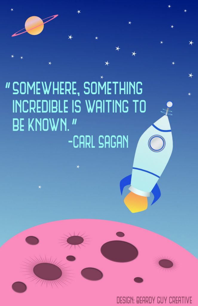
“Somewhere, something incredible is waiting to be known.” - Carl Sagan
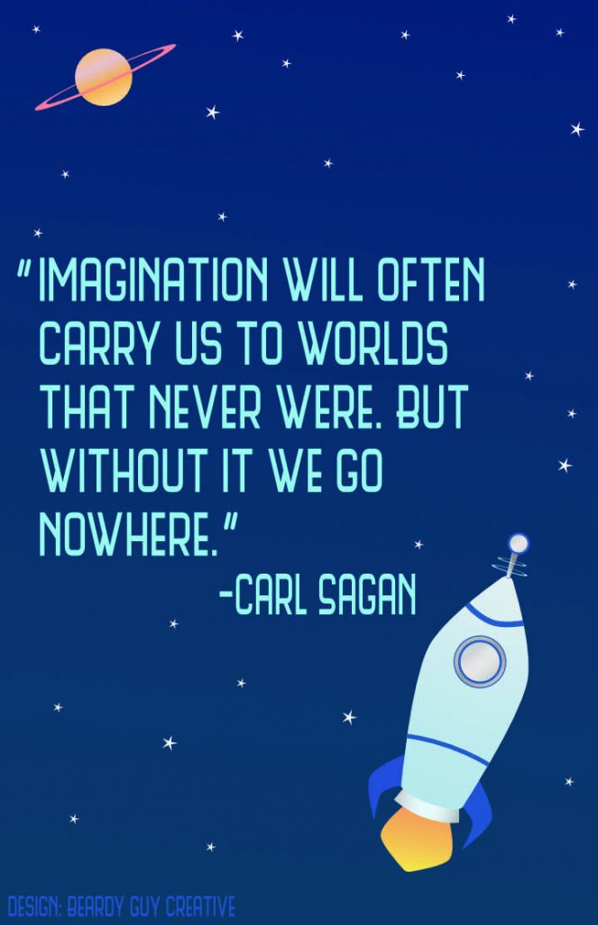
“Imagination will often carry us to worlds that never were. But without it we go nowhere.” - Carl Sagan
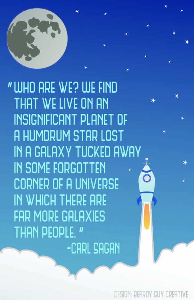
“Who are we? We find that we live on an insignificant planet of a humdrum star lost in a galaxy tucked away in some forgotten corner of a universe in which there are far more galaxies than people.” - Carl Sagan
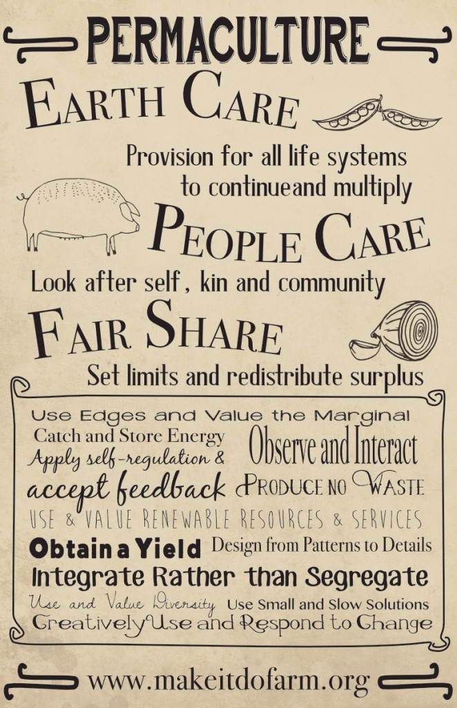
Permaculture Poster Design (& Affinity Designer First Impression)
Before I go any further, let me say this isn’t much of a review or even a mini-review. Just my initial impressions.
I’m a regular user of Adobe CC but not a big fan of the subscription model. When I recently learned of Affinity Designer and the upcoming Affinity Photo I figured it was worth checking out. The reviews for AD thus far are very high and having used it for a couple of projects I can see why. The Permaculture-themed poster below started as just a quickie to test out some of the basic tools I’ve come to expect from Illustrator and I’m happy to report that AD was a pleasure to use. Everything from the pen tool to text to text on a curve were easy and buttery smooth. As with Illustrator, layers are easy enough to use to group elements for editing and locking. On a couple of test designs I tried a few of the other basics such as shape building and editing as well as applying gradients and various styles, all worked just as one would expect.
What’s missing? Right off, there is no workspace outside of the defined document margins which is something I definitely miss. Illustrator and InDesign both allow for the storing of elements outside of the defined art board or document margins. Also, no export for web. Perhaps I missed it but I certainly didn’t see it and I’ve looked a couple times. I know that I can set a document up as having an intended use for the web but that’s not what I’m after. I want to be able to set up for print and also be able to export or save for web. Found it! Right in front of me but called “Export Persona”. The only option I don’t see is the option to resize the dimensions at time of export.
I’m guessing that I’ll find other features missing that I’m used to having but as of this moment I intend to switch to AD for any design work that I would have previously used Illustrator for.
The Typography of Alien
A pretty fantastic post about the typography of Alien.
My third post about typography in sci-fi has been gestating for a while now. Indeed, it’s been slowly taking shape – you might say it’s been forming itself inside of me – for really quite some time. I’m delighted to say that it is now ready to burst forth from my allegorical chest, and to spatter allegorical typographic blood all over your allegorical faces. Welcome to Typeset In The Future: The Alien Edition.
Mini-Review: iDraw for iPad
My main work machine is the 2012 Mac Mini. I’ve written before about my transition to a standing desk for health purposes. That said, I do want to be able to use the iPad as a tool to get work done. Having a flexible workflow is good and it would seem a waste, with the increased power of the iPad Air 2, to not utilize it when the need arises. My initial thought was that it would come in handy for editing the html of client websites and yes, that is a breeze with Diet Coda and Transmit. But why stop there? Those were tasks I could also accomplish with the 3rd gen iPad.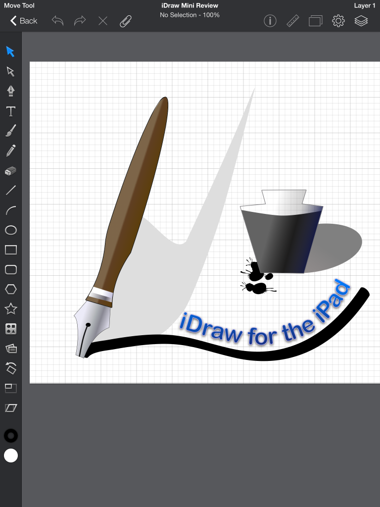
In recent days I have also begun wondering if I might not also be able to get a bit of graphic design work done with the iPad. Adobe does not yet sell an iPad version of Illustrator or Photoshop but there are other options available. Pixelmator is the most recent crossover from the Mac. It has some pretty fantastic photo filters and the handy ability to be passed back and forth to the Mac version. It can also export to psd for crossing over to Photoshop when I’m back to my Mac. That said in the little bit of dabbling I’ve done with it I’m finding some frustrating limitations which I’ll likely explore in more detail soon. Suffice it to say for the purposes of this post that those limitations led me to try out iDraw and that has proven to be a great decision.
iDraw has been available for the iPad since the first iPad release in 2010 and there is a Mac version too though I’ve not tried it. Last week I downloaded the iPad version and have been giving it a spin. Fantastic. This is an app I can use to get real design work done. I’ve not yet used it for a client project though that will come soon enough. I’ve done enough with it in a few hours to know what it is capable of. Not surprisingly, it’s not as fully featured as Illustrator or Photoshop but it does have the most important tools and they perform very well. In fact, the iPad handles everything I’ve tried to with iDraw with ease.
I created the example image in my first spin with the app. Shape building, styling with gradients, adding text to a path are all very straight forward. I started with the rectangle tool and then used the pen tool to begin adding new points and then used the path tool to make my pen handle and tip. Apply stroke and gradient and then tweek. As with Illustrator, all the objects are put on one layer but layers are supported and easy enough to create. I used the same process for creating the inkwell. Styles include drop shadow, inner shadow, inner and outer glow. Multiple instances of these effects as well as multiple fills can be applied to each object. Very handy to be able to apply multiple gradients to single objects.
 The brush tool is very easy to use with width and smoothing options though I only found the one style brush tip. Will need to investigate. Adding text to a brush stroke is easy enough as is styling that text after adding it to the path. Adjusting the path or moving the text to different points along the path are also very easy. As you might expect, there are plenty of object options such as alignment, path combinations and more.
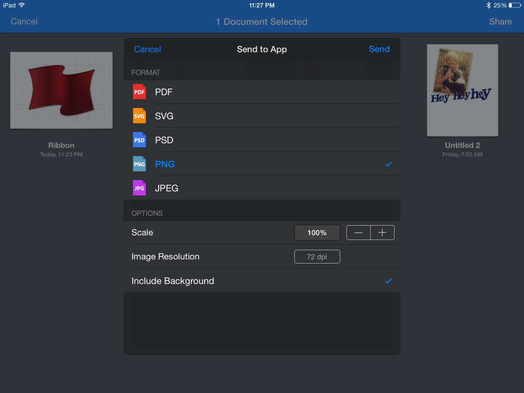
When you’ve finished you have quite a few options for using and sharing images. Before sending to any of the iOS 8 app extensions for sharing (Transmit, Facebook, Twitter, etc.) you have the option to choose the file size, resolution, and format: pdf, svg, psd, png or jpg.
Don't Forget the Words
Frank Chimero, The Second Trip-Up:
A young designer is beaten over the head with typefaces, grids, and rules—and rightfully so—but typography can act as a smoke screen. There is so much to learn about the letters that it’s easy to forget about the words. Once a designer has the typographic skills in their pocket, anyone with their head on straight realizes ugly words in beautiful typefaces are still pretty dumb. I tripped over this observation while struggling to make good designs and clear illustrations for idiotic articles and muddled ideas. I then fell into something I’m still attempting to understand: words are the most explicit example of clear thinking.
Poster Design for Los Alamos Beer Co-op
 Client wanted a bright but rustic flyer to advertise a beer festival sponsored by her beer brewing co-op. I used several fonts beginning with one of my current favorites, American Captain. I ended the design with something a bit more whimsical and reflective of their current branding and website, Brain Flower Euro. In between, Playball, Oklahoma, and Rockwell. I used a grunge paper texture faded in the background to help create a rougher, rustic feel.
The client was excited about the final result!
Ad Design for Pizzaria
This was an ad for a Georgia pizzeria.The client wanted an old world aesthetic with reds and greens as well as earth tones. A rough paper texture was used to achieve a rustic feel that might be mistaken for an old earthen wall somewhere in a Tuscan village.
Ad Design for JoJo and Sofia
It’s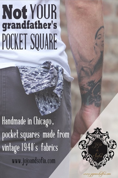 been a very busy 6 months! I’ve not been keeping up with the blog but have determined to make it a priority. I’ll start with highlighting some of my recent work, in particular a series of vintage themed print ads for JoJo and Sofia’s new line of men’s pocket-squares. This is one of two. A lot of fun to do.
Features two of my favorite fonts: Rockwell and Antique Book Cover. Good stuff.
Kaleesha Williams: Author Website, ePub and Printed Book Design
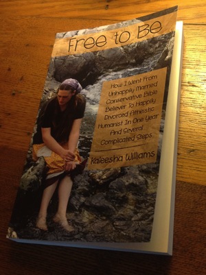 My partner here at Make-It-Do Farm and Tucker Creek Creative (she is also the creative force behind Daisyblend Organic Creations), Kaleesha, just recently published her first book. In fact, the Kindle and ePub versions have only been out a week and the print copies are due to arrive next week so when I say recently what I really mean is just! It is an understatement to say we are excited about her accomplishment!
I’m happy to have been able to play a supportive role in the effort. Relative to the writing of the book, my tasks were fairly quickly and easily accomplished. In preparation for publishing the book we set-up her Kaleesha Williams author website months in advance to allow time for google and other search engines to find it. We added in book teasers and she actively provided book excerpts and other related content to the blog.
After months of writing and editing she put the final touches on the book and we assembled it first in Apple’s iBooks Author. Strangely there is no easy way to export from Apple’s Pages app directly to iBooks Author so I added the chapters one by one. The final result is very nice but still waiting approval on Apple’s end. Next was publishing from Pages to ePub which is an export option and was fairly easy to do if one pays attention to the details. To get it all right it is essential to use properly named styles. For example, each chapter title should be a Header 1 style which helps to create the Table of Contents. Another important point, block quotes need to be in a style named block quote. It may seem obvious but if you’ve not used Styles with Pages it requires a bit of digging. It is the “proper” way to do long form layout and a real time saver. Using styles allows the designer to make changes throughout the publication in just seconds. Decide you want less of an indent in the block quotes? Just update the style and the changes occur throughout the document. Very similar to using CSS style sheets in html documents.
One hang-up that was not resolved: Kindle formatting. While the ePub translated fairly well into Pages and third party ePub readers such as iBooks and those available as extensions for Google’s Chrome browser, the Kindle platform has become fragmented. While our export was technically correct and works perfectly on most Kindle versions some formatting is lacking depending on the device and app used. It’s not a deal killer but would certainly be nice if the engineers at Amazon would unify the layout on the platform. We persevered and finally got the Kindle version published.
Last and probably the most exciting was laying out the book to be printed at Amazon’s Create Space. The process was fairly straightforward with just one big hiccup. The newest version of Apple’s Pages, 5.1, no longer allows for layout using facing pages which is essential. As a result we exported to the old version of Pages and designed the print version from Pages 09. It required a few tweaks but nothing too difficult. The cover was designed to Create Space specifications using Photoshop. We received the proof copy yesterday and are now awaiting the first shipment of books!