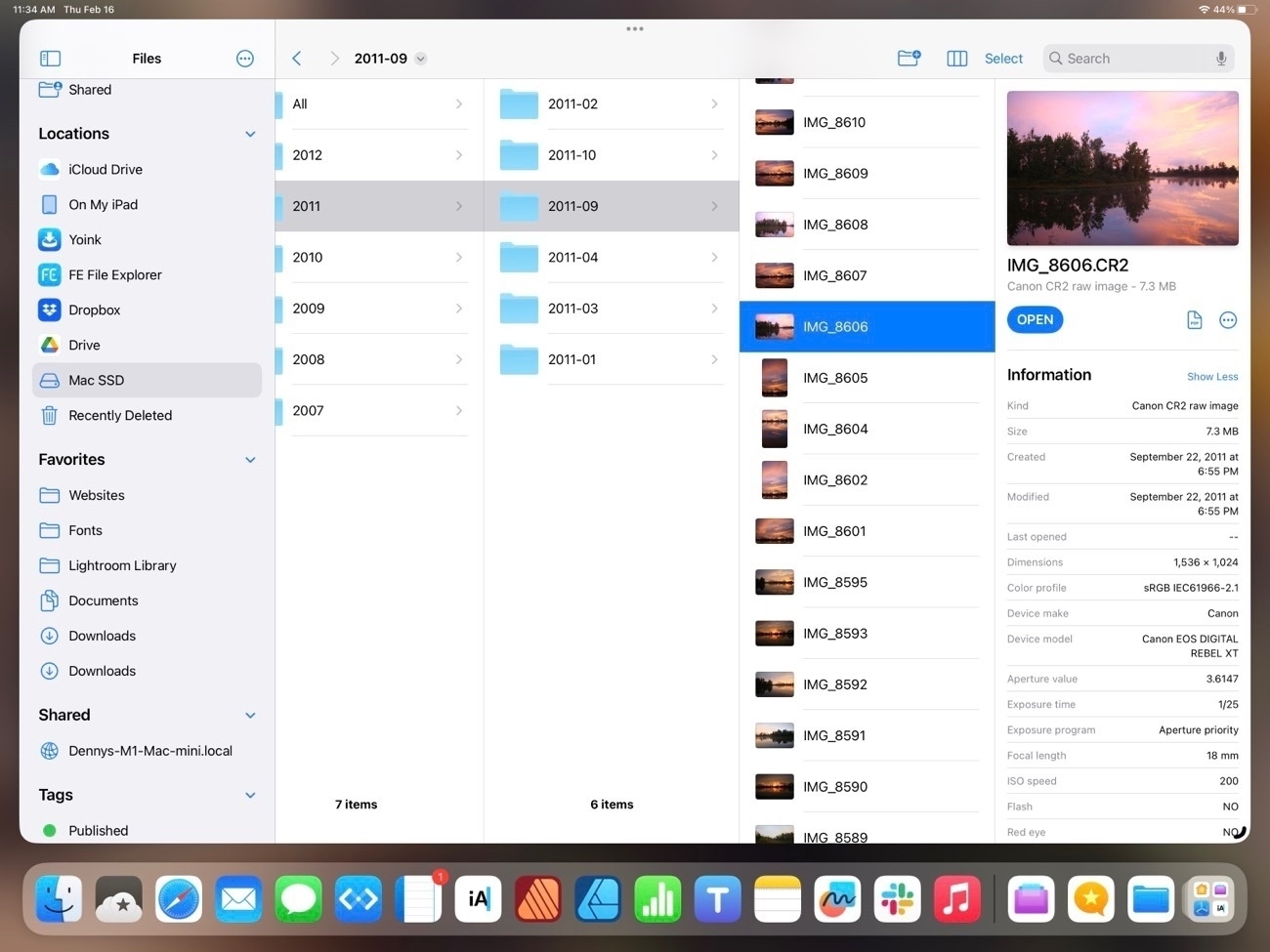
Exploring the Files App on iPadOS 16
I mentioned recently that I’d noticed a post on Mastodon by someone who was complaining how difficult it was to resize an image using iPadOS. I replied to point out that it was the exact same process and done with the same ease as it is on the Mac using the same app. With Files it’s simply two taps (or clicks with a trackpad). It seems a fairly common thing for Mac users these days to complain about the many ways that the iPad is not a Mac or is otherwise lacking. But what’s frustrating is that often times such critiques are coming from a lack of experience and knowledge as in the example above. Users simply haven’t taken the time to use the iPad and learn that many of the same features they use on the Mac are also right there in the same apps on the iPad. The Files app is an excellent example so I thought I’d explore it a bit.
Before I dig in I’ll just say that the Files app on the iPad did indeed start out as a pretty basic app (iOS 11, 2017) that was far, far short of the Finder on the Mac. But with each new version of iPadOS it has gained new features, slowly bringing it closer to feature parity with the Finder. I suspect that many mistakes are made by people who simply have not kept up. They used Files 2 or 3 years ago and not much since then.
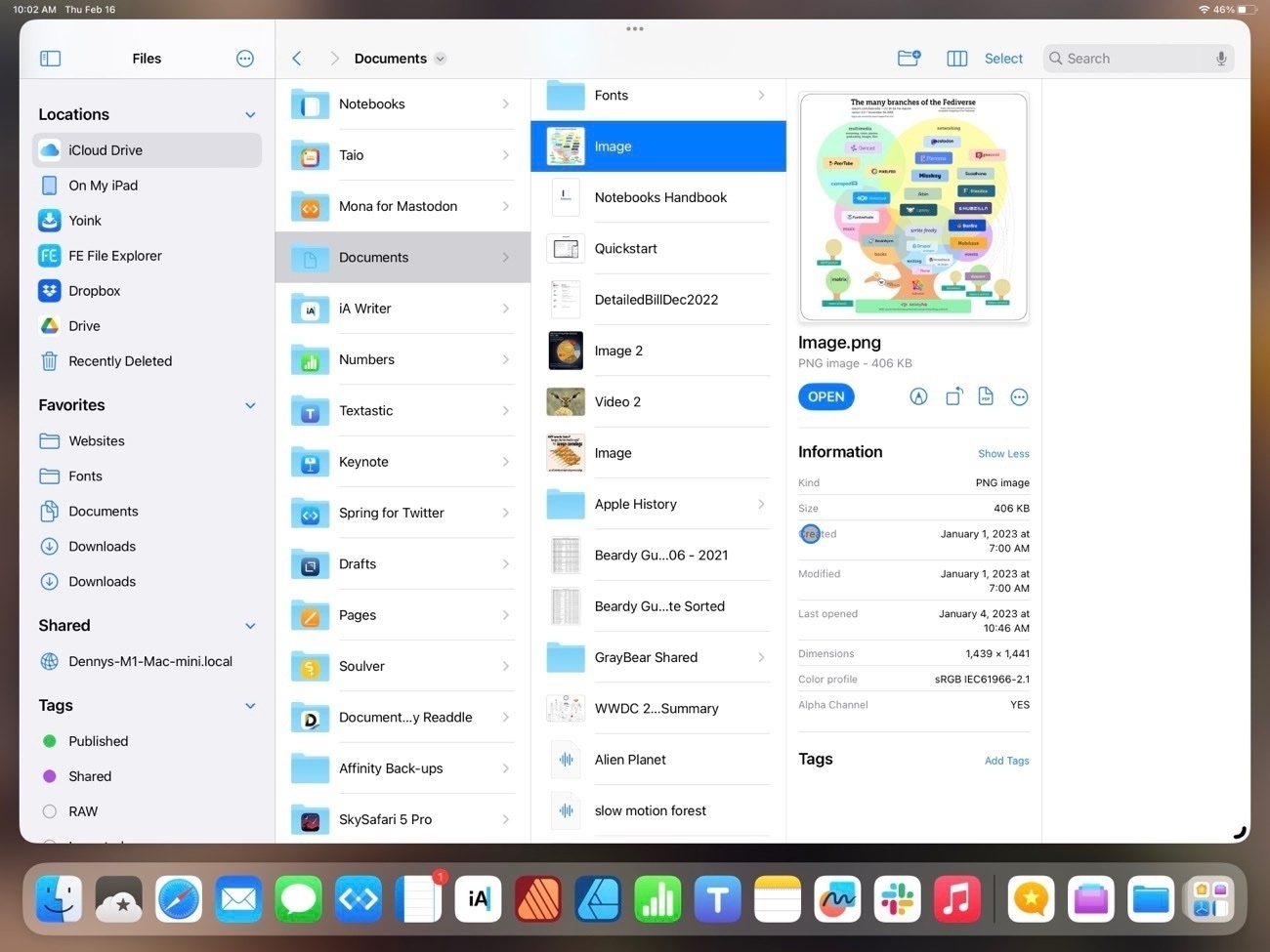
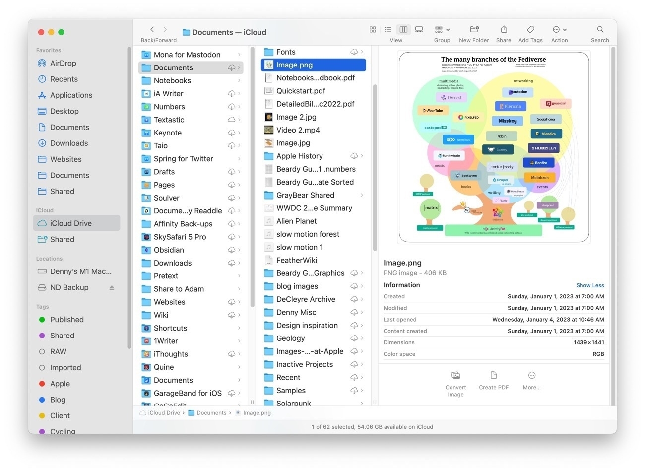
It might be helpful to start with a comparison of the Files app on iPad to Finder on the Mac. I tend to use the column view the most.
While not identical, two apps are very similar in 2023 and in terms of functionality they are nearly the same. Both share most of the same elements with variations. The most noticeable is that everything on the iPad is larger because it’s optimized for touch so less is visible in a full screen window. But take a look at the sidebar in each. Aside from the difference in the order they contain the nearly the same elements: Locations, Favorites, Tags (not visible on the iPad due to size constraints) all of which can be customized in both apps. One interesting difference is that while Locations on the Mac is drive based, on the iPad Locations also includes app providers. So, for example, FE File Explorer on the iPad, if selected, reveals a list of FTP servers I use for connecting remotely to file servers to update websites. I can browse to any remote server from within the files app. Other apps do similarly. In the various screenshots below the Files app is on top, the Finder below it.
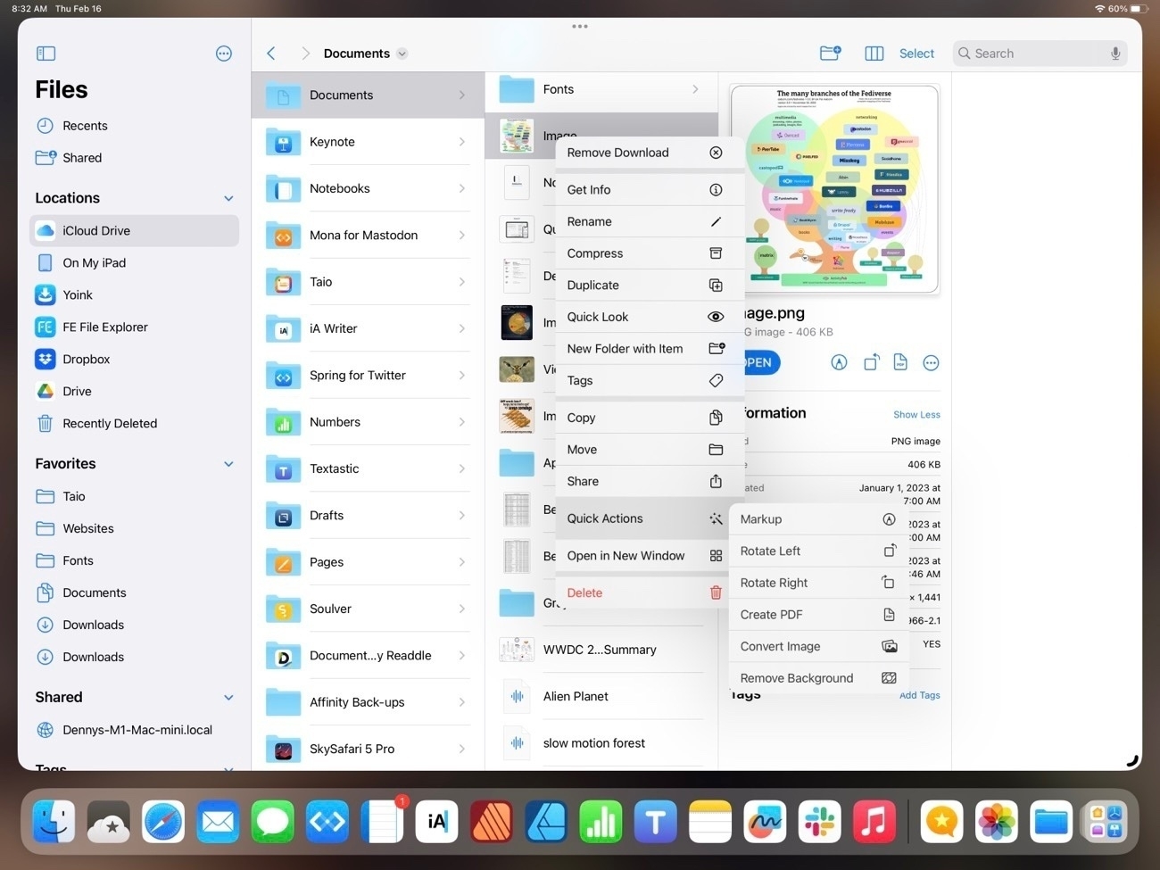
In the primary pane of the column view, again, nearly identical with variations in size and differences in the tool bar and presentation of the details in the right-most pane. Each has the same representation of file metadata but there are differences in the tools available. On the iPad, when viewing an image the tools are: Markup, Rotate, Convert to PDF and last the button to reveal more tools. On the Mac the default is Convert Image, Create PDF and reveal more tools.
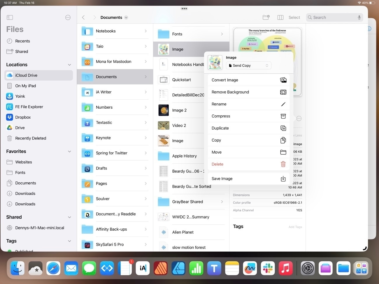
Upon tapping into the Reveal more on each we see that by default the iPad has a few extra options that are placed differently on the Finder (see 3rd screenshot below). Also, there are many additional customization options for sharing and Shortcuts that are not visible in the screenshot. On the Mac there are three defualt actions with the option to add more.
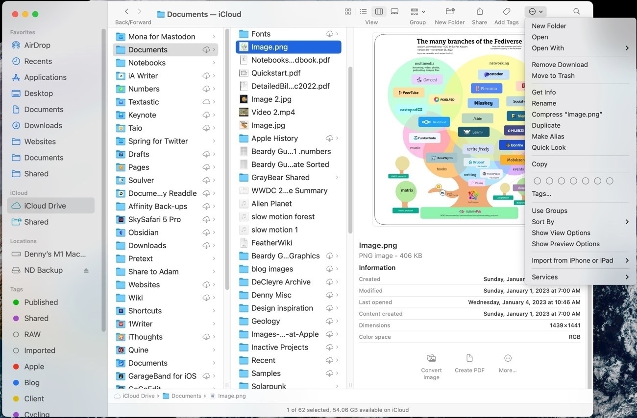
You’ll note that at the top of the Finder window is another Action button that reveals options:
For the most part the two apps are offering the same options and actions but in different locations. Here’s the contextual menu for a file on the iPad. As expected and similar to the Mac, it’s many of the same actions that are available in other locations:
And, not surprisingly, other options are the same between the two devices. For example, the space bar brings up Quick Look.
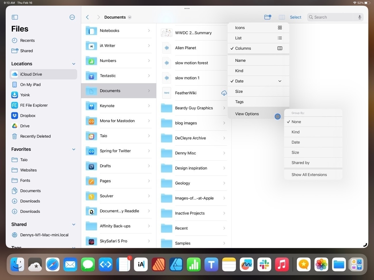
But the Mac Finder remains the better of the two in at least two areas. One, the customization of the top tool bar. The iPad toolbar cannot be customized and some of the options that we see on the Mac, while available on the iPad are only accessible by tapping the 3 column icon which reveals list view, icon grid view, sorting and grouping:
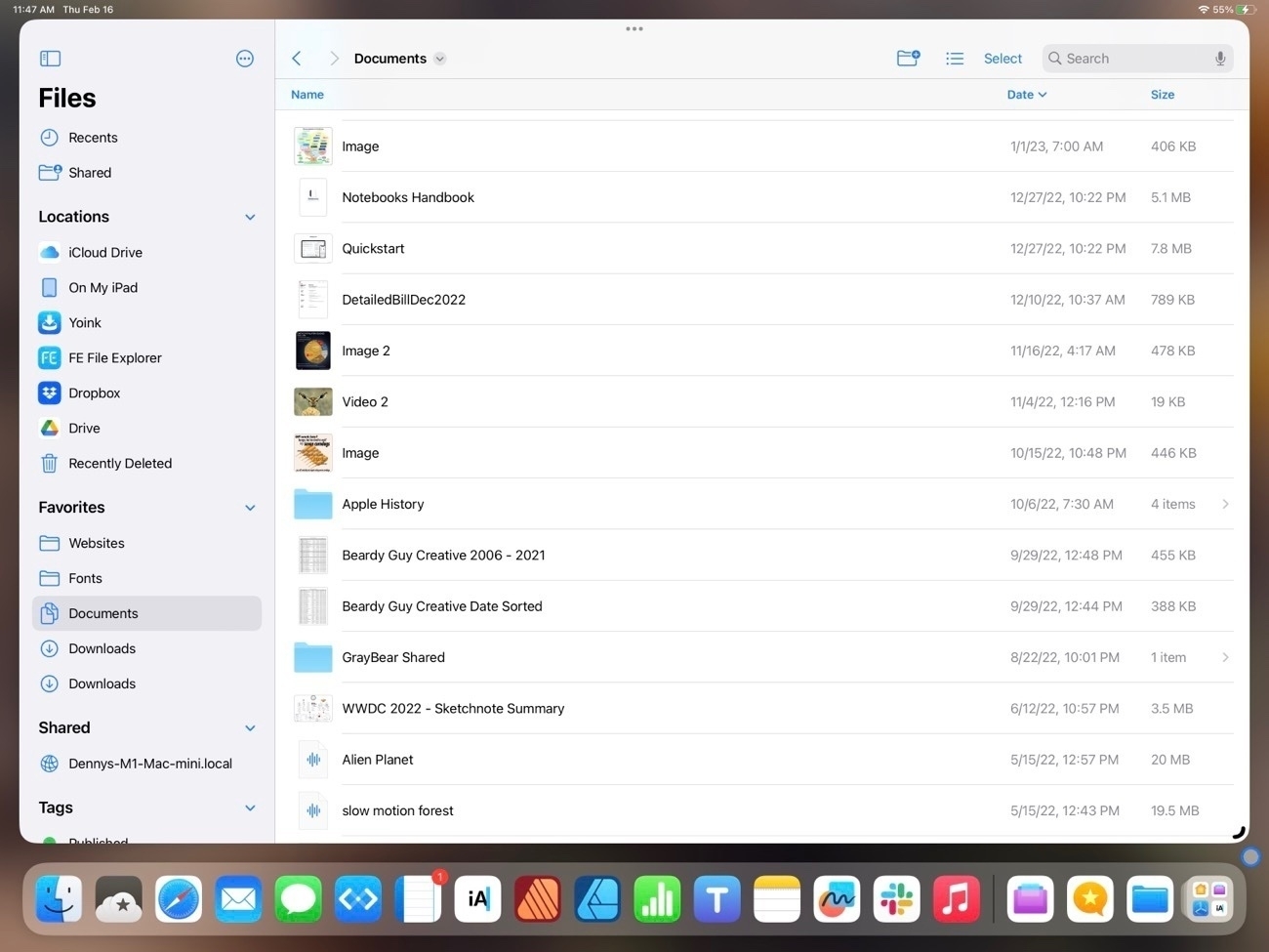
Also, the list view of the iPad is still really limited when compared to the Finder on the Mac. Currently there are three columns available with no possibility for additional columns. If a user chooses to sort by kind or date the column that is displayed changes to reflect the sort. On the larger iPad it would seem there is room for a 4th column.
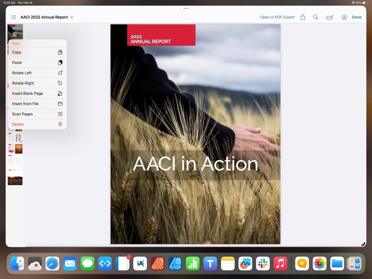
One advantage the iPad has over the Mac is the additional options in Quick Look on the iPad when viewing a pdf. These options are on the Mac in the Preview app but on the iPad a pdf can be edited right from the Files app Quick Look, a nice convenience:
In previous years one complaint about the Files app was the lack of proper external drive support. That was remedied in iOS 15:
So that’s Files on iPadOS 16. It’s come a long way since the early days. I think it’s fair to say that for most users it’s just as easy and functional to use as the Finder on the iPad. While it can feel cramped on a smaller iPad screen or on a 13" iPad when using 2 Files windows, this is a limitation due to the increased size of the touch interface I don’t see that as something Apple will be able to change.
I would like to see a more customizable tool bar and additional options for the columns that are visible in list view. Possibly an option for smaller touch targets, a kind of Files specific “Show more” view that would shrink the size of icons and text. Lastly, more consistent indexing of the content of files. Currently searching the Files app returns a mix of results depending on the content the app resides in. Some apps seem to provide an index that includes content, other apps only Filenames.
Oh, and I’d love to see Files renamed to Finder or, at least given the Finder icon. I understand that the Files name and generic icon matches the actual use of the app better. You may have noticed I’ve created a Shortcut for opening the Files app and have given it a proper Finder smiley face where it resides in my Dock. It’s as it should be.
