Apple
- Cannot customize drop shadows or add them to shapes
- No gradient fills
- Text cannot contain a link
- Oddly, without a hardware keyboard I can only style text at the block level. If I want to style text within a block (sentences, individual words, etc) I have to use a hardware keyboard.
- This client’s business is primarily based on Spring/Fall workshops so I’ve created a section for the upcoming schedule that get’s added to the events page of the website/postcard/poster.
- A section to place his Pages documents for new or updated event pages.
- A section for the links to the pages so that he can review previous year’s event pages as well as the new or updated pages before we make them live.
- A section for miscellaneous documents such as the postcards, posters, etc.
- Just as Apple Notes provides checkboxes I’d hope that we’ll get a checkbox list type. This seems like an obvious feature for an app designed to help people with project tracking and creation.
- More Pencil options. Currently it works just as a drawing tool. As a drawing tool it would be good to have the ability to draw a square, arrow, triangle, etc and have the app straighten the lines into a perfect shape is it does in the Notes app. Also, have as an option to use the Pencil to select/drag to move objects.
Exploring the Files App on iPadOS 16
I mentioned recently that I’d noticed a post on Mastodon by someone who was complaining how difficult it was to resize an image using iPadOS. I replied to point out that it was the exact same process and done with the same ease as it is on the Mac using the same app. With Files it’s simply two taps (or clicks with a trackpad). It seems a fairly common thing for Mac users these days to complain about the many ways that the iPad is not a Mac or is otherwise lacking. But what’s frustrating is that often times such critiques are coming from a lack of experience and knowledge as in the example above. Users simply haven’t taken the time to use the iPad and learn that many of the same features they use on the Mac are also right there in the same apps on the iPad. The Files app is an excellent example so I thought I’d explore it a bit.
Before I dig in I’ll just say that the Files app on the iPad did indeed start out as a pretty basic app (iOS 11, 2017) that was far, far short of the Finder on the Mac. But with each new version of iPadOS it has gained new features, slowly bringing it closer to feature parity with the Finder. I suspect that many mistakes are made by people who simply have not kept up. They used Files 2 or 3 years ago and not much since then.
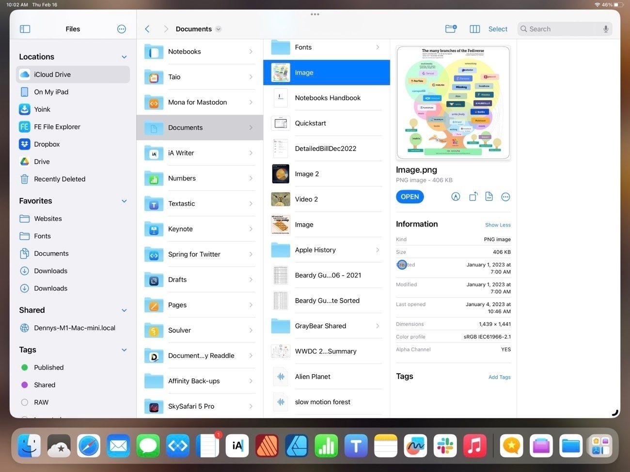
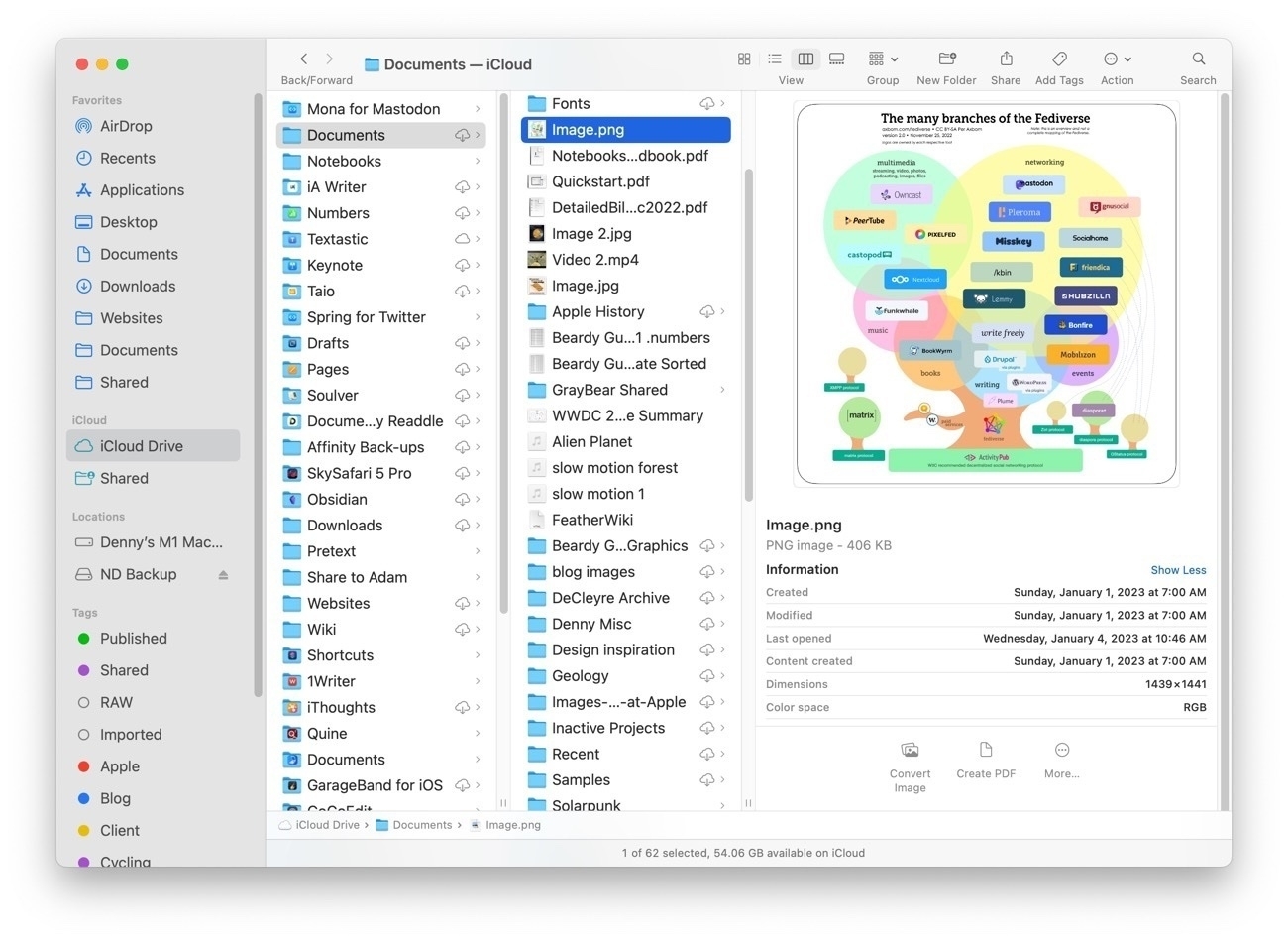
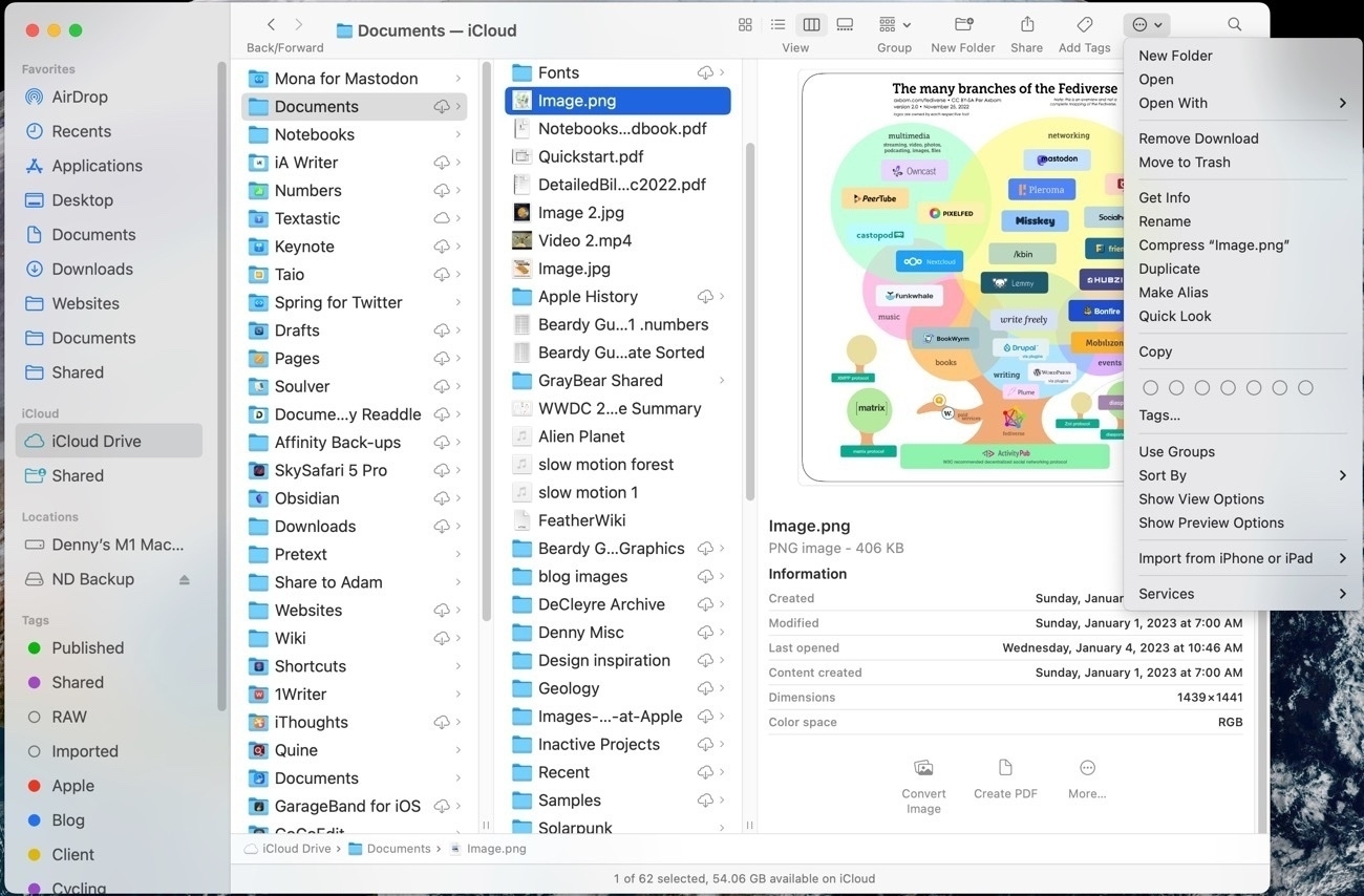
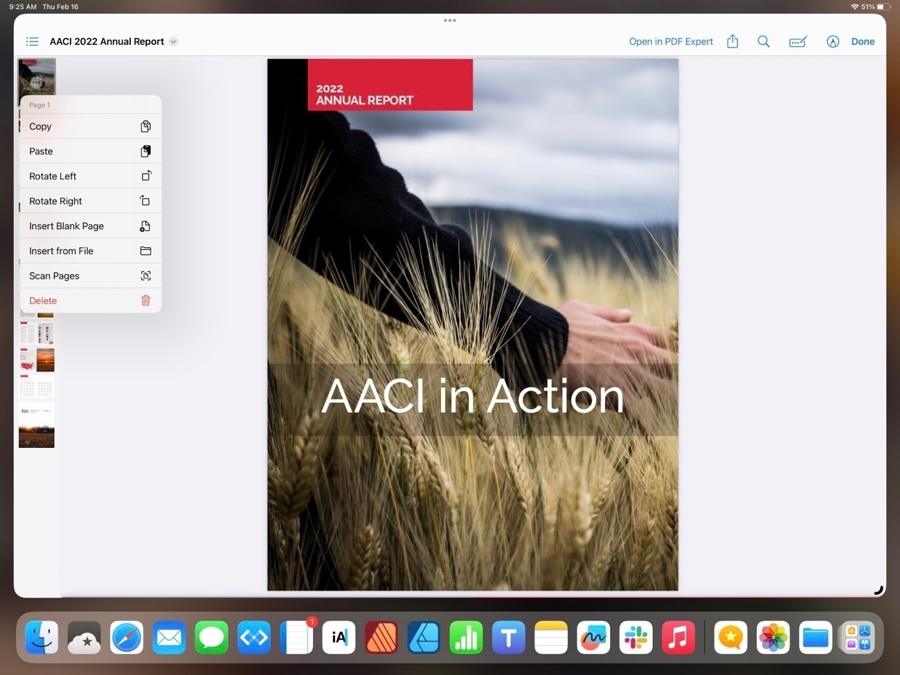
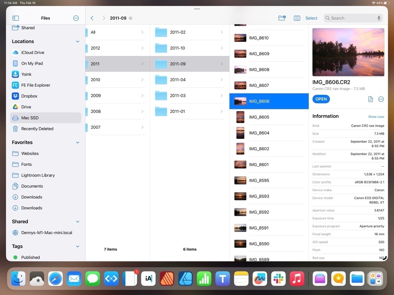
It might be helpful to start with a comparison of the Files app on iPad to Finder on the Mac. I tend to use the column view the most.
While not identical, two apps are very similar in 2023 and in terms of functionality they are nearly the same. Both share most of the same elements with variations. The most noticeable is that everything on the iPad is larger because it’s optimized for touch so less is visible in a full screen window. But take a look at the sidebar in each. Aside from the difference in the order they contain the nearly the same elements: Locations, Favorites, Tags (not visible on the iPad due to size constraints) all of which can be customized in both apps. One interesting difference is that while Locations on the Mac is drive based, on the iPad Locations also includes app providers. So, for example, FE File Explorer on the iPad, if selected, reveals a list of FTP servers I use for connecting remotely to file servers to update websites. I can browse to any remote server from within the files app. Other apps do similarly. In the various screenshots below the Files app is on top, the Finder below it.
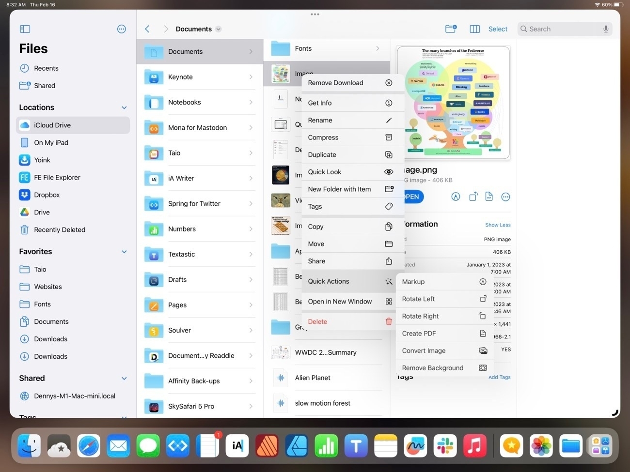
In the primary pane of the column view, again, nearly identical with variations in size and differences in the tool bar and presentation of the details in the right-most pane. Each has the same representation of file metadata but there are differences in the tools available. On the iPad, when viewing an image the tools are: Markup, Rotate, Convert to PDF and last the button to reveal more tools. On the Mac the default is Convert Image, Create PDF and reveal more tools.
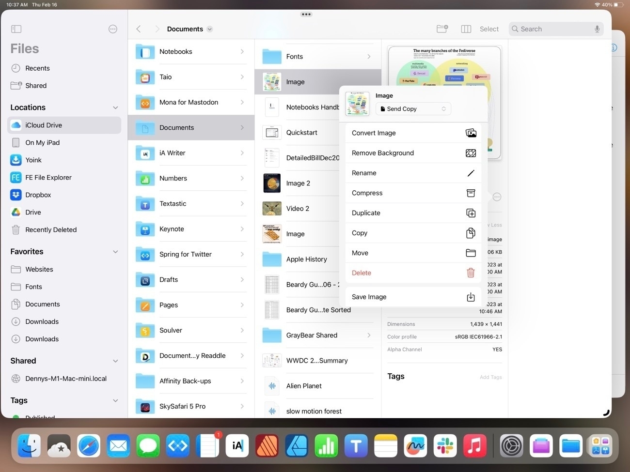
Upon tapping into the Reveal more on each we see that by default the iPad has a few extra options that are placed differently on the Finder (see 3rd screenshot below). Also, there are many additional customization options for sharing and Shortcuts that are not visible in the screenshot. On the Mac there are three defualt actions with the option to add more.
You’ll note that at the top of the Finder window is another Action button that reveals options:
For the most part the two apps are offering the same options and actions but in different locations. Here’s the contextual menu for a file on the iPad. As expected and similar to the Mac, it’s many of the same actions that are available in other locations:
And, not surprisingly, other options are the same between the two devices. For example, the space bar brings up Quick Look.
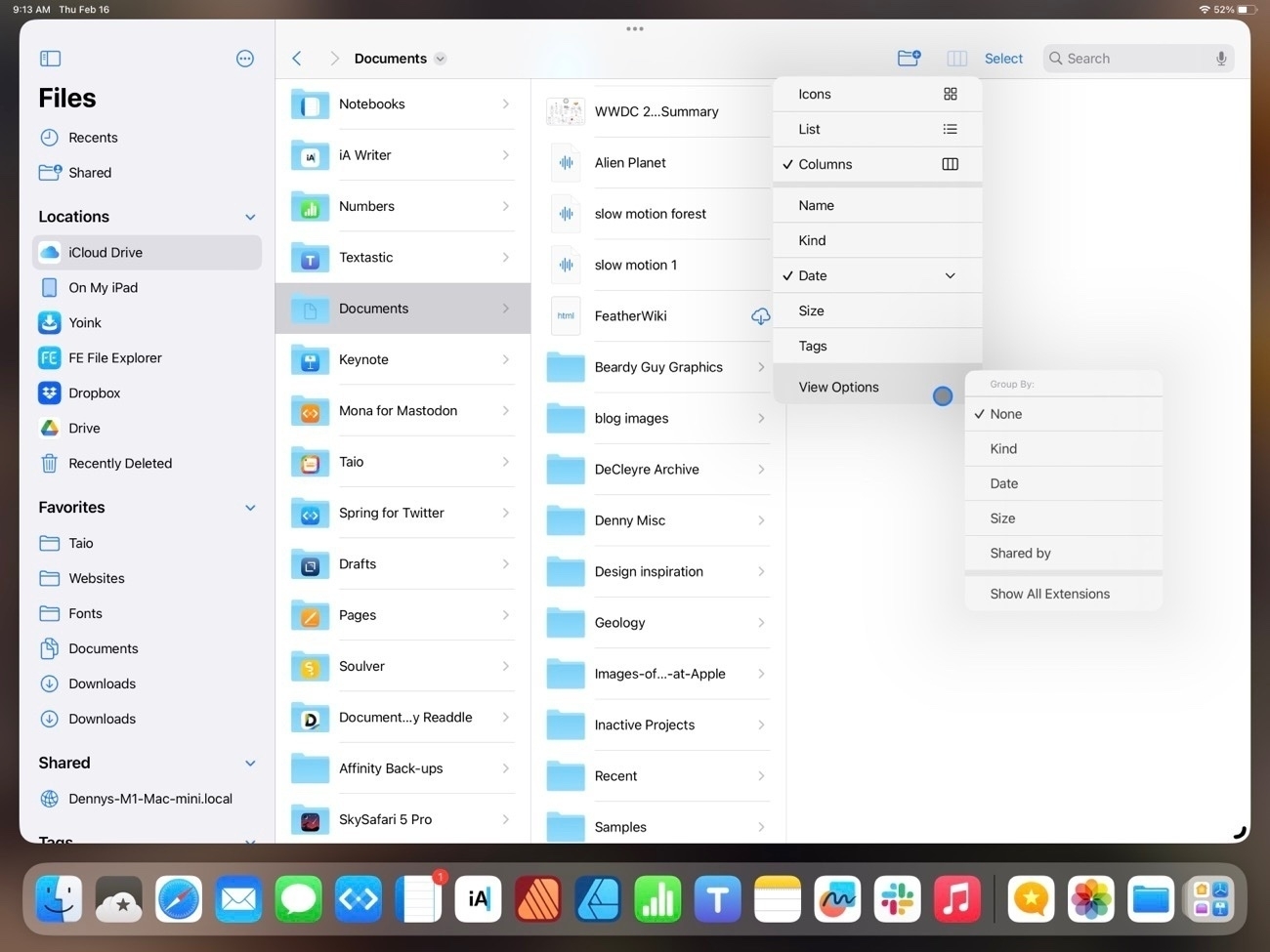
But the Mac Finder remains the better of the two in at least two areas. One, the customization of the top tool bar. The iPad toolbar cannot be customized and some of the options that we see on the Mac, while available on the iPad are only accessible by tapping the 3 column icon which reveals list view, icon grid view, sorting and grouping:
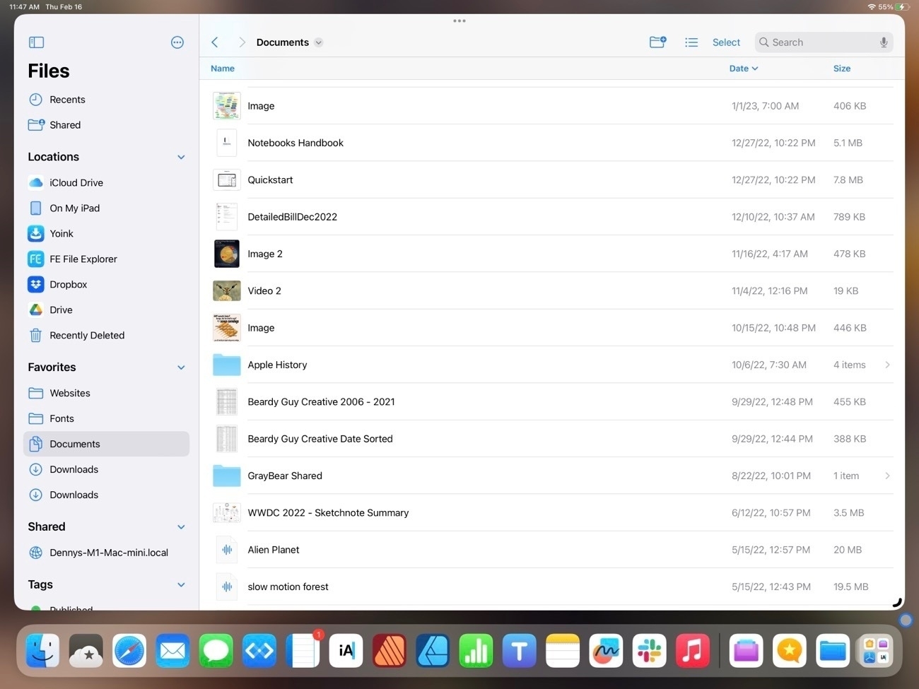
Also, the list view of the iPad is still really limited when compared to the Finder on the Mac. Currently there are three columns available with no possibility for additional columns. If a user chooses to sort by kind or date the column that is displayed changes to reflect the sort. On the larger iPad it would seem there is room for a 4th column.
One advantage the iPad has over the Mac is the additional options in Quick Look on the iPad when viewing a pdf. These options are on the Mac in the Preview app but on the iPad a pdf can be edited right from the Files app Quick Look, a nice convenience:
In previous years one complaint about the Files app was the lack of proper external drive support. That was remedied in iOS 15:
So that’s Files on iPadOS 16. It’s come a long way since the early days. I think it’s fair to say that for most users it’s just as easy and functional to use as the Finder on the iPad. While it can feel cramped on a smaller iPad screen or on a 13" iPad when using 2 Files windows, this is a limitation due to the increased size of the touch interface I don’t see that as something Apple will be able to change.
I would like to see a more customizable tool bar and additional options for the columns that are visible in list view. Possibly an option for smaller touch targets, a kind of Files specific “Show more” view that would shrink the size of icons and text. Lastly, more consistent indexing of the content of files. Currently searching the Files app returns a mix of results depending on the content the app resides in. Some apps seem to provide an index that includes content, other apps only Filenames.
Oh, and I’d love to see Files renamed to Finder or, at least given the Finder icon. I understand that the Files name and generic icon matches the actual use of the app better. You may have noticed I’ve created a Shortcut for opening the Files app and have given it a proper Finder smiley face where it resides in my Dock. It’s as it should be.
The iPad, Apple pundits and reality
Once a year Jason Snell puts out a survey to a group of prominent Apple pundits and they grade Apple in a variety of areas. The Apple Report Card is generally a summary of the hot-takes that have been shared on podcasts and in articles for the past year. The 2022 report comes days after Apple released it’s quarterly results and the consensus that the iPad is floundering seems at odds with the ongoing popularity of the device.
While the report card was generally negative or “meh” in their view of the iPad, Apple’s quarterly results show that the iPad continues to sell very well. Apparently the general public is unaware that they are buying a failing product. In the most recent quarter the iPad had its highest revenue in nine years. But the point is the iPad has been very popular with the general public since its release. And not just the basic iPads. The iPad Pro also continues to sell well and get excellent reviews.
Out of curiosity it occurred to me to check reviews of the iPad on various online retailers. My guess is that the majority of buyers at Amazon, Best Buy, Walmart, Target, etc are likely to be a somewhat accurate representation of the general public’s view of the device. These are people that probably don’t spend their free time focused on the latest Apple rumors, news, betas, etc. I’d guess that most don’t listen to Apple or tech related podcasts. Reading through the reviews it’s hard to know if many of these folks ever dig in very deep. Some state their use cases, many don’t. Many state that it’s their first iPad, some note that they’ve had several and keep coming back. I’m not going to suggest that such reviews, possibly based on just the first few days or weeks of use have much depth to them. But as I’ve often mentioned in other posts here, the iPad has served as an important computer in my extended family, the kinds of users I’d guess are fairly typical. And yes, it’s often casual use. No one in my family have any idea of what “power users” think of the iPad or what the latest features are. Stage Manager what? What’s this Split View thing?
But, I hear you saying, the critique coming from the Apple pundits is more thoughtful, considered and informed. These are people who spend a lot of time thinking and talking about Apple tech and they are better positioned to offer a more in-depth analysis.
Well. Not so fast. I’m going to pick on Marco Arment to make a point. In episode 520 of the Accidental Tech Podcast in a discussion about trying to find a place for the iPad in his life he complains about how difficult or impossible it is to do a simple multitasking type task on the iPad, stating that is easy to do on the Mac. The task he was trying to do was refer to an email and/or attachment in his inbox while composing an email at the same time. He also mentions being able to refer to an Apple Note while doing this. Listening to the podcast one would think yeah, that’s something that should be doable on a computer, why can’t it be done on an iPad?
It can. Very easily and using a feature that’s been around for 2 years. In fact, it’s a feature that was prominently noted by Apple and yet this “well informed” Apple commentator doesn’t know how to do it. He makes his living discussing Apple and yet when Apple introduces features to do exactly the sorts of things he wants to do he is unaware of them 2 years later. The feature is enabled by a simple tap on the 3 dots widget in the center of a mail window, in his case, an email he was composing. All he had to do was tap or click the 3 dots and choose Split View. This would have placed his compose window into a split leaving his list of emails accessible for browsing and reading as he composed. Then he could easily bring the Notes app up into Slideover to reference a note. Or, if using Stage Manager in iPad OS 16, replying to an email creates a new window by default. In this case no added step would be necessary.
This isn’t the first time I’ve heard an Apple pundit make an uninformed statement about something the iPad couldn’t do because of a missing feature. It happens often enough that I’ve noticed it on a fairly regular basis when these kinds of conversations are happening. In agitated hot takes they proclaim that they want to use the iPad but they can’t because it simply cannot do what they want it to do.
But the truth is that it’s often the case that the iPad actually does far more than many users know is possible simply because they have not taken the time to use it. Easier to assume and complain rather than take the time to actually learn the features that available. As I’m writing this I took a break and I kid you not, up pops this question from another Apple/tech journalist I follow on Mastodon:
It's simple to convert images to different formats in macOS, you can do it literally using a couple of taps from the desktop. Why is it such a pain in the ass on iOS?
To which I responded with the below text and 2 screenshots to illustrate:
It's literally built into the Files app and accessible in a couple taps. You don't even need to use a shortcut. Tap and hold an image to get the context menu then go to Quick Actions then choose convert image. It can also be done from the column view in the Files app. See second image with arrows. Just as simple. So, not a pain in the ass?
After posting I checked on my Mac to confirm and yes, it is exactly the same action done in exactly the same way on the Files app as it is on the Finder app. It perfectly illustrates the point that many Mac users just assume features are not available when, in fact, they are. Given that the method here is exactly the same across all devices I can only guess that zero effort was made to look.
Perhaps the most well known iPad user is Federico Viticci who has made his living as a podcaster and tech writer for several years. For most of that time he’s been a passionate advocate of the iPad as a real computer for getting work done. It’s kind of his thing, a part of his online identity. But in recent years he’s become increasingly frustrated with iPadOS and dissatisfied with what he perceives to be a lack of progress by Apple. In his own contribution to the 2022 report card he rates Apple’s performance on the iPad in 2022 a 1/5 and introduces his comments thusly:
Speaking of dropping the ball: I’m sorry to say this, but that’s exactly what the company is doing with iPad and the iPadOS platform. Unless the company course-corrects its decisions with Stage Manager in the near future, shows they can still innovate in terms of hardware, and, more importantly, starts listening to the concerns of power users, I’m afraid even the most die-hard iPad users like myself will have to accept reality and consider other options.
My problem with his statement is that I think he’s assuming too much authority. He’s one user. No doubt that with his website and large social media following, he touches base with a pool of users many of which might agree with him. But there are “power users” that are actually very satisfied with the iPad as it is today. It’s great that he’s passionate but he’s one user with a particular set of needs and desires.
He concludes his thoughts on the iPad:
I want to continue loving the iPad, but, at the end of the day, I also need to get my work done and I’m tired of having to rely on separate machines (an iPad Pro and Mac mini) to do all the things I need to do. At the moment, the iPad seems to be stuck in this limbo of “more than a tablet but not quite a desktop-class computer”, and I think it’s time for Apple to do some soul-searching and make up its mind. The device is called “iPad Pro”, but this gray area surely doesn’t help pro users at all.
It seems likely to me that Federico is just better served with a Mac if he’s going to stipulate that he wants to work with only one computer. Much of his work is podcasting and at the moment the iPad does not have all of the audio capabilities he needs. Until it does he’ll need the Mac, it’s that simple. But again, his constraints are his, not mine. I’d guess that the vast majority of iPad Pro users are not podcasters with his specific needs. I’d also guess that most iPad Pro users are not professional YouTubers/video creators that need Final Cut Pro. I’d further guess that most iPad Pro users are not app developers that need XCode. These are work flows and Pro apps that are often brought up as barriers to adoption and they likely are a barrier to a very small subset of users.
I’ve read and listened to Federico since the beginning of his publishing of MacStories and always enjoyed him. But in the past couple of years I’ve observed that his tone and approach have shifted. Even as iOS on the iPad was forked into it’s own iPadOS variant and continued improvement year to year, Viticci has become more critical. This has coincided with other prominent iPad content creators doing the same. It’s also coincided with Apple’s transition away from Intel processors, bringing a new era to the Mac with it’s own homegrown Apple silicone starting with the M1 Macs and now the M2 Macs. It could be a coincidence but with that transition and excitement many Mac enthusiasts who had been complaining about the stagnation of the Mac were buoyed by the giant leap forward. Suddenly their beloved Macs had the fast Apple-designed processors that the iPad Pros had been featuring as well as the fantastic battery life that came with them. It seemed to trigger a flood iPad enthusiasts who quickly jumped back on the Mac bandwagon each offering long lists of reasons for their move back to the Mac. This does seem to be a part of the larger group behavior.
But really, it’s not my intent to fall into a rabbit hole about the dynamics of the “Apple Community”, which is itself an interesting, strange sort of thing. But rather to point out that over the past 3 years Apple has steadily if slowly improved the iPad experience by deepening iPadOS with a host of new features year by year. But the prominent content creators seem determined to maintain a willful ignorance (see the examples several paragraphs back). Another example, three years ago one of the big iPad problems being discussed repeatedly was the Files app. “Just bring the Mac Finder to the iPad!” While the name has remained Files, the app now much more closely resembles the Mac’s Finder. It’s not identical but it’s very close now. Open up Files and take a close look, compare it to the Mac and it’s obvious Apple put a lot of effort into making this app work better. And it does. In my experience I would say it’s very close to being on par with the Mac Finder. The complaints stopped but were replaced by other complaints. The goal posts are always moving. The last two years has seen a shift towards “we need free form windowing” and “better multitasking” and “pro apps”.
The problem here though is that aside from the repeated calls for Apple to release its pro apps, the other requests are fairly open ended. Windowing and multitasking can take many forms. Stage Manager is the current form of that windowing and addition to multitasking but it’s Federico’s opinion that it’s broken. Many might agree. But there are some users who like it and I’m one of them. Is it perfect? No. But I find it useful and enjoyable to use. Federico states that “this gray area surely doesn’t help pro users at all” but he’s wrong. It just doesn’t help him.
I would urge the Apple podcasters that have such strong feelings to remember that they are not everyone. Their needs are not everyone’s needs. It is possible that there are users beyond their personal experience or imagination who are finding the changes brought to iPadOS each year to be improvements. If your needs are not met by the iPad there’s good news, you can use a Mac or any number of other computers. That’s fantastic. Pick the right tool for the jobs you need to do.
And let me be honest, I’m just a goofball in the woods that can be pretty energetic in my own opinions. In recent years I’ve written quite a bit about how much I enjoy using an iPad. In the years before that the Mac was my favorite computer and I often wrote about that too. But my blog is tiny and I’d guess my readers total less than 10. I blog for fun about the stuff I enjoy and love. More than anything I want to celebrate the cool things we can do with our tech.
So much of the Apple community seems to have taken on a persistent negative tone, a constant stream of hot takes and gotchas about the thing that’s just not good enough. Don’t get me wrong, I understand that critique has it’s place. It’s how progress is made. From what I’ve read Steve Jobs was often intense, demanding in the creative and design process and as the story would seem to demonstrate, it led to same pretty great things. But perhaps we could do with some humility and empathy too?
I started writing yet another post about iPad and the Apple pundits' hot takes. That post has now turned into two posts one of which is comparing today’s Apple-oriented online culture to the late 90s and early 2000’s. And now a third post writing about the other two posts. 🤣🤓
Some iPad users really should just use a Mac
And so it goes, Federico Viticci continues to be unhappy with the iPad. With that article as wall as his other recent posts and podcasts and I can’t help but conclude that it’s probably time for him to move on to the Mac. Same for many of the other comments I’m seeing on Mastodon, etc. There’s also this post by Hey Scotty, a fellow micro.blogger.
And really, I don’t think it’s all that confusing. The initial iPad was meant to be a casual, easy to use device that sat between the iPhone and a Mac. Mostly for consumption but Apple also sold the Keyboard Dock and had the iWork apps available from day one (at least Pages, not sure about the others). So even then they knew it had potential.
Fast forward 6 years and the device is getting more powerful and they release the larger iPad Pro. And it just goes from there that the hardware is obviously very powerful and Apple, noticing at least a small group of users are increasingly enthusiastic about the device as a full-on computer.
From there it’s just a process of Apple protecting the ease of use for the vast majority of iPad users that want that easy, casual, non threatening computer while, at the same time, offering new features for the “power” users. Year by year adding those features pretty steadily,
The “problem” is that the tech enthusiasts tend to have the loudest voice. Thanks to his website and the many podcasts he’s hosts, Federico’s voice and opinions are greatly magnified. And over the past couple of years he’s become increasingly disgruntled. The iPad simply does not meet his very particular needs, preferences, tastes. But again, his disgruntlement is the loudest opinion.
Setting aside all of the users the iPad was originally aimed for, I’d guess that there are lots of very satisfied “pro” users of the iPad today who are actually quite happy with the device but who’s voices are greatly muted in comparison to the very opinionated guy with the bullhorn.
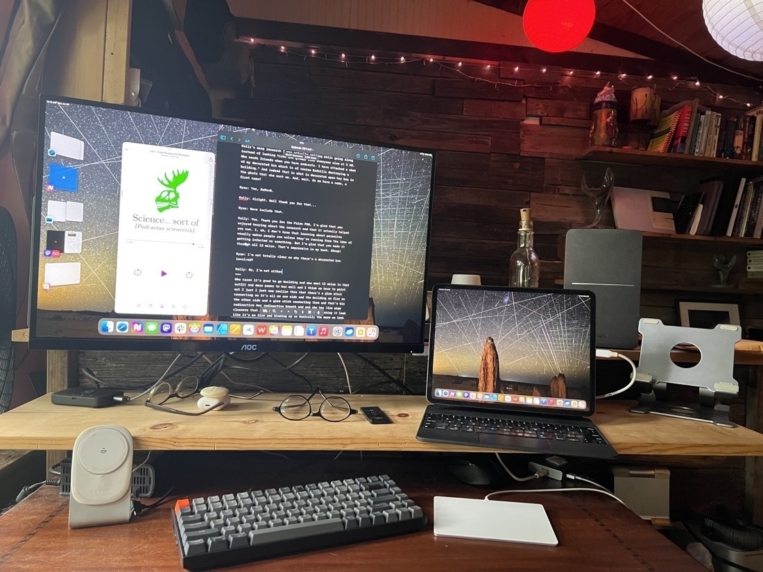
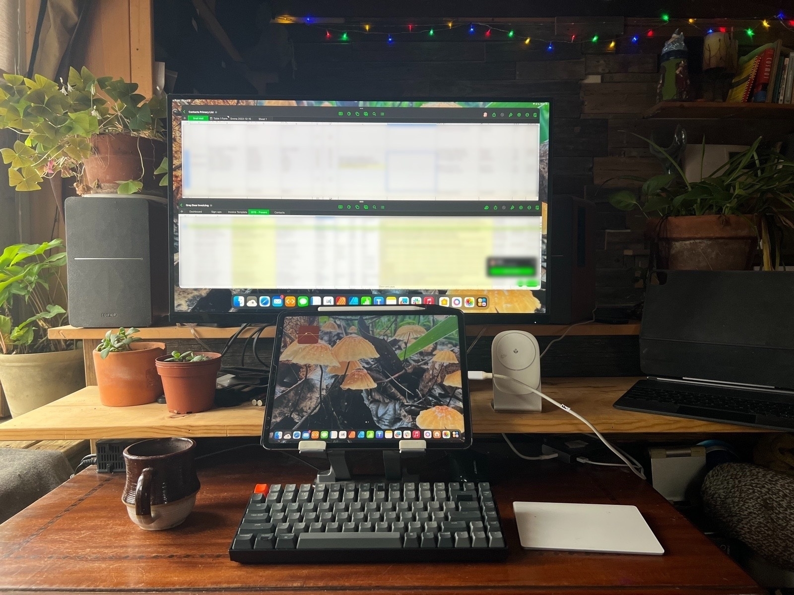
I really love iPadOS and the iPad form factor. I’m not conflicted or angry about the state of Stage Manager or multitasking. I’ve been watching with great appreciation as Apple has, year-by-year, increased the features found in important apps like Files, Mail, Safari, iWork, etc. For me it’s only getting better. And now, with Stage Manager and full external display support, it’s the mobile touch tablet that can be a laptop or a desktop computer in seconds. Attached to an external display I’m able to see more and do more as I’m doing in the photo above working with two Numbers spreadsheets, each of which has a lot of columns across and thousands of rows. Stage Manager on an external display makes my hours of work on these documents more efficient. It’s a huge win for me.
It’s a shame that the iPad isn’t doing it for Federico and others. For them it would seem the Mac is the better choice. That’s fine. It’s can’t be for everyone. Just as the Mac isn’t for everyone.
Whatever happened to the Apple oriented news media
I just realized something about the Apple oriented “press”: I don’t think it really exists anymore. We’ve got lots of podcasts and websites… but jiminy, go to any of the big Apple oriented news websites and the content is increasingly just garbage hot takes on the latest rumors, hot deals, and general fluff designed to with the primary purpose of driving affiliate links.
Just a few minutes ago John Voorhees on Mastodon posted about the current episode of Appstories podcast was about peering “into the future to try to imagine the apps that will define Apple’s rumored VR headset.” Okay, well, that fits in with months of speculation by all of the Apple sites and podcasts that this rumored headset is coming.
My reaction was to comment back asking why they’ve not done a show on the Affinity 2.0 updates, a very real product released recently and arguably important for the Mac and iPad. Especially given the attention that Affinity has paid to the iPad I expressed my disappointment that a website/podcast known for highlighting the iPad would not have at least mentioned it. I’m not sure they’ve mentioned or discussed DaVinci Resolve or LumaFusion either. Interestingly Federico commented back that they haven’t covered it because they haven’t used it. Yet they haven’t used this non-existent product from Apple either.
Now, I’m not trying to pick on Federico or MacStories. It just struck me that the Apple news oriented press is not what it used to be. My next thought was to wonder, has MacWorld covered the Affinity apps? It’s been ages since I visited MacWorld.com so I hoped over. No. No mention of it at all that I could find using their site search. In fact, I found a 2018 review of Affinity Photo but only minor mentions of of Affinity Designer and no mention of Affinity Publisher at all.
It just got me to thinking about the Apple press of 1998 or 2000 or 2002 or 2004. I guess the decline was gradual. But what a bummer that we apparently no longer have an Apple oriented press that’s willing to actually sort through actual important news. I remember the above mentioned time period and discussions and reviews and articles about Quark and Adobe. And actual attention paid to the important software and why it mattered. Real reviews of real products. I did a search on Quark and the results from pre-2012 painted a picture of an Apple press that fits my memory. Namely that they took the issue of important software and software categories seriously.
I think TidBits.com might be one of the only remaining Apple sites that still properly covers this stuff. Are there any others?
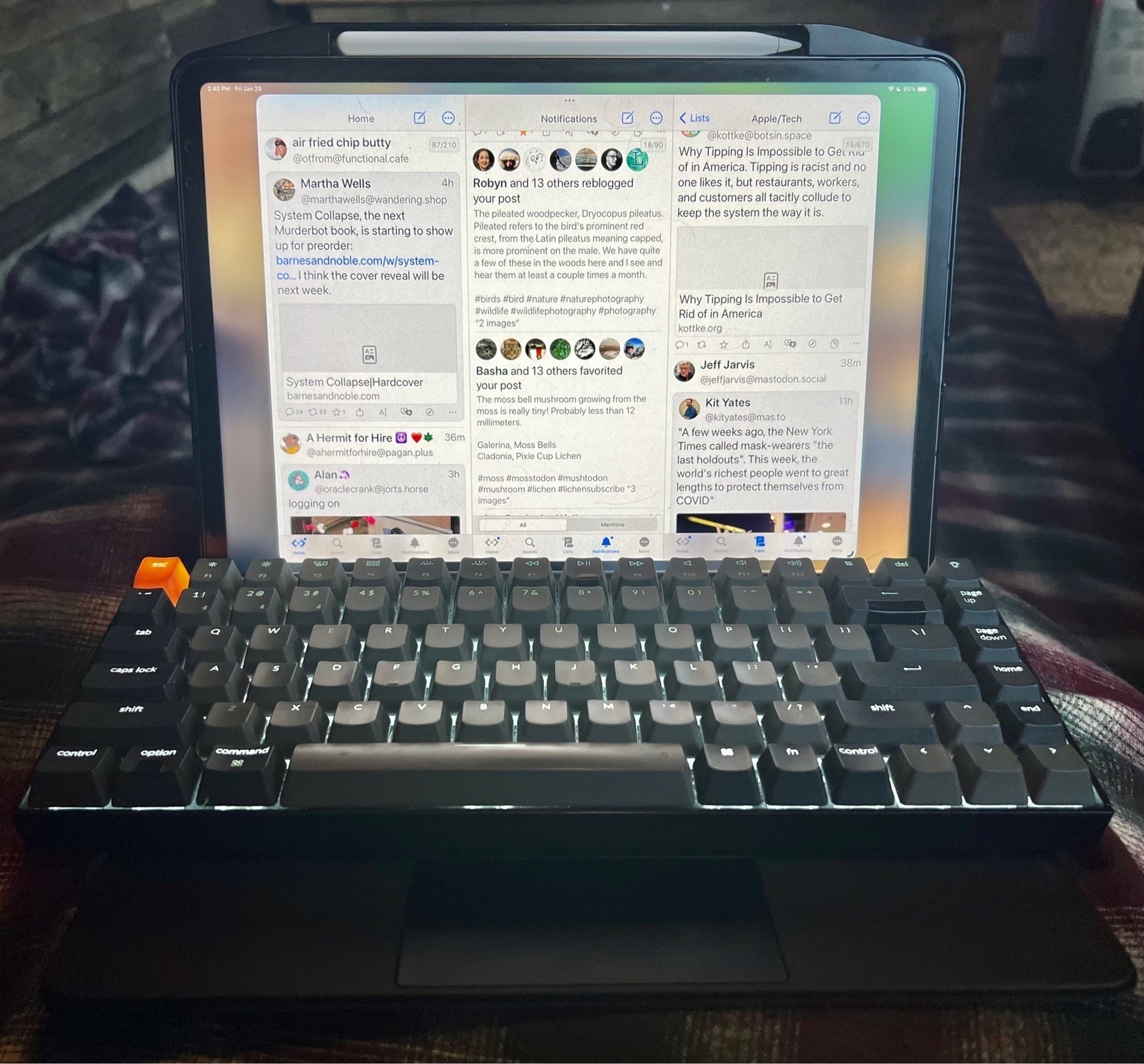
Maybe I should be embarrassed but yeah, when I'm working on a podcast transcript I like to arrange a Keychron keyboard on top of the Magic Keyboard. Helps to have the media keys. I can even use the trackpad. But, as you can see, I'm procrastinating. 🤣
Celebrating 20 Years of Apple's Safari and Keynote

On January 7, 2003 Apple introduced two new apps, both of which proved to be significant steps for the still young Mac OS X platform. The apps were a surprise to the public and press and were important steps in a much larger process of Apple building it's own ecosystem of applications which it continues today.
Of the two, Safari was likely the most significant. Apple's press release:
MACWORLD EXPO, SAN FRANCISCO—January 7, 2003—Apple® today unveiled Safari™, the fastest and easiest to use web browser ever created for the Mac®. Safari’s highly-tuned rendering engine loads pages over three times faster than Microsoft’s Internet Explorer for the Mac and runs Javascript over twice as fast. Safari’s innovative features include Google search capabilities integrated directly into the toolbar; SnapBack, a new way to instantly snap back up to search results or the top level of any website after browsing down one or more levels; a completely new way to name, organize and present bookmarks; and automatic “pop-up” ad blocking.
Safari began it's life at Apple with the WebKit project which was a fork of the open source KHTML layout engine. Don Melton started the WebKit project at Apple on June 25, 2001. He's got a great post about Safari on his blog, published 2013.
Apple's Safari Page on Web Archive
I remember being very excited as I'm sure many were. The significance of Apple releasing its own web browser was pretty clear to Apple users. My take-away at the time was that Apple didn't want to depend on Microsoft for what was becoming one of the most important apps on a computer. 20 years later and Safari continues and is now the second most used browser largely due to the introduction of the iPhone and iPad. While I tried various browsers over the years Safari remained my primary browser and today is the only one I use for day-to-day browsing.
But their big app announcements for that day were not finished.
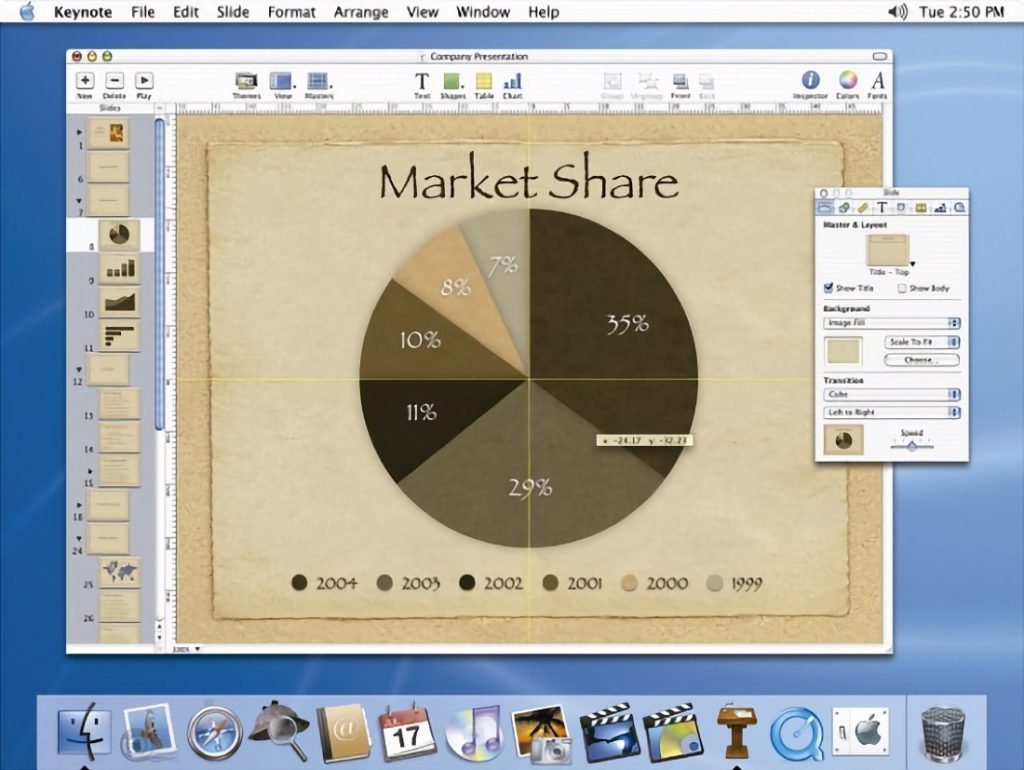
The other significant surprise of the day was the release a new presentation application: Keynote. This release seemed to further underscore Apple's intention to become more self-reliant in it's app offerings. As a user of the Appleworks suite of applications I was very excited at the new release as it filled a gap. Though we were unaware at the time it would prove to be the first of a new suite of applications that Apple would release over the next few years called iWork.
The app was originally designed as presentation software for Steve Jobs, Keynote originally retailed as a stand alone application for $99. Pages was added in 2005 and Numbers in 2007. While Microsoft continued to provide its Office apps, Keynote quickly became a favorite of Mac users due to the ease of use and quality of the presentation. I've used Keynote many times over the years and it's been a pleasure to create presentations with it.
“Using Keynote is like having a professional graphics department to create your slides,” said Steve Jobs, Apple’s CEO. “This is the application to use when your presentation really counts.”
Keynote includes 12 Apple-designed themes featuring coordinated backgrounds, fonts, colors, bullets, tables and charts. Users can change the theme of their presentation any number of times, modify an existing theme to their liking, or create custom themes to give their presentations a totally unique look.
Freeform, the new kid on the Apple block I’ve always enjoyed using Apple’s Pages, Numbers and Keynote apps so was eagerly awaiting Freeform. I think it’s going to be a useful app for a lot of folks.
Freeform, the new kid on the Apple block
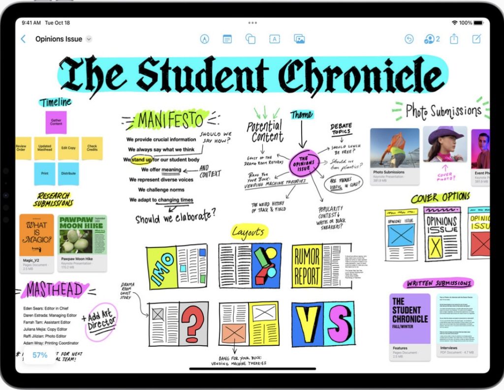
Freeform, the new kid on the Apple block In first use I immediately felt a comparison to Apple’s Pages, Keynote and Numbers would be in order as Freeform seems a natural companion to those apps. In fact, one of Apple’s own marketing images demonstrates a potential use of Freeform as a collection point for digital assets including Pages and Keynote documents. In this marketing image a Freeform document is being used to organize an issue of a school newspaper and contains various embedded documents including PDF, Pages, Keynote, web links and images. It’s clear that Apple intends Freeform to be used a collaborative collection point of not just ideas or process, but of project resources.
Like many others in the Apple ecosystem I’ve been using Pages, Numbers and Keynote for many years. In general, the formatting and style features are just a small subset of what’s available in the other Apple apps like Pages and Keynote. Given this is the first version of the app it’s not too surprising that there might be some missing options. Here’s a sample of what’s missing:
While Pages, Keynote, and Numbers all have a standard, uniform UI for design and formatting tools, Freeform deviates from the other three in small ways that seem unnecessary. Why not stick to the same UI? Of particular note is the lack of a complete formatting palette. It’s possible that the more basic options are just the fact that it is a version 1 of the app.
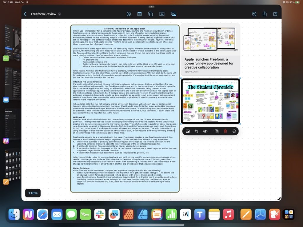
Attached File Considerations It’s worth noting that attached files are not links to originals but are copies that are embedded. One can view them without editing and in this QuickLook mode copy text. In that mode there is a button to open the file in the native application but doing so will result in a duplicate document being created in that application’s file storage space. Edits can be made but are in the new document and are not copied back to the file being stored in Freeform. So, if multiple people are sharing in Freeform it’s worth mentioning that editing of embedded documents should be done carefully so as not to result in mix-ups of edits/document versions. Any time a user makes edits to the embedded original they’ll need to manually attach the new version to the Freeform document.
I should also note that I’ve not actually shared a Freeform document yet so I can’t say for certain what happens with embedded documents in that case. What I would hope for is that in any embedded document, particularly any embedded Pages, Keynote or Numbers document, iCloud sharing with participants would be automatic. That the embedded document would become a shared iCloud document. I doubt that’s the case currently but I’d hope for that in the future.
Will I use it? I tend to work with individual clients but I immediately thought of one use I’ll have with one client in particular. I manage his website as well as design promotional postcards and posters. Add to that various graphic and document designs during the year as needed. Typically he sends requests for edits, new pages, new documents via email or Messages. About a 50/50 mix and that’s always worked pretty well. Sometimes its just text, other times it’s a Pages document with text and images to be used. The main downside to using Messages is that over the course of a busy day or days, it can become a bit tricky following a thread of files intermixed with commentary about those files.
Freeform is going to be a great solution in this case. I’ve already created a new Freeform document. I’ve created 4 initial landing zones to keep it organized. I’ll add new sections when or if they are needed.
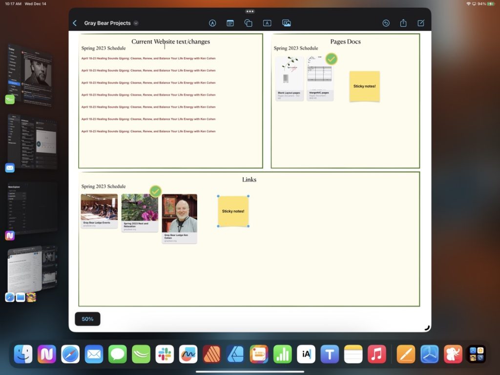
I plan to use Sticky notes for commenting back and forth on the specific elements/documents/pages etc as needed. As changes are made we’ll both be able to view everything in one space. I’ll use a green check mark from the clip art gallery as an indicator that I think something is finished and if the client needs a new change he’ll either remove it or we’ll add in another clip art indicator that a revision is needed.
Hopes for future Aside from the above mentioned critiques and hoped for changes I would add the following:
I could have waited another week for the final release of iPadOS 16.2 but the temptation to download the RC beta was too much. Spent the afternoon enjoying the experience of proper second display support! Next on the list: try out Freeform.
Tim Chaten invited me to join him on his podcast iPad Pros to talk about the new Affinity 2.0 creative suite. Affinity previously set a high bar for design apps on the iPad and Publisher raises it even higher. It was a fun conversation and my thanks to Tim for inviting me on!
Serif recently released the long anticipated major updates to it’s Affinity suite of creative apps bringing them up to version 2.0 and adding in a new Publisher app for the iPad bringing it up to full parity with the desktop app suites.
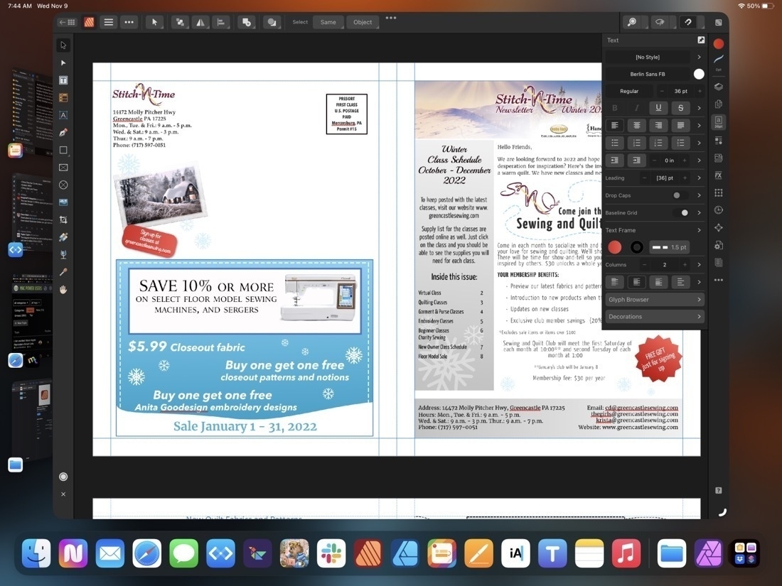
I’ve used Affinity Publisher for the iPad for a week during which time I’ve imported several of my regular, client projects, mostly, newsletters. And yesterday I just finished off a marketing one sheet and a newsletter. For the newsletter importing from the Mac version of Publisher 1 was easy, no issues. Importing from a pdf also worked very well with various images, text, shapes, etc mostly intact. Exporting the final pdf was fast and as expected. Exporting a Publisher package also went without a hitch with the expected folder of linked images, fonts, and the package file.
Publisher on the iPad works exactly as it does on the Mac with the exception that instead of the top level menu the iPad has the touch, optimized tools and what Affinity refers to as “Studios” on the right side of the window: Layers, Pages, Colors, Text, Stock Photos, Assets, Text Wrap, etc.
Using the “more space” option in the display settings on the 13 inch iPad Pro has the effect of making some of the touch points fairly small, even in full screen. Fine for using with a trackpad or Apple Pencil, but a little bit difficult with the fingers when, for example, selecting layers.
Somewhat surprising to myself is that I did most of the two projects yesterday in tablet mode using the Apple Pencil and my fingers to select text from documents provided by client to place or paste into the publisher document. It works very well and I am reminded why I enjoy using the iPad so much for this kind of work. It’s a very smooth and quick experience alternating between a pencil and fingers as needed to select, move, copy, drag and drop from Files, est. Oh, and notably, moving between pages, and using touch to zoom in and out of details on a page was super smooth just as it’s always been on the Photo and Designer apps by Affinity.
Looking forward to trying it out on an external display when 16.2 is released. I tried the trackpad a bit while importing and updating some of my other projects and it also works very well (as expected).
Not too much of a surprise for a new app there are a few issues. In my case I noticed a few font issues which others are also reporting. I also had a few app crashes though I’m using Stage Manager so it’s possible that might have been related. With the next project I’m going to use it without SM to compare. Oh, and the top toolbar is hampered by Apple’s 3 dot window dropdown widget. Totally get’s in the way of any button underneath it. Hoping I do find that 3 dot window widget useful but hope Apple increases the window chrome just a small bit at the top of windows because it’s something I accidentally tap far too often in every app. Guessing I’m not alone there. So, not really an Affinity app specific problem.
All in all, I think Serif has done an excellent job and with Publisher on iPad my full workflow is now possible on that device. My Mac will be officially retired to file/media server backup. For Mac users I have no doubt that the 3 new Mac apps are all solid upgrades. And I expect Serif will be fairly reliable in releasing bug fixes for all the platforms as they’ve done so in the past. For a one-time purchase it’s a fantastic deal if you’re someone that needs these kinds of apps.
Quick Start Guide for Affinity Publisher 2 for iPad
The Universal license provides access to all the V2 apps on all the operating systems: Mac, iPadOS and Windows is 40% off for a few weeks, only $100. A bonkers good deal!
Affinity Publisher for iPad mini-review
Serif recently released the long anticipated major updates to its Affinity suite of creative apps bringing them up to version 2.0 and adding in a new Publisher app for the iPad bringing it up to full parity with the desktop app suites.

I’ve used Affinity Publisher for the iPad for a week during which time I’ve imported several of my regular, client projects, mostly, newsletters. And yesterday I just finished off a marketing one sheet and a newsletter. For the newsletter importing from the Mac version of Publisher 1 was easy, no issues. Importing from a pdf also worked very well with various images, text, shapes, etc mostly intact. Exporting the final pdf was fast and as expected. Exporting a Publisher package also went without a hitch with the expected folder of linked images, fonts, and the package file.
Publisher on the iPad works exactly as it does on the Mac with the exception that instead of the top level menu the iPad has the touch, optimized tools and what Affinity refers to as “Studios” on the right side of the window: Layers, Pages, Colors, Text, Stock Photos, Assets, Text Wrap, etc.
Using the “more space” option in the display settings on the 13 inch iPad Pro has the effect of making some of the touch points fairly small, even in full screen. Fine for using with a trackpad or Apple Pencil, but a little bit difficult with the fingers when, for example, selecting layers.
Somewhat surprising to myself is that I did most of the two projects yesterday in tablet mode using the Apple Pencil and my fingers to select text from documents provided by client to place or paste into the publisher document. It works very well and I am reminded why I enjoy using the iPad so much for this kind of work. It’s a very smooth and quick experience alternating between a pencil and fingers as needed to select, move, copy, drag and drop from Files, est. Oh, and notably, moving between pages, and using touch to zoom in and out of details on a page was super smooth just as it’s always been on the Photo and Designer apps by Affinity.
Looking forward to trying it out on an external display when 16.2 is released. I tried the trackpad a bit while importing and updating some of my other projects and it also works very well (as expected).
Not too much of a surprise for a new app there are a few issues. In my case I noticed a few font issues which others are also reporting. I also had a few app crashes though I’m using Stage Manager so it’s possible that might have been related. With the next project I’m going to use it without SM to compare. Oh, and the top toolbar is hampered by Apple’s 3 dot window dropdown widget which gets in the way of any button underneath it. Hoping I do find that 3 dot window widget useful but hope Apple increases the window chrome just a small bit at the top of windows because it’s something I accidentally tap far too often in many apps. Guessing I’m not alone there. So, not really an Affinity app specific problem.
All in all, I think Serif has done an excellent job and, with Publisher on iPad, my full workflow is now possible on that device. My Mac will be officially retired to file/media server backup. For Mac users I have no doubt that the 3 new Mac apps are all solid upgrades. And I expect Serif will be fairly reliable in releasing bug fixes for all the platforms as they’ve done so in the past. For a one-time purchase it’s a fantastic deal if you’re someone that needs these kinds of apps.
Quick Start Guide for Affinity Publisher 2 for iPad
The Universal license provides access to all the V2 apps on all the operating systems: Mac, iPadOS and Windows is 40% off for a few weeks, only $100. A bonkers good deal!
Exciting day for users of the Affinity suite of creative apps, especially #iPad users. Serif have released the new 2.0 suite which includes Publisher for iPad. Publisher was previously only available for Mac/Windows. So, now all 3 desktop apps have been updated and all three are also updated and available on the iPad. I’ve already imported a project from my Mac into Affinity Publisher on the iPad and it’s fantastic.

If you’re not familiar with the Affinity apps, they are Photo, Designer and Publisher and are similar to Adobe’s Photoshop, Illustrator and InDesign. I dropped Adobe several years ago and have never regretted it. The Affinity apps have met my needs. Not only are they fully featured but in my opinion are far more responsive than the Adobe apps. The apps on the iPad set the bar for what professional creative apps can and should on iPadOS.
No subscription and they’re offering a launch special, all of the apps (a universal license), desktop and iPad, for $100. I think that includes Mac and Windows apps as well. Or buy the individual apps at 40% off the future full price. I don’t think I’ll use the Mac apps much but bought the universal license anyway.
As a part of my ongoing effort to reduce the number of paid apps I rely on, I used Apple’s Numbers app to create a bank/financing ledger tracking multiple accounts. Pretty easy to export csv files from iFinance to get it started. Blog post here.
Switching from a dedicated financial ledger app to Numbers
A few months ago I posted about my switch from FileMaker Pro to Numbers for my client invoice tracking. It’s worked out very well. Recently upon opening the iFinance app where I track my banking I was greeted to a message that there was a new version available. The amount is not too much but my current version works fine and browsing through the changes I didn’t see anything new that I needed. But it brought to mind that it would mean that the current version wouldn’t be seeing any more updates. Not a problem for now but perhaps in the future with OS updates. So, I had a similar thought, why not try to move my banking to a Numbers spreadsheet?
My needs are pretty basic. I wanted to mimic iFinance. I exported each account to a CSV and imported into Numbers. Then I created a master account file and set-up multiple sheets, one each for the various accounts. So, for example, Cash, Apple Cash, bank, PayPal, credit card, etc. Each is a simple line-item ledger that keeps a balance along with the usual: date, description, payee, category and note if needed.
[caption id="" align=“aligncenter” width=“800”] The table for cash on hand. Different accounts are visible in the top row of sheet tabs.[/caption]
[caption id="" align=“aligncenter” width=“800”]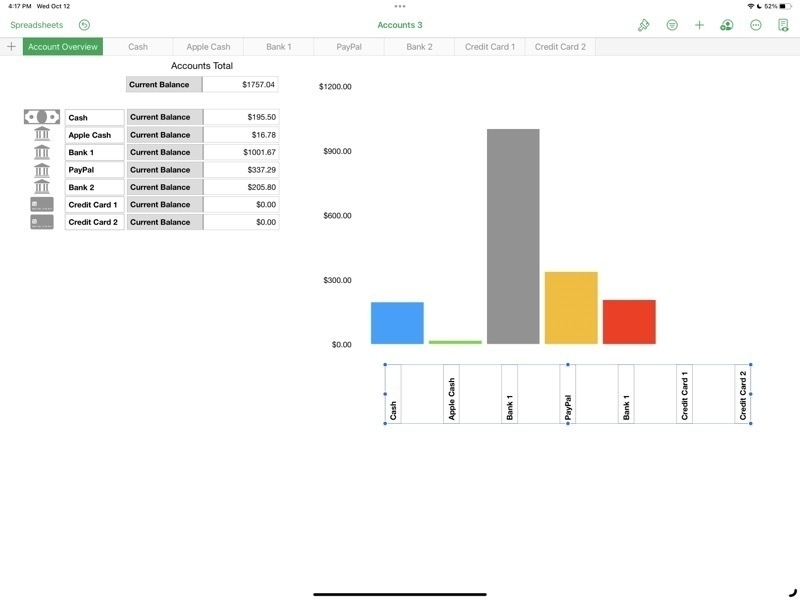 The Account Overview shows the current balance of each account as well as a bar graph.[/caption]
Stage Manager for iPadOS is coming together
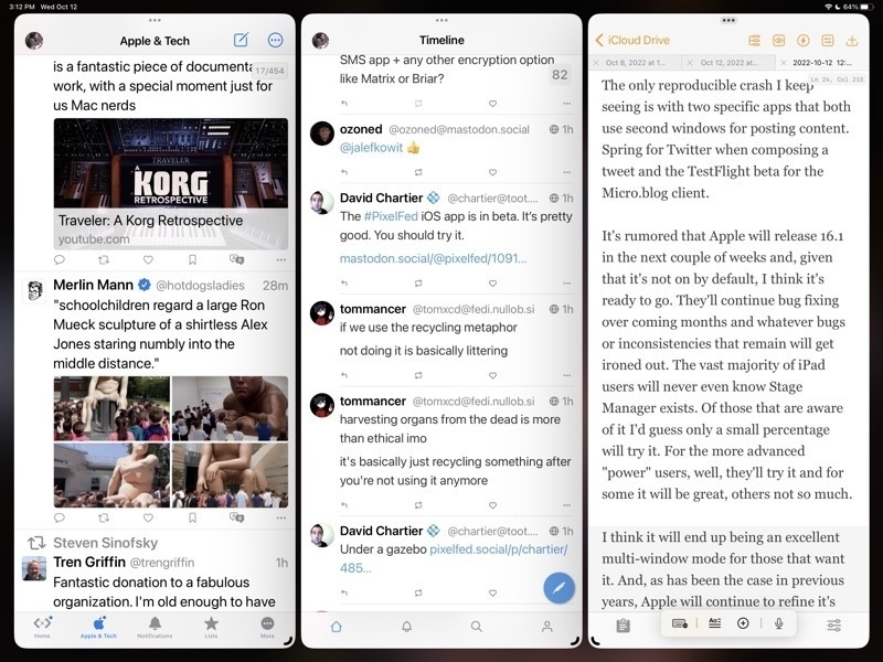
For the iPad enthusiasts that are tuned in to the various pundits of Twitter, YouTube, Blogs, Podcasts, the common narrative is that Stage Manager is a hot mess of bugs, poor design, etc. While I'd generally acknowledge that it's been buggier than recent years' beta cycles I don't think it's the dumpster fire some are making it out to be. A few thoughts.
Windowing: Free form or tiled Some will like overlapping windows, some won't. Notable iPad enthusiast Federico Viticci doesn't seem to like overlapping windows and was hoping for tiled windows instead. I do like the idea of tiled window options as an extension of the current 2 window split. Having options for 3 or 4 windows in splits might work very well. That said I think the current implementation is a good start.
As currently implemented one a general opinion seems to be that truly free form windows would be better than Apple's attempt to manage windows for users with a kind of size snapping and window juggling that seems hard to predict. Apple's goal is to make it easier but it may be that it's actually just making it harder. I think it's still a work in progress and I'm not sure if I have a preference. But I do think that with the last beta the behavior is better.
The Dock and side strip of recent app spaces
In regards to the bottom dock and the side strip of recently used apps, I like that there are options here to hide one or both in stage manager. What I'm finding is that I like to leave both on because I always have the option to size windows such that they can occupy the full screen, temporarily hiding both the dock and the strip as needed. It's easy to use a finger swipe or just push the cursor to the bottom or side to bring forth either as needed.
The Home Screen and Stage Manager
Like many who have noted, I agree that it seems silly to blur the Home Screen when using Stage Manager. Also, as noted by others, when tapping or clicking the Home Screen behind a window, it would seem to be an expected behavior that this would hide/minimize the current windows and reveal the Home Screen.
Other notes on recent betas
I'm seeing a lot of improvement, as we would hope and expect, in the latest beta released on October 11/12. Happy to see the return of the feature enabling a tap at the top of a window to quickly scroll to the top. Generally it's been very stable with fewer bugs or confusing behaviors.
The only reproducible crash I keep seeing is with two specific apps that both use second windows for posting content. Spring for Twitter when composing a tweet and the TestFlight beta for the Micro.blog client.
It's rumored that Apple will release 16.1 in the next couple of weeks and, given that it's not on by default, I think it's ready to go. They'll continue bug fixing over coming months and whatever bugs or inconsistencies that remain will get ironed out. The vast majority of iPad users will never even know Stage Manager exists. Of those that are aware of it I'd guess only a small percentage will try it. For the more advanced "power" users, well, they'll try it and for some it will be great, others not so much.
I think it will end up being an excellent multi-window mode for those that want it. And, as has been the case in previous years, Apple will continue to refine it's vision of multi-tasking on the iPad going forward.
I find Apple users' obsession with bragging about their iPhone pre-orders a bit weird. Future humans trying to survive on an over heating planet will look back to us and wonder what we were thinking.
I don’t know. I spent the morning drinking coffee and eating cake donuts.
A lot has been said in recent days and weeks about iPadOS 16 Stage Manager currently being used by beta testers. Some folks are finding it very buggy or just having difficulty with the design of the new feature. It’s far from perfect, no doubt about that. I’ve been bouncing back-and-forth between using the feature and then turning it off to go back to the default split screen multitasking. There’s much to like about Stage Manager and for the most part I’m enjoying it. If not for the buggy resprings I would likely leave it on.
I found that for myself, it seems to work best with the dock, turned off, and the side multitasking strip also turned off. Even the larger 13 inch iPad is still a relatively small screen so by turning those off I’m getting a bit more room for window content. I think the greatest potential for this new feature is probably with the 13 inch screens or something larger that might come in the future. Also it’s great on an external monitor which I use a couple hours a day.

My favorite use thus far is 3 windows side by side taking up the full screen. Two groupings in particular: Spring for Twitter, Twidere X open to Mastodon, and Gluon for Micro.blog. Another 3 windows set-up is Mail, Slack and Messages. In general I like the width of 3 windows side-by side on the 13" iPad Pro.
What would I like to see changed? Like many have commented on, when changing window sizes pre-determined window sizes are chosen for the user rather than fluid free form window sizing, and that can get to be a bit tiresome instead of being helpful. In my use it requires me to do more work than I should have to rather than less. Personally my preference would be to have free form window sizing but with a grid like snap to feature  similar to that found on  Windows. I would imagine half screen, quarter screen, and 1/3 screen, those sorts of size options. There are similar third-party apps available for the Mac that seem to be popular.
Also, when switching apps sometimes things can get a bit confusing, especially when using an external display.
Stage Manager and an external screen are proving to be really helpful. Of course iPadOS 16 is still a beta and so a bit buggy. Even so, I’m finding it still very usable and a nice improvement.
