Productivity
- In general, I prefer the Taio interface as it always shows the sidebar of files. If I want to go full screen I can but I like seeing the files all the time.
- Taio does nothing with hashtags for searching whereas 1Writer recognizes tags and a click to a tag brings up other files with that tag, showing them in the sidebar as an auto-populated search which is fantastic.
- Search in 1Writer is generally much better as it also searches file content. Search in Taio is nearly useless as it basically searches titles.
- When it comes to editing vs previewing Taio creates a mess of tabs along the top of the document window. Open a file to edit then switch to the preview and you get a new tab showing that preview. Tap on a link in that preview to another document? New preview tab of that document. Want to edit that document? New tab. Now you’ve got 4 tabs open! It can get out of control quickly. By comparison 1 Writer does everything in one window. Much tidier. And if I want nearly real-time html preview with clicking to other files I can bring up a second window of the file I’m editing and put it in preview mode. Works very well.
- Copy plain text, formatted text or html
- Email plain text, formatted text, pdf attachment or plain text attachment
- Print as plain text or formatted text
- Open in plain text or pdf which then goes to the standard share sheet
- Ads
- Apple+ is Apple’s new News and magazine service and the stories are mixed into my feed. Sometimes a new magazine will take up nearly half a page. If I were a subscriber I’d be okay with that but I’m not and I have no option to turn it off.
- When sharing Apple News articles the link is a proprietary Apple News format. Fine for sharing to Apple users but I often share to a Slack group that has several folks who don’t use Apple. I’ve got a fix in the form of a Shortcut that converts but I should not have had to do that.
- The training is not all that great. I often see stories I do not want to see and it seems no amount of training with dislikes helps. Even worse, when I block a source it often persists for a day or two rather than disappearing immediately. No, no, no, I don’t want to see stories about the British royal family, not interested in sports either!
- Last, some stories in Apple News have ads and some stories, if viewed on a web site would have comments I’m interested in seeing. So, while the reading experience is often great, it can also be a bit cluttered and often requires that I load the story in Safari.
- Or the recently updated LumaFusion video editor. I just started using this today and as many have already said, it is as close as we currently have to Final Cut Pro for the iPad. ↩
- Special Keys: I DO miss the lack of media playback keys which are especially helpful when using Apple's Podcast App in split screen for transcription work. That said, reaching up to the same spot to pause and start isn't killing me. Same for the volume keys. I'd prefer to have them but will get along without them.
- The Smart Keyboard/case is very stable thus far. I've used it in may lap during much of every day for the past week. But I've found that it is most stable when used on something and conveniently, almost by accident, I set it on the box it was packaged in as I was setting up the iPad the first day. The first time I picked it up to use it I left it sitting on that box which provides a lightweight and stiff base. It's perfect. I haven't even used it in my lap without that box under it. Confusing at first but now that I've done it a few times the folding of the case over the top of the iPad is very easy as is opening it and setting up the iPad for typing. The two together are very compact and light. I'm really glad I went with this case.
- Typing has been great. Just as I remembered from the 20 minute test in the store, this keyboard is a real pleasure to type on. When I set-up on Tuesday I was halfway through a 75 minute podcast transcription so of course I finished that transcription using the new set-up and I required no time to get used to the new keyboard. It's every bit as enjoyable to type on as my to Logitech keyboards. No, actually, it's more enjoyable with less key travel but with a satisfying movement and light tappy sound.
- Of course, it was pretty fast on the Air 2. See, mostly, the Air 2 felt very fast to me. I was not unhappy with it and were it not for an iPad with this screen size I would have likely just kept using the Air 2 which says something about how fast older iPads and iOS are. ↩
- Set-up a new website for Revival Trade and Coffee Company. This entailed purchasing domain, configuring account, setting up files on server, creating and editing raw code on html and CSS files using Coda. Image optimization via Workflow. Various file transfers to and from local Mac with Transmit.
- Used Transmit to retrieve a pdf from a server then marked it up for review by a client.
- Updated a website with new pdf content which was converted to jpg and web optimized.
- Converted another pdf to web optimized jpg for client use on social media.
Switching from FileMaker to Numbers for Invoicing
I began using FileMaker around 2001. I developed a handful of databases for clients but in recent years I've just been using it for my invoicing system and for personal projects. This past fall it occurred to me that it might be time to move on. I was thinking in terms of future updates, cost, simplicity and easier access to data from multiple devices. So I started looking around at possible small database apps as well as the possibility of using Apple's Numbers app.
I've been a long-time user of Apple's iWork apps and honestly, I love them. Pages is the one I've used the most but I've also spent a good bit of time in Numbers and have really enjoyed using it. Could Numbers replace FileMaker for my invoicing? It's not something I'd ever considered as FileMaker is ideally suited to this purpose and my FileMaker invoicing is a database I've been using and evolving for over a 15 years. It's perfect for me and works well on my iPad with FileMaker Go. Why in the world would I ever switch to Numbers? It's not really the best app for this kind of task.
FileMaker, while a fantastic app, is really more than I need. It's expensive (for what I do with it) and new versions of the desktop development versions as well as mobile versions are released fairly often. But I don't actively work on FileMaker projects for clients these days and my only use in-house use is invoicing. And while my slightly out-of-date versions of the mobile and Mac apps get the job done I don't know when they won't be supported on my devices in the future. Even now, I've recently switched to the M1 Mac Mini and I'm not sure the version I have will run natively. I haven't even installed it on the new Mac. I have not opened it on the 2012 Mac Mini in a year or so. On the iPad, where I use it the most, I'm at least one version behind. Various reviews of the most recent version of FileMaker Go for iPad indicate that it's buggy so I'm not interested in updating.
Not only is there the cost factor, there's also the simple fact that I don't need the growing power and complexity of FileMaker. My invoicing needs are fairly minimal and in recent years it's largely remained the same with the exception of a few visual design changes I made a couple of years ago. With FileMaker, a database, especially a multi-table database, can begin to feel like an app in and of itself. Thanks to the power and flexibility of FileMaker, it really is an app to develop systems that begin to resemble applications themselves with a multitude of layouts and interfaces.
I briefly considered a few database options such as Airtable and Tap Forms but decided to try Numbers first. My reasoning was that Numbers likely has a stable development future and comes free with every Apple device. It's an app I'm familiar with and, though a spreadsheet application rather than a database app, I expected it would be enough for my needs.
Simplicity in use is another aspect of what I was considering in this move. With a switch to Numbers I am getting seamless sync between devices. With FileMaker I was using FileMaker Go on the iPad most of the time and just copying that over to the Mac as a back-up or to make changes to the design of the database where the Mac is a requirement. iCloud makes copying unnecessary and all changes can be done on the iPad, Mac or iPhone for that matter.
So, with the intent of exploring Numbers as an alternative to FMP for invoicing I began to tinker. My first effort resulted in a sort of dashboard file with two tables. One table was to record line items date, client, description and time worked. The second sheet would be an overview of invoices with totals and paid status. Then, each client would then get their own, separate Numbers file, each new invoice would just be a new sheet with the date for that invoice. So, I'd have an Invoices folder with Invoice Dashboard.numbers and then ClientName.numbers for each clients invoices. When it was time to send an invoice I'd do a quick filter for client name to get all of the unpaid time slips for that client, copy the rows then paste into a duplicated invoice sheet for that client. One benefit to this would be that if, at any point, I wanted to have a quick view of a particular client's invoices they would all be accessible in that one file, organized by date in individual sheets.
I think the above method would have worked fine but before I could really test it I came across a macmost.com tutorial on creating a single file numbers invoice and that seemed a better way to go. I downloaded the sample file and began making a few customizations. I concluded this method would be a better solution. It consists of three sheets, each with it's own table. The first sheet is for adding clients and their contact info. The second is for line items/consultations, I just add the client ID then the date, description, rate time. The third sheet is the invoice. After watching the video a couple times I think I have a pretty good idea about how some of the more complex features work and I see the logic of setting it up this way. With this method the "Invoice" sheet is an invoice template that uses the Lookup function and present the data for the client ID number provided. All of the associated/related line items for that client that are not marked with a paid date will appear in the invoice. Then I just export the invoice as a pdf to email. Once an invoice is paid the date is added to the paid cell for each of the line items in that sheet.
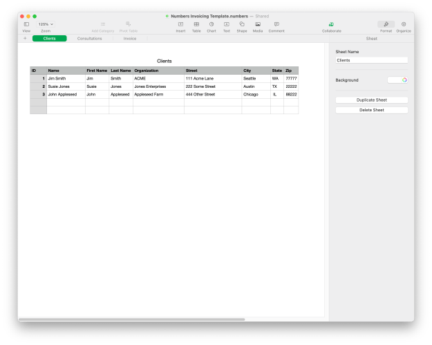
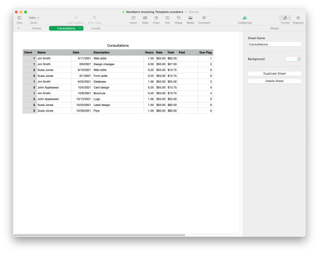
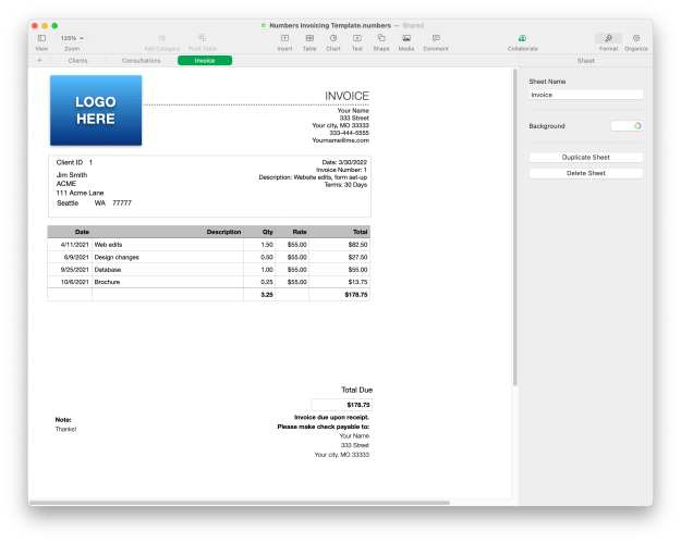
After four months of use I think this will work well as a long-term replacement for FileMaker.
--
As a follow-up, part two of this story, a couple of months after I transitioned to this new system, one of my website/design clients asked me for advice on setting up a system for tracking/creating invoices and various other bits of data for his retreat which provides courses, lodging, etc. I'd just assumed he had a proper system in place as he's been running his business for 20ish years. No, not so much. He's gotten by with a patchwork reservation/invoicing system but concluded that it was more work than it needed to be. We went over the various options and I explained my recent transition from FileMaker to Numbers.
Within a day or two I further modified my invoice system with new features and sheets to cover his more complicated needs. What I've learned is that Numbers is far more capable than I ever realized. Over several years of casual use I'd gotten a lot out of it but I knew I was just scratching the surface of what could be done with this app and now I've gotten yet another glimpse of what's possible.
Obviously, Numbers is not FileMaker Pro, it's not a relational database and there are limits. But I find it is very enjoyable to use, fairly easy to learn as I go
Keychron K2
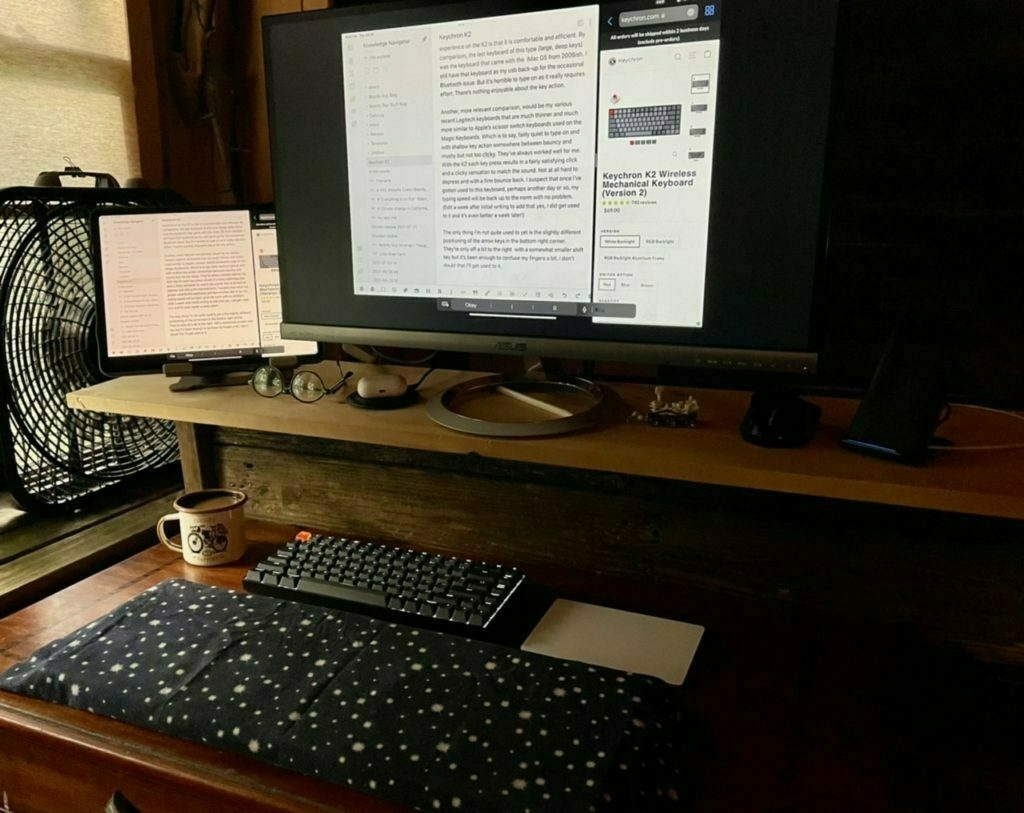 My favorite keyboard in recent memory has been the Logitech K811. I bought it reconditioned from Amazon seven years ago. It’s no longer manufactured and mine is beginning to fail. It no longer pairs reliably and at least one key has stopped working. I’ve got at least one other similar Logitech keyboard that can be used but I often have issues with it and the iPad Pro. I’m not sure why. It seems to cause conflict with the Apple Trackpad which I like to use if I’m using the iPad with a separate keyboard and a second display.
So, I decided I’d look for a new keyboard that could connect via Bluetooth and usb as well. And, while I was at it thought I’d finally take a look at mechanical keyboards. I type a lot and have heard lots of good things about mechanical keyboards. This past summer my nephew had one so I had a chance to give it a go and it was very nice. After looking at the less expensive options I settled on the Keychron K2. It seemed reasonable at around $80 and has great reviews. It arrived a few days ago and boy-howdy is this a nice typing experience!
First, I like the fact that it is Mac/iOS first. They include extra key caps for switching out 3 or so keys of you prefer the Windows specific symbols. As I’m running the iPadOS 15 beta which now makes great use of the globe key I’ve got the caps lock re-mapped to the globe key. It’s superficial but I wish that key had a globe icon. Yeah, that’s silly but whatever.
I plugged the keyboard into the iPad with the included and very nice braided USB cable and away we went. I’ve also paired it with the Mac via Bluetooth. I’ll pair it with the iPad Pro as well but with the iPadOS beta Bluetooth is currently somewhat buggy so I’ll wait till that get’s fixed.
I ordered the keyboard with the brown switches from Amazon but was sent the blue switches which are, as I understand it, the loudest of the three options. It’s not a problem as I live and work alone and they’re not that much louder. Many of the reviews mentioned that the keyboard, being quite tall, is best used with a wrist pad. I have lots of scrap wood boards that I save for projects and found a piece of cedar that was the perfect width and height to match the keyboard. I gave it a light sanding and it’s perfect. Actually, adding this a few days later, I went with a piece of wood that was both deeper, wider and taller than the keyboard. The larger and taller plank provides a platform for my entire forearms rather than just my wrist and hand. I’ve got it covered with some soft flannel and it’s very comfortable. I’m still experimenting with the best position for the trackpad.
The two things that come to mind when describing the typing experience on the K2 is that it is comfortable and efficient. By comparison, the last keyboard of this type (large, deep keys) was the keyboard that came with the iMac G5 from 2006ish. I still have that keyboard as my usb back-up for the occasional Bluetooth issue. But it’s horrible to type on as it really requires effort. There’s nothing enjoyable about the key action.
Another, more relevant comparison, would be my various recent Logitech keyboards that are much thinner and much more similar to Apple’s scissor switch keyboards used on the Magic Keyboards. Which is to say, fairly quiet to type on and with shallow key action somewhere between bouncy and mushy but not too clicky. They’ve always worked well for me. With the K2 each key press results in a fairly satisfying click and a clicky sensation to match the sound. Not at all hard to depress and with a firm bounce back. I suspect that once I’ve gotten used to this keyboard, perhaps another day or so, my typing speed will be back up to the norm with no problem. (Edit a week after initial writing to add that yes, I did get used to it and it’s even better a week later!)
The only thing I’m not quite used to yet is the slightly different positioning of the arrow keys in the bottom right corner. They’re only off a bit to the right with a somewhat smaller shift key but it’s been enough to confuse my fingers a bit. I don’t doubt that I’ll get used to it.
Review: Logitech Combo Touch for the 12.9” iPad Pro
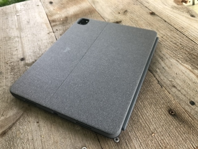
At the the core of my love for the iPad are the many possibilities that come along with a touchscreen tablet. I particularly enjoy the variety of keyboards and stands that make for the modular computing experience that seem to define this form factor. Whenever the subject of external keyboards and cases come up, it’s common for people on the internet to ask, why not just get a laptop? The simple and best answer is that I can’t remove the screen from a laptop. It’s permanently attached. And, along with that limitation, I cannot rotate a laptop from the horizontal position to a portrait position.
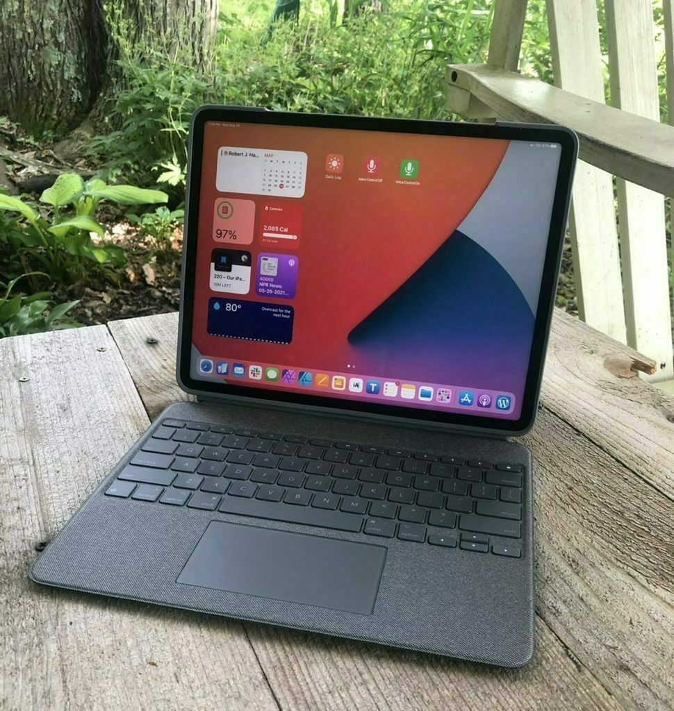
The options I considered Of all the keyboard cases I’ve tried with all of my iPads since 2010, I think this Logitech Combo Touch may prove my favorite though it’s too soon to be certain. I’ve been very happily using Apple’s Smart Keyboard portfolio that I’ve really enjoyed using the past 2+ years and considered just updating that to a new one. In the end my desire for a trackpad and backlit keyboard led me to consider Apple’s Magic Keyboard for iPad, Brydge’s Max+ and Logitech’s Combo Touch. I chose the Logitech.
Comparing features The outer material Apple uses on the iPad keyboards has not been durable in my experience so that was a strike against the Magic Keyboard especially at the price Apple asks. Add to that the missing row of function keys and it seemed I should keep looking. The Brydge Max+ was the next choice but was less protective along the edges of the iPad. And when removing the iPad from the Brydge to use hand held it would have no protection at all. It also costs more and would not be shipping till June. Lastly, Brydge has a mixed track record in terms of quality control. That left the Logitech which offered the best protection, earlier shipping and the least cost. Another plus with the Logitech was the built in kickstand for use with the iPad propped up without a keyboard. I also thought I’d like the textured fabric-like covering on the Logitech. The biggest drawback is that due to that kickstand design it has a very deep footprint and the reviews are mixed as to how that works in the lap.
It’s only been a week but here are some thoughts. I like the feel of this case just as I thought I would. The fabric-like texture is very nice, much preferred to Apple’s. It feels nicer and does not show oily smudges from contact with skin I’m really happy to have the iPad protected in a case that seems sturdy but I’ll note that it’s thinner and lighter than I expected.
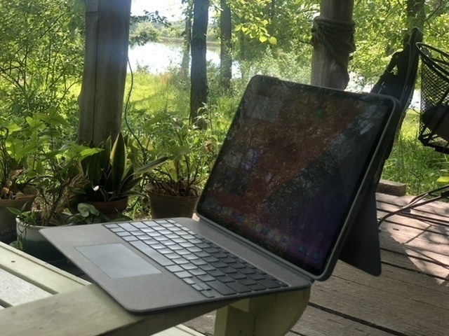
The keyboard itself is excellent just as I’ve come to expect from Logitech keyboards. Now, I should say, I’m not that picky and am fairly adept at adapting to keyboards but this one feels very well made and I type well on it. The row of function keys is a very nice feature to have and happily has screen brightness, keyboard brightness and all the other expected functions. I’m super happy that holding the lock key in the top right corner functions as a Siri key. I like using Siri but don’t like reaching up to the iPad corner button. And Hey Siri sometimes has other devices respond rather than the one I’m using.
The trackpad works pretty well. I did turn off tap to click as there’s not much palm rejection going on and so the cursor jumps all over with the slightest touch. So, still getting used to the click to click as I’ve gotten used to tap to click with the Magic Trackpad I’d been using at my desk. But the clicking works very well in all areas of the trackpad. Also, there’s a two finger click to bring up the contextual menu and that works perfectly. Lastly, scrolling and all the gestures work fairly well and smoothly. All in all, the trackpad is excellent.
What about the deep footprint? Well, when I’m using in my lap I’m almost always in my tiny house with pillows nearby and my general habit is to have a pillow in my lap. This works perfectly with the kickstand folded all the way back to it’s lowest position then propped up on the pillow in my lap. If I need to adjust how I’m sitting or move the pillow or my legs it’s easy to just reach up and adjust the angle of the kickstand to keep it stable and at an angle I want. It’s not as sturdy as I would get with the laptop style of the Brydge but it does work very well though I can imagine scenarios where it does not work as well due to more limited space.
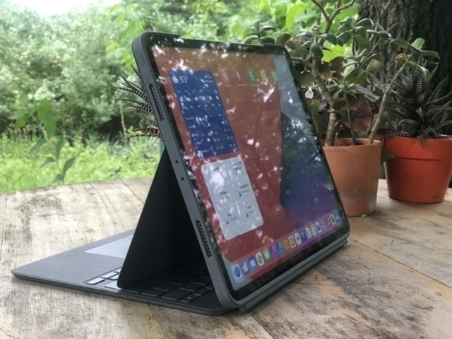
I love the iPad as both a tablet and a laptop. With this case and keyboard I can very easily pull the keyboard off the screen and still have my iPad sitting up on it’s own and still protected in a case. This is often what I’m doing when I just want to read or watch video. I can set the keyboard off to the side or even flip it backwards and reattach it as a base but with the keyboard deactivated. This last point is one of the most important of all because with this case the modularity of the iPad as tablet and laptop is at it’s best.
Experiments with Markdown Editors, Saving Content and Obsidian
Background
This post began as a post over at this thread at the Mac Power Users Forum. I started with Obsidian a couple months back but a funny thing happened. Because I do most of my computing on the iPad and there was at that time no Obsidian mobile app (it‘s in beta now), I started with my trusted iA Writer for the back-end editing of files but it does nothing with Wiki links. So I moved to experimenting with a couple of other Markdown apps, 1Writer and Taio as they both do well with wiki links (more on these two apps later). I figured I’d just hop onto the Mac occasionally to use Obsidian. A couple months in and I’ve hardly touched Obsidian but I’ve been much more proactive in writing of daily notes (a new practice that I’d long pondered) and more writing generally as a result of starting the day with daily notes.
Another result is that it’s got me thinking more actively and critically about what/how/where/why I save files. In yet another post at Mac Power Users, the topic of saving web pages as html rather than pdf files also got me thinking about file format as it relates to what I do with stored files. As a part of considering my intent, I’m also considering the saving process and the information I actually want to save. To put it plainly, I’m trying to be very deliberate about my accumulation of information I may never need. Be it whole files, text, or images embedded in pdfs, etc. The deliberation and a slightly different process adds a bit of friction but that’s good in this case. I’ve generally been pretty good about not saving everything just because I have the thought this might be useful someday. It’s a trap a lot of people seem to fall into.
An example, a few nights ago I happened upon a recipe and considered whether I wanted to save it. Recipes are a new thing for me to bother with but I am starting to save a few. Rather than just save to pdf I used a shortcut to save a markdown/text file to Files in my 1Writer folder. I hop over to 1Writer and open the new document, clean out any cruft and tag it both in the text and also in the Files app. Within just a minute or two I have a very tiny, tidy, portable text file that works in 1Writer and Obsidian and also fairly easy to find in Files/Finder. I’ve since created a Shortcut that outputs nice, clean markdown via reader view which I’ll mention later.
So, rather than dive into DEVONthink (which I had been considering) as a catch-all tool my plan is to go the opposite way. It’s also got me looking at how I use Apple Notes… largely, I’ve been far too lazy and sloppy in throwing stuff in there and not cleaning up after myself when notes are no longer needed. So, avoiding the trap of over-collecting via DEVONthink, cleaning up Apple Notes, and now…
Markdown Editors
Gah!! I consider this useful fiddling but I try to keep app jumping to a minimum as that seems to be a huge time suck. That said, I’m experimenting just a bit. As I mentioned, iA Writer is the app I’ve been using for the past couple years. Love it for compiling podcast transcripts, writing and blogging. But it falls short on Wiki links. So I did a little poking around and found Taio and 1Writer. Here’s how they compare.
Overview
Exporting
Both apps offer a variety of export options though with a very different interface. With Taio I’m presented with a simpler interface to export files to markdown, pdf, html, Docx, RTF and web archive or by copying text to clipboard as markdown or html. After selecting the standard share sheet interface comes up.
1Writer has a preconfigured set of export options with similar formats:
Nearly equal but Taio offers Docx and web archive, neither of which I need but might be useful to some. 1Writer allows for creating new actions for sharing but I’ve not explored what’s possible there.
Shortcuts and automation
Taio is much better in this regard! It offers a variety of actions to the Shortcuts app as well as it’s own built-in shortcuts like action editor. It’s not even close. 1Writer offers 1 action for Shortcuts which is to create a new document. Better than nothing! Taio offers 11 actions. Most important of these in my use thus far, I’ve got a shortcut that takes a web page I want to save, generates cleaned up markdown with a link to the page at the bottom. The Taio version of this shortcut results in an actual file containing content. The 1Writer version creates a new file for me with the text copied to my clipboard. All I have to do is paste it in. But it seems silly that there’s no way (that I know of) to create the file with the content already intact.
The built-in action editor in Taio seems very powerful. I’ve not explored it much just yet but I did create 1 automation to create a daily log file with a pre-populated template and ready to go. I’m looking forward to using it a bit more.
Extras
Last, Taio offers an interesting clipboard saver. I’ve not used it much and I’m not sure I will but it’s there and might prove useful. I’m not really prepared to offer any thoughts yet.
Both of these are excellent markdown apps that will create a folder or folders of markdown files that will play well with Obsidian. Not only are they feature rich in terms of editing they are excellent for viewing, interacting with and exporting documents. For the moment I’ve currently settled on 1Writer and expect that to stick for awhile.
All this to say that it’s great that we have so many apps/tools but I’m recognizing how easy it is to get lost in them, jumping from one to another looking for the perfect tool with all of the exact features we need or think we need. It’s easy to focus on the new shiny tool rather than actively engage with and use the information in a meaningful way. I suppose that’s one of the pitfalls of being a geek.
I guess that was a bit of a sidetrack but I think in looking at the bigger picture it can be helpful to ask what it is we’re hoping to do with apps. I expect I’ll get around to actually using Obsidian more often and it’s feature set will prove helpful when I need them. But for the most part I’m currently just enjoying the focus on writing and more active engagement with information processing for a more tidy and deliberately curated set of open, accessible files.
Still here!
So, it’s been awhile. Almost a full year since my last post here. But really, that’s just the way it goes. Interesting, looking at my last two posts from Late March and April 2020 explains why I’ve not posted here in a year which is to say that not much has changed that was really worth posting about. There are plenty of websites in the world sharing the details of Apple related news. Lots of sites discussing using Apple tech. This site is my journal of sorts where I’ve enjoyed sharing my work or my tech journey as it evolves and over the past year it has been steady-state. It’s been a fantastic year but with no new developments in how I’m using my iPad or other related Apple gear. Looking at the last two posts made me laugh because as I sit here writing I realized why I’d not posted: my set-up is exactly the same.
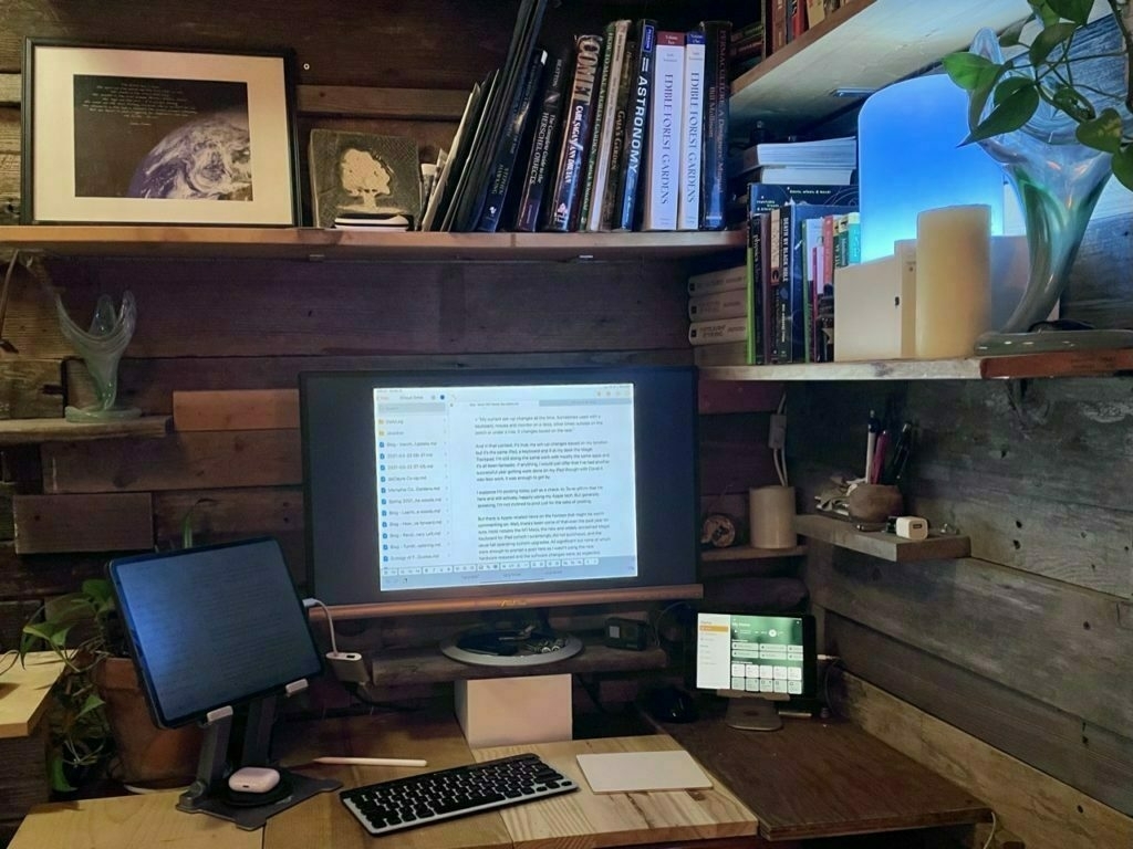
My iPad Pro, Smart Keyboard Portfolio and the Magic Trackpad 2 in a scene that is nearly identical to the second image in my March 31 post which was captioned:
“My current set-up changes all the time. Sometimes used with a keyboard, mouse and monitor on a desk, other times outside on the porch or under a tree. It changes based on the task.”
And in that context, it’s true, my set-up changes based on my location but it’s the same iPad, a keyboard and if at my desk the Magic Trackpad. I’m still doing the same work with mostly the same apps and it’s all been fantastic. If anything, I would just offer that I’ve had another successful year getting work done on my iPad though with Covid it was less work, it was enough to get by.
I suppose I’m posting today just as a check-in. To re-affirm that I’m here and still actively, happily using my Apple tech. But generally speaking, I’m not inclined to post just for the sake of posting.
But there is Apple-related news on the horizon that might be worth commenting on. Well, there’s been some of that over the past year for sure, most notably the M1 Macs, the new and widely acclaimed Magic Keyboard for iPad (which I surprisingly did not purchase), and the usual fall operating system upgrades. All significant but none of which were enough to prompt a post here as I wasn’t using the new hardware released and the software changes were, as expected, incremental.
I’m a little antsy about the possibility of a new iPad Pro being announced and I still ponder the purchase of the Magic Keyboard for iPad but given how well my current set-up works I’m not sure I’ll buy anything. My 2nd Apple Smart Keyboard Portfolio is showing the same wrinkling and bubbling that the first one did before being replaced under warranty. Eventually I’ll need to replace it with something. And in the 2+ years of use I’m definitely seeing degradation in the iPad battery. I’m just not sure it warrants replacement yet because for the tasks I use it for it remains a very fast and capable computer. So, ¯(ツ)/¯
What I‘m hoping to see is currently rumored USB C with Thunderbolt which might also come with an iOS update allowing for better external monitor support similar to what we saw last year with the big mid-cycle release of trackpad support. If I were able to have a second desktop on another display (not just the mirroring that we have now) that took full advantage of the full screen width without the black bars on either side, well, that would likely be enough for a purchase. Add to that the faster processors and 5G (in my area I‘m getting excellent 5G thanks to Sprint/T-Mobile) and that would be a very solid upgrade. Though I‘m still not sure what I‘ll do for a keyboard.
iPad and a Magic Trackpad 2
Last week marked the 10 year anniversary of the release of iPad and I shared a few thoughts. In it I mentioned the recently released iPadOS 13.4 update which added cursor support. At the time I posted I’d been trying it with a Bluetooth mouse and found it fairly helpful though lacking in a few things, namely the swiping gestures that are so integral to using an iPad as a tablet.
For the past day I’ve been using Apple’s Magic Trackpad 2 with the iPad and as many have pointed out, it’s pretty fantastic. Of course, interacting with text on a screen for editing is great but, more importantly, the Magic Trackpad 2 fully supports all the gestures that make the iPad a great tablet. For the first time ever it’s now possible to use the iPad in an elevated stand without reaching up. In the past I worked around this by using keyboard shortcuts which works pretty well. Apps like Pages and Numbers are greatly enhanced with the new cursor and trackpad. LumaFusion is another great app that’s working very well with the cursor-trackpad combination. I’m sure many other apps work great as is or will be enhancing what is possible.
About the keyboard, it is often still faster for some tasks than using the trackpad and cursor. For example, app switching via touch on the trackpad is nice but often is much faster via Command-Tab on the keyboard. An even better example, Spotlight, which I use constantly, is faster via keyboard because it works from anywhere. With the trackpad the two finger swipe down to activate Spotlight only works from the home screen.
All that said, having the new cursor is a great new option and it works perfectly with the trackpad. This configuration, a raised iPad or an iPad with an external monitor with a Bluetooth keyboard and Magic Trackpad, is going to be a really useful set-up.
A last thought about the upcoming Magic Keyboard for iPad. I’m going to pass for now. It’s the perfect device for the iPad and exactly what I’d love to have. But I’ve already got the Smart Keyboard and I’m just not sure about how much work I’ll have given the current Covid virus situation. I opted for the Magic Trackpad because it will give me the option to use the cursor in an efficient way for a lot less money and has the added bonus of working great when I’ve got the iPad in a stand.
Busy on two wheels!
Way back in December I wrote a nice (and predictable) 10 year of iPad thing. Never quite got it finished. From this point on this post is not in the least bit about the iPad or Apple or computer tech.
You see, dear reader, back in December I also purchased an e-bike. My first bike in 20 years! I was expecting to use it to ride a couple miles a day to visit with my folks who live nearby. Instead I found that my 20 year old knee injury (my reason for being off bicycles which is are one of my favorite things in the world) had, seemingly, healed over time.

My first day of riding I took it out on a county road and peddled a bit. My knee felt good. I kept peddling until I rode the 6 miles to town. I had a coffee and happily returned home. I did it again the next day. And the next. Since December 22, 2019 I’ve ridden about 1,200 miles, in daily 20 to 35 mile rides. I’ve peddled all over my county and into a couple of nearby counties exploring the countryside via back-country roads.
So, you see, aside from work related computing I’ve spent most of my free time on a bike or walking my dogs! The time I have spent on the iPad that was not work related was spent reading about bikes or writing about them for my other blog! Of course I’m not abandoning this blog it’s just that my current obsession involves another kind of tech that has enabled me to return to something I’ve long loved and missed! I’ll be around again soon.
Frictionless Posting
I’m in search of a better posting process for my two Word Press blogs. Really, it’s not that difficult. I usually post from iA Writer, sometimes the Micro.blog app, sometimes from Apple Notes and lastly, sometimes via the built in Share Sheet in iOS. Again, not really difficult. Just more taps than I’d like.
Apparently I am extremely lazy.
A few thoughts on Apple News and RSS apps
I’ve been using RSS apps since the early(ish) days of it’s existence. I think it was 2002 or 2003 that it became a habit for me. I’ve had at least one RSS app on my Mac and then iPad ever since. For years that app was NetNewsWire. I’d occasionally try others but that was the gold standard. As I recall there was a time when it became a bit stagnate and then was sold. During that time other apps popped up, namely Reeder which became my RSS app of choice. Then along came the iPad and a flurry of RSS apps along with it. I tried several but when Reeder became available for iPad I settled on that. For many Reeder took the place of NetNewsWire as the new standard.
[caption id=“attachment_878” align=“aligncenter” width=“800”]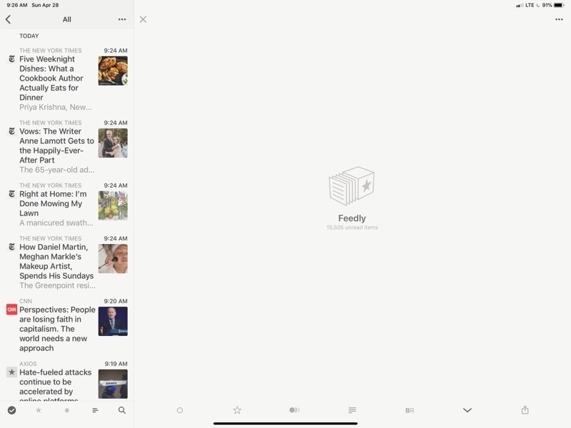 Reeder 4 on the iPad. There’s a lot of wasted space there.[/caption]
What’s the point of RSS? Well, it makes subscribing and skimming a large number of publications easy. Scrolling through headlines with article summaries becomes very easy. Rather than load an entire site I can refresh 30 or 40 and then skim through them all at once. I can do this by topic area or with all of them mixed up. In my case I’ve got groups (folders) by categories such as news, Apple, tech, environment, etc. On slower internet in rural areas it’s a fantastic help.
[caption id=“attachment_879” align=“aligncenter” width=“800”]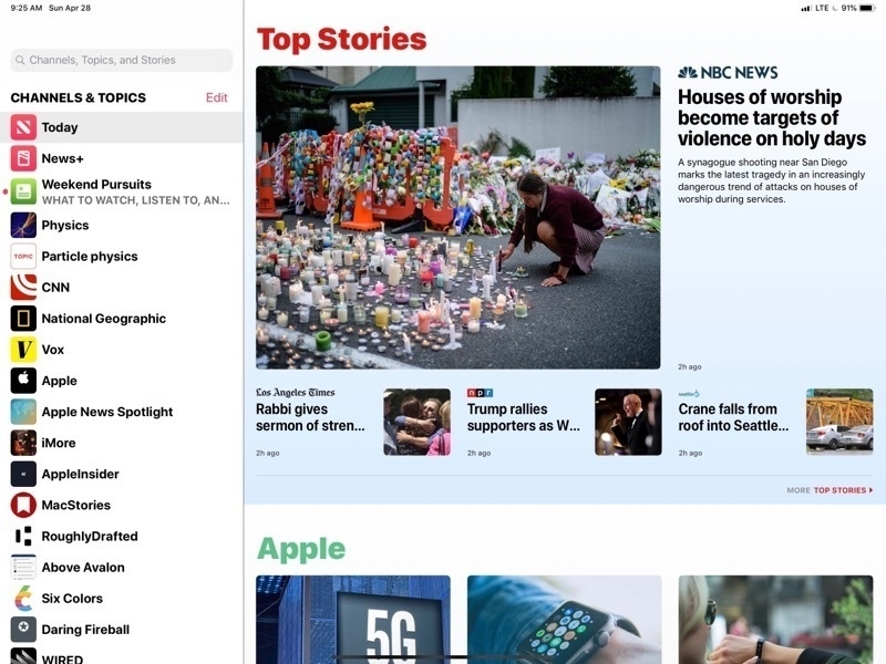 This is the Apple News page in all it’s glory. Nice images, headlines and pleasant to browse[/caption]
A couple years ago Apple released their iPad and iPhone take on a news reader called Apple News. They’d dabbled for many years with RSS built into Safari and even the mail app at one point had RSS built in. But with Apple News they built a dedicated app they really worked pretty well. While RSS and Reeder remained my primary tool I found myself gradually using Apple’s app more and more. I really enjoyed the design of the app which presented the news as a full page of news thumbnails each with an image (usually) and the headline broken up into sections and source publications that I could follow or unfollow with the ability to like or dislike stories as well as save them for future reading. Apple throws in sections and stories from other sources to provide variety and the reader has the option to dislike stories or block sources as needed. In theory this is training which is supposed to improve what Apple provides.
[caption id=“attachment_880” align=“aligncenter” width=“800”]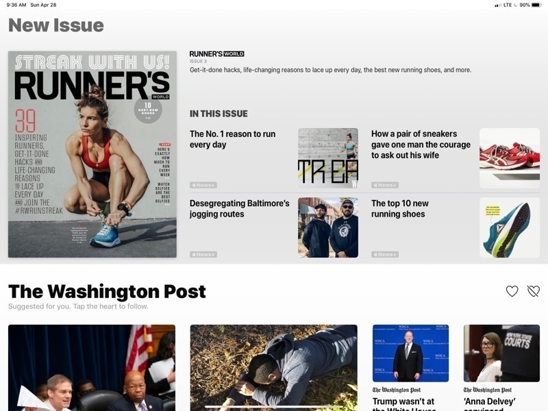 That’s a lot of wasted space for what is, essentially, an ad for Apple’s News+ service. I can’t hide it.[/caption]
What I find most enjoyable with Apple News is the full screen layout of stories, the mix of stories and the reading experience of a story. But there’s a downside (there’s always a downside) and it is three things.
But all in RSS land is not perfect. Reeder, was recently updated to support the new iPads and added a few new features. Nothing game changing but still a solid app. Funny though, I had switched to another RSS app, Newsify, which had added support for the new iPads and have come to like it’s interface as much as Reeder’s. It’s not perfect but it works. I spent the past couple days bouncing back and forth between them and found that each had features that I wished the other had. Neither felt complete.
[caption id=“attachment_881” align=“aligncenter” width=“800”]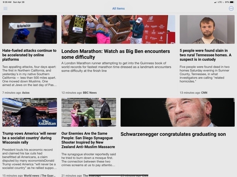 Newsify is properly using the space of my iPad to display a variety of articles with images[/caption]
After some experimentation I’ve found a solution that, I think, brings the best of all three. My main annoyance with Reeder was its huge waste of space when browsing stories. It only takes advantage of a small column on the left for browsing through articles. The primary part of the app is empty. After months with Apple News this was bothering me immediately. In the time I’d been using Newsify I came to enjoy the fact that while the number of articles displayed was about the same they stretched across the screen and more information was provided about each. Still not as nice as Apple News but at least the screen was being used! But there’s a fix that I discovered yesterday while poking around settings in Newsify: It can be displayed using “Newspaper View”. Perfect. Now I had something that looked nearly identical to Apple News!
[caption id=“attachment_883” align=“aligncenter” width=“800”]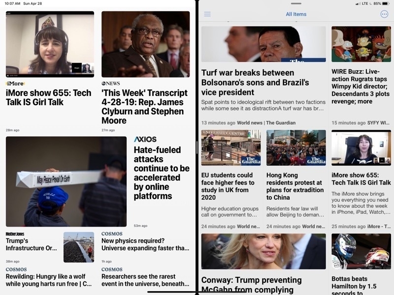 Apple News on the left, Newsify on the right. To my eyes both are very pleasing to browse.[/caption]
So, now I’ve got the article browsing I want without Apple’s ads and no Apple News+ articles I can’t read. What about the reading experience? Close. Unfortunately you’ll note that in Newsify this article does not display the full text but has a “more…” link to click through.
[caption id=“attachment_884” align=“aligncenter” width=“800”]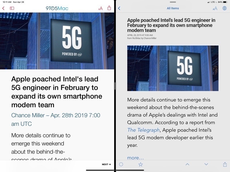 Viewing an article. Almost there but Newsify does not display the full article. Notice the “more…” link[/caption]
Of course that takes me to the full page on the website which is chock-full of ads. But Newsify has a setting which will load the page in the built in Safari View and switch it over to “Reader mode” which is, of course, the perfect uncluttered display comparable to Apple News. I just tap the article title and I’m ready to read in a few seconds. Side benefit, if it’s an article I want to view comments for I can turn off the Reader mode and they’re already to go.
[caption id=“attachment_885” align=“aligncenter” width=“800”]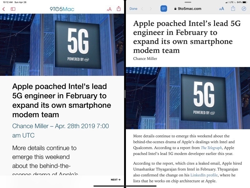 Apple News on the left, Newsify on the right in “Reader mode”. Perfect.[/caption]
Newsify does have a premium subscription which includes a full text display for these kinds of articles but either way I have to tap just once to get a result with is nearly identical.
So, with Newsify and a few tweaks to a few settings I’m getting as close to an ideal (for me) RSS reading experience on the iPad.
Improved Blog Posting from the Notes App with Shortcuts
This past October I posted about blogging from the Notes app
In that example I was just sending my post straight to the WordPress Share Sheet which works fine too.
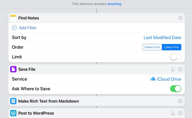
I generally use iA Writer for blogging but it’s also nice to be able to post from Notes. That said, I’d also like to have a copy of all my posts as text files. Enter Shortcuts! I’ve made a shortcut that will post to WordPress but also makes a text file that I can save into the appropriate blog folder in my iA Writer documents.
With the shortcut I’ve also added a step for making rich text from markdown which allows for me to write in markdown.
Only four steps!

Trip Cost Estimate Shortcut
I don’t travel much but I’d recently pondered the idea of a road trip and wondered about the cost. In just a minute or two with the help of Apple Maps I had it figured out. But it occurred to me that this would be the perfect use case for a Shortcut so I put this together:
Trip Cost Estimate
It asks for you to choose from your Contacts for an address or to enter an address manually. Then it will ask for your car’s estimated MGP then the cost of gas per gallon. Siri will then read you the results and offer you the option to share the text with a link to the map in Apple Maps which can be shared to Apple Notes or any other text app with a Share Sheet extension.
iPad Journal: Pages Update
It’s been awhile since I’ve written about using Pages. Last time I wrote this:
Pages is no substitute for something like Adobe’s InDesign but it works very well for brochures, small newsletters, posters and more. At the moment one of the features I miss most is the lack of linked text boxes which are often necessary for larger documents such as newsletters and annual reports. There are other limitations such as no text on path and no stroke for text, features I sometimes need for event posters and flyers. On the Mac version of Pages a pen tool is available but it is, sadly, missing on the iPad. The iPad does offer a line tool but it only allows for one curve. It would be great to see the pen tool added to the iPad.
It’s been just over a year since I wrote that and Pages has seen a few updates. Most importantly, for the work I do, Apple added back the ability to have linked text boxes. For anyone that does multi-page layout, linked text boxes is a very important feature and it has allowed me to return to larger, more complex projects such as newsletters and annual reports. With the previous version of Pages on iPad these kinds of projects were sometimes possible but also more difficult. This is the feature that allows me to leave Adobe InDesign unopened for longer periods of time. I still need it but not as often. If a client specifies that they would like InDesign used or if a print job requires it then I’ll use it. Otherwise I use Pages on the iPad.
As before, the Mac version still holds onto a few features not yet brought over to the iPad but in the past year there are fewer of them. If I had to single out one missing feature that is most likely to require me to go back to the Mac to make changes it would be the inability to specify exact line height. Why this is still missing I do not know. I can change it using the -/+ widget but that is limited to Apple defined increments: .5, .75, 1… Sometimes a line height of 1 is too much but .75 is too little. I might need .9 or 1.1.
On the plus side, Apple finally added the ability to edit paragraph styles on the iPad. This one was another significant omission from the previous version and often forced me to open documents on the Mac. Additionally, Apple has added the option to display two pages side by side which is a great benefit for quickly scanning through multi-page documents. Lastly, the ability to create a master page. I’ve got a starting template that I use for newsletters and annual reports which has border guides built in. Very handy given that Pages does not have a way of showing such things.
What I have not yet had occasion to use more than a bit of playing is the ability to draw using the Pencil. This is a feature introduced with the Apple education event in March 2018. I’ve played with it a bit and can see how it might be useful but as of now have not used it for any client projects. I look forward to the kind of project that will let me have a go with it.
iPad Journal: Multi-touch on the iPad 12.9"
I’ve been using the larger iPad for nearly a month now and continue to consider it the best Apple device I’ve ever used. For casual browsing of the web via Safari, Reeder and Twitter it is essentially the same experience as with the iPad Air 2, just bigger. I probably use split screen more for that. But that’s not why I wanted the larger iPad. I wanted it for work and as a work device it is everything I hoped it would be. And that’s with iOS 10. I expect it to get even better with iOS 11. Managing client websites with Coda while split screening with apps such as Mail, Messages or Safari is a much easier task with the added screen space. Using the recently released Affinity Photo for designing several client postcards and posters has also been a much nicer process with the larger screen. It will be better when they add split screen to it as I often need text and images from other apps while working.
Something which was unexpected: I’ve noticed is that there are times that I’m now actively using more than one touch point at a time. Put another way, I am now using two hands, two fingers on screen at the same time, to do certain tasks. In part I think this came about as a result of the bigger screen. But it was also a result of thinking about the coming changes with iOS 11 as a multi-touch operating system. The idea of using two hands and multiple fingers wasn’t something I’d really thought about before when using the smaller iPad Air 2. But between learning about iOS 11 and multi-touch features and having the larger screen iPad I think something in my brain clicked. Along with this is a more general use of two hands. I may not be actively touching the screen with both hands at the same time but I’m finding now that I am much more likely to have both hands up at the screen, coordinating actions back and forth. Which brings me to Dan Counsell’s recent post to his blog, Minimal Path, Apple should release bigger iPads:
If Apple wants the iPad to start making serious inroads into the pro market, and I believe they do, then they are going to need to release even bigger iPads. That may sound crazy, but hear me out.I agree completely. Personally, I’m very happy with my current set-up of Mac-Mini for desktop and iPad Pro for mobile. I’ll need to keep the Mac for InDesign and as a media server for Plex. But I can definitely see the usefulness of a large, 23 to 27" desktop iPad. I’ve been hoping Apple would make such a beast since Microsoft unveiled the Surface Studio. Would be fantastic for video editing with a new version of Final Cut Pro for iOS1 as well as design work with Affinity Photo and the upcoming Affinity Designer and hopefully, one day, an Affinity Layout app. An “iPad Studio” would be the perfect device to showcase working with the multi-touch capabilities coming with iOS 11. Until then I’ll happily continue using my iPad Pro.For starters, I’d like to see an iPad around the 15-inch mark, akin to the MacBook Pro. Hell, maybe even 17 to 20-inch versions. If you spend a large amount of time working at a desk you don’t need a system to be super portable, you just need more screen real estate and more power.
iPad Journal: First Week with the 2017 iPad Pro
[caption id=“attachment_447” align=“aligncenter” width=“2597”]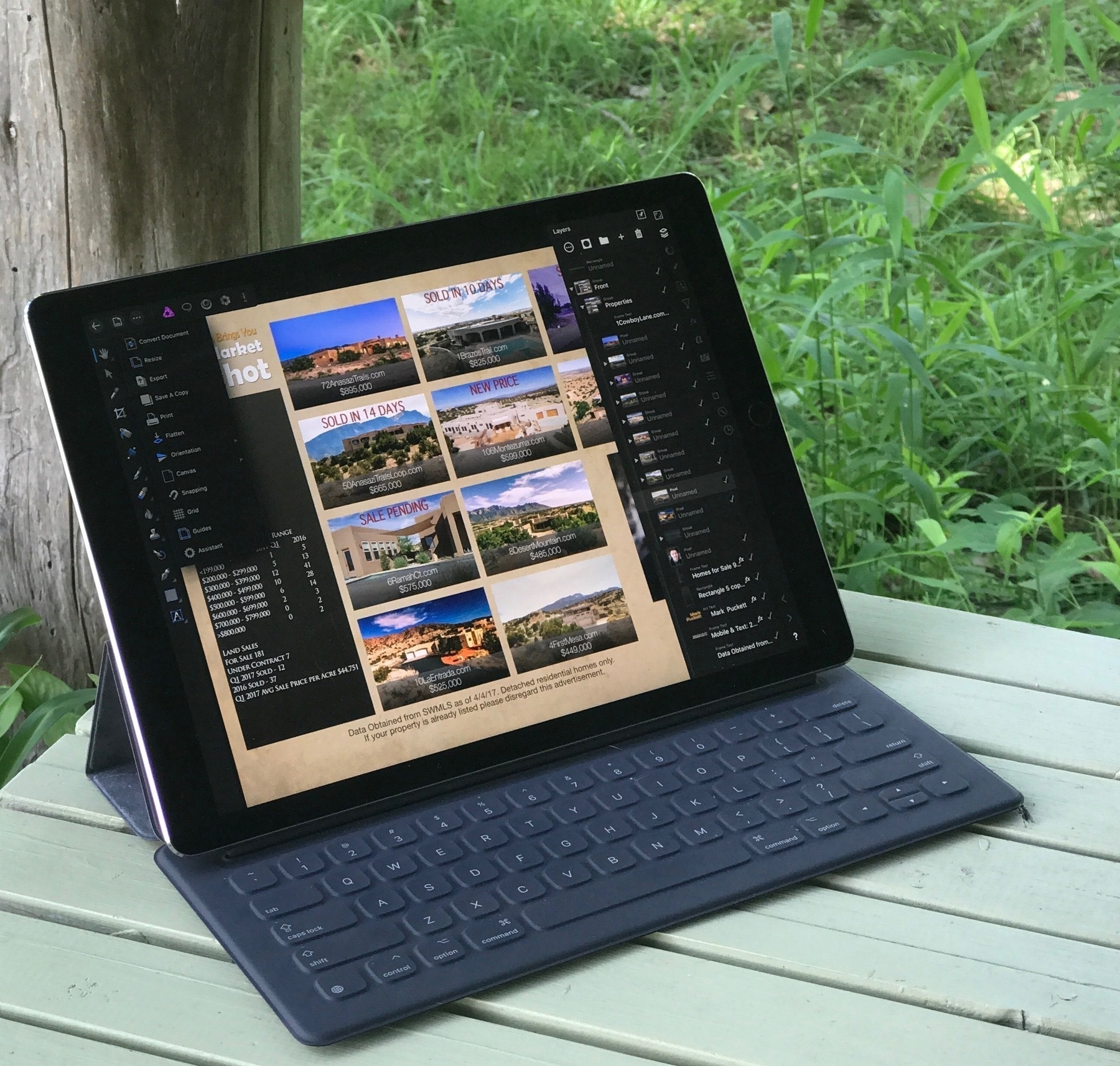 Using Affinity Photo to design a promotional postcard[/caption]
It’s been a week since the 12.9" 2017 iPad Pro arrived at my door. I can best summarize by saying that without any doubt, this is my favorite Apple device ever. I’m not surprised. I expected it would be. And I say that having used it on iOS 10 only. No beta for me. Actually, I should say that it’s not the iPad alone but the pairing of it with the Apple Smart Keyboard and Pencil. I’ve not used the Pencil much but after just few minutes with Procreate and Affinity Photo, I was certain that I will indeed get great use and enjoyment from it. I hope to use it more this week. I did however spend many hours with the keyboard.
The Keyboard
I was a bit surprised at how much I enjoyed using the Smart Keyboard. I’d only used one in a store for about 20 minutes and knew that it felt pretty good to type on. What I wasn’t sure about was the stability of the keyboard or how I would feel about the lack of special, media playback keys.
My main motivation in an iPad Pro was the bigger screen size and it’s been fantastic. Using Coda and Affinity Photo for work over the past week has been an excellent experience on the 12.9" screen. Over the course of the week I updated a client’s website to a new responsive design all from the iPad using Coda to edit CSS and HTML. I often use Coda in conjunction with Transmit, Safari, Messages, and Spark. It’s so much nicer on the larger screen. I also had to put together a magazine ad for a client and a promotional postcard for another client. Both of those were a pleasure to do with Affinity Photo. At no point did I feel I was using anything less than the full version of the app that I’ve gotten used to using on my Mac. The only downside is that Affinity Photo does not yet support split screen. I can live with that given that its the sort of app that begs for the biggest workspace possible. I just use a slide-over when I need to.
Screen Tech
Unlike many I don’t see a huge benefit in the new refresh rate of 120Hz, what Apple is calling Promotion. Sure, scrolling on the new iPad as absolutely smooth. Everything is smooth. But I don’t read text while scrolling. I’ve compared to the iPhone 7+ and I just don’t see a difference. Everything on the iPhone is also buttery smooth. I do notice the TrueTone and the increase in brightness but there again, I rarely use my iPad brighter than 40%! So, yes, it is an absolutely gorgeous screen but to my eyes it is nearly identical to the iPhone 7. I just went back to my Air 2 and scrolled through a full page of text in Safari. First time I’ve done that in a week. I do see a difference but nothing so fantastic as what I’ve been hearing and reading from the Apple Nerdery. Shrug.
Audio
As was noted when the previous iPads Pro were released, yes, the speakers are pretty great. Much better than the iPads that had only two speakers.
Speed and Memory
Yes, no doubt, this machine is beast. Blazing fast. I’ve not noticed any lag in anything I’ve done with any app. Also, having 4 gigs of RAM is pretty nice. I go back to apps that I’ve not used in hours and they are ready to use with no delay. Safari holds far more tabs than I ever saw with the Air 2. I keep most of my apps in folders and all apps that aren’t in the dock are on the second page of the home screen. My main strategy for opening apps is either the dock, Command-Tab, or Spotlight. Most often it is the latter two and it is instantaneous. With Spotlight I type the first few letters of the app then return and there it is 1.
Weight, Size and Portability
Yeah, well, this is bigger than the Air 2 but still, very portable. With it’s Smart Keyboard it is lighter to tote than a MacBook Air 13" or a 2017 MacBook Pro and only slightly heavier than a MacBook. And with at least 10 hours of battery time, yeah, it’s still a great portable machine.
Pro Computer, Pro Apps
Until last spring I’d owned an Apple laptop of one kind or another for 17 years. I sold my last one a year ago because it wasn’t getting used anymore. After over a year of using the iPad Air 2 as a primary, preferred device I have no doubt that my Mac laptop days are over. The real point of this size iPad is that it be a laptop replacement it is fully capable of doing that and even more. As a form factor with flexibility it is better than a fixed hinge laptop. It can be used attached to a keyboard or near a keyboard or with no keyboard at all. Not only that but with the maturity of iOS I have an operating system that I find a delight to use and with iOS 11 it even more so. With the Pro line, iPad is no longer a compromise, no longer a sidestep, it is a step up to something better.
The deal is sealed with “pro” apps. For those that require apps such as InDesign, Final Cut Pro and Xcode this is not YET the device for them. I’m sure there are plenty of other example apps that are not available on iOS and for folks that need those the time for using only an iPad Pro is not yet. But we can see with the release of Affinity Photo that the iPad is fully capable of performing heavy-duty tasks with fully featured apps. There should be no doubt, Affinity Photo represents the long sought after “Photoshop for the iPad”. I’d go further and say it is better because, like it’s desktop equivalent, it does not come with the baggage or subscription pricing that come with Adobe and Photoshop. Going forward it seems a certainty that the iPad Pro, along with iOS 11 and upcoming pro apps by Serif and others, will begin to gain a great deal of traction.
Apple has made it clear that the Mac is not going away which is great news for folks that prefer the Mac. It’s a mature and powerful platform that has it’s place. But it is equally clear now that the iOS platform as an increasingly pervasive and capable mobile ecosystem will continue to expand in power and flexibility to accommodate the needs of power users. I for one am happy to celebrate all of them but it is the iPad that I will look forward to using everyday.
A few links and thoughts on iPad after WWDC 2017
Well, well, well. The 2017 WWDC has come and gone and much that iPad users hoped for has been announced. As far as I’m concerned Apple hit it out of the park. If the features announced work as well as they look then I will be very happy and more productive. While no operating system is ever really finished with iOS 11 we see the most significant complaints about the iPad being addressed. Perhaps the two most significant of these were lack of a user accessible file system and the lack of drag and drop. Not only will iOS 11 have both of these but Apple has implemented each of them in ways that are fully featured and in some ways may well surpass the abilities of the Mac. I’m really looking forward to trying the new features. I’ve been getting along very well without them but I don’t doubt that they will come in handy for some tasks and workflows.

The new Files app looks pretty great. I use DropBox as my primary file system these days so having that integrated along iCloud and local documents will be great.

Drag and drop in iOS goes beyond what we have on a Mac because it’s multi-touch. On a Mac I can select multiple files on the desktop or in a folder and drag to a new location or a new mail message. With iOS 11 I can select multiple items from multiple folders and apps and drag and drop to multiple locations. Finger ninjas will be able to select an image from Safari, text from Safari, and the url of Safari all in one go and then drag to a destination or multiple destinations to drop them. This will require a bit of practice but I imagine it will be really powerful when mastered.

The new dock is going to be far more useful as it will now hold far more apps and will have added functionality with a contextual menu for recently used documents as well as the swiping up action to bring an app into a multi-tasking window. But what about adding an app to the multi-tasking that isn’t in the dock? Well, luckily, we will be able to use Spotlight for that. I’m already in the habit of opening all my apps from Spotlight so being able to drag one down from Spotlight to a multi-tasking window will be a welcome addition.

Paired apps in spaces will probably be very nice too though I’m curious about how it will work to have apps paired up and how easy it will be to change those pairings. I use split view a good bit and will likely use it even more with the 12.9" but I don’t necessarily have two apps that I consistently use together with the exception of the Podcast App which I use with Pages to do podcast transcripts for a couple of clients.
Notes is getting some nifty new features. Document scanning and inline notes/sketching look great. The new bits with Apple Pencil will come in handy I suspect. I don’t do a lot of work that requires mark-up or screenshots but on occasion it comes in handy.
There are so many other goodies coming for both iPad and iPhone. With iOS 11 it’s obvious that Apple has no plans to back-track on the iPad. The above notes are just the most obvious for those of us using iPads everyday. Any notion that the iPad is not a fully capable computer for most people should really be put to rest at this point. With the increasing power of the hardware and the deepening feature set of iOS the iPad is maturing into an incredible tool that is not only as capable as a notebook but one which surpasses that form factor in it’s flexibility.
I’d been waiting for the new 12.9" update so I ordered that, along with a Pencil and Smart Keyboard the minute the store came back online. I’m very excited to put the bigger screen to use. It will come in handy with the newly released Affinity Photo and will be even more useful when iOS 11 is released. The Smart Keyboard was not my first choice as it lacks iOS shortcuts I enjoy: volume, play/pause, Siri activation but the only other keyboard I was interested in and which I would have preferred was the Brydge but I’ve read far too many reports of those having poor build quality with people having to not only go through an exchange process because the out of the box keyboard was broke but of the replacements also being broke. Bummer. Hopefully the Smart Keyboard does the trick!
A great deal has been written in the past week about all of the WWDC news. Here’s just the tiniest sampling of links that caught my eye.
Harry McCracken, writing for Fast Company: With iOS 11, The iPad Will Make More Sense To A Huge Market: Skeptical PC Users
Serenity Caldwell: iPad Drag and Drop, Multitasking, and Split View in iOS 11: Everything you need to know!
iOS 11: The MacStories Overview
Jason Snell asks:Three big questions about Apple’s new iPad announcements
A more general overview is offered up by Steven Sinofsky: WWDC 2017 - Some Thoughts
iPad Journal: Affinity Photo for iPad!!
[caption id=“attachment_426” align=“alignnone” width=“2048”] Affinity Photo on iPad[/caption]
I’ve been using the Affinity apps, Photo and Designer, on my Mac for the past couple of years and thanks to them I’ve largely left Adobe behind. In fact, I only use Adobe for InDesign projects and for Illustrator’s trace functionality. It’s rare that I open up either Illustrator or Photoshop and I look forward to the day that I don’t need to have them installed. The Affinity apps are, in my experience, true replacements for those two Adobe apps.
As I’ve transitioned more if my work to iPad I’ve been waiting and hoping for the Affinity apps to make the jump. Monday at the WWDC event it was announced (via an on stage demonstration) that Affinity Photo was now available for iPad. I purchased it immediately and after a few hours of trying it out I can say I am very satisfied. I should note that I’m using it on an iPad Air 2, not a Pro, and that performance is excellent. I’ve already used the app to do work for two clients and expect to do a lot more. This is a full version comparable to the Mac version rather than something only a small subset of features. It is a fantastic experience. I can’t wait to give it a go on the new 12.9" Pro next week!
By way of comparison, I’d previously been trying to use Pixelmator on iPad and while it occasionally proved useful for bitmap-based work it was never as powerful as I needed and so I often ended up back at the Mac using Affinity Photo or Affinity Designer. With Affinity Photo installed I will likely remove Pixelmator altogether. There really is no comparison. Now I’ll be able to that much more work on iPad. The only difficulty that I expect to encounter is in the area of available fonts but that’s a shortcoming of iOS not this app. In such cases I’ll save a copy to my Mac towards the end of the project and finish it off with the Mac Affinity apps.
Once Serif releases Affinity Designer for vector focused work I’ll have a nearly complete iPad toolkit for graphic design. I expect I will, from that point on, only return to the Mac for InDesign and for projects that require additional, Mac-only fonts. I also expect that one day Apple will allow for an easy way to add fonts as we see fit.
This is exactly the kinds of app needed to help move the iPad toward being a fully Pro tool for those of us that do this kind of work and who choose an iPad as our primary device. I can say, without a doubt, Affinity Photo will be one of my most used iPad apps.
iPad Journal: To-do or not to-do
Last week the Apple nerdery got very excited with the release of Things 3. I took a look and realized that I’m not as interested in to-do apps as I used to be. Mostly I just do the things I need to do as they come my way. Making lists generally doesn’t help me. Perhaps it’s a limitation of my imagination or an indicator of a less active life. I’m just not so busy that I really need an app to keep track of tasks and projects. I’ve tried many of them over the years and none of them ever really stuck. The closest I got was using Wunderlist but that faded as well. Am I doing it wrong?
With the introduction of “Hey Siri” I found that Apple’s Reminders app was sufficient for my fairly limited needs. In fact, I actually found that do to the convenience of Siri I actually used Reminders consistently for very quick, location-based tasks. For example unusual things such as returning a bucket I borrowed from a friend when I know I’ll be driving by their place the next day prompts me to say: “Hey Siri, remind me to return Karen’s bucket tomorrow morning at 9am” or perhaps I need to make a phone call but only at a certain time, that also would get a request to Siri. But those kinds of things don’t need complicated to-do apps, just something basic that will allow me to ask Siri to create a reminder which will pop-up a notification at a specific time or location.
Here’s how I tend to do around-the-house chores. Some repeating weekly or monthly tasks are set-up as repeating reminders. Most notably I have monthly reminders for flea/tick/heartworm meds for my cat and dog. I’ve also got a reminder to change the cat litter. I don’t need such reminders for most other tasks. When the grass gets high I cut it. I’m outside everyday so I can see when I need to water the garden. When my recycling pile starts to overflow I drop it off.
I do my shopping list via Hey Siri and Reminders and the AnyList app that imports anything it finds in my Shopping List.
If I have a larger project such as painting or staining a structure I will just add the things I need to get to my shopping list. Then I get them and then I do the job. I don’t need to list out the steps because they are usually self evident.
When it comes to client projects, again, these are generally straight forward. I get hired to to a brochure or a business card or an annual report and I just do the job. The steps involved are not so many that I cannot easily just do them. With a new website or brochure: Create project folder. Collect text, images and graphics which are placed in project folder. Open or create html file or InDesign document, etc. I rarely have more than one or two projects at a time and have no problem dealing with that kind of activity level. I recently did an annual report. The tasks were largely the same as the last time I did such a document and they flowed from my email exchanges with the client which evolved from instructions then questions then gathering of text, images, graphics. I did a first draft then a back and forth with suggestions and edits then a second and a third. At no point did I need a task list. The same might be said for a recent presentation design and a website re-design. My projects evolve along with email, text messaging with a client and at most a few notes that I might take in the Notes app.
I can’t quite sort out where a to-do app fits in to such projects. It would be like creating a to-do list for my day. Get up. Go to the bathroom. Make coffee. Eat breakfast. Feed the dog. Walk the dog. Refill coffee. On and on. I don’t need a list for such obvious things.
What about a larger non-normal project? Perhaps something large enough with many steps might need a project to-do list. When we were building our cabins a few years back we made weekend shopping lists for the needed materials. But again, this was more about knowing what we needed for the next phase of the construction. I suppose some might do a series of to-dos in this case. At the time (2008) I probably scribbled the list on paper as I didn’t have an iPhone. Were I to do be doing it again today I’d likely just do a shopping list as I do for groceries. But I wouldn’t do a list of to-dos for the actual construction process.
Special tasks seem rare in my life. Often such things are events that go on the calendar. I often take my granny to her doctor so those those appointments go in the calendar for a day and time. Events for family or friends also go to the calendar. If I need to check in with someone about a detail for such an event more often than not I just send a text when I think of the question. No need to remind myself to send a text. A few days ago my brother-in-law called to ask if I could design an invite and a slide show for my niece’s upcoming graduation party. I was out for a walk when he called so I opened up the Notes app to take down the details I needed. I suppose it could have gone into a to-do app under a task “Create Emma’s Party Invite”. Instead I made a note titled Emma and scribbled in the details of the event and a few things that I needed to include in the invite and in the slideshow. Perhaps that’s the key. More often than not anything that comes up that I don’t do immediately get’s put into Notes because of details that I need to do a task or project. Perhaps I’m using Notes in cases where many would use a to-do app?
I don’t know. As I said, maybe I just don’t quite get what to-do apps are for. Maybe my activity level is just very low. I’d like to try out Things 3 but chances are I’d buy it and it would mostly sit in a folder unused. Again, I ask, am I doing it wrong?
iPad Journal: External Keyboards
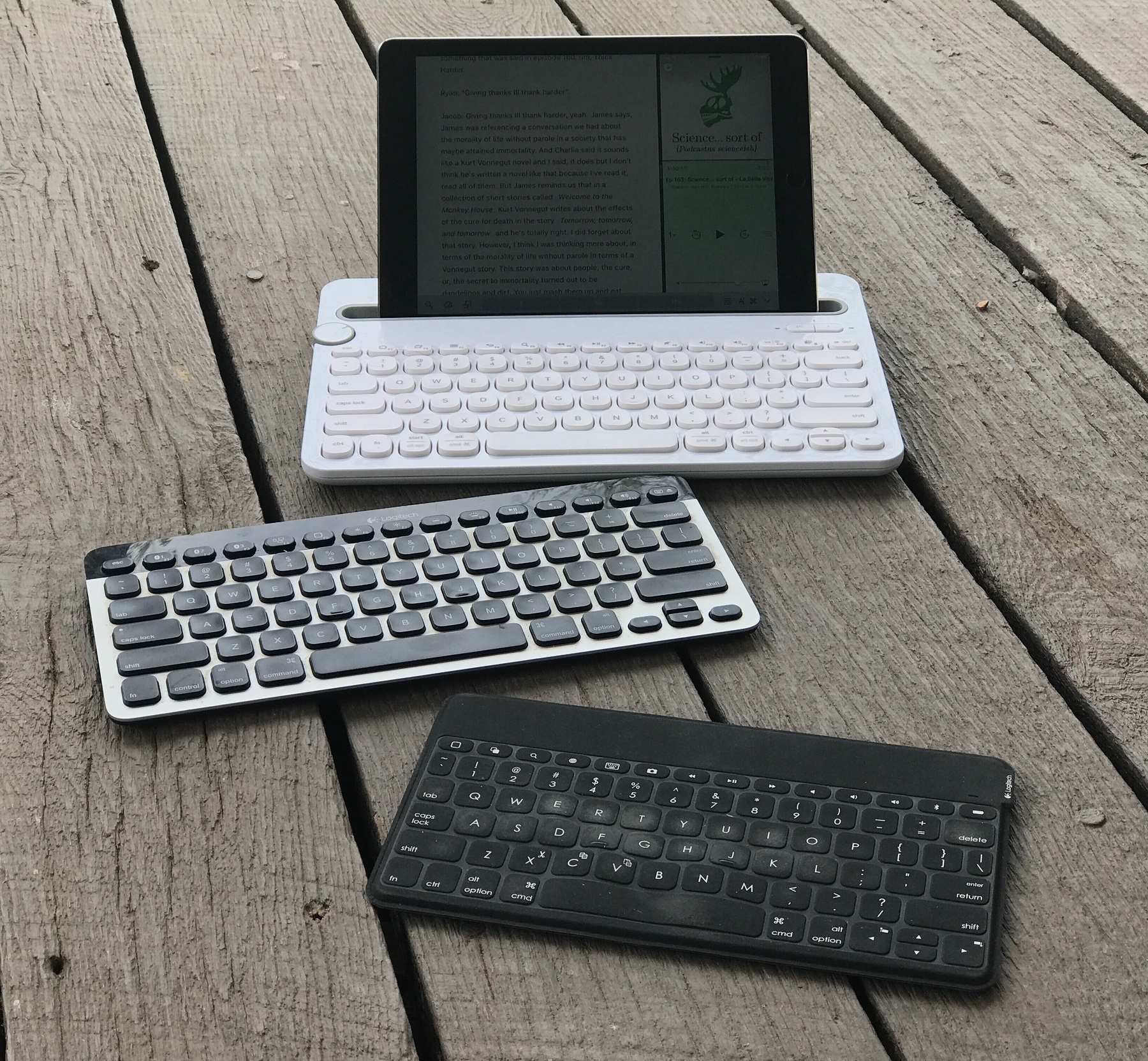
One interesting side-effect of using the iPad as a primary device is that I find myself accumulating keyboards. I consider it of great benefit that the iPad isn’t fixed to a keyboard. I can pick it up and use it all by itself which is largely the point of an iPad. For that reason I will not buy a case that requires the iPad be clipped into it in anyway that is not very easy to remove. The most I want for protection is Apple’s Smart Cover which can easily be pulled off. I want the iPad as light and thin as possible. For the first six years that I owned an iPad I almost always used it in a case with a cover. Once I started using it without covers I started using it more as it just feels better that way. All that said I also use an external keyboard with the iPad for 50% of the time and I’m finding that having multiple keyboards handy. At the moment all three of those are Logitech Keyboards.
My least used of the bunch is the Logitech Keys-To-Go which is great for taking on the road. If I’m going to spend an hour working at the library or coffeeshop all I take is the Keys-To-Go, and iPad in the Smart Cover, that’s it. No bags or cases. Super light and thin but my least favorite to type on as there’s no backlight and very little key travel. It really takes some getting used to. Also, it shows more wear than I think it should for the amount it has been used. In particular the fabric covering, what seems like a kind of rubber, has come a bit loose and bubbly which you can see in the image.
When working at home or outside on the deck I’ve been using the K811 as my primary keyboard. It’s a great keyboard to type on and has backlighting. When I’m using the K811 I’m also using a stand of some kind for the iPad. It’s a two piece arrangement with the iPad in the folded Smart Cover (or one of the other stands I’ve got) and the keyboard on a desk or on a lap board of some kind. The benefit of this arrangement is that the iPad can sit off to the side or up on a stack of books closer to eye level. Basically, anything goes and it changes based on my comfort.
But last week I decided to pick up the Logitech K480 which has a greater front-to-back depth and includes a slot/stand for an iPad or iPhone or both. It’s fairly heavy compared to the other two because it also serves as a stand. This is not a keyboard that I’d take to a coffeeshop for light typing. But for working at or around the home it is my new favorite. That said, at 1.8 lbs, it is still light enough that I would take it on the road if I were expecting to do more than a couple of hours of steady typing. It’s not so heavy that I can’t easily put it into my travel bag with the iPad.
Like the K811 the K480 allows for pairing with multiple Bluetooth devices and easy switching between 3 of them. In the case of the K480 there is a handy dial for switching and it works nearly instantly. I currently have it paired to the iPad and iPhone. When the 12.9" iPad is updated I’ll be getting that and will pair it as well. It won’t fit into the slot in landscape mode with this keyboard but it will work in the portrait orientation. Not sure how stable it will be. If it doesn’t work well with the larger iPad I can pair it to the Mac or AppleTV. Regardless, I expect that it will primarily be used with my current Air 2.
The K480 is a great keyboard for the iPad. The typing experience is excellent and the iPad is very stable when sitting in the keyboard slot. I can have it in my lap at any number of angles based on lighting and my comfort. Over the past three days I’ve used it to type a 20+ page podcast transcript. During that time I’ve used it in my lap on my futon, on the arm of an adirondack chair, in a camping chair in my lap, and in the front seat of a mini-van. In all situations it has allowed for excellent viewing and typing angles while remaining very stable. Due to the weight of the keyboard, the depth and angle of the slot, I can lean it backward or forward and the iPad stays put. It balances with the same stability of a laptop. Carrying from location to location while leaving it in the slot feels very safe.
The only downside is that because it sits so deeply in the slot I cannot activate the swipe-from-bottom Control Center without first lifting the iPad out of the slot a bit. Or, I find that I can swipe up from the bottom left or bottom right corner which will bring up the centered arrow that allows for swiping up Control Center. Not terribly inconvenient but not as easy as a single action swipe up. Yeah, first world problems.
One last negative, minor but worth noting: while the K480 feels like a solid, well made keyboard, it does have a very loud creak to it when picked up or moved around. It’s the sound of plastic flexing and the two pieces of the keyboard rubbing against one another. It’s certainly not a deal breaker but it is loud enough that the people in the room with me noticed it when I adjusted the keyboard on my lap. It’s also a bit loud to type on but I expect a certain amount of sound from a keyboard.
Until Apple releases a 2017 update for the larger iPad Pro I suspect that the majority of my typing will be with the Air 2 and K480 though it’s nice to have the option of pulling the iPad out to use freehanded or with any other keyboard in any arrangement that best fits the situation.
iPad Journal: Just a small thing: AirDrop
I had a meeting/tutoring session with a client a couple days ago. She needed two things. A bit of work done to trace/vectorize a painting that she did which was to be put on t-shirts and other items as well as tutoring on how to go about doing that. She is retired but has a history in art, a mix of sculpting and some painting. But nothing digital. So, no experience with Adobe or any other. I suggested she start with Affinity’s Designer and Photo apps. After a bit of discussion she agreed and we purchased both for her. Then we spent the next 2.5 hours turning her scanned artwork into a primarily vector-based file using Affinity Designer. At the three hour mark she was ready to end the session and seemed very happy with the work we’d done. She wasn’t confident enough with the app to finish the job but we’d been doing the work on her laptop. In the past this would have just been an email with an attachment. But that seemed silly as I was right there with my iPad. An iMessage would have worked pretty well in this scenario too.
I viewed it as an opportunity to show the client AirDrop because I correctly guessed that she’d never used it and was unaware that it existed. I used the Finder on her Mac to select the file on the desktop then clicked the share icon and pointed out the AirDrop option. She asked what that was for and I quickly explained as I carried out the action. I was prompted on the iPad to select iCloud as a save location which I did. The whole action was just a couple clicks and even easier than email. Of course I could have also accepted and saved the file via my iPhone. Really, this is a post about AirDrop and the benefits of a tightly integrated ecosystem. I’ve used AirDrop enough to know that it will always just work. There may have been a time in the early days when the process wasn’t so smooth but these days, at least in my experience, it always just works.
Many folks still insist that the iPad needs more convenient ways to attach external storage. I’ve never needed it. Between iCloud, DropBox, and AirDrop I have everything covered with cloud storage and ease of transferring files. If I’m working with someone that uses Windows or Android we can use other methods. But, really, it’s not been an issue. This is the sort of thing that is easy to take for granted. As someone who has long worked with multiple devices, flawless peer-to-peer sharing is amazing and so convenient. I have no interest in USB ports for attaching external drives.
A bit of an aside regarding this specific project that is worth mentioning. Ideally I would have liked to continue working on the file on the iPad and hopefully in the not too distant future that will be possible because the makers of Affinity Designer do have an iPad version in the works. When or if it will be available for purchase is unknown but I think this falls into the category of “Pro” apps that we really need more of for iPads. That said when I returned to my Mac I opened Astropad and had a go of using the iPad with a generic stylus in conjunction with AD on the Mac. It worked very well as a see where you are drawing style tablet, much better than the Mac with a mouse or trackpad. Going forward, I suspect I’ll make good use of iPad as a graphic tablet compliment to Mac-based work that involves drawing or painting.
iPad Journal: Setting up a new website
I keep forgetting that the iPad is only meant for watching movies and reading websites! While I did use the Mac today to do a bit of revision on an annual report with InDesign most of my time was spent on the iPad: