A few thoughts on Apple News and RSS apps
I’ve been using RSS apps since the early(ish) days of it’s existence. I think it was 2002 or 2003 that it became a habit for me. I’ve had at least one RSS app on my Mac and then iPad ever since. For years that app was NetNewsWire. I’d occasionally try others but that was the gold standard. As I recall there was a time when it became a bit stagnate and then was sold. During that time other apps popped up, namely Reeder which became my RSS app of choice. Then along came the iPad and a flurry of RSS apps along with it. I tried several but when Reeder became available for iPad I settled on that. For many Reeder took the place of NetNewsWire as the new standard.
[caption id=“attachment_878” align=“aligncenter” width=“800”]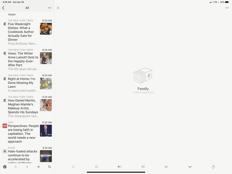 Reeder 4 on the iPad. There’s a lot of wasted space there.[/caption]
What’s the point of RSS? Well, it makes subscribing and skimming a large number of publications easy. Scrolling through headlines with article summaries becomes very easy. Rather than load an entire site I can refresh 30 or 40 and then skim through them all at once. I can do this by topic area or with all of them mixed up. In my case I’ve got groups (folders) by categories such as news, Apple, tech, environment, etc. On slower internet in rural areas it’s a fantastic help.
[caption id=“attachment_879” align=“aligncenter” width=“800”]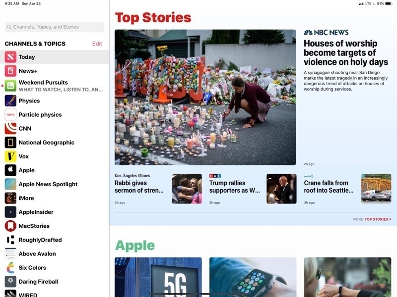 This is the Apple News page in all it’s glory. Nice images, headlines and pleasant to browse[/caption]
A couple years ago Apple released their iPad and iPhone take on a news reader called Apple News. They’d dabbled for many years with RSS built into Safari and even the mail app at one point had RSS built in. But with Apple News they built a dedicated app they really worked pretty well. While RSS and Reeder remained my primary tool I found myself gradually using Apple’s app more and more. I really enjoyed the design of the app which presented the news as a full page of news thumbnails each with an image (usually) and the headline broken up into sections and source publications that I could follow or unfollow with the ability to like or dislike stories as well as save them for future reading. Apple throws in sections and stories from other sources to provide variety and the reader has the option to dislike stories or block sources as needed. In theory this is training which is supposed to improve what Apple provides.
[caption id=“attachment_880” align=“aligncenter” width=“800”]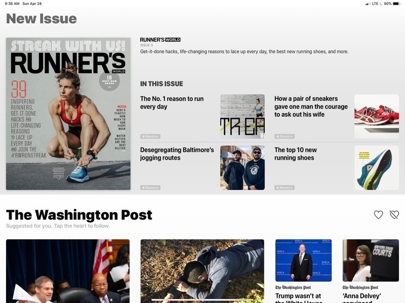 That’s a lot of wasted space for what is, essentially, an ad for Apple’s News+ service. I can’t hide it.[/caption]
What I find most enjoyable with Apple News is the full screen layout of stories, the mix of stories and the reading experience of a story. But there’s a downside (there’s always a downside) and it is three things.
- Ads
- Apple+ is Apple’s new News and magazine service and the stories are mixed into my feed. Sometimes a new magazine will take up nearly half a page. If I were a subscriber I’d be okay with that but I’m not and I have no option to turn it off.
- When sharing Apple News articles the link is a proprietary Apple News format. Fine for sharing to Apple users but I often share to a Slack group that has several folks who don’t use Apple. I’ve got a fix in the form of a Shortcut that converts but I should not have had to do that.
- The training is not all that great. I often see stories I do not want to see and it seems no amount of training with dislikes helps. Even worse, when I block a source it often persists for a day or two rather than disappearing immediately. No, no, no, I don’t want to see stories about the British royal family, not interested in sports either!
- Last, some stories in Apple News have ads and some stories, if viewed on a web site would have comments I’m interested in seeing. So, while the reading experience is often great, it can also be a bit cluttered and often requires that I load the story in Safari.
But all in RSS land is not perfect. Reeder, was recently updated to support the new iPads and added a few new features. Nothing game changing but still a solid app. Funny though, I had switched to another RSS app, Newsify, which had added support for the new iPads and have come to like it’s interface as much as Reeder’s. It’s not perfect but it works. I spent the past couple days bouncing back and forth between them and found that each had features that I wished the other had. Neither felt complete.
[caption id=“attachment_881” align=“aligncenter” width=“800”]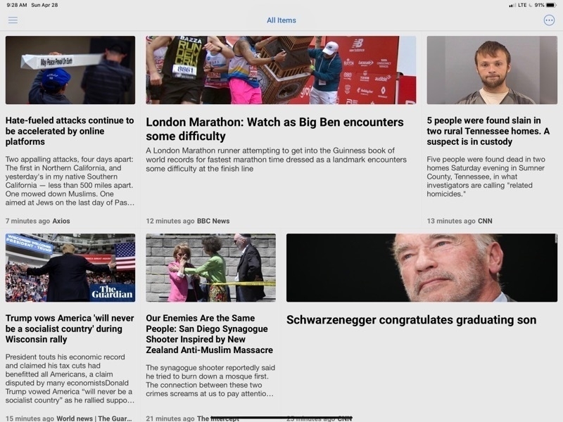 Newsify is properly using the space of my iPad to display a variety of articles with images[/caption]
After some experimentation I’ve found a solution that, I think, brings the best of all three. My main annoyance with Reeder was its huge waste of space when browsing stories. It only takes advantage of a small column on the left for browsing through articles. The primary part of the app is empty. After months with Apple News this was bothering me immediately. In the time I’d been using Newsify I came to enjoy the fact that while the number of articles displayed was about the same they stretched across the screen and more information was provided about each. Still not as nice as Apple News but at least the screen was being used! But there’s a fix that I discovered yesterday while poking around settings in Newsify: It can be displayed using “Newspaper View”. Perfect. Now I had something that looked nearly identical to Apple News!
[caption id=“attachment_883” align=“aligncenter” width=“800”]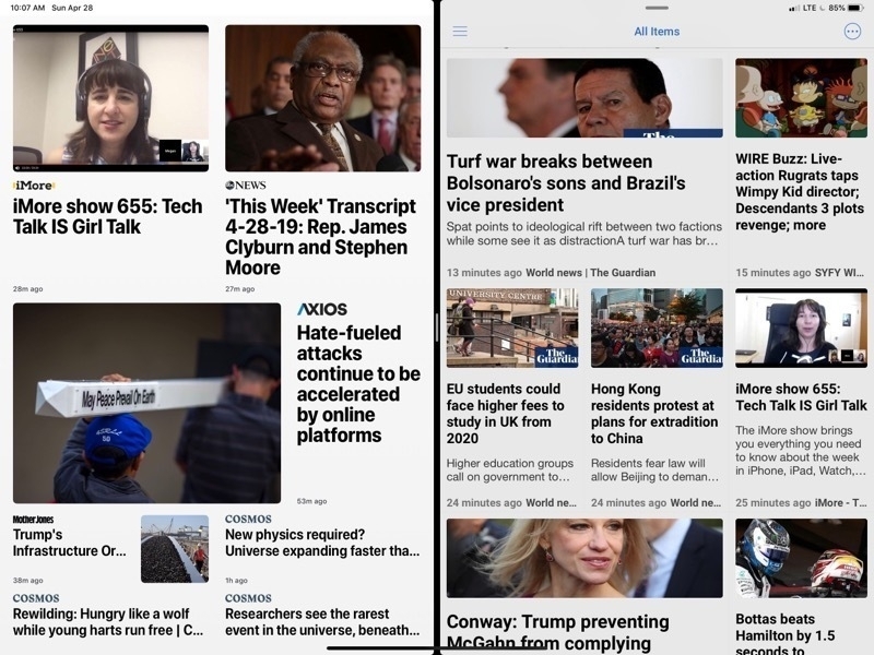 Apple News on the left, Newsify on the right. To my eyes both are very pleasing to browse.[/caption]
So, now I’ve got the article browsing I want without Apple’s ads and no Apple News+ articles I can’t read. What about the reading experience? Close. Unfortunately you’ll note that in Newsify this article does not display the full text but has a “more…” link to click through.
[caption id=“attachment_884” align=“aligncenter” width=“800”]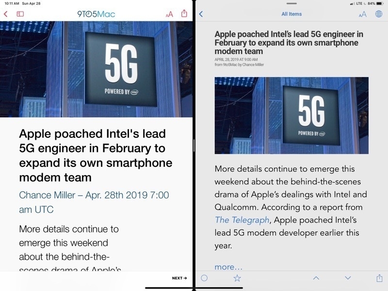 Viewing an article. Almost there but Newsify does not display the full article. Notice the “more…” link[/caption]
Of course that takes me to the full page on the website which is chock-full of ads. But Newsify has a setting which will load the page in the built in Safari View and switch it over to “Reader mode” which is, of course, the perfect uncluttered display comparable to Apple News. I just tap the article title and I’m ready to read in a few seconds. Side benefit, if it’s an article I want to view comments for I can turn off the Reader mode and they’re already to go.
[caption id=“attachment_885” align=“aligncenter” width=“800”]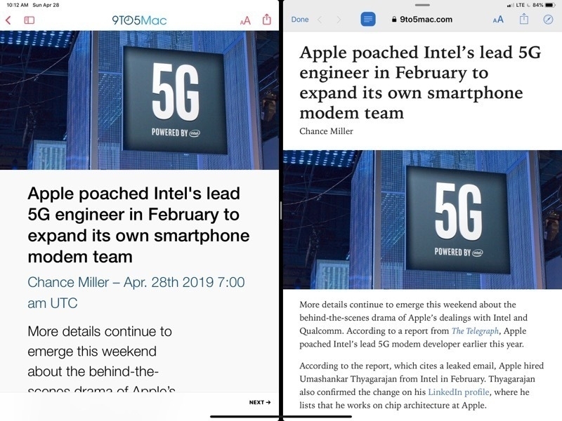 Apple News on the left, Newsify on the right in “Reader mode”. Perfect.[/caption]
Newsify does have a premium subscription which includes a full text display for these kinds of articles but either way I have to tap just once to get a result with is nearly identical.
So, with Newsify and a few tweaks to a few settings I’m getting as close to an ideal (for me) RSS reading experience on the iPad.