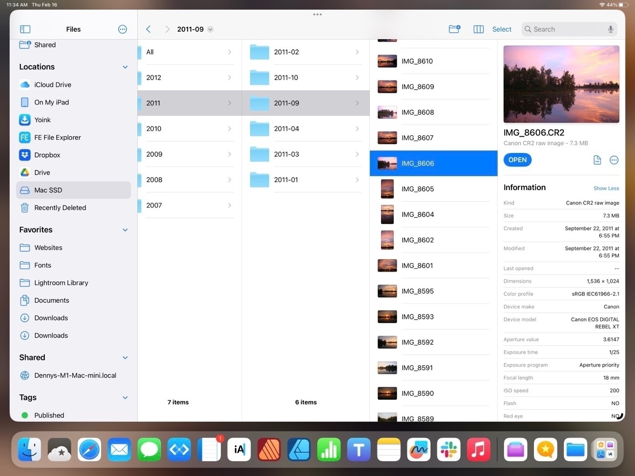
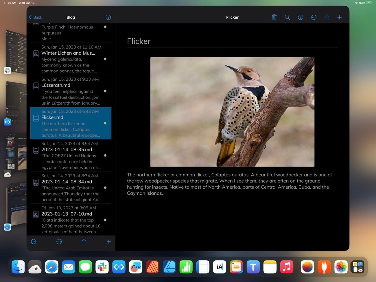
File this under fun multitouch gestures the iPad can do. Pull a tab from Safari and hold. Tap the Safari icon in the Dock to see other Safari windows. Tap new Safari window and move the tab to that window. 🤓
We’re Crossing the Threshold of Survivability — And There’s No Going Back My friends in the Indian Subcontinent tell me stories, these days, that seem like science fiction.
The Age of Extinction Is Here — Some of Us Just Don’t Know It Yet | by umair haque
Weeks of dry winter weather have raised concerns that Italy could face another drought after last summer’s emergency, with the Alps having received less than half of their normal snowfall.
Venice canals start to run dry as low tide and lack of rain hit | Italy | The Guardian
A welcome patch of green in the winter woods, Fan club moss, Diphasiastrum digitatum, known as groundcedar, running cedar or crowsfoot. It grows to a height of four inches, with the spore-bearing strobili held higher.
I love early spring rides in the woods. I can feel spring right around the corner! It's the time of year when I can hear the spring peepers and in a couple of weeks the first wildflowers will start to pop!
Easy Peanut Butter Chocolate Chip Oatmeal Cookies
Okay, easy and also kinda healthy and vegan if you want them to be. This recipe makes around 8 cookies, around 650 calories total.
- I blend up 1 cup of rolled oats into flour. Takes about 5 seconds in a blender
- Mix in 3 to 4 teaspoons of brown sugar
- 1/8 tsp of salt
- 1 to 2 tbs of mini chocolate chips
- 2 tbs of peanut butter
- About 1/4 cup of soy milk (or whatever milk you prefer)
Mix it by hand and spoon it out on a cookie sheet. Bake at whatever for whatever. I usually do about 250° for 15 minutes, enough to mostly sorta bake them... I just want them warm and melty. Then I scarf them down way too fast.
While the Files app on the iPad did start out as a pretty basic app that was far short of the Finder on the Mac it’s come a long way since then. With each version of iPadOS it has gained new features, slowly bringing it closer to the Finder. Exploring the Files App on iPadOS 16
Notebooks, a markdown editor with added features that allow for it to also be a possible Notes app replacement: Indexing pdfs, scanned images, sketches, html archives, links, audio notes. Quite a few options for export as well html. Notebooks 12 Reviewed and Compared
Exploring the Files App on iPadOS 16
I mentioned recently that I’d noticed a post on Mastodon by someone who was complaining how difficult it was to resize an image using iPadOS. I replied to point out that it was the exact same process and done with the same ease as it is on the Mac using the same app. With Files it’s simply two taps (or clicks with a trackpad). It seems a fairly common thing for Mac users these days to complain about the many ways that the iPad is not a Mac or is otherwise lacking. But what’s frustrating is that often times such critiques are coming from a lack of experience and knowledge as in the example above. Users simply haven’t taken the time to use the iPad and learn that many of the same features they use on the Mac are also right there in the same apps on the iPad. The Files app is an excellent example so I thought I’d explore it a bit.
Before I dig in I’ll just say that the Files app on the iPad did indeed start out as a pretty basic app (iOS 11, 2017) that was far, far short of the Finder on the Mac. But with each new version of iPadOS it has gained new features, slowly bringing it closer to feature parity with the Finder. I suspect that many mistakes are made by people who simply have not kept up. They used Files 2 or 3 years ago and not much since then.
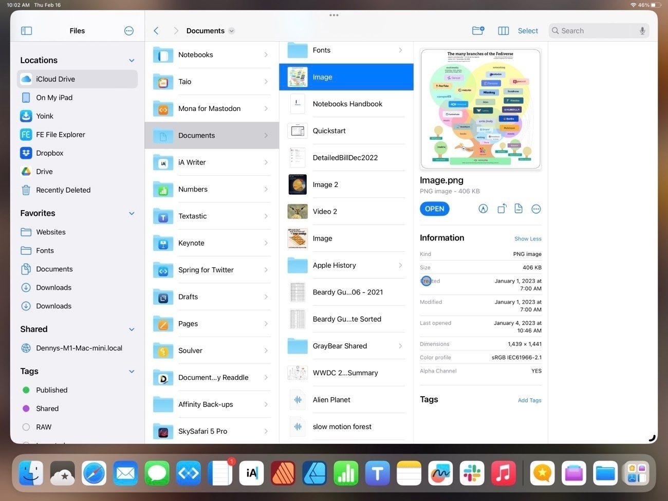
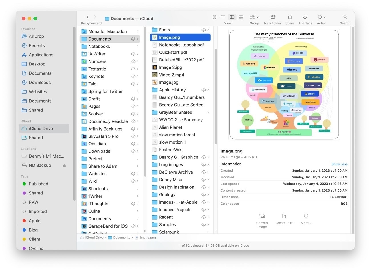
It might be helpful to start with a comparison of the Files app on iPad to Finder on the Mac. I tend to use the column view the most.
While not identical, two apps are very similar in 2023 and in terms of functionality they are nearly the same. Both share most of the same elements with variations. The most noticeable is that everything on the iPad is larger because it’s optimized for touch so less is visible in a full screen window. But take a look at the sidebar in each. Aside from the difference in the order they contain the nearly the same elements: Locations, Favorites, Tags (not visible on the iPad due to size constraints) all of which can be customized in both apps. One interesting difference is that while Locations on the Mac is drive based, on the iPad Locations also includes app providers. So, for example, FE File Explorer on the iPad, if selected, reveals a list of FTP servers I use for connecting remotely to file servers to update websites. I can browse to any remote server from within the files app. Other apps do similarly. In the various screenshots below the Files app is on top, the Finder below it.
In the primary pane of the column view, again, nearly identical with variations in size and differences in the tool bar and presentation of the details in the right-most pane. Each has the same representation of file metadata but there are differences in the tools available. On the iPad, when viewing an image the tools are: Markup, Rotate, Convert to PDF and last the button to reveal more tools. On the Mac the default is Convert Image, Create PDF and reveal more tools.
Upon tapping into the Reveal more on each we see that by default the iPad has a few extra options that are placed differently on the Finder (see 3rd screenshot below). Also, there are many additional customization options for sharing and Shortcuts that are not visible in the screenshot. On the Mac there are three defualt actions with the option to add more.
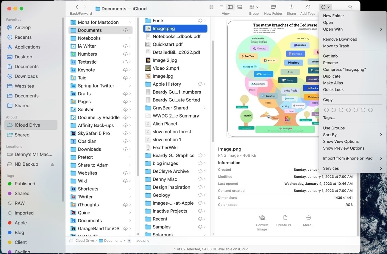
You’ll note that at the top of the Finder window is another Action button that reveals options:
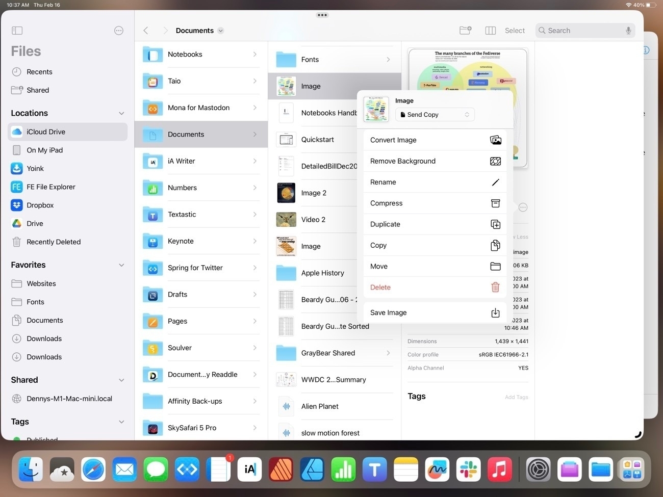
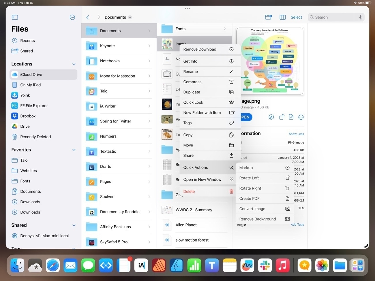
For the most part the two apps are offering the same options and actions but in different locations. Here’s the contextual menu for a file on the iPad. As expected and similar to the Mac, it’s many of the same actions that are available in other locations:
And, not surprisingly, other options are the same between the two devices. For example, the space bar brings up Quick Look.
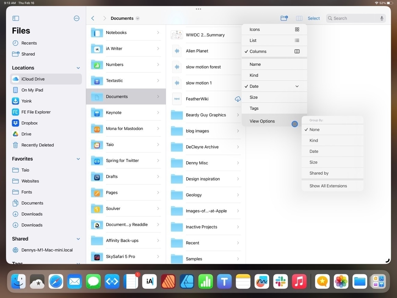
But the Mac Finder remains the better of the two in at least two areas. One, the customization of the top tool bar. The iPad toolbar cannot be customized and some of the options that we see on the Mac, while available on the iPad are only accessible by tapping the 3 column icon which reveals list view, icon grid view, sorting and grouping:
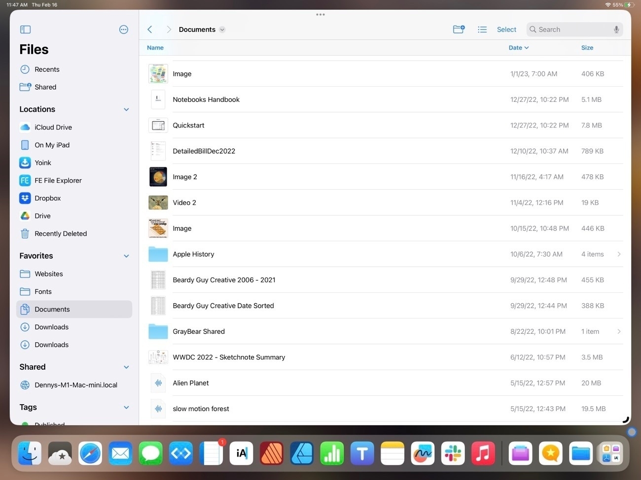
Also, the list view of the iPad is still really limited when compared to the Finder on the Mac. Currently there are three columns available with no possibility for additional columns. If a user chooses to sort by kind or date the column that is displayed changes to reflect the sort. On the larger iPad it would seem there is room for a 4th column.
One advantage the iPad has over the Mac is the additional options in Quick Look on the iPad when viewing a pdf. These options are on the Mac in the Preview app but on the iPad a pdf can be edited right from the Files app Quick Look, a nice convenience:
In previous years one complaint about the Files app was the lack of proper external drive support. That was remedied in iOS 15:
So that’s Files on iPadOS 16. It’s come a long way since the early days. I think it’s fair to say that for most users it’s just as easy and functional to use as the Finder on the iPad. While it can feel cramped on a smaller iPad screen or on a 13" iPad when using 2 Files windows, this is a limitation due to the increased size of the touch interface I don’t see that as something Apple will be able to change.
I would like to see a more customizable tool bar and additional options for the columns that are visible in list view. Possibly an option for smaller touch targets, a kind of Files specific “Show more” view that would shrink the size of icons and text. Lastly, more consistent indexing of the content of files. Currently searching the Files app returns a mix of results depending on the content the app resides in. Some apps seem to provide an index that includes content, other apps only Filenames.
Oh, and I’d love to see Files renamed to Finder or, at least given the Finder icon. I understand that the Files name and generic icon matches the actual use of the app better. You may have noticed I’ve created a Shortcut for opening the Files app and have given it a proper Finder smiley face where it resides in my Dock. It’s as it should be.
Forest within a forest. Turban cup lichen, Cladonia peziziformis. A species of cup lichen in the family Cladoniaceae. The thallus consists of two parts: the primary thallus and the upwardly podeties where the apotheci are found.
Underneath thousands of feet of Thwaites Glacier’s solid ice, a bot filmed peculiar features, where melting is much faster. It’s an ominous sign for rising sea levels.
A Robot Finds More Trouble Under the Doomsday Glacier | WIRED
Notebooks 12 Reviewed and Compared
I’ll admit I have a habit of collecting text/notes apps. It’s one of my most used categories of apps because it’s what I use for blogging. I’m fairly certain, based on posts over at MacPower Users as well as on blogs I read that I’m not alone in my habit of collecting such apps. That said, I do try to settle into an app for awhile. I don’t actually want to switch all the time, I just enjoy trying the different possibilities.
When it comes to text/notes apps I generally have four jobs in mind.
- A general collection point for miscellaneous, often short lived text that might also include an attached pdf, scan, or photo. For a good long while Apple's Notes app has served this purpose and will continue to do so. While some report problems with iCloud synching it's never been a serious problem for me. So, I'll stick to that for those kinds of notes. I've currently got just under 500 of these.
- Website coding and management
- Podcast transcripts
- Blogging and journaling. This is where I go when I intend to write something that will likely end up on one of my two blogs. This is also a space where I'll only use an app that is based on distinct text files that's capable of syncing via iCloud. All of my blogging is done in Markdown and any Markdown editor can open up a folder of files. Very nice for trying different apps and for easy backing up.
For context, here’s a list of text/markdown apps I’ve used over the past few years, beginning with most recent favorites and how I use/used them. Note: When I first started this post I considered writing reviews of all of these apps but then I realized, I’ve written about all of them at least once before, many of them I’ve likely mentioned in numerous posts so there’s probably not much point.
- Textastic - My primary tool for managing client websites: editing html files and uploading those to various servers.
- Apple Notes - My general go to for quick notes, shared notes or notes that might have a pdf attached.
- Notebooks - The newest addition and my current primary for markdown files. More details below!
- iA Writer - In the past this has served as my primary markdown editor for blogs and podcast transcripts. The only markdown app on iPadOS that also has a built in publish to WordPress and Micro.blog.
- Taio - Another excellent, more recent markdown editor that I've been trying out. Added support for tags and wiki style links. I'd been using this for most of 2021 as it's a well built native app, often updated and supports iPadOS features. Interacts well with Shortcuts for receiving Safari content and sending to Micro.Blog.
- Obsidian - This one has gotten a lot of attention the past year. Very powerful, lots of plugins and offers wiki style links for creating digital gardens. This one does offer publishing via plugins. Something about the UI of Obsidian bothers me. It's not a bad looking app, it just seems off regardless of the theme I try.
- 1Writer - Like iA Writer this one's been around a long time and has similar features to both iA Writer and Taio. An excellent app but my least used of the top five.
- Drafts - Used by a lot of nerds to capture text and then push to other apps. Been around a very long time. I don't use Drafts for much because it does not work with individual text files in iCloud but rather keeps it's files in it's own, siloed database. It does have a built-in audio transcription feature which is what I use it for these days.
- Byword - My introduction to markdown was Byword. An excellent app but not updated in two years. Publishes to WordPress.
I came across Notebooks in late 2022 in a thread on the above mentioned MPU forums. I wasn’t looking to change and had been fairly happy with Taio. So why did I make the move? As a markdown editor Notebooks is very similar to Taio and iA Writer. On that alone I could just as easily stayed with either of the other two apps. The additional features that initially prompted the change:
- Notebooks does more with with pdfs. Specifically, pdfs can be added to Notebooks and their content is indexed and searchable.
- In addition to plain text and markdown, Notebooks also does rich text formatting stored as html.
- Sketches, voice memos, scans/photos, web page bookmarks or full webpage archive imports.
- Tasks, reminders
- Notebooks even allows "importing" of other files for preview and will point to original for opening: Apple's Pages, Numbers or Microsoft Word
With those five features Notebooks might also be a gradual replacement for Apple’s stock Notes app and even the Reminders app. A sort of bucket-app for referencing and indexing a variety of files.
Before I dig in I’m just going to note that there’s a great deal to this app so what I’m writing here is just scratching the surface and is based on the things I’ve enjoyed or found useful in just a couple weeks of using the app. So, really, it’s just a mini-review. For the a more full description I’ll point again to the Notebooks website.
The sidebar, organizing and browsing files A pretty typical UI element in these sorts of apps is a sidebar showing folders and files. I consider it to be an important part of the UI because it’s something that is used often and is looked at often. iA Writer does the sidebar really well. Functional and visually pleasing. The sidebar in Taio is functional but feels a bit clunky. The sidebar of Notebooks is between the two. Not quite as compact or clean as iA Writer but it does offer more functionality with several default Smart Books for Favorites, Recent Items, Contexts/Tags and at least one dynamic list that will show up at certain times for due tasks but disappear when there are no due tasks. There’s also a helpful sorting header for quick sorting of folders and files. Finally, a global documents search at the very top. So, while it takes more vertical space it is more functional and still looks very nice. In addition to marking a file as a favorite for display in favorites smart book it’s also possible to pin files for quick access.
I’d initially missed that Notebooks offers tagging. It’s presented as “Contexts”, sort of in the GTD (Getting Things Done) realm of organization. But in an exchange I had with the developer Alfons (who, by the way has been very helpful in a series of email exchanges) he kindly pointed out the feature so I’m adding it to the review. I’ve turned it on and as I have no use for the contexts I’ve removed those and am adding my own to reflect my needs as a blogger/writer. Now, to be honest, I’ve tried tagging off and on with numerous apps and have always struggled to develop a system that works for me. So, I’m not sure if this will stick.
Files can be set to default to editing mode or in the more visually attractive rendered appearance. I’ve chosen the latter as it makes for a more enjoyable experience when looking through documents. With just a tap or click in the text area of the file it switches to editing mode with the cursor at the position of the tap or click. Another benefit is that if you choose the other option, to default to editing mode, you’re making extra work because to view your rendered document you have to click twice to switch to that mode. May not seem like much but I find that it’s much easier to just click once into the document and type than to click a button then another button.
I’ve set up several “Notebooks” in the app which, when viewed in Files are just folders. Currently I’m using a generic Blog folder for published files. Other folders correspond to several blog archives, podcast transcripts, help documents that pertain to the Notebook app and two to-do lists (more about that later). If you click into a Notebook and create a file then of course the file will be created in that Notebook. I generally start in the default, general area and move files via drag and drop as needed.
Getting content into Notebooks This is fairly easy and can be accomplished in a variety of ways. From the Files app select a file and, using the share tool, select Notebooks. The file will be copied to the default Notebooks folder. It’s possible to copy and store iWork documents: Pages, Numbers and Keynote or Microsoft Office docs. The same for pdfs, images, movies, or audio. Once in Notebooks tapping a file in the sidebar will open it up as a preview in the main window. Tap and hold the file name or select the share icon from the top right of the window allows for “Open in” to open in the default app. Any changes made will be reflected in the Notebooks app once the file is saved and then opened again in Notebooks.
I’ve also set up several shortcuts for sending quoted text and links from Safari to new files in Notebooks for easy and quick linked posts for blogs.
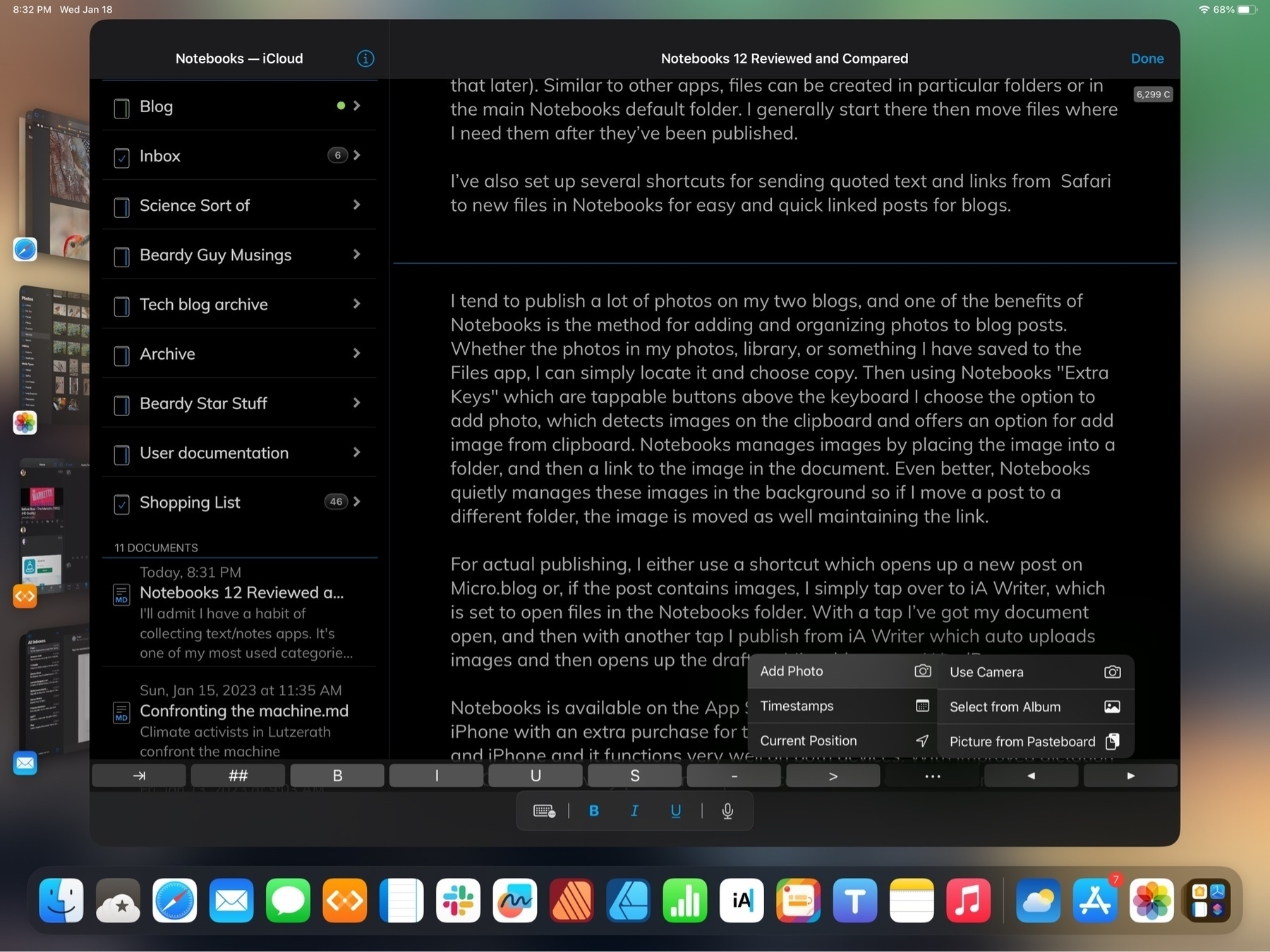
I tend to publish a lot of photos on my two blogs, and one of the benefits of Notebooks is the method for adding and organizing photos to blog posts. Whether the photos in my photos, library, or something I have saved to the Files app, I can simply locate it and choose copy. Then using Notebooks “Extra Keys” which are tappable buttons above the keyboard I choose the option to add photo, which detects images on the clipboard and offers an option for Picture from pasteboard. Notebooks manages images by placing the image into a folder, and then a link to the image in the document. Even better, Notebooks quietly manages these images in the background so if I move a post to a different folder, the image is moved as well maintaining the link.
For actual publishing, I either use a shortcut which opens up a new post on Micro.blog or, if the post contains images, I simply tap over to iA Writer, which has the option for “Added Locations” outside of the default iCloud location for iA Writer files. I’ve added Notebooks as one location so I can easily tap into all of my Notebooks folders. With a tap I’ve got my document open, and then with another tap I publish from iA Writer which auto uploads images and then opens up the draft on Micro.blog or on WordPress.
Tasks in a note app? Yep. Notebooks has a pretty interesting and powerful system for tasks built in and I’m giving that a try. I’m not a heavy user of task apps and I’ve gotten by pretty well with Apple’s Reminders app for tracking a handful of repeating tasks. I’m giving the feature a try in Notebooks and so far I like it.
Is there a benefit to having to-dos in Notebooks? With Apple’s Reminders app I am restricted to the predetermined format for every reminder. It works pretty well but it can be a bit cumbersome when using the little pop-up window with set fields. Notebooks offers a variety of more flexible ways to create and track tasks.
One step for getting started with tasks in Notebooks is to set a default task list. Usually this as an Inbox but you can use any name for the default. This is where tasks will be sent when using Siri if you don’t specify where to send a to-do. It’s also possible, in any current text document in Notebooks to select text and then, using the pop-up context menu, select Add to Inbox. Whatever text is selected will be added as a task to whatever list you’ve designated as the default task list.
A second option: Designate any notebook as a task list. You can have as many of these lists as you like. Within each list any markdown file becomes a list item that can be given a due date/time, an alarm, etc. When you navigate to that Notebook/list you’ll see your markdown files but they have a small open circle button next to them indicating that they can be tapped to be checked. A single tap puts a dot inside to indicate that it is in process. A second tap puts a check inside to mark it as completed.
With Notebooks a markdown file in a notebook specified to be a task list is tracked as a to-do. This can be as simple as a one line description or, if a task is somewhat complex, a small document can be written as a detailed note with embedded photos, linked files (pdfs, Pages, Word Docs, etc), links to web pages. Almost anything. The task can be assigned a due date/time with an alarm as well as be marked as repeating. Siri works with Notebooks generally and this includes adding items to task lists.
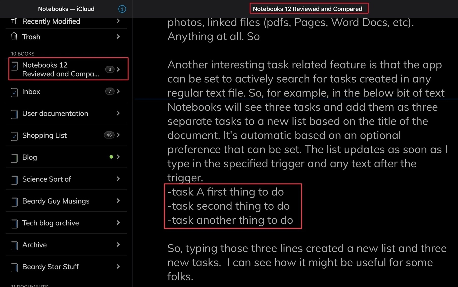
A second way to set-up a task list begins with a setting in preferences to tell the app to actively search for tasks created in any regular text file outside of a designated list. So, this document is just a standard markdown document but in the below bit of text Notebooks will see three tasks and add them as three separate tasks to a new list based on the title of this document. It’s automatic based on an optional preference that can be set. The list updates as soon as I type in the specified trigger and any text after the trigger.
✓ A first thing to do -task Order needed item on http://amazon.com ✓ another thing to do
So, typing those three lines created a new list and three new tasks. I can see how it might be useful for some folks or certain multi step projects.
As you do those tasks and mark them completed they will be updated in the original document with a check mark. So, in this way, a document could serve as a kind of project manager that can update a list of tasks and which is updated as those tasks are marked as completed.
Or, if you’re working on a document and decide you’d like the whole document to be converted into a series of tasks you can choose to do that with a couple of taps.
There are a lot of options for the tasks features and several settings. I’d at first assumed that the task feature was something simple that would be a nice to have but have since realized that it’s really quite a powerful set of features. For someone spending a lot of time in Notebooks it probably makes a lot of sense to switch to the app for task tracking.
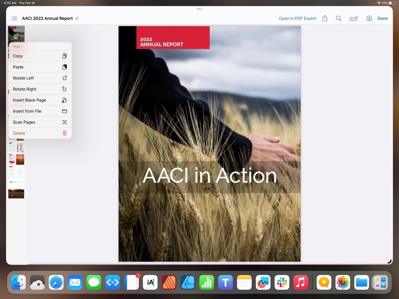
PDFS I mentioned above that Notebooks indexes the content of pdfs making them searchable. It’s also possible to link to pdfs from within a markdown document. And, lastly, when opening a pdf in Notebooks there is full support for all of the features one gets when opening a pdf in the Files app. In the pdf sidebar it’s possible to tap on a page and rotate, add new pages, remove pages, import new pages from another document, etc. Markup is also available on pdfs right in Notebooks.
Getting content out of Notebooks When it’s time to do something with content you’ve created Notebooks has quite a few options which are locating in the “Process” menu. For exporting a non editable document there are two options: PDF, ePub. It’s also possible to “duplicate as” these file times which creates a new document that can continue to be edited as plain text, html, Latex and RTF. All excellent options.
For something as well featured as Notebooks I wish it had publish features. Being able to output to WordPress or other blogging platforms would be great but that’s not exactly an expected or common feature.
Notebooks is available on the App Store as a one-time payment and is universal between iPad and iPhone. The Mac app is a separate purchase.
2023-02-14 20:19
The climate crisis is causing sea levels to rise faster than for 3,000 years: Some nations could cease to exist, drowned under the waves.
Rising seas threaten ‘mass exodus on a biblical scale’, UN chief warns | The Guardian
If you think the rich nations of the world are making real progress towards achieving limits on global warming, think again. In one essay, Kevin Anderson, professor of energy and climate change at the Universities of Manchester, Uppsala and Bergen, puts it this way: “Wealthy nations must eliminate their use of fossils fuels by around 2030 for a likely chance of 1.5C, extending only around 2035 to 2040 for 2C… We are where we are precisely because for thirty years we’ve favoured make-believe over real mitigation.
Greta Thunberg’s ‘The Climate Book’ urges world to keep climate justice out front | TPR
The excelent Mona app for Mastodon is now in public beta Testflight: testflight.apple.com/join/xNdg…
It’s great on the iPhone but really shines on the iPad with unlimited, customizable split panes. Also available as a public beta for the Mac!
Jesus loved the people we hate.
So the ad is actually aimed at right-wing Christians?
The Servant Foundation has donated more than a billion dollars in recent years to religious, political and educational organizations, including some that align with anti-abortion and right-wing political causes.
The norm of Christianity in the US seems to be the opposite of open love and acceptance. In general it seems to be about judgment, control and obedience of those that are believers as well as those that are not. The country would be a better place if Christians would stop their hate-filled public morality campaigns and perhaps redirect inwards to their personal and congregational members. That said it seems counter to the history, which, as far as I can tell is a constant effort to proselytize others. I don’t see that Christians accept others as they are.
‘He Gets Us’ Super Bowl Ad Aims to Increase Relevance of Jesus - The New York Times
See also: The Far Right Is Funding Evangelical Super Bowl Sunday Ads - Jacobin
“Bernheim Forest in Kentucky is the largest privately held forest block in the eastern US, and is currently fighting plans for a 12-mile gas pipeline, part of which would cross a northern section of the forest”
The pristine US forest threatened by a pipeline | The Guardian
“A common, effective abortion-inducing drug could be banned nationwide within a matter of days, thanks to a “loose cannon” of a judge appointed by former President Donald Trump.”
Abortion Pills Could Be Banned Everywhere Within Days. Here’s What You Need to Know.


