Mini-Review: iDraw for iPad
My main work machine is the 2012 Mac Mini. I’ve written before about my transition to a standing desk for health purposes. That said, I do want to be able to use the iPad as a tool to get work done. Having a flexible workflow is good and it would seem a waste, with the increased power of the iPad Air 2, to not utilize it when the need arises. My initial thought was that it would come in handy for editing the html of client websites and yes, that is a breeze with Diet Coda and Transmit. But why stop there? Those were tasks I could also accomplish with the 3rd gen iPad.
In recent days I have also begun wondering if I might not also be able to get a bit of graphic design work done with the iPad. Adobe does not yet sell an iPad version of Illustrator or Photoshop but there are other options available. Pixelmator is the most recent crossover from the Mac. It has some pretty fantastic photo filters and the handy ability to be passed back and forth to the Mac version. It can also export to psd for crossing over to Photoshop when I’m back to my Mac. That said in the little bit of dabbling I’ve done with it I’m finding some frustrating limitations which I’ll likely explore in more detail soon. Suffice it to say for the purposes of this post that those limitations led me to try out iDraw and that has proven to be a great decision.
iDraw has been available for the iPad since the first iPad release in 2010 and there is a Mac version too though I’ve not tried it. Last week I downloaded the iPad version and have been giving it a spin. Fantastic. This is an app I can use to get real design work done. I’ve not yet used it for a client project though that will come soon enough. I’ve done enough with it in a few hours to know what it is capable of. Not surprisingly, it’s not as fully featured as Illustrator or Photoshop but it does have the most important tools and they perform very well. In fact, the iPad handles everything I’ve tried to with iDraw with ease.
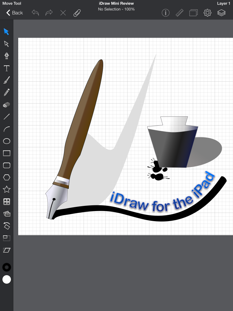
I created the example image in my first spin with the app. Shape building, styling with gradients, adding text to a path are all very straight forward. I started with the rectangle tool and then used the pen tool to begin adding new points and then used the path tool to make my pen handle and tip. Apply stroke and gradient and then tweek. As with Illustrator, all the objects are put on one layer but layers are supported and easy enough to create. I used the same process for creating the inkwell. Styles include drop shadow, inner shadow, inner and outer glow. Multiple instances of these effects as well as multiple fills can be applied to each object. Very handy to be able to apply multiple gradients to single objects.
 The brush tool is very easy to use with width and smoothing options though I only found the one style brush tip. Will need to investigate. Adding text to a brush stroke is easy enough as is styling that text after adding it to the path. Adjusting the path or moving the text to different points along the path are also very easy. As you might expect, there are plenty of object options such as alignment, path combinations and more.
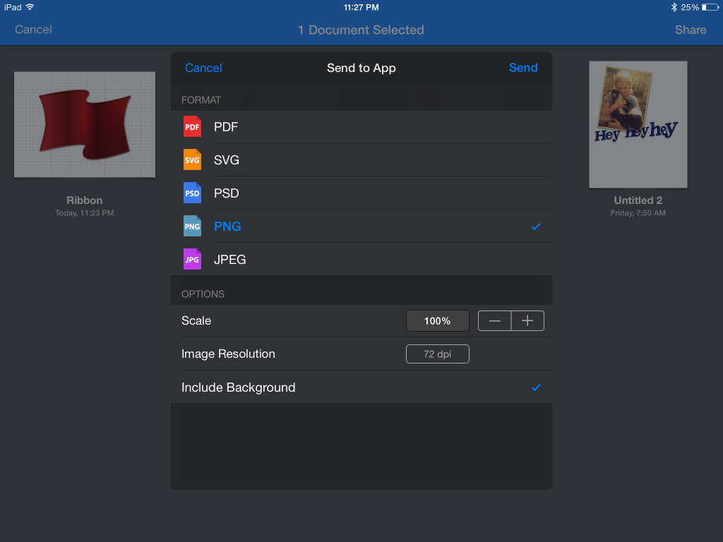
When you’ve finished you have quite a few options for using and sharing images. Before sending to any of the iOS 8 app extensions for sharing (Transmit, Facebook, Twitter, etc.) you have the option to choose the file size, resolution, and format: pdf, svg, psd, png or jpg.
