Affinity Publisher for iPad Review
Back in November I published a mini-review of Affinity Publisher for iPad.. At the time I’d only had a week to work with it but was happy with the app. It’s now been four months and I thought I’d offer an update. Serif have released 4 small bug fixes but most of the larger bugs have yet to be fixed. In my experience there have been just three bugs that have been a bit of a bother. The first, some fonts show up in Chinese characters instead of being displayed in English. Second, sometimes the app stops taking input from an external keyboard, restarting the app fixes the issue. The third really isn’t a bug at all because it’s specifically a problem related to using the app on an external display which Serif have said is not yet a supported feature. For now using the app on an external display is useless because the the right side context toolbar disappears anytime a tool is changed using the left side toolbar. Technically Stage Manager isn’t supported at all but I’ve found the app works fine with Stage Manager turned on.
In general the app has been very stable and usable in my four months of use. And to be clear, it’s not just usable, it’s smooth and responsive on the M1 iPad, 8GB of memory. Being able to work with touch, Pencil and trackpad is a real pleasure.
The foundation of Publisher was put down in 2019 with the desktop version of the app. It was a solid foundation offering excellent performance and a well rounded feature set.
Where Publisher really shines is in multi page documents and it has not disappointed in that role. Newsletters, reports, brochures, magazines or anything of that sort. I’ve also been using it for all my single page documents as it has linked text boxes and text wrap, two features not found in Affinity Designer which is what I would have used for single page designs previously.
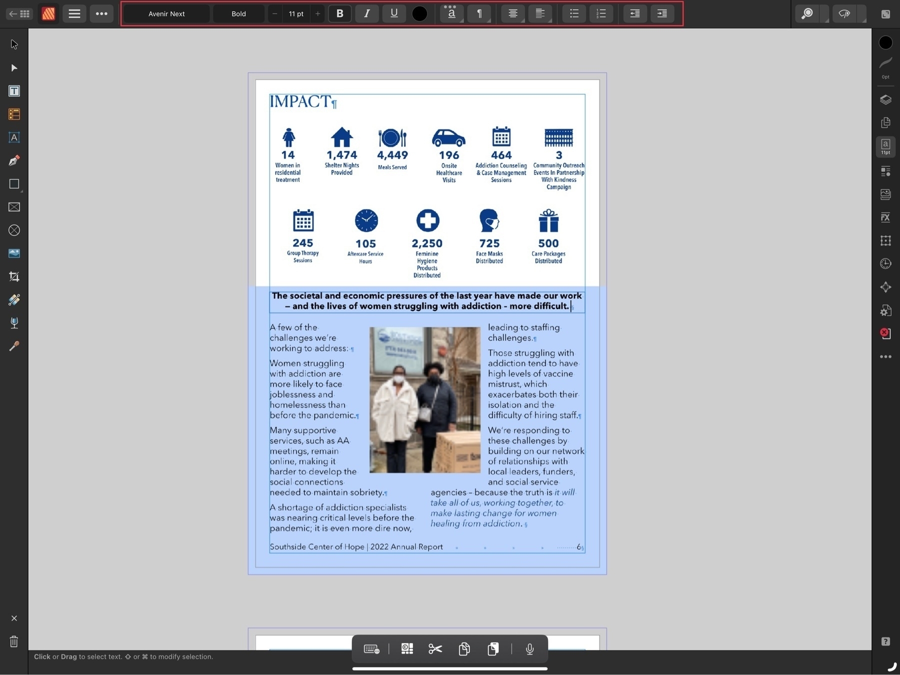
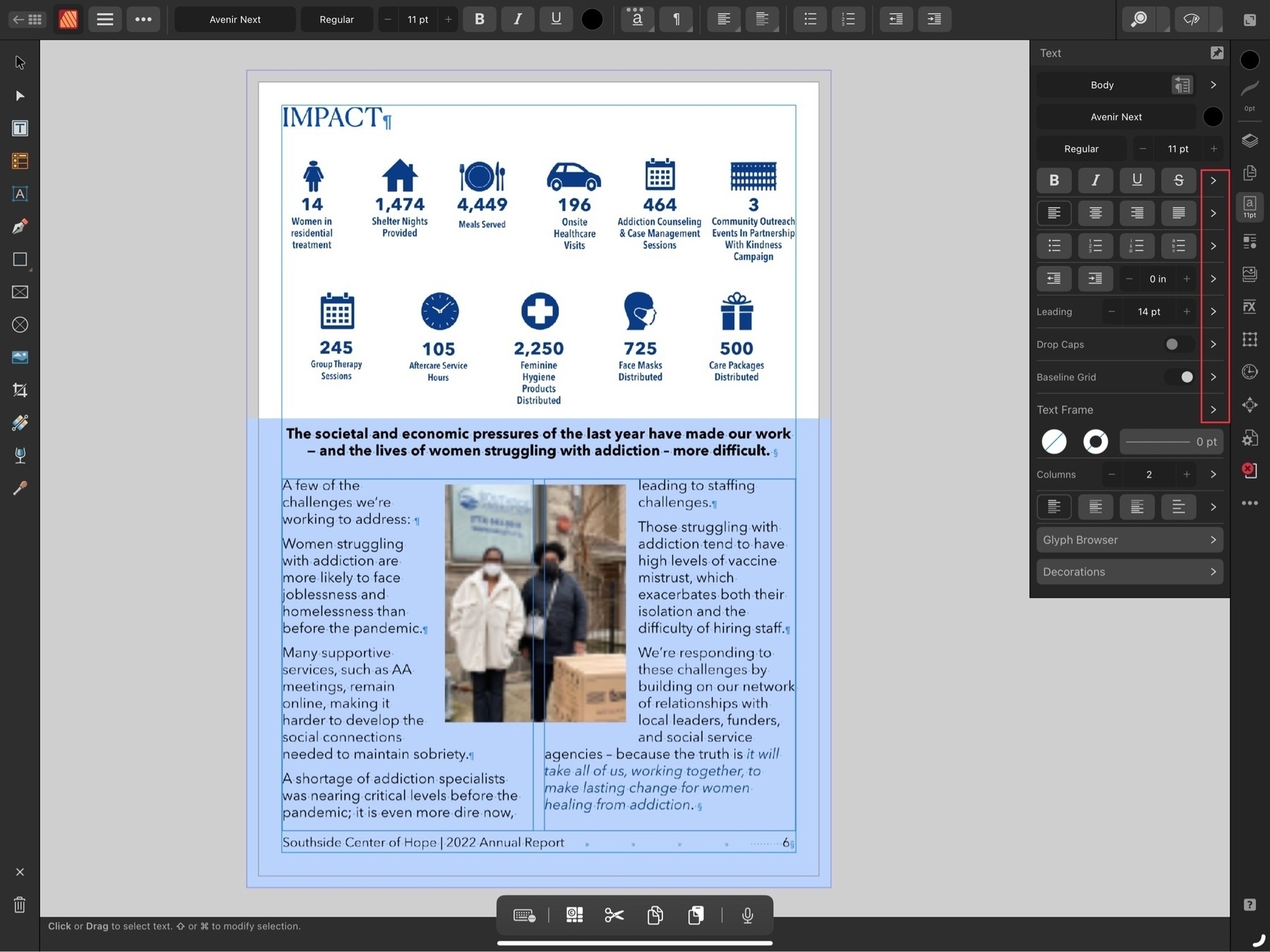
The usual tools one expects to have with this kind of app are on the left toolbar. As you would expect, as you change tools the top toolbar changes to reflect the options associated with the selected tool. On the right side is a vertical stack called the context toolbar represented by icons that allow for the full range of options you need for whatever tool might be selected. So, for example, when you’re working with text you’ll see the most common tool options in the top tool bar but most of the options are only visible when you click to the text tool button on the right side context toolbar. Note all of the disclosure > icons on the right side. Tap into each one for another menu of text related options. Just as they did with Affinity Designer and Photo, Serif have done an excellent job translating the desktop interface to the iPad.
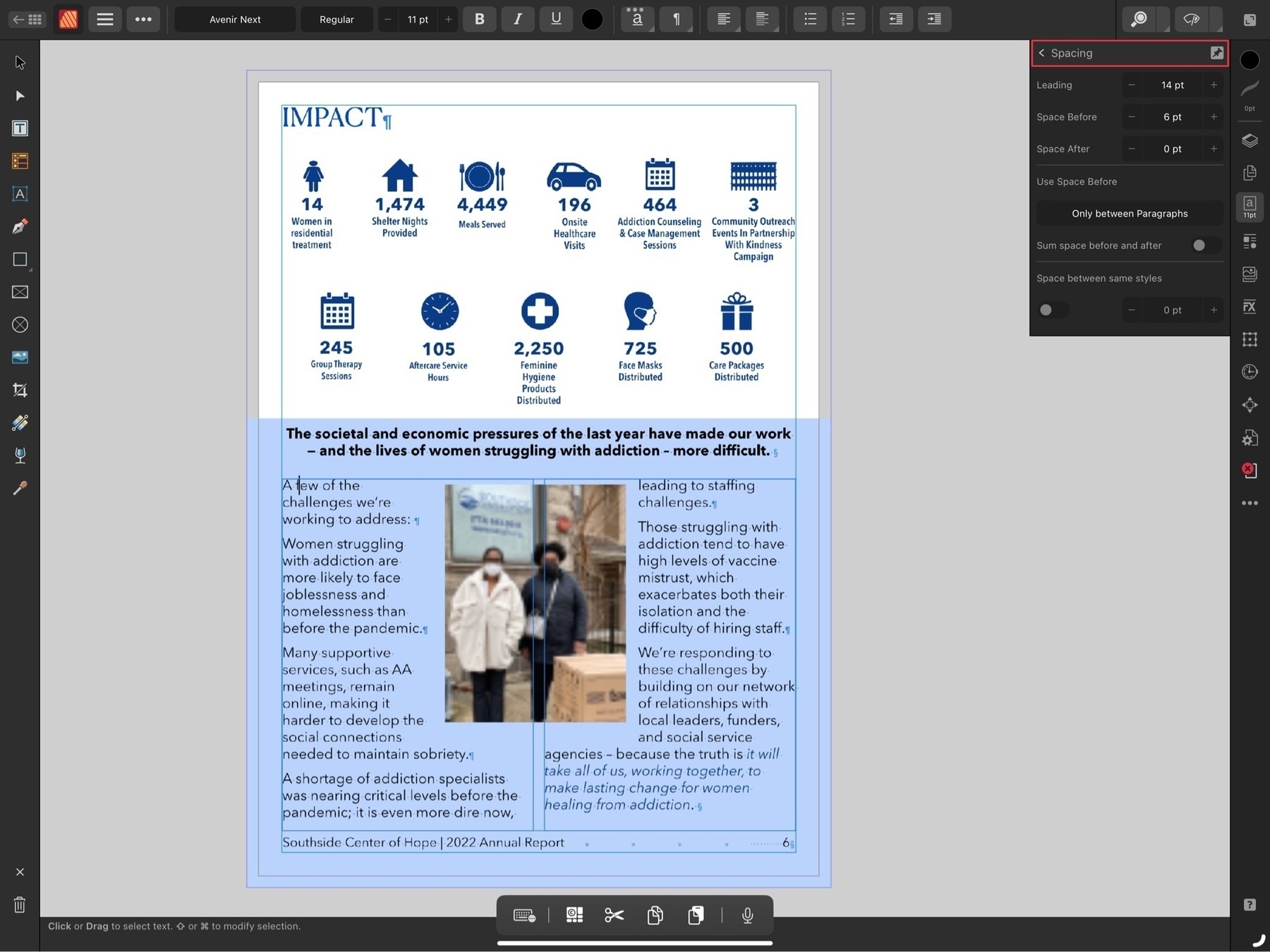
A powerful app like Publisher, by definition is more complicated than many other apps. I’ve seen people complain that Pages is too complicated and, well, Publisher does far more than Pages. This isn’t an app you’re going to open for the first time and suddenly understand. It can take some time to learn and remember all of the options. It took me several days of repeated use to remember which sub menus in the text tools contained which options. But as you use it you’ll see that the submenus are organized with purpose. For example, when I tap into the Leading disclosure triangle the resulting submenu is appropriately titled Spacing and it’s here that I can change the spacing around paragraphs and other options.
A word of advice if you’re just getting started, the built in help is also available on the web and it can be useful to have that open as it allows you to bounce back and forth between the app and the help while you’re working. The built in help system is located within the main app home page and unfortunately it’s not possible to access the help while working on a file In addition to the help Serif has also posted quite a few Publisher tutorial videos on their YouTube channel and these are worth checking out.
[caption id="" align=“aligncenter” width=“2048”]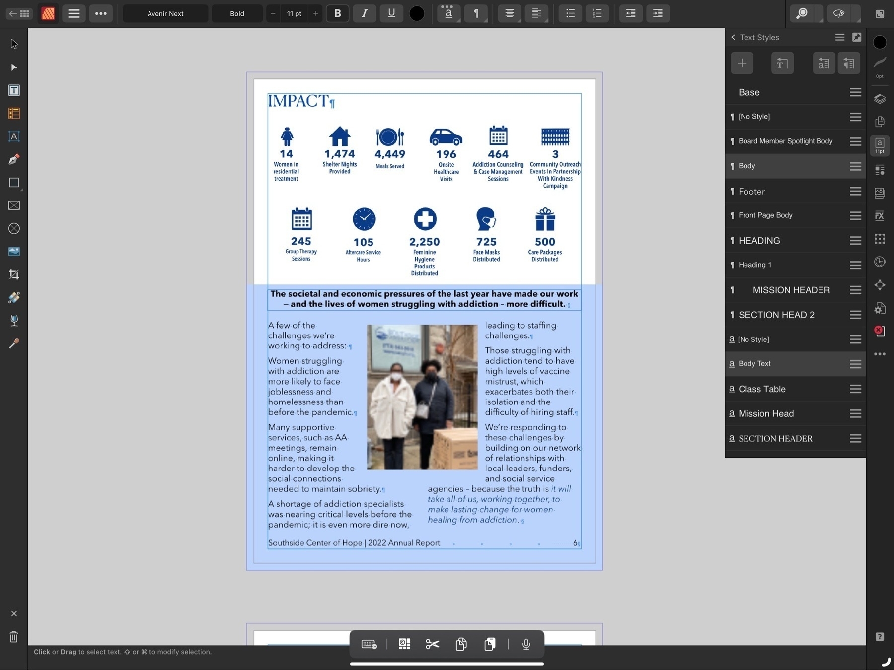 Another submenu while working in the text context sidebar is character and paragraph styles[/caption]
For many iPad users Apple’s Pages app is all that’s needed. That app has also had many features added over the years and is quite capable for laying out documents. I used it for years designing a wide variety of reports, newsletters and brochures. Affinity Publisher is a competitor to Adobe’s InDesign. It will open InDesign IDML files as well as pdfs for conversion to Publisher files.
Unlike Adobe’s various iPad apps, Publisher on iPad is the full app with the full feature set. Should you want to edit a Publisher file shared by someone or share to someone using Publisher on a Mac or Windows, it’s no problem as long as the file will be opened with version 2 of the app on those platforms (Files created by Publisher 2 or any of the Affinity 2 apps are not backwards compatible so cannot be opened by the version 1 apps. If you’ll be sharing a file with someone else be sure to confirm that they’ve updated to version 2 of the app).
Not only are files cross compatible between iPad, Windows and Mac, but all three apps of the suite can open files from the other apps. So, for example, it’s no problem to open a Designer or Photo file in Publisher. The file can continue to be edited and saved in its original format.
[caption id="" align=“aligncenter” width=“2048”]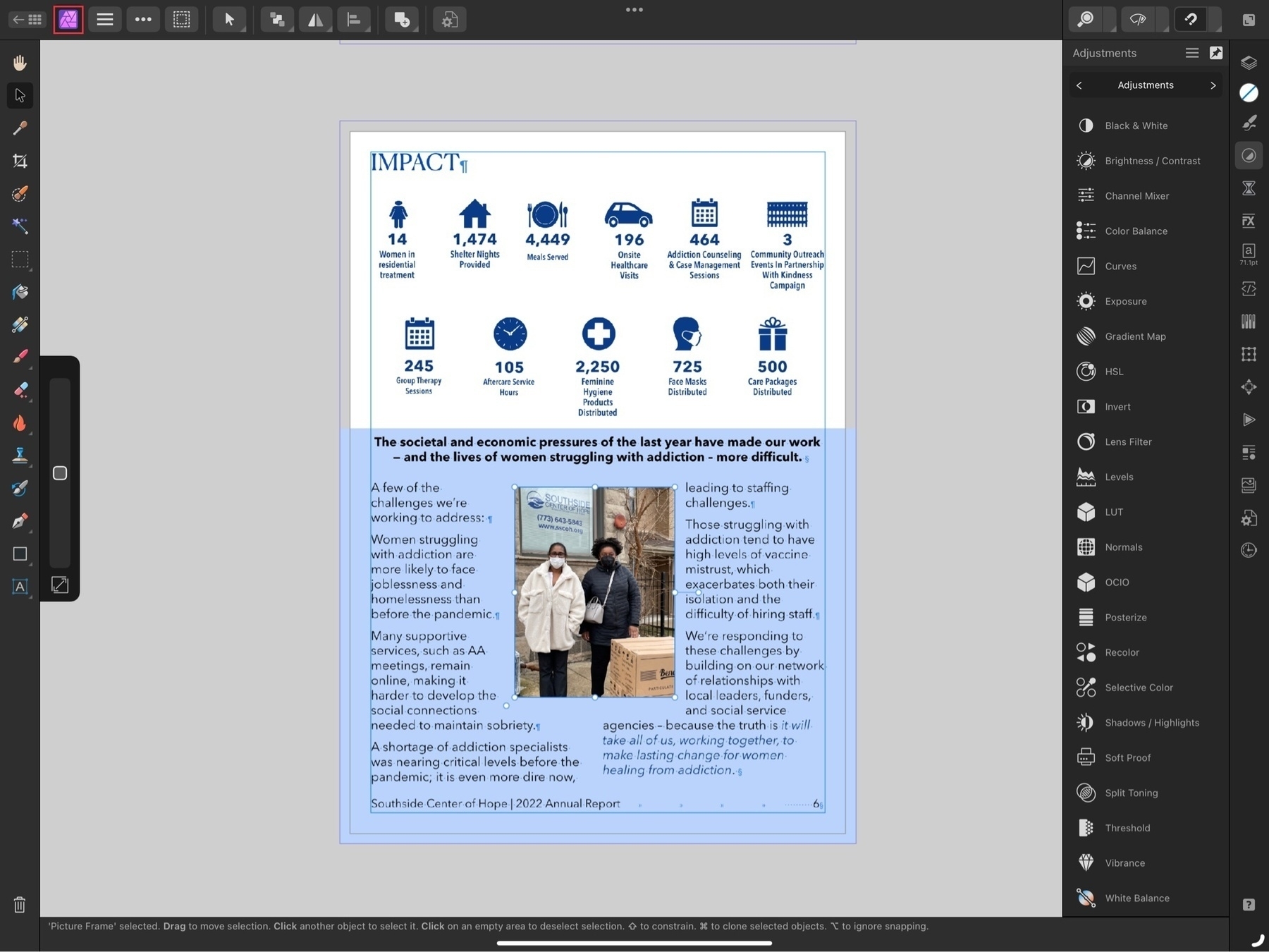 Notice the Publisher icon in the top left has been replaced by the Photo icon. Also the sidebars reflect the tools found in Affinity Photo.[/caption]
The last feature I’ll mention is perhaps one of the best. StudioLink, allows me to open up an a vector graphic in Designer or an image in Photo without actually leaving the Publisher app. It’s an amazing feature though it does require that you have all three apps installed to work. From within the Publisher app the other two apps are referred to as “Personas”. Open them up as needed by tapping the Publisher icon in the top left of the window where you’ll see a dropdown menu showing the other two apps. Choose the other app you need and the Publisher toolset will instantly change to the tools and features found in the other apps. Make adjustments to images from the Photos Persona, create advanced vector graphics or edit embedded vectors from within the Designer Persona. You have the full range of the tools found in the app you’ve “switched” to. When finished just tap back to the Publisher Persona to return to page layout. The transition is seamless and instant.
Serif has set a high bar with the Affinity apps on the iPad and Publisher allows all three to work together seamlessly. And at a time when Apple pundits continue to doubt the potential of the iPad as a powerful tool for creative work, Serif demonstrates what is possible.
If only those pundits could occasionally step away from the churning the rumor mill for a bit they might actually discover there are still innovative developers working hard to create valuable tools used by real people in the real world.
Serif’s Affinity 2 apps continue to be a fantastic bargain. Buy single apps or buy the universal license and use the Mac, Windows or iPad apps, no subscription, these are a one time purchase.
