iPad Journal
- Ads
- Apple+ is Apple’s new News and magazine service and the stories are mixed into my feed. Sometimes a new magazine will take up nearly half a page. If I were a subscriber I’d be okay with that but I’m not and I have no option to turn it off.
- When sharing Apple News articles the link is a proprietary Apple News format. Fine for sharing to Apple users but I often share to a Slack group that has several folks who don’t use Apple. I’ve got a fix in the form of a Shortcut that converts but I should not have had to do that.
- The training is not all that great. I often see stories I do not want to see and it seems no amount of training with dislikes helps. Even worse, when I block a source it often persists for a day or two rather than disappearing immediately. No, no, no, I don’t want to see stories about the British royal family, not interested in sports either!
- Last, some stories in Apple News have ads and some stories, if viewed on a web site would have comments I’m interested in seeing. So, while the reading experience is often great, it can also be a bit cluttered and often requires that I load the story in Safari.
- Line spacing is still limited to pre-set increments. I can have 1 or .75 or .5 but not .9 or .8 and sometimes I need .9 or .8. This seems like something they should be able to fix.
- Spacing between characters.
- More keyboard shortcuts.
- Shapes are still not editable. On a Mac I can make any shape editable and then drag the points around in all sorts of useful ways create new shapes with curves. Very useful for brochures and that sort of thing.
- Multipart lines are still not possible. With the Mac I can create a line with the pen tool that has many different points which can then be curves or straight and the positions moved around. With the iOS version I can create a line with just one adjustable point.
- Advanced gradient fills are not possible. Included in this would be a gradient with transparency.
- I still can’t change a document type to “Page Layout”.
- Formatting table borders is still lacking basic options such as color and line width.
- It’s not possible to edit the color, angle, distance or spread of drop shadows.
- When exporting to pdf it would be nice to have the ability to choose the quality of the images.
- Paragraph styles can be created and edited
- Character styles can be created and edited
- Custom document sizes in document setup
- Facing Pages
- Page masters
- Switching from Portrait to Landscape
- Drawings
- Equations
- Sorting based on date, name, size, tags
- Quick view via “Recents”
- Labels/Tags
- Quicklook or preview files (this sometimes works on shelf apps but often does not)
Using the iPad Pro and Smart Keyboard Portfolio in non-standard configurations
It’s been over six months since I posted my thoughts about the 2018 iPad Pro and the new design of the Smart Keyboard Portfolio and my thoughts on the keyboard remain the same. I continue to love it. The design and typing experience are excellent and it is far more stable than the previous version. I regularly use it in my lap with no issues.
That said I still have two gripes: the lack of media control keys and the lack of backlighting. If these two features existed this would be the perfect keyboard for me (and I suspect many others). As we are fresh in the month of May we’ve now seen the release of three different takes on iPad Pro keyboard cases. Actually, I’m sure there are others but these are from three of the better known manufacturers: Zagg, Brydge, and Logitech.
These all look excellent and have those two features I want: backlit keyboards and media keys. I’ve looked at them all and thought about getting one. But there’s one common drawback to all three that keeps me saying no: They are heavier and more importantly, they confine the iPad in ways I don’t like, the Zagg and Logitech require the iPad be held in a shell-type case that’s hard to get in and out of. The Brydge has clips that are very tight and while it’s possible to pull the iPad in and out it’s still quite a bit more effort that releasing it from Apple’s offering. Also, the Brydge design makes flipping the dock up for multitasking more difficult. Also, all three are an added expense of more than $100.
One of the features of the above mentioned Zagg keyboard folio is that the iPad shell which has a kickstand detaches from the keyboard allowing it to free stand so for watching video and/or just using in a different arrangement with the keyboard. I like his and have often done this in the past with various stands and my beloved Logitech K811 keyboard which has backlit keys and the media keys I want for use with the iPad.
I began to wonder, not for the first time in 5 months, how I might make better use of this keyboard. Could it be better used in conjunction with the Apple Folio?
 I’ve known of the trick of flipping the Folio backwards and upside down for creating a drafting table sort of angle for use with the Pencil. While it looks a bit odd it works great and it was that sort of thinking I was after. How might the case be flipped or otherwise used in a non-standard configuration with an external keyboard?
The first and an embarrassingly obvious thing to do (and I can’t believe I’ve not tried it till now): I just sat it on top of the keyboard of the Smart Keyboard Folio and started using it instead. I think I’d assumed that there would be issues with the keys of the Folio keyboard registering taps but they don’t. (Well, in my lap they don’t. I noticed that on a hard surface the keyboard does sometimes actually register key presses on the spacebar and the keys on the bottom left and right). But there were also two additional problems. For some reason, if the iPad is docked in typing mode on the Folio the Command-Tab and Command-Spacebar shortcuts for app-switching and Spotlight stop working. Well, that’s no good! I use them far too often and won’t do without. But now I was somewhat hopeful that I might find another configuration.
What if the iPad is used in a sort of A-Frame position? Would it be stable? Yes, this has some real potential.

In my lap while sitting in my favorite work spot, a big bean-bag chair and my legs up on my table. Actually very stable and now I can adjust the angle. Been working this way all morning. I often use a little homemade lap-desk, just a bit of shelf wood that is 12” deep and 20” or so in length. Perfect for having a cup of coffee on my lap next to the iPad. This A-frame configuration also works great on that little desk.

 Out on the porch you can see the variety of angels possible. Also, conveniently the Apple Pencil still has a place to sit though it obviously won’t charge. Note, on some smooth surfaces the iPad would probably slide a bit but in my lap and on this table it stays put.
So, now I’ve got a set-up that cost nothing extra, allows me to make more use of a keyboard I already had and which has the added benefit of more viewing angles.
Mind Mapping Experiment
A year or so ago a friend on Twitter asked me if I used or had ever tried any mind mapping apps. I had not. He was pretty excited and suggested a couple. I took a look at a couple and thought they might be useful for particular projects. I downloaded iThoughts and gave it a spin. Then I almost never used it. Why not? The short answer is that I think this is the sort of app that is useful for larger, more complicated projects and those happen to be the kind of projects I don’t take on very often.
Most of my work is of a repetitive nature, small one off projects finished in one to three days and most of them come in one at a time so I’m rarely balancing two or three projects at a time. Most of my work is website updates and document designs and layouts. I have no need for mind maps for these things.
In my initial test I came away thinking that mind maps would be great for long writing projects and larger projects that require more steps and ingredients than I usually handle. As it happens I’ve got a potential project coming up that would probably benefit from actually diving in with this kind of app. It’s only a potential project at the moment. It is a volunteer project involving the local library which may involved several people, organizations, and an ongoing and complicated process (compared to my usual).
A few days ago I saw the new version of MindNode was released so I downloaded it for the free 2 week trial. I spent an hour with each app and came away with the impression that iThoughts is a more powerful app in almost every way.
MindNode is better in the area of visual style with a couple of added features. It’s also got newly announced support for second, external USB C monitors which might be nice for some.
But iThoughts seems to be the more capable app. It’s got support for markdown in the notes for nodes, the ability to import a greater variety of objects, and far more export/sharing options. After an hour of using them I felt like I’d gotten a solid handle on how they each work (very similar) but also had the sense that I’d reached the limit of MindNode’s feature set.
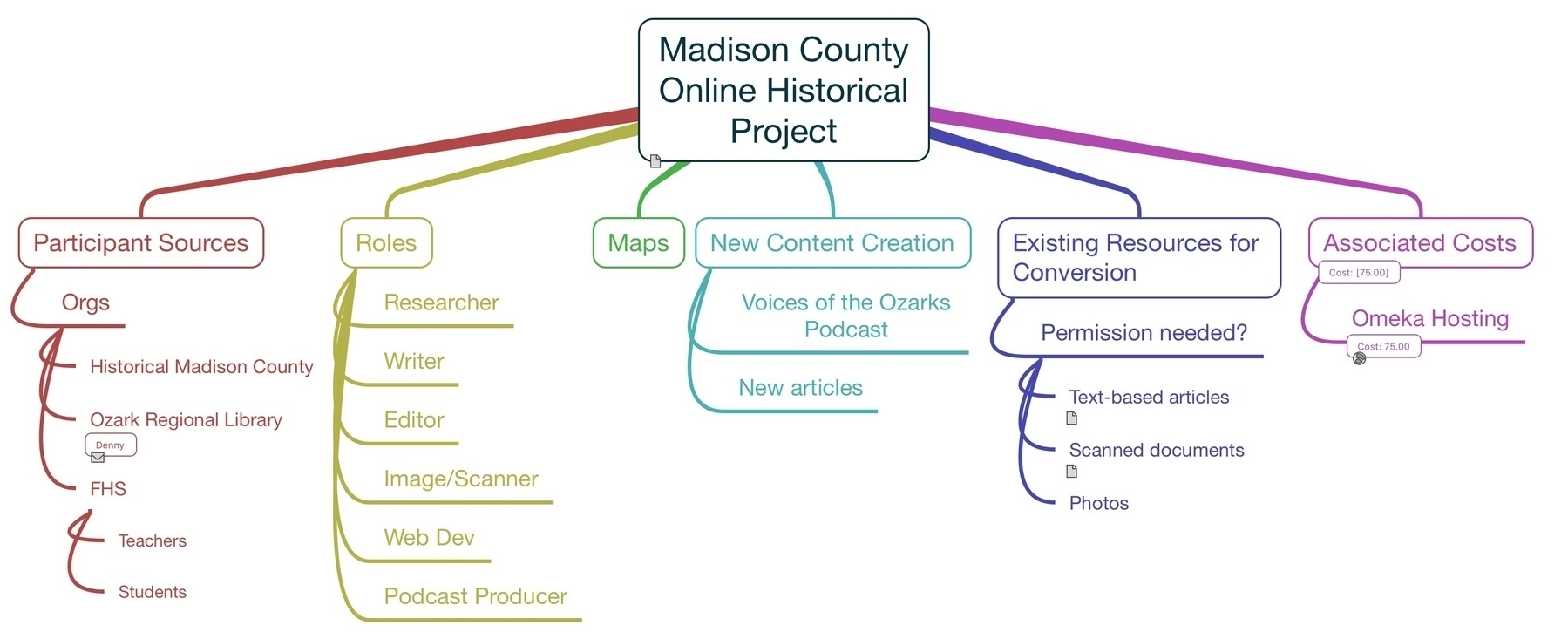
With iThoughts there is more to learn and more that I could do. An example, the project I’m mapping, is a collaborative local history project which includes several small non-profits, various resources being digitized, a podcast and a website where the materials will be catalogued. iThoughts has the ability to work with special categories of notes such as tasks with due-dates, resources (people in orgs), cost calculating nodes, and project progress (for nodes that have tasks). Also, I can drag and drop contacts which will add clickable email links for the contact. I can also drag and drop websites and many kinds of files. Some files, such as Pages files, cannot be drag and dropped but can be added via the attach context menu. MindNode does not seem to support any of these features and really, they are the kinds of features I think I’d want to have available for the kind of project I’m likely to use a mind mapping app for.
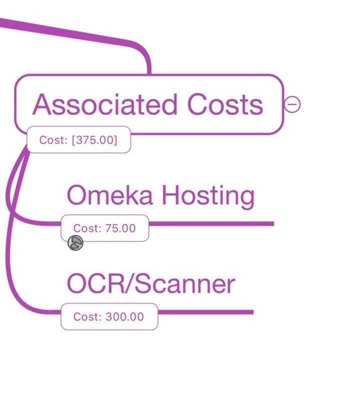
Back to my case test, as I developed my mind map I wanted to add people to the workflow and add email addresses to those people. Ideally it would give me the option to add a link to the contact vCard but the email is what it attaches and in most cases that’s what I’d want. I’ll also be wanting to add project resources such as forms and documents and as already stated, this is no problem. Also in my case test I added a node for possible project costs. This is a potentially very handy tool! As new child nodes are added a designated parent node calculates the costs listed in each of those children. So, in my case, web hosting has already been added. Any new possible costs can be added as nodes and the parent will keep it tallied.
I’m liking the way this is going and I can see this being a tool I use for future projects of this kind. As this particular project continues, IF this particular project continues, I look forward to continuing with iThoughts.
A few thoughts on Apple News and RSS apps
I’ve been using RSS apps since the early(ish) days of it’s existence. I think it was 2002 or 2003 that it became a habit for me. I’ve had at least one RSS app on my Mac and then iPad ever since. For years that app was NetNewsWire. I’d occasionally try others but that was the gold standard. As I recall there was a time when it became a bit stagnate and then was sold. During that time other apps popped up, namely Reeder which became my RSS app of choice. Then along came the iPad and a flurry of RSS apps along with it. I tried several but when Reeder became available for iPad I settled on that. For many Reeder took the place of NetNewsWire as the new standard.
[caption id=“attachment_878” align=“aligncenter” width=“800”]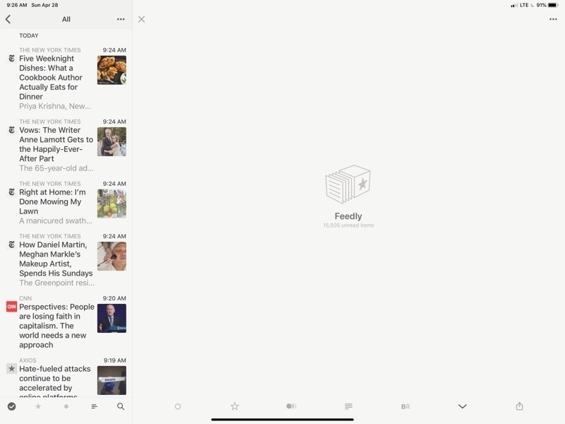 Reeder 4 on the iPad. There’s a lot of wasted space there.[/caption]
What’s the point of RSS? Well, it makes subscribing and skimming a large number of publications easy. Scrolling through headlines with article summaries becomes very easy. Rather than load an entire site I can refresh 30 or 40 and then skim through them all at once. I can do this by topic area or with all of them mixed up. In my case I’ve got groups (folders) by categories such as news, Apple, tech, environment, etc. On slower internet in rural areas it’s a fantastic help.
[caption id=“attachment_879” align=“aligncenter” width=“800”]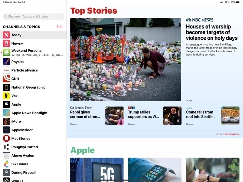 This is the Apple News page in all it’s glory. Nice images, headlines and pleasant to browse[/caption]
A couple years ago Apple released their iPad and iPhone take on a news reader called Apple News. They’d dabbled for many years with RSS built into Safari and even the mail app at one point had RSS built in. But with Apple News they built a dedicated app they really worked pretty well. While RSS and Reeder remained my primary tool I found myself gradually using Apple’s app more and more. I really enjoyed the design of the app which presented the news as a full page of news thumbnails each with an image (usually) and the headline broken up into sections and source publications that I could follow or unfollow with the ability to like or dislike stories as well as save them for future reading. Apple throws in sections and stories from other sources to provide variety and the reader has the option to dislike stories or block sources as needed. In theory this is training which is supposed to improve what Apple provides.
[caption id=“attachment_880” align=“aligncenter” width=“800”]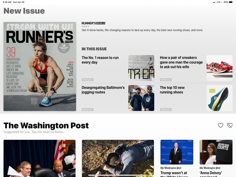 That’s a lot of wasted space for what is, essentially, an ad for Apple’s News+ service. I can’t hide it.[/caption]
What I find most enjoyable with Apple News is the full screen layout of stories, the mix of stories and the reading experience of a story. But there’s a downside (there’s always a downside) and it is three things.
But all in RSS land is not perfect. Reeder, was recently updated to support the new iPads and added a few new features. Nothing game changing but still a solid app. Funny though, I had switched to another RSS app, Newsify, which had added support for the new iPads and have come to like it’s interface as much as Reeder’s. It’s not perfect but it works. I spent the past couple days bouncing back and forth between them and found that each had features that I wished the other had. Neither felt complete.
[caption id=“attachment_881” align=“aligncenter” width=“800”]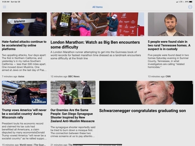 Newsify is properly using the space of my iPad to display a variety of articles with images[/caption]
After some experimentation I’ve found a solution that, I think, brings the best of all three. My main annoyance with Reeder was its huge waste of space when browsing stories. It only takes advantage of a small column on the left for browsing through articles. The primary part of the app is empty. After months with Apple News this was bothering me immediately. In the time I’d been using Newsify I came to enjoy the fact that while the number of articles displayed was about the same they stretched across the screen and more information was provided about each. Still not as nice as Apple News but at least the screen was being used! But there’s a fix that I discovered yesterday while poking around settings in Newsify: It can be displayed using “Newspaper View”. Perfect. Now I had something that looked nearly identical to Apple News!
[caption id=“attachment_883” align=“aligncenter” width=“800”]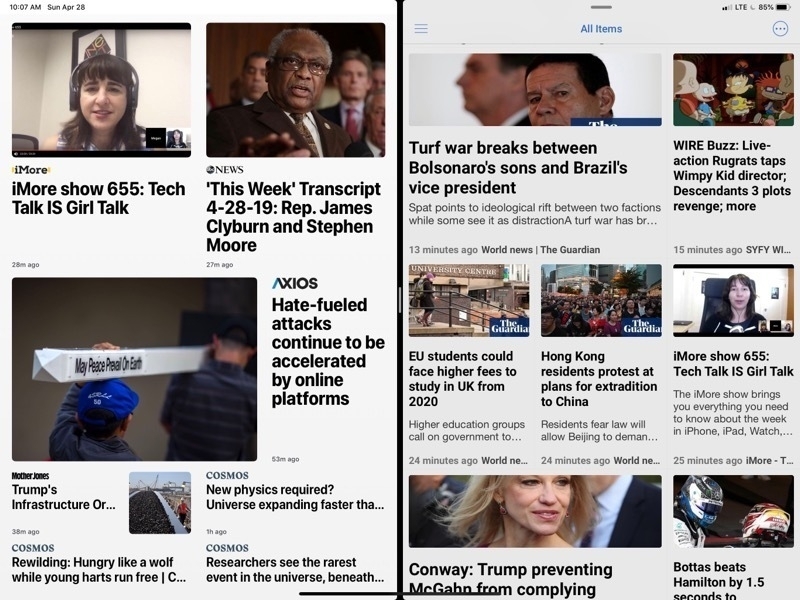 Apple News on the left, Newsify on the right. To my eyes both are very pleasing to browse.[/caption]
So, now I’ve got the article browsing I want without Apple’s ads and no Apple News+ articles I can’t read. What about the reading experience? Close. Unfortunately you’ll note that in Newsify this article does not display the full text but has a “more…” link to click through.
[caption id=“attachment_884” align=“aligncenter” width=“800”]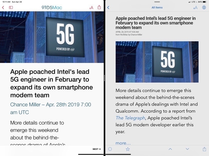 Viewing an article. Almost there but Newsify does not display the full article. Notice the “more…” link[/caption]
Of course that takes me to the full page on the website which is chock-full of ads. But Newsify has a setting which will load the page in the built in Safari View and switch it over to “Reader mode” which is, of course, the perfect uncluttered display comparable to Apple News. I just tap the article title and I’m ready to read in a few seconds. Side benefit, if it’s an article I want to view comments for I can turn off the Reader mode and they’re already to go.
[caption id=“attachment_885” align=“aligncenter” width=“800”]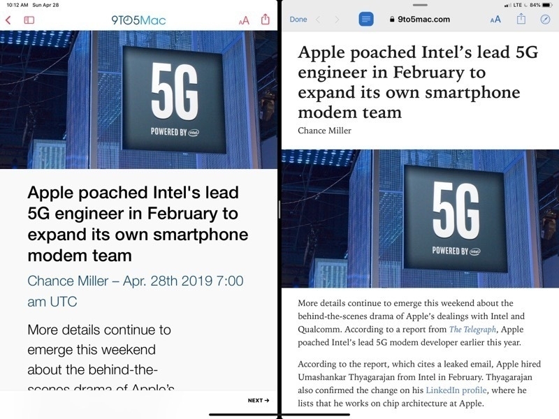 Apple News on the left, Newsify on the right in “Reader mode”. Perfect.[/caption]
Newsify does have a premium subscription which includes a full text display for these kinds of articles but either way I have to tap just once to get a result with is nearly identical.
So, with Newsify and a few tweaks to a few settings I’m getting as close to an ideal (for me) RSS reading experience on the iPad.
2018 iPad Pro: The review scene and bigger picture context
As I write this we’re about two weeks in since the new iPads were delivered and there are reviews everywhere and most of them say the same thing which I can sum up as “fast and powerful but limited by iOS and the lack of professional apps”. I’d like to offer a counter to those reviews and the half-baked argument they make to cover-up their own lack of effort and knowledge. But first just a few words, not about iOS or the professional app ecosystem, but about the new iPads.
By way of introduction let me say that I don’t use an iPad as my primary computer because it is the most powerful computer I own (though it is). I use the iPad because it enables me to do the work I need to do (as does the Mac) and because I find it the most delightful computer I’ve ever used. I have said this about the iPad Air as well as my previous iPad Pro and I’ll say it again about this new iPad. This is the best computer I’ve ever owned. As tech goes, the 2018 iPad Pro is a stunner in every way. By itself or attached to the Keyboard Folio with the Pencil, this is a beautifully designed computer that is so much fun to use.
I’ll discuss in order of impact as to how it feels in my use. I’ll start with the Keyboard Folio because I use the iPad attached to a keyboard at least 60% of the time.
The new folio is a much more stable experience than the previous Smart Keyboard. With the Smart Keyboard there was always the feeling and the chance that it could tip or flop backward or, more likely, forward. Even so I used it all the time because I appreciated the proximity of my hands to the screen. Also, I really liked the feel if the keys.
The new Smart Folio Keyboard is so much better because while the keys are the same, the solid base and new magnetic back attachment means the iPad is now very stable even in the lap. I feel completely safe using it knowing that it will not flip or flop. In fact, it feels as stable as a traditional laptop. With this design the only thing I feel I’m missing is the back-light and top row of media control keys. And those are big misses to be sure, but even so the experience is still excellent. I really like the sound and feel of this keyboard, more than any other keyboard I can remember using. It’s a personal preference and some might dislike it.
Another aspect of the new keyboard is the much easier set-up and the new available angle. I can go from closed to typing with less effort. For the tablet experience I can remove the case all together with little effort or fold the keyboard all the way back. Both are very nice. With the keyboard folded back it has a nice grippy feel as the magnet is strong enough to hold it solidly in place but with a flick of my fingers I can easily drop it down for use in the keyboard position.
A last note about the keyboard is just how satisfying the feel of the magnets are. Closing it up results in a subtle but nice click which can be felt and heard. Seating the iPad in either of the two slots also has a satisfying feel and click which affirms the sturdiness of the new configuration.
Then there is the tablet itself. If I had to summarize the difference between the new design of the 2018 iPad Pro compared to the previous it is this: the 2018 feels solid and compact while at the same time lighter and thinner. As much as I enjoyed using the 2017 iPad Pro as a tablet, hand-held with no case, this one is even better in the hand. It feels very solid and yet impossibly thin given its other dimensions. Of course it’s very fast but so was the 2017 version. Even my iPad Air 2 is still fast with apps appearing nearly instantly.
Face Id is better on the iPad than the iPhone though it is excellent on both. The only failures I’ve had have been the result of covering the camera while holding it as a tablet. In those cases correction is quick and easy. When attached to the keyboard I simply tap the space bar twice and I’m good to go with no delay.
The Pencil is so much more convenient! The new combined inductive charging and magnetic storage method is vastly better than the previous. And, like the case, the magnetic connection provides a satisfying click as the Pencil is securely pulled into its place.
The last feature that is not at all new to the iPad but which I really rely on is LTE. My first two iPads had cellular but I then skipped it with the following two purchases. My reasoning was that between tethering and my home internet I would not need built in cellular. In practice my satellite internet is too slow. Tethering to the iPhone is faster but often fails the first few attempts to connect and too often my iPad would sleep and loose it’s connection or I might walk away with the phone and have to reconnect upon returning. In other words, it feels fiddly. Having the always on LTE is so much better. The iPad antennas provide a signal that is equal to or better than the phone and so my connection is always strong. Going forward any new iPad I purchase will have cellular because the experience is just too good to pass up.
Lastly, let’s talk about iOS and the app ecosystem. With iOS 9 I began the shift to iPad as my preferred computer. This was solidified further with the release of the multitasking features in iOS 11 and improved with iOS 12. Much has been made in recent weeks about the missing features of iOS. I won’t argue against facts. It’s true that iOS does not support mice or trackpads or accessing files stored on attached hard drives. It’s true that it’s missing certain Apple pro apps such as Logic or Final Cut Pro. As of this writing these things are true.
That said, the echo chamber of tech reviewers is stale and, even worse, misleading. It seems to me that many of these reviewers have not used iPads enough to know what is possible with iOS or the app ecosystem. Or, if they do, they are deliberately leaving out important information which counters their preferred narrative.
For example, yes, it’s true that I cannot plug in a usb drive and access files unless they are media files recognized by the Photos app, namely videos and images. I’m going to go out on a limb and guess that most reviewers mentioning the lack of file access on hard drives also consider themselves power users. That’s certainly what they imply or state. In this picture of professionals working in an office setting, it’s to be expected that they have access to a network and nearby computers. Using an app such as FileBrowser or Documents they can easily access their files in such an office setting. I myself have a MacMini that I use as a media/file server and it’s not uncommon for me to need access to older project files. In just a few seconds and a couple taps I have access to all of the files on my Mac or any hard drives attached to the Mac. I can open files from the Mac, copy them to my iPad’s local storage or save/export any of my local files back to the Mac.
If tech reviewers are going to position themselves as advanced power users, shouldn’t they be more aware of the many apps available which allow for access to any local file attached to a nearby networked computer? A part of being a professional user is being aware of the available tools, in this case, apps. But many “professional” reviewers seem to be largely unaware of what’s available on the App Store. That’s their shortcoming not the iPad’s. Take for example the many reviewers who mentioned the lack of Final Cut Pro. Are they unaware of LumaFusion? Apparently so. It’s #2 in the Photo & Video category with almost 5,000 ratings and an average of 4.8 stars.
Apple cannot and will not provide all of the needed software for their devices. That’s why third party app developers exist. From the well known giants such as Microsoft or Adobe to fantastic (though sometimes less known) developers such as Serif (the makers of the Affinity suite of apps, one of which is #1 in the Photo & Video category), Readdle, Omni, just to name a few. If reviewers are going to ding the platform because it is missing essential professional apps or app types then they should know that those apps are indeed missing. It is my contention that they would rather have something to complain about because that’s the in-thing to do with Apple these days. It get’s clicks. Meanwhile, the people who are actually using iPads know about these apps and use them every day.
I’ll round this out with what might seem an odd comparison. In recent years Apple has become quite large as a company (both in financial resources and employee base) and as they have increased in size so too have expectations that they are all powerful. At the same time many of their products are offered at higher prices. iPhones at $1,500!? iPads for $1,800?!? Outrageous. And so now there is the narrative of the “Apple premium”. One result is that reviewers feel they can and should hold Apple to a higher standard. I get that. But at the same time the reviewers themselves should be held to a higher standard. Critique is fine but it should be fully informed and thoughtful. Mostly I see cheap repetition in reviews.
Apple does charge a premium. But you know what else Apple does that is not mentioned in the reviews? Apple has gone to extraordinary lengths to become an excellent environmental citizen. To my knowledge no other company has come even close to what Apple has achieved. This is worth something and it has to be paid for by everyone including consumers. Along the same lines, few reviewers mention the fact that Apple devices get new OS updates for many years, far longer than those in competing systems. So yes, if one purchases a top of the line device they can expect that it it will continue to receive updates and function well for 4 to 5 years or more. These are not throw away devices to be tossed aside after two years.
While I don’t use it often I still have a 2012 MacMini that stays on 24/7 as a file and media server. I occasionally use it for InDesign projects as well. It still has plenty of power and runs the latest macOS. I will be able to use my iPhone X for at least another 3-4 years if I choose to do so. The 2018 iPad should serve me well for at least 3 to 5 years. I’m still using an iPad Air 2 introduced in 2014. It’s 4 years old and I expect I’ll get another two years, possibly more from it. While I greatly prefer the larger screen of the iPad Pro the Air 2 could be my only iPad because it still functions very well. Apps open up nearly instantly and rarely do I see a slow-down when I’m using it.
Rarely do reviewers mention the longevity of Apple devices and this is an oversight. Their reviews are incomplete without this bigger picture.
One last bit. In reviewing Apple products and the bigger picture, I’d suggest that reviewers should at least mention the value added by Today at Apple. This isn’t just a sales gimmick being offered up by Apple. It’s a real offering that requires real resources and it’s offered to Apple customers for free. If I lived near an Apple Store I know I’d take advantage of the program. Aside from this excellent post at MacStories I’ve barely seen mention of the program in any of the Apple Press and that’s a disservice to their readers.
Pages Fall 2018 Status Update
Because Pages is one of my most loved and used apps I pay very close attention to the feature set. In particular to the features as compared between platforms.
Five years ago, October 2013, Apple released Pages 5.0, a complete rewrite of Pages on the Mac and iOS to bring them into a unified format and more similar feature set. It freaked a lot of users out because it meant that the Mac version lost many features it previously had. I’m not going to go into comparing the current version of Pages on Mac to the previous version. In my recollection, we’ve gotten back almost everything that was lost. What I’m most interested in is the still missing features on Pages for iOS.
It’s been 5 years. How are things going?
Apple’s done a good job of bringing the iOS version into near parity with the Mac version but it’s still not there. I still have to make some tweaks on the Mac and that’s not something I should have to do 5 years in. So, what’s still missing?
I’m sure there are other missing features but these are the things that I’ve come across in recent weeks that have been problems.
But let’s give credit where due. What’s been added in recent versions to bring the iOS version of Pages up to par? Some of the most recent notable changes include:
One last bit. Apple has positioned the iPad Pro as a pro device. Not only should they finally fill in the above mentioned gaps between the Mac and iOS versions, but it might be nice to see a few advanced features added that would bring it more on par with apps like InDesign. For example, drop caps! Sure, I can create those with text boxes but I shouldn’t have to work around this. One feature that might be considered more advanced would be the option to have an art board around documents. A place off the document that allows for storing bits of text, shapes, images, etc. I don’t expect it but it sure would be helpful. More advanced PDF export would also be nice.
All in all I find Pages to be an incredible app and I use it several times a week. For what I do it is essential. I’m happy with the progress made thus far and it’s so close to being “finished”, as in, feature complete when compared to the Mac version. Tomorrow is the 2nd big fall event in 2018, new iPads are coming. Would be a special treat of a substantial Pages update were also announced! Come on Apple!
The shared clipboard in a multiple iPad workflow
As we come up on Apple’s October 30, 2018 event and the almost certain announcement of new iPads I’ve debated whether I will sell my current iPad Pro or keep it. Over the past few months I’ve found a great use for a second iPad when working on certain projects. Something I’ve started doing for certain tasks is using my iPad Air 2 as my reference screen. I can usually do everything just on the Pro in split screen but on occasion I’ll have a project that requires two larger screens and at that point it’s like having a dual monitor Mac.
One such task involves my use of the Affinity Apps, Designer and Photo. Both of these apps are full screen only, no split screen. Which is actually fine with me as the work I do there really requires the most screen I can get. But sometimes I need to reference both text and files for a project. If I can only have a slide over I’m limited to one or the other. I just finished such a project, a promotional postcard for which the client sent images and text to be used as content.
My workflow in this case was made so much better with the second iPad which became my text provider. On the Pro I had my Affinity Photo document and the Files app as a slideover window. I placed the two iPads side by side and got to it. I could reference the iPad Air for my clients directions and needed text. I selected text on the Air and copied it. Then on the Pro I pasted the text into place. Then I used the Files app slideover to drag and drop the images into place. In some cases this drag and drop happens from Mail, Notes, or Safari as the images provider. It’s also possible to copy the images on the second iPad for pasting into the Pro. Anything that can be copied to the system clipboard can then be pasted into the second device.
While it’s not quite the same as working with one computer and two displays it comes close to feeling like that which is what matters. Other than reaching over to the second screen or keyboard I don’t notice a slowdown to my workflow.
Batch processing images with Shortcuts
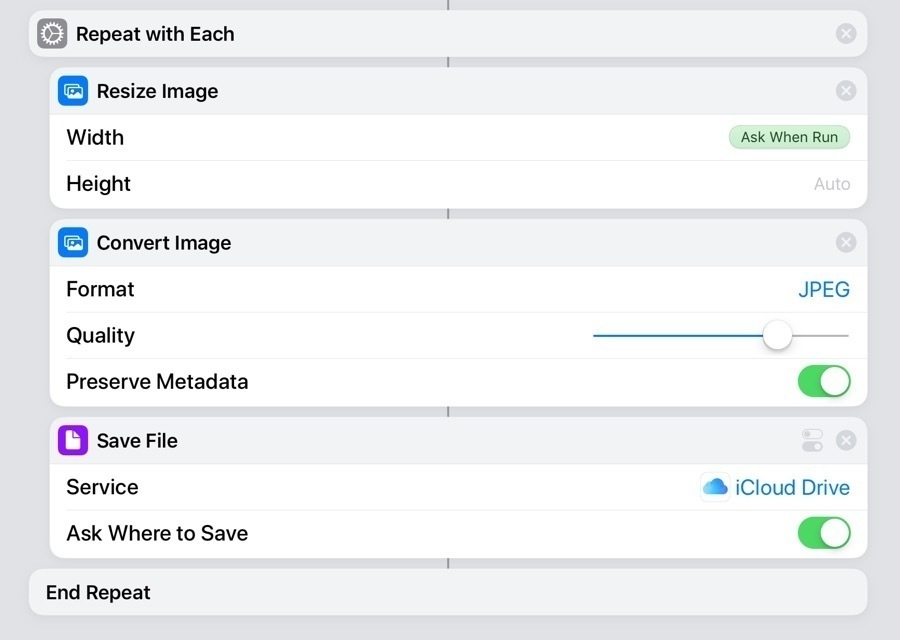
Much of the work I do involves adding new content to client websites. It’s usually a mix of text and imagery and the images can come in many forms though they usually get posted as jpg files. One of the most time consuming tasks is processing images from email or Messages. Some images are already web-optimized and can be posted as is. But more often than not they are too large or can come in file formats I need to change. Everything from Apple’s new image format HEIC to pdfs to tiffs come to me. Sometimes the image will need cropping, color or light adjustments or other work in which case I’ll open it in Affinity Photo.
But quite often the images don’t need much work, they just need to be optimized and converted to jpg. That’s when I use a Shortcut. This is especially useful when I’ve got multiple images that need to have the same thing done to them. Most recently a client sent 10 images in the HEIC format. These were originals taken with an iPhone. After selecting and dragging them all from mail into Files I selected them in files and then shared them to my Batch Process Images Shortcut. The Shortcut then ran through each image prompting me to select a size, image format and quality level, and finally, a save location.
There are various ways of doing this that would save even more time. I‘ve also created a Shortcut with a preset image size, format and quality level which is set to save in a processed images folder. If I choose this Shortcut all the images will be processed and saved with no intervention from me. Each image takes less than a second and so 20 images can be processed in just a couple of seconds. It’s a fantastic timesaver. The only thing that will be left for me to do is re-name images which is not something I want to automate and then move them into place in the appropriate project folder.
Download Batch Resize with options. Download Batch Resize with presets.
A big thanks to Jeff Perry of Tablet Habit who helped me create the Shortcut! I’d tried a couple of times and failed. Turns out I was missing 2 important steps. He added “Repeat with each” to the beginning of the workflow and ended it with “End repeat” and that’s what I was missing.
Apple stock app favorites: Files and Notes
I wrote recently about using Apple’s Stock Apps rather than third party apps. It was a response to a thread over at the Mac Power Users forum. I’ve since seen quite a few threads pop up there regarding third party utilities designed to store text, images, pdfs, etc. Some are semi-permanent, longer term storage such as Evernote and others are temporary shelf type apps such as Yoink and Gladys. Like many productivity and to-do apps these seem to be a constant magnet for nerds that want to experiment. Funny that as I write this I’ve come upon David Sparks' most recent post as he experiments and considers a move from Apple Notes to Bear. I’ve tried many of these myself. But when it comes to notes and similar utilities, I’ve always come back to using Apple Notes and Files.
Recently version 2.0 of Yoink was released with one of the new features being iCloud syncing. I read the review over at MacStories and thought, hmmm, yeah, that’s nice but I reached the same conclusion I’d previously come to: I can just as easily use Files and Notes instead of Yoink. With the Apple apps I’ve had iCloud syncing for awhile and they sync to the Mac too. With this latest update Yoink on iOS will now sync but won’t sync on the Mac yet. So in that regard it’s still not on par with Apple’s apps.
With the introduction of system-wide drag and drop in iOS 11 Apple made it extremely easy to transfer content from practically anywhere via dragging and dropping. I’m really interested in the benefits of using Files and Notes as the end (or middle) point of this content collection in place of third party apps. Also, once in Files or Notes, how easy is it to use content in other apps?
What’s the difference in third party apps and the Apple apps? Well, for starters, the third party apps are often more specialized. Apps like Evernote are for long-term storage and indexing of content for retrieval later. I think of them as digital scrapbooks. The shelf apps are usually for temporary storage while working on a project. Drag text, images, pdfs to a shelf app and then use it a short time later and then likely delete it from the shelf. With third party apps the user is likely making a decision between longer term storage and short term storage.
With the combination of Files and Notes I’m not necessarily thinking that way about my content. Neither of those apps is really designed for short or long-term content. These apps are a bit more general purpose, a little less specialized. If I’m working on a project today, tomorrow, or next week, I can drag images, pdfs, or text right into my Documents folder in Files or into a project specific folder if I have one. The Files app works just as well (in most ways) as a dedicated shelf app and in fact I use it as a shelf app everyday. And in so many ways it is better than the dedicated apps.
Here are a couple of recent examples in which the Files app served as a “shelf”. I recently made a forum post and wanted to illustrate with screenshots. I took the screenshots and saved them into my Documents folder using a Shortcut that also converts them to jpg, shrinks the size and dimensions. Note, you generally can’t save files to a shelf app, they are for dropping files. Then I opened the Files app next to Safari and started my post. I was able to drag and drop the jpgs into my compose field with no problem. Another example, a client sent images I needed to use on a website. In this case the images were sent via both email and Messages. I opened Mail and Messages into splitview and then opened up files as a third slideover window on top. I navigated to my project folder in Files then it was a quick drag and drop from Mail and Messages. Done. There was no need in this case for a shelf as they were going straight to where they needed to go.
I should also point out that the Files app has several important features that the shelf apps generally seem to be missing. These are pretty basic for a file browser but are often essential to getting work done efficiently when using files.
Of course Files has its limits. The most notable (in my use) of the app is its handling of text clippings. It accepts text via drag and drop but often turns it into RFTD files which can then be difficult to open without extra effort. The shelf apps are pretty good at handling this sort of thing and this is where I’ll tend to use Notes as it handles text very well. Notes is my go-to if I’m not quite ready to work with the text or if I’m gathering bits of text from different sources. In that case Notes becomes my shelf app. In some cases where I have an immediate use I‘ll skip Notes and just bring up the app I’ll be using to process the text. If it’s a document for design purposes I’ll drag the text right into Pages or copy/paste it into one of the Affinity apps (the Affinity apps do not accept text via drag and drop. If its for a web page I’ll copy/paste it right into Textastic (Textastic also does not support drag and drop of text!).
Notes is also a good option if a client has sent me a mix of text, pdfs, and images that I need to use for a website update. In that case I drag and drop it all into a note then I switch from Mail to Textastic and work off of the note to process everything. Text is copy pasted while the images or pdfs are sent to from Notes to Shortcuts for resizing or converting if needed then saved into the appropriate project folders. I’m taking the same steps I would take if I had saved it all to Yoink or another Shelf app.
I mentioned above that David Sparks, like many, is trying out the notes app Bear. It’s a nice app with a few features that Notes doesn’t have, namely themes, tagging and Markdown support. Regarding Markdown support though, I don’t really need that in my Notes. I already have Drafts and iA Writer which is where I usually write blog posts, not sure I need a third app for that. Themes are very nice but not something I really need. Tags though, I’d really like to have tags in Notes. But are tags worth the subscription cost of Bear? Nope. I will say though that the cost of Bear, as a subscription, seems pretty reasonable at $1.49/month or $14.99/year.
Notes has an incredibly rich feature set some of which is not available on Bear. For example, Notes can be locked for relatively secure keeping and they can be shared with other iCloud users as collaborative documents. PDFs and practically any media can be easily embedded in Notes. Any app that can save or print to pdf can also send that PDF to Notes and bonus, the content of PDFS is intexed. Bear supports some but not nearly as much embedded media.
Like most other text apps it’s also possible to share Notes content with the sharesheet. The sharesheet is incredibly flexible at letting me share in a variety of ways: pdfs, Messages, Slack, email, or even as a WordPress post with images. It reminds me a bit of Drafts in that it’s a great place to just begin with some text. But while Drafts has greater flexibility through automation, Notes has the added benefit of being able to add various media from images to gifs to movies to audio. And while I personally don’t do much note taking with the pencil it’s an option other folks might like. For those that record meeting notes or lectures I can see how having notes open with Voice Memos in the background for recording would be useful. After the event the audio recording could be saved right into the note. Playback happens in a bar at the top of the note which allows for editing of the note while playing and pausing. Most of these are features that neither Bear nor Drafts have.
Notes also has an excellent scanning feature via the device camera, sketching, and mark-up of pdfs and images. Of course Notes also has excellent text formatting with the usual and expected things such as bold, italics but also Title, Headings, Body, Lists, indented text and tables. Much of this formatting is intact when shared with apps such as Mail allowing for more formatting in those apps should you need it. While sharing via the sharesheet strangely lacks Pages as an option, copy/pasting into a Pages document carries over the formatting perfectly. Very nice should you decide a note needs the more advanced layout features in Pages.
For example, you start a note for a class assignment which ends up including formatted text, a couple images, an audio file and a sketch. You spend a few days writing and gathering content for the assignment but then need to package it in a nicely designed document. Just select all, copy and paste into a new Pages document. You’re ready to do some layout.
Given the deep feature set of Notes and the integration of Notes and Files with iCloud, they form a solid foundation for getting things done on iOS devices. Not only are they adequate but they are a pleasure to use and they come with the operating system so no subscription or extra payments are necessary. Of course I like to see third party development but I don’t have limitless budget and cost is a factor for me especially when subscriptions are involved. For now and the foreseeable future I’ll be sticking to Apple’s Notes and Files in these categories of apps.
Donating time to the Ozark Regional Library
We have an excellent rural library system but like many public services in rural areas funding is always hard to come by these days. A year ago I started volunteering shelving books and doing a bit of tech support for a few patrons that occasionally showed up when I was there. After a few months when shelving help was less needed I began helping out with graphic design and then a few months back when a new website design was needed I offered that as well. I thought I’d share a few of those projects here.
A few notes. As usual, all work was done using the iPad. For the design documents Affinity Photo or Affinity Designer was used. For the website, Textastic for coding.

Regarding the new website, as is almost always the case I started with one of my templates based on the Skeleton framework. I forget now the CMS that was used on their original site but the page code was a nightmare to look at. Each page was 3 to 4 mb due to scripts and graphics. It was not a responsive design. Not surprisingly the pages took forever to load which is made worse by slow internet speeds in this rural area. The new site loads nearly instantly even on slower connections. Pages are more like 500kb. Web fonts are probably the main bottleneck now.
Flyers are typically printed at 8.5 x 11, occasionally larger and also posted on social media. Here are a few recent designs.
First up is the most recent advertising an upcoming presentation about growing up in Okinawa. I really enjoyed making this one.

The reason for the next is pretty obvious! As is usually the case, I really enjoyed this one too.

This was a quick job! A more simple design largely due to time constraints.

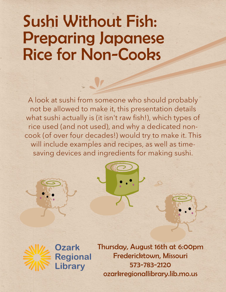
I had a lot of fun making these little sushi characters.
Interview on the iPad Pro Podcast
Hey, neat! It was a lot of fun talking with Tim of the iPad Pros Podcast about using the iPad as a primary computer. We covered lots of the workflow details for using an iPad for layout and graphic design as well as web design and website management. If you enjoy nerding out about iPads and iOS give it a listen!
Affinity Designer on the iPad!
We’ve known for awhile that Affinity was bringing it’s fantastic vector app Designer to the iPad. It began on the Mac 4+ years ago and I’ve enjoyed using it along with Affinity Photo (also on the Mac) but since moving to the iPad I’ve wished for it on the iPad.
In June of 2017 Affinity released Affinity Photo for iPad which has proven an amazing app and not surprisingly has garnered great reviews and an Apple Design Award. Having Photo on the iPad was actually better for me than Designer would have been because as a web designer I’m often in need of an app that allows me to work with images as a part of a graphic design followed by outputting a web-optimized image. But of course once I had a taste of Affinity Photo for iPad I was eager to get Designer as well.
An interesting thing though, about both of these apps, is that they reach pretty deeply into the abilities of the other. Which is to say Photo has amazing vector tools and Designer has excellent raster tools. Also, as on the Mac, I can create a new file in Photo and then open it in Designer or the other way around. So, say I start a project in Photo and then decide I need add some text on a path. It’s no problem to open the file in Designer and add my text on a path. I can finish there or send the file right back over to Photo. It’s a great workflow and easy with iPad drag and drop. That said, if you want to make adjustments to a photo you want to do it in Photo. And if you want to do a primarily vector project you’re better off doing in Designer. But you’ve got the freedom to jump back and forth if the app you’re working in falls short.
I’ve made great use of Affinity Photo over the past year designing everything from event posters to anniversary invitations to promotional real estate postcards to web graphics. It’s a powerful tool. Now with Designer on my iPad I’ll be able to cover the tasks that were missing. For example, the above mentioned text on a path. I don’t need that often but when I do I can now do it on the iPad rather than sending a file to my Mac.
Another fantastic feature of Designer that’s missing in Photo that I’d like to mention is vector brushes using the pencil tool or vector brush tool. A very handy way to quickly draw lines and non-standard shapes with a wide variety of brushes, solid strokes or dashed strokes.

While I was downloading the new app from Affinity I received an email from them letting me know it was available. The first thing I did upon successful download was start-up a new document. Just for fun and using the graphic in their email as my inspiration I spent the next couple hours playing. At some point during this time I hit upon something I needed help with so hopped over to the Affinity website and checked out some of their video tutorials. I think I was looking for the different touch-based gestures which are, thankfully, covered very well in one of the tutorials. Then I got back to the exploration and pulled over a few files from Affinity Photo and opened them up. Then a few Designer files from my Mac. I spent the rest of the day giving it a run through and what fun! I don’t currently have a client project that calls for it but I’ll be playing with it as time permits. What I can say thus far is that it is almost completely on par with the desktop version of Designer.
Taking advantage of the touch interface is something every iPad app creator should have as a priority. This may be less important with text apps but with a graphics app such as Designer it’s important. Not surprisingly using Apple’s Pencil with Designer is a fantastic experience. Using the above mentioned vector tools with pressure sensitivity via the Pencil is very useful. I’m super happy with the number of touch gestures that have been implemented. 2 finger tap to undo, 3 finger tap to redo, 2 finger and hold while dragging an object to duplicate, dragging up or down on Stroke Studio icon to change the width of stroke or on the Navigator Studio icon to change the zoom are just a few of the many. Gesture support in Designer is comprehensive and very well thought out.
So, what’s lacking? It can’t be all good can it? The only miss that I’ve discovered thus far is an easy way to discover keyboard shortcuts. It has them, but it does not have the usual informational overlay display brought up by holding the command key. This has become common and I’m used to it working with most apps and it’s very handy. With Designer (and Photo) you have to jump out of your document and go to the app help and search for it. I’ve also noticed a few moments when attempting to move around a document or moving objects, where things get a bit jumpy. That said, for the most part, things are very smooth, very fast. The experience is just as good as what I have on my Mac. Well, no, actually, it’s better because it’s on the iPad and I prefer the iPad!
As with Photo, Designer is exactly the kind of app that works fantastically with a touch screen and with the Pencil. Such a treat to work directly on the screen with this kind of app. These are exactly the kind of apps the iPad needs to be taken more seriously as a computer for getting real work done. Whether related to the release of Designer or not, the day after its release Adobe announced that it would be releasing a full version of Photoshop for iPad at some point in the next year or so. And at some point in the future Illustrator. Personally, I’m all in on Affinity and have no interest in Adobe’s subscription model. Affinity has a great user base that is growing well and I’m really happy to see that. Competition in the iOS ecosystem is great and having such a solid non-Adobe option from a smaller company offering a range of excellent cross-platform products is wonderful for users.
The simple reason I prefer the iPad
A few days ago Affinity released it’s fantastic app Designer for the iPad. I’ll be posting about that soon. A day or two later Adobe announced it would be bringing the full version of it’s Photoshop app to the iPad and sometime in the future probably Illustrator as well. Well, let’s just say that for many people who now use the iPad for doing work with images and graphics these two things were big news. On twitter I came across an exchange by a fairly well known former Adobe employee and former project manager of Photoshop and chimed in. The context of the conversation was Photoshop for mobile:
@jnack: @stroughtonsmith I forgot I said all that aloud. 😌 It remains unclear that anyone wants full Photoshop or similar on iPad, and I’d expect more of a Lightroom CC/Rush play (stripped down, rethought). We’ll see.@dennyhenke: @stroughtonsmith @jnack Well, I for one use my iPad everyday for client work. I’m fully invested in Affinity apps at this point and would have paid them triple what they asked. At this point I only use Adobe for InDesign projects. I can’t tell you the last time I opened Photoshop or Illustrator.
@jnack: @dennyhenke @stroughtonsmith What advantages do you find in the iPad relative to, say, a MacBook Air (similar weight)? Battery life, touch screen, other?
@dennyhenke: @jnack @stroughtonsmith Form factor is key. With a laptop I must always have a keyboard attached and there’s no touch screen. With iPad I can and do use it often without a keyboard. Also, the Pencil is a joy to use with apps such as those made by Affinity. Last, I greatly prefer iOS/touch.
Of course I’ve written many times about why I now prefer the iPad as my primary computer but thought I’d share again here as a riff off of the above exchange. It really can be summed up as simply having an ultraportable, flexible form factor that can be used with a keyboard or without, with a finger or with the Pencil. A computer based on incredibly powerful hardware that never gets hot in my lap, runs in complete silence and which now has a mature OS that is a delight to use and which has an increasingly powerful app ecosystem that helps me get my work done.
While a Mac has a great operating system and a pretty great app ecosystem, I am always stuck with the keyboard. I used Mac laptops ever since the first iBook and never thought I’d be without one but with the iPad I have something better and after 2+ years I see no reason to go back.
iPad Journal: Pages Update
It’s been awhile since I’ve written about using Pages. Last time I wrote this:
Pages is no substitute for something like Adobe’s InDesign but it works very well for brochures, small newsletters, posters and more. At the moment one of the features I miss most is the lack of linked text boxes which are often necessary for larger documents such as newsletters and annual reports. There are other limitations such as no text on path and no stroke for text, features I sometimes need for event posters and flyers. On the Mac version of Pages a pen tool is available but it is, sadly, missing on the iPad. The iPad does offer a line tool but it only allows for one curve. It would be great to see the pen tool added to the iPad.
It’s been just over a year since I wrote that and Pages has seen a few updates. Most importantly, for the work I do, Apple added back the ability to have linked text boxes. For anyone that does multi-page layout, linked text boxes is a very important feature and it has allowed me to return to larger, more complex projects such as newsletters and annual reports. With the previous version of Pages on iPad these kinds of projects were sometimes possible but also more difficult. This is the feature that allows me to leave Adobe InDesign unopened for longer periods of time. I still need it but not as often. If a client specifies that they would like InDesign used or if a print job requires it then I’ll use it. Otherwise I use Pages on the iPad.
As before, the Mac version still holds onto a few features not yet brought over to the iPad but in the past year there are fewer of them. If I had to single out one missing feature that is most likely to require me to go back to the Mac to make changes it would be the inability to specify exact line height. Why this is still missing I do not know. I can change it using the -/+ widget but that is limited to Apple defined increments: .5, .75, 1… Sometimes a line height of 1 is too much but .75 is too little. I might need .9 or 1.1.
On the plus side, Apple finally added the ability to edit paragraph styles on the iPad. This one was another significant omission from the previous version and often forced me to open documents on the Mac. Additionally, Apple has added the option to display two pages side by side which is a great benefit for quickly scanning through multi-page documents. Lastly, the ability to create a master page. I’ve got a starting template that I use for newsletters and annual reports which has border guides built in. Very handy given that Pages does not have a way of showing such things.
What I have not yet had occasion to use more than a bit of playing is the ability to draw using the Pencil. This is a feature introduced with the Apple education event in March 2018. I’ve played with it a bit and can see how it might be useful but as of now have not used it for any client projects. I look forward to the kind of project that will let me have a go with it.
Using Affinity Photo on iPad: File Management
To say that I am an enthusiastic user of Affinity Photo would be an under statement. It is the most used app on my iPad and always a pleasure to use. I’ve been using it for client projects literally since the day it was released in June 2017. With the first update of 2018, version 1.6.7 the developers added the ability to open and save files in place. This is great because while the app has a decent built-in interface for managing files and folders that interface does have limitations. I’ve mostly been ignoring those limitations until today. By chance I was poking around the iPad Settings app and took a look at my iPad’s storage and saw that Affinity Photo was using up 22GB! I’ve got quite a few projects but expected it to be half of that. But using the apps built in method for file interaction provides no indication of file sizes so really, it’s all just guessing. Another limitation is that if I want to back-up a bunch of files, copy or move them I have to do it one at a time via the “Save as” option. Very tedious.
[caption id=“attachment_682” align=“aligncenter” width=“2732”] Using the Affinity Photo file browser to browse a folder containing 4 files[/caption]
Now, I’ve got plenty of storage on my iPad but I don’t like the feeling that if I want to move or copy my files I have to do it one file at a time. There’s no way to tag or search files either. That’s not a problem if I’ve just got 10 files. But if I’ve got 150 files in 12 folders you can see how cumbersome this can be. File management is the only part of the app that I found average. So, I decided it was time to have a serious look at how Affinity Photo uses the Files app. I’d previously tinkered with it but it seemed a bit confusing.
By default files are stored within the Affinity Photo built in storage system on the iPad. A sort of hidden storage area which only shows up in the documents browser within Affinity Photo. It’s not possible to see file sizes from this location. How do I move these over to the Files app and what are the options? There are two options for storage in the Settings, general tab: iCloud or “On my iPad”. If I had better internet I would have gone with iCloud. But given the bandwidth Iimits I have (rural satellite) I chose “On my iPad”.
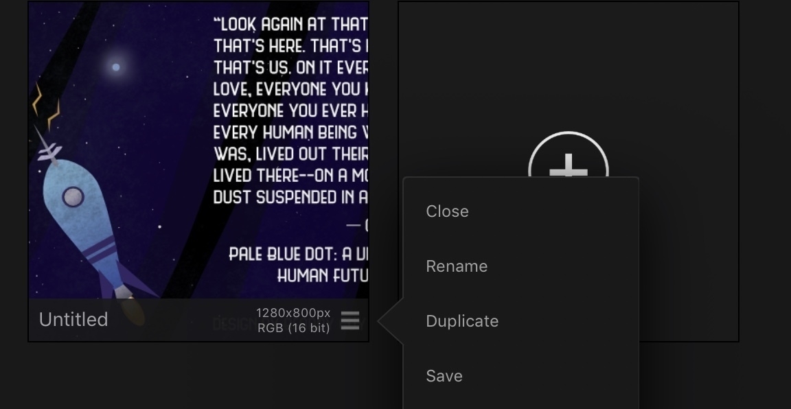
To save my Affinity Project files to this Files accessible storage area I access the corner widget of the document icon in the built-in document browser and chose “Save”. The file is then saved into “On my iPad” in the “Photo” folder on iPad. After that I can open it up from the Files app using the “On my iPad” location in the side bar. From the Files app I can now see the file size and easily share the file via the share sheet or via drag and drop from the Files app to any location or to email as an attachment or Messages or whatever.
[caption id=“attachment_681” align=“aligncenter” width=“2732”]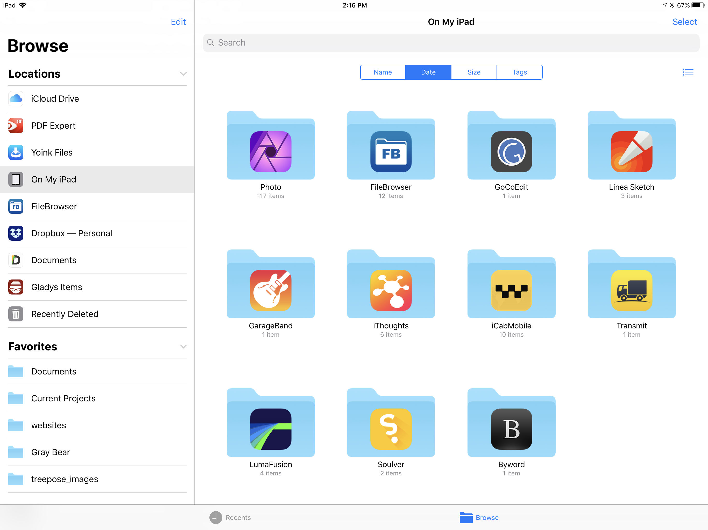 The Affinity Photo folder is very easy to spot thanks to the icon.[/caption]
So, going forward, I’ll be moving my current Affinity Photo files over to this local iPad storage and will save all new files there. I’ll save in folders by project and/or client and also begin using some of the tags that I have set-up for the Files app. After a file has been saved to Files I will delete the original that remains within the Affinity Photo app storage system so as to not have duplicates. Interestingly, the way to delete a file from the application storage is simply to select the same corner widget where the Save function is, but choose Close. They really should call it Delete not Close. Now, if I then open the newer copy of the file from within the Files app and make changes I can choose the option (again, the widget is in the bottom of the file icon) to Save and then Close. In this latter case it is closed from the application but remains in the Files app as one would expect. It’s a bit confusing and I hope the folks at Affinity change the way it is labeled. Files stored internally should have the option to Delete. Files stored in the Files app should have the option to close.
As long as the files are in the “Photo” folder on “On my iPad” they can easily be opened “in place” from Files by a simple tap to it’s icon. I can save at any time and any changes I make get saved back to the file just as I would expect. Note, again, saving is done while looking at the document icon from within the Affinity Photo file browser and choosing save from the widget from the lower right corner. Files can also be nested in other folders within that Photo folder in the Files app.
What happens if I copy these folders or files to another location, for example, to the a Documents folder in my iCloud Drive? In that case tapping it does not open into the app but rather opens a preview of it in the Files app. I can then use the “Copy to Photo” option in the share sheet to send it to Photo. As long as I leave don’t use the above mentioned “Close” option I can repeatedly open it for editing. I can save changes and those changes will take place on that file. If I close it I have to reopen again via the same “Copy to Photo” option in the share sheet. So, it’s still open in place with changes saved back, but it’s opening process is slightly different.
Affinity Photo is an app I’ll be using for many years and many client projects. It is a “Pro” app. Given that, I’m hoping that the developers add an option to use the Files app as the default method for managing files. Maybe even making that the default rather than the current storage within the app’s hidden away storage. The current options that I’ve discussed above are in the app’s help pages but some of the specifics are missing. For now it would helpful if they could emphasize the option for saving out to files stored in the Files app.
Trying Drafts Again
(Note: I started this post back in February but never published. It’s now April and Drafts 5 has just recently been released!)
First, I’ll say that I make it a point to not clutter up my devices with apps I don’t use. There’s a balance to be found finding apps that work and sticking to them but also remaining open to discovering new apps. Early on with iPad then iPhone I tried lots of apps that I didn’t use for long and then I gradually settled to a fairly small subset that fill most of my needs. But being a nerd there is a constant pushback. Reading and listening to Federico Viticci makes this even more difficult. He’s constantly experimenting. So much so that I don’t know how he get’s any sleep given what he produces. He had a recent write-up on new automation in Things 3.4 which I sorta use and in it he also touched on the up-coming Drafts 5.
Drafts. This is one of those apps I bought but that I never use. It fits into the territory of Notes and Evernote. A few years back I tried Evernote for a few months but gave up on it. Why? Notes. I’ve always gravitated back to Apple Notes. And it’s even better now with scanning, searchable pdfs, images, etc. That said Drafts has a few advantages for just working with text, particularly Markdown. But then it crosses over into territory that is also occupied by iA Writer which is what I use for blogging and podcast transcription. So, it becomes a case of is there really a place for it or is it just clutter?
The key in determining if it will be useful for me will be the actions it is capable of. The primary purpose behind Drafts is that it is meant to be a place for quickly capturing text which can be built on or sent on to another app. Certainly, the quick capture is true. When I tried it in the past I looked at the automations and thought yes, they would be useful but most seemed to be basic feeds to other apps. Which is the point and which also had me questioning the usefulness. Why not just start and finish the email in Mail? Start and finish the post in Micro.Blog? The tweet in Twitterrific. The event in Fantastical. The to-do in Things. Again, that is the whole point of Drafts. It is for people who want to go to one place to start every action. Hence the name. You start a draft which you then send on to its final destination. Finally, the light goes off in my head. It took too long and it’s pretty dim. But there it is.
Okay, okay. So, now that I finally get this simple point and purpose, will I fit it in? I admit I’m curious. Over the past couple days I’ve made it a point to try. I added a couple of items to Things via Drafts. I added a couple of items to my calendar via the Drafts to Fantastical action. I even created a blog post which I saved to my iA Writer directory on iCloud. I hopped over to iA Writer and opened it and posted to WordPress. I’m going to make an effort for the next week or so to start with Drafts. That should be enough time to make it a part of the routine and better get to know the app and what it is like to use and whether it reduces friction or increases it. Some of these actions are the sort of things I increasingly accomplish with Siri. When I added the events to my calendar using Drafts I had to deliberately stop myself from using Siri. Fine for the purposes of evaluation but day-to-day I’d likely just use Siri.
April 19th update. Well, I wrote the above but never published it. Did I use Drafts much in the 50 days since writing the above post? Some but not much. The final version was just released yesterday so of course it’s all over my RSS and Twitter as the nerds go nuts for the latest text app. I spent some time reading the review by Tim Nahumck over at MacStories. I’ve read a few other things and watched a couple videos. I decided that to give it a fair shake I needed to move it into the Dock where it now sits by iA Writer which would be the app it would potentially replace.
Comparing iA Writer and Drafts Both apps have very pleasant writing environments. Both have features the other does not so there will be trade offs as is always the case when choosing between apps of any kind.
I use iA Writer to write and publish to my two WordPress blogs and for podcast transcripts which get exported to pdf and html. It works very well for those tasks. How does Drafts do? With Drafts I can print to pdf and export to html (both are actions downloaded from the action directory). There is no built in blog publishing other than sharing via the share sheet to the WordPress which is very limited. That said, there is an action to copy as rich text. From there it is a simple step to switch to Safari or the WordPress app, create a post and paste. When I use iA Writer I’m taken to Safari anyway for a final check before I post from within Safari. So, either way, it’s essentially the same.
Document storage is another consideration. Here I give the edge to iA Writer which autosaves and stores all of it’s files as text files in iCloud which is a huge plus. Also, iA Writer documents in the app can be stored in folders and those folders also exist in the Files app on iCloud. By comparison, Drafts keeps its documents in its own synched database and does not offer folders other than the default four which are Inbox, Flagged, Archive and Trash. Organization in Drafts can be accomplished via tags though and that’s potentially very useful and potentially even more powerful than folder-based organization. If I need to I can save my documents as txt to any location which is an added step by comparison to the native text files used by iA Writer but it’s a pretty simple step.
The greatest benefit to using Drafts would be the more customizable interface and the extensibility of actions. The whole point of the app (originally) was a place to start text so that it could then be used in a variety of ways via sharing. I’ll add that getting text into Drafts is much easier via other apps' share sheets. I often want to share text from Safari for a blog post. With Drafts I can select text and the share sheet gives me that selection as well as the markdown link at the top. Very handy. With iA Writer this is not possible. I find it hard to believe that the developers of iA Writer have not enabled receiving text from other apps via share sheets! I can copy/paste or drag and drop but it’s extra work. A big plus for Drafts on this.
Of course, there is far more to both of these apps, I’m only touching on the most obvious features in regards to my typical usage. I really like the feel of both of them. Very pleasant to write in and easy to use. They both stay out of the way but provide enough interface to make formatting markdown easy.
Subscriptions Done Right
Pricing on Drafts 5 has definitely gone up regardless of the subscription. Version 4 has been on sale for 3 to 4 years at $5. Cost now is $20 a year which is still more affordable than Ulysses but 4 times the cost of the previous version. Given that it is per year, it would be $60 for 3 years compared to $15 at the previous rate (assuming $5/per year). I think a part of the negative reaction to subscriptions is that they seem to be price increases at the same time. Every user will have their own line based on usefulness and budget. For my I purposes of blogging and transcripts I could just as easily rely on Pages or Notes. This kind of app is optional for me and I wouldn’t want to pay more than $10/year. The previous price of $5 was too little especially given it was a one time purchase. I think this time he’s jumped just a little too far the other direction. But that’s my judgment from my perspective.
All that said, while Drafts 5 is a subscription I actually like the way it’s being done. I can use the nearly full functionality of the app without a subscription. All the essential stuff works and some of the “extras” too. The pro subscription is for the advanced feature set that I may never use. For those that use those pro features the subscription is a great way to support continued development. If I find myself using the app, even just the basic functionality, I’ll likely subscribe for at least a few months to contribute to the development. I like that I have the option to drop out of the subscription and continue creating with the app. With Ulysses' subs I felt locked in, restricted to viewing and exporting only, and so I stopped using it the day they switched to subscriptions. Yes, I know I could have continued using the version I had till it stopped working with a future iOS update. But I didn’t see the point of it given my eventual departure. Why lock-in all my writing when the end result would be the same thing: moving to a different app.
A Good Problem to Have
It’s great that there are so many fantastic apps being developed for iOS. I’d much rather have too many to choose from than not enough. I’m looking forward to spending more time with Drafts. I’m curious to see if it becomes a habit. I’m used to going to apps and I suspect I’ll continue to do so. That said, I see the merit of having one place to start all text which then get’s pushed out to other apps. Time will tell.
Using an iPad to maintain websites - my workflow
A couple weeks ago I wrote about my website managment workflow changing up a bit due to Panic’s recent announcement that they were discontinuing Transmit. To summarize, yes, Transmit will continue to work for the time being and Panic has stated that it will continue developing Coda for iOS. But they’ve been slow to adopt new iOS features such as drag one drop while plenty of others are already offering that support. So, I’ve been checking out my options.
After two weeks with the new workflow on the iPad I can say this was a great decision and I no longer consider it tentative or experimental. This is going to stick and I’m pretty excited about it. I’ve moved Coda off my dock and into a folder. In it’s place are Textastic and FileBrowser. Not only is this going to work, it’s going to be much better than I expected. Here’s why.
iCloud Storage, FTP, Two Pane View Textastic allows for my “local” file storage to be in iCloud. So, unlike Coda, my files are now synced between all devices. Next, Textastic’s built in ftp is excellent. And I get the two pane file browser I’ve gotten used to with Transmit and Coda. Local files on the left, server files on the right. The html editor is excellent and is, for the most part, more responsive than Coda. Also, and this is really nice as it saves me from extra tapping, uploading right from a standard share button within the edit window. Coda requires switching out of the edit window to upload changes.
Drag and Drop Unlike Transmit and Coda, the developers of FileBrowser have implemented excellent drag and drop support. I’ve set-up ftp servers in FileBrowser and now it’s a simple action to select multiple files from practically anywhere and drag them right into my server. Or, just as easily, because I’ve got all of my website projects stored in iCloud I can drag and drop from anywhere right into the appropriate project folder in the Files app then use the ftp server in Textastic to upload. Either way works great. Coda/Transmit do not support drag and drop between apps and are a closed silo. The new workflow is now much more open and with less friction.
Image Display and Editing One benefit of FileBrowser is the display of images. In the file view thumbnails on the remote server are nicely displayed. If I need to browse through a folder of images at a much larger view I can do that too as it has a full screen image display that allows for swiping through. Fantastic and not something offered by Transmit or Coda. Also, from a list view of either Files or FileBrowser, local or remote, I can easily drag and drop an image to import into Affinity Photo for editing. Or, from the list view, I can select the photo to share/copy to Affinity Photo (or any image editor).
Textastic and Files This was another pleasant surprise. While I’ll often get into editing mode and just work from an app, in this case Textastic, every so often I might come at the task from another app. Say, for example, I’ve gotten a new images emailed from a client as happened today. I opened Files into split view with Mail. In two taps I had the project folder open in Files. A simple drag and drop and my images were in the folder they needed to go to. The client also had text in the body of the email for an update to one of his pages. I copied it then tapped the html file in Files which opened the file right up in Textastic. I made the change. Then uploaded the images and html files right from Textastic.
Problems? Thus far I’ve encountered only one oddity with this new workflow and it has to do with this last point of editing Textastic files by selecting them from within the Files app. As far as I can tell, this is not creating a new copy or anything, it is editing the file in place within Textastic. But for any file I’ve accessed via Files it shows a slight variation in the recents file list within Textastic. Same file, but the app seems to be treating it as a different file and it shows up twice in the recent files list. Weird. It is just one file though and my changes are intact regardless of how I’m opening it. As a user it seems like a bug but it may just be “the way it works”.
Panic, Transmit and Keeping My Options Open
I’ve been coding websites for the web since 1999 and doing it for clients since 2002. I started using Coda for Mac when the first version came out and when Transmit and Coda became available for iOS I purchased both. When I transitioned to the iPad as my primary computer in 2016 those two apps became the most important on my iPad. But no more.
A couple weeks ago Panic announced that they would no longer be developing Transmit for iOS. They’d hinted in a blog post a year or two ago that iOS development was shaky for them. They say though that Coda for iOS will continue. But I’m going to start trying alternative workflows. In fact, I’ve already put one in place and will be using it for the foreseeable future. Why do this if Coda still works and has stated support for the future?
I’m not an app developer. I’m also not an insider at Panic. But as a user, I find it frustrating that we are over three full months since the release of iOS 11 and seven months since WWDC and Panic’s apps still do not support drag and drop in iOS 11. Plenty of other apps that I use do. I find myself a bit irritated that Panic occupies this pedestal in the Apple nerd community. It’s true that their apps are visually appealing. Great. I agree. But how’s about we add support for important functionality? I really love Coda and Transmit but I just don’t feel the same about Panic as a company. Sometimes it seems like they’ve got plenty of time and resources for whimsy (see their blog for posts about their sign and fake photo company) and that’s great I guess. I guess as a user that depends on their apps I’d rather they focus on the apps. I’m on the outside looking in and it’s their company to do as they please. But as a user I’ll have an opinion based on the information I have. And though they’ve said Coda for iOS will continue, it’s time to test other options.
I’ve been using FileBrowser for three years just as a way to access local files on my MacMini. I’d not thought much about how it might be used as my FTP client for website management in conjunction with Apple’s new Files app. Thanks to Federico’s recent article on FTP clients I was reminded that FileBrowser is actually a very capable ftp app. So, I set-up a couple of my ftp accounts. With this set-up I can easily access my servers on one side of my split screen via FileBrowser and my “local” iCloud site folders in Files on the other side. I really like the feel of it. The Files app is pretty fantastic and being able to rely on that in this set-up is a big plus. It feels more open which brings me to the next essential element in this process: editing html files.
One of my frustrations with Coda and Transmit was that my “local” files were stuck in a shared Coda/Transmit silo. Nice that they were interchangeable between the two but I could not locate them in DropBox or iCloud. With this new set-up I needed a text editor that could work from iCloud as a local file storage. I’ve got two options that I’m starting with, both have built in ftp as well as iCloud as a file storage option. Textastic is my current favorite. Another is GoCoEdit. Both have built in preview or the option to use Safari as a live preview. So, as of now, I open my coding/preview space and use a split between Textastic and Safari. I haven’t used Textastic enough to have a real opinion about how it feels as an editor when compared to Coda’s editor. But thus far it feels pretty good. My initial impression is that navigation within documents is a bit snappier and jumping between documents using the sidebar is as fast as Coda’s top tabs.
So, essentially, this workflow is relying on four apps in split screen mode in two spaces. One space is for file transfer, the other is for coding/previewing. Command Tab gets me quickly back and forth between them. I often get instructions for changes via email or Messages. Same for files such as pdfs and images. In those cases it is easy enough to open Mail or Messages as a third slide over app that I can refer to as I edit or for drag and drop into Files/FileBrowser.
It’s only been a few days with this new 4 app workflow but in the time I’ve used it I like it a lot. I get drag and drop and synched iCloud files (which also means back-up files thanks to the Mac and Time Machine).
Brydge Keyboard Update
It’s been almost two months of using the Brydge keyboard. It seems to be holding up very well in that short time. The only defect I’ve discovered is the right most edge of the space bar does not work. My thumb has to be at least a half inch over to activate a press. Not a deal breaker but it is something I’ve had to adjust.
Also, something positive that I’ve discovered. The Brydge hinges rotate all the way to a parallel position with the keyboard. In other words, the iPad rotates all the way to no angle at all, it just sort of opens all the way, level with the keyboard. I initially thought this would be useless. Why would I ever want to do this?
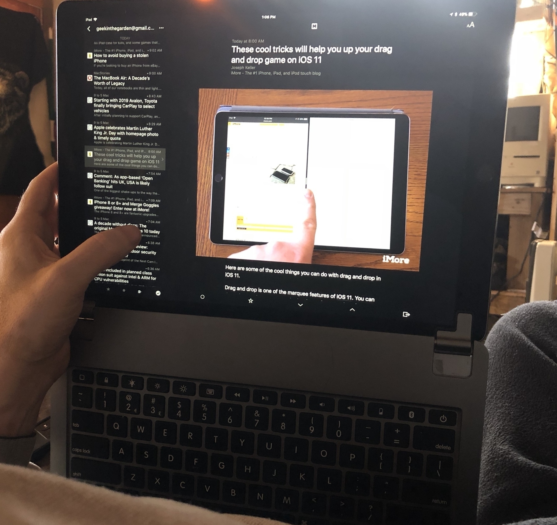
The iPad Laptop
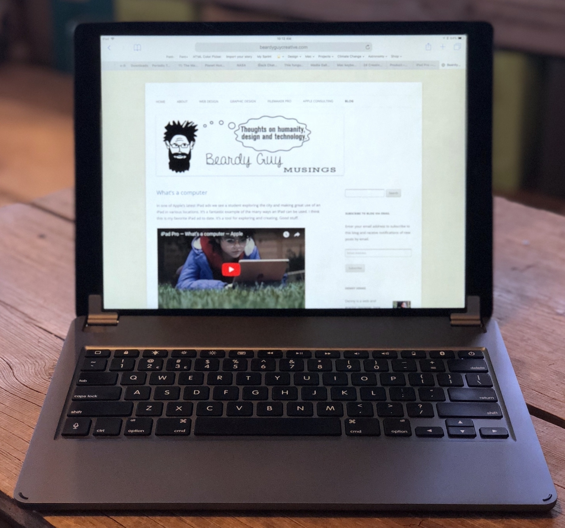
That said, as much as I’ve enjoyed using the Smart Keyboard I’ve got to admit I’ve been longing for Apple to make a keyboard like the Brydge. Others have written about the Brydge which is often described as very similar to an Apple laptop keyboard. Most recently Jason Snell wrote an excellent piece on Why Apple’s next laptop should run iOS. He’d previously written a review of the Brydge and mentions it again:
The problem with the iPad Pro is that it’s literally not a laptop: You can’t comfortably set it in your lap and get work done. (Yes, you can kind of balance the Smart Keyboard on your lap, but it’s not the same as using a laptop—in terms of stability or adjustability.) This year I’ve been using my iPad Pro with the Brydge keyboard, a Bluetooth keyboard with two clamps that turn the iPad Pro into something that looks an awful lot like a laptop—albeit one with no trackpad.Seeing his mention of it and the accompanying photo sent me off to have another look. The only reason I’d previously held off were the many reports of hit and miss quality. Lots of folks report getting units that had to be replaced, often more than once. Yikes. By chance I happened to look around Thanksgiving and they were running a Black Friday sale so I finally bought it and have been using it for about a week.
The Brydge arrived in perfect condition. It is, as reported by many, very similar to typing on the keyboard of a current generation MacBook Air or the previous generation of MacBook Pro. Which is to say, it’s excellent. It is very nearly the perfect iPad keyboard. I can slide the iPad into the hinge connectors easily but not too easily. They grip it well so it feels secure. I really only have two complaints.
The top, outer edge of this keyboard is very sharp. It almost feels like a knife blade. Second, the iPad rests deep enough in the hinges that the bottom edge of the screen is just level with the back of the keyboard which means using my fingers to pull-up to activate the dock and multitasking of iOS 11 is very difficult and often results in misses. Very frustrating. If I put the iPad into the hinge brackets but don’t push it all the way down it still sits above the back of the unit and activating the dock is easy. If it just sat 1-2 millimeters higher, access to the dock and multitasking would be much better.
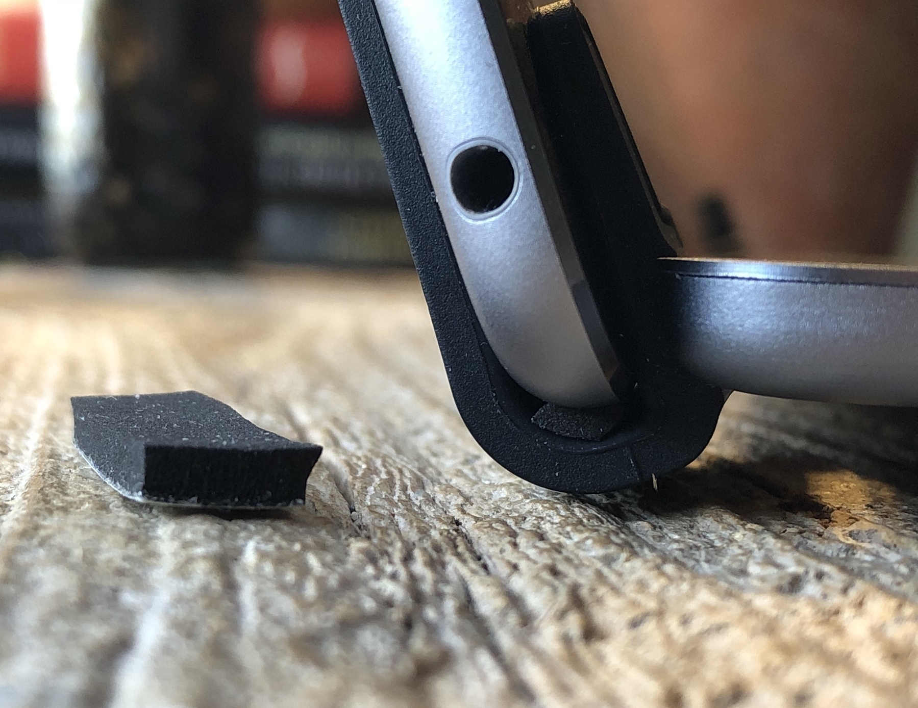
If the design were tweaked these are issues that could be fixed without too much difficulty and they really should be.
Back to Jason Snell who posted a follow-up article on the idea of an iOS laptop, this time addressing the critiques of his initial article. In the follow-up, The case against building an iOS laptop—and why it might happen anyway, he writes:
I use my iPad with external keyboards all the time. Sometimes it’s clipped into a keyboard case, so it’s shaped exactly like a laptop. Sometimes it’s on a table with a Smart Keyboard attached. Other times, it’s in a stand on a table with a USB keyboard attached via Apple’s USB 3-Lightning adapter...I’ve been using mine like this too. My only disagreement is that I think the current iPad is the iPad Jason is describing. I don’t think Apple needs to do much aside from build a proper keyboard. Just tweak the current Brydge a bit and give it the usual Apple fit and finish. Perhaps fix the orientation of the Apple logo on the back of the iPad to reflect a primary horizontal orientation. If Apple could create a hinge with the Smart Connector and a magnetic lock-in we would have the tablet/laptop combination.If I were doing something that didn’t require typing, something that involved intense tapping and swiping on my iPad, the Zombie Arms experience would start to come to the fore. On the iPad, that’s when I would disconnect the keyboard and hold the tablet more naturally. (That’s why I think an iOS laptop would ideally be a convertible laptop, so you could fold back the keyboard entirely when it isn’t needed.)
As is I think the Brydge does this right now though it is bluetooth based whereas an Apple solution would use the Smart Connector. I’ve only had a week with the Brydge but this combination feels nearly perfect. It’s a laptop when I want a laptop, a tablet when I want a tablet. The effort required to switch form factors is simply to lift the iPad from the hinges or to place in back in them.
What’s a computer
In one of Apple’s latest iPad ads we see a student exploring the city and making great use of an iPad in various locations. It’s a fantastic example of the many ways an iPad can be used. I think this is my favorite iPad ad to date. It’s a tool for exploring and creating. Good stuff.